Flutter_W6
6주차 학습내용
1. TextButton
맨위-
TextButton
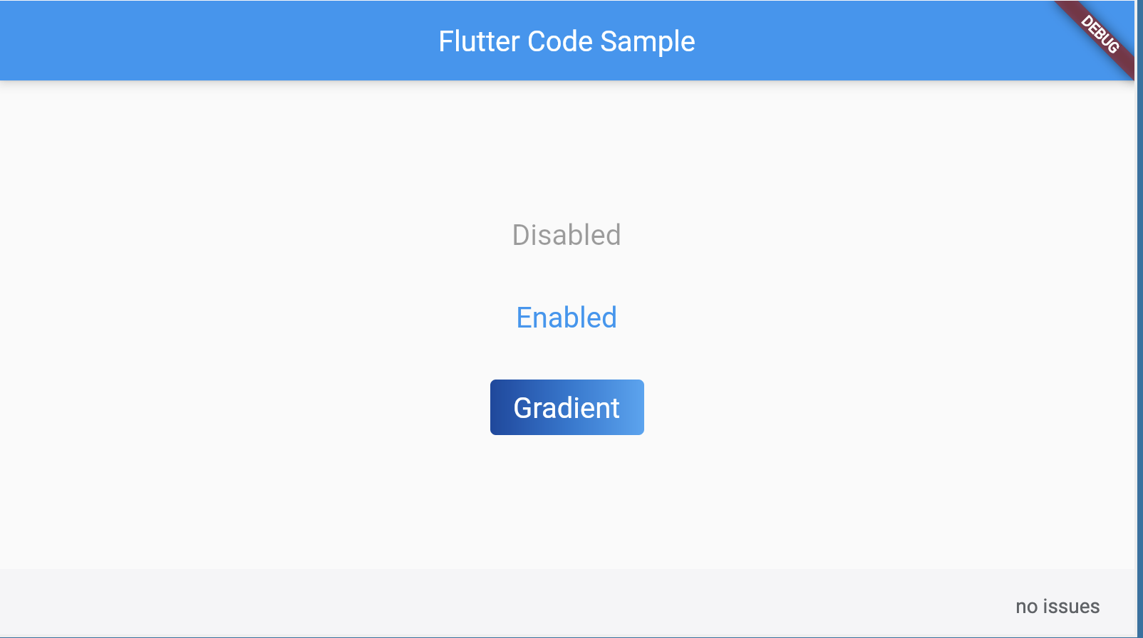
import 'package:flutter/material.dart'; void main() => runApp(const MyApp()); class MyApp extends StatelessWidget { const MyApp({super.key}); static const String _title = 'Flutter Code Sample'; Widget build(BuildContext context) { return MaterialApp( title: _title, home: Scaffold( appBar: AppBar(title: const Text(_title)), body: const MyStatelessWidget(), ), ); } } class MyStatelessWidget extends StatelessWidget { const MyStatelessWidget({super.key}); Widget build(BuildContext context) { return Center( child: Column( mainAxisSize: MainAxisSize.min, children: <Widget>[ TextButton( style: TextButton.styleFrom( textStyle: const TextStyle(fontSize: 20), ), onPressed: null, child: const Text('Disabled'), ), const SizedBox(height: 30), TextButton( style: TextButton.styleFrom( textStyle: const TextStyle(fontSize: 20), ), onPressed: () {}, child: const Text('Enabled'), ), const SizedBox(height: 30), ClipRRect( borderRadius: BorderRadius.circular(4), child: Stack( children: <Widget>[ Positioned.fill( child: Container( decoration: const BoxDecoration( gradient: LinearGradient( colors: <Color>[ Color(0xFF0D47A1), Color(0xFF1976D2), Color(0xFF42A5F5), ], ), ), ), ), TextButton( style: TextButton.styleFrom( foregroundColor: Colors.white, padding: const EdgeInsets.all(16.0), textStyle: const TextStyle(fontSize: 20), ), onPressed: () {}, child: const Text('Gradient'), ), ], ), ), ], ), ); } }
See also:
- OutlinedButton, a TextButton with a border outline.
- ElevatedButton, a filled button whose material elevates when pressed.
- material.io/design/components/buttons.html
- m3.material.io/components/buttons
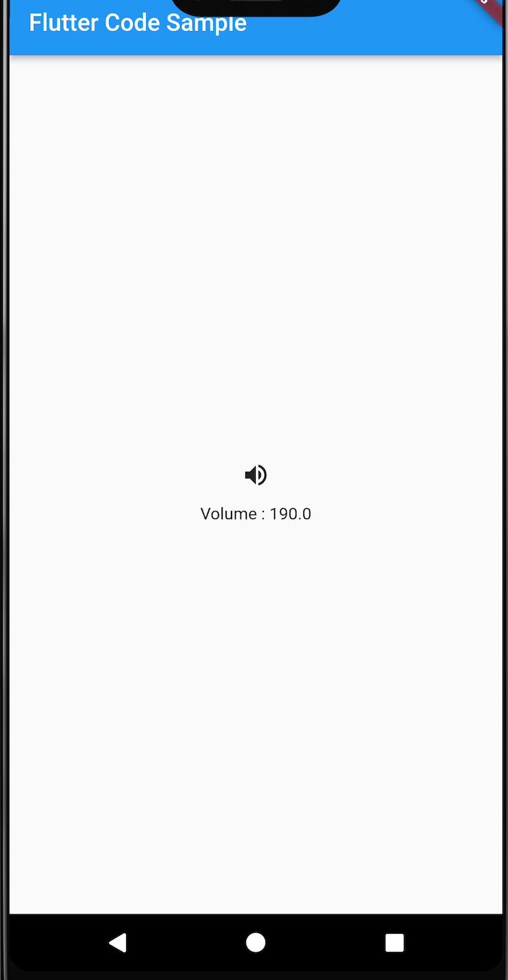
2. IconButton
맨위- 머티리얼 디자인 아이콘 버튼이다.
- An icon button is a picture printed on a Material widget that reacts to touches by filling with color (ink).
- 아이콘 버튼은 일반적으로 AppBar.actions 필드에서 사용되지만 다른 많은 곳에서도 사용할 수 있다.
- onPressed callback이 null이면 버튼이 비활성화되고 터치에 반응하지 않는다.
- 상위 항목 중 하나가 머티리얼 위젯이어야 한다.
- The hit region of an icon button will, if possible, be at least kMinInteractiveDimension pixels in size, regardless of the actual iconSize, to satisfy the touch target size requirements in the Material Design specification.
- 정렬은 Hit 영역 내에서 아이콘 자체의 위치를 제어한다.
import 'package:flutter/material.dart';
void main() => runApp(const MyApp());
class MyApp extends StatelessWidget {
const MyApp({super.key});
static const String _title = 'Flutter Code Sample';
Widget build(BuildContext context) {
return MaterialApp(
title: _title,
home: Scaffold(
appBar: AppBar(title: const Text(_title)),
body: const Center(
child: MyStatefulWidget(),
),
),
);
}
}
double _volume = 0.0;
class MyStatefulWidget extends StatefulWidget {
const MyStatefulWidget({super.key});
State<MyStatefulWidget> createState() => _MyStatefulWidgetState();
}
class _MyStatefulWidgetState extends State<MyStatefulWidget> {
Widget build(BuildContext context) {
return Column(
mainAxisSize: MainAxisSize.min,
children: <Widget>[
IconButton(
icon: const Icon(Icons.volume_up),
tooltip: 'Increase volume by 10',
onPressed: () {
setState(() {
_volume += 10;
});
},
),
Text('Volume : $_volume'),
],
);
}
}See also:
- Icons, the library of Material Icons.
- BackButton, an icon button for a "back" affordance which adapts to the current platform's conventions.
- CloseButton, an icon button for closing pages.
- AppBar, to show a toolbar at the top of an application.
- TextButton, ElevatedButton, OutlinedButton, for buttons with text labels and an optional icon.
- InkResponse and InkWell, for the ink splash effect itself.
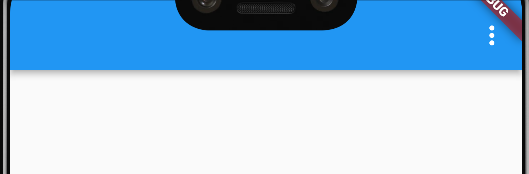
3. Popupmenu
맨위-
Popup menu
-
누를 때 메뉴를 표시하고 항목이 선택되어 메뉴가 닫히면 onSeleted를 호출한다.
- onSelected에 전달된 값은 선택한 메뉴 항목의 값이다.
-
One of child or icon may be provided, but not both. If icon is provided, then PopupMenuButton behaves like an IconButton.
- icon이 제공되면 IconButton처럼 작동한다.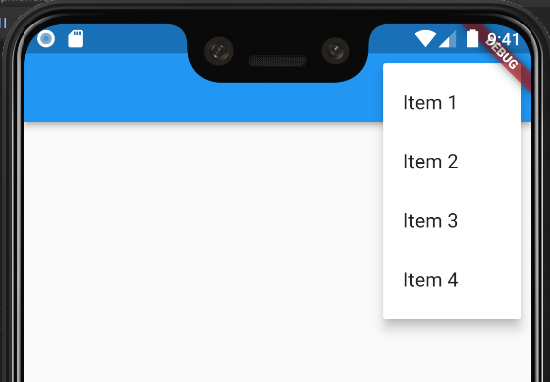
import 'package:flutter/material.dart'; // This is the type used by the popup menu below. enum Menu { itemOne, itemTwo, itemThree, itemFour } void main() => runApp(const MyApp()); class MyApp extends StatelessWidget { const MyApp({super.key}); static const String _title = 'Flutter Code Sample'; Widget build(BuildContext context) { return const MaterialApp( title: _title, home: MyStatefulWidget(), ); } } class MyStatefulWidget extends StatefulWidget { const MyStatefulWidget({super.key}); State<MyStatefulWidget> createState() => _MyStatefulWidgetState(); } class _MyStatefulWidgetState extends State<MyStatefulWidget> { String _selectedMenu = ''; Widget build(BuildContext context) { return Scaffold( appBar: AppBar( actions: <Widget>[ // This button presents popup menu items. PopupMenuButton<Menu>( // Callback that sets the selected popup menu item. onSelected: (Menu item) { setState(() { _selectedMenu = item.name; }); }, itemBuilder: (BuildContext context) => <PopupMenuEntry<Menu>>[ const PopupMenuItem<Menu>( value: Menu.itemOne, child: Text('Item 1'), ), const PopupMenuItem<Menu>( value: Menu.itemTwo, child: Text('Item 2'), ), const PopupMenuItem<Menu>( value: Menu.itemThree, child: Text('Item 3'), ), const PopupMenuItem<Menu>( value: Menu.itemFour, child: Text('Item 4'), ), ]), ], ), body: Center( child: Text('_selectedMenu: $_selectedMenu'), ), ); } }See also:
-
PopupMenuItem, a popup menu entry for a single value.
-
PopupMenuDivider, a popup menu entry that is just a horizontal line.
-
CheckedPopupMenuItem, a popup menu item with a checkmark.
-
showMenu, a method to dynamically show a popup menu at a given location.
-
4. Floating Action Button
맨위-
Floating Action Button
-
Scaffold에 FAB를 추가시켜주면 된다.
Scaffold( floatingActionButton: FloatingActionButton( child: Icon(Icons.add), onPressed: () {}, ), ); -
하단 탭이 있는 경우에도 FAB를 위치시킬 수 있다.
-
이때, 중앙에 오기를 원하면 FloatingActionButtonLocation.centerDocked,를 명시한다.
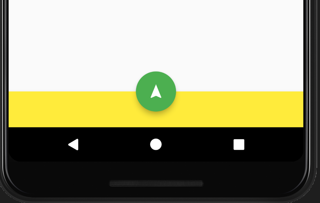
Scaffold(
      appBar: AppBar(
        title: const Text('FloatingActionButton Sample'),
      ),
      body: const Center(child: Text('Press the button below!')),
      floatingActionButton: FloatingActionButton(
        onPressed: () {
          // Add your onPressed code here!
        },
        backgroundColor: Colors.green,
        child: const Icon(Icons.navigation),
      ),
      floatingActionButtonLocation: FloatingActionButtonLocation.centerDocked,

      bottomNavigationBar: BottomAppBar(
        		color: Colors.yellow,
		        child: Container(height: 50.0),
      ),
    );
-
-
5. Divder
맨위-
Material Components widgets
-
Divider
-
양쪽에 패딩이 있는 얇은 수평선
-
머티리얼 디자인 언어에서 이것은 구분선을 나타낸다.
-
구분선은 lists component, Drawers component 및 다른 곳에서 콘텐츠를 구분하는 데 사용할 수 있다.
-
ListTile 항목 사이에 구분선을 만들려면 이 경우에 최적화된 ListTile.divideTiles를 사용하는 것이 좋다.
Column(
	children: [
		BlueBox(),
		Divider(),
		RedBox(),
	]
)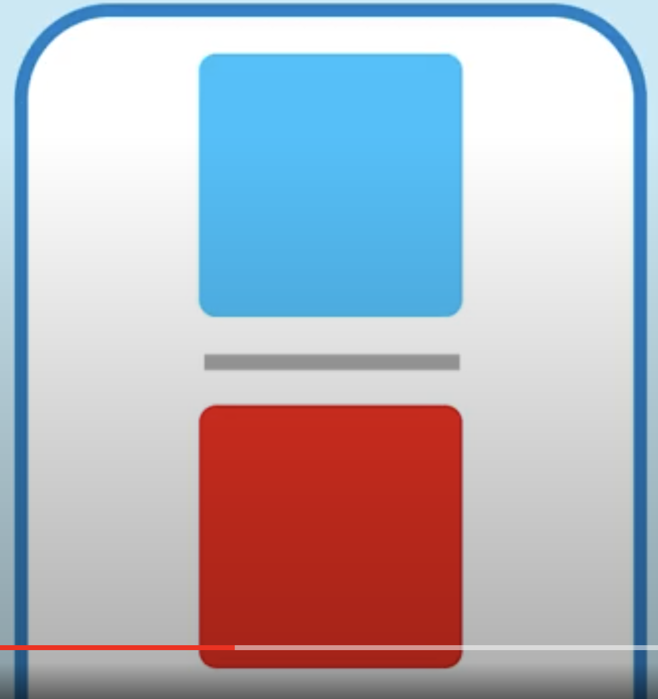
Column(
	children: [
		BlueBox(),
		Divider(
			height:100,
		),
		RedBox(),
	]
)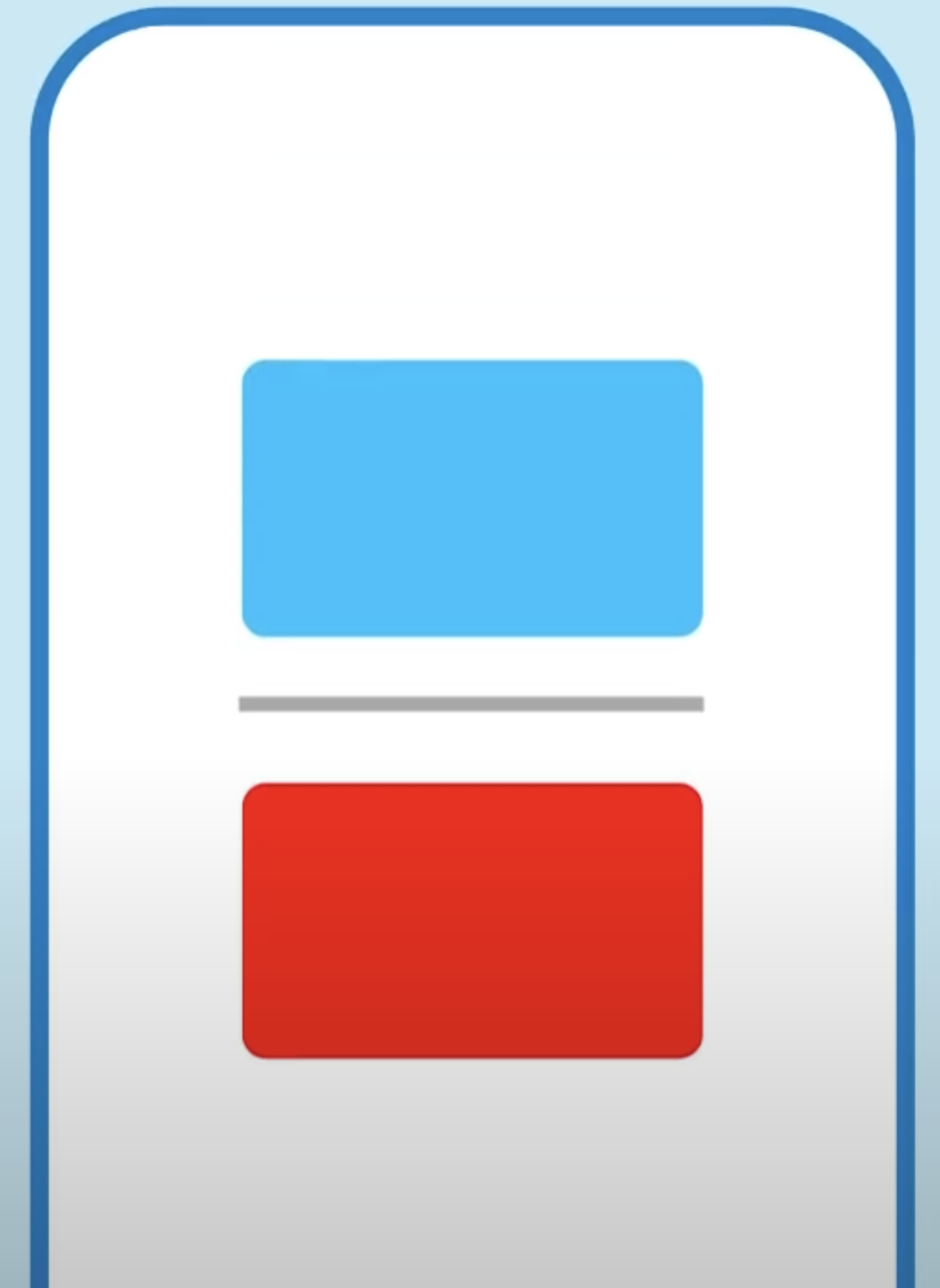
Column(
	children: [
		BlueBox(),
		Divider(
			height:100,
			thickness:20,
			color:Color.purple,
			indent: 20,
			endIndent: 20,
		),
		RedBox(),
	]
)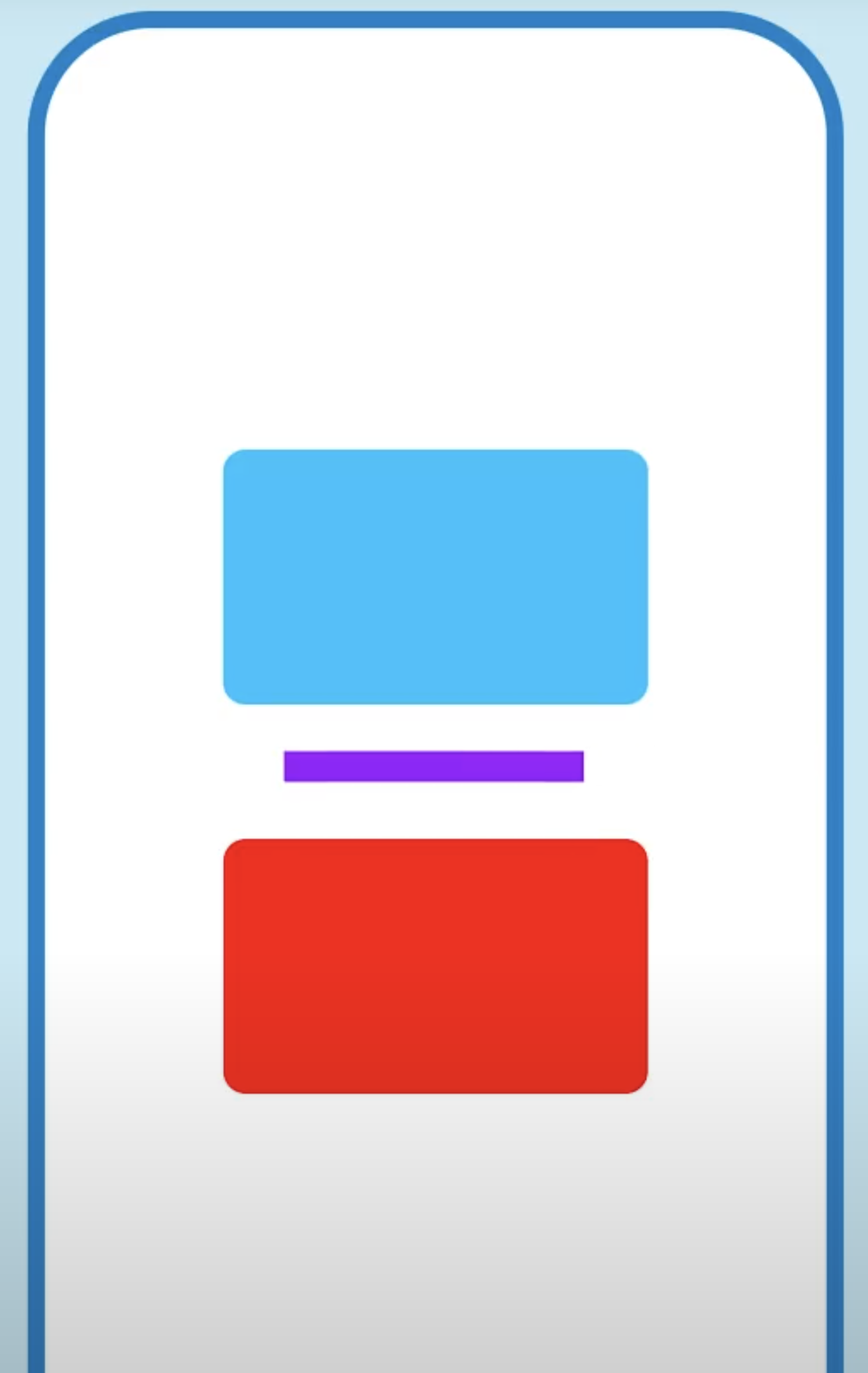
-
-
일괄적으로 적용하려면 DividerThemeData를 명시한다.
- 위 예시와 차이점은 height가 아닌 space를 사용한다.
MaterialApp(
		theme: ThemeData(
			dividerTheme: DividerThemeData(
				space: 50,
				thickness: 10,
				color: Color.purples,
				indent: 20,
				endIndent: 20,
			),
	),
	//...
)
- 위 예시와 차이점은 height가 아닌 space를 사용한다.
-
유용하게 사용되는 예
- ListView의 separatorBuilder를 통해 ListTile의 divideTiles를 이용하는 경우
ListView.separated(
	separatorBuilder: (_, __)
			=> const Divider(),
);
// ...

ListTile.divideTiles(
	context, tiles, Colors.purple);
- ListView의 separatorBuilder를 통해 ListTile의 divideTiles를 이용하는 경우
-
See also:
- PopupMenuDivider, which is the equivalent but for popup menus.
- ListTile.divideTiles, another approach to dividing widgets in a list.
- VerticalDivider, which is the vertical analog of this widget.
- material.io/design/components/dividers.html
-
-
6. ListTile
맨위-
Material Components widgets
-
ListTile
-
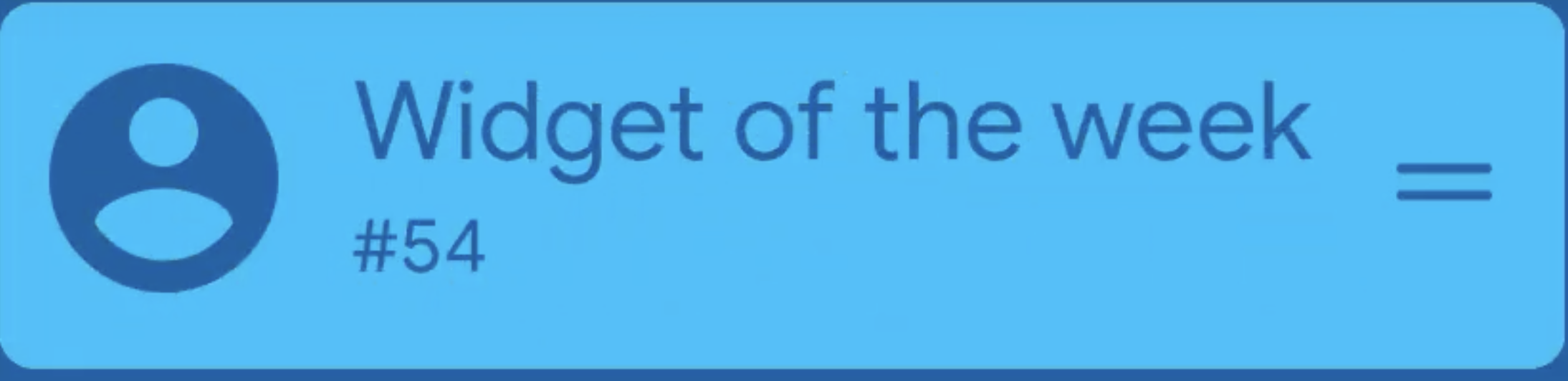
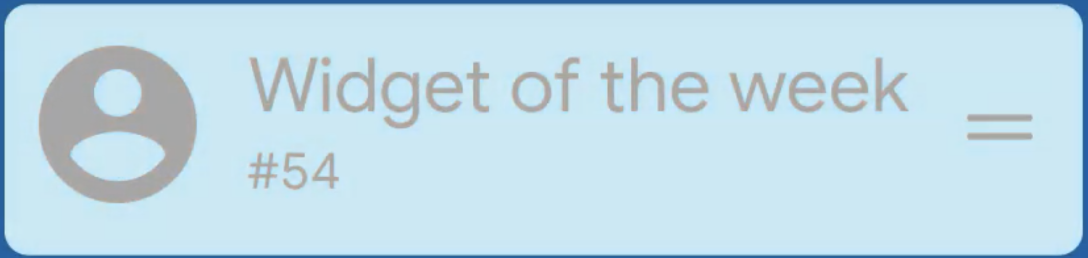
이미지를 통해 직관적으로 살펴보자.
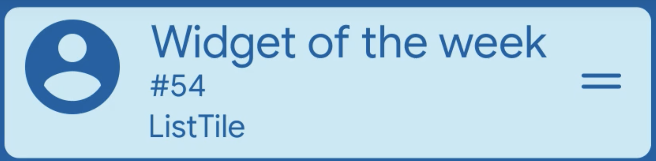
ListTile(
	leading: icon,
	title: "Widget of the week",
	subtitle: "#54",
	isThreeLine: true,
	dense: true,
	trailing: icon,
);
여기서 dense 속성을 이용해 보다 작게 밀집시킬 수 있다.
-
onTap이나 onLongPress callBack과도 상호작용이 가능하다.
ListTile( leading: icon, title: "Widget of the week", subtitle: "#54", **onTab: () => _tapCallback, //onLongPress: () => _pressCallback,** trailing: icon, ); -
enabled 속성
ListTile( leading: icon, title: "Widget of the week", subtitle: "#54", **enabled: false** trailing: icon, ); -
selected 속성
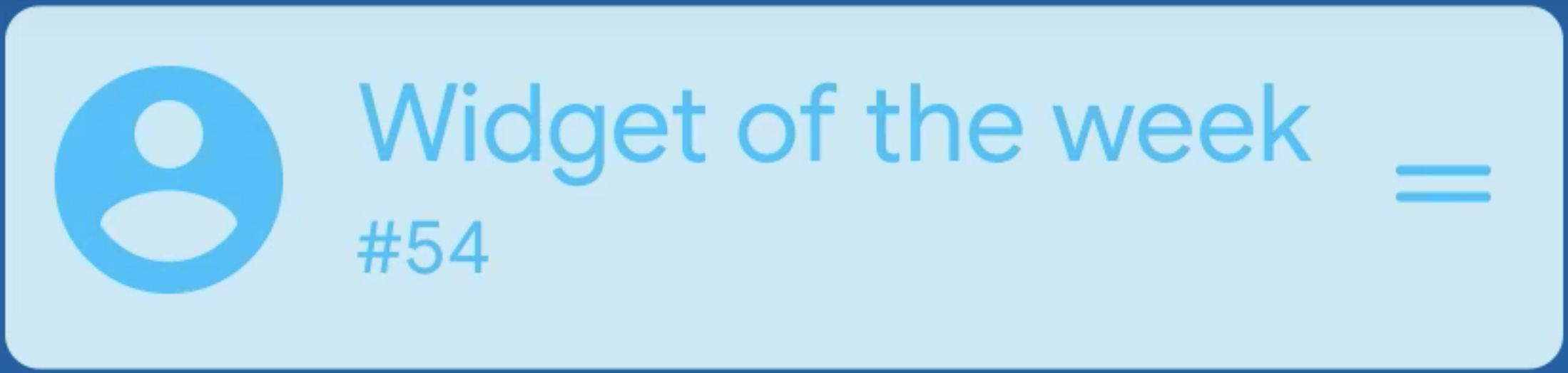
ListTile( leading: icon, title: "Widget of the week", subtitle: "#54", **selected: false,** trailing: icon, ); -
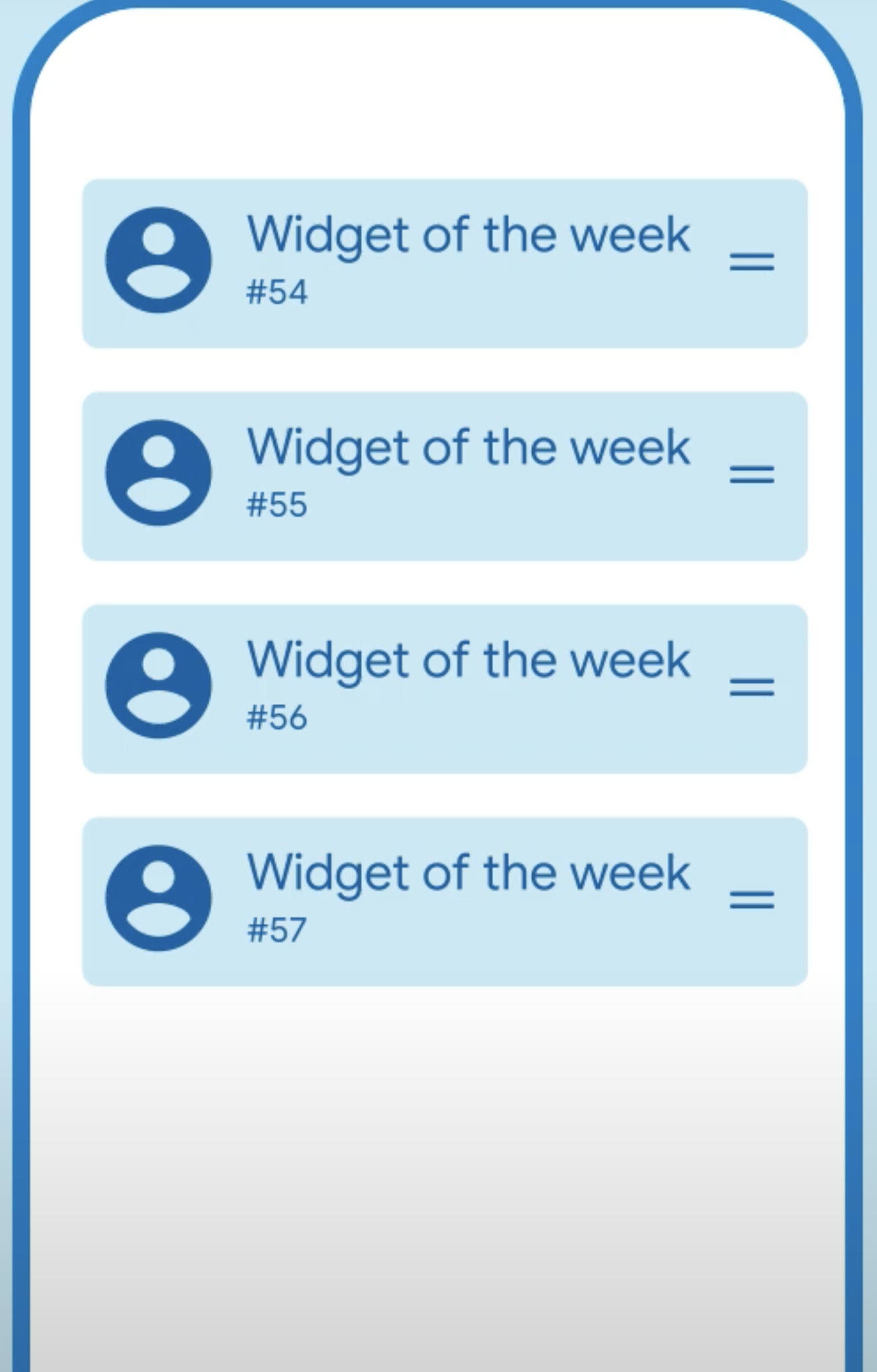
적용예
-
See also:
- ListTileTheme, which defines visual properties for ListTiles.
- ListView, which can display an arbitrary number of ListTiles in a scrolling list.
- CircleAvatar, which shows an icon representing a person and is often used as the leading element of a ListTile.
- Card, which can be used with Column to show a few ListTiles.
- Divider, which can be used to separate ListTiles.
- ListTile.divideTiles, a utility for inserting Dividers in between ListTiles.
- CheckboxListTile, RadioListTile, and SwitchListTile, widgets that combine ListTile with other controls.
- material.io/design/components/lists.html
- Cookbook: Use lists
- Cookbook: Implement swipe to dismiss
-
-
7. Stepper
맨위- 일련의 단계를 통한 진행 상황을 표시하는 material widget 이다.
- 한 단계에서 다른 단계를 완료해야 하거나 여러 단계를 완료해야하는 형태에 유용하다.
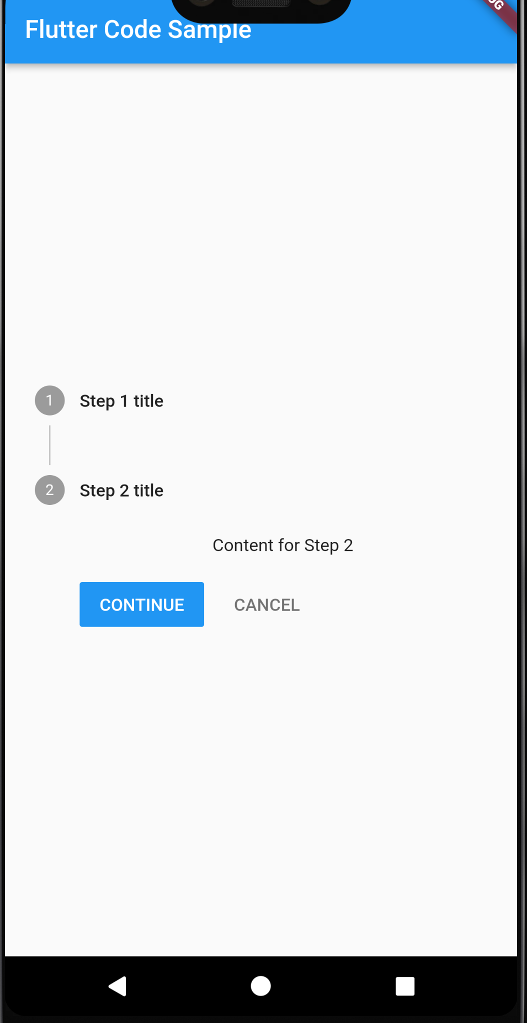
import 'package:flutter/material.dart';
void main() => runApp(const MyApp());
class MyApp extends StatelessWidget {
const MyApp({super.key});
static const String _title = 'Flutter Code Sample';
Widget build(BuildContext context) {
return MaterialApp(
title: _title,
home: Scaffold(
appBar: AppBar(title: const Text(_title)),
body: const Center(
child: MyStatefulWidget(),
),
),
);
}
}
class MyStatefulWidget extends StatefulWidget {
const MyStatefulWidget({super.key});
State<MyStatefulWidget> createState() => _MyStatefulWidgetState();
}
class _MyStatefulWidgetState extends State<MyStatefulWidget> {
int _index = 0;
Widget build(BuildContext context) {
return Stepper(
currentStep: _index,
onStepCancel: () {
if (_index > 0) {
setState(() {
_index -= 1;
});
}
},
onStepContinue: () {
if (_index <= 0) {
setState(() {
_index += 1;
});
}
},
onStepTapped: (int index) {
setState(() {
_index = index;
});
},
steps: <Step>[
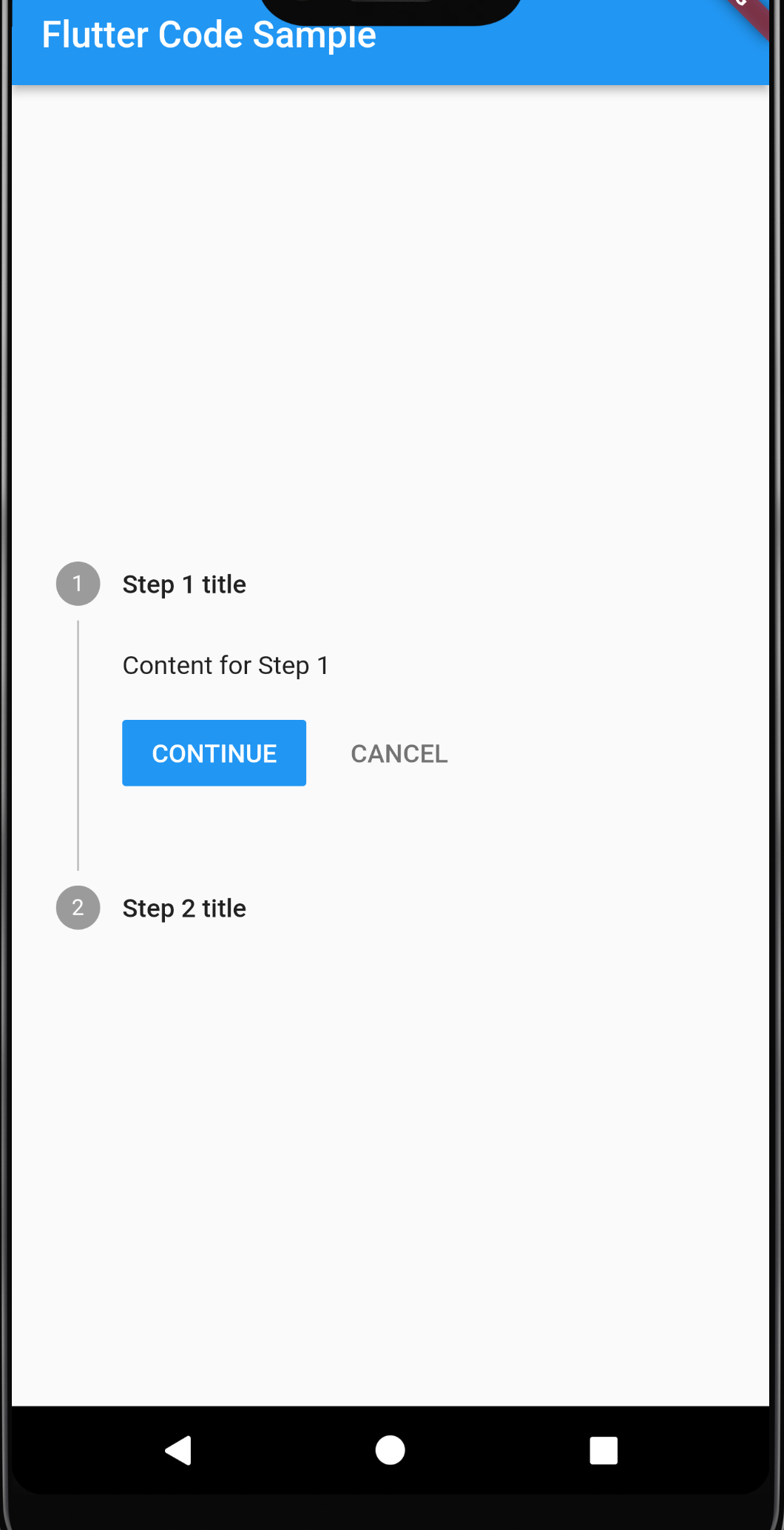
Step(
title: const Text('Step 1 title'),
content: Container(
alignment: Alignment.centerLeft,
child: const Text('Content for Step 1')),
),
const Step(
title: Text('Step 2 title'),
content: Text('Content for Step 2'),
),
],
);
}
}