버튼 생성하기
fig.update_layout(
    updatemenus=[
        dict(
            type = "buttons",
            buttons=list([dict(label="None",
                    method= 버튼을 눌렀을때 어떤 기능을 수행할지 설정,
                    args = [...]method 에 맞춰 구체적인 동작 지정,
                    args2 = [...]버튼을 2번째 눌렀을때 구체적인 동작 지정,
                    label = 버튼 텍스트)]),
            pad=버튼 패딩,
            x= 버튼위치 x좌표,
            y= 버튼위치 y좌표,
            showactive={True, False} 현재 버튼 활성화 여부 판단,
            active = 처음 그래프 생성 시 활성화 버튼 번호
        ),])
함수 안의 내용
updatemenus= dict() 형태로 아래의 정보들을 지정합니다.type= "buttons"buttons= [...] 버튼의 기능 관련 정보를 각각 dict() 형태로 넣습니다.method= {"restyle", "relayout", "update", "animate"}restyle: 데이터 변경 or 그래프 타입 변경 액션relayout: 그래프 레이아웃(타이틀, 축 등등..) 변경 액션update: 위의 두개를 동시에 수행할때animate: 애니메이션 플레이 스탑 버튼args= [...] 위의method 에 맞춰 구체적인 동작 지정label= 버튼 내부 레이블 지정pad={"r": 오른쪽, "l": 왼쪽, "t": 위쪽, "b":아랫쪽} 버튼의 pading을 지정합니다.x= 버튼 위치의 x좌표y= 버튼 위치의 y좌표active= 처음 그래프 생성 시 활성화 되어있는 버튼의 index 번호
그래프 Type 변경 버튼
이 기능은 그래프 타입이 변경되는 버튼을 만드는 것입니다.
산포도 그래프를 만들고, bar, scatter 형태로 버튼으로 손 쉽게 변환해 보겠습니다.
import plotly.graph_objects as px
import numpy as np

# 데이터 생성
random_x = np.random.randint(1, 101, 100)
random_y = np.random.randint(1, 101, 100)

#Figure 생성
fig = px.Figure()

#그래프 생성
fig.add_trace(px.Scatter(x=random_x, y=random_y, mode='markers'))


# 버튼 2개 생성
fig.update_layout(
    updatemenus=[
        dict(
            type="buttons",
            buttons=list([
                dict(args=["type", "scatter"],  # 1번 버튼
                     label="Scatter Plot",
                    method="restyle"),
                dict(args=["type", "bar"],  # 2번 버튼
                    label="Bar Chart",
                    method="restyle")
            ]),
        ),
    ]
)

fig.show()| Scatter | Bar |
|---|---|
 | 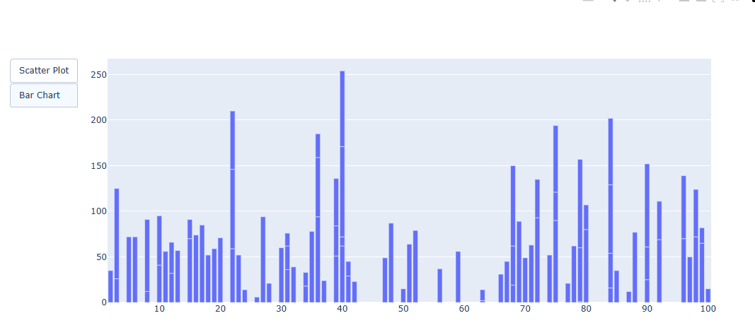 |
위에 보이는 것처럼 버튼에 따라 표가 다르게 보이는 것을 볼 수 있다.
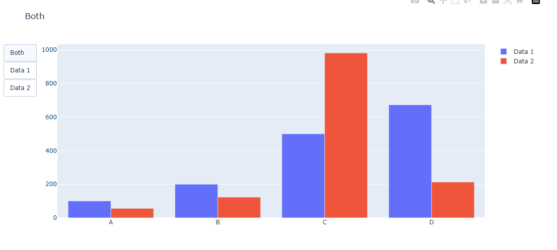
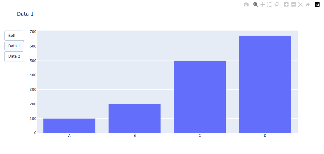
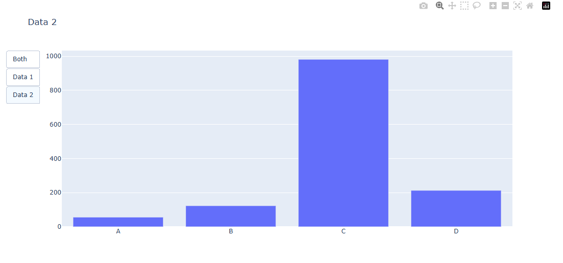
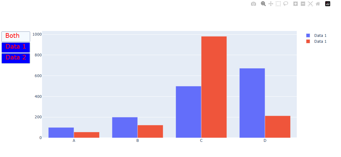
그래프를 통으로 삭제 생성하는 예제
import plotly.graph_objects as go
import numpy as np

#Figure 생성
fig = px.Figure()

#그래프 생성
x = ['A', 'B', 'C', 'D']

# 1번 그래프
fig.add_trace(go.Bar(name='Data 1',x=x, y=[100, 200, 500, 673]))

# 2번 그래프
fig.add_trace(px.Bar(name='Data 2',x=x, y=[56, 123, 982, 213]))


# 버튼 3개 생성
fig.update_layout(
    updatemenus=[
        dict(
            type="buttons",
            buttons=list([
                dict(label="Both",
                     method="update",
                     args=[{"visible": [True, True]},
                           {"title": {"text":"Both"}}]),
                dict(label="Data 1",
                     method="update",
                     args=[{"visible": [True, False]},
                           {"title": {"text":"Data 1"}}]),
                dict(label="Data 2",
                     method="update",
                     args=[{"visible": [False, True]},
                           {"title": {"text":"Data 2"}}]),
            ]),
        ),
    ]
)

fig.show()
둘다 보여주는 그래프 형태
Data1만 보여주는 그래프 형태
Data2만 보여주는 그래프 형태
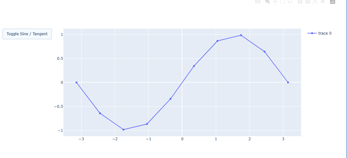
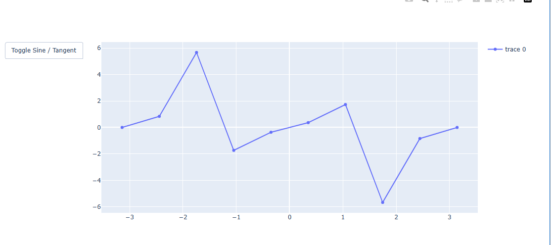
그래프 데이터가 변경되는 예제
import plotly.graph_objects as go
import numpy as np


#데이터 생성
x = np.linspace(-np.pi, np.pi, 10)

y1 = np.sin(x)
y2 = np.tan(x)


#Figure 생성
fig = go.Figure()

# 그래프 생성
fig.add_traces(go.Scatter(x=x, y=y1, visible=True, showlegend=True))


# 버튼 1개 생성
fig.update_layout(
    updatemenus=[
        dict(
            type="buttons",
            buttons=list([
                dict(label="Toggle Sine / Tangent",
                     method="restyle",
                     args=[{'y': [y1]}],
                     args2=[{'y': [y2]}],
                    ),

            ]),
        ),
    ]
)

fig.show()
sin 그래프
tan 그래프
버튼 스타일 지정하기
마찬가지로 버튼도 꾸밀 수가 있습니다.
fig.update_layout(
    updatemenus=[
        dict(
            type = "buttons",
            font_color = 텍스트 색,
            font_family = 텍스트 서체,
            font_size = 텍스트 사이즈,
            bgcolor = 배경색,
            bordercolr = 테두리색,
            borderwidth = 테두리 두깨,
        ),])
updatemenus= dict() 형태로 아래의 정보들을 지정합니다.type= "buttons"font_color= 텍스트 색,font_family= 텍스트 서체,font_size= 텍스트 사이즈,bgcolor= 배경색,bordercolr= 테두리색,borderwidth= 테두리 두깨,
import plotly.graph_objects as px
import numpy as np
#Figure 생성
fig = px.Figure()
#그래프 생성
x = ['A', 'B', 'C', 'D']
# 1번 그래프
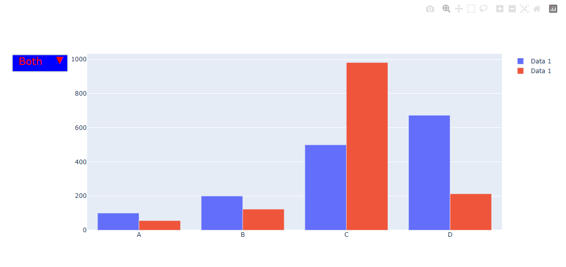
fig.add_trace(go.Bar(name='Data 1',x=x, y=[100, 200, 500, 673]))
# 2번 그래프
fig.add_trace(go.Bar(name='Data 1',x=x, y=[56, 123, 982, 213]))
# 버튼 3개 생성
fig.update_layout(
updatemenus=[
dict(
type="buttons",
buttons=list([
dict(label="Both",
method="update",
args=[{"visible": [True, True]},
{"title": "Both"}]),
dict(label="Data 1",
method="update",
args=[{"visible": [True, False]},
{"title": "Data 1",
}]),
dict(label="Data 2",
method="update",
args=[{"visible": [False, True]},
{"title": "Data 2",
}]),
]),
font_color = 'red',
font_size = 20 ,
bgcolor = 'blue',
borderwidth = 2
),
]
)
fig.show()
이런식으로 버튼도 폰트, 백그라운드 컬러, 가로, 세로 길이까지 다 지정할 수 있다.
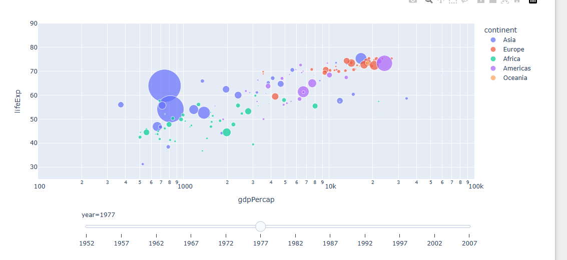
슬라이더 생성하기
Plotly의 슬라이더 기능을 활용하면 아주 간단한 코드로 시간의 변화 또는 범부 변화에 따른 경향 확인이 가능합니다.
express 를 활용한 슬라이더 생성
import plotly.express as px

#데이터 불러오기
df = px.data.gapminder()
fig = px.scatter(df, x="gdpPercap", y="lifeExp",size="pop", color="continent",
               log_x=True, size_max=55, range_x=[100,100000], range_y=[25,90],
                animation_frame="year")

# 재생버튼 삭제
fig["layout"].pop("updatemenus")
fig.show()
밑에있는 슬라이더를 움직이면 년도에 따라 경향이 바뀐다.
범위 슬라이더(range slider)생성
import plotly.express as px

# 데이터 생성
df = px.data.tips()

# 그래프 생성
fig = px.scatter(df, x="total_bill", y="tip", color="sex",)

#범위 슬라이더 생성
fig.update_layout(xaxis=dict(rangeslider_visible=True))

fig.show()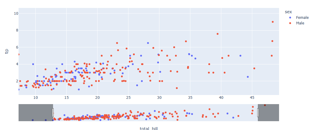
직접 슬라이더 한 step 씩 만들기
- 각 스텝 별 그래프 생성
import plotly.graph_objects as go
import numpy as np

# Figure 생성
fig = go.Figure()

# 각 스텝 별 그래프를 만들기
for step in np.arange(0, 3, 0.1):
    fig.add_trace(
        go.Scatter(
            visible=False,
            line=dict(color="#00CED1", width=6),
            name="𝜈 = " + str(step),
            x=np.arange(0, 10, 0.02),
            y=np.sin(step * np.arange(0, 10, 0.02))))
- 각 스텝 별 슬라이더 데이터를 생성
# 스텝 별 슬라이더 데이터 리스트 생성
steps = []
for i in range(len(fig.data)):
    step = dict(
        method="update",
        args=[{"visible": [False] * len(fig.data)},
              {"title": "Slider switched to step: " + str(i)}],  # layout attribute
    )
    step["args"][0]["visible"][i] = True  # Toggle i'th trace to "visible"
    steps.append(step)

# 최종 슬라이더 데이터 업데이트
fig.update_layout(
sliders = [dict(
    active=10,
    currentvalue={"prefix": "Frequency: "},
    pad={"t": 50},
    steps=steps
)])
- 최종 코드 종합
import plotly.graph_objects as go
import numpy as np

# Figure 생성
fig = go.Figure()

# 각 스텝 별 그래프(Trace)를 만들기
for step in np.arange(0, 3, 0.1):
    fig.add_trace(
        go.Scatter(
            visible=False,
            line=dict(color="#00CED1", width=6),
            name="𝜈 = " + str(step),
            x=np.arange(0, 10, 0.02),
            y=np.sin(step * np.arange(0, 10, 0.02))))

# 처음 그래프 생성했을땐 index 10의 Trace 가 보이게 설정
fig.data[10].visible = True

# 스텝 별 슬라이더 데이터 리스트 생성
steps = []
for i in range(len(fig.data)):
    step = dict(
        method="update",
        args=[{"visible": [False] * len(fig.data)},
              {"title": "Slider switched to step: " + str(i)}],  # layout attribute
    )
    step["args"][0]["visible"][i] = True  # Toggle i'th trace to "visible"
    steps.append(step)

# 최종 슬라이더 데이터 업데이트
fig.update_layout(
sliders = [dict(
    active=10,
    currentvalue={"prefix": "Frequency: "},
    pad={"t": 50},
    steps=steps
)])

fig.show()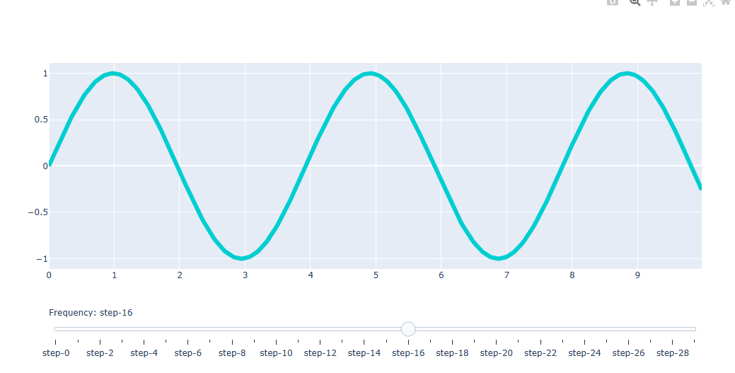
슬라이더 스타일 지정하기
fig.update_layout(
    sliders=[
        dict(
            type = "buttons",
            font_color = 텍스트 색,
            font_family = 텍스트 서체,
            font_size = 텍스트 사이즈,
            bgcolor = 배경색,
            bordercolr = 테두리색,
            borderwidth = 테두리 두깨,
        ),])
sliders= dict()형태로 아래의 정보들을 지정합니다.
type= "buttons"
font_color= 텍스트 색,
font_family= 텍스트 서체,
font_size= 텍스트 사이즈,
bgcolor= 배경색,
bordercolr= 테두리색,
borderwidth= 테두리 두깨,
ticklen= ticker 길이
tickcolor= ticker 색
tickcwidth= ticker 두깨
import plotly.graph_objects as go
import numpy as np

# Figure 생성
fig = go.Figure()

# 각 스텝 별 그래프(Trace)를 만들기
for step in np.arange(0, 3, 0.1):
    fig.add_trace(
        go.Scatter(
            visible=False,
            line=dict(color="#00CED1", width=6),
            name="𝜈 = " + str(step),
            x=np.arange(0, 10, 0.02),
            y=np.sin(step * np.arange(0, 10, 0.02))))

# 처음 그래프 생성했을땐 index 10의 Trace 가 보이게 설정
fig.data[10].visible = True

# 스텝 별 슬라이더 데이터 리스트 생성
steps = []
for i in range(len(fig.data)):
    step = dict(
        method="update",
        args=[{"visible": [False] * len(fig.data)},
              {"title": "Slider switched to step: " + str(i)}],  # layout attribute
    )
    step["args"][0]["visible"][i] = True  # Toggle i'th trace to "visible"
    steps.append(step)

# 최종 슬라이더 데이터 업데이트
fig.update_layout(
sliders = [dict(
    active=10,
    currentvalue={"prefix": "Frequency: "},
    pad={"t": 50},
    steps=steps,
    bgcolor="blue",
    font_color = "red",
    font_size= 20,
    ticklen = 3 ,
    tickcolor = "green",
)])

fig.show()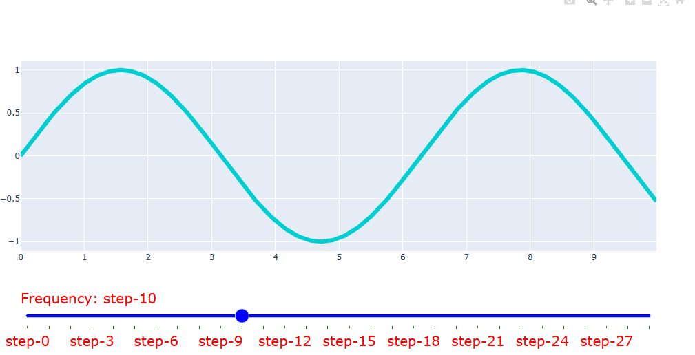
드롭다운 메뉴 생성하기
Dropdown 생성 방법
fig.update_layout(
    updatemenus=[
        dict(
            type = "dropdown",
            direction = 메뉴가 펼쳐지는 방향
            buttons=list([dict(label="None",
                    method= 버튼을 눌렀을때 어떤 기능을 수행할지 설정,
                    args = [...]method 에 맞춰 구체적인 동작 지정,
                    args2 = [...]버튼을 2번째 눌렀을때 구체적인 동작 지정,
                    label = 버튼 텍스트)]),
            pad=버튼 패딩,
            x= 버튼위치 x좌표,
            y= 버튼위치 y좌표,
            showactive={True, False} 현재 버튼 활성화 여부 판단,
            active = 처음 그래프 생성 시 활성화 버튼 번호
),])- 예시)
import plotly.graph_objects as px
import numpy as np

# 데이터 생성
random_x = np.random.randint(1, 101, 100)
random_y = np.random.randint(1, 101, 100)

#Figure 생성
fig = px.Figure()

#그래프 생성
fig.add_trace(px.Scatter(x=random_x, y=random_y, mode='markers'))


# 버튼 2개 생성
fig.update_layout(
    updatemenus=[
        dict(
            type="dropdown",
            direction="down",
            buttons=list([
                dict(args=["type", "scatter"],  # 1번 버튼
                     label="Scatter Plot",
                    method="restyle"),
                dict(args=["type", "bar"],  # 2번 버튼
                    label="Bar Chart",
                    method="restyle")
            ]),
        ),
    ]
)

fig.show()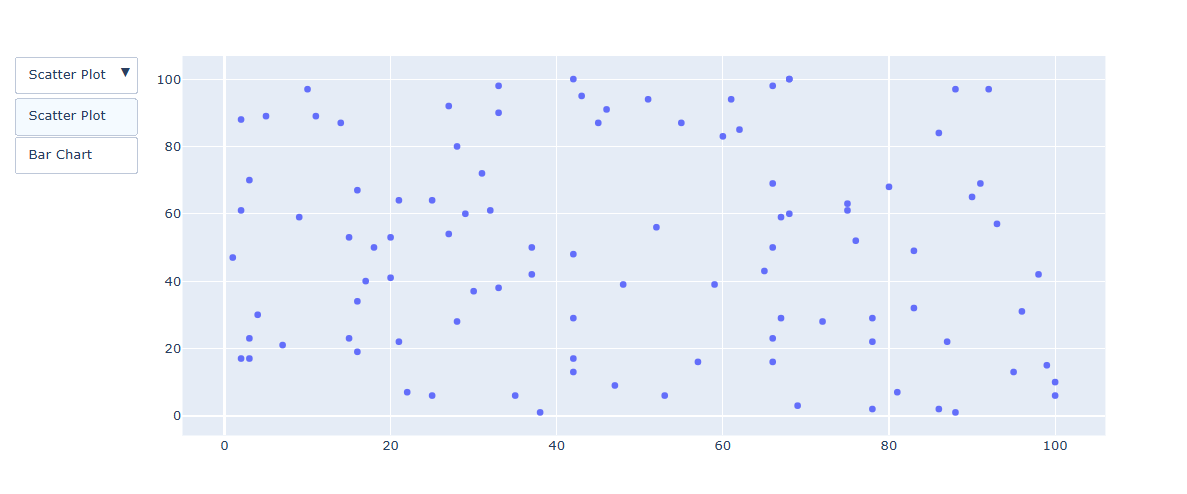
그래프를 통으로 삭제 생성하는 예제
import plotly.graph_objects as px
import numpy as np

#Figure 생성
fig = px.Figure()

#그래프 생성
x = ['A', 'B', 'C', 'D']

# 1번 그래프
fig.add_trace(go.Bar(name='Data 1',x=x, y=[100, 200, 500, 673]))

# 2번 그래프
fig.add_trace(go.Bar(name='Data 1',x=x, y=[56, 123, 982, 213]))


# 버튼 3개 생성
fig.update_layout(
    updatemenus=[
        dict(
            type="dropdown",
            direction="down",
            buttons=list([
                dict(label="Both",
                     method="update",
                     args=[{"visible": [True, True]},
                           {"title": "Both"}]),
                dict(label="Data 1",
                     method="update",
                     args=[{"visible": [True, False]},
                           {"title": "Data 1",}]),
                dict(label="Data 2",
                     method="update",
                     args=[{"visible": [False, True]},
                           {"title": "Data 2",}]),
            ]),
        ),
    ]
)

fig.show()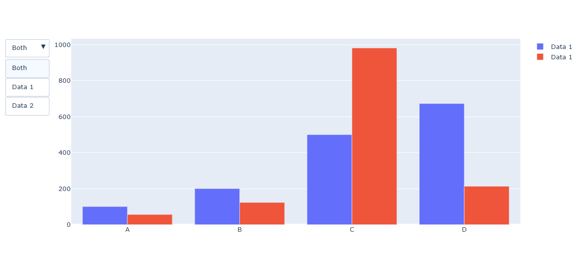
Dropdwon 스타일 지정하기
import plotly.graph_objects as px
import numpy as np

#Figure 생성
fig = px.Figure()

#그래프 생성
x = ['A', 'B', 'C', 'D']

# 1번 그래프
fig.add_trace(go.Bar(name='Data 1',x=x, y=[100, 200, 500, 673]))

# 2번 그래프
fig.add_trace(go.Bar(name='Data 1',x=x, y=[56, 123, 982, 213]))


# 버튼 3개 생성
fig.update_layout(
    updatemenus=[
        dict(
            type="dropdown",
            direction = "down",
            buttons=list([
                dict(label="Both",
                     method="update",
                     args=[{"visible": [True, True]},
                           {"title": "Both"}]),
                dict(label="Data 1",
                     method="update",
                     args=[{"visible": [True, False]},
                           {"title": "Data 1",
                            }]),
                dict(label="Data 2",
                     method="update",
                     args=[{"visible": [False, True]},
                           {"title": "Data 2",
                            }]),
            ]),
        font_color = 'red',
        font_size = 20 ,
        bgcolor = 'blue',
        borderwidth = 2

        ),
    ]
)

fig.show()

안녕하세요 게임개발을 공부하고 있는 돼지인간 입니다.