
이전 글에서 이어집니다.
타이포그라피 컴포넌트 만들기
세팅 완료되고 제일 먼저 한 일은 기존의 타이포그라피 컴포넌트를 뷰 형식으로 변환하는 것입니다.
- 기존 타이포 정의 컴포넌트
import styled, { css } from '@vue-styled-components/core'
import { theme } from './common'

const textStyle = css`
  color: ${({ color }) => color || theme.colors.black};
  margin: ${({ margin }) => margin || 0};
  padding: ${({ padding }) => padding || 0};
  ${({ fontWeight }) => `font-weight:${fontWeight};`}
`

export const H1 = styled.h1`
  font-size: 6rem;
  line-height: 7.5rem;
  font-weight: 700;
  ${textStyle}
`

export const H2 = styled.h2`
  font-size: 4rem;
  line-height: 5rem;
  font-weight: 700;
  ${textStyle}
`

export const H3 = styled.h3`
  font-size: 2.4rem;
  line-height: 3rem;
  font-weight: 600;
  ${textStyle}
`
export const H4 = styled.h4`
  font-size: 1.8rem;
  line-height: 2.6rem;
  font-weight: 400;
  ${textStyle}
`
export const Paragraph = styled.p`
  font-size: 1.6rem;
  line-height: 2.4rem;
  font-weight: 400;
  ${textStyle}
`
styled-component 방식을 그대로 적용한 파일입니다.
- 변경한 타이포 컴포넌트
//src/components/common/typography/TypographyTag.vue
<template>
  <component :is="type" :class="classes">
    <slot />
  </component>
</template>

<script setup lang="ts">
import { computed } from 'vue'
import { TypoTypes, TypographyProps, getTypoClasses } from './settings'

interface Props extends TypographyProps {
  type?: TypoTypes
}

const props = withDefaults(defineProps<Props>(), {
  type: 'p',
})

const classes = computed(() => getTypoClasses(props.type, props))
</script>
위 코드에서는 props로 type값을 하나 받아 타입에 따른 스타일링과 HTML 태그를 뱉어냅니다.
저렇게 들어올지 말지 모르는 속성(정식 명칭은 optional property)이 있을 경우에는, vue 내장 함수인 withDefaults와 defineProps를 사용하여 기본값을 지정해줘야 합니다.
리액트 코드로 변환하면 대충 이런 느낌입니다.
import React from 'react'
import { TypoTypes, TypographyProps, getTypoClasses } from './settings'

interface Props extends TypographyProps {
  type?: TypoTypes
  children?: React.ReactNode
}

const TypographyTag: React.FC<Props> = ({
  type = 'p',
  className,
  children,
  ...rest
}) => {
  const classes = getTypoClasses(type, { className })
  const Component = type as keyof JSX.IntrinsicElements

  return (
    <Component className={classes} {...rest}>
      {children}
    </Component>
  )
}

export default TypographyTag
그리고 아래 파일에선 타이포 타입과 getTypoClasses함수를 정의합니다.
//src/components/common/typography/settings.ts

export type TypoTypes = Extract<
  keyof HTMLElementTagNameMap,
  'h1' | 'h2' | 'h3' | 'h4' | 'h5' | 'h6' | 'p' | 'span' | 'div' | 'a'
>

export interface TypographyProps {
  className?: string
}

export const getTypoClasses = (type: TypoTypes, props?: TypographyProps) => {
  const baseClasses = ['text-black-333', props?.className]

  let typeClasses: string[] = []

  switch (type) {
    case 'h1':
      typeClasses = ['text-[6rem]', 'leading-[7.5rem]', 'font-bold']
      break
    case 'h2':
      typeClasses = ['text-[4rem]', 'leading-[5rem]', 'font-bold']
      break
    case 'h3':
      typeClasses = ['text-[2.4rem]', 'leading-[3rem]', 'font-bold']
      break
    case 'h4':
      typeClasses = ['text-[1.8rem]', 'leading-[2.6rem]', 'font-bold']
      break
    case 'h5':
      typeClasses = ['text-[1.6rem]', 'leading-[2.2rem]', 'font-bold']
      break
    case 'h6':
      typeClasses = ['text-[1.4rem]', 'leading-[2rem]', 'font-bold']
      break
    case 'p':
      typeClasses = ['text-[1.6rem]', 'leading-[2.4rem]', 'font-normal']
      break
    case 'a':
      typeClasses = ['text-[1.6rem]', 'leading-[2.4rem]', 'no-underline', 'cursor-pointer']
      break
    default:
      typeClasses = []
  }

  return [...typeClasses, ...baseClasses].filter(Boolean).join(' ')
}
눈에 띄는 차이점을 정리하면 이렇습니다.
| React | Vue |
|---|---|
{children} | <Slot/> |
Component = type as keyof JSX.IntrinsicElements | <component :is="type"> |
{...rest} | v-bind="$attrs" |
className={classes} | :class="classes" |
type = 'p' | withDefaults(defineProps<Props>()) |
| 렌더링 시마다 재계산됨 | computed() |
여기서 리액트와 뷰의 문법 차이가 꽤나 크다는 걸 느낄 수 있었고, 어느 부분에서 간편한지 보입니다. 리액트 문법에 쩔어 있던 저에겐 특히나 뷰의 문법이 어려워 보였고요.
computed에서 차이나는 반응성 시스템
그리고 마지막의 computed()는 리액트에서 흔히 useEffect와 비슷한 기능으로 설명되는 것 같습니다. 왜 그런가 하고 보니, 두 라이브러리의 반응성 시스템이 근본적으로 다른 이유라고 합니다.
vue의 computed는 의존성이 변하지 않으면 이전 계산 결과를 그대로 반환하고, 의존성이 변경될 때만 재계산됩니다.
하지만 react는 컴포넌트가 리렌더링될때마다 무조건 다시 계산하기 때문에 캐싱이 없고, 캐싱을 사용하기 위해선 useMemo를 이용해야 합니다.(근데 이 정도 규모는 캐싱 안써도 됩니다.)
음식으로 비교하자면 vue는 미리 조리해둔 것을 퍼주는 떡볶이 같은거고, react는 주문이 들어올때마다 새로 말아주는 김밥 같은 느낌이네요. (중요한건 같은 음식이 아니라는 점)
헤더 컴포넌트 짜기
이렇게 해서 만들어진 <TypographyTag>를 활용할겁니다.마침 순수 css로만 짜여져 있던 헤더가 있기 때문에, 이녀석을 뜯어고칩니다.
기존 코드
//src/components/common/HeaderComponent.vue
<template>
  <header class="header">
    <div class="container">
      <div class="wrapper">
        <h1>작은 부분부터 실천하는</h1>
        <h1 class="green">Frontend Developer</h1>
        <h1>이슬아입니다.</h1>
      </div>
      <h4>
        안녕하세요, 저는 웹 디자이너에서 시작한 주니어 프론트엔드
        개발자입니다.<br />좋은 코드는 정리하는 습관에서부터 시작된다고
        생각합니다.<br />코드를 해석하고 정리하는 것을 즐기며 가독성과
        유지보수성을 높이는 것에 가치를 둡니다.
      </h4>
    </div>
  </header>
</template>

<script setup lang="ts">
// import { theme } from '../common/common';
</script>

<style scoped>
.header {
  width: 100%;
  box-shadow: 0px 10px 20px 0px rgba(0, 0, 0, 0.08);
  padding: 40px 0 60px;
  position: relative;
  top: 0;
  transition: all 0.5s;
}
h1 {
  font-size: 6rem;
  line-height: 7.5rem;
  font-weight: 700;
}

h4 {
  font-size: 1.8rem;
  line-height: 2.6rem;
  font-weight: 400;
}
.green {
  color: #158000;
}
.container {
  width: 1000px;
  margin: 0 auto;
}
.wrapper {
  margin: 30px 0 52px;
}
</style>
일반 html/css와 비슷해 보이는 코드입니다. 지금 상태로도 스타일 적용은 잘 되어있지만, 타이포나 컬러같은걸 글로벌하게 쓸 수 없기에 유지보수 측면에선 나쁩니다.
참고로 <style scoped>처럼 scoped속성을 주면 해당 컴포넌트에만 스타일이 적용되는, 이른바 CSS 격리 기능을 사용할 수 있습니다. 만약 다른 컴포넌트에 .header 클래스가 존재한다 해도 이 스타일시트가 먹히지 않는거죠.
변경한 코드
//src/components/common/HeaderComponent.vue

<template>
  <header class="w-full sticky pt-[40px] pb-[60px] top-0">
    <div class="w-[1000px] mx-auto">
      <div class="mt-[30px] mb-[52px]">
        <TypographyTag type="h1">{{ title[0] }}</TypographyTag>
        <TypographyTag type="h1" className="text-green-01">{{ title[1] }}</TypographyTag>
        <TypographyTag type="h1">{{ title[2] }}</TypographyTag>
      </div>

      <div class="flex justify-between items-end">
        <TypographyTag type="h4" className="whitespace-pre-line font-normal">
          {{ intro }}
        </TypographyTag>
        <DetailButton buttonName="More" />
      </div>
    </div>
  </header>
</template>

<script setup lang="ts">
import TypographyTag from '../typography/TypographyTag.vue'
import { headerData } from '@/data/static'
import DetailButton from './DetailButton.vue'

const { title, intro } = headerData
</script>
무엇이 변경되었나?
- 기존
<h1>,<h4>같은 html 태그들이<TypographyTag/>로 변환됨. .container | .header | .wrapper처럼 클래스 스타일링이 아닌 엘리먼트에 직접 스타일링하는 형식으로 변경(이건 테일윈드 때문에 그렇습니다. 가독성이 떨어져서 저는 이 방식을 안좋아합니다.)- 직접 텍스트를 쓰는 대신
headerData라는 json 데이터 사용
추가로 <DetailButton/> 이라는 공용 컴포넌트가 생겼습니다. 이건 그냥 문자열 props만 받아오는 간단한 컴포넌트라 설명 없이 넘어갑니다.
//요래 생겼다.
<template>
<TypographyTag type="p" class="text-gray-7d cursor-pointer">{{ buttonName }} ></TypographyTag>
</template>
<script setup lang="ts">
import TypographyTag from '../typography/TypographyTag.vue'
interface IDetailButtonProps {
buttonName: string
}
defineProps<IDetailButtonProps>()
</script>근데 HeaderComponent에선 단순히 데이터 바인딩만 한 정도라서 뷰의 다른 기능을 맛볼 수 없습니다. 이번엔 반복 렌더링을 사용하는 컴포넌트를 만들어봅니다.
반복 컴포넌트 짜기
반복 컴포넌트를 아주아주 많이 쓰는 부분입니다. 이미지로 보면 이렇습니다.
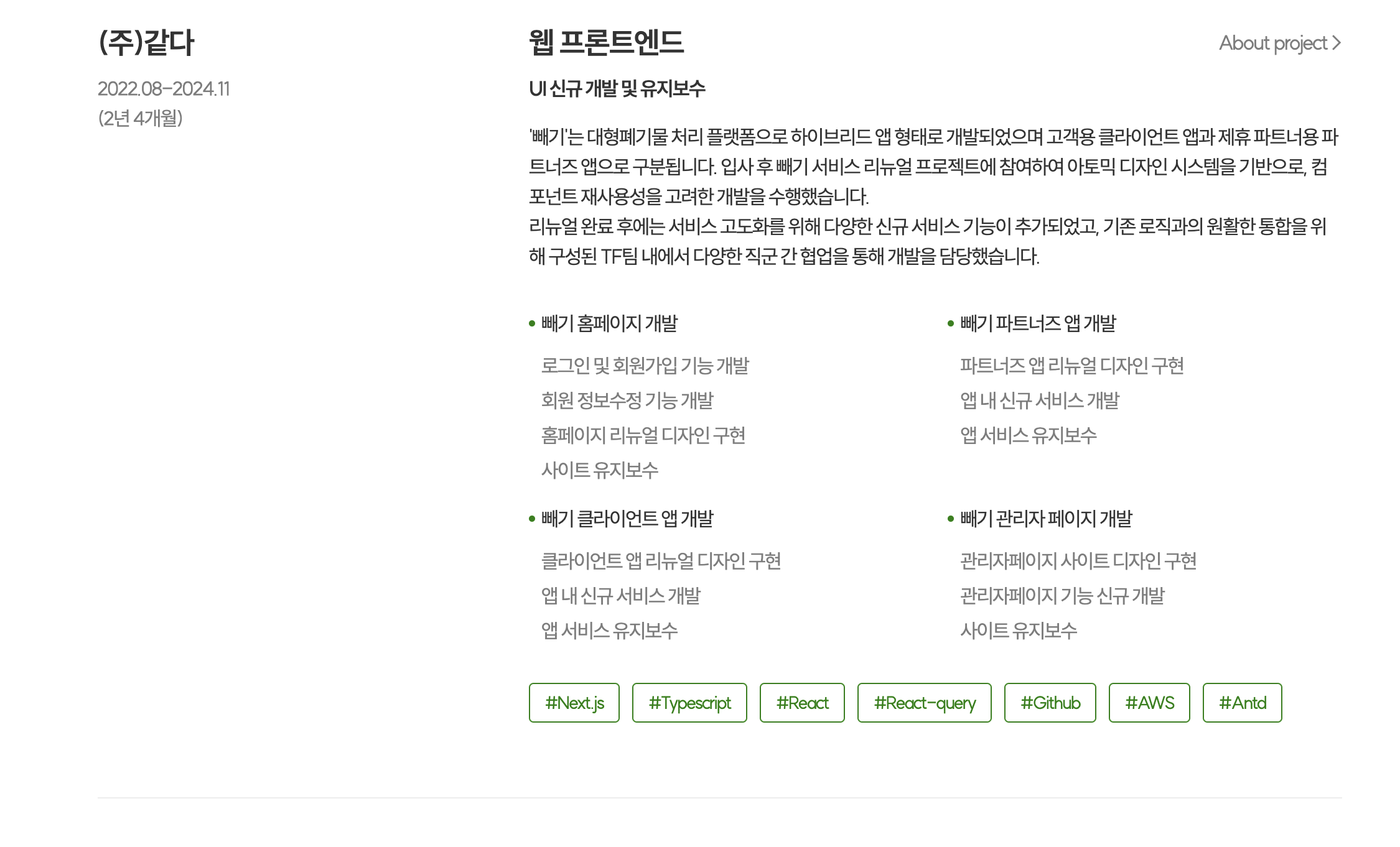
코드는 이렇습니다. <CareerList/>를 반복문으로 돌려주는걸 알 수 있네요.
(React에서 map() 함수를 사용하여 반복을 돌려주는 것과 같습니다.)
Vue 스타일
// src/components/career/pc/CareerSection.vue
<template>
  <section class="w-full bg-white shadow-default relative">
    <div class="container-custom pt-[50px] pb-[150px]">
      <div class="mt-[30px]">
        <TitleWithDot title="어떤 경험을 했나요?" />
        <CareerList
		  //v-for을 이용하여 for문과 같은 문법을 쓴다.
          v-for="(data, index) in careerData"
		  //react나 vue나 key값이 필수로 붙는건 똑같다.
          :key="data.index"
          :career-data="data"
          :show-divder="index < careerData.length - 1"
        />
      </div>
    </div>
  </section>
</template>

<script setup lang="ts">
import TitleWithDot from '@/components/common/TitleWithDot.vue'
import CareerList from './CareerList.vue'
import { careerData } from '@/data/static'
</script>
React 스타일
import React from 'react'
import TitleWithDot from '@/components/common/TitleWithDot'
import CareerList from './CareerList'
import { careerData } from '@/data/static'

const CareerSection: React.FC = () => {
  return (
    <section className="w-full bg-white shadow-default relative">
      <div className="container-custom pt-[50px] pb-[150px]">
        <div className="mt-[30px]">
          <TitleWithDot title="어떤 경험을 했나요?" />
          {careerData.map((data, index) => (
            <CareerList
              key={data.index}
              careerData={data}
              showDivider={index < careerData.length - 1}
            />
          ))}
        </div>
      </div>
    </section>
  )
}

export default CareerSection
여기서 특이한건
 :career-data="data"
 :show-divder="index < careerData.length - 1"
이런 식으로 콜론 : 뒤에 케밥케이스로 props를 써주는 것입니다.
vue는 콜론만 앞에 붙이면 그 뒤에 카멜케이스를 쓰든, 케밥케이스를 쓰든 자동으로 변환해 주기 때문에 두 가지 표현이 가능합니다.
// 이렇게 써도 된다
 :careerData="data"
 :sshowDivder="index < careerData.length - 1"
이번엔 조건부 렌더링을 문법을 보기 위해 CareerList 컴포넌트를 보겠습니다.
조건부 렌더링
// src/components/career/pc/CareerList.vue

<template>
  <div class="grid grid-cols-[1fr_2fr] gap-[20px]">
    <!-- companyInfo -->
    <div class="basis-[460px]">
      <TypographyTag type="h3" class="font-semibold">{{ company }}</TypographyTag>
      <TypographyTag type="p" class="mt-[10px] text-gray-7d whitespace-pre-wrap">{{ history }}</TypographyTag>
    </div>

    <div>
      <!-- ServiceWithRole -->
      <div class="w-full flex justify-between items-center">
        <TypographyTag type="h3" class="font-semibold">{{ role }}</TypographyTag>
        <!-- ProjectDetail -->
        <DetailButton buttonName="About project" v-if="projectDetail" />
      </div>

      <TypographyTag type="p" class="mt-[10px] font-semibold">{{ work }}</TypographyTag>
      <TypographyTag type="p" class="mt-[15px] mb-[30px] whitespace-pre-line max-w-[760px]" v-if="description">{{
        description
      }}</TypographyTag>
      <!-- ProjectItems -->
      <ProjectItems :project-lists="projectList" :only-title="onlyTitle" />
      <!--tech keyword-->
      <div class="flex justify-start gap-[10px] mt-[30px]">
        <div
          class="text-center px-[12px] py-[8px] border border-solid border-green-01 rounded-md"
          v-for="tech in techs"
          :key="tech"
        >
          <TypographyTag type="p" class="text-[14px] text-green-01 leading-none">#{{ tech }}</TypographyTag>
        </div>
      </div>
    </div>
  </div>
  <!--Divider-->
  <DividerLine v-if="showDivder" />
</template>

<script setup lang="ts">
import TypographyTag from '@/components/typography/TypographyTag.vue'
import { ICareerData } from '@/data/static'
import ProjectItems from './ProjectItems.vue'
import DividerLine from '@/components/common/DividerLine.vue'
import DetailButton from '@/components/common/DetailButton.vue'

interface ICareerListProps {
  careerData: ICareerData
  showDivder?: boolean
}

const props = withDefaults(defineProps<ICareerListProps>(), {
  showDivder: false,
})

const { company, work, history, role, description, techs, projectList, onlyTitle, projectDetail } = props.careerData
</script>
쓸데없기 길긴 한데 여기선 v-if만 보면 됩니다.조건부 렌더링을 해주는 디렉티브로서, 이 코드는 원래 리액트로 이렇게 만들어져 있습니다.
import { Divider, FlexBox } from "@/components/common/component";
import { CompanyInfo, ServiceWithRole } from "../../atoms/CareerItem";
import { ICareerData } from "@/data/static";
import Tag from "../../atoms/Tag";
import { CareerItemWrap } from "./styles";
import ProjectItem from "../../molcules/ProjectItems";

export interface ICareerList {
  careerData: ICareerData;
  showDivider: boolean;
}

const CareerList = ({ careerData, showDivider }: ICareerList) => {
  const {
    company,
    work,
    history,
    role,
    description,
    techs,
    projectList,
    onlyTitle,
    projectDetail,
  } = careerData;

  return (
    <>
      <CareerItemWrap>
        <CompanyInfo companyName={company} history={history} />

        <div>
          <ServiceWithRole
            work={work}
            role={role}
            description={description}
            projectDetail={projectDetail}
          />

          <ProjectItem projectLists={projectList} onlyTitle={onlyTitle} />

          <FlexBox justify="flex-start" gap="10px" margin="30px 0 0">
            {techs.map((tech, index) => (
              <Tag keyword={tech} key={`tech-${index}`} />
            ))}
          </FlexBox>
        </div>
      </CareerItemWrap>

	  {/*조건부 렌더링*/}
      {showDivider && <Divider margin="60px 0" />}
    </>
  );
};

export default CareerList;
컴포넌트의 구조만 보면 리액트 스타일이 더 깔끔하다는 생각이 드는데, styled component를 쓰기 때문에 그런 것 같습니다.(저렇게 만들면 각 컴포넌트를 일일이 찾아보면서 분석해야 하기 때문에 꽤나 귀찮습니다.)
한 파일 내에 2개의 컴포넌트 정의하기
그런데 잠깐, 리액트에서는 한 파일 안에서 tsx 컴포넌트를 여러 개 만든 적이 있습니다.
뷰에서는 그게 안될까? 당연 가능합니다.
<!--src/components/career/pc/ProjectItems.vue-->

<template>
  <div v-if="onlyTitle" class="mt-[15px]">
    <div v-for="(project, index) in projectLists" :key="`project-${index}`">
      <!-- ProjectTitle -->
      <div class="flex gap-[5px] justify-start mb-[10px] items-center">
        <ListDot />
        <TypographyTag type="p">{{ project.title }}</TypographyTag>
      </div>
    </div>
  </div>

  <div v-else class="mt-[20px] gap-x-[20px] gap-y-[15px] grid w-full grid-cols-2" >
    <div v-for="(project, index) in projectLists" :key="`project-${index}`">
      <!-- ProjectTitle -->
      <div class="flex gap-[5px] justify-start mb-[10px] items-center">
        <ListDot />
        <TypographyTag type="p">{{ project.title }}</TypographyTag>
      </div>
      <!-- ProjectDetail -->
      <div class="flex flex-col gap-[4px] justify-start items-start ml-[10px]">
        <TypographyTag type="p" class="text-gray-7d" v-for="(detail, index) in project.detail" :key="index">{{
          detail
        }}</TypographyTag>
      </div>
    </div>
  </div>
</template>

<script setup lang="ts">
import { h } from 'vue'
import TypographyTag from '@/components/typography/TypographyTag.vue'
import { IProjectData } from '@/data/static'

const ListDot = () => {
  return h('div', { class: 'w-[5px] h-[5px] bg-green-01 rounded-xl' })
}

interface IProjectItemsProps {
  projectLists: IProjectData[]
  onlyTitle?: boolean
}

withDefaults(defineProps<IProjectItemsProps>(), {
  onlyTitle: false,
})
</script>
이번에도 쓸데없이 긴 코드인데,import { h } from 'vue' 이 부분만 보면 됩니다.
h라는 내장 함수를 가져와서 이렇게 컴포넌트를 만들어주고 있습니다.
h()는 "hyperscript"의 약자로, "HTML을 생성하는 JavaScript"를 의미합니다. Virtual DOM 노드(VNode)를 생성하는 함수입니다.
아래와 같은 파라미터를 받습니다.function h( type: string | Component, props?: object | null, children?: Children | Slot | Slots ): VNode
그래서 ListDot이라는 디자인용 컴포넌트를 보면 이렇게 사용하고 있습니다.
const ListDot = () => {
  return h('div', { class: 'w-[5px] h-[5px] bg-green-01 rounded-xl' })
}
이런 애들은 공용 컴포넌트로 빼면 되지 않나 싶지만
여기서만 사용하는 녹색 점이라서 같은 파일에 우겨넣는게 유지 보수에도 더 편합니다.
이외 나머지 영역들은 다 반복문 아니면 조건부 렌더링들을 사용해 만들어졌습니다.
중간중간 실제 디자인과 다르게 나온 부분이 있는지 체크하면서 스타일을 다듬어주면..
어떻게 css 구현까진 된 모습
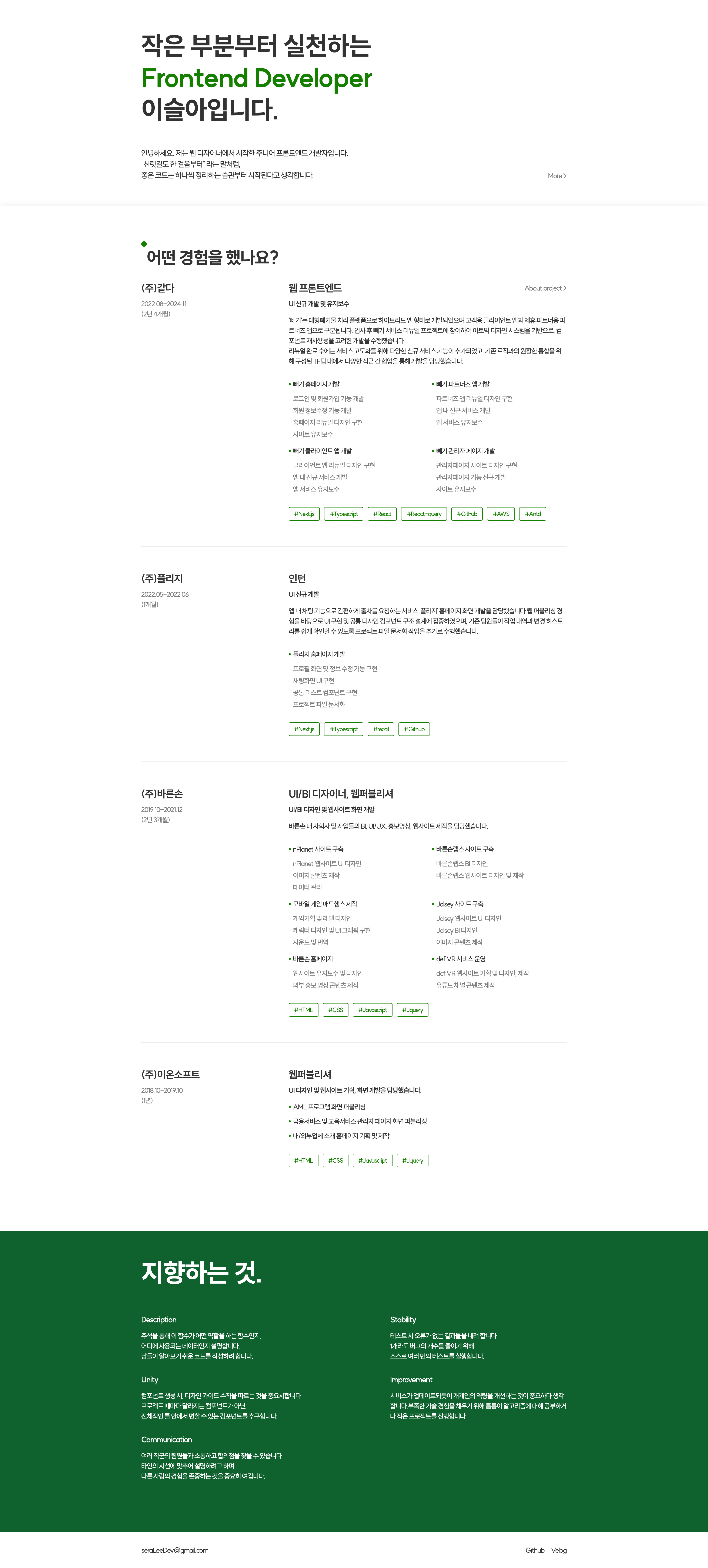
어색한 테일윈드를 쓰느라 중간에 손볼 곳이 있었지만, 결과적으로 실제 사이트와 동일하게 구현되었습니다. 코드의 길이는 리액트나 뷰나 크게 다를 바 없어보이긴 합니다.
이제 모달 컨텍스트와 같은 동적 기능들을 구현해야 하는데, 마감을 쳐야 하는 일이 생겨서 언제 또 해야할지 모르겠습니다. 프로젝트 끝나고 할일 없을때 깨끗해진 뇌로 글을 쓰겠네요.