Grid가 필요한 이유
FLEX BOX를 이용하여 박스들을 격자모양으로 일정하게 배치한다면, 각각 박스마다 주어야 할 속성들이 많아진다. justify-content, align-items 속성으로 위치를 설정할 때에도 다음과 같은 사태가 발생 할 수 있다.

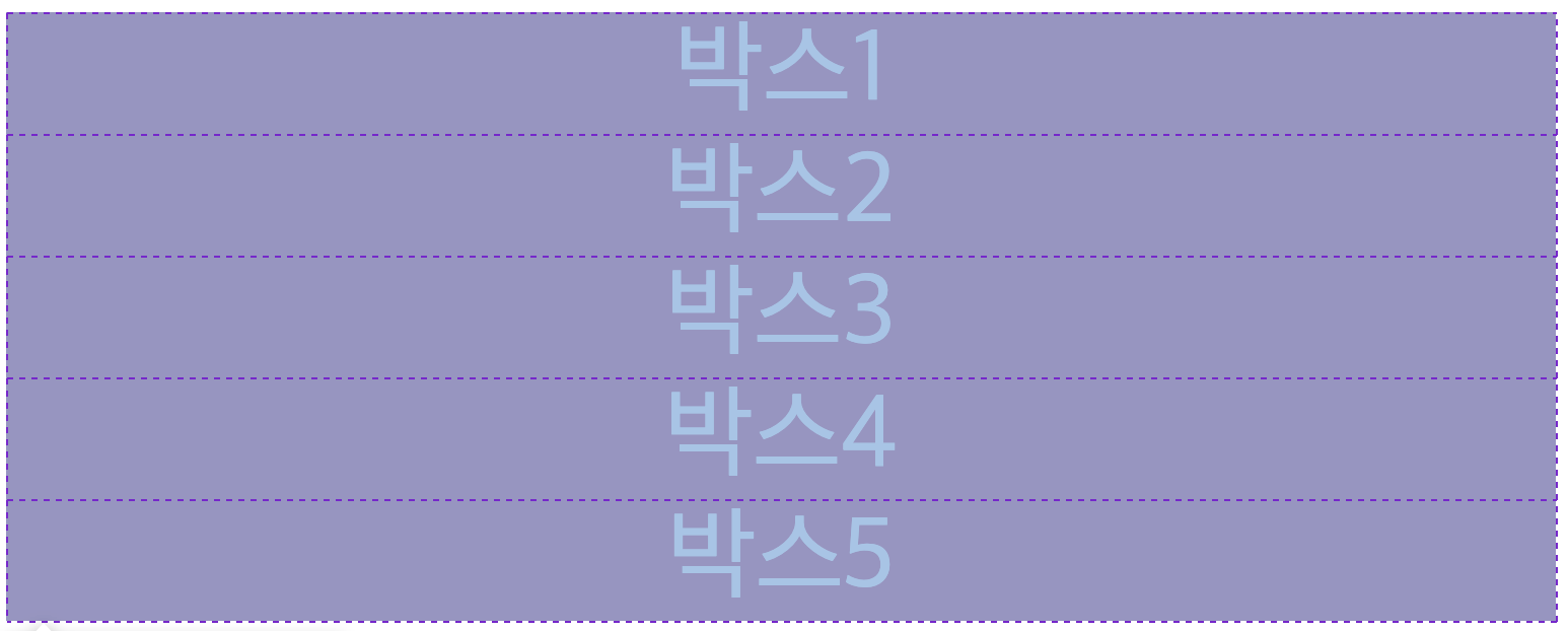
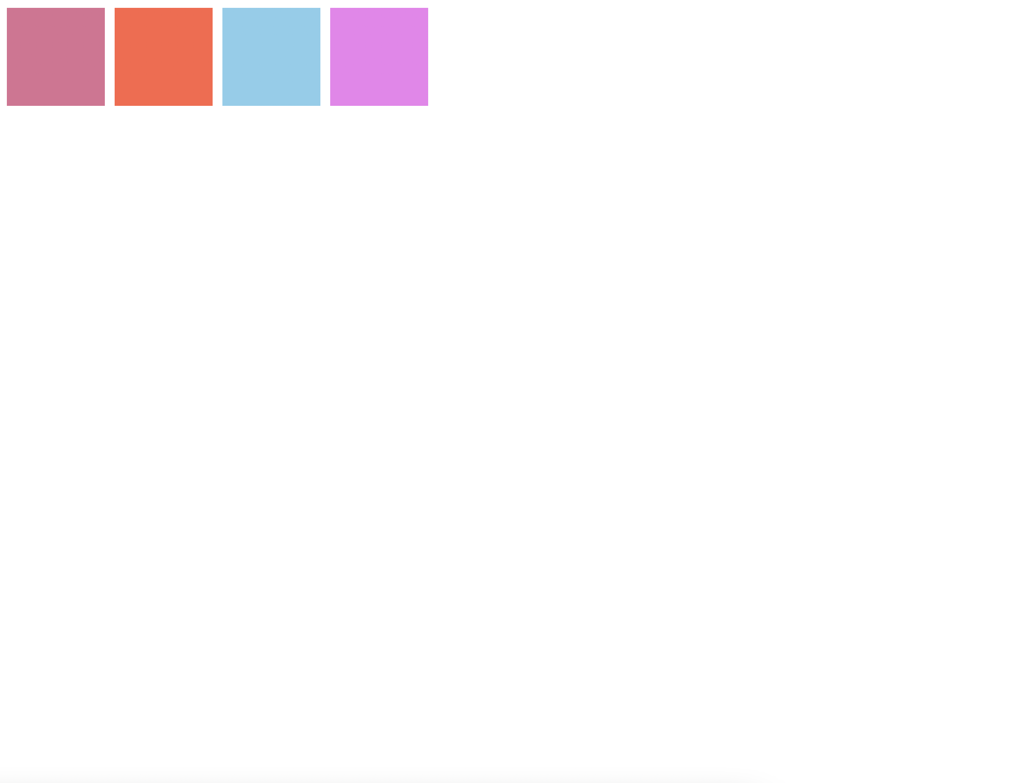
justify-content : space-between;박스들을 일정한 간격으로 띄우고싶어서 space-between 을 적용한 모습이다.
보는것과 같이.. 5번째 박스가 박스 4번 옆으로 붙지도않고, 박스 5번은 margin-top도 없는모습이다. (박스4는 margin-top을 적용했음)
이런식으로, 격자로 박스를 배치하고싶을때 박스마다 속성을 신경써주어야한다.
그래서 FLEX BOX로는 Gird형태를 만들기 어렵다! CSS Grid 가 이래서 필요한것이다!
우리가 쇼핑몰, 유튜브 등 웹사이트를 방문할 때, Grid 형태는 많이 접할 수 있다.

이런 디자인을 FlexBox로 디자인한다? 아주 귀찮은 작업이 될 것이다! 그래서 우리는 CSS Grid를 사용해야 한다!
Let's Start
우리가 flex box를 사용할 때,
display:flex위 속성을 배치할 박스들이 있는 부모 박스에 설정해줬던 것처럼, grid도 부모 박스에 설정한다.
.father {
  display: grid;
}
(여기서 father는 부모박스)
Grid는 부모 속성에서 디자인한다. (column, row 등 부모에서 설정)
<!DOCTYPE html>
<html lang="en">
  <head>
    <meta charset="UTF-8" />
    <meta http-equiv="X-UA-Compatible" content="IE=edge" />
    <meta name="viewport" content="width=device-width, initial-scale=1.0" />
    <link rel="stylesheet" href="styles.css" />
    <title>Document</title>
  </head>
  <body>
    <div class="father">
      <div class="child">박스1</div>
      <div class="child">박스2</div>
      <div class="child">박스3</div>
      <div class="child">박스4</div>
      <div class="child">박스5</div>
    </div>
  </body>
</html>
html 코드가 이렇게 작성되어있다고 가정하고 CSS에서 그리드를 설정해줬다고 해보자.
.father {
  display: grid;
}

.child {
  background-color: palevioletred;
  color: white;
  font-size: 50px;
  display: flex;
  justify-content: center;
  align-items: center;
}

특별한건 없고 우선 이렇게 생겼다.
특별한걸 찾아보자면, F12를 눌러서 father 엘리먼트를 클릭하면 이런식으로 격자가 나타난다는거?
그러면 이제 grid 속성을 이용하여 column과 row를 주는 방법을 알아보자.
grid-template-columns
grid 의 columns을 지정하는 속성이다. 사용법은 간단하다.
.father {
display: grid;
grid-template-columns: 20px 40px 80px 100px 120px;
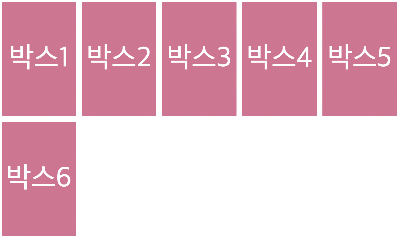
}columns 순서대로 사이즈를 지정해주면 된다! 어떻게 변했는지 한번 관찰해보자.

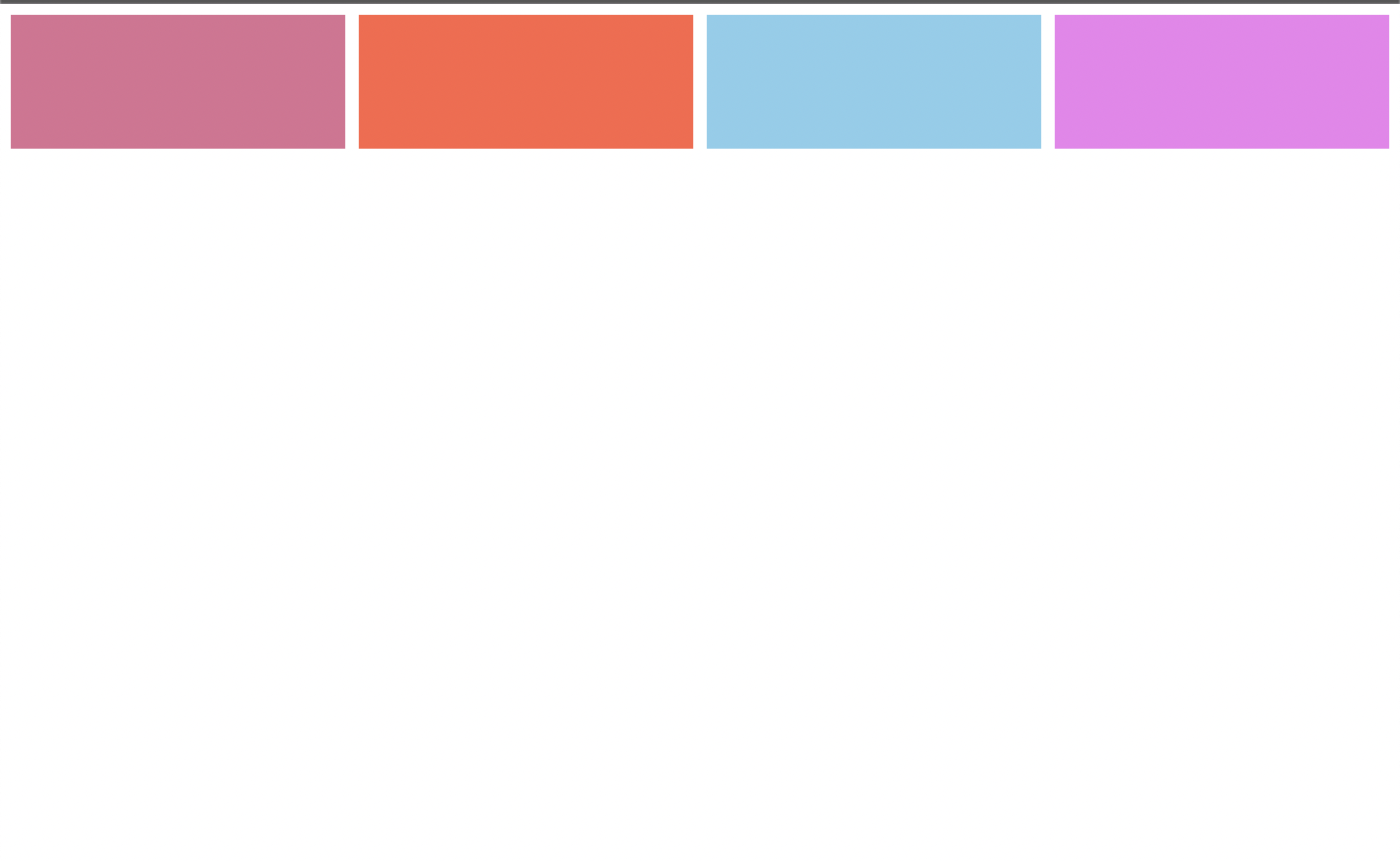
박스1은 20px, 박스2는 40px, 박스3은 80px, 박스4는 100px, 박스5는 120px 의 크기로 5개의 column이 생성됬다!
컬럼만들기는 이게 끝이다! 정말 간단하지 않나요?
다음 것을 기록하기전에 컬럼 크기들을 일정하게 설정했다.

여기서, 자식박스를 하나 더 추가하면 어떻게될까?

이런식으로 아래로 내려온다! 5개의 컬럼을 설정해줬으니까!

.father {
  display: grid;
  grid-template-columns: 130px 130px 130px 130px 130px;
  column-gap: 10px;
}
부모박스에 column-gap 속성을 설정하면, 위 사진처럼 자연스럽게 컬럼 사이사이 공간을 주는것도 가능하다! 자식 박스들에 따로 margin을 줄 필요가 없다!
마찬가지로 row-gap 속성으로 행사이의 공간을 만들어 줄 수도 있다.
.father {
  display: grid;
  grid-template-columns: 130px 130px 130px 130px 130px;
  column-gap: 10px;
  row-gap: 10px;
}
row-gap 속성과 column-gap 속성을 합친 gap 속성도 있다.
.father {
  display: grid;
  grid-template-columns: 130px 130px 130px 130px 130px;
  gap: 10px;
}
grid-template-rows
column의 크기를 만들어주는 속성이 있었다면, 마찬가지로 rows의 크기를 만들어주는 속성도 존재한다.
위에서는 따로 gird-template-rows 를 해주지 않았기에,
행의 크기는 박스안에 있는 content( font-size )에 맞춰 설정이 되었었다.
.father {
  display: grid;
  grid-template-columns: 130px 130px 130px 130px 130px;
  grid-template-rows: 200px 200px 200px 200px 200px;
  gap: 10px;
}
짠! grid-template-rows 속성을 이용하여 각 row들의 크기를 설정했다.
grid-template-columns 그리고 grid-template-rows 를 설정할때 우리가 표를 만든다고 생각하면 이해하기 쉽다.
위 코드에서 둘다 5개의 값을 줬었다.
grid-template-columns: 130px 130px 130px 130px 130px;
grid-template-rows: 200px 200px 200px 200px 200px;
이건 5x5 의 그리드를 만든것이다. 즉 값 하나 하나 마다 행 또는 열을 하나씩 추가한다고 생각하자!
repeat
위에서 grid-template-columns 속성이나 grid-template-rows 속성을 사용할 때, 각 column과 row의 크기를 일일히 지정해줬었다. 만약 일정한 크기로 column과 row들의 크기를 지정해줄때 일일히 크기를 쓰는건 스마트하지않다.
repeat는 이 작업을 스마트하게 해주는 css grid가 가지고있는 함수이다.
.father {
  display: grid;
  grid-template-columns: 130px 130px 130px 130px 130px;
  grid-template-rows: 200px 200px 200px 200px 200px;
  gap: 10px;
}
위 코드를 repeat 를 사용하면 아래와같이 바꿔줄 수 있다.
.father {
  display: grid;
  grid-template-columns: repeat(5, 130px);
  grid-template-rows: repeat(5, 200px);
  gap: 10px;
}
코드가 훨씬 보기 좋아졌다!! 훨씬 짧고 간결하게 쓸 수 있게되었다!!
아, 참 그리고 섞어쓸수도있다. 무슨말이냐면
.father {
  display: grid;
  grid-template-columns: 100px repeat(2, 130px) 100px;
  grid-template-rows: 250px repeat(2, 200px) 250px;
  gap: 10px;
}
이런식으로 쓸 수 있다는 뜻!
Grid Template Areas
Grid Template Areas는 레이아웃 디자인을 쉽게 할 수 있게 해준다.
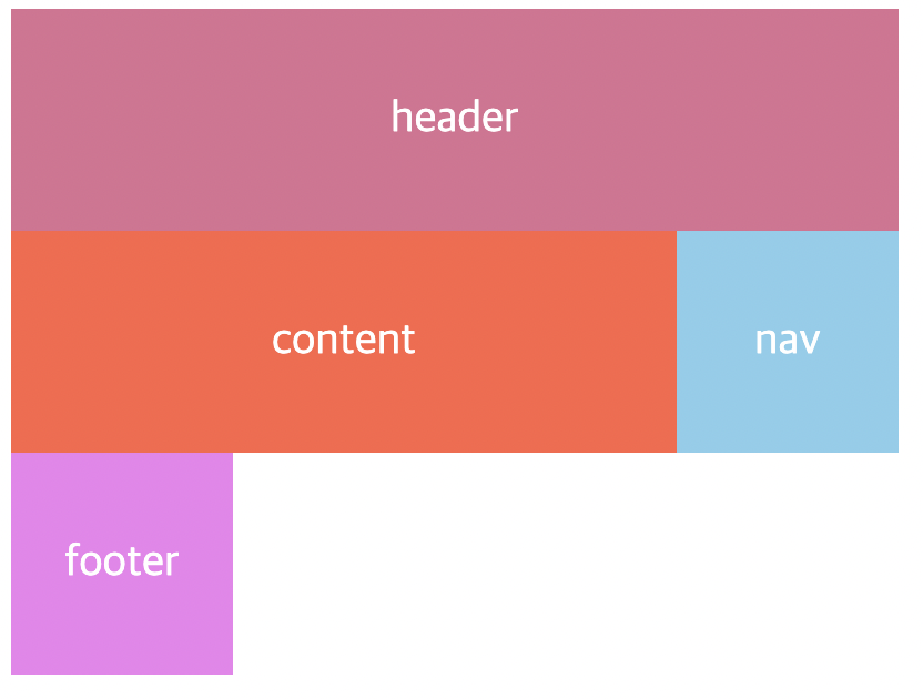
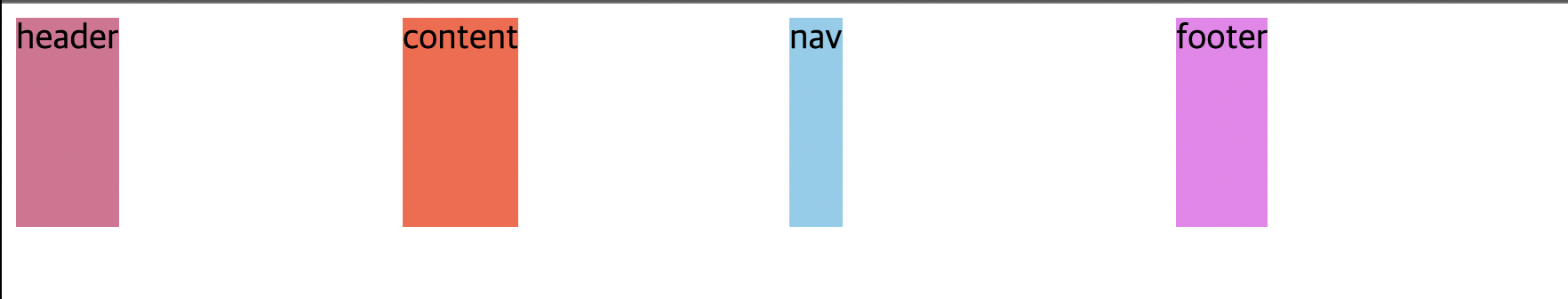
현재 박스가 이렇게 정렬되어 있다. 이 박스들을 grid-template-areas 속성으로 배치해 볼 것이다.
현재 그리드 css는 다음과 같다.
.father {
display: grid;
grid-template-columns: repeat(4, 130px);
grid-template-rows: repeat(4, 200px);
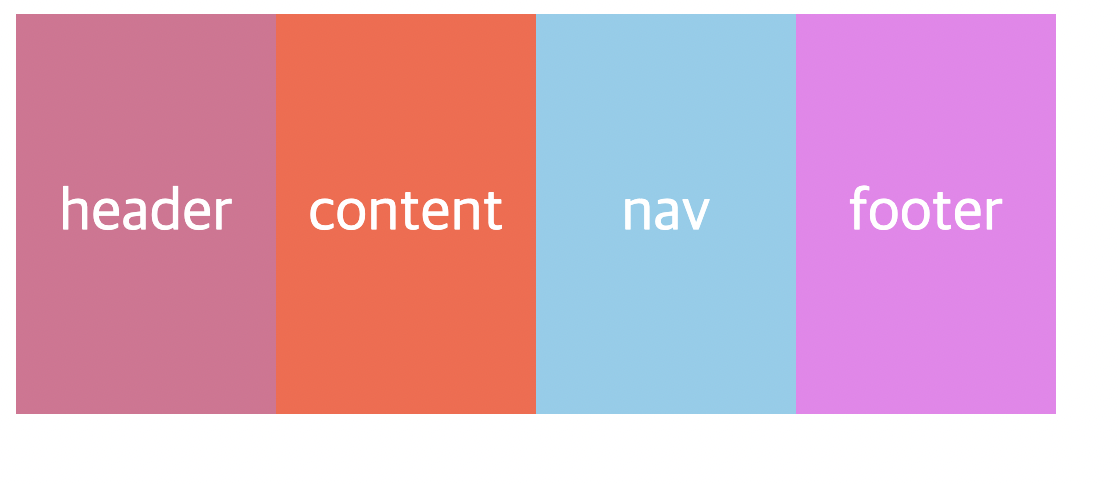
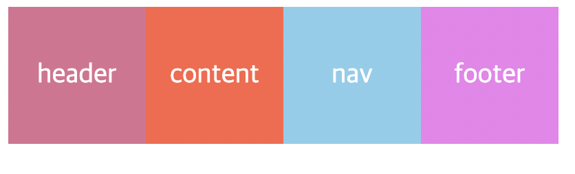
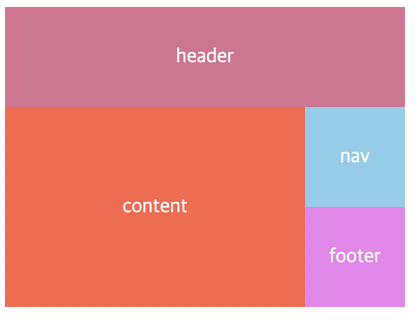
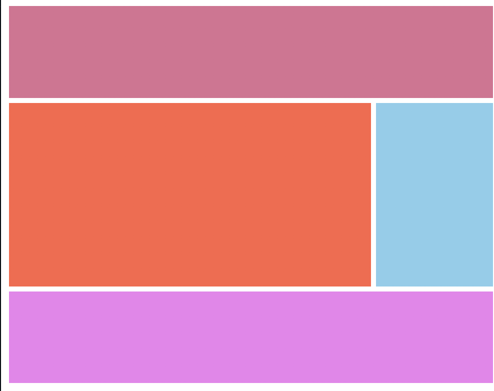
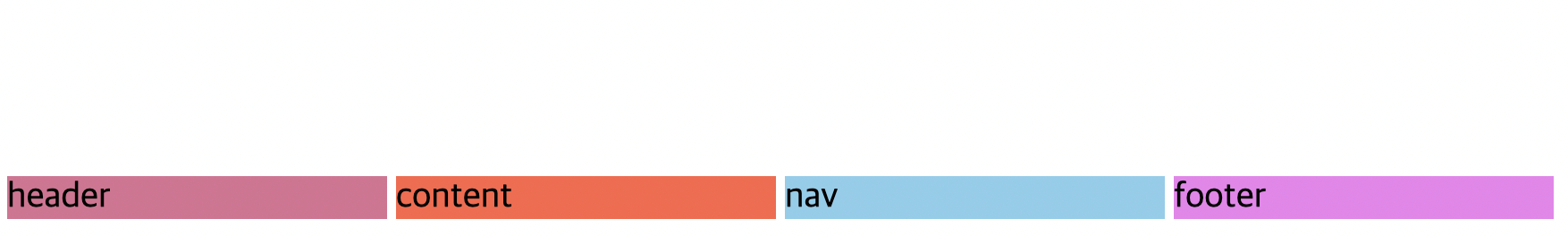
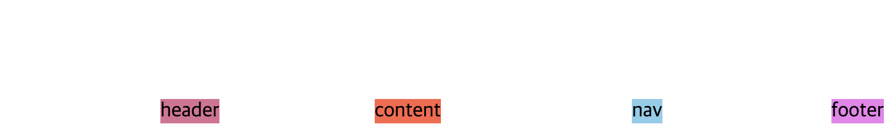
}우선, grid-template-areas 를 적용한 사진부터 한번 보자.
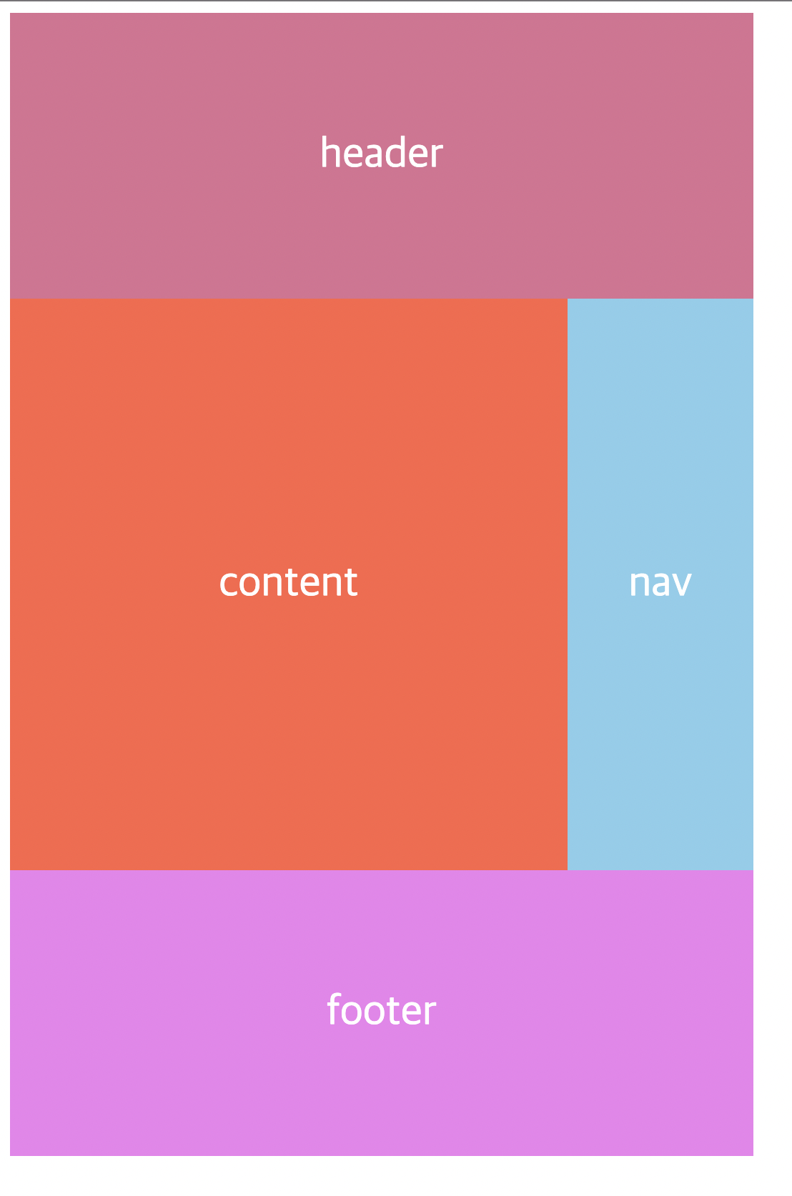
WOW 그 찐따같던 박스들이 맞나? 가슴이 웅장해진다..
이제 코드와 함께 봅시다.
.father {
display: grid;
grid-template-columns: repeat(4, 130px);
grid-template-rows: repeat(4, 200px);
grid-template-areas:
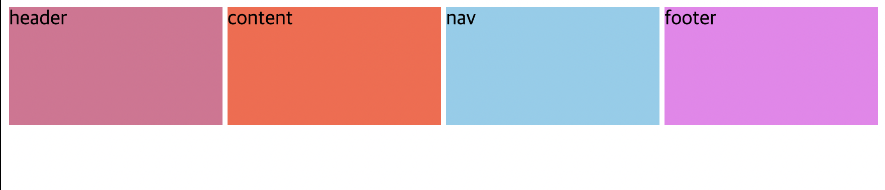
"header header header header"
"content content content nav"
"content content content nav"
"footer footer footer footer";
}grid-template-areas는 굉장히 직관적이다.
사진과 코드를 비교해보면 무슨 뜻인지 바로 이해가 갈 것이다.
여기서 주의할점은 "header header header header" 이런식으로 작성해야한다는것!
실수로 "header" "header" "header" "header" 이렇게 하면! No! 못볼것을 보게 될것이다.
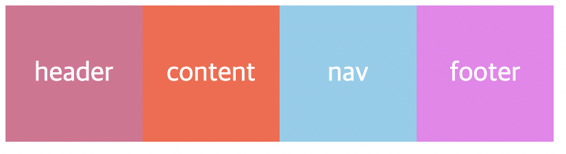
하지만, 이렇게 한다고해서 바로 적용이 되는것은아니다. 왜냐하면 grid-template-areas 속성은 아직 header, content, nav, footer가 뭘 가르키고있는지 모르기 때문이다. 그래서 뭘 가르키는지 지정을 해줘야한다.
바로 이렇게!
.header {
  background-color: palevioletred;
  color: white;
  font-size: 30px;
  display: flex;
  justify-content: center;
  align-items: center;
  grid-area: header;
}

.content {
  background-color: tomato;
  color: white;
  font-size: 30px;
  display: flex;
  justify-content: center;
  align-items: center;
  grid-area: content;
}

.nav {
  background-color: skyblue;
  color: white;
  font-size: 30px;
  display: flex;
  justify-content: center;
  align-items: center;
  grid-area: nav;
}

.footer {
  background-color: violet;
  color: white;
  font-size: 30px;
  display: flex;
  justify-content: center;
  align-items: center;
  grid-area: footer;
}
grid-area 속성에, grid-template-areas에 들어가는 이름을 지정해줘야함!
(클래스이름과는 무관하다! 클래스이름이 footer여도, grid-area 는 다른 이름으로 해 줄 수 있다. 근데 통일 시키는게 덜 헷갈리지 않을까~?)
근데 주의할점이 두 가지 있다.
1. 같은 영역은 서로 이어져 있어야 된다.
2. 이어져 있더라도 그 집합 영역이 'ㄱ' 자나 'ㄴ'자 모양이면 안된다.
- 'ㄱ' 자나 'ㄴ'자 모양이면 안된다는건 다음과 같은 형태를 의미한다.
grid-template-areas:
 "header header header header"
 "header nav nav content"
 "footer content content content"
 "footer footer footer footer";
gird-column, grid-row
- grid-column-start
- grid-column-end
- grid-row-start
- grid-row-end
- grid-column
- grid-row
속성을 살펴 보려고 한다.
위에서는 grid-template-areas 를 이용하여 레이아웃 디자인을 해보았다.
이번엔 위에 나열한 속성들로 해볼 것이다.
위 속성들을 이용하여 column 그리고 row 가 어디서부터 시작하여, 어디서 끝날지를 지정해 줄 수 있다.
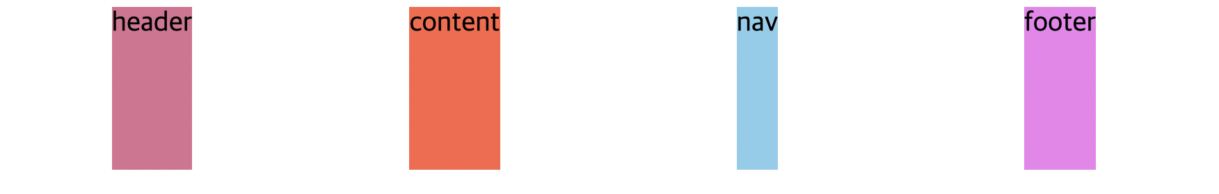
현재 박스들은 이렇게 배치되어있다.
.father {
  display: grid;
  grid-template-columns: repeat(4, 100px);
  grid-template-rows: repeat(4, 100px);
}

.header {
  background-color: palevioletred;
  color: white;
  font-size: 20px;
  display: flex;
  justify-content: center;
  align-items: center;
}

.content {
  background-color: tomato;
  color: white;
  font-size: 20px;
  display: flex;
  justify-content: center;
  align-items: center;
}

.nav {
  background-color: skyblue;
  color: white;
  font-size: 20px;
  display: flex;
  justify-content: center;
  align-items: center;
}

.footer {
  background-color: violet;
  color: white;
  font-size: 20px;
  display: flex;
  justify-content: center;
  align-items: center;
}
header부터 한번 속성을 지정해보도록 하자.
grid-column-start, grid-column-end
header에 grid-column-start, grid-column-end 를 지정했다.
.header {
  background-color: palevioletred;
  color: white;
  font-size: 20px;
  display: flex;
  justify-content: center;
  align-items: center;
  grid-column-start: 1;
  grid-column-end: 2;
}
그러나 변화는 일어나지 않는다. 왜일까?
왜냐하면 박스로 생각하면 안되기 때문이다. "줄(line)" 로 생각해야한다.
우리가 지금 한걸 표시해보면 다음과 같다.
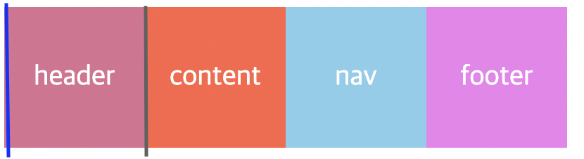
사진에 표시한 파란선이 grid-column-start, 회색선이 grid-column-end이다.
이것이 줄로 생각해야한다는 의미이다!
1번째줄과 2번째줄까지를 영역으로 지정해줬으니, 변화가 나타나지 않았던 것이다.
grid-column-end 를 3으로 바꿔보겠다.
.header {
  background-color: palevioletred;
  color: white;
  font-size: 20px;
  display: flex;
  justify-content: center;
  align-items: center;
  grid-column-start: 1;
  grid-column-end: 3;
}
OKAY?
grid-row-start / grid-row-end 를 적용하기위해 계속 진행해보도록 하겠다.
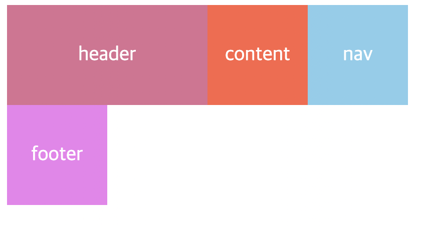
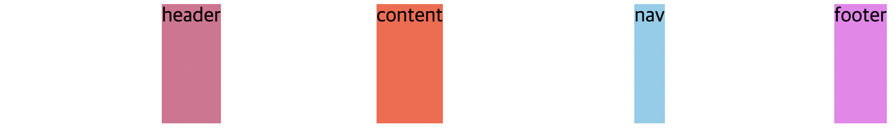
현재 내가 한 레이아웃 디자인은 다음과 같다.
현재 이상태에서 content, nav 부분을 두 줄로 늘리고싶다.
이 때! grid-row-start / grid-row-end를 사용할 수 있는것이다!
원리는 grid-column-start / grid-column-end랑 완전히 똑같다. 가로 세로만 다를 뿐이다.
짠! 코드를 봅시다.
.content {
  background-color: tomato;
  color: white;
  font-size: 20px;
  display: flex;
  justify-content: center;
  align-items: center;
  grid-column-start: 1;
  grid-column-end: 4;
  grid-row-start: 2;
  grid-row-end: 4;
}
완전히 똑같쥬? 근데 여기서 주의할점은 grid-row-start를 만약 1로 바꾸면?
요렇게 순서가 뒤바뀌어버린다! 왜냐하면 스타트가 1번째 줄이니깐!! OKAY?
grid-column-start,end / grid-row-start,end 를 써서 아까 만든 레이아웃과 똑같이 만들어주었다!
gird-column / grid-row
위에서 grid-column-start, end / grid-row-start,end 를 살펴보았다.
grid-column 그리고 grid-row는 start 와 end 를 합친 속성이다.
즉, 일일히 start, end 를 쓸필요 없이 grid-column 또는 grid-row 이거 한방이면 끝난다는 뜻~!
아래 코드를 grid-column 그리고 grid-row 만 쓴 코드로 바꿔보겠음.
BEFORE
.father {
  display: grid;
  grid-template-columns: repeat(4, 100px);
  grid-template-rows: repeat(4, 100px);
}

.header {
  background-color: palevioletred;
  color: white;
  font-size: 20px;
  display: flex;
  justify-content: center;
  align-items: center;
  grid-column-start: 1;
  grid-column-end: 5;
}

.content {
  background-color: tomato;
  color: white;
  font-size: 20px;
  display: flex;
  justify-content: center;
  align-items: center;
  grid-column-start: 1;
  grid-column-end: 4;
  grid-row-start: 2;
  grid-row-end: 4;
}

.nav {
  background-color: skyblue;
  color: white;
  font-size: 20px;
  display: flex;
  justify-content: center;
  align-items: center;
  grid-row-start: 2;
  grid-row-end: 4;
}

.footer {
  background-color: violet;
  color: white;
  font-size: 20px;
  display: flex;
  justify-content: center;
  align-items: center;
  grid-column-start: 1;
  grid-column-end: 5;
}
AFTER
.father {
  display: grid;
  grid-template-columns: repeat(4, 100px);
  grid-template-rows: repeat(4, 100px);
}

.header {
  background-color: palevioletred;
  color: white;
  font-size: 20px;
  display: flex;
  justify-content: center;
  align-items: center;
  grid-column: 1 / 5;
}

.content {
  background-color: tomato;
  color: white;
  font-size: 20px;
  display: flex;
  justify-content: center;
  align-items: center;
  grid-column: 1 / 4;
  grid-row: 2 / 4;
}

.nav {
  background-color: skyblue;
  color: white;
  font-size: 20px;
  display: flex;
  justify-content: center;
  align-items: center;
  grid-row: 2 / 4;
}

.footer {
  background-color: violet;
  color: white;
  font-size: 20px;
  display: flex;
  justify-content: center;
  align-items: center;
  grid-column: 1 / 5;
}
짠 ! 이게 끝이다 ! 엄청 편리하쥬?
그리고 grid-column: 1 / 5; 이런식으로 처음부터 끝까지를 지정한다고 할 때,
끝을 직접 세서 적어주는 방법도 있지만, grid-column: 1 / -1; 이렇게 써 줄 수 도 있다.
마이너스(-) 를 붙이면 끝에서부터 시작한다는 걸 의미함!
마이너스를 사용해서 위 코드를 바꿔주면 다음과 같다.
.father {
  display: grid;
  grid-template-columns: repeat(4, 100px);
  grid-template-rows: repeat(4, 100px);
}

.header {
  background-color: palevioletred;
  color: white;
  font-size: 20px;
  display: flex;
  justify-content: center;
  align-items: center;
  grid-column: 1 / -1;
}

.content {
  background-color: tomato;
  color: white;
  font-size: 20px;
  display: flex;
  justify-content: center;
  align-items: center;
  grid-column: 1 / -2;
  grid-row: 2 / -2;
}

.nav {
  background-color: skyblue;
  color: white;
  font-size: 20px;
  display: flex;
  justify-content: center;
  align-items: center;
  grid-row: 2 / -2;
}

.footer {
  background-color: violet;
  color: white;
  font-size: 20px;
  display: flex;
  justify-content: center;
  align-items: center;
  grid-column: 1 / -1;
}
그리고 마이너스를 이용한 방법도 있지만, 다른 방법도 있다.
span 이라는건데, grid에서 하나의 공간을 셀 이라고할 때, span은 셀을 의미한다.
grid-column : 1 / -1; 을 span을 사용해서 대체한다면,
grid-column : span 4; 이렇게 써 줄 수 있다.
왜냐하면 우리 그리드는 셀이 4개니깐 4개의 셀을 하나로 생각한다. 이렇게 해석하면 이해가 빠를 듯 하다.
즉 grid-column 속성이 적용된 박스는, 4개의 column 을 하나로 가진다! (span 4) 라는것!
span 을 적용해서 다시 한 번 코드를 적어보면 다음과 같다.
.father {
display: grid;
grid-template-columns: repeat(4, 100px);
grid-template-rows: repeat(4, 100px);
}
.header {
background-color: palevioletred;
color: white;
font-size: 20px;
display: flex;
justify-content: center;
align-items: center;
grid-column: span 4;
}
.content {
background-color: tomato;
color: white;
font-size: 20px;
display: flex;
justify-content: center;
align-items: center;
grid-column: 1 / -2;
grid-row: 2 / span 2;
}
.nav {
background-color: skyblue;
color: white;
font-size: 20px;
display: flex;
justify-content: center;
align-items: center;
grid-row: 2 / -2;
}
.footer {
background-color: violet;
color: white;
font-size: 20px;
display: flex;
justify-content: center;
align-items: center;
grid-column: span 4;
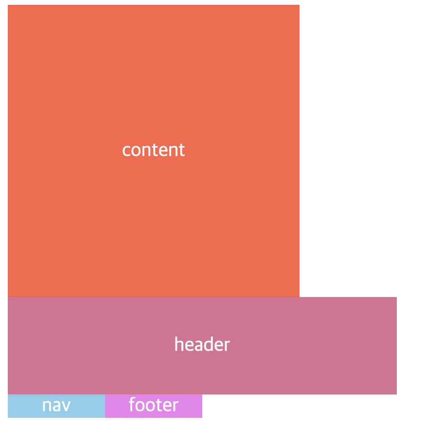
}여기서 content의 grid-row 부분을 보면, 2 / span 2; 라고 되있는데, row의 시작점을 정해주지 않으면, 시작점이 없기때문에 nav 박스가 그 자리를 차지하고, content 박스는 그 밑에 나타나게 된다.
그래서 시작점과 같이 지정해준것이다. 2번째 줄 부터 시작하고, 2칸의 row를 차지한다! 라는 의미!
+ content, nav 둘 다 grid-row : span 2; 로 바꿔주면, 문제없이 잘 동작된다!
Fraction
지금까지는 그리드의 row, column을 지정할 때, px 단위를 사용했었는데, 이 파트에서는 fr (fraction) 이라는 단위에 대한 설명을 기록해보려고한다.
지금 CSS 파일은 다음과 같이 작성되어있다.
.father {
  display: grid;
  grid-template-columns: repeat(4, 100px);
  grid-template-rows: repeat(4, 100px);
  gap: 10px;
}

.header {
  background-color: palevioletred;
  font-size: 20px;
  display: flex;
  justify-content: center;
  align-items: center;
}

.content {
  background-color: tomato;
  font-size: 20px;
  display: flex;
  justify-content: center;
  align-items: center;
}

.nav {
  background-color: skyblue;
  font-size: 20px;
  display: flex;
  justify-content: center;
  align-items: center;
}

.footer {
  background-color: violet;
  font-size: 20px;
  display: flex;
  justify-content: center;
  align-items: center;
}
여기서 gird를 정의하고 있는 부분을 보자.
.father {
  display: grid;
  grid-template-columns: repeat(4, 100px);
  grid-template-rows: repeat(4, 100px);
  gap: 10px;
}
여기서 보면 각 column, row 사이즈를 100px로 만들어주고있다.
우선 column 100px 를 1fr로 바꾸고 변화를 관찰해보자.
박스들이 body의 모든부분을 차지하는 모습을 관찰 할 수 있다.
fraction은 이런식으로 사용 가능한 공간을 모두 가진다는걸 뜻한다. (grid에서 사용 가능한 공간 그리드의 너비가 500px이면 그 공간을 활용하는것)
그리고 우리는 1fr을 4번 반복하고있으므로 각 박스들은 공간을 가질 수 있는 만큼 가지고 4번 반복한다.
그런데 px로 지정하는 대신 fr로 지정하면 뭐가 좋을까?
다양한 환경에서 큰 활약을 한다.
우리가 예를들어 100px로 지정했다고 가정했을때, 웹에서 봤을 땐 그렇게 큰 사이즈가 아니지만 모바일에서는 크게 보일 수 있다.
하지만 fr을 사용하면 fr은 비율을 나타내기때문에 어떤 환경에서도 그 환경에 맞는 비율로 요소들을 볼 수 있다.
주의할 점이 하나 있는데, row column을 지정할 때 이다. 다음 코드와 이미지를 참고해보장.
.father {
  display: grid;
  grid-template-columns: repeat(4, 1fr);
  grid-template-rows: repeat(4, 1fr);
  gap: 10px;
}

.header {
  background-color: palevioletred;
  font-size: 20px;
  display: flex;
  justify-content: center;
  align-items: center;
}

.content {
  background-color: tomato;
  font-size: 20px;
  display: flex;
  justify-content: center;
  align-items: center;
}

.nav {
  background-color: skyblue;
  font-size: 20px;
  display: flex;
  justify-content: center;
  align-items: center;
}

.footer {
  background-color: violet;
  font-size: 20px;
  display: flex;
  justify-content: center;
  align-items: center;
}
아무것도 뜨지 않는다. 왜 이러는걸까?
그 이유는 지금 grid의 높이를 지정하지 않아서 그렇다.
아까 말했듯 fr은 사용 가능한 공간을 모두 가진다. 그런데 height가 0 이기때문에 공간을 가질 수 없는것이다.
항상 block은 width와 height가 주어져 있지 않은 경우에는 width는 가능한 한 최댓값, height는 0이다.
Grid Template
grid-template-areas 와 비슷하게 사용하는 속성이다.
코드를 보면 어떻게 사용하는지 단번에 감이 잡힐 것이다!
.father {
  display: grid;
  grid-template-columns: repeat(4, 1fr);
  grid-template-rows: repeat(4, 1fr);
  gap: 5px;
  height: 50vh;
  grid-template:
    "header header header header" 1fr
    "content content content nav" 2fr
    "footer footer footer footer" 1fr / 1fr 1fr 1fr 1fr;
}

.header {
  background-color: palevioletred;
  font-size: 20px;
  display: flex;
  justify-content: center;
  align-items: center;
  grid-area: header;
}

.content {
  background-color: tomato;
  font-size: 20px;
  display: flex;
  justify-content: center;
  align-items: center;
  grid-area: content;
}

.nav {
  background-color: skyblue;
  font-size: 20px;
  display: flex;
  justify-content: center;
  align-items: center;
  grid-area: nav;
}

.footer {
  background-color: violet;
  font-size: 20px;
  display: flex;
  justify-content: center;
  align-items: center;
  grid-area: footer;
}
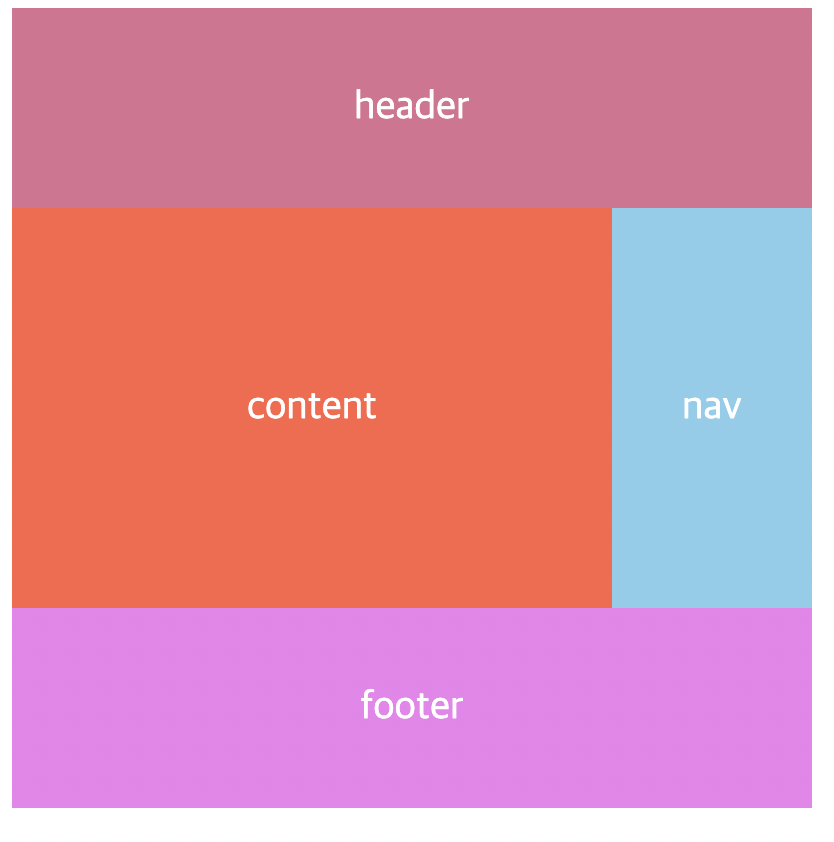
header, content, nav, footer 각 박스에 grid-area 속성으로 grid-template 에서 활용할 이름들을 정해주고, grid-template-area 처럼 했던것 처럼 배치하면 된다.
grid-template-area와의 차이점은 끝 끝 마다 각 row의 길이를 적어준다는것?
  grid-template:
    "header header header header" 1fr
    "content content content nav" 2fr
    "footer footer footer footer" 1fr / 1fr 1fr 1fr 1fr;
여기서 보면 알 수 있다. 각 "" 이 끝나고 뒤에 나오는 1fr이 row의 길이이고,
/ 뒤에 있는 1fr들은 column의 길이를 설정하는 것이다.
여기서 주의할 점은 여기서는 repeat함수가 먹지 않기 때문에, 각 각 직접 써줘야한다.
justify- ~ , align- ~
Justify-items, align-items
justify-items
justify-items의 기본값은 stretch 이다.
stretch는 자식요소들을 쭈-욱 늘려서 안을 채우는 느낌이라고 생각하자.
CSS 코드와 사진이다.
.father {
  display: grid;
  grid-template-columns: repeat(4, 1fr);
  grid-template-rows: repeat(4, 1fr);
  gap: 5px;
  height: 50vh;
  justify-items: stretch;
}

.header {
  background-color: palevioletred;
  font-size: 20px;
}

.content {
  background-color: tomato;
  font-size: 20px;
}

.nav {
  background-color: skyblue;
  font-size: 20px;
}

.footer {
  background-color: violet;
  font-size: 20px;
}
쭈-욱 늘리는게 어떤건지 감이 잡히지 않을 수 있다.
그러면 start와 비교를 해볼까?
CSS코드와 사진이다.
.father {
  display: grid;
  grid-template-columns: repeat(4, 1fr);
  grid-template-rows: repeat(4, 1fr);
  gap: 5px;
  height: 50vh;
  justify-items: start;
}

.header {
  background-color: palevioletred;
  font-size: 20px;
}

.content {
  background-color: tomato;
  font-size: 20px;
}

.nav {
  background-color: skyblue;
  font-size: 20px;
}

.footer {
  background-color: violet;
  font-size: 20px;
}
justify-items : start 속성은 이미지처럼 item들이 처음부터 시작한다. stretch와의 차이점을 확실히 느낄 수 있을 것이다. ( 쭈 - 욱 당긴다는 뜻도 이해가 될 것이다.)
다음은 justify-items : center 이다.
직관적으로 이해할 수 있다.
다음은 end 인데, 이것도 뭐... 어떤 형태가 될 것인지는 다들 알 것이다!
align-items
align-items라는 속성도 있는데, justify-items가 가로 방향을 담당했다면, align-items는 세로 방향으로 같은 역할을 한다.
다음 코드와 사진을 함께 보도록하자.
.father {
  display: grid;
  grid-template-columns: repeat(4, 1fr);
  grid-template-rows: repeat(4, 1fr);
  gap: 5px;
  height: 50vh;
  align-items: end;
}

.header {
  background-color: palevioletred;
  font-size: 20px;
}

.content {
  background-color: tomato;
  font-size: 20px;
}

.nav {
  background-color: skyblue;
  font-size: 20px;
}

.footer {
  background-color: violet;
  font-size: 20px;
}
justify-items와 완전 똑같다! 방향만 다를뿐이다!
이 두개를 짬뽕하면 이런것도 가능함.
👆👆👆👆👆👆👆👆👆👆👆
justify-items: end;
align-items: end;
를 적용한 모습이다!
🚨 주의사항 : 높이와 너비가 없으면, 아무것도 안보일거임! 지금은 박스들안에 텍스트가 있지만 만약 텍스트가 없다면! 아무것도 안보일거임! 그리고 임의로 높이와 너비를 주게되면, stretch 를 줘도 쭈-욱 늘어나지 않는다!
Place Items
위에서 했던 두가지 (justify-items, align-items) 를 융합한 속성이라고 할 수 있다!
코드를 보면 바로 무슨 말인지 이해 할 수 있을 것이다.
place-items : y(align-items) x(justify-items); 👈 이렇게 사용함!
헷갈리니까 실제 사용 예를 써보면,
place-items : stretch center; 👈 이런느낌
Place Content
- Justify-content : start; /(그리드가 놓이는 위치를 뜻하며 기본은 start)/
- Align-content는 수직적으로 그리드를 움직이는 것
- Start, end, space-evenly, space-around, space-between 사용
- 컨테이너의 height가 그리드를 담을 만큼 충분해야한다.(높이 지정)
- Grid-template에서 높이를 fr로 설정하고 align-content를 stretch로 설정하면 쭉 늘어난다.
- Place items와 마찬가지로 place-content를 통해 수직 수평으로 그리드 이동가능(첫번째가 수직, 두번째 옵션이 수평)
- Place-items는 셀안에서 항목이 이동하는 것이며, place-content는 그리드가 이동하는 것이다.
더 많은 내용이 분명 존재할텐데! 나는 일단 이정도만 정리해보려고한다!