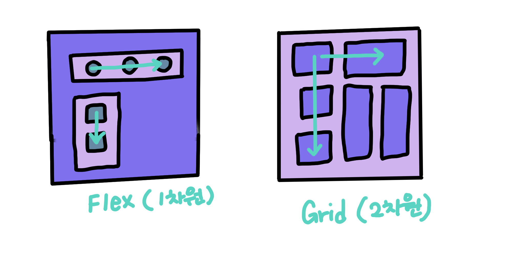
Flex가 한 방향 레이아웃 시스템이라면 (1차원)
Grid는 두 방향(가로-세로) 개념의 레이아웃 시스템이다. (2차원)
밑 코드는 컨테이너에
Grid트랙의 크기들을 지정해주는 속성이다.
여러가지 단위를 사용할 수 있고 섞어서 쓸 수도 있다.
.container {
	grid-template-columns: 200px 200px 500px;
	/* grid-template-columns: 1fr 1fr 1fr */
	/* grid-template-columns: repeat(3, 1fr) */
	/* grid-template-columns: 200px 1fr */
	/* grid-template-columns: 100px 200px auto */

	grid-template-rows: 200px 200px 500px;
	/* grid-template-rows: 1fr 1fr 1fr */
	/* grid-template-rows: repeat(3, 1fr) */
	/* grid-template-rows: 200px 1fr */
	/* grid-template-rows: 100px 200px auto */
}fr은 fraction, 숫자 비율대로 트랙의 크기를 나눈다.
즉 위의 1fr 1fr 1fr은 균일하게 1:1:1 비율인 3개의 column을 만들겠다는 의미이다.
- repeat을 이용해서 반복하는 방법
/*repeat(반복횟수, 반복값)*/
grid-template-columns: repeat(5, 1fr);
/* grid-template-columns: 1fr 1fr 1fr 1fr 1fr */- 컨테이너에는 이렇게 직접 칸을 나눠 이름을 넣어주고
  grid-template-areas: 'header header header'
                       'section section aside'
                       'section section aside'
                       'footer footer footer';
gap: 20px;- 디자인한 이름을
item선언해주는 방법
.header {
    grid-area: header;
}
.section {
    grid-area: section;
}
.aside {
    grid-area: aside;
}
.footer {
    grid-area: footer;
}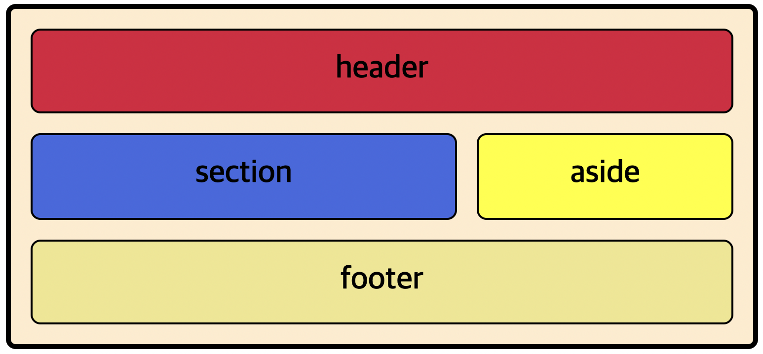
각 셀의 영역을 지정
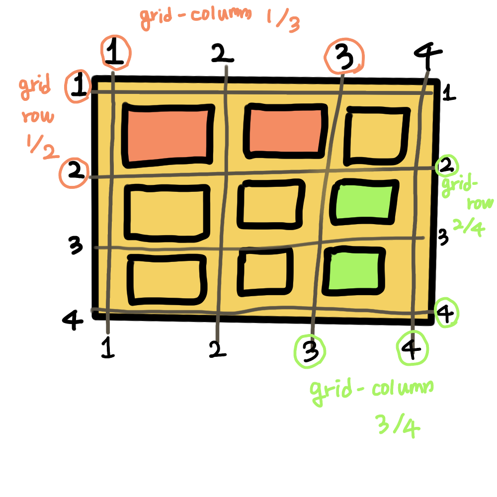
주황색 item을 가리키는 코드
.item:nth-child(1) {
	grid-column-start: 1;
	grid-column-end: 3;
	grid-row-start: 1;
	grid-row-end: 2;
}
를 축약해서 밑 코드처럼 쓸 수 있다.
.item:nth-child(1) {
	grid-column: 1 / 3;
	grid-row: 1 / 2;
}
지금은 grid를 두번째 접했는데 grid에 익숙해지기 위해선 차라리 손으로 레이아웃을 그려서 item 셀 라인의 감을 잡는게 좋을 것 같다 😭
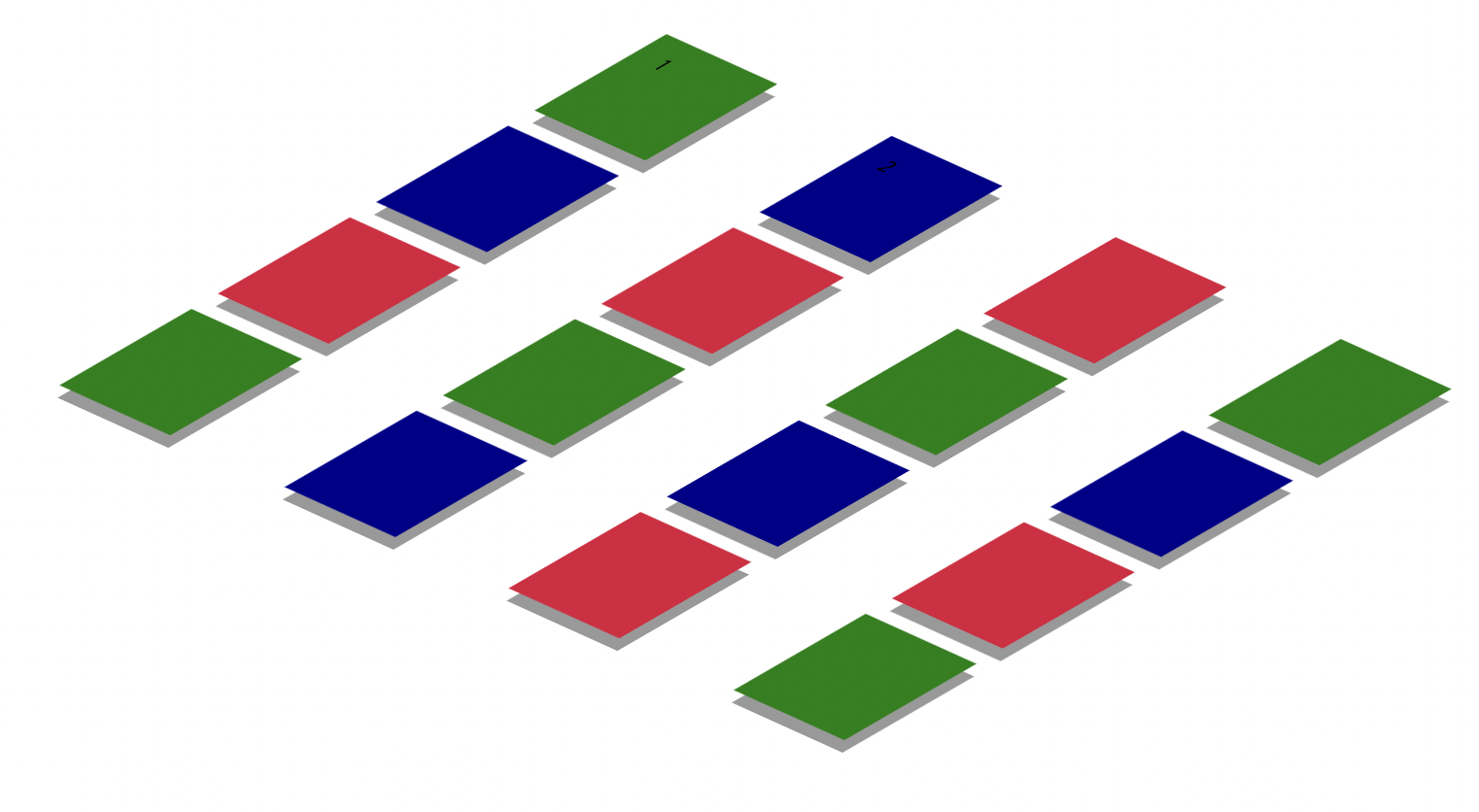
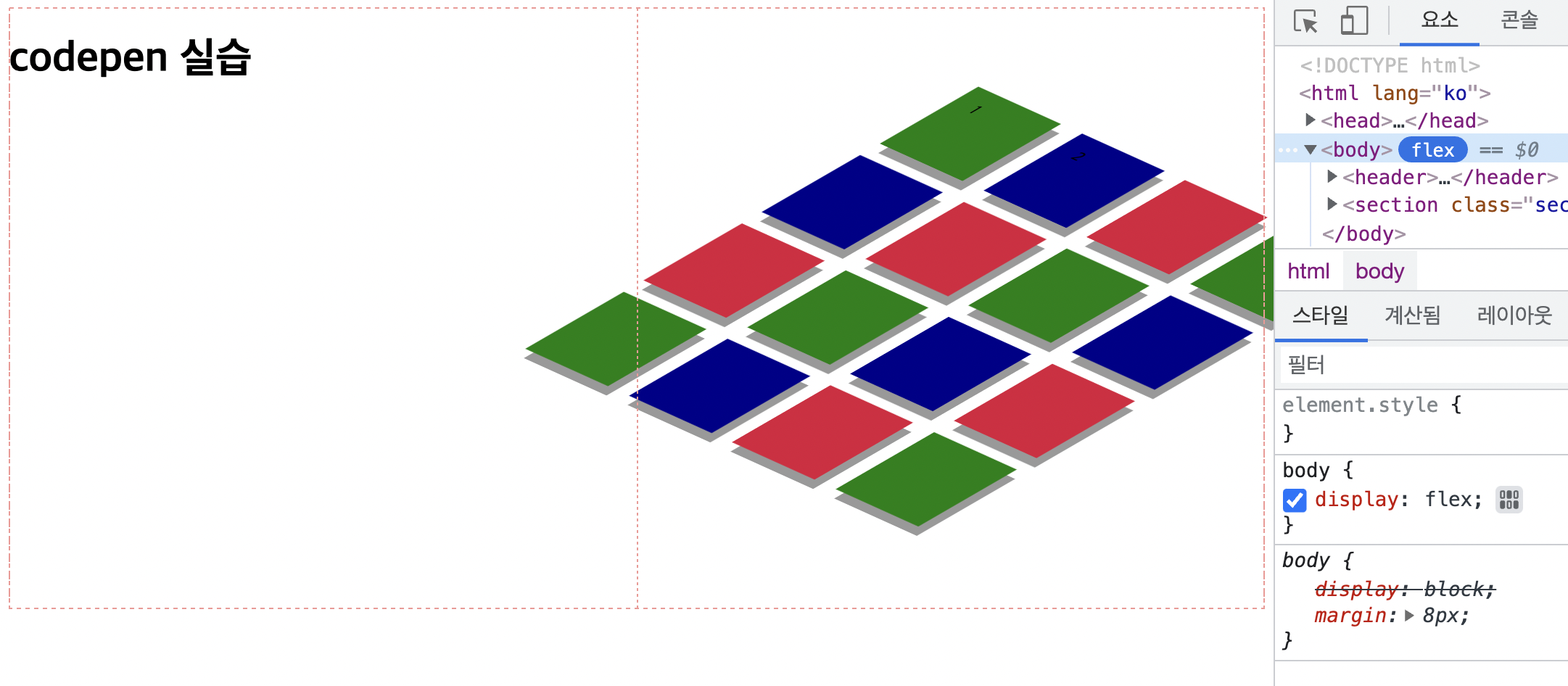
codepen 카드 실습
<!DOCTYPE html>
<html lang="ko">
<head>
    <meta charset="UTF-8">
    <meta http-equiv="X-UA-Compatible" content="IE=edge">
    <meta name="viewport" content="width=device-width, initial-scale=1.0">
    <title>codepen-clone-1</title>
    <style>
        body {
            /* 한쪽은 h1 ,한쪽은 grid를 배치하기 위해서,  둘 다 flex:1 을 줘서 양분  */
            display: flex;
        }

        header {
            flex: 1;
        }

        .section-board {
            /* X축 양수 Y축은 음수 Z축은 양수 - 이런식으로 감을 잡아야한다. */
            transform: rotateX(60deg) rotateY(-10deg) rotateZ(50deg);
            flex: 1;
            display: grid;

            /* 콜럼을 4개니까 자동적으로 로우도 4개를 가진다. */
            grid-template-columns: repeat(4, 1fr);
            gap: 20px;
        }

        .board-item {
            position: relative;
            top: 0;
            left: 0;
            width: 100px;
            height: 100px;
            transition: all .3s;
        }

        .board-item input {
            /* position: absolute;
            left: -9999px; */

            /* 버튼은 살아있음,그저 투명.. */
            /* opacity: 0; */

            display: none;
        }

        .board-item label {
            display: flex;
            align-items: center;
            justify-content: center;
            width: 50%;
            height: 50%;
        }

        /* input이 체크가 되야 라벨이 적용이 된다. */
        .board-item input:checked + label {
                color: white;
                background: hotpink;
        }

        /*마우스 오버시, 아이템이 움직이는 효과*/
        .board-item:hover {
            cursor: pointer;
            /* transform: translate(10px, -10px); */
            top: -15px;
            left: -15px;
        }

	/* after로 그림자를 만들어준다. */
        .board-item::after{
            z-index: -1;
            content: '';
            position: absolute;
            top: 10px;
            left: 10px;
            background: #999;
            width: 100px;
            height: 100px;
            transition: all .3s;
        }

       /* hover했을 때 그림자가 가만히 있도록 하기위해 설정해준다. 아이템 이동 15 + 그림자가 10 = 25 를 준다 */
        .board-item:hover::after{
            top: 25px;
            left: 25px;
        }

        .board-item:nth-child(3n) {
            background: crimson;
        }

        .board-item:nth-child(3n-1) {
            background: darkblue;
        }

        .board-item:nth-child(3n-2) {
            background: green;
        }
    </style>
</head>
<body>
    <header>
        <h1>codepen 실습</h1>
    </header>
    <section class="section-board">
        <div class="board-item">
            <!-- name을 해주면 둘 중에 하나만 선택이 된다. -->
            <input type="radio" id="radio-1" name="hello">
            <label for="radio-1">1</label>
        </div>
        <div class="board-item">
            <input type="radio" id="radio-2" name="hello">
            <label for="radio-2">2</label>
        </div>
        <div class="board-item"></div>
        <div class="board-item"></div>
        <div class="board-item"></div>
        <div class="board-item"></div>
        <div class="board-item"></div>
        <div class="board-item"></div>
        <div class="board-item"></div>
        <div class="board-item"></div>
        <div class="board-item"></div>
        <div class="board-item"></div>
        <div class="board-item"></div>
        <div class="board-item"></div>
        <div class="board-item"></div>
        <div class="board-item"></div>
    </section>
</body>
</html>
☇
코드에 대한 설명은 주석으로 달았다!
결과

얼레벌레 돌아가는 Frontend Developer