오늘은 hero component를 만들어 보았다.
만든 결과물은 아래와 같다.
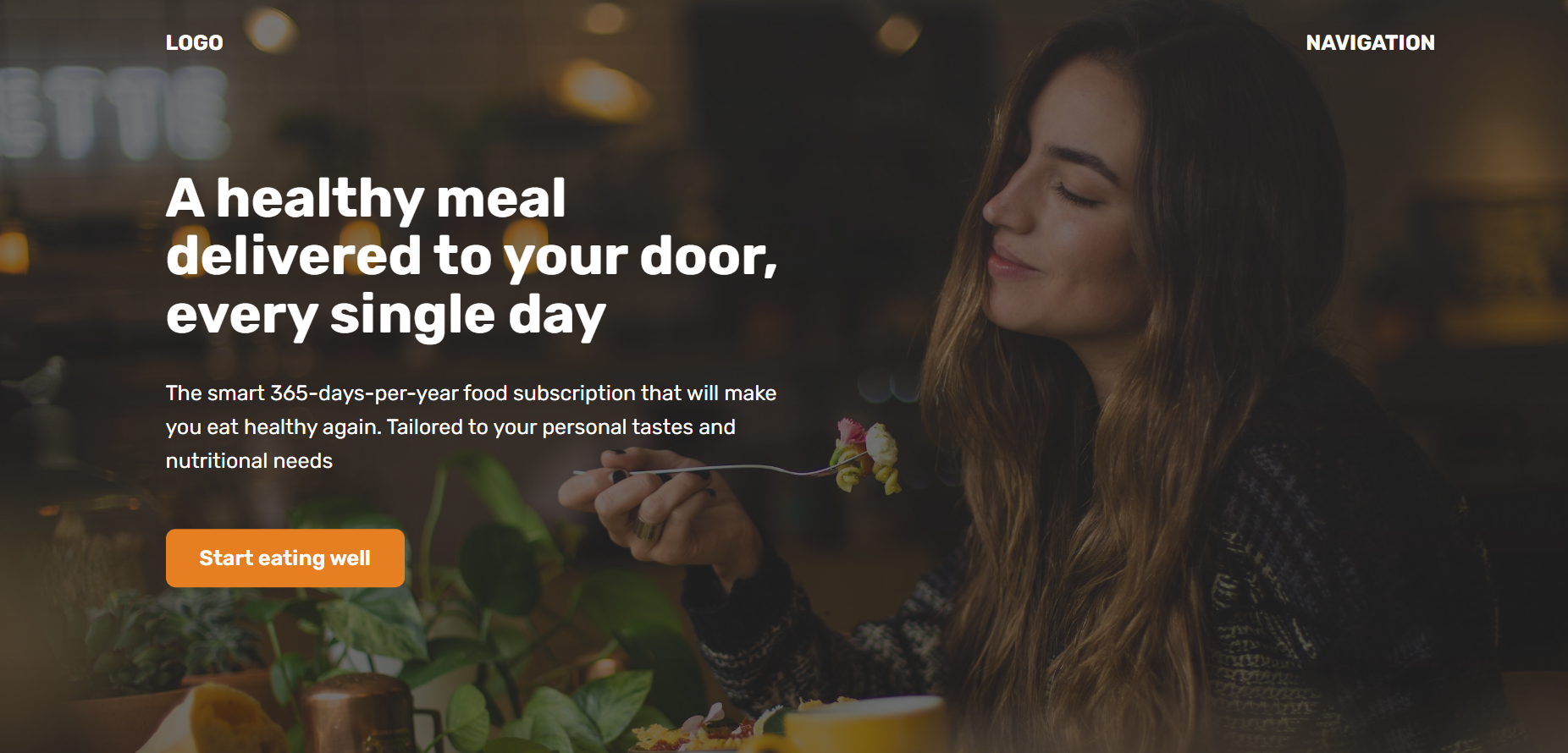
코드를 하나하나 복습해보자.
먼저 바디 부분이다.
<body>
    <header>
      <nav class="container">
        <div>LOGO</div>
        <div>NAVIGATION</div>
      </nav>

      <div class="header-container">
        <div class="header-container-inner">
          <h1>A healthy meal delivered to your door, every single day</h1>
          <p>
            The smart 365-days-per-year food subscription that will make you eat
            healthy again. Tailored to your personal tastes and nutritional
            needs
          </p>
          <a href="#" class="btn">Start eating well</a>
        </div>
      </div>
    </header>

    <section>
      <div class="container">
        <h2>Some random heading</h2>
        <p>
          Lorem ipsum dolor sit amet, consectetur adipisicing elit. Cum quaerat
          necessitatibus suscipit nobis, voluptas omnis ullam odio eaque neque
          amet unde voluptates obcaecati error illum soluta itaque perferendis
          molestiae iste?Lorem ipsum dolor sit amet consectetur adipisicing
          elit. Sequi laborum est porro vel ex inventore veniam architecto,
          repellat, reprehenderit repellendus accusamus cupiditate libero harum
          pariatur velit! Nam laborum minima porro.
        </p>
      </div>
    </section>
  </body>
nav로 logo와 navigation을 감싸주었고
맨 밑 부분은 section으로 감싸주었다.
css부분을 살펴보자
 <style>
      * {
        margin: 0;
        padding: 0;
        box-sizing: border-box;
      }

      html {
        font-family: "Rubik", sans-serif;
        color: #444;
      }

      .container {
        margin: 0 auto;
        width: 1200px;
      }

      header {
        /* background-color: orangered; */
        height: 100vh;
        position: relative;

        background-image: linear-gradient(
            rgba(43, 42, 42, 0.6),
            rgba(32, 32, 32, 0.6)
          ),
          url(hero.jpg);
        background-size: cover;
        color: #fff;
      }

      nav {
        font-size: 20px;
        font-weight: 700;
        display: flex;
        justify-content: space-between;
        padding-top: 32px;
        /* background-image: linear-gradient(to right, red, blue); */
        /* background-color: green; */
      }

      .header-container {
        width: 1200px;
        position: absolute;

        /* In relation to PARENT size*/
        left: 50%;
        top: 50%;

        /*In relation to ELEMENT size*/
        transform: translate(-50%, -50%);

        /* background-color: violet; */

        /* text-align: center; */
      }

      .header-container-inner {
        width: 50%;
        /* background-color: blue; */
      }

      h1 {
        font-size: 52px;
        margin-bottom: 32px;
        line-height: 1.05;
      }

      p {
        font-size: 20px;
        line-height: 1.6;
        margin-bottom: 48px;
      }
      .btn:link,
      .btn:visited {
        font-size: 20px;
        font-weight: 600;
        background-color: #e67e22;
        color: #fff;
        text-decoration: none;
        display: inline-block;
        padding: 16px 32px;
        border-radius: 9px;
      }

      h2 {
        font-size: 44px;
      }

      section {
        padding: 96px 0;
        /* margin: 0 auto; */
        background-color: #f7f7f7;
      }
    </style>
header부분에서
height: 100vh; 이걸 썼는데
보이는 부분을 다 채워주는 역할이다.
글씨 써져 있는 부분은 header-container 인데
가운데로 옮겨주기 위해서 position을 absoulte로 해준뒤
배웠던 transform을 적용해주었다.
참고로 position absoulte해주면 parent container에
position: relative; 설정해줘야 하니까 header부분에
써준것이다. 그렇게 가운데로 온 header 컨테이너의
반절을 글 부분이 이용하는 거니까
 .header-container-inner {
        width: 50%;
        /* background-color: blue; */
      }
요렇게 써준거.
