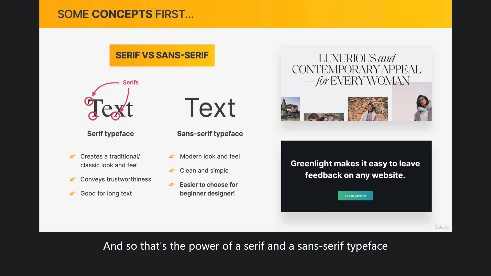
예전에 코드보면서 SERIF SANS-SERIF는 도대체
무슨 의미였는지 궁금해 했다가
별로 중요한게 아닌거 같아서 넘어간 기억이 있는데
이렇게 설명이 있어서 좋았다!!!!
그리고 typography에 대한 가이드라인 페이지를 제공했는데
거기서 많이 도움되는 몇개를 골라왔다.
- When choosing font-sizes, limit choices! Use a “type scale” tool or other
pre-defined range- Use a font size between 16px and 32px for “normal” text
- For long text (like a blog post), try a size of 20px or even bigger
- For headlines, you can go really big (50px+) and bold (600+), depending
on personality- For any text, don’t use a font weight under 400 (regular)
- Use less than 75 characters per line
- For normal-sized text, use a line height between 1.5 and 2. For big text, go below 1.5
응??? 거의 다 가져온거 같은데???? 암튼...실습하면서
이거 따르면서 설정해줬는데 재밌었다.
예전에 플라스크 작업 하면서 폰트입혔던 기억이 있는데
    <link href="https://fonts.googleapis.com/css2?family=Inter:wght@400;500;700&display=swap" rel="stylesheet">


   <link rel="stylesheet" href="style.css" />
이렇게 link rel저기 위해 붙여넣기 해주고
body {
  font-family: 'inter',sans-serif;
}
body부분에 이렇게 넣어줬더니 바로 다 적용됨.
나머지는 가이드라인 보고 따라서
이것저것 고쳐보는 실습을 했다 !
