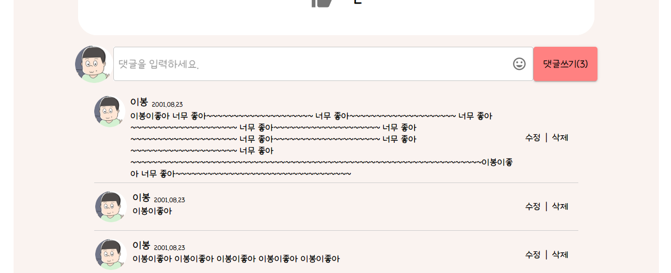
광기의 댓글창,, 좀 무섭다
TextField에 IconButton 넣기

TextField 우측에 아이콘 버튼을 넣어볼 것 이다!
InputProps={{
              endAdornment: (
                <InputAdornment position="end">
                  <IconButton
                    aria-label="toggle password visibility"
                    edge="end"
                  >
                    <MoodIcon />
                  </IconButton>
                </InputAdornment>
              ),
            }}
원하는 icon을 찾아서 TextFiled 안에 코드를 이렇게 작성해주면 된다.

와..
Menu 위치 조정
MUI Menu 컴포넌트는 이런식으로 버튼 아래에 나오는 것이 기본이다.
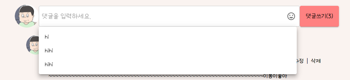
나는 이런식으로 아이콘 버튼을 클릭했지만 텍스트필드 아래에 버튼이 생성되게 할 것이다.
const emoticonRef = React.useRef(null);먼저 useRef를 통해 ref를 생성해준다.
<TextFiled ref={emoticonRef} />메뉴 생성 기준이 될 컴포넌트에 코드 작성
<IconButton onClick={handleClick}/>클릭 시 메뉴가 나올 컴포넌트에 코드 작성
  const [anchorEl, setAnchorEl] = React.useState(null);
  const handleClose = () => {
    setAnchorEl(null);
  };
  const emoticonRef = React.useRef(null);
  const handleClick = (event) => {
    setAnchorEl(emoticonRef.current);
  };
메뉴가 열리고 닫히기 위한 함수들
anchorOrigin={{
          vertical: "bottom",
          horizontal: "left",
        }}
        transformOrigin={{
          vertical: "top",
          horizontal: "left",
        }}
        getContentAnchorEl={null}
        PaperProps={{
          style: {
            maxHeight: "200px",
            width: "45%",
          },
        }}
이제 Menu 태그 안에서 위치와 크기를 조절해주면 된다.
이제 Menu 안을 이모티콘으로 채워줄 것 이다.
  const emoticons = [
    emoticon0,
    emoticon0,
    emoticon0,
    emoticon0,
    emoticon0,
    emoticon0,
    emoticon0,
    emoticon0,
    emoticon0,
    emoticon0,
  ];
코드가 길어질 것 같아 태그, 댓글 때 썼던 map을 이용하기로 했다. 임시로 이모티콘 사진 파일 정보가 포함된 배열을 먼저 만들어주고
<Stack
          direction="row"
          gap="10%"
          flexWrap="wrap"
          justifyContent="center"
        >
          {emoticons.map((emoticon, i) => {
            return (
              <Stack width="100px" height="110px">
                <img
                  alt="emoticon0"
                  src={emoticon}
                  width="100%"
                  height="100%"
                  style={{ cursor: "pointer" }}
                  onClick={handleClose}
                />
              </Stack>
            );
          })}
        </Stack>
map을 이용해 이모티콘들을 배치한다.
backgroundColor: "rgba(255, 255, 255, 0.8)",메뉴 투명도도 조절해주고
MUI 메뉴 컴포넌트는 왼쪽에서 열리고 닫히는 애니메이션이 기본인데 우리의 경우는 오른쪽에 이모티콘 버튼이 있어 부자연스럽다.
anchorOrigin={{
          vertical: "bottom",
          horizontal: "right",
        }}
        transformOrigin={{
          vertical: "top",
          horizontal: "right",
        }}
left=>right로 해주면 커스텀 끝!
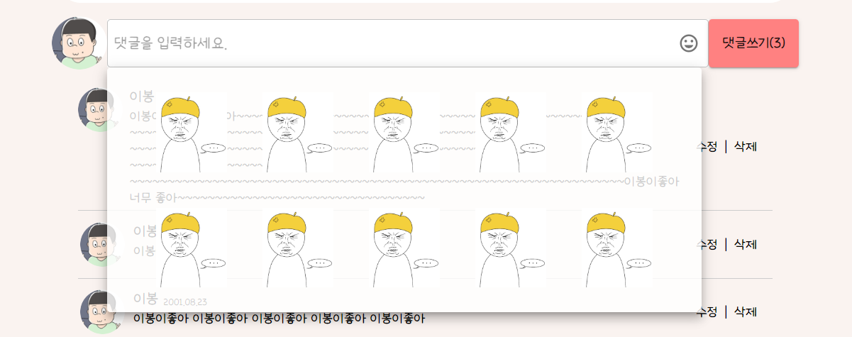
어우 좀 징그럽다
MUI 진짜 편하긴한데 커스텀이 어려운것 같다. 오늘 한건 쉬운 편이고 솔직히 세세하게 좀 더 수정하고 싶은데 다음 작업들을 위해 그냥 넘어가야 할 것 같다ㅠㅠ 나중에 기회되면 어려운 것들도 해보는 걸로!
댓글 컴포넌트 전체 코드
import React from "react";
import {
  Stack,
  TextField,
  Button,
  InputAdornment,
  IconButton,
  Menu,
} from "@mui/material";
import MoodIcon from "@mui/icons-material/Mood";
import basicProfile from "../image/profilephoto.png";
import emoticon0 from "../emoticon/...emoticon.png";

function Comment() {
  const comments = [
    [
      basicProfile,
      "이봉",
      "2001.08.23",
      "이봉이좋아 너무 좋아~~~~~~~~~~~~~~~~~~~~ 너무 좋아~~~~~~~~~~~~~~~~~~~~ 너무 좋아~~~~~~~~~~~~~~~~~~~~ 너무 좋아~~~~~~~~~~~~~~~~~~~~ 너무 좋아~~~~~~~~~~~~~~~~~~~~ 너무 좋아~~~~~~~~~~~~~~~~~~~~ 너무 좋아~~~~~~~~~~~~~~~~~~~~ 너무 좋아~~~~~~~~~~~~~~~~~~~~~~~~~~~~~~~~~~~~~~~~~~~~~~~~~~~~~~~~~~~~~~~~~~이봉이좋아 너무 좋아~~~~~~~~~~~~~~~~~~~~~~~~~~~~~~~~~",
    ],
    [basicProfile, "이봉", "2001.08.23", "이봉이좋아"],
    [
      basicProfile,
      "이봉",
      "2001.08.23",
      "이봉이좋아 이봉이좋아 이봉이좋아 이봉이좋아 이봉이좋아",
    ],
  ];

  const emoticons = [
    emoticon0,
    emoticon0,
    emoticon0,
    emoticon0,
    emoticon0,
    emoticon0,
    emoticon0,
    emoticon0,
    emoticon0,
    emoticon0,
  ];

  const [anchorEl, setAnchorEl] = React.useState(null);
  const handleClose = () => {
    setAnchorEl(null);
  };
  const emoticonRef = React.useRef(null);
  const handleClick = (event) => {
    setAnchorEl(emoticonRef.current); // Stack 컴포넌트의 ref를 anchorEl로 설정
  };

  return (
    <Stack
      minHeight="12vh"
      height="fit-content"
      weight="100%"
      bgcolor="white"
      alignItems="center"
    >
      <Stack bgcolor="#FAF3F0" width="70%" height="12vh">
        <Stack
          width="100%"
          height="100%"
          justifyContent="center"
          alignItems="center"
          direction="row"
        >
          <img
            alt="basicProfile"
            src={basicProfile}
            width="6%"
            height="66%"
            style={{ borderRadius: "50%" }}
          />
          <TextField
            id="outlined-basic"
            variant="outlined"
            color="primary"
            ref={emoticonRef}
            InputProps={{
              endAdornment: (
                <InputAdornment position="end">
                  <IconButton
                    aria-label="toggle password visibility"
                    edge="end"
                    onClick={handleClick}
                  >
                    <MoodIcon />
                  </IconButton>
                </InputAdornment>
              ),
            }}
            sx={{
              width: "65%",
              bgcolor: "white",
              "& .MuiOutlinedInput-input": {
                height: "100%",
                padding: "4px 8px",
                fontSize: "20px",
              },
              "&.MuiTextField-root": {
                height: "60%",
              },
              "& .MuiOutlinedInput-root": {
                height: "100%",
              },
            }}
            placeholder="댓글을 입력하세요."
          />
          <Button
            variant="contained"
            color="primary"
            sx={{ fontSize: "18px", height: "60%" }}
          >
            댓글쓰기({comments.length})
          </Button>
        </Stack>
      </Stack>
      <Menu
        aria-labelledby="composition-button"
        anchorEl={anchorEl}
        open={Boolean(anchorEl)}
        onClose={handleClose}
        anchorOrigin={{
          vertical: "bottom",
          horizontal: "left",
        }}
        transformOrigin={{
          vertical: "top",
          horizontal: "left",
        }}
        getContentAnchorEl={null}
        PaperProps={{
          style: {
            backgroundColor: "rgba(255, 255, 255, 0.8)",
            width: "45%",
          },
        }}
      >
        <Stack direction="row" flexWrap="wrap" justifyContent="center">
          {emoticons.map((emoticon, i) => {
            return (
              <Stack width="80px" height="90px" margin="20px 20px 20px 20px">
                <img
                  alt="emoticon0"
                  src={emoticon}
                  width="100%"
                  height="100%"
                  style={{ cursor: "pointer" }}
                  onClick={handleClose}
                />
              </Stack>
            );
          })}
        </Stack>
      </Menu>
      <Stack bgcolor="#FAF3F0" width="70%" height="fit-content">
        <Stack width="100%" height="fit-content" alignItems="center">
          {comments.map((comment, i) => {
            return (
              <Stack
                direction="row"
                width="75%"
                minHeight="10vh"
                height="fit-content"
                justifyContent="space-between"
                alignItems="center"
                sx={{ borderBottom: "1px solid #ccc" }}
              >
                <Stack
                  width="87%"
                  height="100%"
                  direction="row"
                  margin="5px 0 5px 0"
                  gap="8px"
                >
                  <Stack
                    width="8%"
                    height="100%"
                    justifyContent="flex-end"
                    alignItems="center"
                  >
                    <img
                      alt="basicProfile"
                      src={comment[0]}
                      width="50px"
                      height="50px"
                      style={{ borderRadius: "50%" }}
                    />
                  </Stack>

                  <Stack gap="2px" height="100%">
                    <Stack
                      direction="row"
                      alignItems="flex-end"
                      gap="6px"
                      height="!00%"
                    >
                      <Stack fontSize="19px">{comment[1]}</Stack>
                      <Stack fontSize="12px"> {comment[2]}</Stack>
                    </Stack>
                    <Stack fontSize="17px" flexWrap="wrap">
                      {comment[3]}
                    </Stack>
                  </Stack>
                </Stack>
                <Stack direction="row" gap="9%" width="11%">
                  {/* 댓글 작성자가 아닐 경우X */}
                  <Stack fontSize="17px" style={{ cursor: "pointer" }}>
                    수정
                  </Stack>
                  <Stack fontSize="17px">|</Stack>
                  <Stack fontSize="17px" style={{ cursor: "pointer" }}>
                    삭제
                  </Stack>
                </Stack>
              </Stack>
            );
          })}
        </Stack>
      </Stack>
    </Stack>
  );
}

export default Comment;