Styling
웹사이트의 레이아웃을 구성하는 버튼, Box, 텍스트 등의 컴포넌트에 색깔, 크기, 투명도, 등을 설정하는 방법
CSS
Cascading Style Sheets
계단식 스타일 시트
각각의 스타일에 적용 규칙을 부여하고, 이 조건에 부합하는 Element에 스타일을 적용하는 것
기본적인 사용법
h1 {
  color: green;
  font-size: 16px;
}
Selector
어떤 Element에 적용할지 결정하는 문법
- Element Selector: HTML 태그를 Selector로 설정
- ID Selector: HTML의 ID 속성을 Selector로 설정
- Class Selector: HTML의 Class 속성을 Selector로 설정
- Universal Selector: 모든 Element를 대상으로 함
- Grouping Selector: 같은 스타일의 Elements를 묶어서 Selector로 설정
- Element의 상태와 관련된 Selector
- hover: 마우스 커서가 Element 위에 올라왔을 때
- active: Element가 클릭되었을 때 (주로 <a>에서 많이 씀)
- focus: Element가 초점을 갖고 있을 때 (<input>과 같은 경우)
- checked: Radio나 Checkbox 같은 <input>이 체크되어 있을 때
- first-child & last-child : Element가 상위 Element를 기준으로 맨 처음/마지막 Child일 때
// Universal Selector
* {...}

// 모든 <h1>에 대한 스타일
h1 {...}

// ID가 header인 Element에 대한 스타일
#header {...}

// Class가 TodoListItem인 Element에 대한 스타일
.TodoListItem {...}

// Class가 medium인 <p>의 스타일
p.medium {...}

// h1, h2, p를 모두 같은 스타일로 설정
h1, h2, p {...}

// button이 hover 상태일 때
button:hover {...}
주로 많이 쓰는 CSS
레이아웃 관련
display
div {
  display: none | block | inline | flex;
}- none: Element를 숨긴다. (아예 없는 것 취급)
- block: Element를 블록 단위로 배치 (<div>와 비슷)
- inline: Element를 라인 안에 넣는 것 (<span>와 비슷)
- flex: Element의 블록 레벨의 Flex Container로 표시 (Flex Container는 이후에 자세히 다룸)
visibility
div {
  visibility: visible | hidden;
}- visible: 화면에 보임
- hidden: 화면에 안 보임. 단, 보이지만 않을 뿐 영역은 차지함
position
div {
   position: static | fixed | relative | absolute;
}- static: Element를 원래 순서대로 위치시킴
- fixed: Element를 브라우저 창에 상대적으로 위치시킴
- relative: Element를 보통 위치에 상대적으로 위치시킴
- absolute: Element를 절대 위치에 위치시킴
크기 관련
div {
  width: auto | value;
  height: auto | value;

  min-width: auto | value;
  min-height: auto | value;

  max-width: auto | value;
  max-height: auto | value;
}- auto: 상위 컴포넌트(또는 브라우저 창)의 크기에 따라 알아서 조절됨
- value: 픽셀(px), 퍼센트(%), rem, vw/vh 등 다양한 값으로 줄 수 있다.
Flexbox
레이아웃을 더 자유롭게 설정할 수 있게 해주는 속성
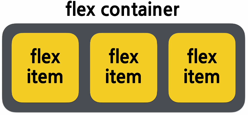
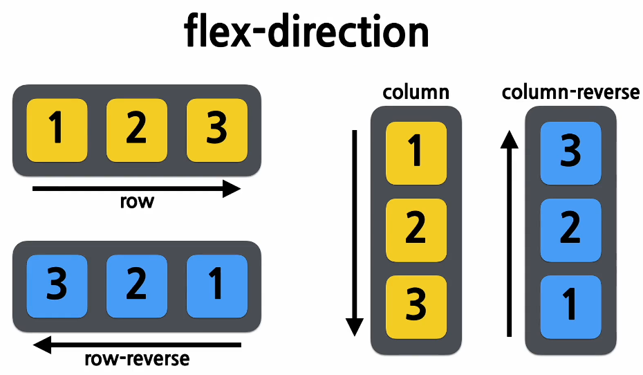
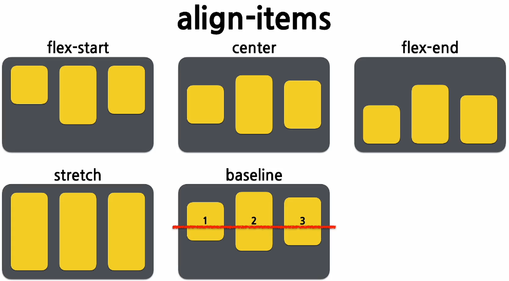
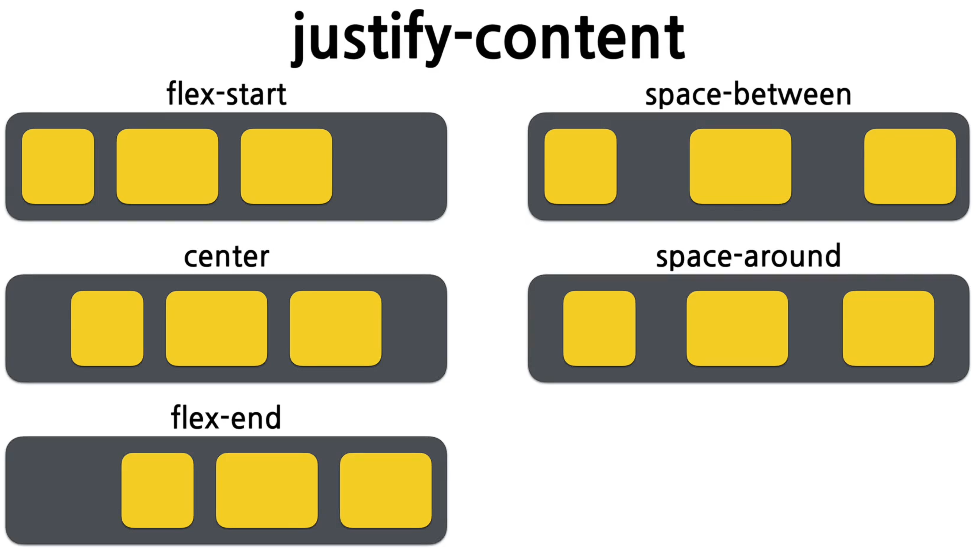
다음과 같은 Flex Container의 아이템들이 있을 때, 이 아이템들을 어떤 방향과 순서로 배치할지 정의할 수 있다.div { display: flex; // 필수 flex-direction: row | column | row-reverse | column-reverse; align-items: stretch | flex-start | center | flex-end | baseline; justify-content: flex-start | center | flex-end | space-between | space-around; }
폰트 관련
font-family
// 기본
#text {
  font-family: "(실제 사용할 글꼴의 이름)"
}

// farback: 지정된 글꼴을 찾지 못했을 경우를 방자한 대비책
#text {
  font-family: "familyName", fameilyVar, (serif | sans-serif | monospace | cursive | fnatasy);
}
* 맨 뒤에 있는 글꼴 분류 속성 (대체로 여기 5개 중 하나임)
- serif: 각 글자의 모서리에 작은 테두리를 갖고 있는 글꼴
- sans-serif: 모서리에 테두리가 없이 깔끔한 선을 가진 글꼴 (기존 serif보다 가독성 좋음)
- monospace: 모든 글자가 같은 가로 길이를 가지는 글꼴 (코딩용 글꼴)
- cursive: 사람 손글씨 글꼴
- fantasy: 장식이 추가된 글꼴
font-size
단위
- px: 고정된 값
- em: (px X 16)의 값
- rem:
- vw(Viewport Width): 브라우저의 창의 가로폭에 따른 사이즈
font-weight (=두께)
- normal: 일반
- bold: 두꺼운 글씨
- 100, 200, ..., 900: 숫자가 클수록 두꺼워짐
font-style
- normal: 일반
- italic: 기울어진 글자 (디자이너가 직접 디자인함)
- oblique: 글자가 비스듬함 (걍 글자를 기울임)
기타
background-color
div {
  background-color: color | transparent;
}
transparent = 투명한
색상 값
- (16진수 컬러 값) #ff0000
- (16진수 컬러 값 + 투명도) # ff000055
- (RGB 컬러 값) rgb(255, 0, 0)
- (RGBA 컬러 값) rgba(255, 0, 0, 0.5)
- (HSL 컬러 값) hsl(120, 100%, 25%)
- (HSLA 컬러 값) hsla(120, 100%, 25%, 0.3)
- (미리 정의된 색상 키워드) red, blue, yellow, ...
- currentcolor 키워드
border
div {
   border: border-width border-style border-color;
}- border-width: 테두리 두께
- border-style: 테두리 속성
- border-color: 테두리 색상
Sytled-Component
CSS 문법을 그대로 사용하면서, 결과물을 Styling된 컴포넌트로 만들어주는 오픈소스 라이브러리
설치
# npm을 사용하는 경우
npm install --save styled-components

# yarn을 사용하는 경우
yarn add styled-components
tagged template literal
literal
소스코드 상에 명시된 상수
let num = 20; // 20이 literaltemplate literal
백틱스(`)를 사용하여 문자열을 작성하고, 그 안에 대체 가능한 Expression을 넣는 방식
// Untagged Template Literal
// 단순한 문자열
`string text`;

// 여러 줄에 걸친 문자열
`string text line 1
 string text line 2`;

// 대체 가능한 expression이 들어있는 문자열
`string text ${expression} string text`;

// Tagged Template Literal
// myFunc의 파라미터로 expression으로,
// 구분된 문자열 배열과 expression이 순서대로 들어간 형태로 호출됨
myFunc`string text ${expression} string text`;
사용 예시 (1)
import React from "react";
import sytled from 'styled-components';

const Warpper = styled.div`
  padding: 1em;
  background: grey;
`;

const Title = styled.h1`
  font-sise: 1.5em;
  color: white;
  text-align: center;
`;

function MainPage(props) {
  return (
    <Warpper>
      <Title>
        안녕, 리액트!
      </Title>
    </Warpper>
  );
}

export default MainPage;
사용 예시 (2)
import React from "react";
import sytled from 'styled-components';

const Button = styled.button`
  color: ${props => props.dart ? "white" : "dart"};
  bacground: ${props => props.dart ? "black" : "white"};
  border: 1px solid black;
`;

function Sample(props) {
  return(
    <div>
      <Button>Normal</Button>
      <Button dark>Dark</Button>
    </div>
  );
}

export default Sample
사용 예시 (3)
import React from "react";
import sytled from 'styled-components';

const Button = styled.button`
  color: grey;
  border: 2px solid palevioletred;
`;

// Button에 style을 추가(확장)한 style 컴포넌트
const RoundedButton = styled(Button)`
  border-radius: 16px;
`;

function Sample(props) {
  return(
    <div>
      <Button>Normal</Button>
      <RoundedButton>Rounded</RoundedButton>
    </div>
  );
}

export default Sample
Referance
안녕하세요! 프로타쿠입니다