세계 테러 데이터 분석
-
위 사이트는 1970년대부터 2010년대까지 전세계 테러 관련된 데이터입니다.
-
지금부터 시작되는 과제는 어쩌면 https://www.kaggle.com/ash316/terrorism-around-the-world 이 주소의 코드가 여러분에게 영감과 도움을 줄 수 있을 것입니다.
-
여러분들이 먼저 집중해야할 것은 컬럼의 이름입니다. 135개의 많은 컬럼이 존재하므로 여러분은 이제 다음에 제시는 문제들을 보면서 필요한 컬럼을 잘 선택해야 합니다.
-
해당 데이터에는 테러가 발생한 시점, 공격형태(암살, 폭탄 등등), 국가, 지역(동아시아, 유럽, 등등), 부상자, 사망자, 테러의 발생 위도, 경도 정보 등등이 있습니다.
import numpy as np
import pandas as pd
import seaborn as sns
import matplotlib.pyplot as plt
%matplotlib inline
%config InlineBackend.figure_format = 'retina'
from matplotlib import rc
rc('font', family='Malgun Gothic')
gtd_data = pd.read_csv('./globalterrorismdb_0718dist.csv', encoding='ISO-8859-1')
gtd_data.head()
gtd_data.columns.values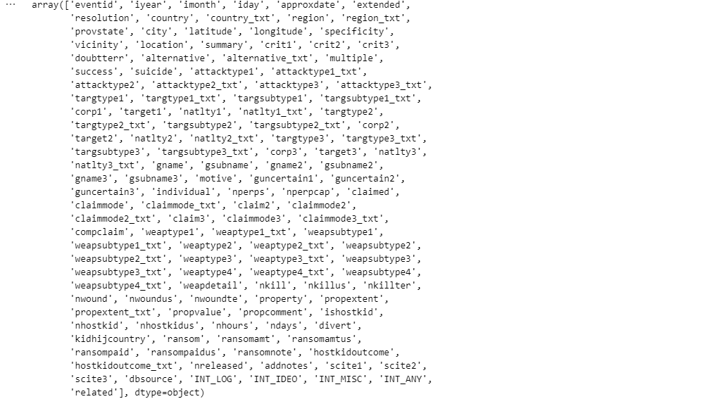
gtd_df = gtd_data.copy()

gtd_df = gtd_df[['eventid', 'iyear', 'imonth', 'iday', 'country_txt', 'region_txt', 'provstate', 'city',
                 'latitude', 'longitude', 'attacktype1_txt', 'weaptype1_txt', 'nkill', 'nwound',
                 'targtype1_txt', 'target1', 'natlty1_txt', 'gname']]

gtd_df.rename(columns={'eventid':'ID', 'iyear':'Year', 'imonth':'Month', 'iday':'Day', 'country_txt':'Country',
                       'region_txt':'Region', 'provstate':'State', 'city':'City', 'latitude':'lat', 'longitude':'log',
                       'attacktype1_txt':'Attack_Type', 'weaptype1_txt':'Weapon', 'nkill':'Killed', 'nwound':'Wounded',
                       'targtype1_txt':'Target_Type', 'target1':'Target', 'natlty1_txt':'Target_Country',
                       'gname':'Terrorist'}, inplace=True)

gtd_df.reset_index()
gtd_df.tail()
gtd_df.info()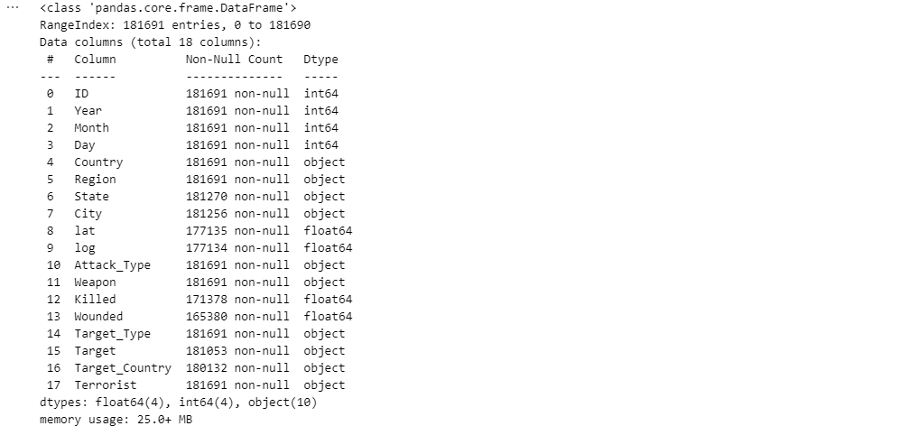
문제 1
먼저 데이터의 전체 기간에서 테러의 숫자를 연도별로 집계하여 연도별 테러 숫자를 시각화하시오.
시각화를 해보면 전세계 테러는 어떤 특정 연도를 기점으로 갑자기 급격히 증가합니다. 이 구간을 특정짓고 그 “기점”에 세계적 이슈가 무엇이 있었는지를 추측해보세요.
연도별 테러 발생건수
gtd1 = gtd_df['Year'].value_counts()
gtd1.head()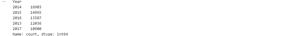
plt.figure(figsize=(12,6))
sns.barplot(x=gtd1.index, y=gtd1.values, palette='hls')
plt.xticks(rotation=45, ha="right")
plt.title('연도별 테러 발생건수')
plt.axhline(y=5000, ls='dashed', c='red')

plt.show()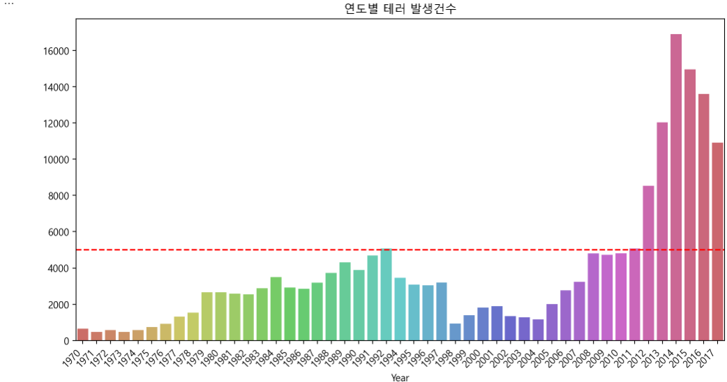
2010년대 초반 세계 테러가 급증한 이유
아랍의 봄으로 촉발된 정치적 불안정, ISIS의 성장, 소셜미디어를 통한 선전, 서방 국가의 개입과 철수가 복합적으로 작용
-
아랍의 봄과 중동 지역 불안정
2010~2012년 아랍의 봄으로 인해 튀니지, 리비아, 이집트, 시리아 등 여러 국가에서 정권이 붕괴하거나 내전 발생
이 과정에서 기존 정부의 통제가 약화 → 무장 단체들의 세력 확장 -
ISIS(이슬람국가) 부상
2014년 ISIS가 이라크와 시리아에서 빠르게 세력을 확장하면서 전 세계적으로 테러를 조장
소셜미디어를 이용한 선전·모집 전략을 통해 서방 국가에서도 외로운 늑대(lone wolf) 테러 증가 -
이라크 전쟁과 미군 철수(2011년)
2003년 이라크 전쟁 이후 미국이 2011년 철군하면서 이라크 내 정국이 불안정해졌고, ISIS가 그 혼란을 이용해 세력 확장
이라크 내 수니파와 시아파 간 갈등 심화 → 극단주의 단체 성장 -
시리아 내전(2011년~)
시리아 내전이 장기화되면서 여러 테러 조직이 활동할 수 있는 공간이 생겼고, 국제적으로 외국인 전투원이 유입되면서 테러 확산 -
인터넷과 소셜미디어를 통한 극단주의 확산
2010년대부터 테러 조직의 주요 선전 도구로 인터넷과 소셜미디어 사용
ISIS는 이를 이용해 전 세계적으로 지지자들을 모집하고, 자생적 테러리스트(lone wolf)를 부추김 -
아프리카 및 아시아 지역 테러 단체 확산
보코하람(나이지리아), 알샤바브(소말리아), 탈레반(아프가니스탄) 등도 이 시기에 세력 확장
문제 2
전 세계 테러 데이터를 가지고, 테러가 많이 일어난 국가를 정렬해서 상위 10위의 국가를 시각화하세요
테러발생건수 상위10개국
gtd2 = gtd_df['Country'].value_counts()[:10]
gtd2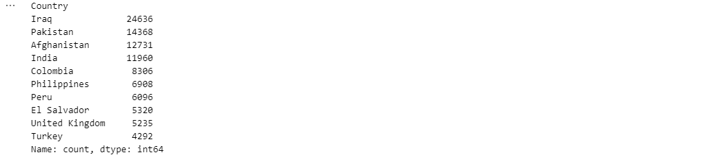
plt.figure(figsize=(12,6))
sns.barplot(x=gtd2.index, y=gtd2.values, palette='magma')
plt.xticks(rotation=45)
plt.title('테러 발생 국가 TOP 10')
plt.show()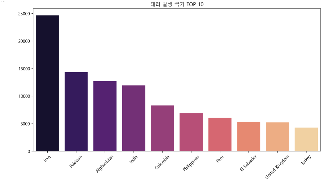
문제3
문제2의 전 세계 테러가 일어난 횟수별 상위 10위 국가에 대해 국가별로 사망자 수와 부상자 수를 구분하여 시각화하시오.
만약 국가별로 다른 국가와 사망자수, 부상자수의 특성이 다른 국가들이 있다면 시각화에 신경을 쓰세요. 즉, 어떤 국가는 테러횟수와 사상자(사망자수+부상자수)가 비슷한 경우가 있고, 또 어떤 국가는 테러횟수에 비해 사상자수가 많은 경우가 있을 겁니다.
gtd3 = gtd_df.loc[:, ['Country', 'Killed', 'Wounded']].fillna(0)
gtd3 = gtd3.groupby('Country')[['Killed', 'Wounded']].sum()
gtd3['Total'] = gtd3['Killed'] + gtd3['Wounded']
gtd3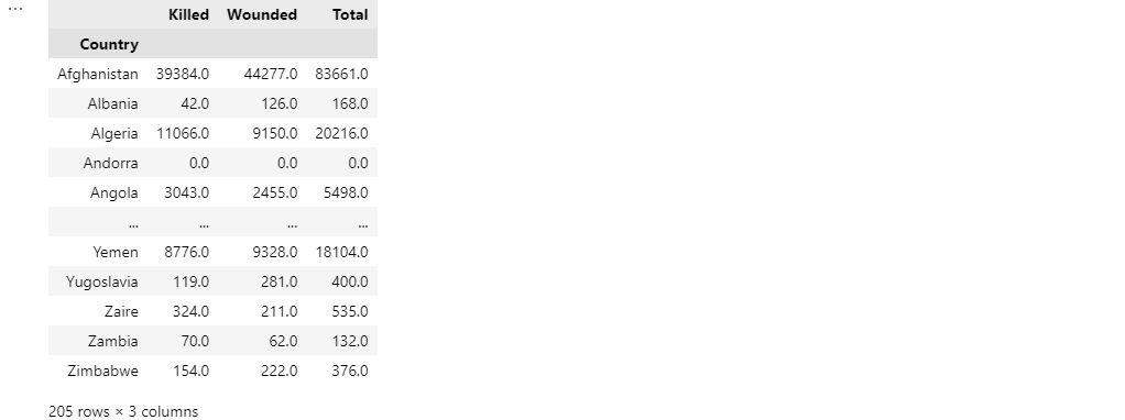
테러발생건수 상위10개국의 피해자 수
gtd3_top10 = gtd3.loc[gtd2.index]

plt.figure(figsize=(12, 8))
gtd3_top10[['Killed', 'Wounded']].plot(kind='bar', stacked=True, color=['darkblue', 'orange'])
plt.title('테러 발생 국가 TOP 10 - 사망자 및 부상자 수')
plt.legend(title='사망자 및 부상자', labels=['사망자', '부상자'])
plt.xlabel('국가')
plt.ylabel('사망자/부상자 수')
plt.xticks(rotation=45)
plt.show();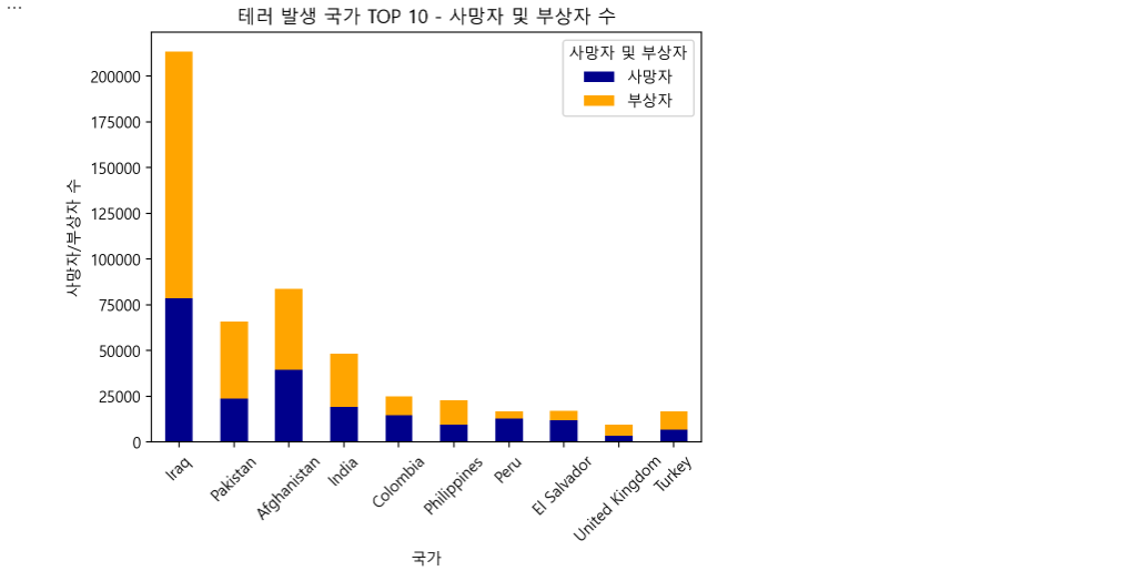
fig, ax = plt.subplots(1, 2, figsize=(12, 6))

ax[0].bar(gtd2.index, gtd2.values, color='darkgreen')
ax[0].set_title('테러 발생 횟수 (상위 10개 국가)')
ax[0].set_xlabel('국가')
ax[0].set_ylabel('테러 발생 횟수')
ax[0].tick_params(axis='x', rotation=45)

gtd3_top10['Fatality_to_Injury_Ratio'] = gtd3_top10['Killed'] / gtd3_top10['Wounded'].replace(0, 1)
colors = ['red' if ratio > 1.0 else 'darkred' for ratio in gtd3_top10['Fatality_to_Injury_Ratio']]

ax[1].bar(gtd3_top10.index, gtd3_top10['Fatality_to_Injury_Ratio'], color=colors)
ax[1].axhline(y=1., ls='dashed', c='red')
ax[1].set_title('사망자/부상자 비율 (상위 10개 국가)')
ax[1].set_xlabel('국가')
ax[1].set_ylabel('사망자/부상자 비율')
ax[1].tick_params(axis='x', rotation=45)

plt.tight_layout()
plt.show()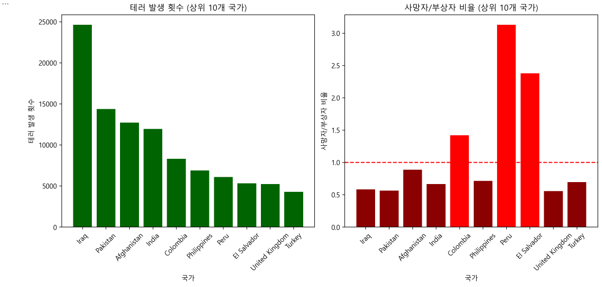
테러 피해자 수 상위 20개 국가
top10_countries = gtd3_top10.index.tolist()
gtd3_20 = gtd3.sort_values(by='Total', ascending=False).head(20)

colors_killed = ['gray' if country in top10_countries else 'darkgray' for country in gtd3_20.index]
colors_wounded = ['darkred' if country in top10_countries else 'pink' for country in gtd3_20.index]

plt.figure(figsize=(12, 8))
bars_killed = plt.bar(gtd3_20.index, gtd3_20['Killed'], color=colors_killed,
                      label='Killed', edgecolor='black', linewidth=.5)
bars_wounded = plt.bar(gtd3_20.index, gtd3_20['Wounded'], bottom=gtd3_20['Killed'],
                       color=colors_wounded, label='Wounded', edgecolor='black', linewidth=.5)
plt.title('테러 피해자 수 상위 20개 국가 (테러 발생국 Top 10 강조)')
plt.xticks(rotation=45)
plt.legend()
plt.grid(True, axis='y')

plt.show()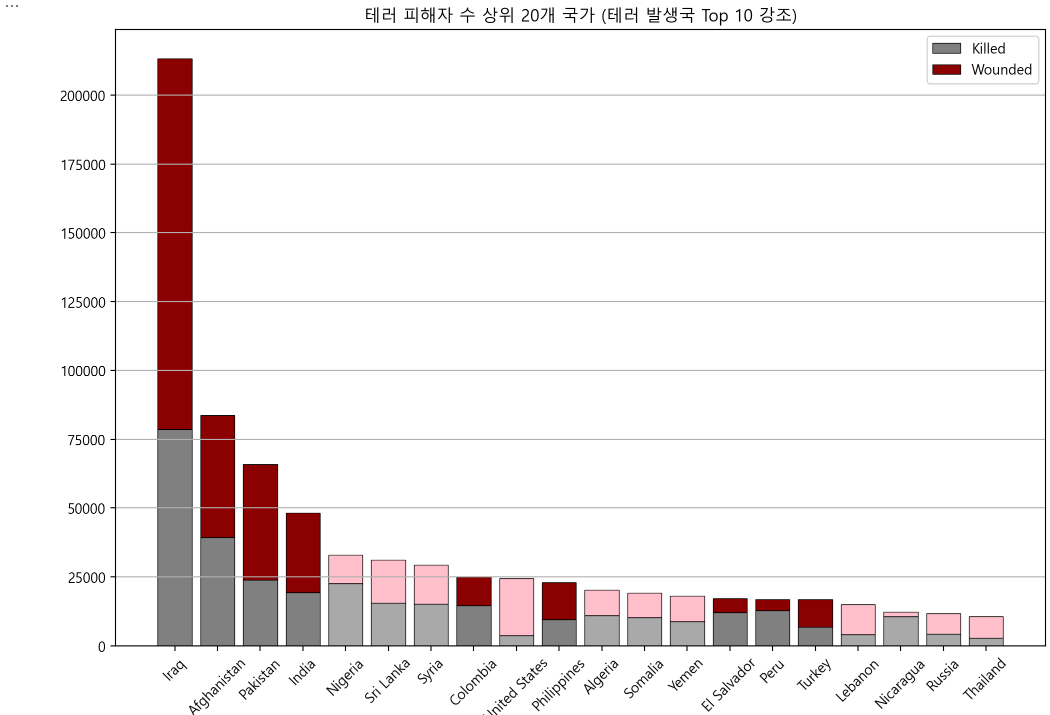
문제 4
중동&북아프리카, 남아시아, 남아메리카, 서유럽, 남동아시아, 동유럽, 북아메리카, 동아시아 지역으로 구분하여 각 지역별로 테러 공격 형태, 사망자와 사상자의 수 등에 대해 각 지역별로 특성들이 있는지를 확인하세요.
gtd_df['Killed'] = gtd_df['Killed'].fillna(0)
gtd_df['Wounded'] = gtd_df['Wounded'].fillna(0)

region_summary = gtd_df.groupby('Region').agg(Terror_Attacks=('ID', 'count'), Killed=('Killed', 'sum'),
                                              Wounded=('Wounded', 'sum')).reset_index()

region_attack_types = gtd_df.groupby('Region')['Attack_Type'].value_counts().unstack().fillna(0)

region_summary['Casualties'] = region_summary['Killed'] + region_summary['Wounded']

gtd4 = pd.merge(region_summary, region_attack_types, on='Region', how='left')

gtd4.head()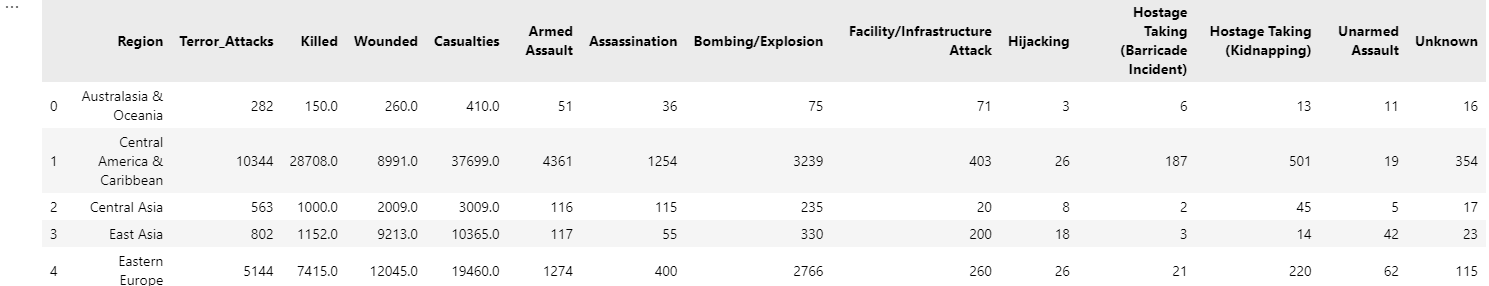
지역별 테러 발생 수
attack_counts = gtd4[['Region', 'Terror_Attacks']].sort_values(by='Terror_Attacks', ascending=False)
colors = plt.cm.Paired.colors[:len(attack_counts)]

def label_function(pct):
    return f"{pct:.1f}%" if pct >= 2 else ''

fig, ax = plt.subplots(1, 2, figsize=(14, 10))

sns.barplot(data=attack_counts, x='Terror_Attacks', y='Region', palette=colors, ax=ax[0],
            hue='Region',legend=False)
ax[0].set_title('지역별 테러 공격 수 (막대 차트)')
ax[0].set_xlabel('테러 공격 수')
ax[0].set_ylabel('')
for i in range(len(attack_counts)):
    ax[0].text(attack_counts['Terror_Attacks'].iloc[i] + 0.1, i,
               f'{attack_counts["Terror_Attacks"].iloc[i]}',
               va='center', ha='left', fontsize=12, fontweight='bold')

ax[1].pie(attack_counts['Terror_Attacks'],
          labels=[None] * len(attack_counts),
          autopct=lambda pct: label_function(pct),
          startangle=90,
          colors=colors, textprops={'fontsize':15},
          wedgeprops={'width': 0.7})
ax[1].set_title('지역별 테러 공격 수 (도넛 차트)')
ax[1].axis('equal')

plt.tight_layout()
plt.show()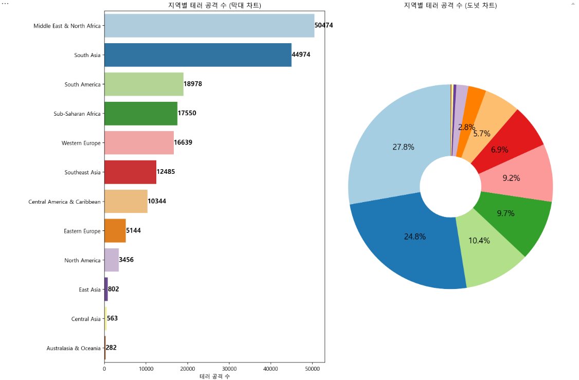
지역별 피해자 수
gtd4 = gtd4.sort_values(by='Casualties', ascending=False)
regions = gtd4['Region']
killed = gtd4['Killed']
wounded = gtd4['Wounded']
index = np.arange(len(gtd4))
bar_width = 0.4

plt.figure(figsize=(12, 8))
plt.bar(index - bar_width / 2, killed, bar_width, label='사망자 수', color='orange',
        edgecolor='black', linewidth=0.5)
plt.bar(index + bar_width / 2, wounded, bar_width, label='부상자 수', color='darkblue')

plt.title('지역별 피해자 수', fontsize=16)
plt.xlabel('')
plt.ylabel('')
plt.xticks(index, regions, rotation=30, ha="right")
plt.legend(title='피해 유형')
plt.grid(True, axis='y')

plt.show()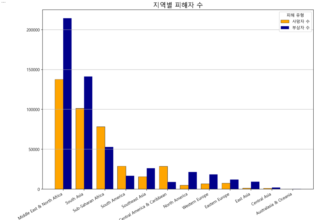
지역별 사망자수와 부상자수 관계
plt.figure(figsize=(10, 8))
sns.scatterplot(x='Killed', y='Wounded', data=gtd4, hue='Region', palette='RdYlBu',
                s=200, edgecolor='black', linewidth=1.5)
plt.plot([0, gtd4['Killed'].max()], [0, gtd4['Killed'].max()], color='red', linestyle='--', linewidth=2)
plt.title('지역별 사망자수와 부상자수 관계', fontsize=16)
plt.xlabel('사망자 수', fontsize=12)
plt.ylabel('부상자 수', fontsize=12)
plt.legend(title='지역', bbox_to_anchor=(1.05, 1), loc='upper left')
plt.grid()

plt.show()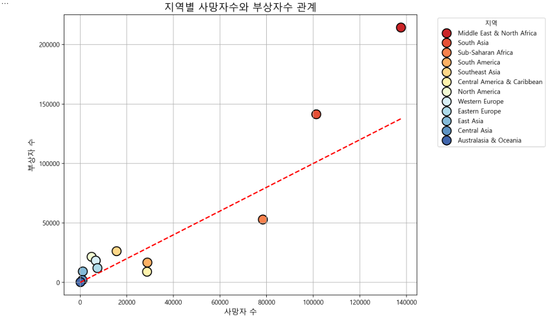
지역별 공격 유형 분포
region_att = region_attack_types.sum(axis=1).sort_values(ascending=True)
region_att_d = region_attack_types.loc[region_att.index]
region_att_r = region_att_d.div(region_att_d.sum(axis=1), axis=0) * 100

fig, ax = plt.subplots(1, 2, figsize=(12, 8))

region_att_d.plot(kind='barh', stacked=True, ax=ax[0], colormap='RdBu')
ax[0].set_title('지역별 공격 유형 분포 (수치 기준)')
ax[0].set_ylabel('')
ax[0].tick_params(axis='y', rotation=0)

region_att_r.plot(kind='barh', stacked=True, ax=ax[1], colormap='RdBu')
ax[1].set_title('지역별 공격 유형 분포 (비율 기준)')
ax[1].set_ylabel('')
ax[1].set_yticklabels([])
for p in ax[1].patches:
    width = p.get_width()
    height = p.get_height()
    x = p.get_x()
    y = p.get_y()
    if width > 0 and width > 4:
        ax[1].text(x + width / 2, y + height / 2, f'{width:.0f}%',
                   horizontalalignment='center', verticalalignment='center',
                   color='white', fontsize=12)
ax[1].legend('')

plt.tight_layout()
plt.show()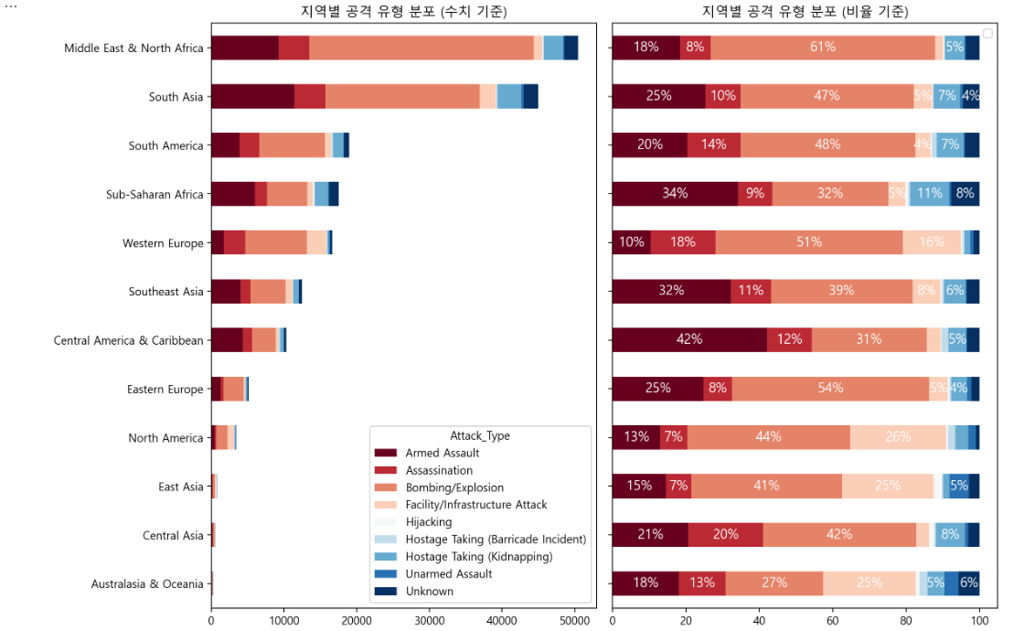
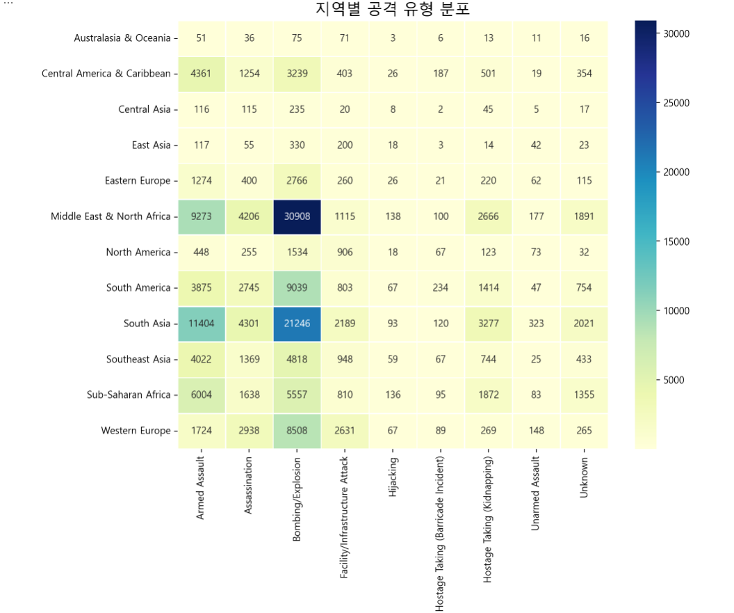
plt.figure(figsize=(10, 8))
sns.heatmap(region_attack_types, annot=True, fmt='.0f', cmap='YlGnBu', cbar=True, linewidths=0.5)
plt.title('지역별 공격 유형 분포', fontsize=16)
plt.xlabel('')
plt.ylabel('')
plt.show()
공격 유형별 피해자 수
gtd4_1 = gtd_df[['Attack_Type', 'Killed', 'Wounded']].dropna()
fig, ax = plt.subplots(1, 2, figsize=(18, 8))

sns.boxplot(x='Attack_Type', y='Killed', data=gtd4_1, hue='Attack_Type',
            palette='Set2', ax=ax[0], dodge=False)
ax[0].set_title('공격 유형별 사망자 수')
ax[0].set_xlabel('')
ax[0].set_ylabel('사망자 수', fontsize=12)
ax[0].tick_params(axis='x', rotation=90)

sns.boxplot(x='Attack_Type', y='Wounded', data=gtd4_1, hue='Attack_Type',
            palette='Set2', ax=ax[1], dodge=False)
ax[1].set_title('공격 유형별 부상자 수')
ax[1].set_xlabel('')
ax[1].set_ylabel('부상자 수', fontsize=12)
ax[1].tick_params(axis='x', rotation=90)

plt.tight_layout()
plt.show()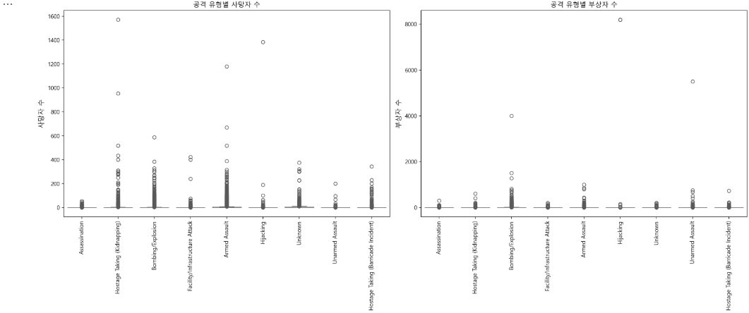
문제 5
중동&북아프리카, 남아시아, 남아메리카, 서유럽, 남동아시아, 동유럽, 북아메리카, 동아시아 지역으로 구분하여 진행한 문제4번에 대해 문제1번에서 특정 지은 시기를 기준으로 다시 분리하여 테러의 양상을 분석해 보시오.
before_2010 = gtd_df[gtd_df['Year'] < 2010]
after_2010 = gtd_df[gtd_df['Year'] >= 2010]

before_2010.head(), after_2010.head()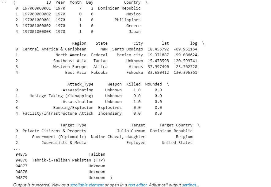
지역별 테러 발생 수 비교 (2010년 이전 vs 이후)
attack_b = before_2010.groupby('Region')['ID'].count().reset_index().rename(columns={'ID': 'Terror_Attacks'})
attack_a = after_2010.groupby('Region')['ID'].count().reset_index().rename(columns={'ID': 'Terror_Attacks'})
attack_com = pd.merge(attack_b, attack_a, on='Region', how='outer', suffixes=('_before', '_after'))
index = range(len(attack_com))
bar_width = 0.4

plt.figure(figsize=(12, 8))

plt.bar([i - bar_width/2 for i in index], attack_com['Terror_Attacks_before'],
        bar_width, label='2010년 이전', color='darkgray')

plt.bar([i + bar_width/2 for i in index], attack_com['Terror_Attacks_after'],
        bar_width, label='2010년 이후', color='brown')

plt.title('지역별 테러 발생 수 비교 (2010년 이전 vs 이후)', fontsize=16)
plt.xlabel('')
plt.ylabel('')
plt.xticks(index, attack_com['Region'], rotation=45, ha="right")
plt.legend(title='시점')
plt.grid(True, axis='y')

plt.tight_layout()
plt.show()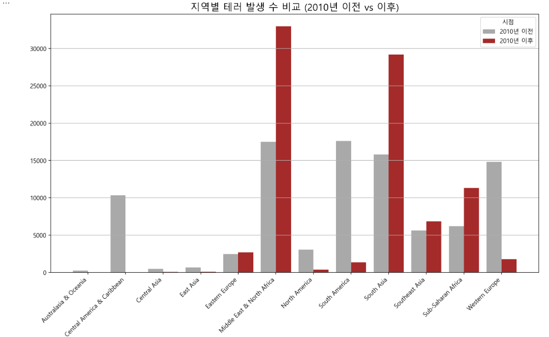
지역별 피해자 수 비교 (2010년 이전 vs 이후)
regions = gtd_df['Region'].unique()
killed_before = before_2010.groupby('Region')['Killed'].sum()
wounded_before = before_2010.groupby('Region')['Wounded'].sum()
killed_after = after_2010.groupby('Region')['Killed'].sum()
wounded_after = after_2010.groupby('Region')['Wounded'].sum()

index = np.arange(len(regions))
bar_width = 0.4

plt.figure(figsize=(14, 14))

plt.subplot(2, 1, 1)
plt.bar(index - bar_width / 2, killed_before.loc[regions], bar_width,
        label='사망자 수 (2010년 전)', color='orange', edgecolor='black', linewidth=0.5)
plt.bar(index + bar_width / 2, killed_after.loc[regions], bar_width,
        label='사망자 수 (2010년 후)', color='brown')
plt.title('지역별 사망자 수 (2010년 전후)', fontsize=16)
plt.xlabel('')
plt.ylabel('사망자 수')
plt.xticks(index, regions, rotation=30, ha="right")
plt.legend(title='피해 유형')
plt.grid(True, axis='y')

plt.subplot(2, 1, 2)
plt.bar(index - bar_width / 2, wounded_before.loc[regions], bar_width, label='부상자 수 (2010년 전)',
        color='skyblue', edgecolor='black', linewidth=0.5)
plt.bar(index + bar_width / 2, wounded_after.loc[regions], bar_width, label='부상자 수 (2010년 후)',
        color='purple')
plt.title('지역별 부상자 수 (2010년 전후)', fontsize=16)
plt.xlabel('지역')
plt.ylabel('부상자 수')
plt.xticks(index, regions, rotation=30, ha="right")
plt.legend(title='피해 유형')
plt.grid(True, axis='y')

plt.tight_layout()
plt.show()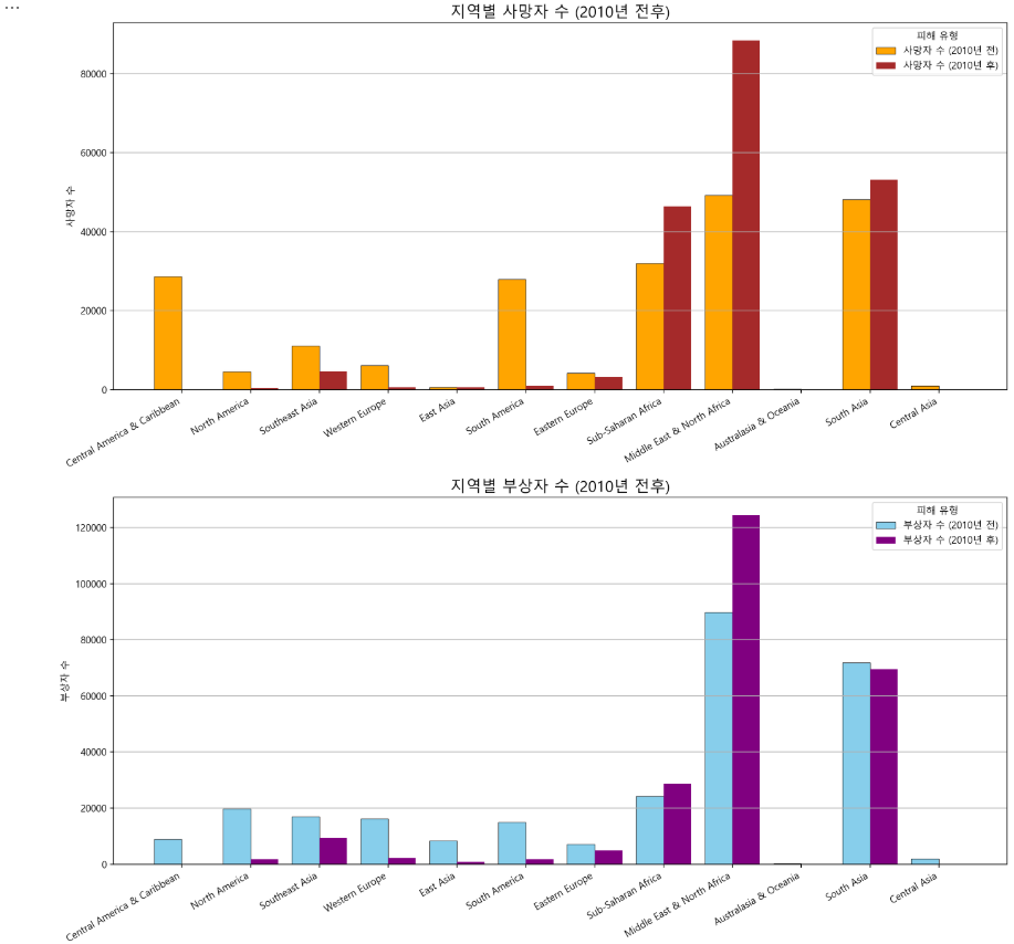
지역별 공격 유형 분포 비교 (2010년 이전 vs 이후)
region_attack_b = before_2010.groupby('Region')['Attack_Type'].value_counts().unstack().fillna(0)
region_attack_a = after_2010.groupby('Region')['Attack_Type'].value_counts().unstack().fillna(0)
region_attack_c = pd.concat([region_attack_b.add_suffix('Before 2010'),
                             region_attack_a.add_suffix('After 2010')], axis=1)

region_attack_bp = region_attack_b.div(region_attack_b.sum(axis=1), axis=0) * 100
region_attack_ap = region_attack_a.div(region_attack_a.sum(axis=1), axis=0) * 100
region_attack_cp = pd.concat([region_attack_bp.add_suffix('Before 2010'),
                              region_attack_ap.add_suffix('After 2010')], axis=1)

fig, ax = plt.subplots(2, 2, figsize=(12, 12))

region_attack_b.plot(kind='barh', stacked=True, ax=ax[0, 0], colormap='RdBu')
ax[0, 0].set_title('2010년 이전 지역별 공격 유형 분포 (수치 기준)')
ax[0, 0].set_ylabel('지역')
ax[0, 0].tick_params(axis='y', rotation=0)

region_attack_bp.plot(kind='barh', stacked=True, ax=ax[0, 1], colormap='RdBu')
ax[0, 1].set_title('비율 기준')
ax[0, 1].set_ylabel('')
ax[0, 1].set_yticklabels([])
for p in ax[0, 1].patches:
    width = p.get_width()
    height = p.get_height()
    x = p.get_x()
    y = p.get_y()
    if width > 0 and width > 4:
        ax[0, 1].text(x + width / 2, y + height / 2, f'{width:.0f}%',
                      horizontalalignment='center', verticalalignment='center',
                      color='white', fontsize=12)
ax[0, 1].legend('')

region_attack_a.plot(kind='barh', stacked=True, ax=ax[1, 0], colormap='Spectral')
ax[1, 0].set_title('2010년 이후 지역별 공격 유형 분포 (수치 기준)')
ax[1, 0].set_ylabel('지역')
ax[1, 0].tick_params(axis='y', rotation=0)

region_attack_ap.plot(kind='barh', stacked=True, ax=ax[1, 1], colormap='Spectral')
ax[1, 1].set_title('비율 기준')
ax[1, 1].set_ylabel('')
ax[1, 1].set_yticklabels([])
for p in ax[1, 1].patches:
    width = p.get_width()
    height = p.get_height()
    x = p.get_x()
    y = p.get_y()
    if width > 0 and width > 4:
        ax[1, 1].text(x + width / 2, y + height / 2, f'{width:.0f}%',
                      horizontalalignment='center', verticalalignment='center',
                      color='white', fontsize=12)
ax[1, 1].legend('')

plt.tight_layout()
plt.show()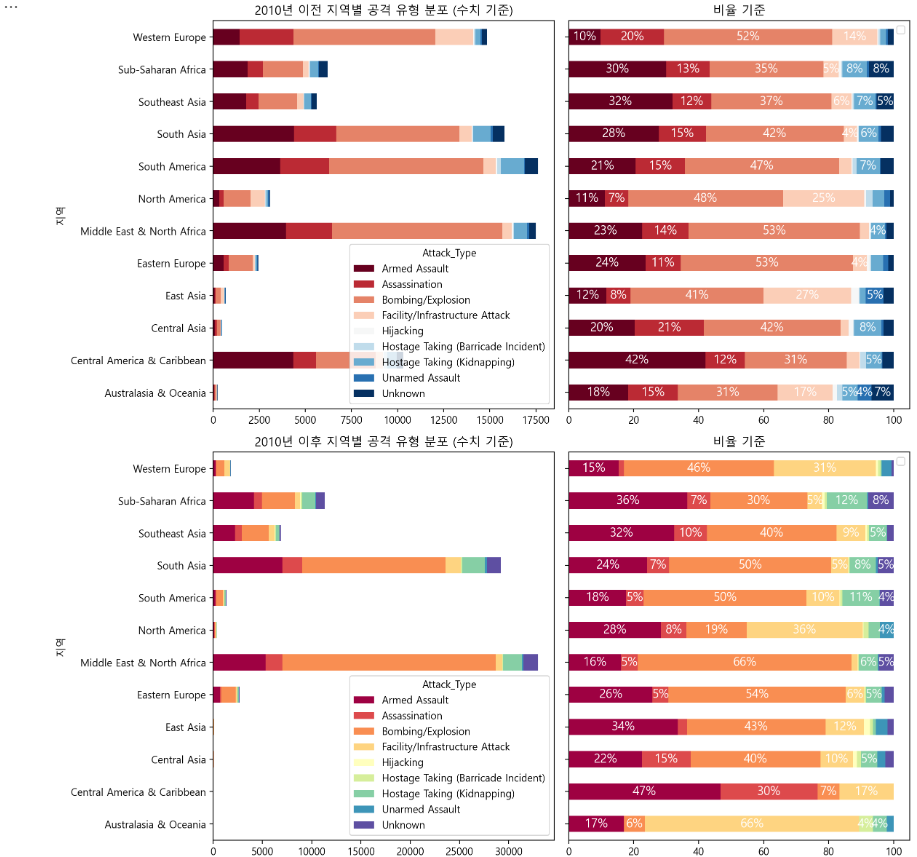
fig, ax = plt.subplots(1, 2, figsize=(16, 10))

sns.heatmap(region_attack_b, annot=True, fmt='.0f', ax=ax[0], cmap='Blues', cbar=False, linewidths=0.5)
ax[0].set_title('2010년 이전 지역별 공격 유형 분포')
ax[0].set_xlabel('')
ax[0].set_ylabel('')

sns.heatmap(region_attack_a, annot=True, fmt='.0f', ax=ax[1], cmap='Reds', cbar=False, linewidths=0.5)
ax[1].set_title('2010년 이후 지역별 공격 유형 분포')
ax[1].set_xlabel('')
ax[1].set_ylabel('')
ax[1].set_yticklabels([])

plt.tight_layout()
plt.show()
지역별 공격 유형별 피해자 수 (2010년 이전 vs 이후)
before_2010_attack_type = before_2010.groupby('Attack_Type')['Killed'].sum() + before_2010.groupby('Attack_Type')['Wounded'].sum()
after_2010_attack_type = after_2010.groupby('Attack_Type')['Killed'].sum() + before_2010.groupby('Attack_Type')['Wounded'].sum()

attack_types = list(set(before_2010['Attack_Type']).union(set(after_2010['Attack_Type'])))
before_2010_deaths = [before_2010_attack_type.get(attack, 0) for attack in attack_types]
after_2010_deaths = [after_2010_attack_type.get(attack, 0) for attack in attack_types]

fig, ax = plt.subplots(figsize=(10, 6))

bar_width = 0.35
index = range(len(attack_types))
bar1 = ax.bar(index, before_2010_deaths, bar_width, label='Before 2010')
bar2 = ax.bar([i + bar_width for i in index], after_2010_deaths, bar_width, label='After 2010')

ax.set_xlabel('')
ax.set_ylabel('피해자 수')
ax.set_title('2010년 전후 공격 유형별 피해자 수')
ax.set_xticks([i + bar_width / 2 for i in index])
ax.set_xticklabels(attack_types, rotation=90)
ax.legend()

plt.tight_layout()
plt.show()
문제 6
중동&북아프리카, 남아시아, 서유럽, 남동아시아, 동유럽, 북아메리카, 동아시아 지역으로 구분하여 70년대, 80년대, 90년대, 2000년대, 2010년대로 구분하여 특성을 분석해보시오.
지역별 테러 발생 수 & 피해자 수 (Decade)
gtd6 = gtd_df[['Year', 'Region', 'Attack_Type', 'Killed', 'Wounded']].dropna()

def categorize_decade(year):
    if year >= 1970 and year < 1980:
        return '1970s'
    elif year >= 1980 and year < 1990:
        return '1980s'
    elif year >= 1990 and year < 2000:
        return '1990s'
    elif year >= 2000 and year < 2010:
        return '2000s'
    elif year >= 2010:
        return '2010s'
    return 'Unknown'

gtd6['Decade'] = gtd6['Year'].apply(categorize_decade)

region_decade = gtd6.groupby(['Region', 'Decade']).agg(Terror_Attacks=('Year', 'count'), Killed=('Killed', 'sum'),
                                                               Wounded=('Wounded', 'sum')).reset_index()

region_decade.tail()
import plotly.express as px
region_decade['Decade'] = region_decade['Decade'].astype(str)

fig1 = px.line(region_decade, x='Decade', y='Terror_Attacks', color='Region', markers=True,
               title='지역별 테러 발생 수 (Decade)',
               labels={'Terror_Attacks': 'Terror Attacks', 'Decade': 'Decade'})

fig2 = px.line(region_decade, x='Decade', y='Killed', color='Region', markers=True,
               title='지역별 사망자 수 (Decade)',
               labels={'Killed': 'Killed', 'Decade': 'Decade'})

fig3 = px.line(region_decade, x='Decade', y='Wounded', color='Region', markers=True,
               title='지역별 부상자 수 (Decade)',
               labels={'Wounded': 'Wounded', 'Decade': 'Decade'})

fig1.show()
fig2.show()
fig3.show()
문제 7
우리나라의 테러를 집계해서 나름대로의 방법으로 시각화 및 분석을 수행하시오.
korea_df = gtd_df[gtd_df['Country'] == 'South Korea']
korea_df.head()
한국의 연도별 테러 발생 수 & 피해자 수
attack_count = korea_df.groupby('Year')['ID'].size()
total_killed = korea_df.groupby('Year')['Killed'].sum()
total_wounded = korea_df.groupby('Year')['Wounded'].sum()
total_victims = total_killed + total_wounded

yearly_data = pd.DataFrame({
    'attack_count': attack_count,
    'total_killed': total_killed,
    'total_wounded': total_wounded,
    'total_victims': total_victims,
}).reset_index()

fig, ax = plt.subplots(1, 2, figsize=(12, 6))

ax[0].plot(yearly_data['Year'], yearly_data['attack_count'], marker='o', color='blue', label='Attacks')
ax[0].set_title('한국의 연도별 테러 발생 수')
ax[0].set_xlabel('Year')
ax[0].set_ylabel('')
ax[0].grid(True, axis='y')

ax[1].plot(yearly_data['Year'], yearly_data['total_killed'], marker='o', color='red', label='Killed', linestyle='--')
ax[1].plot(yearly_data['Year'], yearly_data['total_wounded'], marker='o', color='orange', label='Wounded', linestyle='-')
ax[1].set_title('연도별 테러 피해자 수')
ax[1].set_xlabel('Year')
ax[1].set_ylabel('')
ax[1].legend()
ax[1].grid(True, axis='y')

plt.tight_layout()
plt.show()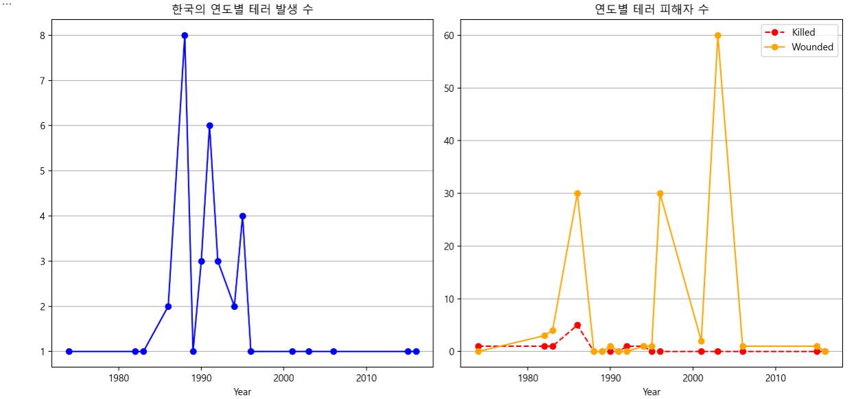
한국의 연도별 테러 공격 유형 & 테러 대상
attack_types_count = korea_df.groupby('Year')['Attack_Type'].value_counts().unstack().fillna(0)
target_types_count = korea_df.groupby('Year')['Target_Type'].value_counts().unstack().fillna(0)

fig, ax = plt.subplots(2, 1, figsize=(15, 12))

attack_types_count.plot(kind='bar', stacked=True, ax=ax[0])
ax[0].set_title('한국의 연도별 테러 공격 유형')
ax[0].set_xlabel('')
ax[0].set_ylabel('')
ax[0].legend(title='공격 유형', bbox_to_anchor=(1.05, 1), loc='upper left')

target_types_count.plot(kind='bar', stacked=True, ax=ax[1])
ax[1].set_title('한국의 연도별 테러 대상')
ax[1].set_xlabel('')
ax[1].set_ylabel('')
ax[1].legend(title='공격 대상', bbox_to_anchor=(1.05, 1), loc='upper left')

plt.tight_layout()
plt.show()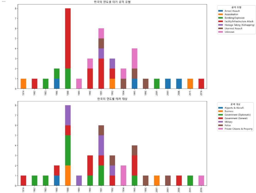
attack_types_count.reset_index(inplace=True)
target_types_count.reset_index(inplace=True)

fig1 = px.line(attack_types_count, x='Year', y=attack_types_count.columns[1:],
               title='한국의 연도별 테러 공격 유형',
               labels={'value': 'Number of Attacks', 'Year': 'Year'},
               markers=True)

fig2 = px.line(target_types_count, x='Year', y=target_types_count.columns[1:],
               title='한국의 연도별 테러 대상',
               labels={'value': 'Number of Targets', 'Year': 'Year'},
               markers=True)

fig1.update_layout(xaxis_title='Year', yaxis_title='', legend_title='공격 유형')
fig2.update_layout(xaxis_title='Year', yaxis_title='', legend_title='공격 대상')

fig1.show()
fig2.show()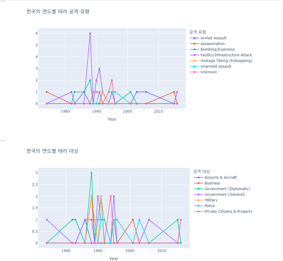
한국의 도시별 테러 발생 수 & 피해자 수
city_attack_count = korea_df.groupby('City')['ID'].size().reset_index(name='Attack_Count')
city_victims = korea_df.groupby('City').agg(
    Total_Killed=('Killed', 'sum'),
    Total_Wounded=('Wounded', 'sum')
).reset_index()
city_data = pd.merge(city_attack_count, city_victims, on='City')
city_data = city_data.sort_values(by='Attack_Count', ascending=False)

fig = px.bar(city_data, x='City', y=['Attack_Count', 'Total_Killed', 'Total_Wounded'],
             title='한국의 도시별 테러 발생 수/사망자 수/부상자 수',
             labels={'value': 'Count', 'variable': 'Category'},
             barmode='group')

fig.update_layout(
    width=800,
    height=600,
    xaxis_title='',
    yaxis_title='',
    legend_title='Categories',
    xaxis_tickangle=-45
)

fig.show()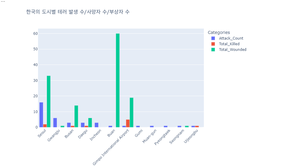
한국의 도시별 테러 공격 유형 & 테러 대상
city_attack_types = korea_df.groupby(['City', 'Attack_Type']).size().reset_index(name='Count')
city_target_types = korea_df.groupby(['City', 'Target_Type']).size().reset_index(name='Count')


fig1 = px.bar(city_attack_types, x='City', y='Count', color='Attack_Type',
              title='한국의 도시별 테러 공격 유형',
              labels={'Count': 'Number of Attacks', 'City': 'City'},
              barmode='stack')
fig1.update_layout(
    width=800,
    height=600,
    xaxis_title='',
    yaxis_title='',
    legend_title='공격 유형',
    xaxis_tickangle=-45)

fig2 = px.bar(city_target_types, x='City', y='Count', color='Target_Type',
              title='한국의 도시별 테러 공격 대상',
              labels={'Count': 'Number of Targets', 'City': 'City'},
              barmode='stack')
fig2.update_layout(
    width=800,
    height=600,
    xaxis_title='',
    yaxis_title='',
    legend_title='공격 대상',
    xaxis_tickangle=-45)

fig1.show()
fig2.show()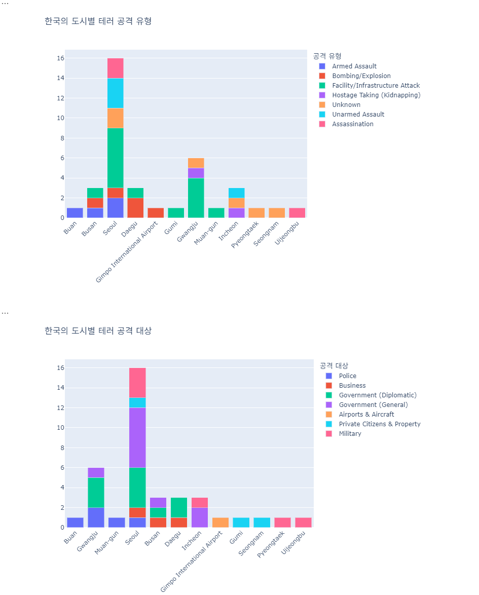
문제 8
불특정 민간인을 대상으로 한 테러는 “악”이라고 할 수 있습니다.
이런 테러의 어둡고 무서운 면을 강조할 수 있는 방법을 고민하여 데이터를 분석하고 시각화하여 제시하시오.
gtd_df['Target_Type'].value_counts()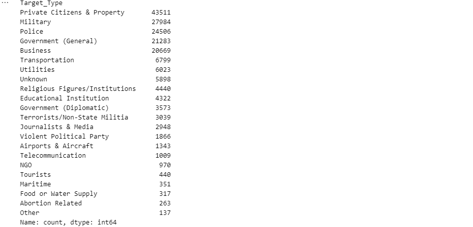
연도별 민간인 대상 테러 수
target_types = ['Private Citizens & Property', 'Business', 'Transportation', 'Tourists','Food or Water Supply',
                'Telecommunication', 'Educational Institution', 'Airports & Aircraft', 'Journalists & Media']
civilian_df = gtd_df[gtd_df['Target_Type'].isin(target_types)]
civilian_df['Year'] = civilian_df['Year'].astype(int)
total_per_year = civilian_df.groupby('Year').size()
total_attacks = gtd_df.groupby('Year').size()
civilian_percentage = (total_per_year / total_attacks) * 100

fig, ax = plt.subplots(1, 2, figsize=(12, 6))

total_per_year.plot(kind='line', marker='o', color='r', ax=ax[0])
ax[0].set_title('연도별 민간인 대상 테러 수')
ax[0].set_xlabel('')
ax[0].set_ylabel('')
ax[0].grid(True, axis='y')

civilian_percentage.plot(kind='line', marker='o', color='b', ax=ax[1])
ax[1].set_title('연도별 민간인 대상 테러 비중')
ax[1].set_xlabel('')
ax[1].set_ylabel('')
ax[1].grid(True, axis='y')

plt.tight_layout()
plt.show()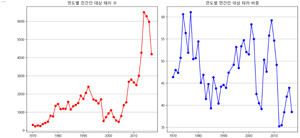
연도별 민간인 대상 테러 피해자 수
casualties_k = civilian_df.groupby('Year')[['Killed']].sum()
casualties_w = civilian_df.groupby('Year')[['Wounded']].sum()

fig, ax = plt.subplots(1, 2, figsize=(12, 6))

casualties_k.plot(kind='bar', color='brown' ,ax=ax[0])
ax[0].set_title('연도별 민간인 대상 테러 사망자 수')
ax[0].set_xlabel('')
ax[0].set_ylabel('')
ax[0].grid(True, axis='y')

casualties_w.plot(kind='bar', color='green', ax=ax[1])
ax[1].set_title('연도별 민간인 대상 테러 부상자 수')
ax[1].set_xlabel('')
ax[1].set_ylabel('')
ax[1].grid(True, axis='y')

plt.tight_layout()
plt.show()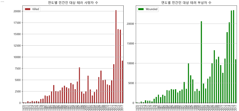
민간인 대상 테러의 공격 유형 & 사용 무기
attack_types = civilian_df['Attack_Type'].value_counts().head(6)
weapons = civilian_df['Weapon'].value_counts().head(6)

fig, ax = plt.subplots(1, 2, figsize=(12, 6))

attack_types.plot(kind='bar', color='pink', ax=ax[0])
ax[0].set_title('민간인 대상 테러의 공격 유형')
ax[0].set_xlabel('Attack Type')
ax[0].set_ylabel('')

weapons.plot(kind='bar', color='skyblue', ax=ax[1])
ax[1].set_title('민간인 대상 테러에서 사용된 무기')
ax[1].set_xlabel('Weapon')
ax[1].set_ylabel('')

plt.tight_layout()
plt.show()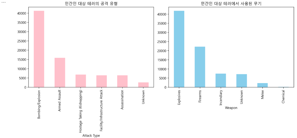
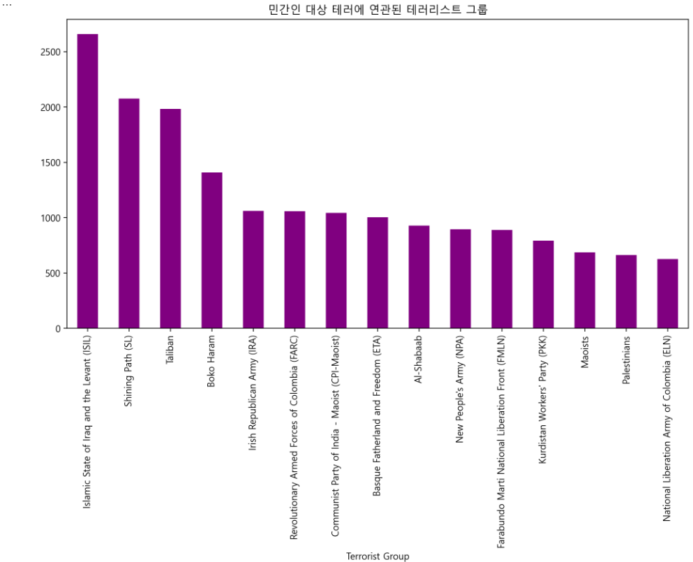
민간인 대상 테러에 연관된 테러리스트 그룹
terrorists = civilian_df['Terrorist'].value_counts()
terrorists = terrorists[terrorists.index != 'Unknown'].head(15)

plt.figure(figsize=(12, 6))
terrorists.plot(kind='bar', color='purple')
plt.title('민간인 대상 테러에 연관된 테러리스트 그룹')
plt.xlabel('Terrorist Group')
plt.ylabel('')
plt.show()