예제1: seaborn 기초
np.linspace(0, 14, 100)
x = np.linspace(0, 14, 100)
y1 = np.sin(x)
y2 = 2 * np.sin(x + 0.5)
y3 = 3 * np.sin(x + 1.0)
y4 = 4 * np.sin(x + 1.5)
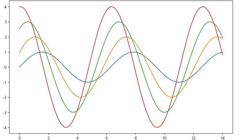
plt.figure(figsize=(10, 6))
plt.plot(x, y1, x, y2, x, y3, x, y4)
plt.show()
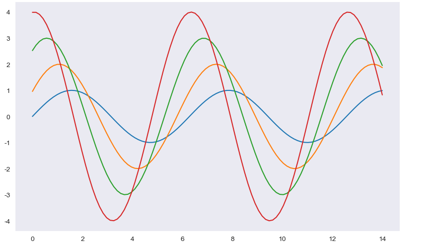
sns.set_style("white")
plt.figure(figsize=(10, 6))
plt.plot(x, y1, x, y2, x, y3, x, y4)
plt.show()
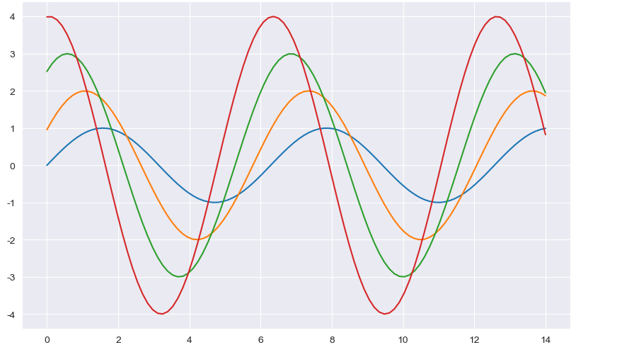
sns.set_style("dark")
plt.figure(figsize=(10, 6))
plt.plot(x, y1, x, y2, x, y3, x, y4)
plt.show()
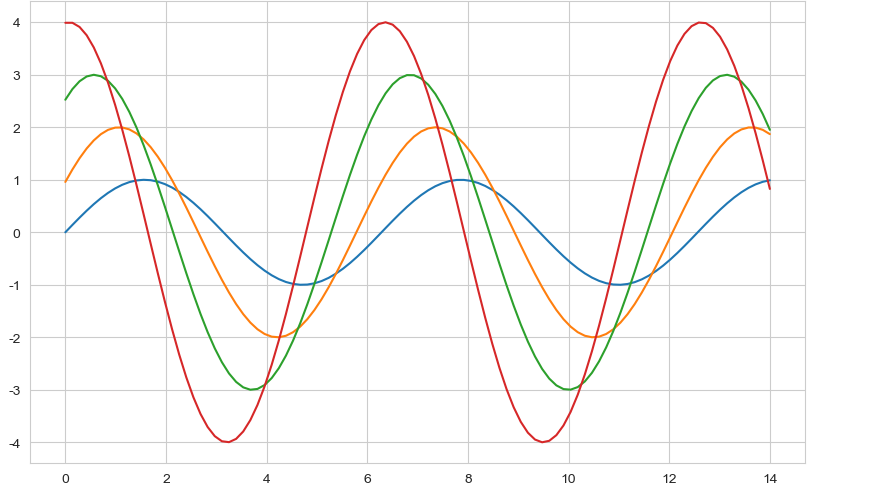
- sns.set_style("whitegrid")
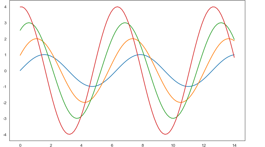
sns.set_style("whitegrid")
plt.figure(figsize=(10, 6))
plt.plot(x, y1, x, y2, x, y3, x, y4)
plt.show()
- sns.set_style("darkgrid")
sns.set_style("darkgrid")
plt.figure(figsize=(10, 6))
plt.plot(x, y1, x, y2, x, y3, x, y4)
plt.show()
예제2: seaborn tips data
boxplot
swarmplot
lmplot
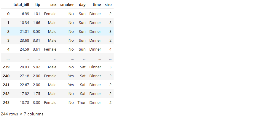
tips = sns.load_dataset("tips")
tips
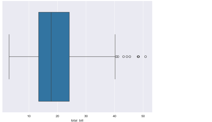
plt.figure(figsize=(8, 6))
sns.boxplot(x=tips["total_bill"])
plt.show()
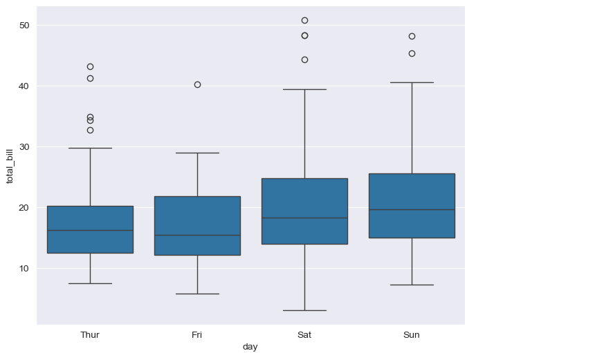
plt.figure(figsize=(8, 6))
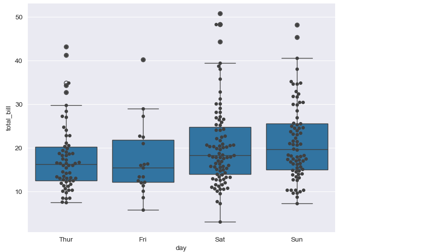
sns.boxplot(x="day", y="total_bill", data=tips)
plt.show()
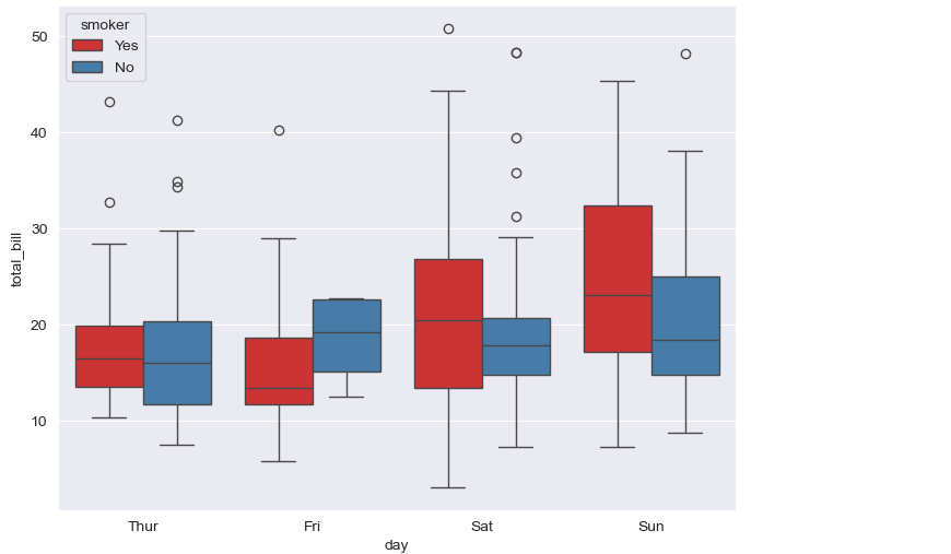
- boxplot hue, palette option
plt.figure(figsize=(8, 6))
sns.boxplot(x="day", y="total_bill", data=tips, hue="smoker", palette="Set1")
plt.show()
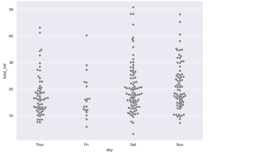
plt.figure(figsize=(8, 6))
sns.swarmplot(x="day", y="total_bill", data=tips, color="0.5")
plt.show()
plt.figure(figsize=(8, 6))
sns.boxplot(x="day", y="total_bill", data=tips)
sns.swarmplot(x="day", y="total_bill", data=tips, color="0.25")
plt.show()
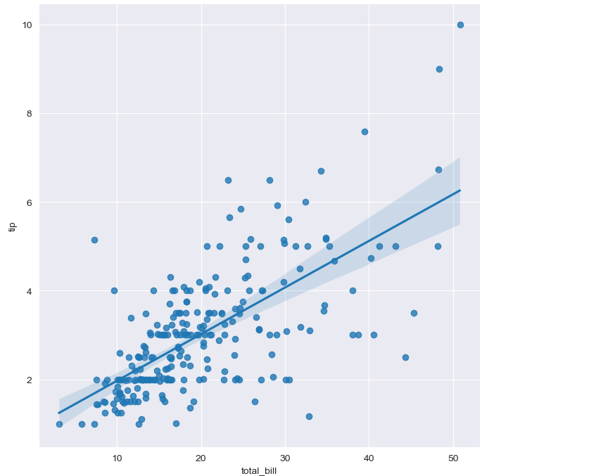
- lmplot: total_bil과 tip 사이 관계 파악
sns.set_style("darkgrid")
sns.lmplot(x="total_bill", y="tip", data=tips, height=7)
plt.show()
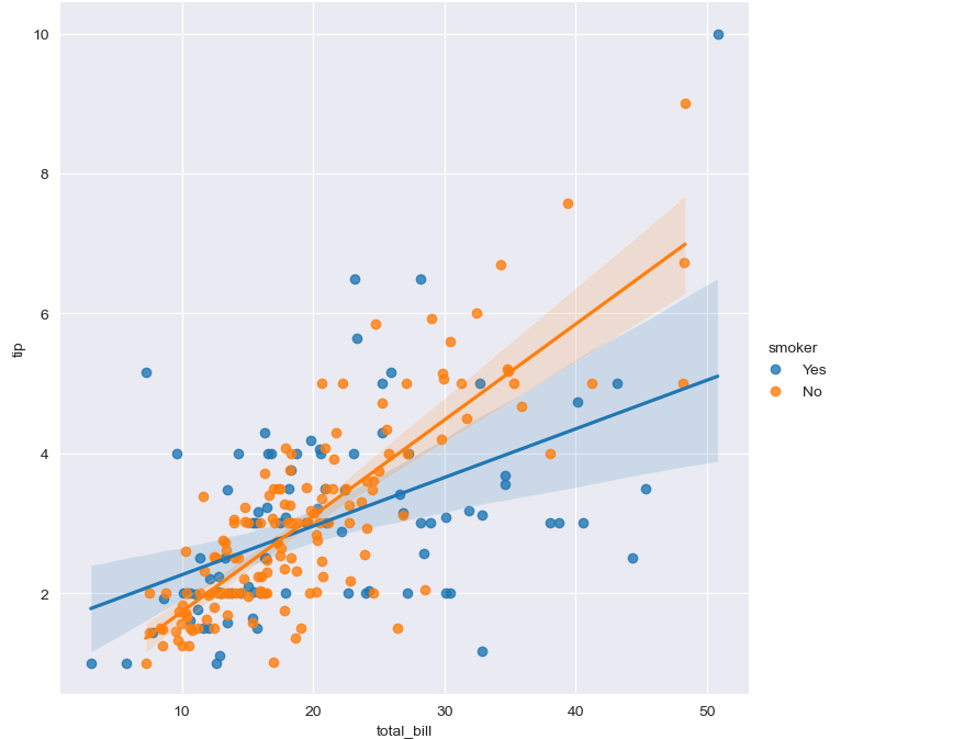
sns.set_style("darkgrid")
sns.lmplot(x="total_bill", y="tip", data=tips, height=7, hue="smoker")
plt.show()
예제3: flights data
heatmap
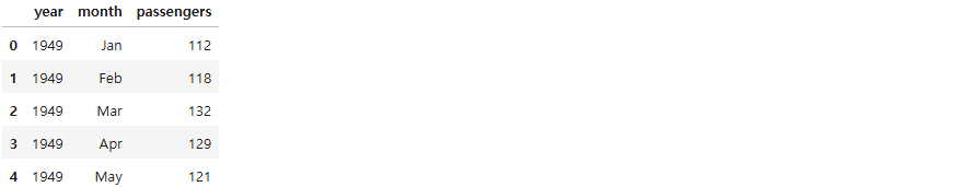
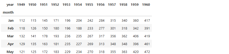
flights = sns.load_dataset("flights")
flights.head()
flights = flights.pivot(index="month", columns="year", values="passengers")
flights.head()
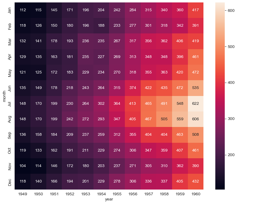
plt.figure(figsize=(10, 8))
sns.heatmap(data=flights, annot=True, fmt="d")
plt.show()
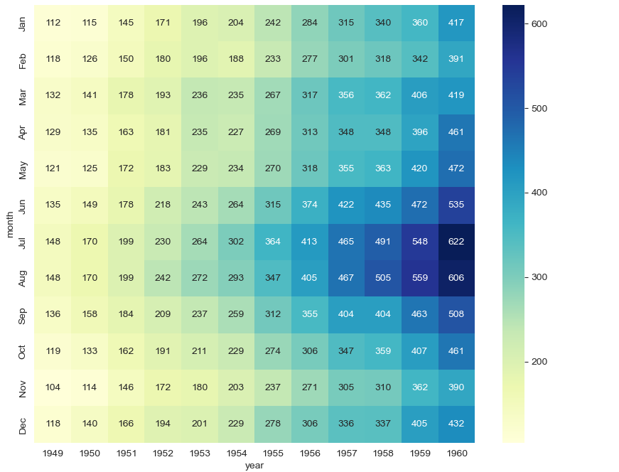
plt.figure(figsize=(10, 8))
sns.heatmap(flights, annot=True, fmt="d", cmap="YlGnBu")
plt.show()
예제4: iris data
pairplot
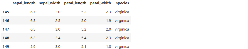
iris = sns.load_dataset("iris")
iris.tail()
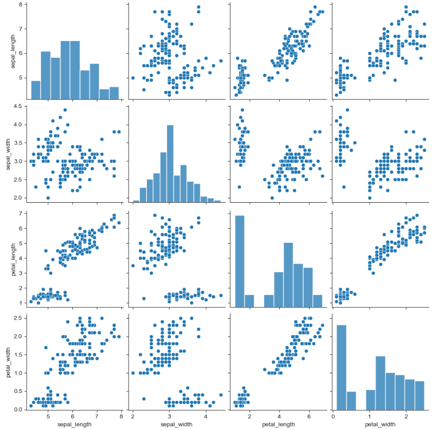
sns.set_style("ticks")
sns.pairplot(iris)
plt.show()
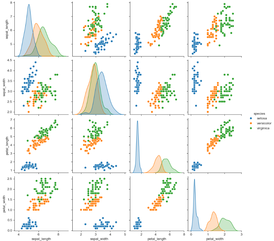
sns.pairplot(iris, hue="species")
plt.show()
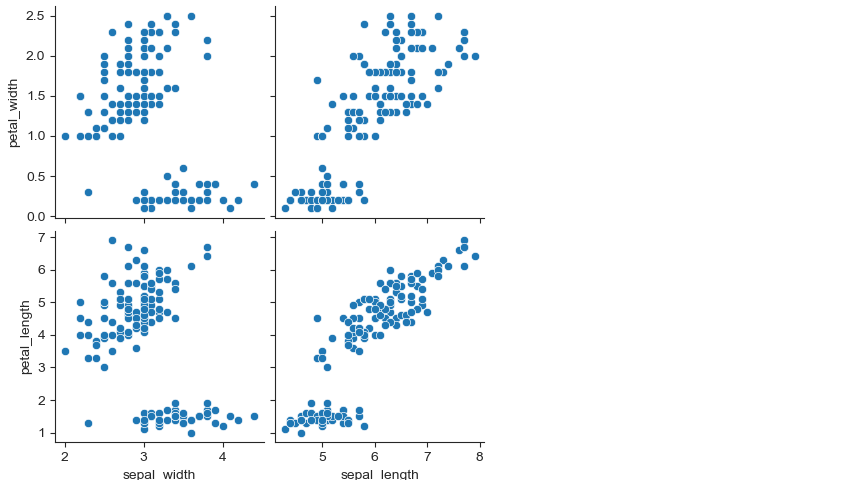
sns.pairplot(iris,
             x_vars=["sepal_width", "sepal_length"],
             y_vars=["petal_width", "petal_length"])
plt.show()
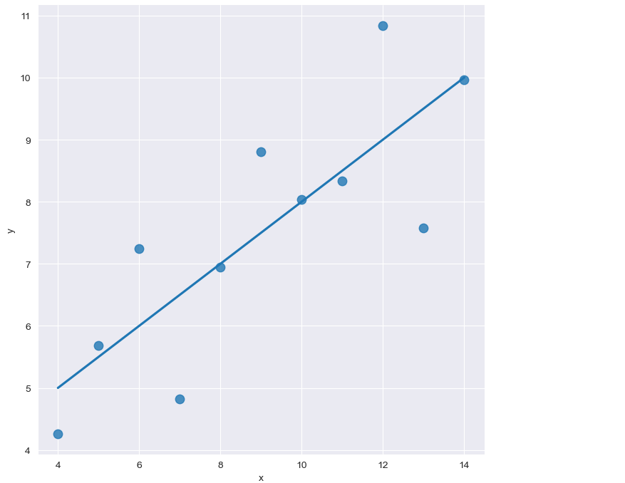
예제5: anscombe data
lmplot
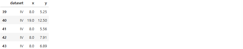
anscombe = sns.load_dataset("anscombe")
anscombe.tail()
sns.set_style("darkgrid")
sns.lmplot(x="x", y="y", data=anscombe.query("dataset == 'I'"), ci=None, height=7, scatter_kws={"s": 80})
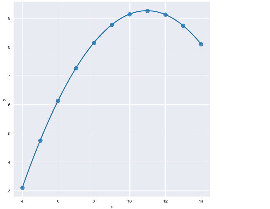
sns.set_style("darkgrid")
sns.lmplot(
    x="x",
    y="y",
    data=anscombe.query("dataset == 'II'"),
    order=2,
    ci=None,
    height=7,
    scatter_kws={"s": 80})
plt.show()
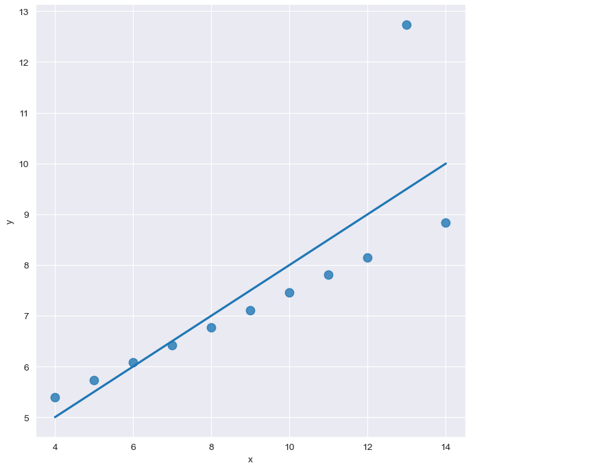
sns.set_style("darkgrid")
sns.lmplot(
    x="x",
    y="y",
    data=anscombe.query("dataset == 'III'"),
    ci=None,
    height=7,
    scatter_kws={"s": 80})
plt.show()
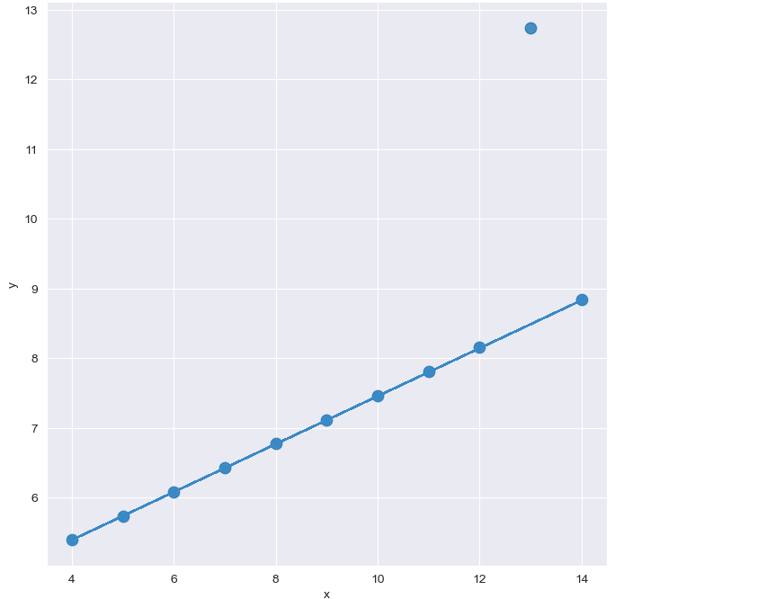
sns.set_style("darkgrid")
sns.lmplot(
    x="x",
    y="y",
    data=anscombe.query("dataset == 'III'"),
    robust=True,
    ci=None,
    height=7,
    scatter_kws={"s": 80})
plt.show()