들어가며
앱 화면에 시간이 걸리는 작업이 있는 경우에는 로딩화면을 구현해야 하는 경우가 있습니다. Flutter 에서는 CirculatProgressIndicator, LinearProgressIndicator를 통해서 로딩화면을 구현할 수 있습니다.
환경 구성
body에 Containe만 전달된 빈 화면을 우선 만들어줍니다.
import 'package:flutter/material.dart';
class Loading extends StatelessWidget {
const Loading({super.key});
Widget build(BuildContext context) {
return Scaffold(
appBar: AppBar(
title: Text('Loading'),
),
body: Container(),
);
}
}
CircularProgressIndicator
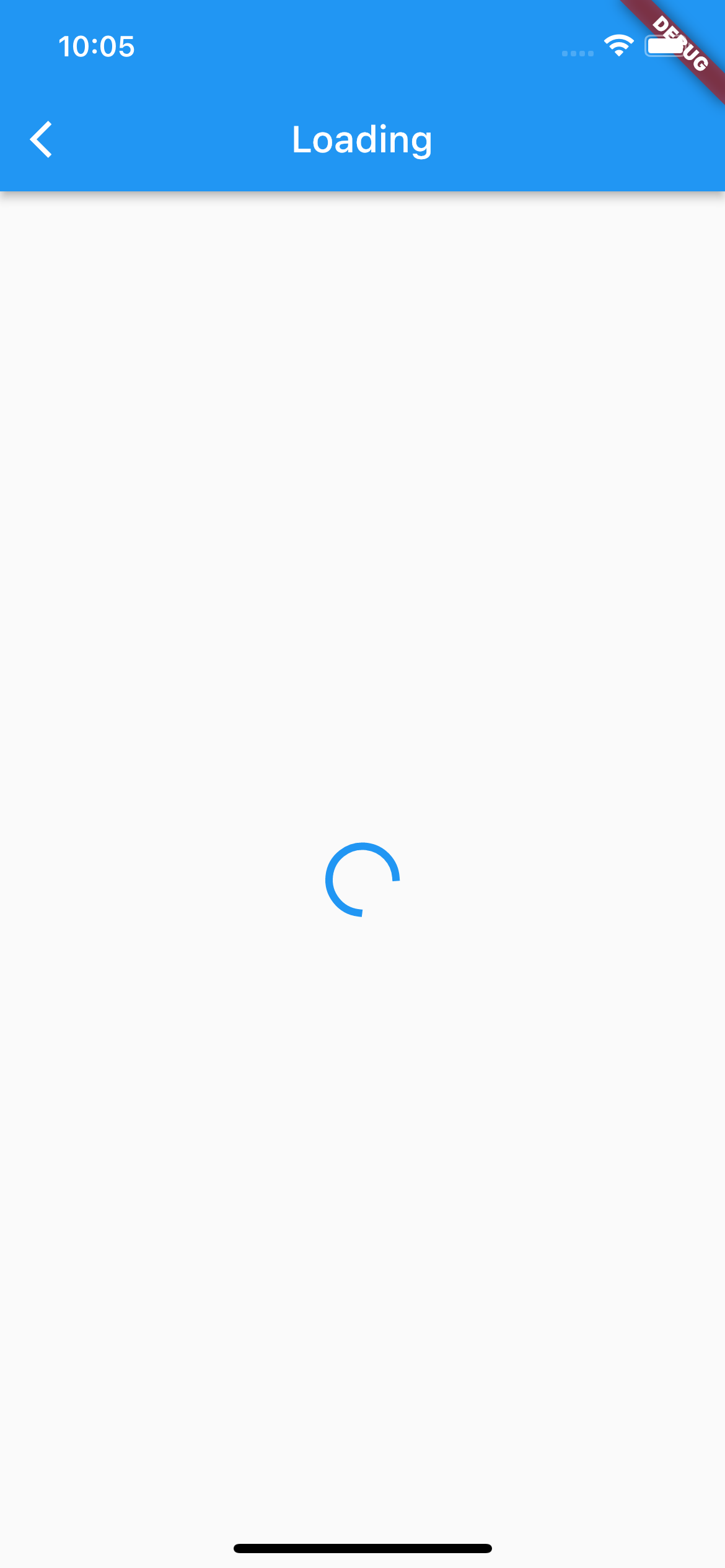
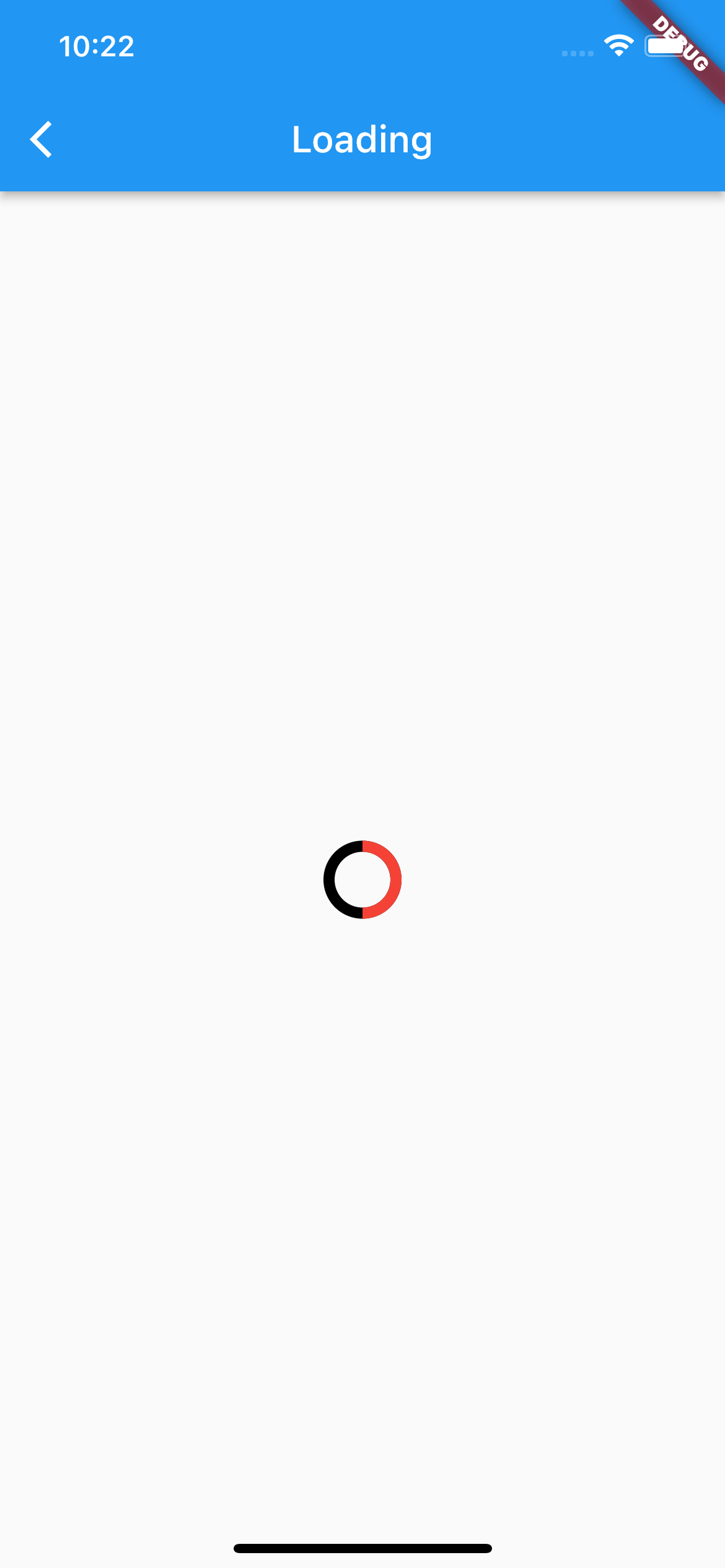
CircularProgressIndicator는 이름에서도 알 수 있듯이, 빙글빙글 도는 로딩 위젯입니다. 한번 눈으로 봐볼까요? Container 대신에 Center위젯을 넣고, child에 CircularProgressIndicator위젯을 넣어줍니다.
import 'package:flutter/material.dart';
class Loading extends StatelessWidget {
const Loading({super.key});
Widget build(BuildContext context) {
return Scaffold(
appBar: AppBar(
title: Text('Loading'),
),
body: Center(
child: CircularProgressIndicator(),
),
);
}
}
구글 스타일의 로딩위젯이 보일겁니다. 여기는 스크린샷이라서 정지되어있지만, 실제로는 계속해서 빙글빙글 돌아가는 로딩 위젯입니다. 디자인을 위한 아규먼트에 대해서 알아볼까요??
color
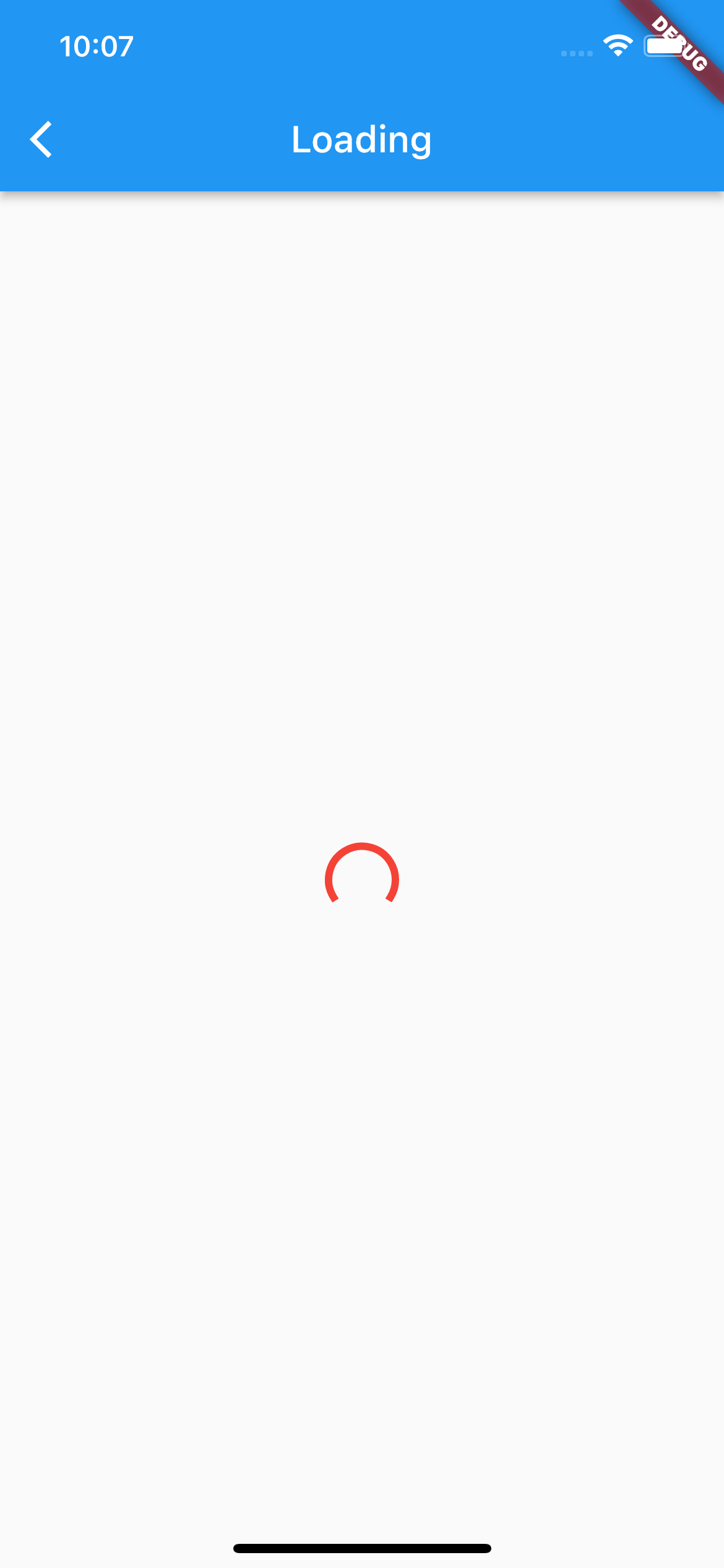
Color를 통해서 위젯의 색상을 바꿀 수 있습니다 ! 빨간색으로 바꿔볼까요?
...
),
      body: Center(
        child: CircularProgressIndicator(
          color: Colors.red,
        ),
      ),
...
value
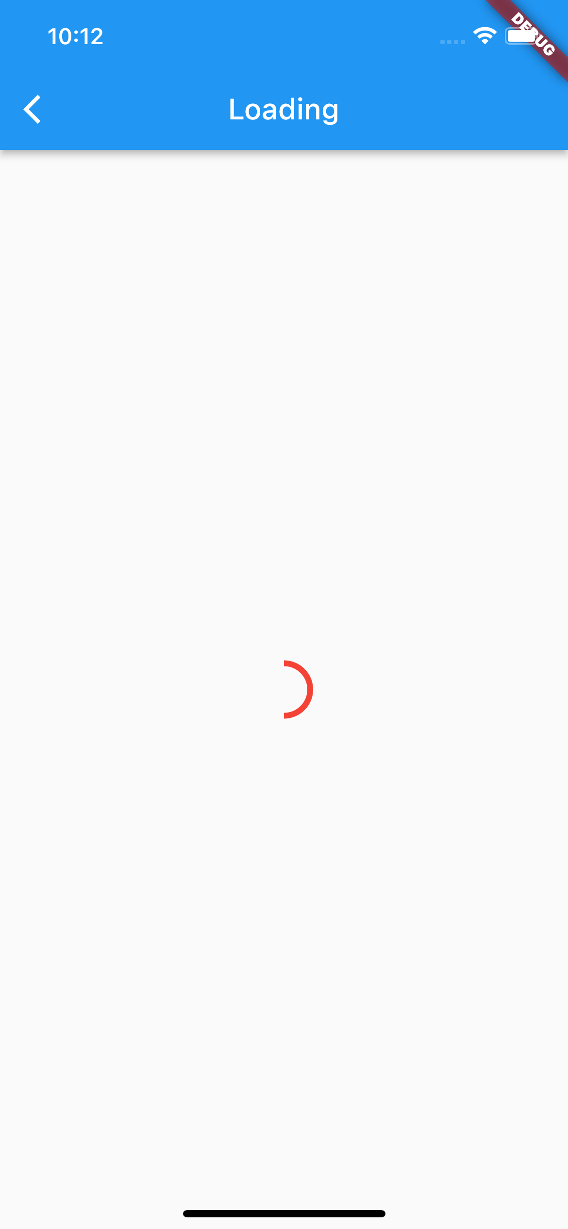
value를 통해서 진행상황을 표현할 수도 있습니다. double값으로 0.0은 0% 1.0은 100%의 원을 그릴 수 있어요. 0.5를 넣으면 절반만 보이겠죠? value를 잘 이용하면 업로드 상황 등을 표현할 수 있습니다.
...
body: Center(
        child: CircularProgressIndicator(
          color: Colors.red,
          value: 0.5,
        ),
      ),
...
backgroundColor
backgroundColor는 뒷 배경색, 즉 로딩 위젯이 지나가는 부분의 색을 지정할 수 있는 인자입니다. 검정색으로 바꾸면 검정색 줄이 생길겁니다.
...
body: Center(
        child: CircularProgressIndicator(
          backgroundColor: Colors.black
          color: Colors.red,
          value: 0.5,
        ),
      ),
...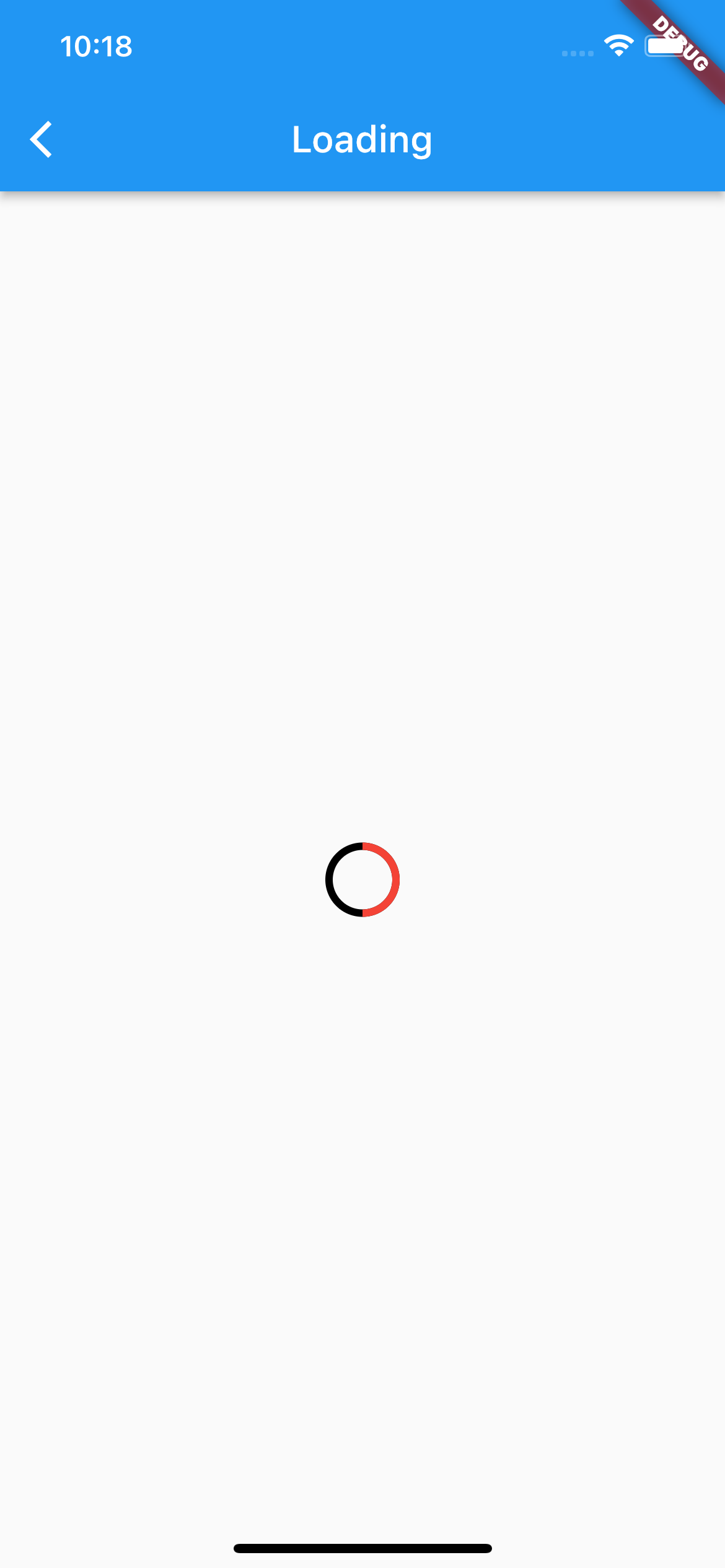
strokeWidth
strokeWidth는 로딩위젯의 굵기를 지정할 수 있습니다. 기본값은 4.0이지만, 6.0으로 바꾸면 더 굵은 로딩 위젯이 됩니다.
...
body: Center(
        child: CircularProgressIndicator(
          backgroundColor: Colors.black,
          color: Colors.red,
          value: 0.5,
          strokeWidth: 6.0,
        ),
      ),
...
value, valueColor
value, valueColor는 로딩위젯을 응용한 로딩 애니메이션을 구현할 수 있도록 해주는 인자입니다. 예시는 따로 하지 않겠습니다.
LinearProgressIndicator
LinearProgressIndicator는 이름 그대로 Circle이 아닌, 선형 로딩 위젯입니다. 선형적으로 표현하고 싶은 경우 사용할 수 있는 위젯이겠죠?
import 'package:flutter/material.dart';
class Loading extends StatelessWidget {
const Loading({super.key});
Widget build(BuildContext context) {
return Scaffold(
appBar: AppBar(
title: Text('Loading'),
),
body: Center(child: LinearProgressIndicator()),
);
}
}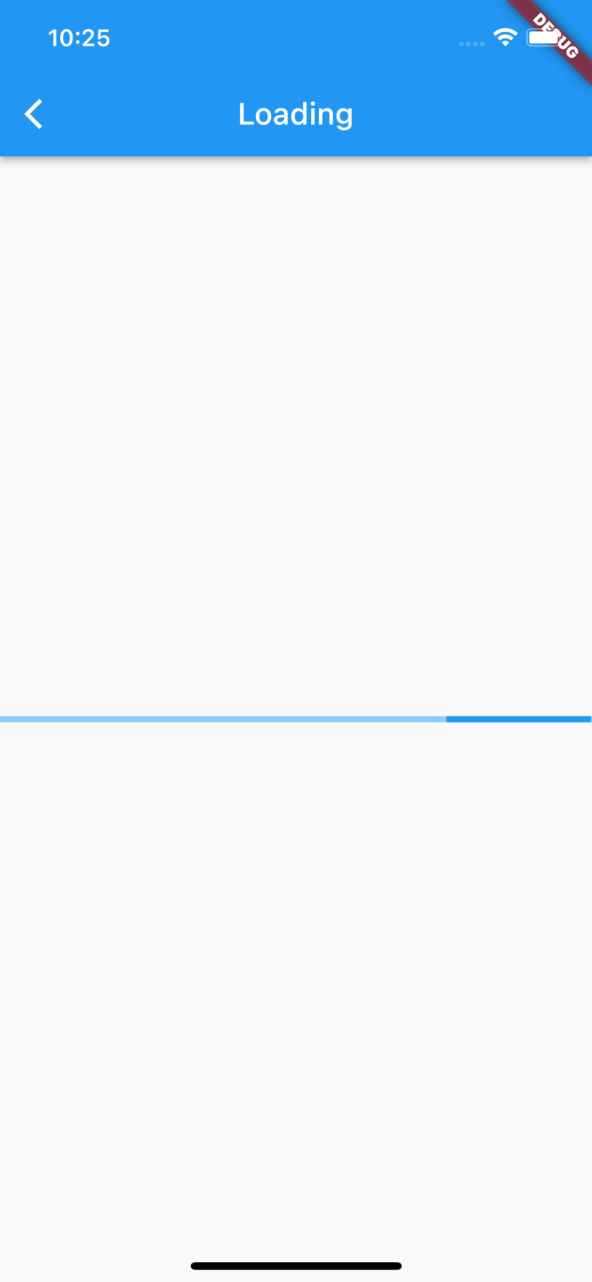
LinearProgressIndicator의 속성은 CircularProgressIndicator와 거의 동일합니다. 다만, strokeWidth가 아니라, minHeight로 굻기를 조정할 수 있습니다.
더 자세한 내용은 공식문서를 참고해주세요 !