
오늘의 목표
-
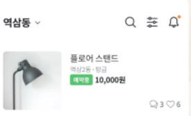
이런 화면을 만들어 봅시다.
- 오늘 사용할 친구들- appBar()
- 앱 상단 바를 만드는 역할을 합니다.
- Row() Column()
- Row 는 요소들을 가로 Column은 요소들을 세로로 정렬합니다.
- Container()
- appBar()
1. 머리(상단바)
 appBar: AppBar(
          backgroundColor: Colors.white,
          title: Text('역삼동', style: TextStyle(color: Colors.black), textAlign: TextAlign.left, ),
          actions: [Icon(Icons.search, color: Colors.black,)],
        ),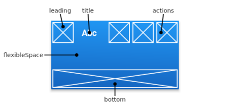
- backgroundColor 색상을 화이트톤으로 지정합니다.
- 기존은 하늘색톤 입니다. - textAlign
- 텍스트 정렬 방식을 지정합니다. - actions[]
- 대괄호가 사용됩니다. 대괄호 내부에 아이콘 요소들을 다양하게 추가할 수 있습니다.
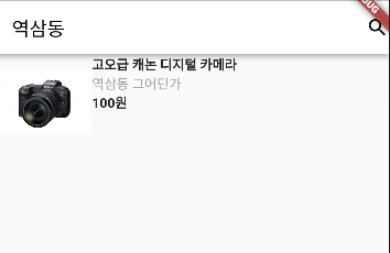
2. 몸통
body: Row(
              children: [
                Image.asset('assets/camera1.jpeg', width: 100),
                Container( height: 100,
                child: Column(
                  crossAxisAlignment: CrossAxisAlignment.start,
                  children: [
                    Text('고오급 캐논 디지털 카메라', style: TextStyle(fontWeight: FontWeight.bold),),
                    Text('역삼동 그어딘가', style: TextStyle(color: Colors.grey),),
                    Text('100원', style: TextStyle(fontWeight: FontWeight.bold),),
                  ],
                ),),
              ],
)-
왜 이렇게 작성했나!
- 레이아웃을 그려봅시다.
- 사진 부분과 설명 부분으로 쪼갤 수 있고, 가로 세로 방향이 명확하지요.
- 따라서 전체적으로 작성되는 방향은 가로지만, 텍스트 부분은 세로로 지정합니다.
- 상품 설명을 세로축 기준 왼쪽으로 정렬
- Row() 와 Column() 을 사용할때 어떤 요소들을 넣을지 잘 생각합시다.
-
빠진 것이 많지만 레이아웃 형태는 비슷하네요.
3. 하단바도 만들어보면 어떨까요.
- 하단바는 bottomNaigationBar를 사용해볼까요.
 bottomNavigationBar: BottomAppBar(
            child: Row(
              children: [
                Icon(Icons.home),
                Icon(Icons.bus_alert),
                Icon(Icons.linked_camera),
              ],
           ),
),-
문제점
- 하단바에 정렬되는 아이콘들은 가로 방향으로 정렬이 필요합니다.
- 그래서 정렬을 했더니 예쁘게 나오지가 않습니다.
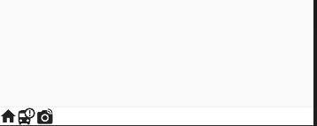
-
이렇게해볼까요
- Row() 정렬을 받는 요소들 그러니까 children() 에 있는 Icon 녀석들에게 새로운 정렬이 필요할 것 같습니다.
- mainAxisAlignment: MainAxisAlignment.spaceEvenly
bottomNavigationBar: BottomAppBar(
            child: Row(
              mainAxisAlignment: MainAxisAlignment.spaceEvenly,
              children: [
                Icon(Icons.home),
                Icon(Icons.bus_alert),
                Icon(Icons.linked_camera),
              ],
            ),
),- 균일한 폭을 유지하여 이쁘게 정렬되었습니다.


만드는 사람이 수고하면 쓰는 사람이 편하고 만드는 사람이 편하면 쓰는 사람이 수고롭다.