회사에서 뷰를 사용할 일이 있어 간단한 todolist를 이용해 공부를 하던 중 모달창을 구현하는 방법에 대해 알게 되었는데 자주 사용할 것 같아 정리해놓으려 한다.
참고로 여기서 사용하는 버전은 2버전이다.
공식 문서 링크 : https://v2.vuejs.org/v2/examples/modal
위의 링크에서 참고 코드를 이용하면 간단하게 모달창을 구현할 수 있다.
먼저 모달창을 위한 뷰 파일을 생성해주자.
AlertModal.vue생성
-
처음에는 Modal.vue라는 이름으로 파일을 생성했는데,
뷰에서 정의한 이름 지정 규칙 때문에 자꾸 에러가 발생해서 AlertModal이라는 이름으로 지정하였다. -
이름 지정 규칙은 아래의 링크를 참고하자
https://ko.vuejs.org/style-guide/rules-essential.html#use-multi-word-component-names
뷰 공식문서로 들어가면 아래처럼 소스코드가 뜨는데, 아래의 코드처럼 적용하자.
script 부분은 여기가 아닌 상위 컴포넌트에서 등록해주자.
<template>
    <transition name="modal">
        <div class="modal-mask">
          <div class="modal-wrapper">
            <div class="modal-container">

                <!-- 모달 헤더 -->
                <!-- 이 컴포넌트를 사용하는 상위 컴포넌트에서 slot부분을 재정의할 수 있음 -->
              <div class="modal-header">
                <slot name="header">
                  default header
                </slot>
              </div>

                <!-- 모달 바디 -->
              <div class="modal-body">
                <slot name="body">
                  default body
                </slot>
              </div>

                <!-- 모달 푸터 -->
              <div class="modal-footer">
                <slot name="footer">
                  default footer
                  <button class="modal-default-button" @click="$emit('close')">
                    OK
                  </button>
                </slot>
              </div>
            </div>
          </div>
        </div>
    </transition>
</template>


<style>
.modal-mask {
  position: fixed;
  z-index: 9998;
  top: 0;
  left: 0;
  width: 100%;
  height: 100%;
  background-color: rgba(0, 0, 0, 0.5);
  display: table;
  transition: opacity 0.3s ease;
}

.modal-wrapper {
  display: table-cell;
  vertical-align: middle;
}

.modal-container {
  width: 300px;
  margin: 0px auto;
  padding: 20px 30px;
  background-color: #fff;
  border-radius: 2px;
  box-shadow: 0 2px 8px rgba(0, 0, 0, 0.33);
  transition: all 0.3s ease;
  font-family: Helvetica, Arial, sans-serif;
}

.modal-header h3 {
  margin-top: 0;
  color: #42b983;
}

.modal-body {
  margin: 20px 0;
}

.modal-default-button {
  float: right;
}

/*
 * The following styles are auto-applied to elements with
 * transition="modal" when their visibility is toggled
 * by Vue.js.
 *
 * You can easily play with the modal transition by editing
 * these styles.
 */

.modal-enter {
  opacity: 0;
}

.modal-leave-active {
  opacity: 0;
}

.modal-enter .modal-container,
.modal-leave-active .modal-container {
  -webkit-transform: scale(1.1);
  transform: scale(1.1);
}

</style>
App.vue 또는 상위 컴포넌트
이제 모달창을 사용할 상위 컴포넌트에 모달을 사용하기 위한 코드를 추가해주자.
<template>
  <div class="inputBox shadow">
    <!-- 생략 -->

    <AlertModal v-if="showModal" @close="showModal = false">
        <!--
      you can use custom content here to overwrite!!!
      default content
    -->
        <template v-slot:header>
            경고!!!
            <i class="closeModalBtn fas fa-times" @click="showModal = false"></i>
        </template>

        <template v-slot:body>
            글을 입력해주세요
        </template>

        <template v-slot:footer>
            copyright : qkrmekem
        </template>
    </AlertModal>
  </div>
</template>

<script>
import AlertModal from './common/AlertModal.vue'


export default {


    // v-model : 뷰 인스턴스와 input박스의 값을 동적으로 매핑
    data: function(){
        return{
            newTodoItem: "",
            showModal: false
        }
    },
    methods: {
        addTodo: function(){
            if(this.newTodoItem !== ''){
				//생략
            }else{
                this.showModal = !this.showModal;
            }

        },
        clearInput: function(){
            this.newTodoItem = '';
        }
    },
    components: {
        AlertModal: AlertModal
    }
}
</script>- addTodo라는 메서드가 실행이 됐을 때,
newTodoItem의 값이 null이라면 showModal의 값을 true로 바꾼다.
AlertModal에서는 v-if를 이용해 showModal의 값에 따라 모달창을 띄우거나 닫는다.
이렇게 정의하면 아래처럼 모달창이 뜨는 것을 확인할 수 있다.
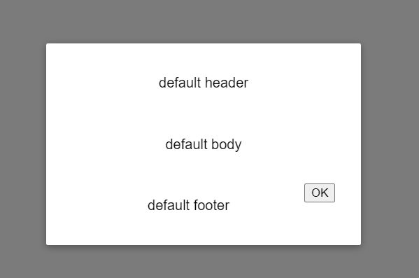
slot
뷰에서 제공하는 기능으로 컴포넌트의 특정 영역을 상위 컴포넌트에서 재정의할 수 있도록 지원한다.
아래의 코드는 slot을 이용해 모달의 각 slot을 재정의하고 있다.
AlertModal.vue
              <div class="modal-header">
                <slot name="header">
                  default header
                </slot>
              </div>
App.vue
        <template v-slot:header>
            경고!!!
            <i class="closeModalBtn fas fa-times" @click="showModal = false"></i>
        </template>
다시 모달창을 확인해보면
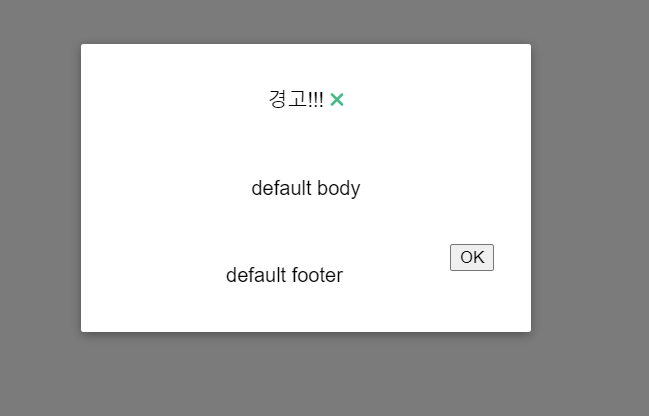
모달의 헤더부분만 재정의된 것을 확인할 수 있다.
- 여기서 재정의를 할 때 적용이되질 않아 헤맸는데, slot의 사용법이 아래와 같이 바뀌었다.
<template v-slot:header>
꾸준히 하자!