React Custom Component
이번 과제는 앞에서 배운 컴포넌트들을 직접 만들어 보는 시간이었다.
이번 과제를 직접 수행하면서 각각의 UI가 어떻게 작동하는지 확인할 수 있었다.

Modal.js
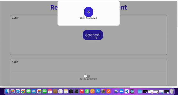
먼저 Modal 기능을 구현해 보았다.
먼저 css로 중앙에 오도록 한 다음, openModalHandler를 작성하였다.
그리고 ModalView컴포넌트와 ModalBackdrop컴포넌트를 작성하고 isOpen상태가 true일 경우에만 렌더링 해주었다.
import { useState } from 'react';
import styled from 'styled-components';
export const ModalContainer = styled.div`
display : flex;
justify-content : center;
align-items : center;
height : 100%;
position : relative;
`;
export const ModalBackdrop = styled.div`
position : fixed;
background-color : rgba(0,0,0,0.3);
top : 0;
left : 0;
right: 0;
bottom :0;
display:flex;
justify-content : center;
align-item :center;
`;
export const ModalBtn = styled.button`
background-color: var(--coz-purple-600);
text-decoration: none;
border: none;
padding: 20px;
color: white;
border-radius: 30px;
cursor: grab;
`;
export const ModalView = styled.div.attrs((props) => ({
// attrs 메소드를 이용해서 아래와 같이 div 엘리먼트에 속성을 추가할 수 있습니다.
role: 'dialog',
}))`
border-radius :1rem;
background-color : white;
flex-direction : column;
display : flex;
justify-content : center;
align-items:center;
width : 500px;
height : 200px;
margin-bottom :300px
>.close-button{
font-size:30px
color:grey;
margin:50px
}
`;
export const Modal = () => {
const [isOpen, setIsOpen] = useState(false);
const openModalHandler = () => {
setIsOpen(!isOpen)
};
return (
<>
<ModalContainer>
<ModalBtn onClick={openModalHandler}
>{isOpen ? 'opened!' : 'openMadal'}
</ModalBtn>{isOpen ?<ModalBackdrop onClick={openModalHandler}>
<ModalView>
<ModalBtn onClick={openModalHandler}> ×</ModalBtn>
<div className ='close-button' >Hello CodeStates!</div>
</ModalView>
</ModalBackdrop> : null}
</ModalContainer>
</>
);
};Toggle.js
토글에서는 Styled Components라이브러리를 활용하였다.
이번에는 토글 스위치가 부드럽게 옮겨지는 에니메이션 효과를 주기 위해 css의 transition 속성을 활용해 보았다.
import { useState } from 'react';
import styled from 'styled-components';

const ToggleContainer = styled.div`
  position: relative;
  margin-top: 8rem;
  left: 47%;
  cursor: pointer;

  > .toggle-container {
    width: 50px;
    height: 24px;
    border-radius: 30px;
    background-color: #8b8b8b;


  }> .toggle--checked {
    background-color : black;

  }

  > .toggle-circle {
    position: absolute;
    top: 1px;
    left: 1px;
    width: 22px;
    height: 22px;
    border-radius: 50%;
    background-color: #ffffff;

  } > .toggle--checked {
    left : 27px;
    transition : 0.1s;
  }
`;

const Desc = styled.div`

  text-align : center;
  > .switch-on{
    color:black;
  }
  > .switch-off{
    color:grey;
  }
`;

export const Toggle = () => {
  const [isOn, setisOn] = useState(false);

  const toggleHandler = () => {

    setisOn(!isOn)
  };

  return (
    <>
      <ToggleContainer onClick={toggleHandler}

      >

        <div className={`toggle-container ${isOn ? 'toggle--checked':''}`}/>
        <div className={`toggle-circle ${isOn ? 'toggle--checked':''}`} />
      </ToggleContainer>
      {isOn ?
      <Desc><div className='switch-on'>Toggle Switch ON</div></Desc>:
      <Desc><div className='switch-off'>Toggle Switch OFF</div></Desc>}
    </>
  );
};
Tab.js
탭에서는 map을 이용하여 li요소를 이용해 메뉴를 생성하고, 각 메뉴를 눌렀을 때 뷰가 전환되도록 selectMenuHandler함수를 작성하였다.
그리고 TabMenu를 클릭하면 Desc컴포넌트의 content의 내용이 content로 바뀌도록 하였다.
import { useState } from 'react';
import styled from 'styled-components';


const TabMenu = styled.ul`
  background-color: #dcdcdc;
  color: rgba(73, 73, 73, 0.5);
  font-weight: bold;
  display: flex;
  flex-direction: row;
  justify-items: center;
  align-items: center;
  list-style: none;
  margin-bottom: 7rem;

  .submenu {
    display : flex;
    justify-content:center;
    width:50px;
    height:20px;
    font-size:12px

  }

  .focused {
    backgroun-color:grey;
    color:white;
  }

  & div.desc {
    text-align: center;
  }
`;

const Desc = styled.div`
  text-align: center;
`;

export const Tab = () => {
  const [currentTab,setTab] = useState(0);

  const menuArr = [
    { name: 'Tab1', content: 'Tab menu ONE' },
    { name: 'Tab2', content: 'Tab menu TWO' },
    { name: 'Tab3', content: 'Tab menu THREE' },
  ];

  const selectMenuHandler = (index) => {

    setTab(index);
  };

  return (
    <>
      <div>
        <TabMenu>
                  {menuArr.map((tap,index)=>{
                    return(<li key={index} className={currentTab===index ? 'submenu focused':'submenu' }
                    onClick={()=>selectMenuHandler(index)}>{tap.name}</li>)
                  }) }
        </TabMenu>
        <Desc>
          <p>{menuArr[currentTab].content}</p>
        </Desc>
      </div>
    </>
  );
};
Tag.js
input창에 텍스트를 입력 후 Enter키를 누르면 태그가 추가되도록 하였고, 삭제 기능을 하는 메서드도 만들어 주었다.
import { useState } from 'react';
import styled from 'styled-components';
export const TagsInput = styled.div`
margin: 8rem auto;
display: flex;
align-items: flex-start;
flex-wrap: wrap;
min-height: 48px;
width: 480px;
padding: 0 8px;
border: 1px solid rgb(214, 216, 218);
border-radius: 6px;
> ul {
display: flex;
flex-wrap: wrap;
padding: 0;
margin: 8px 0 0 0;
> .tag {
width: auto;
height: 32px;
display: flex;
align-items: center;
justify-content: center;
color: #fff;
padding: 0 8px;
font-size: 14px;
list-style: none;
border-radius: 6px;
margin: 0 8px 8px 0;
background: var(--coz-purple-600);
> .tag-close-icon {
display: block;
width: 16px;
height: 16px;
line-height: 16px;
text-align: center;
font-size: 14px;
margin-left: 8px;
color: var(--coz-purple-600);
border-radius: 50%;
background: #fff;
cursor: pointer;
}
}
}
> input {
flex: 1;
border: none;
height: 46px;
font-size: 14px;
padding: 4px 0 0 0;
:focus {
outline: transparent;
}
}
&:focus-within {
border: 1px solid var(--coz-purple-600);
}
`;
export const Tag = () => {
const initialTags = ['CodeStates', 'kimcoding'];
const [tags, setTags] = useState(initialTags);
const removeTags = (indexToRemove) => {
let filterd = tags.filter((el,index)=>index!==indexToRemove);
setTags(filterd);
};
const addTags = (event) => {
let inputV= event.target.value;
if(event.key === 'Enter'&&!tags.includes(inputV)&&inputV!==''){
setTags([...tags,inputV]);
event.target.value='';
}
};
return (
<>
<TagsInput>
<ul id="tags">
{tags.map((tag, index) => (
<li key={index} className="tag">
<span className="tag-title">{tag}</span>
<span className="tag-close-icon" onClick={()=>removeTags(index)}>×
</span>
</li>
))}
</ul>
<input
className="tag-input"
type="text"
onKeyUp={(el) => addTags(el)}
placeholder="Press enter to add tags"
/>
</TagsInput>
</>
);
};
Autocomplete.js
자동완성 기능을 구현하는 게 가장 까다로웠는데, 페어분의 힘을 빌렸다.
state를 하나 더 만들어서 진행을 하였고, r을 입력하면 'rustic''refurbished'이 자동완성으로 나오록 하였고 키보드로 선택 할 수 있게 만들어 주었다.
import { useState, useEffect } from 'react';
import styled from 'styled-components';
const deselectedOptions = [
'rustic',
'antique',
'vinyl',
'vintage',
'refurbished',
'신품',
'빈티지',
'중고A급',
'중고B급',
'골동품'
];
const boxShadow = '0 4px 6px rgb(32 33 36 / 28%)';
const activeBorderRadius = '1rem 1rem 0 0';
const inactiveBorderRadius = '1rem 1rem 1rem 1rem';
export const InputContainer = styled.div`
margin-top: 8rem;
background-color: #ffffff;
display: flex;
flex-direction: row;
padding: 1rem;
border: 1px solid rgb(223, 225, 229);
border-radius: ${activeBorderRadius};
z-index: 3;
box-shadow: 0;
&:focus-within {
box-shadow: ${boxShadow};
}
> input {
flex: 1 0 0;
background-color: transparent;
border: none;
margin: 0;
padding: 0;
outline: none;
font-size: 16px;
}
> div.delete-button {
cursor: pointer;
}
`;
export const DropDownContainer = styled.ul`
background-color: #ffffff;
display: block;
margin-left: auto;
margin-right: auto;
list-style-type: none;
margin-block-start: 0;
margin-block-end: 0;
margin-inline-start: 0px;
margin-inline-end: 0px;
padding-inline-start: 0px;
margin-top: -1px;
padding: 0.5rem 0;
border: 1px solid rgb(223, 225, 229);
border-radius: 0 0 1rem 1rem;
box-shadow: ${boxShadow};
z-index: 3;
> li:hover {
background-color: lightgray;
}
> li {
padding: 0 1rem;
&.selected {
background-color: lightgray;
}
}
`;
export const Autocomplete = () => {
const [hasText, setHasText] = useState(false);
const [inputValue, setInputValue] = useState('');
const [options, setOptions] = useState(deselectedOptions);
const [sl, ssl] = useState(-1);
useEffect(() => {
if (inputValue === '') {
setHasText(false);
setOptions([]);
}
if(inputValue !== ''){
setOptions(deselectedOptions.filter((el) => {
return el.includes(inputValue)
})
)
}
}, [inputValue]);
const handleInputChange = (event) => {
setInputValue(event.target.value);
setHasText(true);
};
const handleDropDownClick = (clickedOption) => {
setInputValue(clickedOption)
};
const handleDeleteButtonClick = (event) => {
setInputValue("");
};
const handleKeyUp = (event) => {
if(hasText){
if(event.key === 'ArrowDown' && options.length - 1 > sl){
ssl(sl + 1);
}
if(event.key === 'ArrowUp' && sl >= 0){
ssl(sl - 1);
}
if(event.key === 'Enter' && sl >= 0){
handleDropDownClick(options[sl])
ssl(-1);
}
}
}
return (
<div className='autocomplete-wrapper'>
<InputContainer >
<input type="text"
value={inputValue}
defaultValue={inputValue}
onChange={handleInputChange}
onKeyUp={handleInputChange}>
</input>
<div className='delete-button'
onClick={handleDeleteButtonClick}
>×</div>
</InputContainer>
{hasText && <DropDown options={options}
handleComboBox={handleDropDownClick}
sl={sl}/>}
</div>
);
};
export const DropDown = ({ options, handleComboBox, sl }) => {
return (
<DropDownContainer>
{options.map((option, idx) => {
return <li
key={idx}
onClick={() => handleComboBox(option)}
className={sl === idx ? 'sl' : ''}
>{option}</li>
})}
</DropDownContainer>
);
};ClickToEdit.js
조건부 렌더링을 활용하여 Edit이 가능한 상태일 때 inputEdit컴포넌트를 불러주었고, 불가능한 상태일 때는 저장된 Value를 보여줄 수 있는 요소를 부르도록 하였다.
import { useEffect, useState, useRef } from 'react';
import styled from 'styled-components';

export const InputBox = styled.div`
  text-align: center;
  display: inline-block;
  width: 150px;
  height: 30px;
  border: 1px #bbb dashed;
  border-radius: 10px;
  margin-left: 1rem;
`;

export const InputEdit = styled.input`
  text-align: center;
  display: inline-block;
  width: 150px;
  height: 30px;
`;

export const InputView = styled.div`
  text-align: center;
  align-items: center;
  margin-top: 3rem;

  div.view {
    margin-top: 3rem;
  }
`;

export const MyInput = ({ value, handleValueChange }) => {
  const inputEl = useRef(null);
  const [isEditMode, setEditMode] = useState(false);
  const [newValue, setNewValue] = useState(value);

  useEffect(() => {
    if (isEditMode) {
      inputEl.current.focus();
    }
  }, [isEditMode]);

  useEffect(() => {
    setNewValue(value);
  }, [value]);

  const handleClick = () => {

    setEditMode(!isEditMode);
  };

  const handleBlur = () => {

    handleValueChange(newValue);
    setEditMode(false)
  };

  const handleInputChange = (e) => {

    setNewValue(e.target.value);

  };

  return (
    <InputBox>
      {isEditMode ? (
        <InputEdit
          type='text'
          value={newValue}
          ref={inputEl}
          onBlur={handleBlur}
          onChange={handleInputChange}

        />
      ) : (
        <span onClick={handleClick}

        >{newValue}</span>
      )}
    </InputBox>
  );
}

const cache = {
  name: '김코딩',
  age: 20
};

export const ClickToEdit = () => {
  const [name, setName] = useState(cache.name);
  const [age, setAge] = useState(cache.age);

  return (
    <>
      <InputView>
        <label>이름</label>
        <MyInput value={name} handleValueChange={(newValue) => setName(newValue)} />
      </InputView>
      <InputView>
        <label>나이</label>
        <MyInput value={age} handleValueChange={(newValue) => setAge(newValue)} />
      </InputView>
      <InputView>
        <div className='view'>이름 {name} 나이 {age}</div>
      </InputView>
    </>
  );
};