1-1 Welcome to Visualization (OT)
- 시각화는 다양한 요소가 포함된 Task
- 목적: 왜 시각화하는지
- 독자: 시각화 결과는 누구를 대상으로 하는지
- 데이터: 어떤 데이터를 시각화할 것 인지
- 스토리: 어떤 흐름으로 인사이트를 전달할 것인지
- 방법: 전달하고자 하는 내용에 맞게 효과적인 방법을 사용하는지
- 디자인: UI에서 만족스러운 디자인을 가지고 있는지
1-2 시각화의 요소
- 전주의적 속성
- 주의를 주지 않아도 인지하게 되는 요소
- 동시에 사용하면 인지하기 어려움
- 시각적으로 다양한 전주의적 속성이 존재
- 적적하게 사용될 때, 시각적 분리(visual pop-out)

1-3 Python과 Matplotlib(colab)
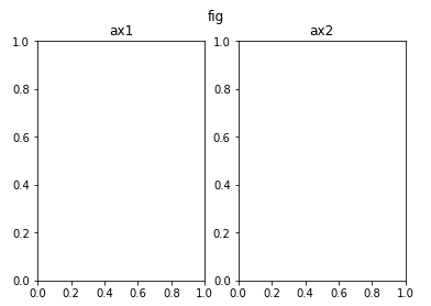
title, suptitle
fig = plt.figure()
ax1 = fig.add_subplot(1, 2, 1)
ax2 = fig.add_subplot(1, 2, 2)
ax1.set_title('ax1')
ax2.set_title('ax2')
fig.suptitle('fig')
plt.show()
xticks, xticklabels
fig = plt.figure()
ax = fig.add_subplot(111)
ax.plot([1, 1, 1], label='1')
ax.plot([2, 2, 2], label='2')
ax.plot([3, 3, 3], label='3')
ax.set_title('Basic Plot')
ax.set_xticks([0, 1, 2])
ax.set_xticklabels(['zero', 'one', 'two'])
ax.legend()
plt.show()
annotate
fig = plt.figure()
ax = fig.add_subplot(111)
ax.plot([1, 1, 1], label='1')
ax.plot([2, 2, 2], label='2')
ax.plot([3, 3, 3], label='3')
ax.set_title('Basic Plot')
ax.set_xticks([0, 1, 2])
ax.set_xticklabels(['zero', 'one', 'two'])
ax.annotate('This is Annotate', xy=(1, 2),
           xytext=(1.2, 2.2),
            arrowprops=dict(facecolor='black'),
           )
ax.legend()
plt.show()


2-1 Bar Plot 사용하기
- 범주에 따른 수치값을 비교하기에 적합한 방법
- 개별 비교, 그룹 비교 모두 적합
Multiple Bar Plot
- 플롯을 여러 개 그리는 방법
- 한 개의 플롯에 동시에 나타내는 방법
- 쌓아서 표현하는 방법(Stacked Bar, Percentage Stacked Bar) -> bottom keyword 사용
    fig, axes = plt.subplots(1, 2, figsize=(15, 7))
    group_cnt = student['race/ethnicity'].value_counts().sort_index()
    axes[0].bar(group_cnt.index, group_cnt, color='darkgray')
    axes[1].bar(group['male'].index, group['male'], color='royalblue')
    axes[1].bar(group['female'].index, group['female'], bottom=group['male'], color='tomato')
	for ax in axes:
    	ax.set_ylim(0, 350)
	plt.show()
- Percentage Stacked Bar -> left keyword 사용
   fig, ax = plt.subplots(1, 1, figsize=(12, 7))
   group = group.sort_index(ascending=False) # 역순 정렬
   total=group['male']+group['female'] # 각 그룹별 합
   ax.barh(group['male'].index, group['male']/total,
            color='royalblue')
   ax.barh(group['female'].index, group['female']/total,
            left=group['male']/total,
            color='tomato')
   ax.set_xlim(0, 1)
- ax.spines[s].set_visible : 테두리 설정
   for s in ['top', 'bottom', 'left', 'right']:
        ax.spines[s].set_visible(False)
   plt.show()
- 겹쳐서 표현하는 방법(Overlapped Bar)
- 이웃에 배치하여 표현하는 방법(Grouped Bar)
Principle Of Proportion Ink
- 실제 값과 그에 표현되는 그래픽으로 표현되는 잉크 양은 비례해야 함
- 반드시 x축의 시작은 zero
- 막대그래프에만 한정되는 원칙은 아니다!
데이터 정렬하기
- 데이터 종류에 따라 다음 기준으로
- 시계열 | 시간순
- 수치형 | 크기순
- 순서형 | 범주의 순서대로
- 명목형 | 범주의 값 따라 정렬
- 여러 가지 기준으로 정렬을 하여 패턴을 발견
- 대시보드에서는 Interactive로 제공하는 것이 유용
적절한 공간 활용
- 여백과 공간만 조정해도 가독성이 높아진다
- matplotlib의 bar plot은 ax에 꽉차서 살짝 답답함
X/Y axis Limit(.set_xlim(), .set_ylim())
Spines(.spines[spine].set_visible())
Gap(width)
Legend(.legend())
Margins(.margins())
복잡함과 단순함
- 필요없는 복잡함(3D)은 No
- 무엇을 보고 싶은가? / 시각화를 보는 대상이 누구인가?
- 정확한 차이(EDA)
- 큰 틀에서 비교 및 추세 파악
- 축과 디테일 등의 복잡함
ETC
- 오차막대(uncertainty) 추가
- Bar 사이 gap이 0 이라면 -> 히스토그램
- 다양한 Text 정보 활용하기(title, xlabel, ylabel)


2-2 Line Plot 사용하기
5개 이하의 선을 사용하는 것을 추천
- 더 많은 선은 중첩으로 인한 가독성 하락
구별하는 요소
- 색상(color)
- 마커(marker, markersize)
- 선의 종류(linestyle, linwidth)
- smoothing: noise의 인지적인 방해를 줄이기 위해 사용
추세에 집중
보간
scipy.interpolate.make_interp_spline()scipy.interpolate.interp1d()scipy.ndinmage.gaussian_filter1d()- 일반적인 분석에서는 지양할 것
이중 축(dual axis)
twinx()fig, ax1 = plt.subplots(figsize=(12, 7), dpi=150) # First Plot color = 'royalblue' ax1.plot(google.index, google['close'], color=color) ax1.set_xlabel('date') ax1.set_ylabel('close price', color=color) ax1.tick_params(axis='y', labelcolor=color) # Second Plot ax2 = ax1.twinx() color = 'tomato' ax2.plot(google.index, google['volume'], color=color) ax2.set_ylabel('volume', color=color) ax2.tick_params(axis='y', labelcolor=color) ax1.set_title('Google Close Price & Volume', loc='left', fontsize=15) plt.show()ticks 색 변경
ax.tick_ylabel(color=color)
ax.tick_params(labelcolor=color)
.secondary_xaxis(),.secondary_yaxis()def deg2rad(x): #윗쪽 축 return x * np.pi / 180 def rad2deg(x): #아래쪽 축 return x * 180 / np.pi fig, ax = plt.subplots() x = np.arange(0, 360) y = np.sin(2 * x * np.pi / 180) ax.plot(x, y) ax.set_xlabel('angle [degrees]') ax.set_ylabel('signal') ax.set_title('Sine wave') secax = ax.secondary_xaxis('top', functions=(deg2rad, rad2deg)) secax.set_xlabel('angle [rad]') plt.show()
ETC
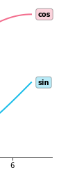
- 범례대신 라인 끝 단에 레이블을 추가하면 식별에 도움
ax.text(x[-1]+0.1, y1[-1], s='sin', fontweight='bold', va='center', ha='left', bbox=dict(boxstyle='round,pad=0.3', fc='#1ABDE9', ec='black', alpha=0.3))- Min/Max 정보(또는 원하는 포인트)는 추가해주면 도움이 될 수 있음
# max
ax.plot([-1, x[np.argmax(y)]], [np.max(y)]*2,
        linestyle='--', color='tomato')
ax.scatter(x[np.argmax(y)], np.max(y),
            c='tomato',s=50, zorder=20)
# min
ax.plot([-1, x[np.argmin(y)]], [np.min(y)]*2,
        linestyle='--', color='royalblue')
ax.scatter(x[np.argmin(y)], np.min(y),
            c='royalblue',s=50, zorder=20)
plt.show()
- 보다 연한 색을 사용하여 uncertainty 표현 가능(신뢰구간, 분산 등)


2-3 Scatter Plot 사용하기
- variation
- 색(color)
- 모양(marker)
- 크기(size)
- 목적
- 상관관계 확인
- 군집
- 값 사이의 차이
- 이상치
- Over-ploting: 점이 많아질 수록 점의 분포를 파악하기 어려움
1. 투명도조정
- 지터링
- 2차원 히스토그램
- Contour plot
- 점의 요소와 인지
- 색
- 마커: 거의 구별하기 힘들다 + 크기가 고르지 않음
- 크기: 구별하기는 쉽지만, 오용하기 쉬움 / 관계보다는 비율에 초점

인공지능 꿈나무