3-1 Text 사용하기(colab)
bbox
ax.text(bbox=dict(boxstyle='round', facecolor='wheat',
				alpha=0.4, edgecolor='black', pad = 1))


legend
ax.legend(
    title='Gender',
    shadow=True,
    labelspacing=1.2,
    loc='lower right',
    bbox_to_anchor=[1.2, 0.5],
    ncol=2)

Ticks & text
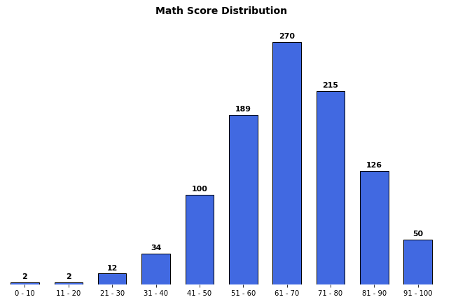
ax.set(frame_on=False) # 테두리 제거
ax.set_yticks([]) # yticks 제거
ax.set_xticks(np.arange(len(math_grade)))
ax.set_xticklabels(math_grade.index)
ax.set_title('Math Score Distribution', fontsize=14, fontweight='semibold')
# text 찍기
for idx, val in math_grade.iteritems():
    ax.text(x=idx, y=val+3, s=val,
            va='bottom', ha='center',
            fontsize=11, fontweight='semibold'
           )
plt.show()
annotate
bbox = dict(boxstyle="round", fc='wheat', pad=0.2)
arrowprops = dict(
    arrowstyle="->")
ax.annotate(s=f'This is #{i} Studnet',
            xy=(student['math score'][i], student['reading score'][i]),
            xytext=[80, 40],
            bbox=bbox,
            arrowprops=arrowprops,
            zorder=9)

3-2 Color 사용하기(colab)
색상대비
color bar
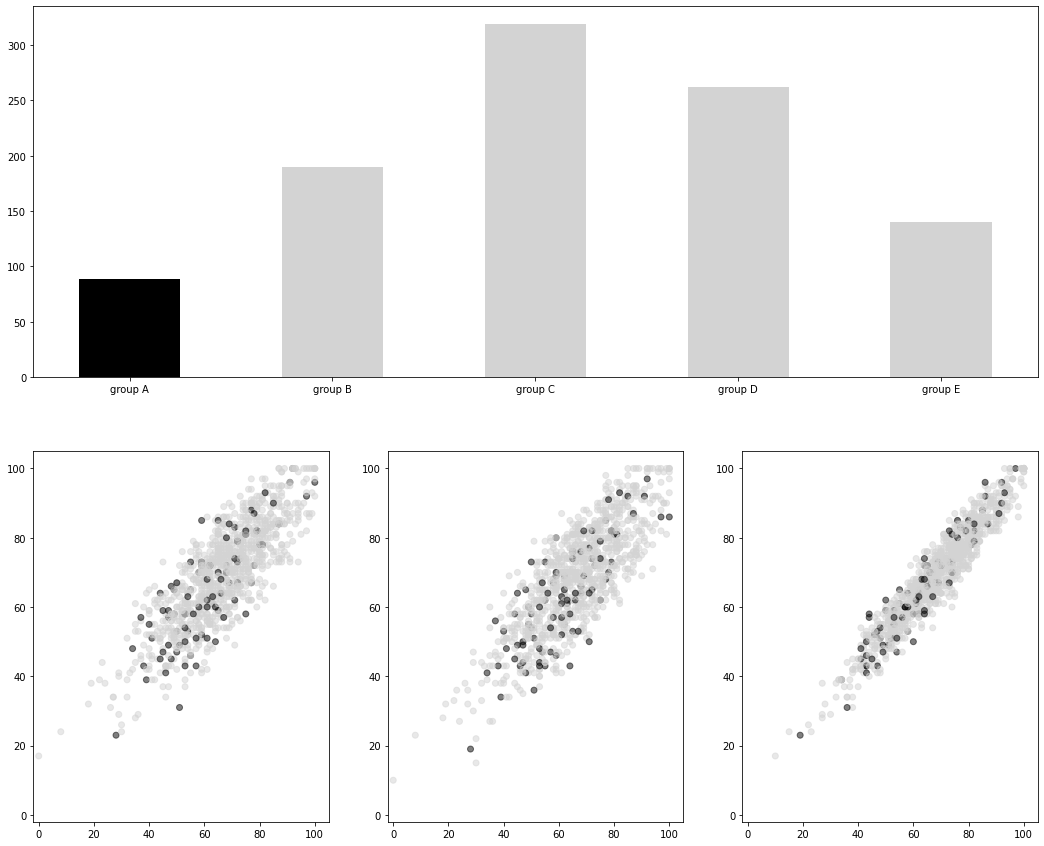
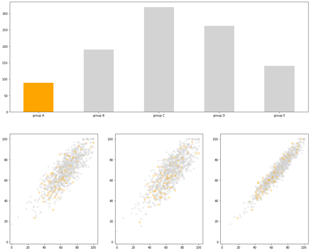
for idx, cm in enumerate(qualitative_cm_list):
    pcm = axes[idx].scatter(student_sub['math score'], student_sub['reading score'],
                     c=student_sub['color'], cmap=ListedColormap(plt.cm.get_cmap(cm).colors[:5])
                     )
    cbar = fig.colorbar(pcm, ax=axes[idx], ticks=range(5))
    cbar.ax.set_yticklabels(groups)
    axes[idx].set_title(cm)
heatmap / 연속형
from matplotlib.colors import TwoSlopeNorm
diverging_cm_list = ['PiYG', 'PRGn', 'BrBG', 'PuOr', 'RdGy', 'RdBu',
            'RdYlBu', 'RdYlGn', 'Spectral', 'coolwarm', 'bwr', 'seismic']
fig, axes = plt.subplots(3, 4, figsize=(20, 15))
axes = axes.flatten()
# 평균값을 기준으로 왼쪽/오른쪽 각각 0~1사이로 정규화
offset = TwoSlopeNorm(vmin=0, vcenter=student['reading score'].mean(), vmax=100)
student_sub = student.sample(100)
for idx, cm in enumerate(diverging_cm_list):
    pcm = axes[idx].scatter(student['math score'], student['reading score'],
                            c=offset(student['math score']), # 0~1사이의 값
                            cmap=cm,) # color map
    cbar = fig.colorbar(pcm, ax=axes[idx],
                        ticks=[0, 0.5, 1],
                        orientation='horizontal')
    cbar.ax.set_xticklabels([0, student['math score'].mean(), 100])
    axes[idx].set_title(cm)
plt.show()
특정부분 강조를 위한 색상대비
- 명도대비
- 채도대비
- 보색대비


3-3 Facet 사용하기(colab)
NxM subplots
plt.subplot()plt.figure()+fig.add_subplot()plt.subplots()fig.add_grid_spec()fig.subplot2grid()ax.inset_axes()make_axes_locatable(ax)
figure color
fig.set_facecolor('lightgray')
dpi: dots per inch
- 기본해상도: 100
- 높은 해상도 300정도
- 값이 높아질 수록 시각화 속도가 느려짐
- 저장:
fig.saveifg('file_name', dpi=300)
sharex, sharey
- 1
fig = plt.figure()
ax1 = fig.add_subplot(121)
ax1.plot([1, 2, 3], [1, 4, 9])
ax2 = fig.add_subplot(122, sharey=ax1)
ax2.plot([1, 2, 3], [1, 2, 3])
plt.show()
- 2
fig, axes = plt.subplots(1, 2, sharey=True)
squeeze / flatten
axes.flatten()
aspect
y축 길이/x축 길이
grid spec
fig = plt.figure(figsize=(8, 5))
gs = fig.add_gridspec(3, 3) # make 3 by 3 grid (row, col)
ax = [None for _ in range(5)]
-
ax[0] = fig.add_subplot(gs[0, :])
ax[0].set_title('gs[0, :]')
-
ax[1] = fig.add_subplot(gs[1, :-1])
ax[1].set_title('gs[1, :-1]')
-
ax[2] = fig.add_subplot(gs[1:, -1])
ax[2].set_title('gs[1:, -1]')
-
ax[3] = fig.add_subplot(gs[-1, 0])
ax[3].set_title('gs[-1, 0]')
-
ax[4] = fig.add_subplot(gs[-1, -2])
ax[4].set_title('gs[-1, -2]')
-
for ix in range(5):
    ax[ix].set_xticks([])
    ax[ix].set_yticks([])
-
plt.tight_layout()
plt.show()
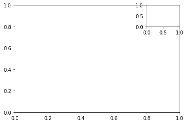
insert_axes
fig, ax = plt.subplots()
axin = ax.inset_axes([0.8, 0.8, 0.2, 0.2]) # x, y, dx, dy
plt.show()

3-4 More Tips(colab)
Grid
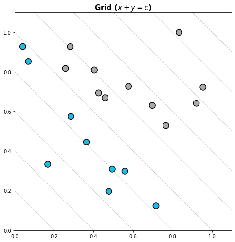
- x + y = c
fig = plt.figure(figsize=(16, 7))
ax = fig.add_subplot(1, 1, 1, aspect=1)
-
ax.scatter(x, y, s=150,
           c=['#1ABDE9' if xx+yy < 1.0 else 'darkgray' for xx, yy in zip(x, y)],
           linewidth=1.5,
           edgecolor='black', zorder=10)
-
## Grid Part
x_start = np.linspace(0, 2.2, 12, endpoint=True)
-
for xs in x_start:
    ax.plot([xs, 0], [0, xs], linestyle='--', color='gray', alpha=0.5, linewidth=1)
-
ax.set_xlim(0, 1.1)
ax.set_ylim(0, 1.1)
-
ax.set_title(r"Grid ($x+y=c$)", fontsize=15,va= 'center', fontweight='semibold')
-
plt.tight_layout()
plt.show()
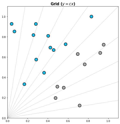
- y=cx
radian = np.linspace(0, np.pi/2, 11, endpoint=True)
for rad in radian:
    ax.plot([0,2], [0, 2*np.tan(rad)], linestyle='--', color='gray', alpha=0.5, linewidth=1)
동심원
rs = np.linspace(0.1, 0.8, 8, endpoint=True)
for r in rs:
    xx = r*np.cos(np.linspace(0, 2*np.pi, 100))
    yy = r*np.sin(np.linspace(0, 2*np.pi, 100))
    ax.plot(xx+x[2], yy+y[2], linestyle='--', color='gray', alpha=0.5, linewidth=1)
    ax.text(x[2]+r*np.cos(np.pi/4), y[2]-r*np.sin(np.pi/4), f'{r:.1}', color='gray')
Line & Span
ax.axvspan(0,0.5, color='red')
ax.axhspan(0,0.5, color='green')
spine
ax.spines['top'].set_visible()ax.spines['top'].set_linewidth()ax.spines['top'].set_position()set_positionax.spines['left'].set_position('center') ax.spines['bottom'].set_position('center')
- 중심부분 이외에도 이동가능
'center' -> ('axes', 0.5) # 축(화면) 기준'zero' -> ('data', 0.0) # 데이터 기준
mpl.rc
plt.rcParams['lines.linewidth'] = 2plt.rcParams['lines.linestyle'] = ':'plt.rcParams['figure.dpi'] = 150- 동일
plt.rc('lines', linewidth=2, linestyle=':')- 디폴트
plt.rcParams.update(plt.rcParamsDefault)
theme
print(mpl.style.available)
mpl.style.use('seaborn')
- with 구문
with plt.style.context('fivethirtyeight'):
    plt.plot(np.sin(np.linspace(0, 2 * np.pi)))


4-2 Seaborn 기초(colab)
counterplot
sns.countplot(x='race/ethnicity',data=student,
              hue='gender',
              order=sorted(student['race/ethnicity'].unique()))
violinplot
- bw: 분포 표현을 얼마나 자세하게 보여줄 것인가 (scott/silverman/float)
- cut: 끝 부분을 얼마나 자를 것인가(float, 0추천)
- inner: 내부를 어떻게 표현할 것인가(box/quartile/point/stick/None, quartile추천)
- ETC
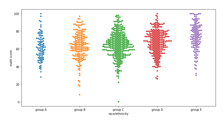
- swarmplot
distribution
- ecdfplot: 누적밀도함수
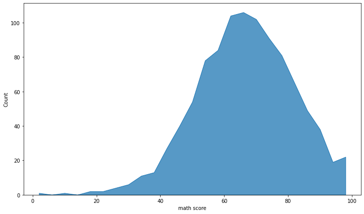
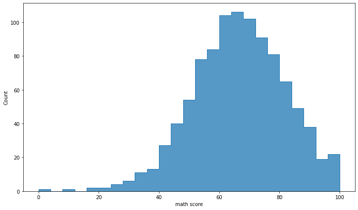
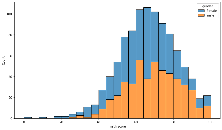
- histplot
sns.histplot(x='math score', data=student, element='poly')sns.histplot(x='math score', data=student, element='step')- multiple
multiple = 'stack'
그 외: layer, dodge, stack, fill
- kdeplot
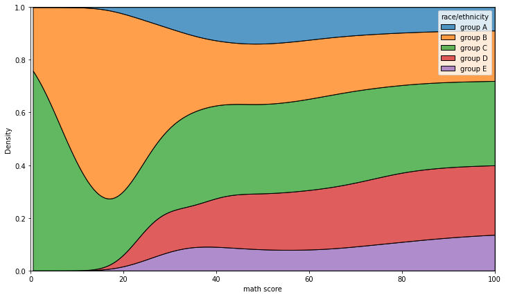
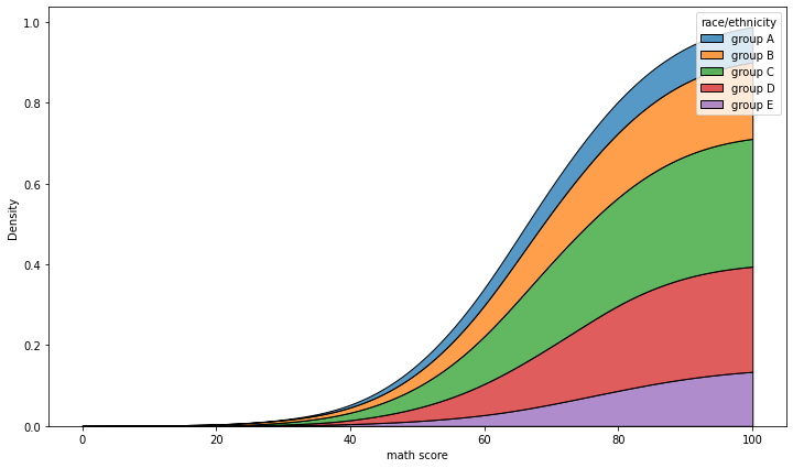
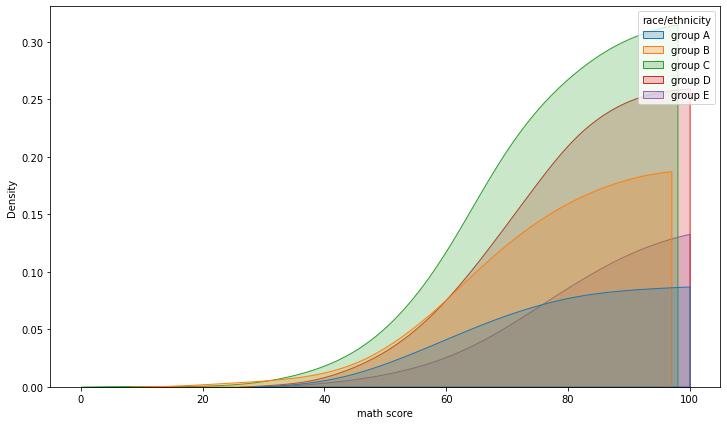
bw_method: 얼마나 데이터의 분포로 표현할지multiple: layer / stack /fillcumulative: 누적
* fill
- stack
- layer
- ecdfplot
complementary: 0부터 시작할지 1부터 시작할지stat: 'count'/'proportion'
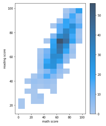
- Bivariate Distribution
- histplot
  sns.histplot(x='math score', y='reading score',
             data=student)
- kdeplot
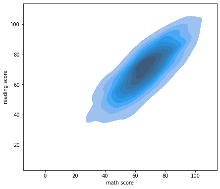
sns.kdeplot(x='math score', y='reading score',
             data=student, fill=True)
- regplot
order: 회귀선 차수logx: log 회귀선x_estimator=np.mean: 평균 막대x_bins: 포인트 수
- heatmap
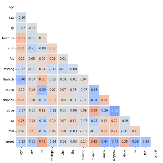
vmin=-1, vmax=1, center=0: 상관계수를 편하게 볼 수 있음square=True: 정사각형linewidth=0.1: 경계선annot=True, fmt='.2f': annotationnumpy.triu_indices_from(arr, k=0): arr의 상위 삼각에 대한 인덱스를 반환mask = np.zeros_like(heart.corr()) # mask[np.triu_indices_from(mask)] = True #상위삼각인덱싱 sns.heatmap(heart.corr(), ax=ax, vmin=-1, vmax=1, center=0, cmap='coolwarm', annot=True, fmt='.2f', linewidth=0.1, square=True, cbar=False, mask=mask )
4-3 Seaborn 심화(colab)
figure-level 시각화
joint
sns.jointplot(x='math score', y='reading score',data=student,
#               hue='gender',
            kind='kde', # { “scatter” | “kde” | “hist” | “hex” | “reg” | “resid” },
#               fill=True
           )
pair
kind: hist 등 모양corner: True / False 하삼각행렬의 plot만 시각화Facetgrid
- catplot
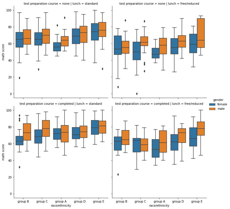
      sns.catplot(x="race/ethnicity", y="math score", hue="gender", data=student,
                kind='box', col='lunch', row='test preparation course')
- displot
sns.displot(x="math score", hue="gender", data=student,
		col='race/ethnicity', # kind='kde', fill=True
        col_order=sorted(student['race/ethnicity'].unique()))
- relplot
sns.relplot(x="math score", y='reading score', hue="gender", data=student,
	col='lunch')


인공지능 꿈나무