이번에 typescript를 배우면서 혼자 토이 프로젝트를 진행하는데 UI가 남들에게 보여줄 수 없을 정도로 너무 구리다....;; 😭😭😭(보여줬는데 다들 웃음 ㅜㅜ)
따라 진행 중인 토이 프로젝트를 엎고 UI는 pinterest등을 참고하고 엎은 김에 더 많은 기능들을 구현해보고 싶은 생각이 들었다. 시작과 동시에 css작업 도중 생각보다 시간이 많이 걸린다..
따라서 핫한 flex와 grid를 완벽하게 잡아보고자 정리한다.
🍀 시작하기 앞서...
flex를 이용하여 수직 가운데 정렬을 line-height로 많이 했다고 하는데 flex를 이용하면서 편해진게 많다고 한다!! flex에 대해서 알아보자!!
flex는 크게 부모 요소인 container와 container안에 존재하는 items과 상호작용을 한다.
그리고 부모 요소인 container에 속성을 지정함으로써 item들을 원하는대로 배치할 수 있다.
용어
- 부모 요소(container): 아래 그림에서
container로item들을 감싸고 있는 큰 영역을 말한다. - 자식 요소(item): 아래 그림에서 item으로 화살표가 가리켜 진 곳으로 색깔이 칠해진 요소를 뜻한다.
- main axis(메인축): 수학 시간에 배운 것을 떠 올려보면 x축인 횡이
main axis(메인 축)에 해당한다. - cross axis(교차축): y축에 해당하며
cross axis(교차 축)이라 한다.
<해당 그림은 이해관계를 돕기 위해 container의 height, padding에 값을 주고 수직정렬한 것이다>
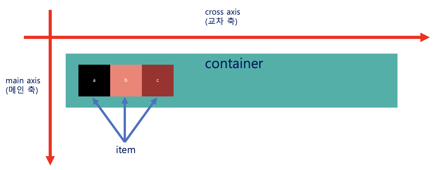
flex에 대해서 알아보기 전에 용어들을 확실히 하기 위해 그림을 첨부했다. 또한 더 들어가기전에 중요한 요점을 짚고 넘어가자면 아래와 같다.
💡 컨테이너의 설정에 따라 item들의 배치를 조절할 수 있다.
이 말은 즉, item 요소들을 배치하기 위해서는 container에 배치에 대한 정보를 명시를 해야한다는 것이다.
🍀 컨테이너에 적용할 수 있는 요소
display: flex
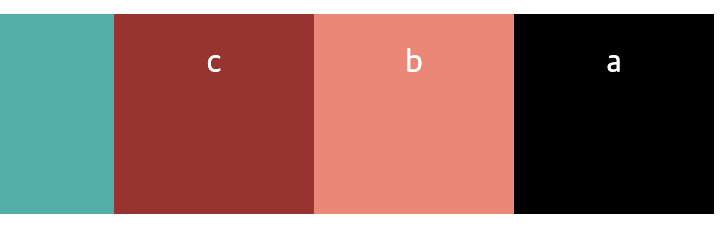
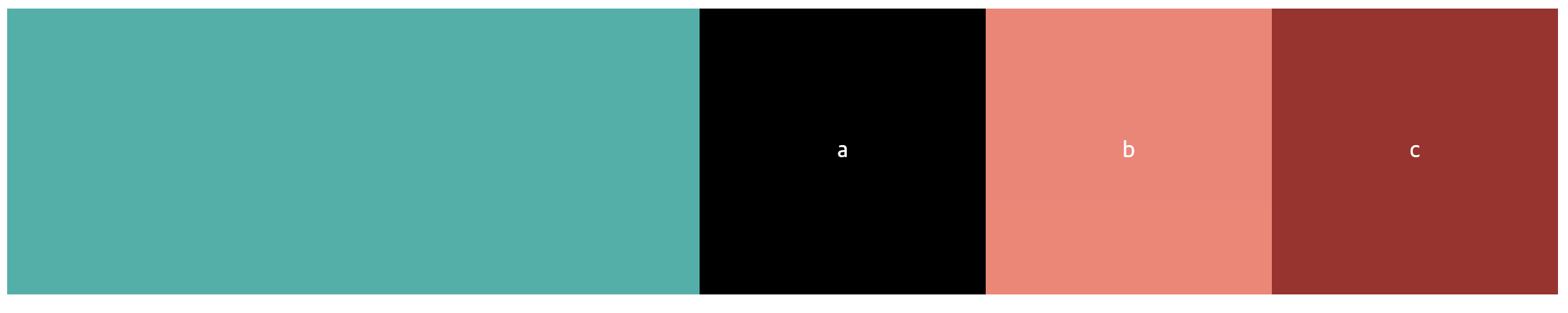
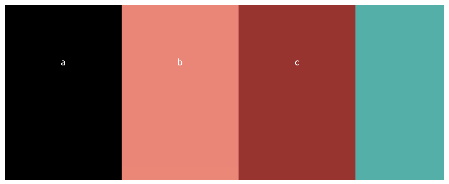
이해를 돕기 위해 아래 그림에서 각 item들 안에 있는 text인 a, b, c는 item들의 내용물이라 정의하면 flex를 적용했을 때 넓이와 높이는 아래와 같이 적용된다.
- 넓이: 각 item들은 item들의
내용물의 넓이 만큼만 가지게 된다. - 높이: 각 item들의 높이는
자동으로 container의 높이와 같게 설정된다

code
div.container>div.item*3을 하면 간편하게 만들 수 있다.
<!-- index.html -->

<div class="container">
  <div class="item">a</div>
  <div class="item">b</div>
  <div class="item">c</div>
</div>
.container {
display: flex;
background-color: lightseagreen;
height: 50px; /* 1️⃣ */
}
.item {
background-color: salmon;
color: white;
text-align: center; /* 2️⃣ */
line-height: 50px; /* 3️⃣ */
}
.item:first-child {
background-color: black;
color: white;
}
.item:last-child {
background-color: brown;
color: white;
}📒 1️⃣에 보면 container의 높이를 50px로 지정해 준 만큼 item들의 높이가 50px로 변했으며 각 아이템들의 넓이는 내용물이 차지하는 넓이만큼만 차지하게된다.
2️⃣와 3️⃣은 내용물인 text를 횡축, 종축을 가운데로 맞춰주기 위함이다.
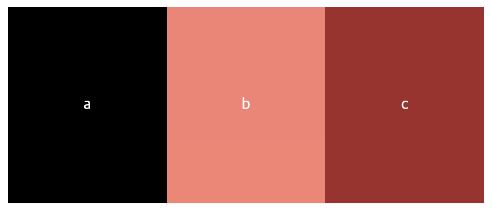
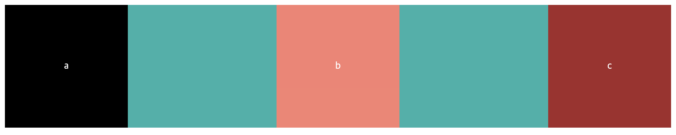
display: inline-flex
inline-flex는 flex와 비슷하지만 요소들이 inline-block처럼 동작한다고 생각하면 쉽다. 위의 flex에서는 container의 넓이가 화면 끝까지였지만 inline-flex는 item들을 합친 넓이와 일치하게 된다. 아래 그림을 보면 c 내용물을 포함한 item의 오른쪽에 container의 배경색이 없는 것을 볼 수 있다.

code
모든 코드는 위의 flex코드와 같으며 display속성만 다르다
.container {
  display: inline-flex;
  ...//
}
flex-direction
flex-direction은 축의 기준과 역순 유무에 따른 배치를 할 수 있다.
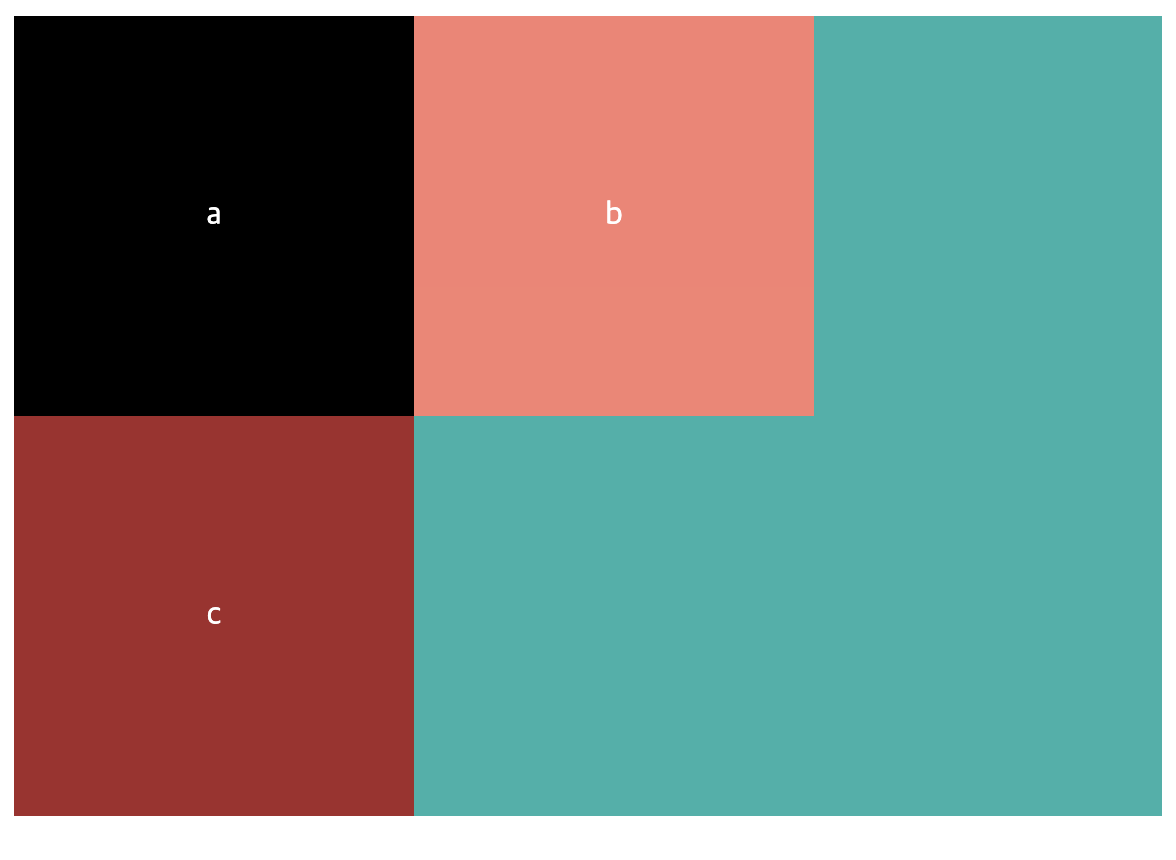
- column: item들이
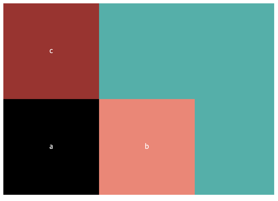
cross axis를 기준으로 나란히 배치된다. - column-reverse: colum과 비슷하지만 item들이
cross axis를 기준으로 역순으로 배치된다. - row: 기본 값
- row-reverse:
main axis를 기준으로 역순으로 배치된다.
column
code
.container{
  flex-direction: column;
}
column-reverse
code
.container{
  flex-direction: column-reverse;
}
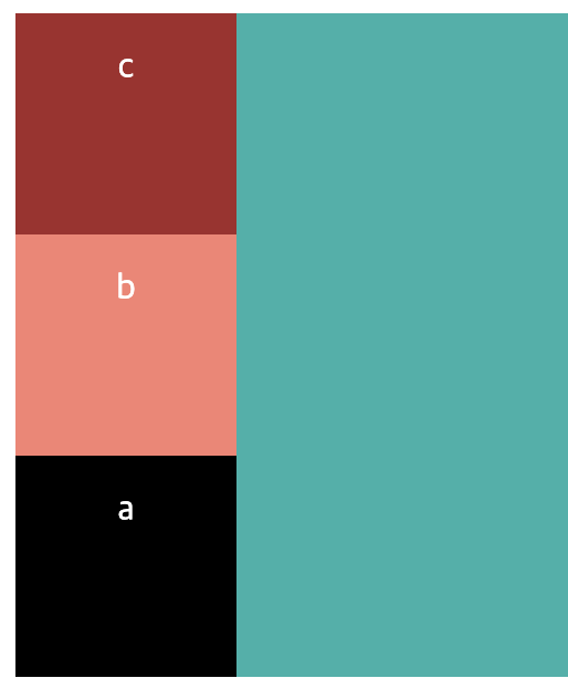
📒 item들이 cross axis를 기준으로 역순 배치됨을 볼 수 있다.
row-reverse
code
.container{
  flex-direction: row-reverse;
}
📒 item들이
main axis를 기준으로 container의 맨 오른쪽에 역순 배치됨을 볼 수 있다.
flex-wrap
item들이 container의 영역을 벗어날 때 어떻게 처리 해주는지에 대한 속성이다.
- nowrap: 기본 값
- wrap: 잘린 요소들을 밑으로 정렬한다.
- wrap-reverse: 잘린 요소를 위로 정렬한다.
code
.item {
  ...//
  width: 200px;
  height: 200px;
  text-align: center;
  line-height: 200px;
}
📒 시각적으로 편하게 보기 위해 width와 height값을 바꿨다.
아래 wrap에 관한 속성들이 잘 적용되는지 확인하기 위해 browser창을 줄여보자.
nowrap
code
.container {
  display: flex;
  flex-wrap: nowrap;
}
📒 nowrap은 container영역을 넘어서게 되면 item에 width와 height를 설정했어도 모든 item의 너비를 합친 값은 container의 넓이를 넘지 못한다. 즉, (container의 넓이 < 각 item들의 넓이의 합)이라면 모든 item들의 넓이는 균일하게 줄어든다. 그림에서는 정사각형으로 설정했지만 넓이가 줄은 것으로 알 수 있다.
wrap
code
.container {
  display: flex;
  flex-wrap: wrap;
}
📒 c가 b옆에 놓이면 container영역 밖으로 튀어나오기 때문에 내용이 c인 item은 밑으로 정렬된 것을 볼 수 가 있으며, item이 밑으로 내려가 container의 height도 바뀜을 알 수 있다.
wrap-reverse
code
.container {
  display: flex;
  flex-wrap: wrap;
}
📒 wrap과 달리 잘리는 마지막 요소인 c는 위로 정렬이 된다.
flex-flow
flow-flow는 flex-direction속성과 flex-wrap속성을 한 번에 지정할 수 있다.
flex-flow: [flex-direction value][flex-wrap value]
flex-flow: row-reverse wrap아이템 정렬
이제는 아이템을 정렬하는 방법을 알아보자.
일단, 아이템을 정렬하기 위해서는 기준이 필요한데 여기서의 기준은 위에서 언급한 main axis와 cross axis가 기준이 된다.
- justify-content: main axis를 기준으로 정렬한다.
- align-items: cross axis를 기준으로 정렬한다.
💡 여기서 진짜 중요한 key-point는 flex-direction이 row인지 column인지에 따라서 축이 바뀐다는 것이다. 즉, flex-direction: column일 때는 justify-content -> align-items, align-items -> justify-content와 같이 동작한다.
justify-content
justify-content는 flex-direction: row일 때 main axis를 기준으로 정렬하고 flex-direction: column일 때 cross axis를 기준으로 정렬한다.
justify-content values
- flex-start(default value):
기본 값으로 main axis기준으로 왼쪽으로 정렬된다. - flex-end: item들이 우측 정렬된다.
- center: item들이 가운데 정렬된다.
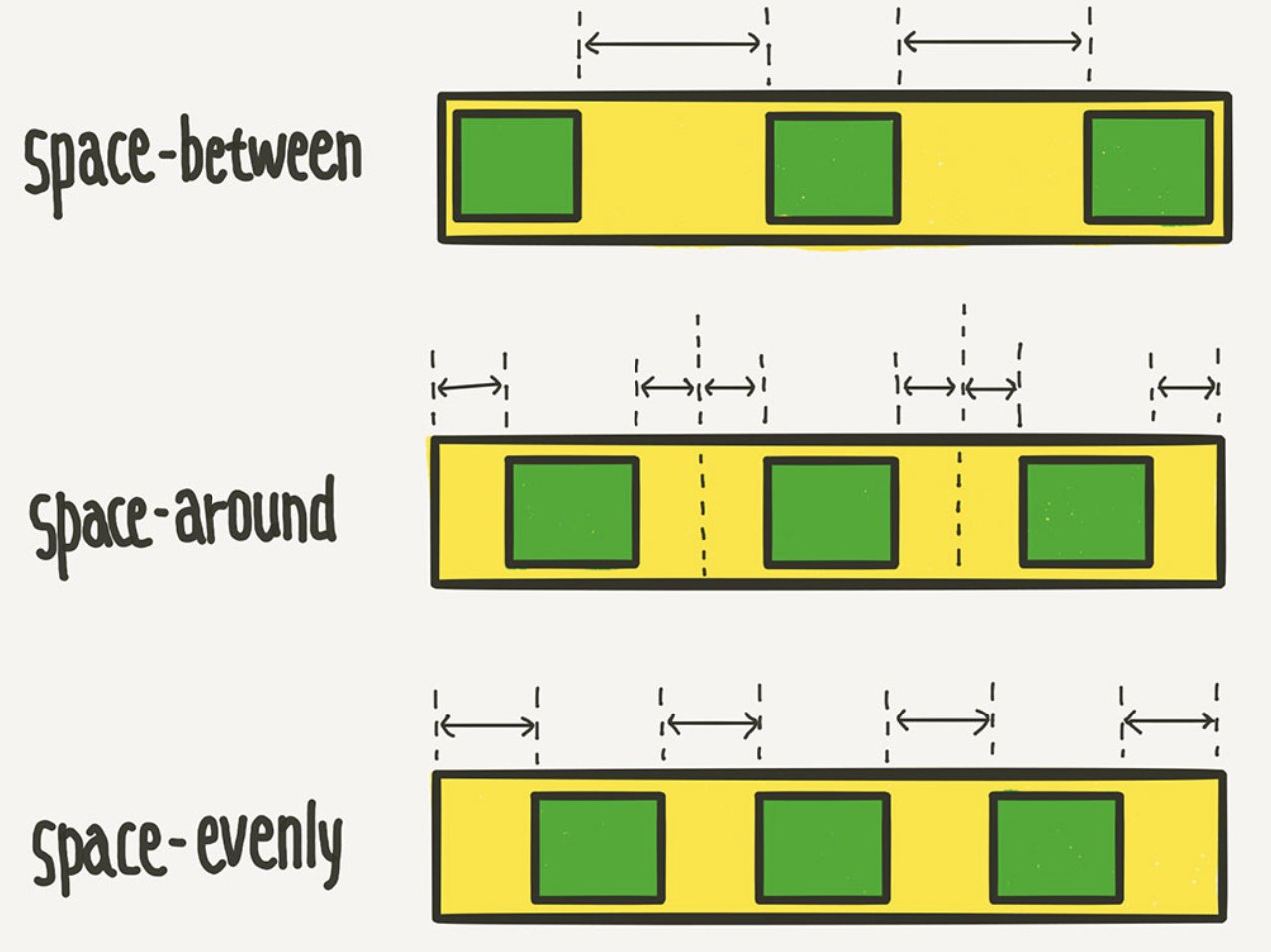
- space-between: 각 item들 사이의 간격이 동일하게 정렬된다.
- space-around: 각 item의 양쪽의 넓이가 동일하게 정렬된다.
- space-evenly: container와 item사이와 각 item들의 사이의 간격이 동일하게 적용된다.
flex-start, flex-end, center는 잘 알고 있었지만 space-*는 헷갈려서 이미지를 첨부했다.
👉🏻 Ⅰ) flex-end
main axis를 기준으로 우측 정렬한다.
code
.container {
  display: flex;
  flex-wrap: wrap;
  justify-content: flex-end;   /* 👈 */
  background-color: lightseagreen;
}
👉🏻 Ⅱ) center
main axis를 기준으로 가운데 정렬한다.
code
.container {
  display: flex;
  flex-wrap: wrap;
  justify-content: center;   /* 👈 */
  background-color: lightseagreen;
}
👉🏻 Ⅲ) space-between
.container {
  display: flex;
  flex-wrap: wrap;
  justify-content: space-between;   /* 👈 */
  background-color: lightseagreen;
}
👉🏻 Ⅳ) space-around
.container {
  display: flex;
  flex-wrap: wrap;
  justify-content: space-around;   /* 👈 */
  background-color: lightseagreen;
}
👉🏻 Ⅴ) space-evenly
.container {
  display: flex;
  flex-wrap: wrap;
  justify-content: space-evenly;   /* 👈 */
  background-color: lightseagreen;
}
align-items
align-items는 flex-direction: row일 때 cross axis를 기준으로 정렬하고 flex-direction: column일 때 main axis를 기준으로 정렬한다.
align-items values
stretch(default value): 기본 값으로 cross axis를 기준으로 container의 높이만큼 쭉 늘어난다.
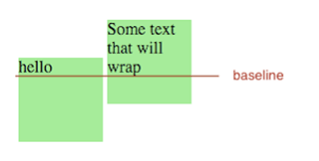
baseline: item들을 text(내용물) baseline을 기준으로 정렬한다. -> 직관적으로 이해가 가지 않으므로 밑에 그림으로 첨부
flex-start: item들이 상단으로 정렬된다.
flex-end: item들이 하단으로 정렬된다.
center: item들이 가운데 정렬된다.
flex-start, flex-end, center는 위에서 배운 justify-content와 똑같으므로, stretch와 baseline에 대해서만 정리했다.
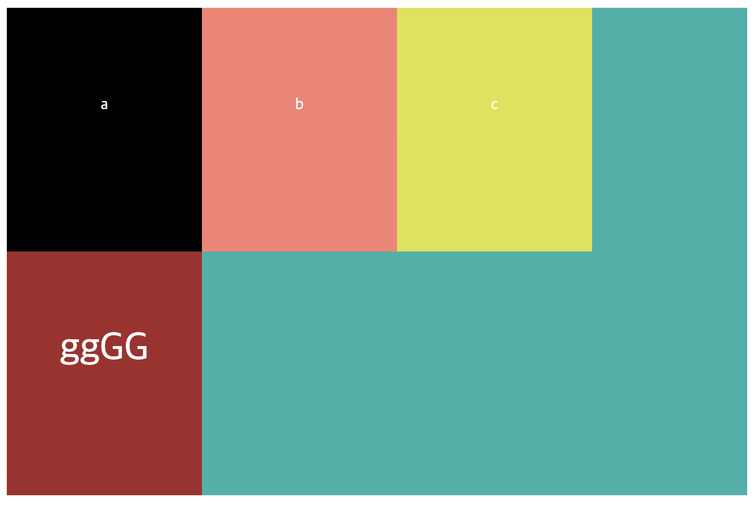
👉🏻 Ⅰ) strectch
strectch를 적용하려고 했는데 item들의 height를 지정시 container의 height만큼 늘어나지 않았다... 이유는 item의 height를 지정해버리면 stretch속성과 관련없이 자기 자신의 높이를 유지하기 때문이다. 따라서 stretch를 적용하기 위해 수정된 code는 아래와 같다.
modified code
.container {
  display: flex;
  align-items: stretch;
  height: 300px;  /* 👈 container의 높이를 item들의 높이보다 높게 설정했다. */
  background-color: lightseagreen;
}

.item {
  background-color: salmon;
  color: white;
  width: 200px;
  /* heigth: 200px; */ 👈 주석처리
  text-align: center;
  line-height: 200px;
}
📒 Stretch는 item들의 height가 container의 height만큼 쭉 늘어난 것을 볼 수 있다.
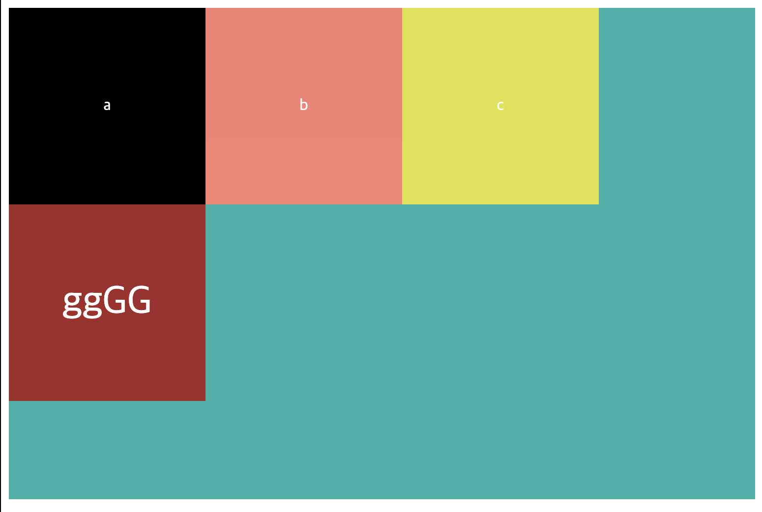
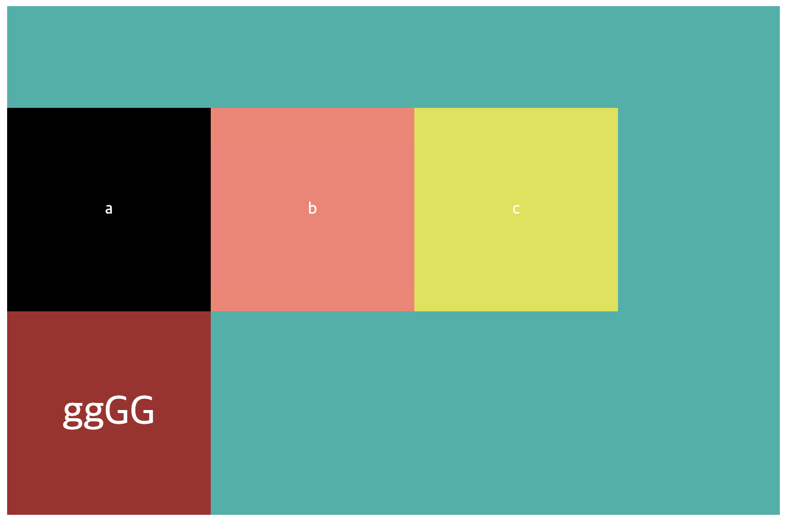
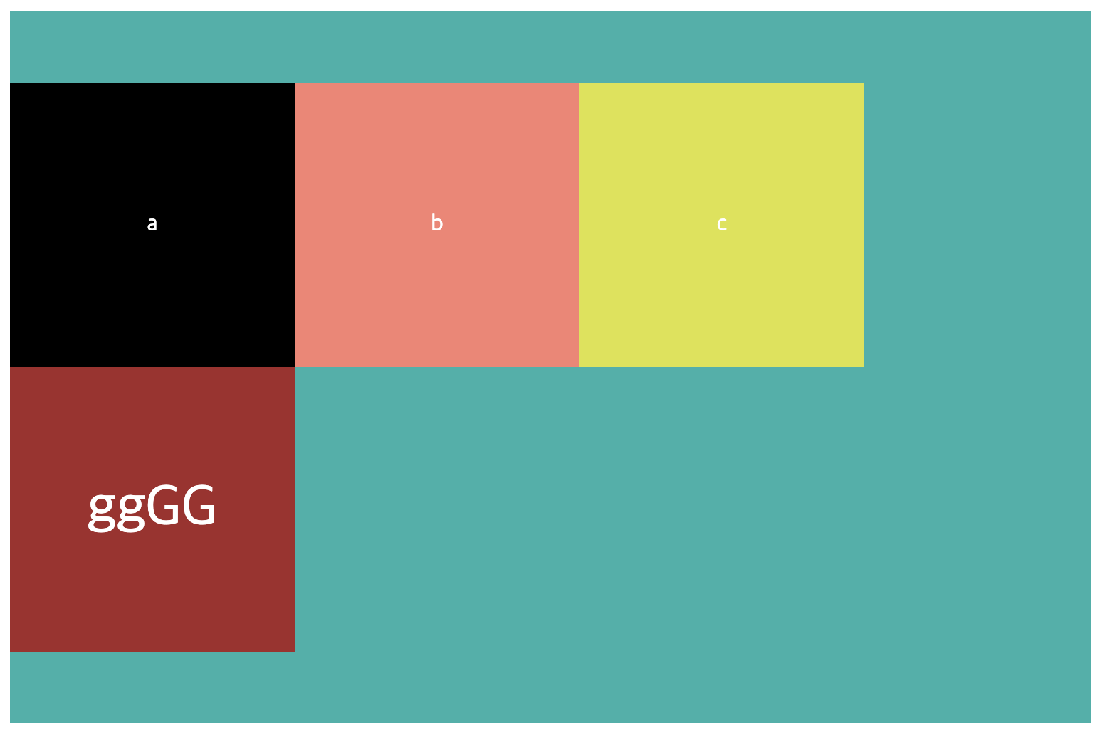
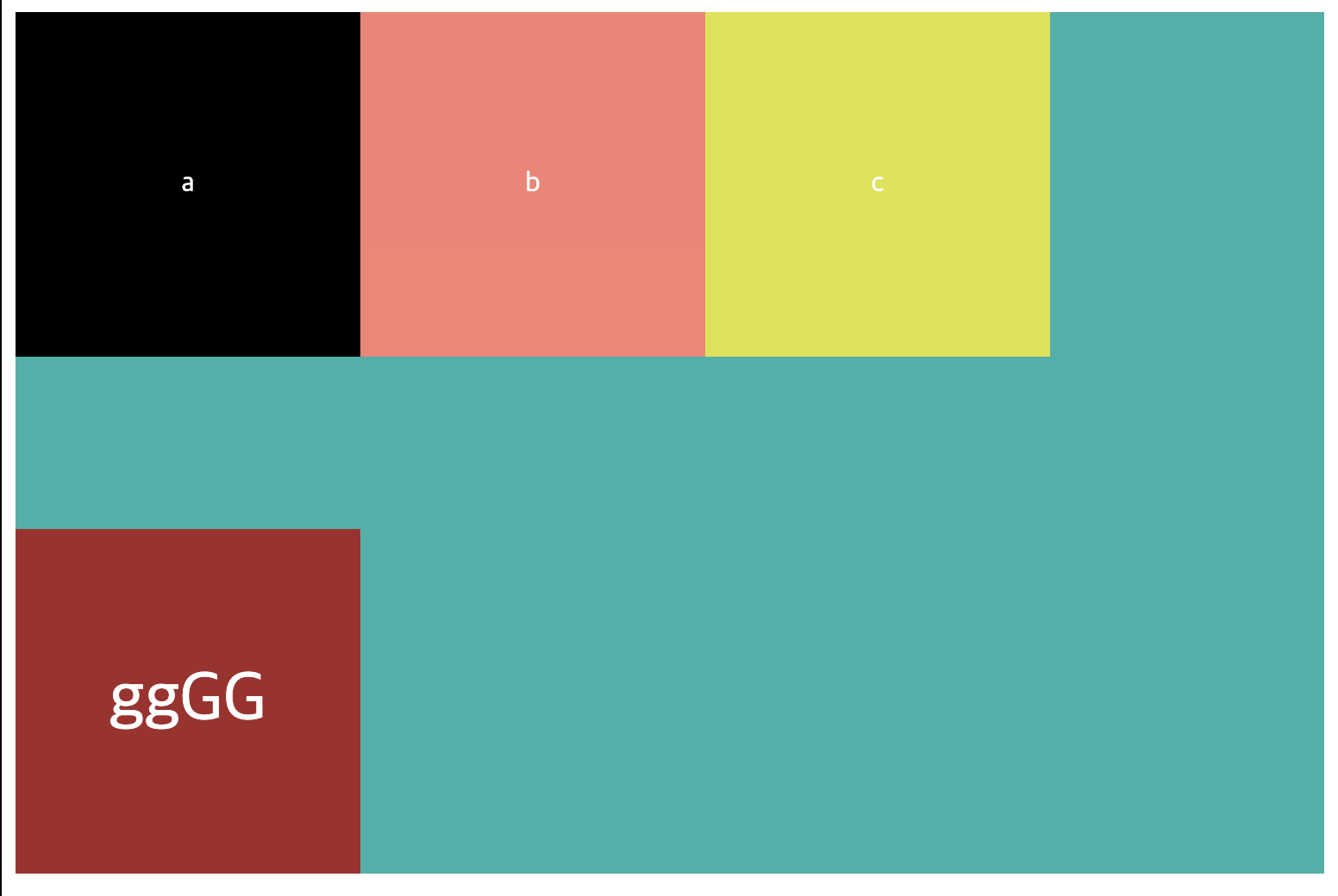
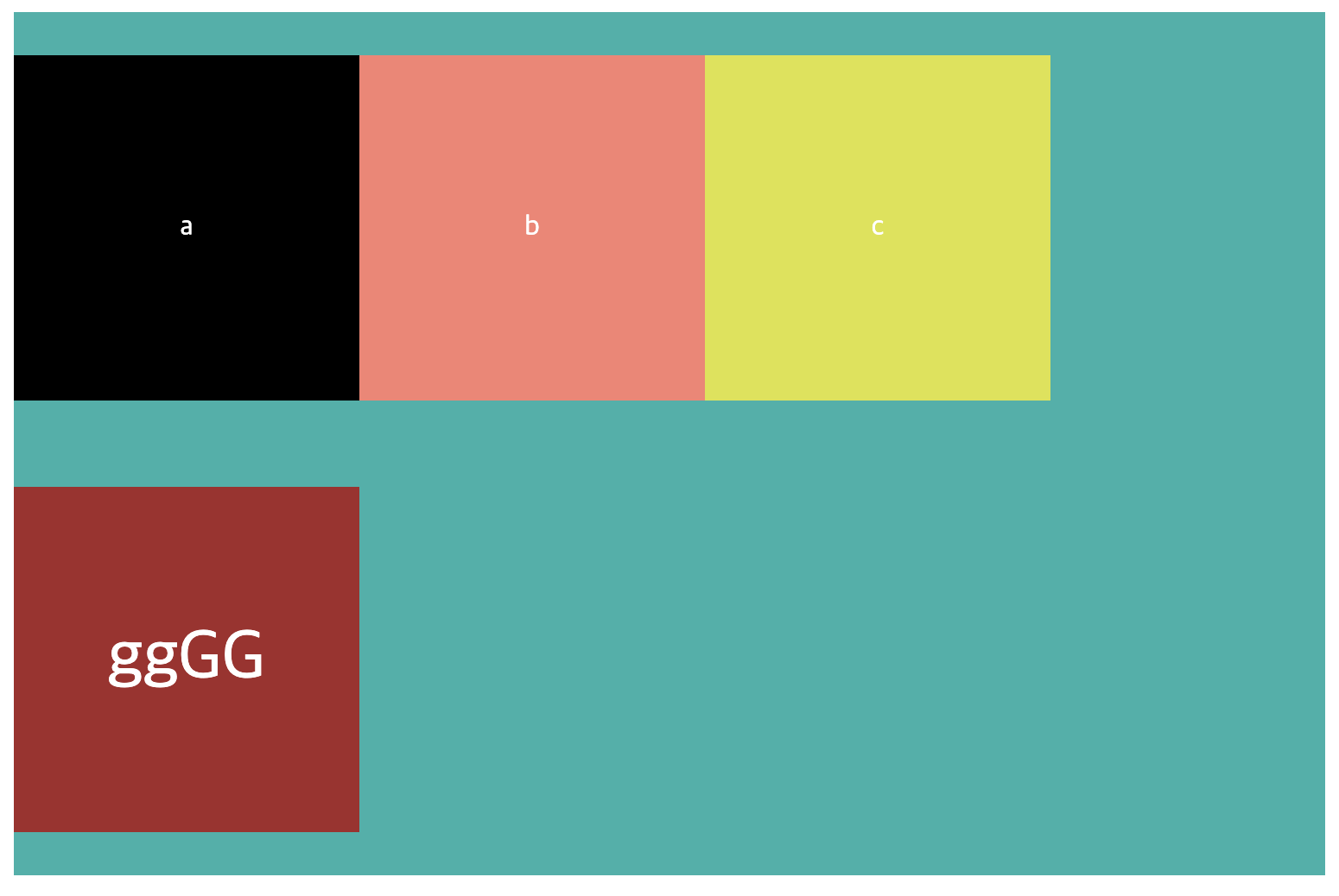
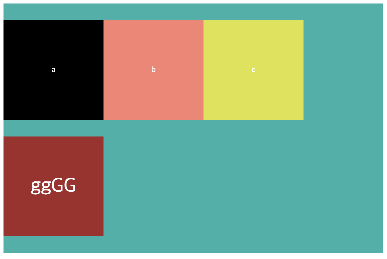
👉🏻 Ⅱ) baseline
baseline은 어떻게 정렬이 되는지 감이 오지 않아 아래에 그림을 2개 첨부했다.
그림을 보면 item을 기준으로 하는 것이 아닌 내용물(text)의 underline을 기준으로 맞추어서 정렬됨을 볼 수 있다.
code
.container {
  display: flex;
  align-items: baseline;
  background-color: lightseagreen;
}
💡 또한
baseline이 잘 적용됐는지 확인하기 위해서 마지막text가 c인 item의 내용을ggGG로 바꾸고font-size도 크게 변경하였다.
baseline 적용 전
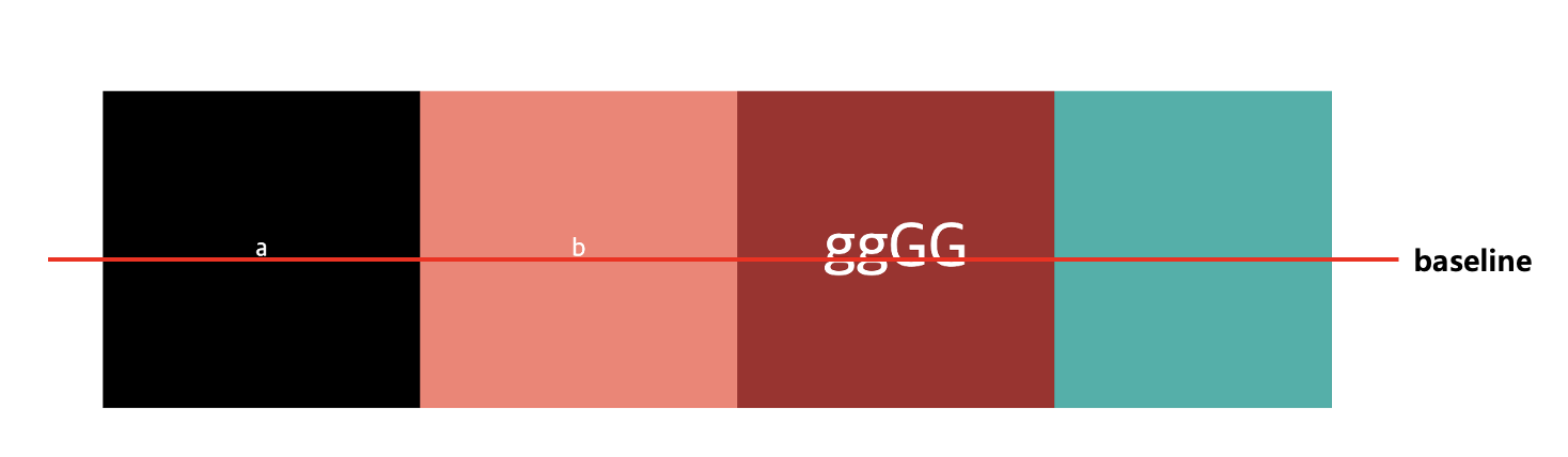
baseline 적용 후
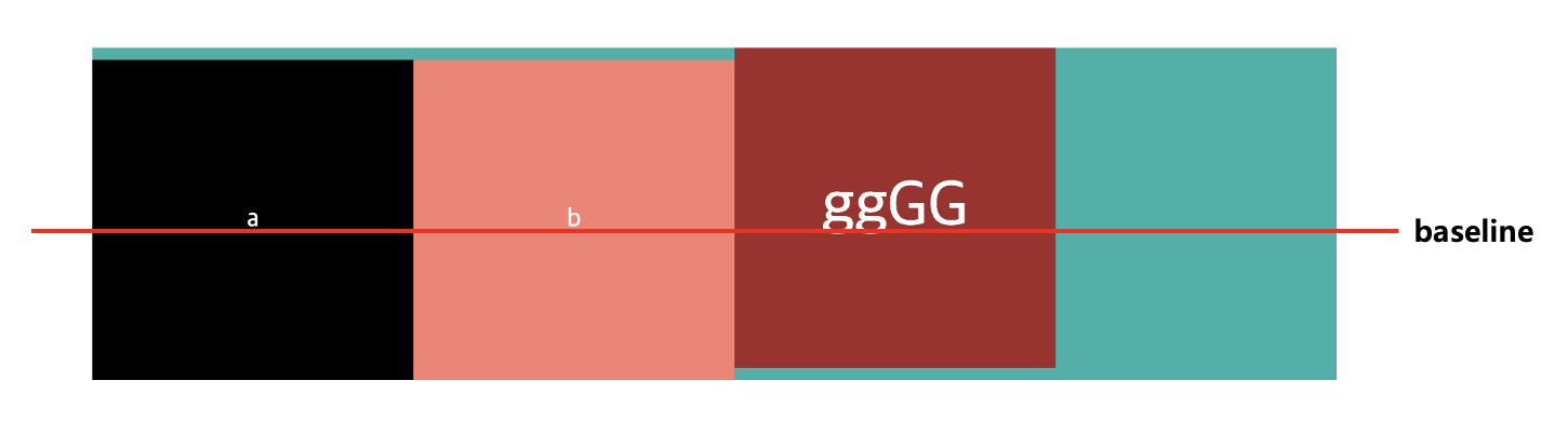
📒 baseline을 적용하면 빨간 줄을 기준으로 정렬됨을 알 수 있다. baseline을 기준으로 정렬됐기 때문에
a, b인 item은 container와 사이에 여백이 생김을 알 수 있다.
align-content
align-content에 대해서는 한 번도 사용해 본 적이 없으며 보긴 했지만, 어떻게 적용되는지 몰랐지만 이번 기회에 이해할 수 있게 되었다.
align-content는 item들이 1줄이 아닌 2줄 이상일 때 적용하는 속성들로 대부분의 속성 값들은 justify-content와 거의 동일하다.
📒 중요한 점은
justify-content의 기본 값은 flex-start이고align-content의 기본값은 stretch이다. 또한flex-direction에 따라서 축의 기준이 달라진다.
align-content values
- stretch(default value): item들의 높이를 합친 것은 container의 height와 같게 적용된다.
- flex-start: axis기준으로 왼쪽으로 정렬된다.
- flex-end: item들이 우측 정렬된다.
- center: item들이 가운데 정렬된다.
- space-between: 각 item들 사이의 간격이 동일하게 정렬된다.
- space-around: 각 item의 양쪽의 넓이가 동일하게 정렬된다.
- space-evenly: container와 item사이와 각 item들의 사이의 간격이 동일하게 적용된다
👉🏻 Ⅰ) stretch
code
.container {
  display: flex;
  flex-wrap: wrap;
  height: 500px;  /* stretch가 잘 적용되는지 확이하기 위해 height를 늘림 */
  align-content: stretch;  /* default 값으로 명시하지 않아도 된다.*/
  background-color: lightseagreen;
}
👉🏻 Ⅱ) flext-start
code
.container {
  ...//
  align-content: flex-start;
}
👉🏻 Ⅲ) flext-end
code
.container {
  ...//
  align-content: flex-end;
}
👉🏻 Ⅳ) center
code
.container {
  ...//
  align-content: flex-end;
}
👉🏻 Ⅴ) space-between
code
.container {
  ...//
  align-content: space-between;
}
👉🏻 Ⅵ) space-around
code
.container {
  ...//
  align-content: space-around;
}
👉🏻 Ⅶ) space-evenly
code
.container {
  ...//
  align-content: space-evenly;
}
🥳 마치며
flex를 이용하면서 막혔던 부분들이 있었는데 이번에 공부하면서 이렇게 해결할 방법이 있구나.. 싶었다... 한 마디로, 삽질을 많이 했었다 ㅜㅜ😭 삽질했던 기억이 천천히 지나가면서 해결방법 또한 얻었으므로 이제부터는 빠르게 css작업을 할 수 있을 것 같다. 그리고 여기저기 찾아보면서 느낀 건데 브라우저마다 cross browsing issue를 잘 확인해봐야 할 것 같다. 이는 can i use에서 확인할 수 있으며 배운 내용을 토대로 toy project에 적용해야겠다.
이번 블로그에서는 flex중에서도 부모 요소인 container에 적용되는 속성에 대해서 배워봤는데 다음 블로그는 아이템에 적용할 수 있는 속성들에 대해서 알아보자.
참고