ApexChart
그래프를 쉽게 구현할 수 있도록 도와주는 라이브러리이다. 메인 프로젝트에 chartjs를 사용했을 때에도 크게 어렵다고 생각하진 않았었는데, apexchart는 더 간단하고 커스터마이징이 자유로운 것 같다. 리액트 데모는 👉여기에서 확인할 수 있다.
설치
npm i react-apexcharts apexchartsLine 차트
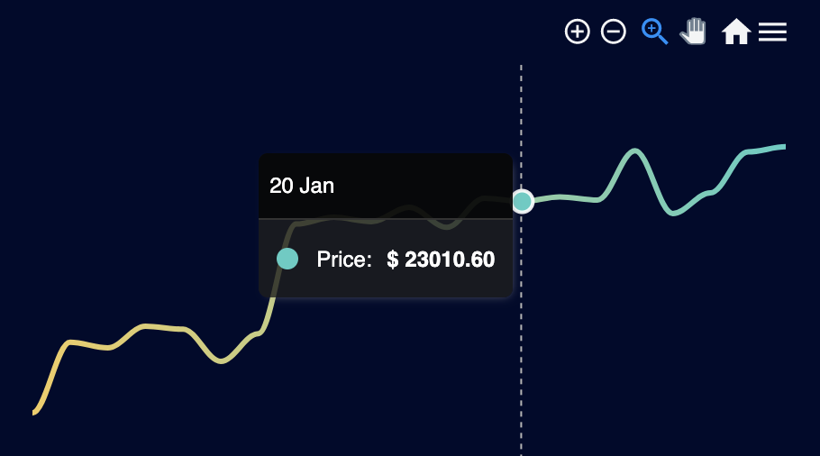
커스터마이징이 자유롭고 문서도 잘 되어 있어서 크게 어렵지 않다. data는 query로 받은 데이터이고 날짜별로 마감 시간의 가격을 출력하고 있다.
코드
<ApexChart
  type="line"
  series={[
    {
      name: "Price",
      data: data?.map(price => Number(price.close)) as number[],
    },
  ]}
  options={{
    theme: {
      mode: "dark",
    },
    chart: {
      height: 500,
      width: 500,
      toolbar: {
        tools: {},
      },
      background: "transparent",
    },
    stroke: {
      curve: "smooth",
      width: 4,
    },
    fill: {
      type: "gradient",
      gradient: {
        gradientToColors: [
          "#F2CD5C",
          "#F2921D",
          "#A61F69",
          "#400E32",
        ],
        stops: [0, 100],
      },
    },
    grid: {
      show: false,
    },
    plotOptions: {
      candlestick: {
        wick: {
          useFillColor: true,
        },
      },
    },
    xaxis: {
      labels: {
        show: false,
        datetimeFormatter: {
          month: "mmm 'yy",
        },
      },
      type: "datetime",
      categories: data?.map(date => date.time_close),
      axisBorder: {
        show: false,
      },
      axisTicks: {
        show: false,
      },
    },
    yaxis: {
      show: false,
    },
    tooltip: {
      y: {
        formatter: v => `$ ${v.toFixed(2)}`,
      },
    },
  }}
/>
candlestick 차트
candlestick chart demo | apexcharts
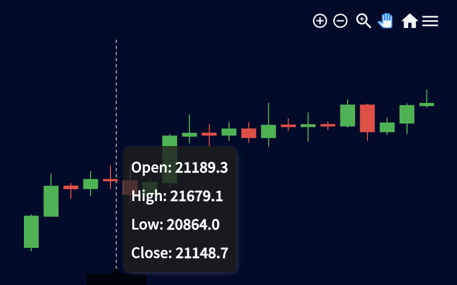
주식, 환율 등 OHLC를 보여주기에 적합한 그래프이다. 이런 그래프를 candlestick이라고 부르는구나 처음 알았다. 주식차트인줄 알았는데
코드
<ApexChart
  type="candlestick"
  series={[
    {
      data: data?.map(price => ({
        x: price.time_close,
        y: [price.open, price.high, price.low, price.close],
      })),
    },
  ]}
  options={{
    theme: {
      mode: "dark",
    },
    chart: {
      height: 500,
      width: 500,
      toolbar: {
        tools: {},
      },
      background: "transparent",
    },
    grid: {
      show: false,
    },
    plotOptions: {
      candlestick: {
        wick: {
          useFillColor: true,
        },
      },
    },
    xaxis: {
      labels: {
        show: false,
        datetimeFormatter: {
          month: "mmm 'yy",
        },
      },
      type: "datetime",
      categories: data?.map(date => date.time_close),
      axisBorder: {
        show: false,
      },
      axisTicks: {
        show: false,
      },
    },
    yaxis: {
      show: false,
    },
    tooltip: {
      y: {
        formatter: v => `$ ${v.toFixed(2)}`,
      },
    },
  }}
/>
출처

XD