1. 학습 내용
오늘은 css에서 가상선택자에 대해 배웠다.
가상 선택자란 ?
- 선택한 요소에 어떠한 행동과 규칙에 의해 디자인을 적용하는 방식으로, 가상의 이벤트를 붙이면 특정 이벤트마다 적용할 스타일을 설정하는 것이다.
html
<a href="https://www.naver.com/">네이버</a>
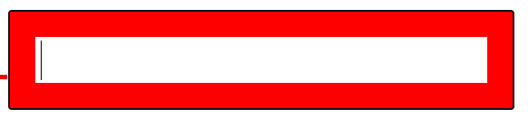
<input type="text">css
a:link{color: red;
a:hover{color: pink;}
a:active {color: blue;}
input:focus{border: solid 10px red;}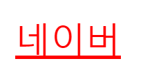
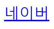
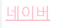
디자인을 적용할 태그에 : 을 붙인다.
:link - 방문한 적 없는 링크에 대해 디자인 적용할 때
:active - 클릭할 때 디자인 적용
:hover - 커서를 갖다댔을 때 디자인 적용
:focus - input을 클릭했을 때 디자인 적용, 포커스를 지우면 없어짐
html
<ul>
	<li>menu 1</li>
	<li>menu 2</li>
	<li>menu 3</li>
	<li>menu 4</li>
	<li>menu 5</li>
	<li>menu 6</li>
</ul>


<ul>
	<li>로그인</li>
	<li>회원가입</li>
	<li>회사소개</li>
	<li>고객센터</li>
</ul>
css
li:first-child{color: red;}
li:last-child{color: blue;}
li:nth-child(2n + 1){color: gray;}
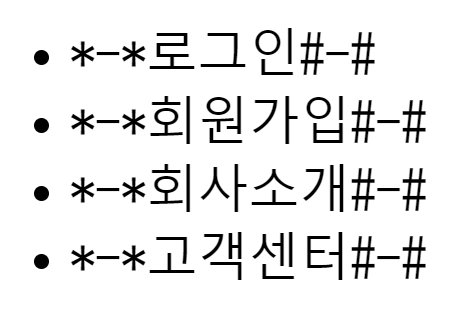
li:before {content: "*-*";}
li:after {content: "#-#";}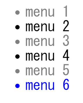
:first-child - 리스트의 첫번째 항목 디자인 변경
:last-child - 리스트의 마지막 항목 디자인 변경
:nth-child(n) - 직접 지정한 리스트의 항목 디자인 변경 (2n : 짝수, 2n+1 : 홀수)
:before {content : ;} - 글자와 태그 사이 공간, content라는 속성은 css를 가지고 화면에 표기를 시킬 수 있다. css에만 존재함
:after {content : ;} - 닫힌태그와 글자 사이
--> 정보가 없는 디자인, 글자를 중심으로 앞 뒤에 내용물을 강제적으로 삽입 가능
카카오톡 친구목록 만들기
<ul class="friends-lists">
	<li class="friends-list">
		<a href="#">
			<img src="https://via.placeholder.com/50 " class="friend-thumbnail">

			<div class="friend-info">
				<h3 class="friend-name">김민호</h3>
				<span class="friend-intro">Minho Kim</span>
			</div>
		</a>
	</li>
	<li class="friends-list">
		<a href="#">
			<img src="https://via.placeholder.com/50 " class="friend-thumbnail">

			<div class="friend-info">
				<h3 class="friend-name">박지연</h3>
				<span class="friend-intro">다정한 사람</span>
			</div>
		</a>
	</li>
	<li class="friends-list">
		<a href="#">
			<img src="https://via.placeholder.com/50 "class="friend-thumbnail">

			<div class="friend-info">
				<h3 class="friend-name">한성은</h3>
				<span class="friend-intro">헤헷</span>
			</div>
		</a>
	</li>
</ul>
css
.friends-lists{
	list-style: none;}

.friends-lists .friends-list a {
	color: #000000;
	text-decoration: none;}

.friends-lists .friends-list a .friend-thumbnail {
	border: solid 2px gray;
	border-radius: 20px;}

.friends-lists .friends-list a .friend-info .friend-name {
	font-size: 20px;
	color: #000000;}
.friends-lists .friends-list a .friend-info .friend-intro {
	font-size: 15px;
	color: #c8c8c8;}

.friends-lists .friends-list a .friend-info .friend-name {
	font-size: 50px;
	color: red;}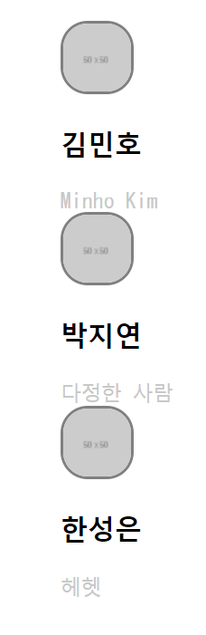
그 전 시간에 했던 카카오톡 친구 목록 만들기를 하고 이번에는 어제 배운 선택자를 이용해 css를 활용해 보았다.
ul, li, div, h3, span 등에 클래스 선택자를 만들어 넣고 css로 디자인을 적용해보았다. 조금 더 디테일하게 고쳐가며 실습을 진행했다.
조금 더 디테일하게 하기 위해 클래스를 생략 하지 않고 순서대로 다 작성해주었다.
캐스케이딩으로 인해 덮어씌우기도 가능했다. (같은 클래스 이고 나중에 작성 된대로 적용이 됨)
border-ridius : 50%로 설정하면 테두리가 원형으로 변한다.
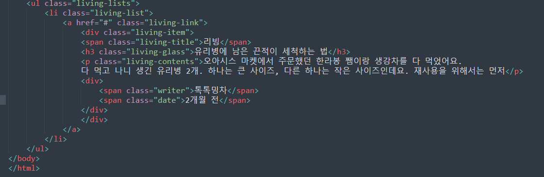
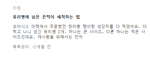
네이버 리빙
html
<ul class="living-lists">
		<li class="living-item">
			<a href="#">
				<img src="https://via.placeholder.com/170x114" class="living-thumbnail">
				<div class="living-info">
					<span class="type">리빙</span>
					<h3 class="title">30평대 아파트, 따뜻한 느낌의 침실</h3>
					<p class="paragraph">Nice To Meet You Nice To Meet YouNice To Meet You Nice To Meet You Nice To Meet You Nice To Meet You</p>

					<div class="date-wrap">
						<span class="source">유닛</span>
						<span class="date">3개월 전</span>
					</div>
				</div>
			</a>
		</li>
		<li class="living-item">
			<a href="#">
				<img src="https://via.placeholder.com/170x114" class="living-thumbnail">
				<div class="living-info">
					<span class="type">리빙</span>
					<h3 class="title">아이있는 집 주방 1년 간의 소소한 변화</h3>
					<p class="paragraph">Nice To Meet You Nice To Meet You Nice To Meet You Nice To Meet You Nice To Meet You Nice To Meet You</p>

					<div class="date-wrap">
						<span class="source">miju</span>
						<span class="date">1개월 전</span>
					</div>
				</div>
			</a>
		</li>
	</ul>
css
.living-lists{
	list-style: none;}

.living-lists .living-item a {
	color: #000000;
	text-decoration: none;}


.living-lists .living-item .living-info .type {
	color: #c08d31;
	font-weight: 700;
	font-size: 12px;}

.living-lists .living-item .living-info .title {
	font-size: 13px;
	color: #000000;}
.living-lists .living-item .living-info .paragraph {
	font-size: 13px;
	color: #404040;
	line-height: 13px;}

.living-lists .living-item .living-info .date-wrap .source,
.living-lists .living-item .living-info .date-wrap .date{
	font-size: 12px;
	color: #505050;	}

.living-lists .living-item .living-info .date-wrap .date {
	color: gray;}


.living-lists .living-item .living-info .date-wrap .date:before {
	content: '-';}

.living-lists .living-item:hover {
	background-color: pink;}


.living-lists .living-item a:hover .living-info .title {
	text-decoration: underline;}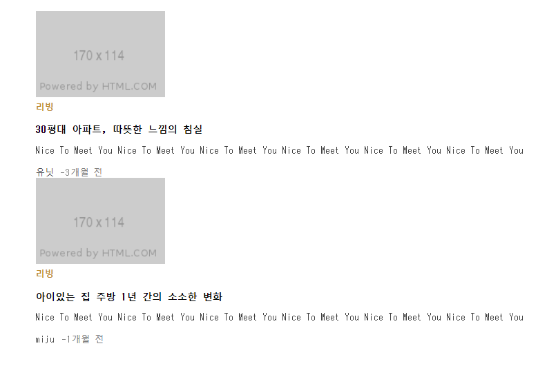
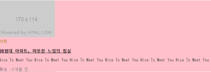
이전 시간에 만든 네이버 경제M과 비슷하게 실습해보았다.
각 태그에 클래스를 지정해주고 css에서 디자인을 적용해주었다.
위와 마찬가지로 디테일하게 작성해주었다.
클래스에 가상 선택자를 지정해주는 것도 가능하다.
그리고 hover을 가상 선택자로 지정해서 a에 갖다댔을 때 .living-info와 .title에 밑줄이 생기는 것 등 같이 지정하는 것도 가능하다.(가상 선택자 뒤에 다른 선택자를 연달아 기입 가능)
line-height : 위아래 글자와의 간격
오늘의 팁
폴더를 하나 만들고 html을 작성 후 css, img, js 폴더를 만든다.
- Html과 css를 연동할 때는 전과 다르게 css폴더 안에 style.css가 있기 때문에 href : css/style.css로 지정 (html기준)
- css에서 이미지를 불러 올 때는 이미지 폴더와 css폴더가 다르기 때문에 ../ 한번 나와서 img/icon.png로 불러온다.
구글로 아무 홈페이지나 들어가서 검사를 눌러 html과 css를 살펴가며 공부하는 것도 도움이 많이 되는 것 같다.
연습내용
근데 왜 디테일하게 태그가 안됐을까. 어쨌든 하긴 했는데..
어려웠던 점
가상선택자 라는 말의 뜻이 처음에 조금 헷갈렸다. 어제 배운 선택자는 또 뭐더라? 하면서 찾아봤다.
해결방법
그냥 무조건 반복..반복..네이버나 다음으로 들어가서 html과 css를 살펴보며 실습해보기
학습 소감
이제 어느 정도 적응이 되었는지 눈뜨고 감을 때 까지 html..css.. 생각만 한다.
이젠 또 hover가 계속 맴돈다. 누가보면 사랑에 빠진 줄 알듯.. 그건 아닌데 .. ㅎ 눈이 너무 아프다. 안구건조증이 또 심해져서 최대한 멀리 떨어져서 실습을 하는데 모니터는 한정적이고 띄울 창은 많다보니 줄여서 하는데 그럼 또 잘 안보인다. 총체적 난국..ㅎ
깃허브도 빨리 사용법을 알아야하는데, 아무리 찾아봐도 나같은 왕초보에게 딱 맞는 설명이 없다 ㅠㅠ 이번 주말에 꼭 해결해놔야지