학습내용
layout
<div class="box-model">
	Hello World
</div>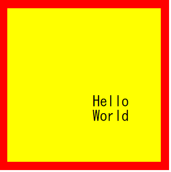
.box-model {

box-sizing: border-box;

width: 200px;
height: 200px;
background-color: yellow;
border: solid 10px red;


margin: 100px 0 0 100px;
padding: 100px 0 0 100px; }-
margin : border를 기준으로 바깥부분, (border값이 없으면 border값이 0인 상태), 선택한 영역이 스스로 움직이는 것이 아니라 공백을 넣어줌으로써 공백으로 인해 밀리는 것이라고 이해
-
padding : border를 기준으로 안쪽부분, 선택한 영역이 스스로 움직이는 것이 아니라 공백을 넣어줌으로써 공백으로 인해 밀리는 것이라고 이해
선택한 영역이 200px인데 padding을 100px를 줘버리면 300px가 된다. 근데 여기에서 margin, padding 값을 주더라도 선택한 영역의 크기는 안 늘어나기를 원할 때는
box-sizing : ; 이라는 속성을 사용하면 된다.
동시에 지정가능, 12시를 기준으로 top, right, bottom, left
margin: 100px 0 0 100px;
- html과 body태그에는 태생적으로 margin, padding 값이 있기 때문에
디폴트값으로 0을 지정해준다.
html, body {
margin: 0;
padding: 0;}
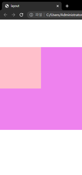
	<div class="margin-one"></div>
	<div class="margin-two"></div>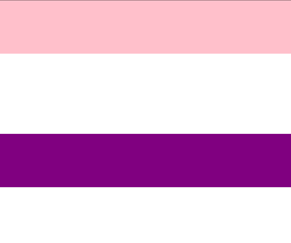
.margin-one {
	width: 100%;
	height: 100px;
	background-color: pink;

	margin-bottom: 100px;
}

.margin-two {
	width: 100%;
	height: 100px;
	background-color: purple;

	margin-top: 150px;
}
margin-one에는 margin-bottom 100px를 주었고
margin-two에는 margin-top 150px를 주었다.
이 경우 둘 사이의 margin값이 총 250이 아니라 150이 된다.
- margin 형제병합 : bottom과 top를 공유하고 있으면, 큰 값이
작은 값을 병합해버림
<div class="margin-parent">
		<div class="margin-child"></div>
	</div>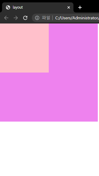
.margin-parent {
width: 300px;
height: 300px;
background-color: violet;

}

.margin-child {

width: 150px;
height: 150px;
background-color: pink;

_**margin-top: 100px;**_
}- margin 부모자식병합 : 자식에게 margin값을 지정하면 부모에게도 영향을 미친다.
display
	<h1>Block</h1>
	<h1>Block</h1>
	<h1>Block</h1>

	<span>Inline</span>
	<span>Inline</span>
	<span>Inline</span>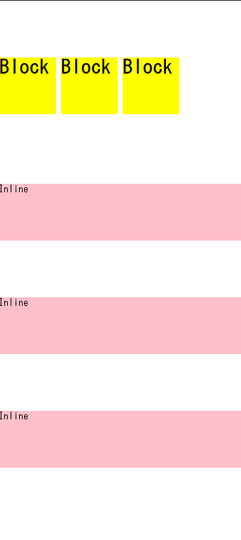
 h1 {
 	display : inline-block
	width: 100px;
	height: 100px;
	background-color: yellow;

	margin-top: 100px;
}

span {
	display: block;

	font-weight: 100px;
	height: 100px;
	background-color: pink;

	margin-top: 100px;
}
block : y축 정렬,공간을 만들 수 있음, 상하배치가능
inline : x축 정렬, 공간을 만들 수 없음, 상하배치불가
display: inline-block; 메뉴버튼만들때 사용
(h1에도 태생적으로 margin, padding값이 있다.)
- display를 이용하여 inline -> block, block -> inline으로 변환 가능
- 양쪽 모두의 속성을 쓰고싶을 때는 inline-block
	<span class="inline">Inline</span>
	<span class="inline-block">Inline-Block</span>
	<img src="https://via.placeholder.com/200/">
	<img src="https://via.placeholder.com/200/">
	<img src="https://via.placeholder.com/200/">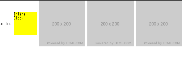
.inline-block {
	display: inline-block;

	width: 100px;
	height: 100px;
	background-color: yellow;
	}

.inline, .inline-block, img {
	vertical-align: middle;
}
vertical-align: 같은 형제, 같은 라인의 있는 요소들이 그 중 가장 큰 크기에 맞추어서 배치 top, middle, bottom
inline에만 적용 가능
img는 inline-block성질을 갖고 있음
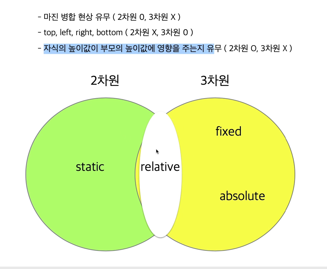
position
1. margin-top 사용 시 부모 자식간에 발생하는 마진
병합 현상이 일어나는지
2. top, right, bottom, left 속성을 사용할 수 있는지
3. 자식의 높이 값이 부모에게 영향을 주는지
<div class="static-parent">
		<div class="static-child"></div>
	</div>
.static-parent {
	width: 300px;
	height: 300px;
	background-color: yellow;
}

.static-child {
	width: 150px;
	height: 150px;
	background-color: blue;

	margin-top: 100px;
}
positoin : static;
-부모자식간 마진병합
-top, right, bottom, light 사용 불가
-부모가 높이 값이 없다면 자식의 값을 가져올 수 있다.
-2차원
-모든 html은 static 디폴트
-브라우저 기준
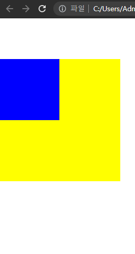
<div class="box1"></div>
	<div class="fixed-parent">
		<div class="fixed-child"></div>
	</div>
	<div class="box2"></div>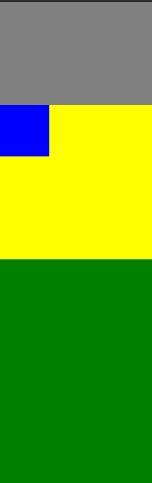
.box1 {
	width: 300px;
	height: 200px;
	background-color: gray;
}

.fixed-parent {
	width: 300px;
	height: 300px;
	background-color: yellow;
}

.fixed-child {
	position: fixed;

	width: 100px;
	height: 100px;
	background-color: blue;
position : fixed ;
-고정되어있음
-부모자식간 마진병합 없음
-top right bottom left 사용 가능(브라우저 왼쪽 상단을 기준으로 움직임)
-3차원
<div class="box1"></div>
	<div class="relative-parent">
		<div class="relative-child"></div>
	</div>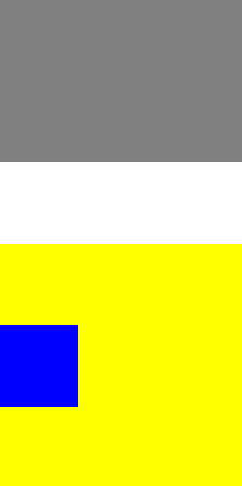
.box1 {
	width: 300px;
	height: 200px;
	background-color: gray;
}

.relative-parent {
	width: 300px;
	height: 300px;
	background-color: yellow;
}

.relative-child {
	position: relative;

	width: 100px;
	height: 100px;
	background-color: blue;
	margin-top: 100px;
	top: 100px;
}
position : relative ;
-부모자식 마진병합 가능
-top right bottom left 사용 가능 (최초 있었던 위치를 기준으로, 주체가 되어움직임)
-자식의 높이값이 부모에게 영향을 준다
-2차원과 3차원의 성질
<div class="box1"></div>

	<div class="absolute-parent">
		<div class="absolute-child"></div>
	</div>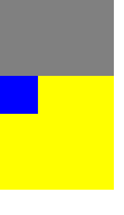
.absolute-parent {
	position: static;
	width: 300px;
	height: 300px;
	background-color: yellow;
}

.absolute-child {
	position: absolute;

	width: 100px;
	height: 100px;
	background-color: blue;

	margin-top: 100px;
	top: 100px;
}
position : absolute ;
-부모자식 마진병합 없음
-top right bottom left 사용 가능 (브라우저를 기준으로 이동)
-자식의 높이값이 부모에게 영향을 주지 않는다
-3차원
-top값은 부모를 기준으로 좌표 기준점이 달라지는데, 부모의 포지션이 어떤 상태인지에 따라 바뀐다.
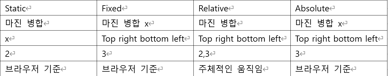
| static | fixed | relative | absolute |
|---|---|---|---|
| 2차원 | 3차원 | 2,3차원 | 3차원 |
| 마진 병합 | x | 마진 병합 | x |
| x | top right bottom left(값 없으면 원래 있던 위치) | top right bottom left | top right bottom left |
| default | 부모 기준 | 부모 기준 | 부모가 static이 아닐 경우에만 부모 기준 |
| 높이 영향 | x | 높이 영향 | x |
어려웠던 점
margin 병합이 오늘 주된 수업 주제였는데 처음에는 이해가 됐는데 중간에 한번 놓쳤더니 멍했다. posion부터 약간 헷갈린다. static, fixed, relative, absolute 이렇게 4개를 자유롭게 활용하면 레이아웃을 가지고 놀 수 있다고 하시는데 헷갈린다. static은 다 이해했다고 생각했는데 absolute부분에서 부모의 position을 기준으로 또 좌표 기준점이 달라진다고 할 때 부모의 position을 stati로 설정했는데 static이 브라우저 기준으로 이동을 한다라고 하셔서 또 멘붕이 왔다. 그런 얘기가 있었나 ..?
해결방법
강의를 몇 번이나 돌려보았다. 그래도 잘 모르겠어서 구글링을 해봐야겠다.ㅠㅠ
학습소감
오늘 이 때까지 한 수업 중 가장 헷갈리는 날이였다.
어찌보면 아직까지 기초파트 인데 이렇게나 헷갈려 하다니 자괴감 든다ㅠ.ㅠ