flex
justify-conent
- 주축을 기준으로 아이탬들을 어떻게 정렬할 것인지를 설정
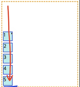
flex-direction:colum
justify-content:flex-end
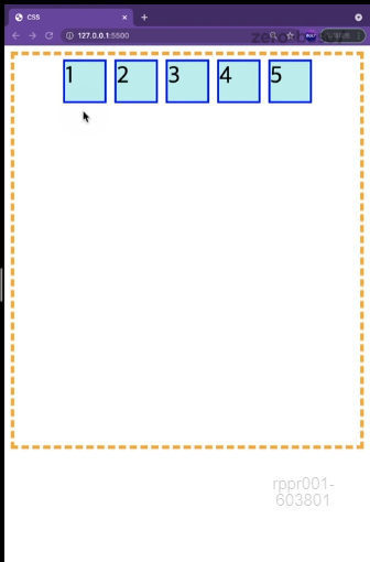
flex-direction:row
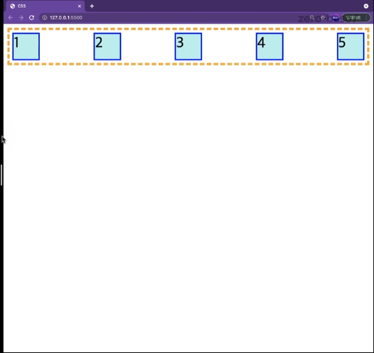
justify-content:center
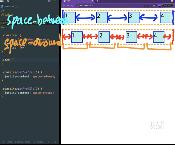
justify-cotent:space-between
.container{
    border:5px dashed orange;
    display: flex;

    /* justify-content: flex-start; */
    /* 시작부분에서 끝인지 시작부분인지 생각 */
    justify-content: space-between;


}

.item{
    width:50px;
    height: 50px;
    margin: 5px;
    background-color: paleturquoise;
    border:3px solid blue;
    font-size: 30px;
}


.container:nth-child(1){
    justify-content: space-between;
}

.container:nth-child(2){
    justify-content: space-around;
}
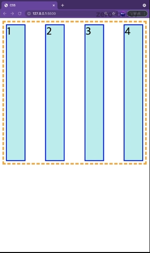
align-items
- 전체 컨테이너 중에서 가로줄의 아이템들을 어느 줄에 둘 것인지를 결정하는 속성
- 기본값으로는 stretch이다. 이 속성은 아이템들이 컨테이너의 공간을 다 차지하려는 습성
.container{
    height: 400px;
    border:5px dashed orange;
    display: flex;

    justify-content: space-between;
    align-items: flex-start;


}

.item{
    width:50px;
    height: 50px;
    margin: 5px;
    background-color: paleturquoise;
    border:3px solid blue;
    font-size: 30px;
}
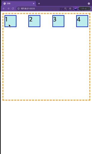
align-items:flex-start
.container{
height: 400px;
border:5px dashed orange;
display: flex;
justify-content: space-between;
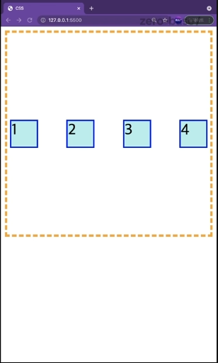
align-items: center;
}align-content
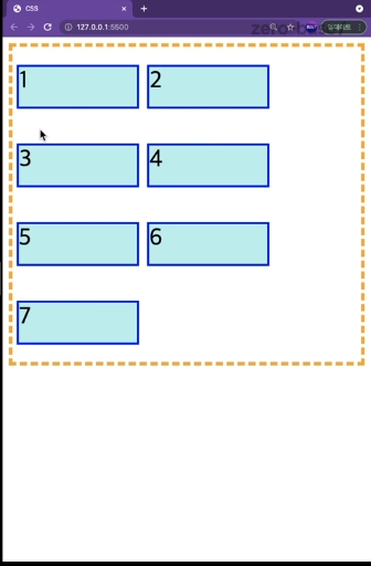
- 여러 줄에 대한 교차축의 정렬을 만들 수 있는 속성
- 콘텐츠 사이와 콘텐츠 주위 빈 공간을 플렉스박스의 교차축, 그리드의 블록 축을 따라 배치
- space-between, space-around 사용 가능
.container{
    height: 400px;
    border:5px dashed orange;
    display: flex;

    flex-wrap: wrap;


    align-content: space-between;
}

.item{
    width:150px;
    height: 50px;
    margin: 5px;
    background-color: paleturquoise;
    border:3px solid blue;
    font-size: 30px;
}
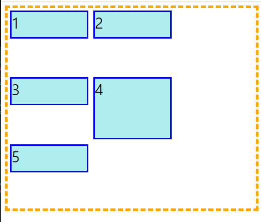
align-self
- container가 아닌 자식 즉, item 사용
- align-items의 값을 덮어씌워 self 값을 적용
- 하나의 요소만 제어하고 싶을때 사용
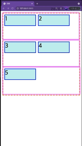
align-items는 한줄씩 밖에 인식못하기때문에 위 그림 처럼 여러 개의 컨테이너를 임의로 생성해서 조절
.container{
    height: 400px;
    border:5px dashed orange;
    display: flex;

    flex-wrap: wrap;

    align-items: stretch;
}

.item{
    width:150px;
    height: 50px;
    margin: 5px;
    background-color: paleturquoise;
    border:3px solid blue;
    font-size: 30px;
}

.item:nth-child(4){
    height: auto;
    align-self: stretch;
}

풋살을 좋아하는 프론트엔드 개발자