
들어가기 전에 먼저 시각화 모듈 seaborn 알아보기
Seaborn
- matplotlib에서보다 구체적으로 시각화 가능
- 커스터마이징
- 시작 전에 seaborn 모듈이 가상환경에 다운로드 되어있어야 한다.
안되어 있다면 주피터 노트북에서 다운!conda install -y seaborn
- sns.set_style()
- "white", "whitegrid", "dark", "darkgrid"
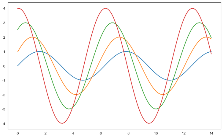
sns.set_style("white")
plt.figure(figsize=(10,6))
plt.plot(x, y1, x, y2, x, y3, x, y4)
plt.show()
- Seaborn에는 몇가지 예시로 데이터들이 들어있다.
- 그 중 tips 를 이용해 몇가지 정리
예제1. seaborn tips data
- boxplot
- swarmplot
- lmplot
- tips데이터 로드

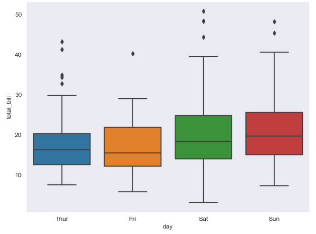
- boxplot()
plt.figure(figsize=(8,6))
sns.boxplot(x="day", y="total_bill", data=tips)
plt.show()
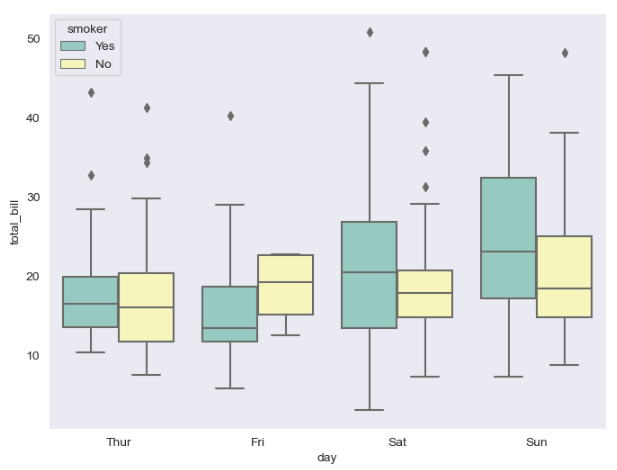
- boxplot() hue, palette
plt.figure(figsize=(8,6))
sns.boxplot(x="day", y="total_bill", data=tips,
hue="smoker", palette ="Set3")
plt.show()
- swarmplot()
plt.figure(figsize=(8,6))
sns.swarmplot(x="day",y="total_bill", data=tips, color="0.8")
#color 0~1 사이, 무채색, 높을수록 흰색
plt.show()

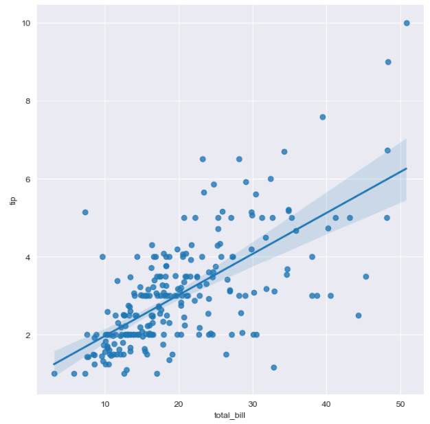
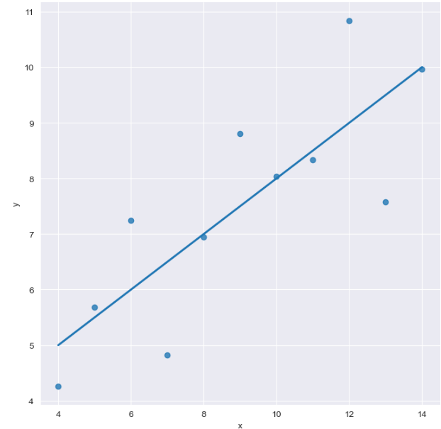
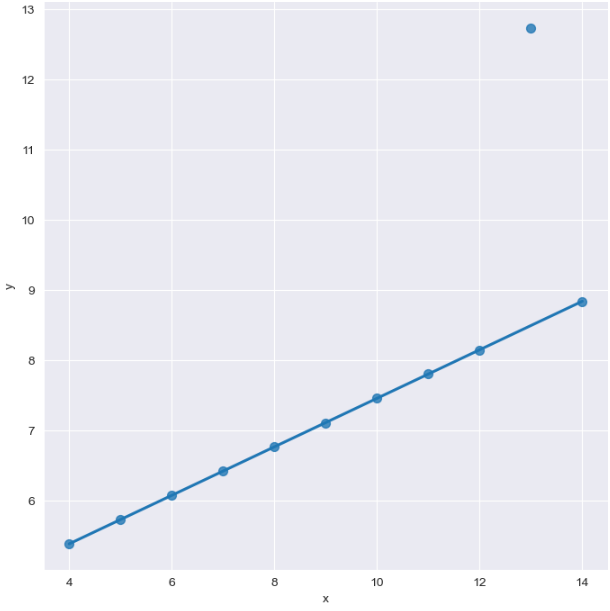
- lmplot() : x,y 사이 관계 파악
sns.set_style("darkgrid")
sns.lmplot(x = "total_bill", y = "tip", data=tips, height = 7 ) #size -> height
plt.show()
- hue option
sns.set_style("darkgrid")
sns.lmplot(x="total_bill", y="tip", data = tips, height=7,
hue="smoker")
plt.show()

예제2. seaborn flight data
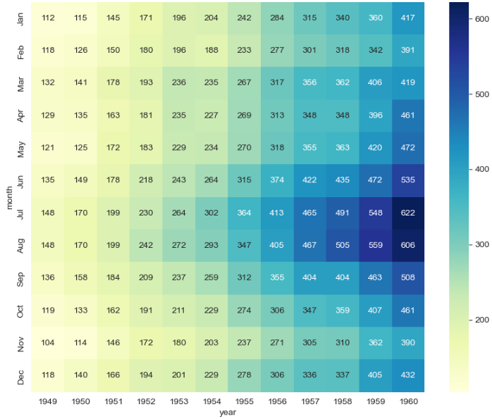
- heatmap
- flight data 로드
flights = sns.load_dataset("flights")
flights.head()

- pivot table로 데이터 정리
flights = flights.pivot(index="month", columns ="year",
values ="passengers")
flights.head()

- heatmap()
-
- annot=True : heatmap안에 데이터 표시
- fmt="d" : 정수형으로 ["f": 실수형]
plt.figure(figsize=(10,8))
# annot 은 데이터 값 표현, fmt="d" 는 정수형으로
sns.heatmap(data=flights, annot=True, fmt="d")
plt.show()

- colornap
plt.figure(figsize=(10,8))
sns.heatmap(data=flights, annot=True, fmt="d", cmap="YlGnBu")
plt.show()
예제3. seaborn iris data
- pairplot()
- iris 데이터 로드
iris = sns.load_dataset("iris")
iris.tail()
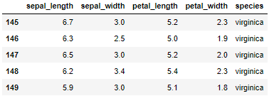
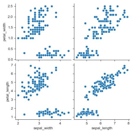
- pairplot() : 나올 수 있는 모든 경우 시각화
sns.set_style("ticks")
sns.pairplot(iris)
plt.show()
- 원하는 컬럼만 pairplot()
sns.pairplot(
    iris,
    x_vars = ["sepal_width","sepal_length"],
    y_vars = ["petal_width","petal_length"]
)
plt.show()
예제4. anscombe data
- lmplot()
- anscombe 데이터 로드
anscombe = sns.load_dataset("anscombe")
anscombe.head()
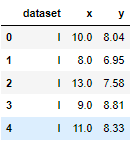
- lmplot()사용해 dataset컬럼의 I 출력
sns.set_style("darkgrid")
sns.lmplot(
    x="x",
    y="y",
    data= anscombe.query("dataset=='I'"),
    ci = None,    # ci=신뢰구간 선택, 나중에 통계에서
    height=7,
    scatter_kws={"s":50}) #점의 크기
plt.show()
- order = 1
sns.set_style("darkgrid")
sns.lmplot(
    x="x",
    y="y",
    data= anscombe.query("dataset=='II'"),
    order=1,
    ci = None,    # ci=신뢰구간 선택, 나중에 통계에서
    height=7,
    scatter_kws={"s":50}) #점의 크기
plt.show()
- order = 2
- 동 떨어진 데이터 무시(노이즈, 예외 무시)
-처리 전sns.set_style("darkgrid") sns.lmplot( x="x", y="y", data= anscombe.query("dataset=='III'"), ci = None, # ci=신뢰구간 선택, 나중에 통계에서 height=7, scatter_kws={"s":50}) #점의 크기 plt.show()
- 처리 후(robust = True)
sns.set_style("darkgrid")
sns.lmplot(
    x="x",
    y="y",
    data= anscombe.query("dataset=='III'"),
    robust = True,
    ci = None,    # ci=신뢰구간 선택, 나중에 통계에서
    height=7,
    scatter_kws={"s":50}) #점의 크기
plt.show()
06. 서울시 범죄 현황 데이터 시각화
- 다시 matplotlib, seaborn 셋팅
import matplotlib.pyplot as plt
import seaborn as sns
from matplotlib import rc
plt.rcParams["axes.unicode_minus"] = False
rc("font", family="Malgun Gothic")
%matplotlib inline
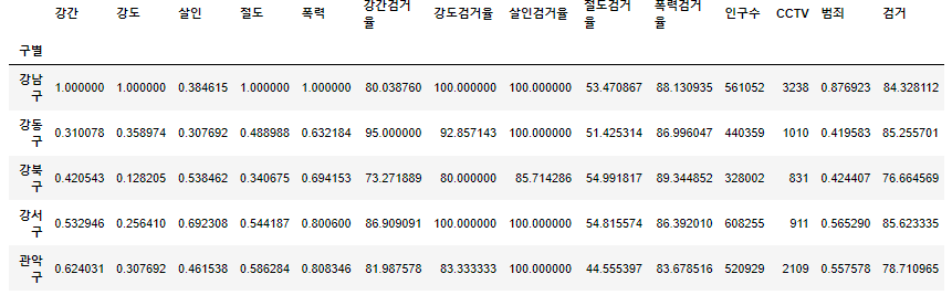
- 가장 근래 정리 한 데이터 프레임 확인
crime_anal_norm.head()
- pairplot으로 "인구수","CCTV"와 "살인","강도"의 상관관계
- 상관관계와 인과관계는 별계이다.
def drawGraph():
    sns.pairplot(
        data=crime_anal_norm,
        x_vars = ["인구수","CCTV"],
        y_vars = ["살인","강도"],
        kind = "reg",
        height = 4
    )
    plt.show()
drawGraph()

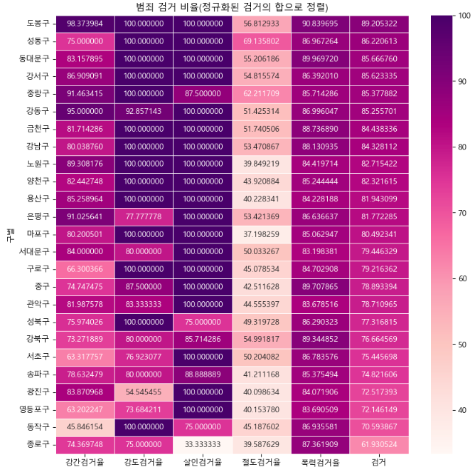
- 검거율 heatmap
def drawGraph():
    # 데이터 프레임 생성
    target_col = ["강간검거율","강도검거율","살인검거율","절도검거율",
    "폭력검거율","검거"]
    crime_anal_norm_sort = crime_anal_norm.sort_values(["검거"],
    ascending=False) #검거 기준 내림차순
    #그래프 설정
    plt.figure(figsize=(10,10))
    sns.heatmap(
        data = crime_anal_norm_sort[target_col],
        annot = True,
        fmt = "f", #d=정수, f=실수
        linewidths=0.5,  #heatmap 데이터들 간 간격
        cmap = "RdPu"
    )
    plt.title("범죄 검거 비율(정규화된 검거의 합으로 정렬)")
    plt.show()
drawGraph()
- 데이터 저장
crime_anal_norm.to_csv("../data/02. crime_in_Seoul_final.csv",
sep=",", encoding="utf-8")
Folium
- folium 모듈 다운
!pip install folium
- 사용할 모듈 불러오기
import folium
import pandas as pd
import json
- folium.Map()
m = folium.Map(location = [37.5445644958079896, 127.05582307754338],
zoom_start=14) # zoom_start 0~18
m
-location =[위도, 경도] : 중심으로 지도 표현
-zoom_start : 0~18으로 지도 표시
- save()
#현재 위치에 .html로 저장
m.save("./folium.html")
- folium.Maps(tiles option)
- "OpenStreetMap"
- "Mapbox Bright" (Limited levels of zoom for free tiles)
- "Mapbox Control Room" (Limited levels of zoom for free tiles)
- "Stamen" (Terrain, Toner, and Watercolor)
- "Cloudmade" (Must pass API key)
- "Mapbox" (Must pass API key)
- "CartoDB" (positron and dark_matter)
m = folium.Map(
    location = [37.5445644958079896, 127.05582307754338],
    zoom_start=14,  # zoom_start 0~18
    tiles ="OpenStreetMap" #지도 스타일
)
m
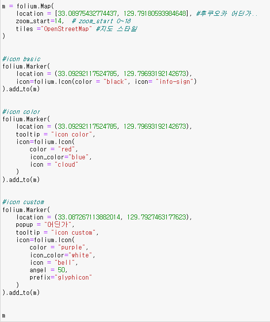
- folium.Marker() : 마커 생성
구글맵에서 한국은 위도경도가 조회되지 않아 가까운 일본 아무곳이나 집어서 진행했다.
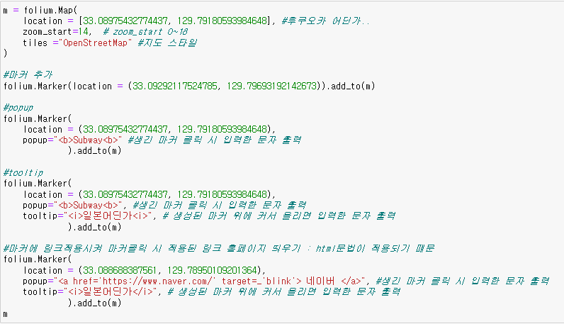
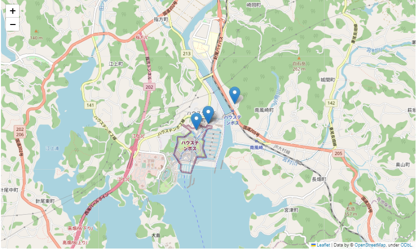
- folium.Icon() : 마커에 아이콘
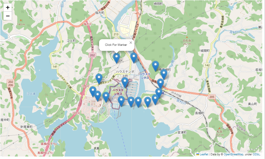
- folium.ClickForMarker()
- 지도 위에 마우스 클릭 시 마커 생성
m = folium.Map(
    location = [33.08975432774437, 129.79180593984648], #후쿠오카 어딘가..
    zoom_start=14,  # zoom_start 0~18
    tiles ="OpenStreetMap" #지도 스타일
)
m.add_child(folium.ClickForMarker(popup="Click For Marker"))
# 클릭해서 생성된 마커에 입력한 문자 출력
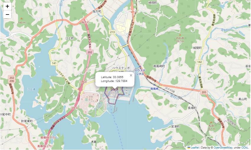
- folium.LarLngPopup()
- 지도위에 마우스 클릭 시 위도,경도 정보를 반환
m = folium.Map(
    location = [33.08975432774437, 129.79180593984648], #후쿠오카 어딘가..
    zoom_start=14,  # zoom_start 0~18
    tiles ="OpenStreetMap" #지도 스타일
)
m.add_child(folium.LatLngPopup())
# 클릭한 곳의 위도, 경도 표시
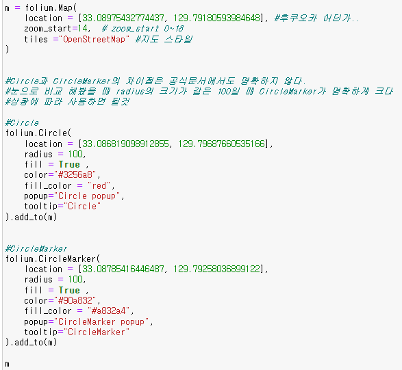
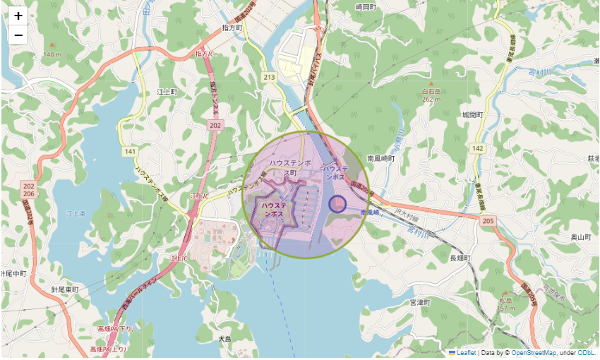
- folium.Circle(), folium.CircleMarker()
- 설정한 위도,경도 중심으로 원 그리기
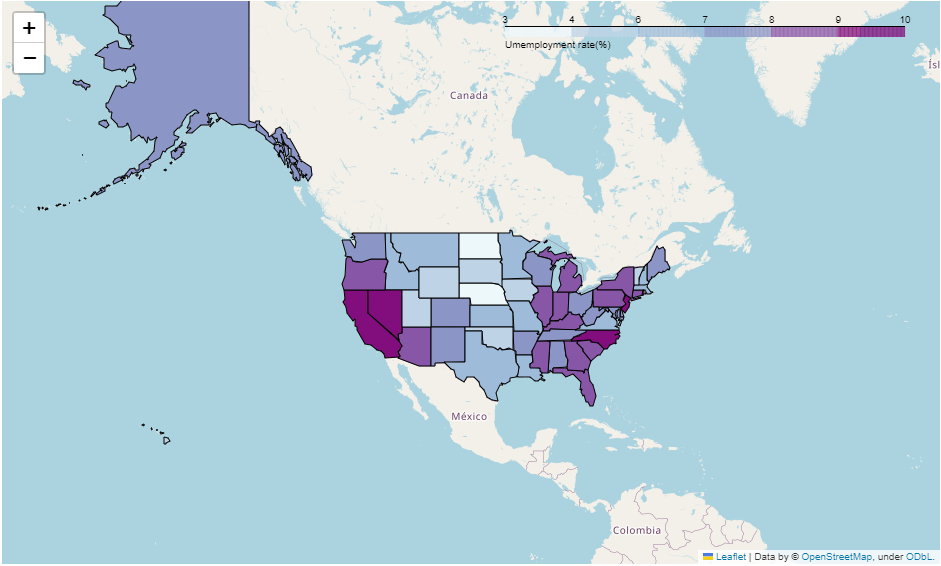
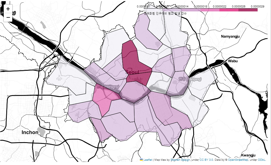
미국 주 경계선 시각화 : folium.Choropleth()
- folium.Choropleth() : .json파일에 들어있는 데이터 기반으로 경계선 따라 한 덩어리로 표현해 heatmap과 같이 시각화
- 경계선을 그린 .json파일을 잘 구해야 한다.

07. 서울시 범죄 현황에 대한 지도 시각화
- 필요한 모듈, 데이터파일 불러오기

- 현재 확인
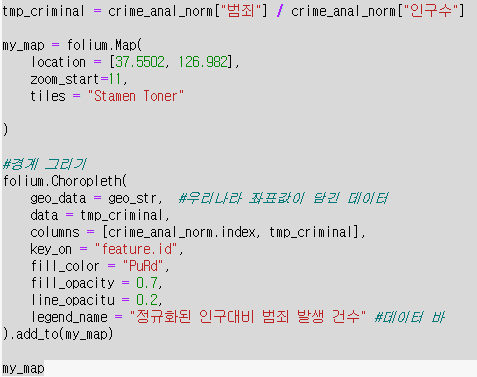
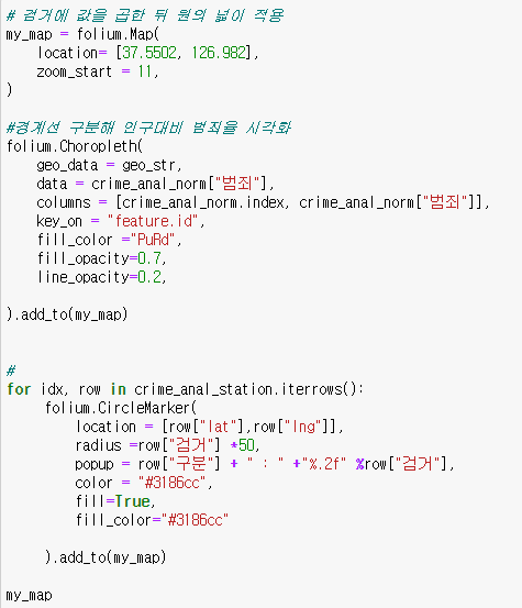
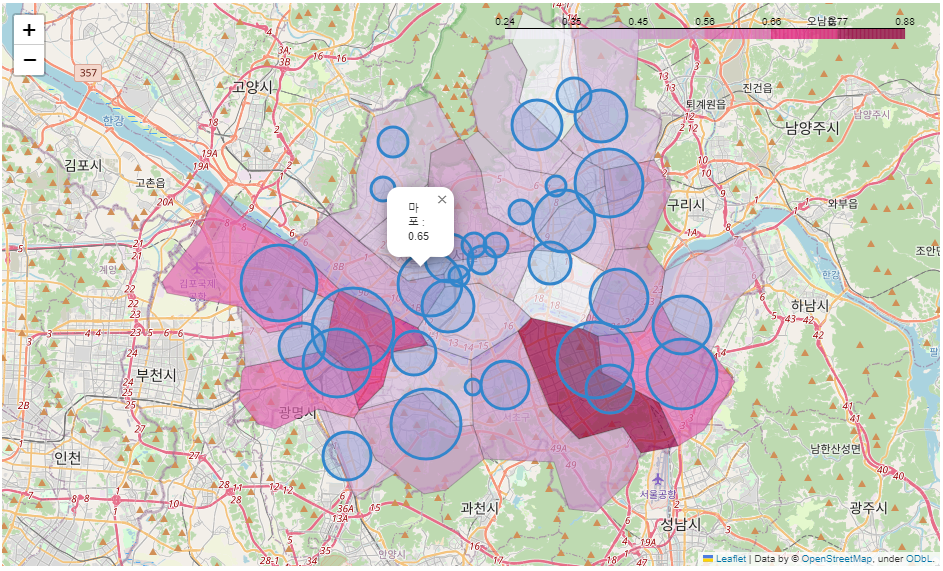
- 인구대비 범죄 발생 건수 지도 시각화
- 경찰서 별 정보를 범죄발생과 함께 정리하기 위해 파일 불러오기

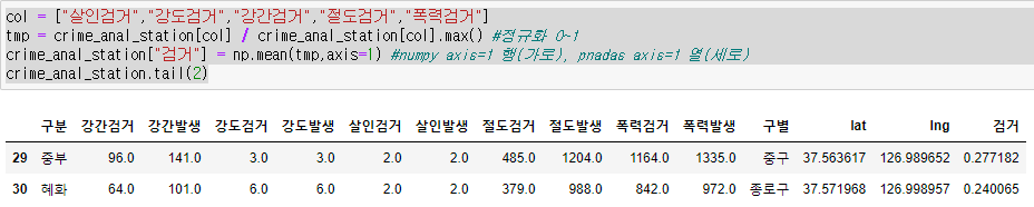
- 5대범죄 검거 건수 정규화 후 평균 값을 "검거"컬럼에 추가
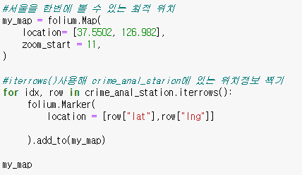
- 서울시 경찰서 위치 마커 표시

- 인구대비 범죄율 경계선 기준으로 시각화, 검거율 기준으로 원그리기

취업공부