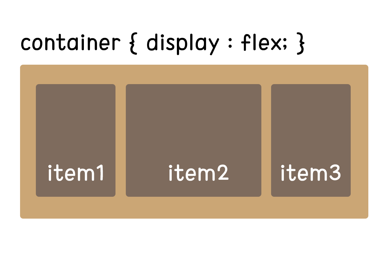
1. display 설정
.container { display : flex; }
.container { display : inline-flex; } =inline-block과 같은 이치
2. 배치 방향 설정
.container { flex-direction : row; }
.container { flex-direction : row-reverse; }
.container { flex-direction : column; }
.container { flex-direction : column-reverse; }
- row : 가로정렬 (기본값)
- row-reverse : 가로 역순 정렬
- column : 세로정렬
- column reverse : 세로 역순 정렬3. 줄바꿈 설정 : 아이템들이 컨테이너 영역 밖으로 넘칠 때
.container{ flex-wrap : nowrap; }
.container{ flex-wrap : wrap; }
.container{ flex-wrap : wrap-reverse; }
- nowrap : 줄바꿈 안함 (기본값)
- wrap : 줄바꿈
- wrap-reverse : 역순 줄바꿈 (아이템이 위로 올라감)4. 위 두 속성의 단축 표현
.container{ row nowrap; }5. 메인축 방향 정렬 : justify
.container{ justify-content : flex-start; }
.container{ justify-content : flex-end; }
.container{ justify-content : center; }
.container{ justify-content : space-between; }
.container{ justify-content : space-around; }
.container{ justify-content : space-evenly; }
- flext-start : 시작점 정렬 (기본값)
- flex-end : 끝점 정렬
- space-between : 시작과 끝을 양 끝에 붙이고, 아이템간 균일한 간격
- space-around : 시작과 끝에 아이템간 간격의 반 값을 넣어줌
- space-evenly : 양 끝과 아이템간 간격 모두 균일한 값으로6. 수직축 방향 정렬 : align
.container{ align-items : stretch; }
.container{ align-items : flex-start; }
.container{ align-items : flex-end; }
.container{ align-items : center; }
.container{ align-items : baseline; }
- stretch : 수직으로 늘어남 (기본값)
- flex-start : 시작점 정렬 (flex-direction이 row일 때는 위, cloumn일 때는 왼쪽)
- flex-end : 끝점 정렬 (flex-direction이 row일 때는 아래, cloumn일 때는 오른쪽)
- center : 가운데 정렬
- baseline : 텍스트 베이스라인 정렬 7. 텍스트, 아이콘버튼 등 가세정렬
display : flex
justify-content : center;
align-item : center;
8. 여러 행 정렬 : wrap 속성이 적용된 상태에서 아이템들의 행이 2줄 이상 되었을 때 수직 방향 정렬
.container{ flex-wrap: wrap; }

.container{ align-content : stretch; }
.container{ align-content : flex-start; }
.container{ align-content : flex-end; }
.container{ align-content : center; }
.container{ align-content : space-between;}
.container{ align-content : space-around; }
.container{ align-content : space-evenly; }
- justify-content 속성값이 수직으로 적용된다고 생각하자.참고한 사이트 > 1분코딩
의미와 가치를 쫓는 개발자 ✨