레이아웃 아이템 배치하기
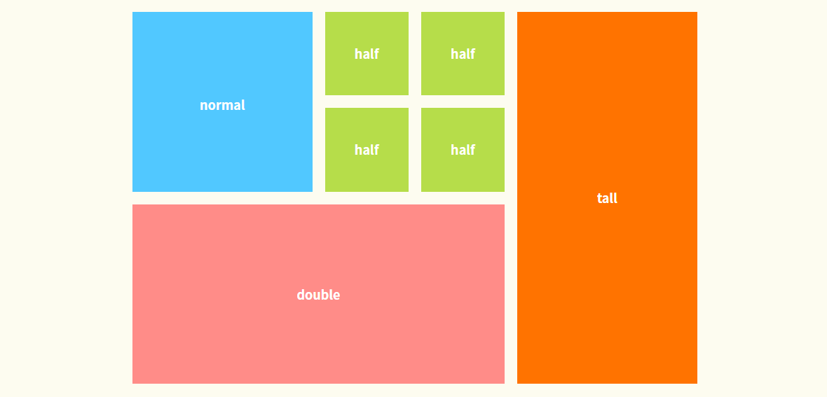
위 예시를 만들기 위한 html 구조를 만들어 보았다.
<div id="wrap">

    <section>
      <div class="top">
        <p>
          normal
          <br>
          <!-- (untagged) -->
        </p>

        <div class="half">
          <div class="half-top">
            <p>half</p>
            <p>half</p>
          </div>

          <div class="half-bottom">
            <p>half</p>
            <p>half</p>
          </div>
        </div>
      </div>

      <p class="bottom">double</p>
    </section>

    <article>
      <p>tall</p>
    </article>

  </div>요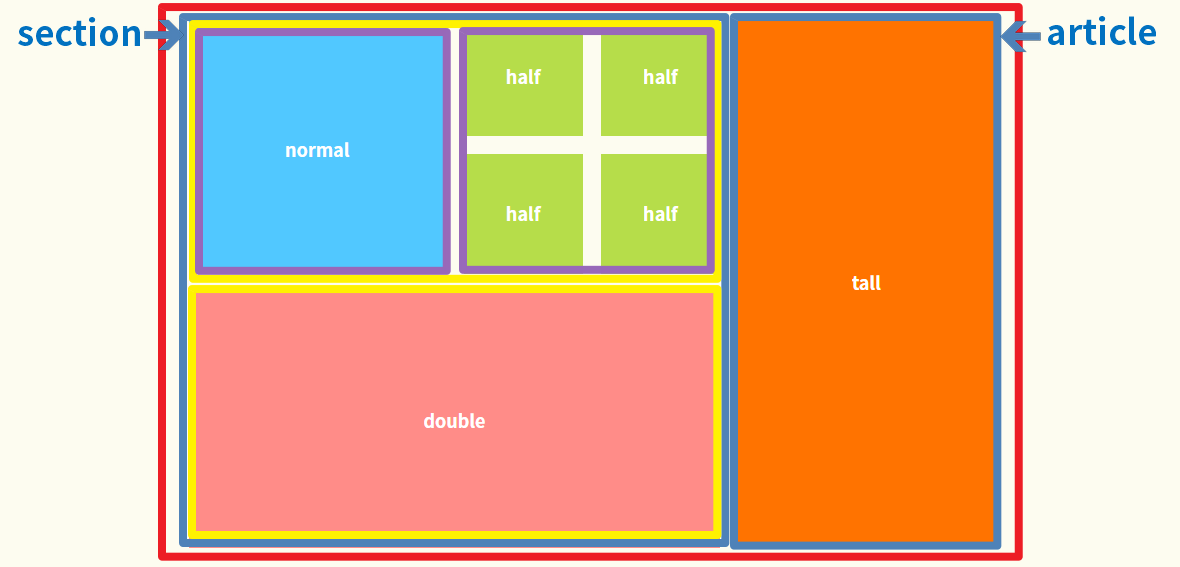
1. 전체 영역 좌우 섹션 분할 = section / article
2. section
1) top과 bottom영역으로 분할
2) top을 p와 class=half로 분할
- 명확한 구분을 위해 p를 class로 묶어도 좋을 것 같음
3)class=half를 half-top과 half-bottom으로 분할
- 선생님께서는 half 박스를 일렬로 4개 만든 후 flex 옵션인 wrap을 이용해 밑으로 떨어뜨리셨다.
[ CSS Style ]
#wrap{
  display: flex;
  flex-flow: row nowrap;
  width: 900px;
  margin: 30px auto;
  color: white;
  font-weight: 600;
  font-size: 20px;
  text-align: center;
}

/* section */
section>.top{
  display: flex;
  flex-flow: row nowrap;
}

section>.top>.half{
  display: flex;
  flex-flow: row nowrap;
  margin-bottom: 20px;
}

/* normal */
section>.top>p{
  width: 285px;
  height: 285px;
  margin-bottom: 20px;
  line-height: 295px;
  background-color: #51c8ff;
}

/* half-top */
section>.top>.half>.half-top{
  margin-left: 20px;
}

section>.top>.half>.half-top>p:first-child{
  width: 132.5px;
  height: 132.5px;
  line-height: 132.5px;
  margin-bottom: 20px;
  background-color: rgb(182, 221, 74);
}

section>.top>.half>.half-top>p:last-child{
  width: 132.5px;
  height: 132.5px;
  line-height: 132.5px;
  background-color: rgb(182, 221, 74);
}

/* half-bottom */
section>.top>.half>.half-bottom{
  margin-left: 20px;
}

section>.top>.half>.half-bottom>p:first-child{
  width: 132.5px;
  height: 132.5px;
  line-height: 132.5px;
  margin-bottom: 20px;
  background-color: rgb(182, 221, 74);
}

section>.top>.half>.half-bottom>p:last-child{
  width: 132.5px;
  height: 132.5px;
  line-height: 132.5px;
  background-color: rgb(182, 221, 74);
}

/* double */
section>.bottom{
  width: 590px;
  height: 285px;
  line-height: 285px;
  background-color: rgb(255, 140, 136);
}

/* tall */
article>p{
  width: 285px;
  height: 590px;
  line-height: 590px;
  margin-left: 20px;
  background-color: rgb(255, 115, 0);
}-
일단, flex item들의 부모인 flex container에 flex 속성을 적용한다. 그럼 block요소 속성때문에 세로로 정렬되던 아이템들이 가로 방향으로 배치되기 시작한다.
각각의 아이템들에 적용시킨 width 값 만큼 가로영역을 차지하면서.
[ flex 기본값 ]```{display=flex;} {flex-direction=row; flex-wrap=nowrap;} or {flex-flow=row nowrap;}``` -
article 영역 같은 경우 height 값을 지정하지 않아도 자동으로 section 영역에 따라 높이가 stretch 된다고 한다!
만들면서 박스크기 조정을 여러번 하느라 숫자가 명확하지 않아 아쉽지만, 스스로 만들어본 첫 레이아웃이라 뿌듯하다.. :)
의미와 가치를 쫓는 개발자 ✨