Vue slot을 이용하여 dialog component 만들기(with vuetify)
vue slot 기능을 사용하여 재사용 가능한 dialog component를 만들어보겠습니다.
아래와 같이 세가지 비슷한 dialog 화면이 있습니다.
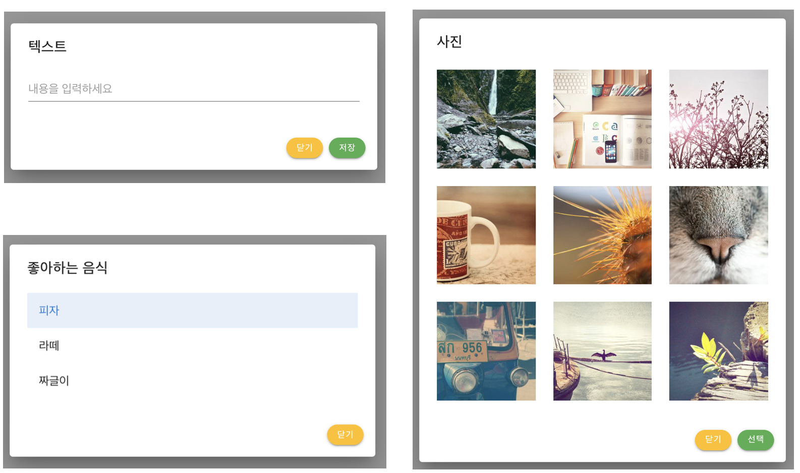
위의 3가지 dialog(modal) 화면에서 공통점이 있습니다.
- 제목(header)
- 내용(body)
- 하단(footer)
제목과 하단 영역은 와 텍스트와 버튼 이름, 개수 정도가 다르지만
내용이 들어가는 바디 영역은 완전히 다른 컴포넌트 입니다.
- 텍스트 필드
- 리스트
- 사진
따라서, body에는 어떤 컴포넌트를 사용할 지 모르기 때문에
body 영역을 slot화 한 RoRoDialog component를 만들어 보겠습니다.
<script>
  export default {
    name: 'RoRoDialog',
    props: {
      footerSubmit: {
        type: Boolean,
        default: true,
      },
      headerTitle: {
        type: String,
        default: '제목',
      },
      footerSubmitTitle: {
        type: String,
        default: '저장',
      },
    },
  }
</script>
헤더인 제목(텍스트/좋아하는 음식/사진)과
푸터의 버튼 이름(저장/선택)은 변경되므로 상위 컴포넌트를 통해 prop으로 받습니다.
푸터의 submit 버튼도 상황에 따라 보여질지 말지 상위 컴포넌트에서 결정합니다.
<template>
  <v-card>
    <v-card-title>
        {{ headerTitle }}
    </v-card-title>
    <v-card-text>
      <slot name="body">
          {{ defaultBodyContent }}
      </slot>
    </v-card-text>
    <v-card-actions class="justify-end mr-2 pb-4">
        <v-btn
            color="amber"
            dark
            rounded
            small
            @click="$emit('hide')"
        >
            {{ footerHideTitle }}
        </v-btn>
        <template v-if="footerSubmit">
            <v-btn
                color="success"
                rounded
                small
                @click="$emit('submit')"
            >
                {{ footerSubmitTitle }}
            </v-btn>
        </template>
    </v-card-actions>
  </v-card>
</template>
template 영역에서는
body 영역을 slot으로 만들어 상위 컴포넌트가 지정할 수 있게 만듭니다.
푸터의 '닫기/선택' 버튼의 클릭 이벤트는 상위 컴포넌트로 emit 합니다.
이제 상위 컴포넌트에서 RoroDialog를 사용해보겠습니다.
<template>
  <v-app>
    <v-main>
      <v-container>
        <v-btn
          dark
          color="green"
          @click="showDialog"
        >
          show dialog!
        </v-btn>
        <v-dialog
          max-width="500"
          v-model="roroDialog"
        >
          <roro-dialog
            @hide="hideDialog"
            @submit="submitDialog"
          />
        </v-dialog>
      </v-container>
    </v-main>
  </v-app>
</template>

<script>
import RoroDialog from './components/RoroDialog'

export default {
  name: 'App',
  components: {
    RoroDialog,
  },
  data: () => ({
    roroDialog: false,
  }),
  methods: {
    showDialog() {
      this.roroDialog = true
    },
    hideDialog() {
      this.roroDialog = false
    },
    submitDialog() {
      console.log('submit 완료!')
      this.hideDialog()
    },
  }
}
</script>
vuetify v-dialog를 이용하여 RoroDialog Component를 사용해봅니다.
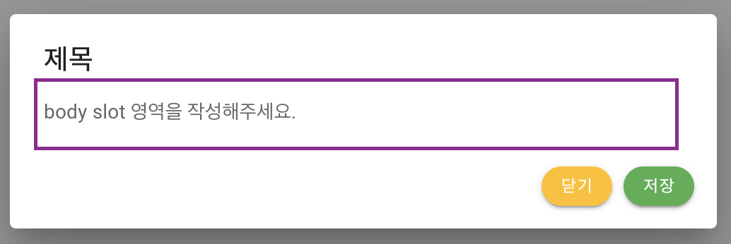
위의 코드에서 body slot 및 prop을 정의 하지 않았으므로
모든 기본값을 가진 RoroDialog가 나타납니다.
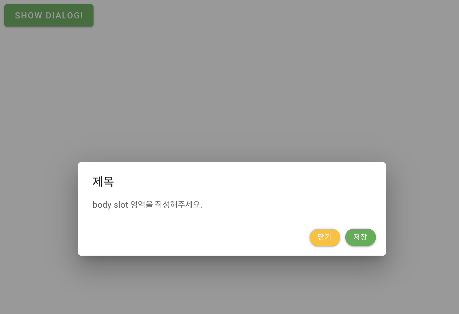
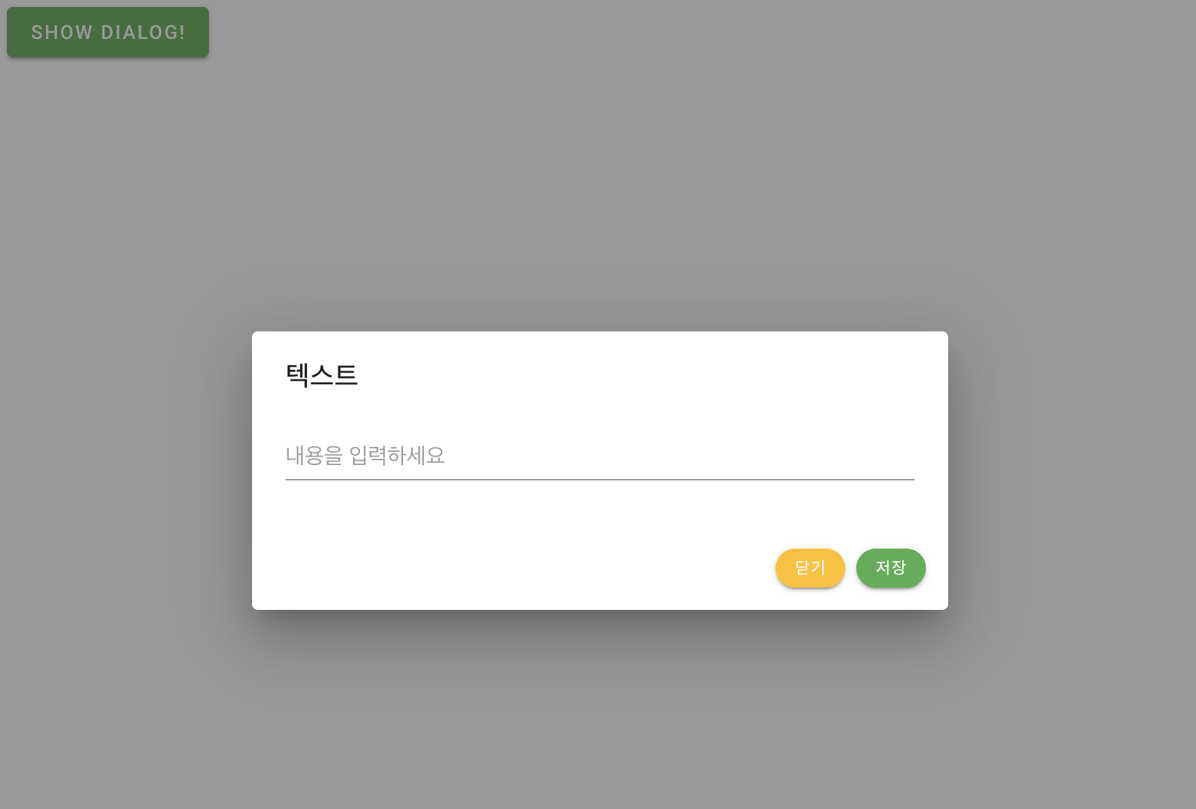
텍스트 제목을 가진 dialog를 만들어봅시다.
<v-dialog
          max-width="500"
          v-model="roroDialog"
>
   <roro-dialog
              header-title="텍스트"
              @hide="hideDialog"
              @submit="submitDialog"
    >
      <template v-slot:body>
         <v-text-field
             placeholder="내용을 입력하세요"
          />
       </template>
    </roro-dialog>
</v-dialog>
header 제목을 텍스트로 지정하고 body slot에 text field 컴포넌트를 작성합니다.
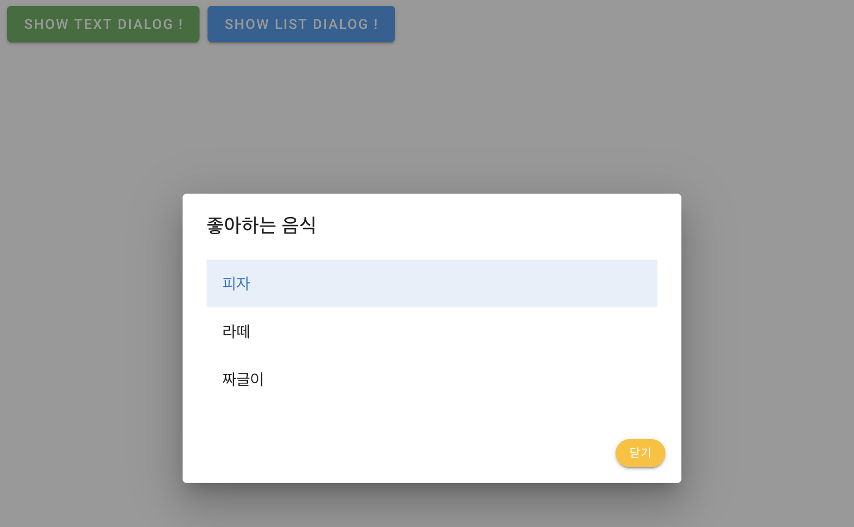
<roro-dialog
            header-title="좋아하는 음식"
            :footer-submit="false"
            @hide="hideDialog('List')"
            @submit="submitDialog('List')"
>
   <template v-slot:body>
     <v-list>
        <v-list-item-group v-model="item" color="primary">
           <v-list-item
                    v-for="(item, i) in items"
                    :key="i"
            >
              <v-list-item-content>
                <v-list-item-title v-text="item.text" />
              </v-list-item-content>
            </v-list-item>
         </v-list-item-group>
     </v-list>
   </template>
</roro-dialog>
좋아하는 음식 리스트 컴포넌트는 slot 영역에 vuetify의 list 컴포넌트를 작성합니다.
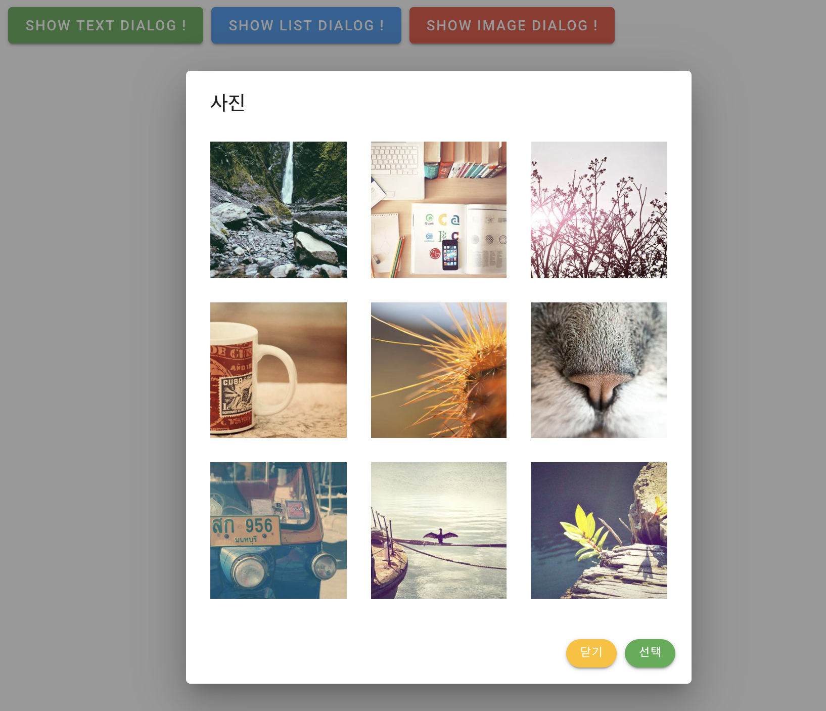
<roro-dialog
            header-title="사진"
            footer-submit-title="선택"
            @hide="hideDialog('Image')"
            @submit="submitDialog('Image')"
          >
            <template v-slot:body>
              <v-row>
                <v-col
                  v-for="n in 9"
                  :key="n"
                  class="d-flex child-flex"
                  cols="4"
                >
                  <v-card flat tile class="d-flex">
                    <v-img
                      :src="`https://picsum.photos/500/300?image=${n * 5 + 10}`"
                      :lazy-src="`https://picsum.photos/10/6?image=${n * 5 + 10}`"
                      aspect-ratio="1"
                      class="grey lighten-2"
                    >
                      <template v-slot:placeholder>
                        <v-row
                          class="fill-height ma-0"
                          align="center"
                          justify="center"
                        >
                          <v-progress-circular indeterminate color="grey lighten-5"></v-progress-circular>
                        </v-row>
                      </template>
                    </v-img>
                  </v-card>
                </v-col>
              </v-row>
            </template>
 </roro-dialog>
마지막 사진 컴포넌트에는 slot 영역에 이미지를 그리는 컴포넌트를 작성합니다.
완성된 모든 코드는 roro-dialog 에 있습니다.

글 잘쓴짜~ 이시네요