
1. 뷰의 개요
- 앱을 실행하면 화면에 무엇인가 나와야 사용자가 인식하고 사용할 수 있습니다.
- 앱 실행 화면을 구성하는 요소를 뷰(view)라고 통칭합니다.
1-1 뷰와 뷰그룹
- 안드로이드 화면에서 실제로 사용되는 것들은 모두 View라는 클래스의 상속을 받습니다.
- 버튼, 라디오버튼, 이미지 등은 모두 View 클래스의 서브클래스입니다.
- 뷰 클래스는 '위젯'이라고도 하는데, 쉽게 말해 화면에서는 버튼을 버튼 위젯, 실제 코드에서는 버튼 클래스라고 부르는 식입니다.
- 다른 위젯을 담을 수 있는 위젯을 특별히 레이아웃이라고 하며, 레이아웃은 ViewGroup이라는 클래스 아래에 존재합니다.(레이아웃도 크게 보면 위젯에 포함됩니다)
- 위젯은 단독으로 존재하지 않으며, 위젯을 담아 배치하는 틀이 바로 레이아웃입니다.
- 레이아웃은 위젯을 포함하는 컨테이너 역할을 하므로 눈에 보이는 개념이 아닙니다.
- 버튼, 텍스트뷰, 체크박스 등 눈에 보이는 요소를 '위젯', 위젯을 담는 틀을 '레이아웃'으로 구분하여 부릅니다.
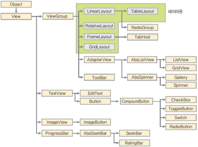
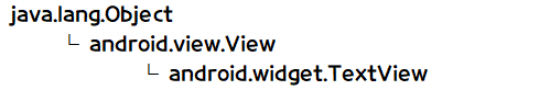
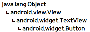
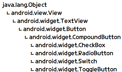
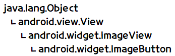
View 클래스 계층도
- 안드로이드에서 View 클래스의 상속을 받은 클래스(위젯) 계층도의 일부입니다.
- 위 그림을 보면 최상위에 Object(java.lang.Object) 클래스가 있고, 이를 상속받은 View 클래스가 있습니다.
- 안드로이드에서 화면에 나타나는 모든 위젯은 View 하위에 존재합니다.
- 레이아웃은 ViewGroup을 상속받은 LinearLayout, RelativeLayout, FrameLayout, GridLayout, TableLayout을 지칭합니다.
- 레이아웃이라고 부르지는 않지만 다른 뷰를 포함하는 ListView, GridView, TabHost, Gallery등을 뷰 컨테이너(View Container)라고 합니다.
- 뷰 컨테이너도 ViewGroup 클래스에서 상속받습니다.
1-2 View 클래스의 XML 속성
- 안드로이드 계층도를 보면 View 클래스가 모든 위젯의 부모 클래스임을 알 수 있습니다.
- 위젯과 레이아웃 등은 모두 View 클래스의 속성과 메서드를 상속받는다고 생각하면 됩니다.
- View 클래스의 중요한 속성을 파악하면 하위 클래스도 쉽게 이해할 수 있습니다.
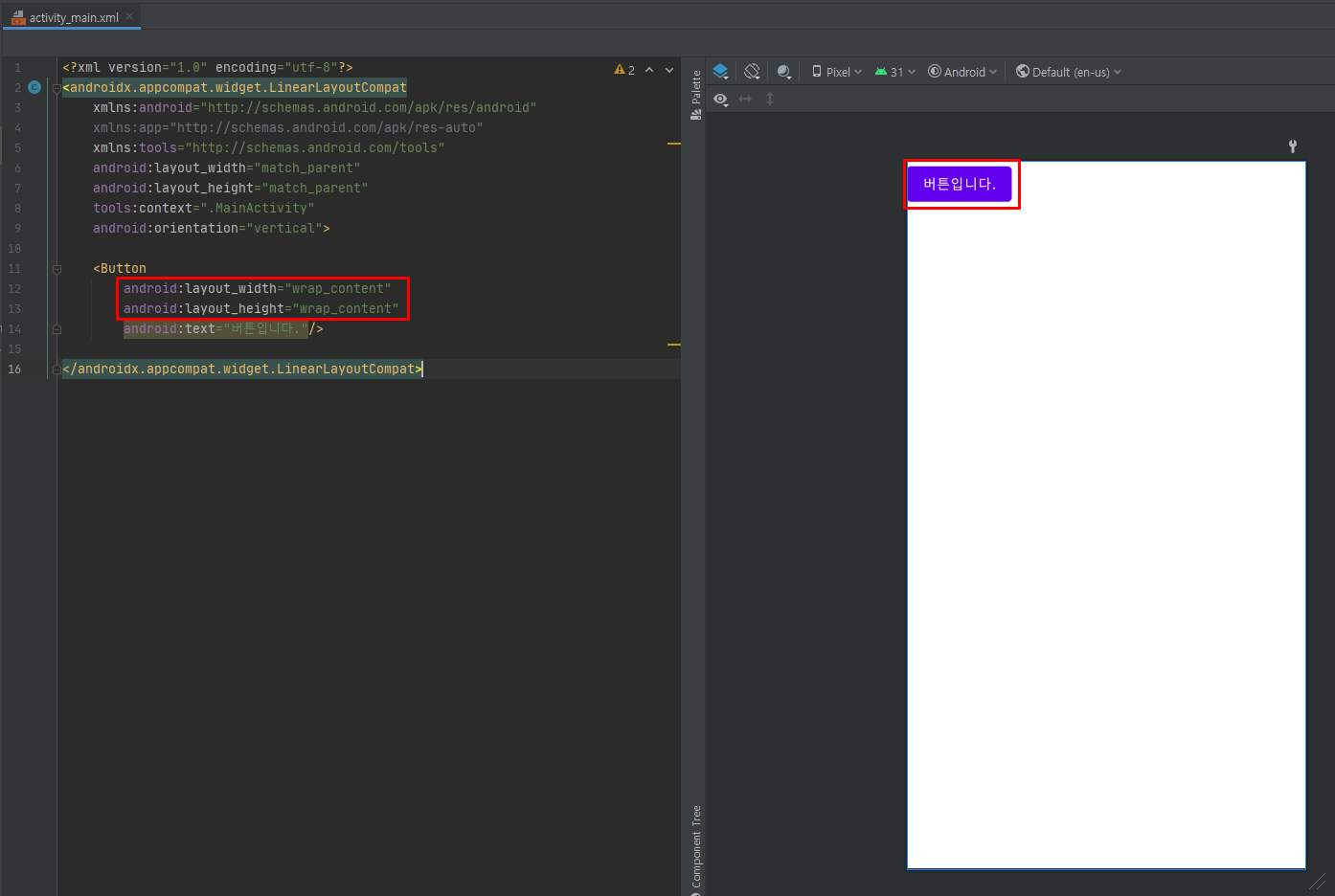
<Button
        android:id="@+id/button"
        android:layout_width="wrap_content"
        android:layout_height="wrap_content"
        android:text="버튼입니다."/>
- 버튼의 id, layout_width 등 몇가지 기본적인 XML 속성이 표현되었습니다.
id 속성
- id 속성은 모든 위젯의 아이디를 나타내며, .Java 코드에서 버튼 등의 위젯에 접근할 때 id 속성에 지정한 아이디를 사용합니다.
- 일반적으로 id 속성은 위젯에 아이디를 새로 부여하는 개념으로 '@+id/' 형식으로 지정합니다.
- / 다음에는 새로 지정할 아이디를 넣습니다.
- android:id="@+id/button"은 버튼 위젯에 아이디로 button을 부여한다는 의미입니다.
- .Java 코드에서 위와 같은 접근 방식을 사용할 수 있습니다.
- Button, RadioButton, CheckBox 등의 위젯은 일반적으로 클릭 또는 터치했을 떄 어떤 동작을 하기 위한 것이므로 id 속성을 지정합니다.
- 클릭이나 터치를 해도 아무 동작이 필요 없는 클자(텍스트뷰)나 배경 이미지(이미지뷰) 등은 굳이 id 속성을 지정하지 않아도 됩니다.
예제 4-1 id 속성의 XML 코드
layout_width, layout_height 속성
- layout_width, layout_height 속성은 모든 위젯에 필수로 들어가는 속성입니다.
- 위젯의 너비와 높이를 나타내며 match_parent와 wrap_content 값으로 설정할 수 있습니다.
- match_parent는 이름 그대로 부모(대개는 레이아웃)에 너비나 높이를 맞춘다는 의미이고, wrap_content는 글자가 꼭 들어갈 정도로 자신의 너비나 높이를 설정한다는 의미입니다.
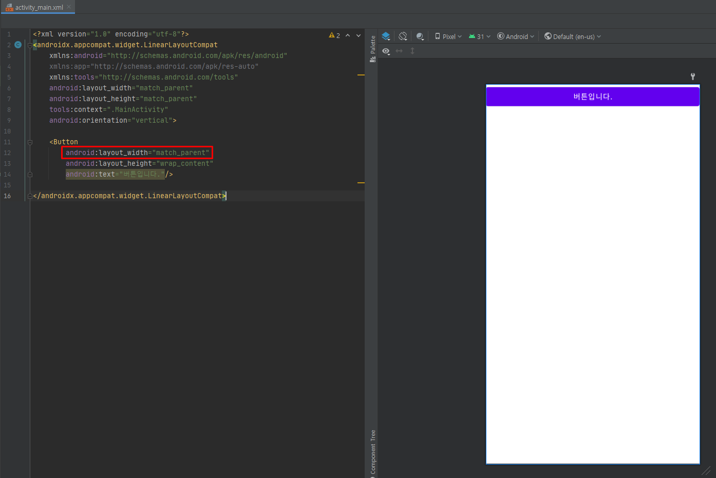
예제 4-2 layout_width, layout_height 속성의 XML 코드 1
- layout_width 속성에 wrap_content 값을 사용하면 버튼의 너비가 그 안에 글자인 '버튼입니다'에 꼭 맞는 크기가 됩니다.
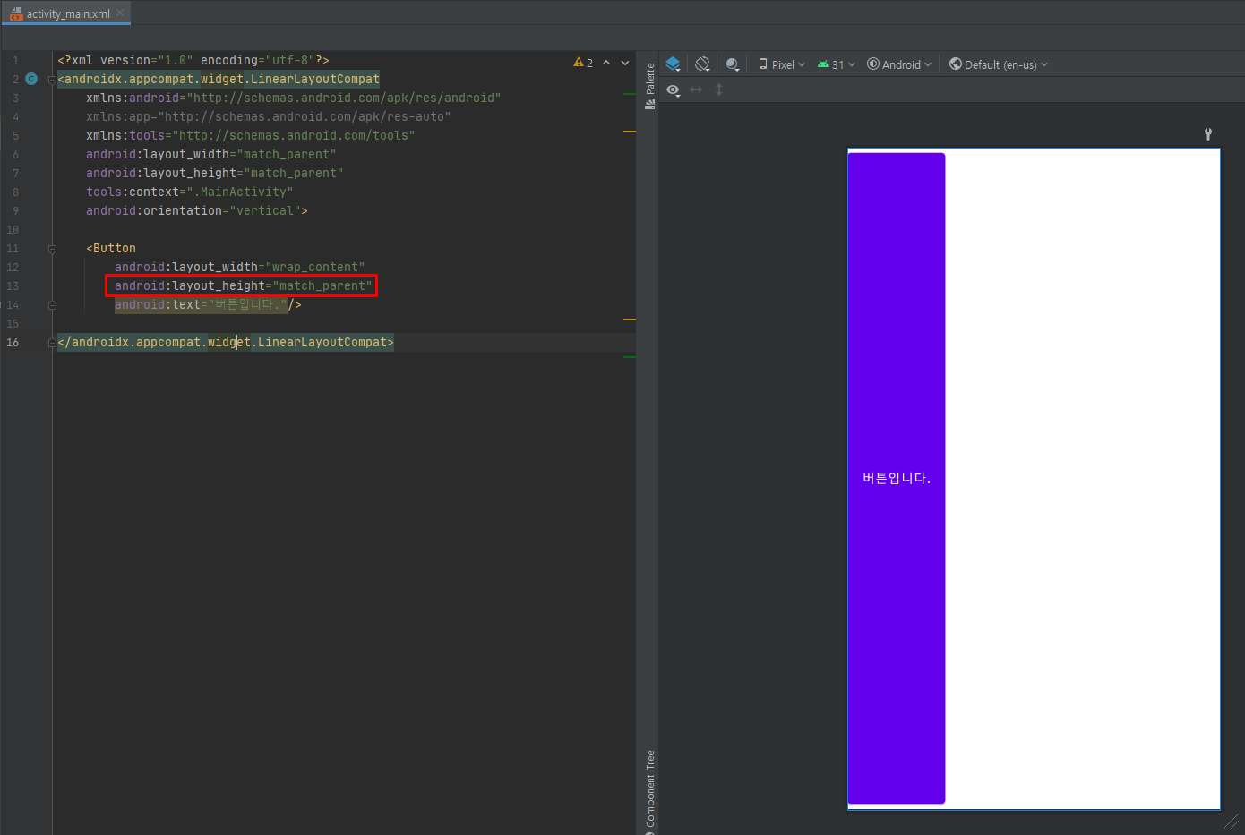
예제 4-3 layout_width, layout_height 속성의 XML 코드 2
- layout_width 속성에 match_parent 값을 사용하면 '버튼입니다'에 관계없이 버튼을 싸고 있는 부모(LinearLayout)의 너비에 꽉 차는 크기가 됩니다.
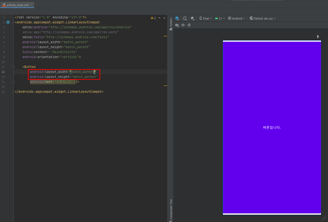
예제 4-4 layout_width, layout_height 속성의 XML 코드 3
- layout_height는 버튼의 높이에 적용됩니다.
예제 4-5 layout_width, layout_height 속성의 XML 코드 4
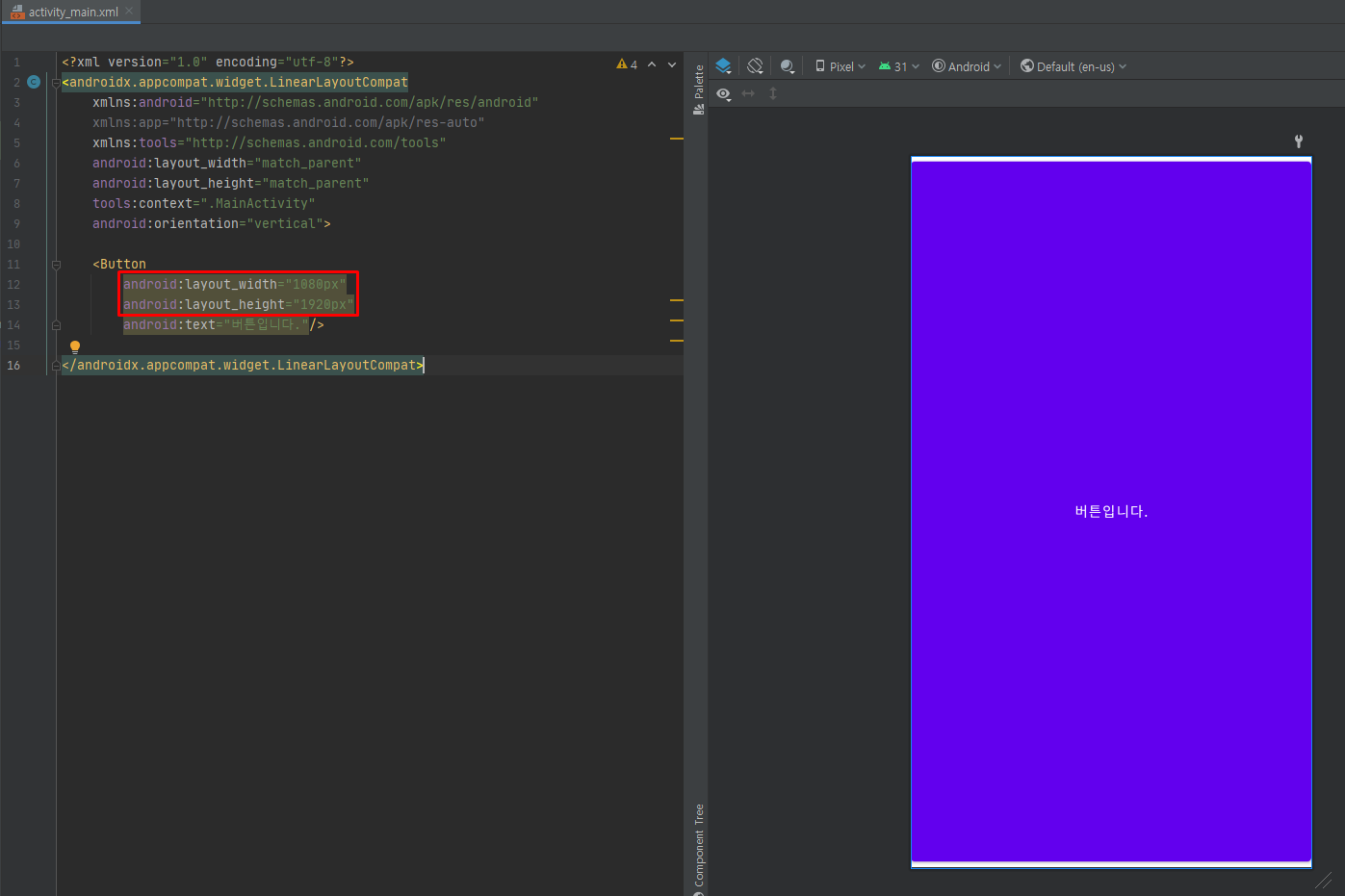
예제 4-6 layout_width, layout_height 속성의 XML 코드 5
- 값을 숫자로 직접 지정할 수도 있으며, 이 때는 단위에 주의해야 합니다.
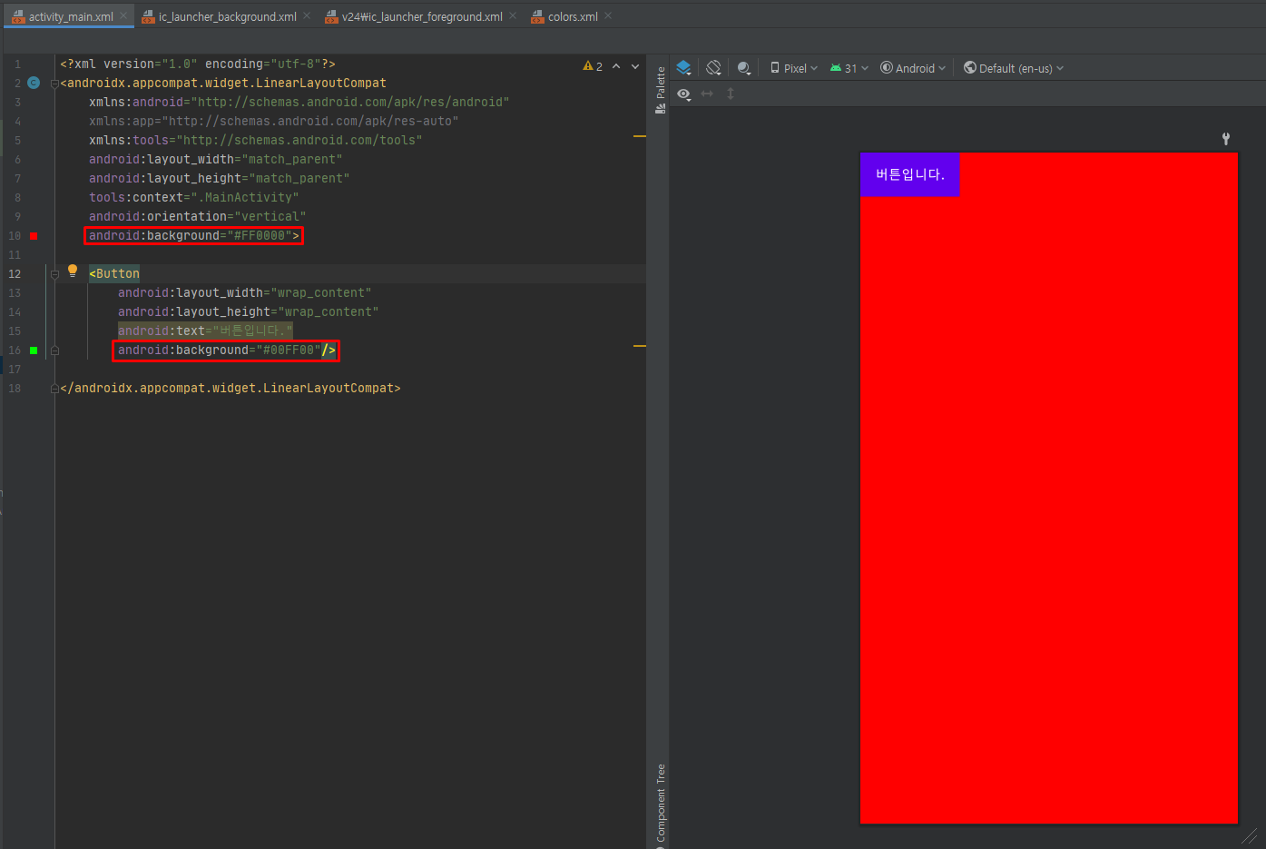
background 속성
- background 속성은 위젯의 색상을 주로 #RRGGBB 값으로 지정합니다.
- 각 값을 빨간색(R), 초록색(G), 파란색(B)을 의미하며 RR, GG, BB의 위치는 16진수 00 ~ FF로 표현할 수 있습니다.
- 예로 #FF0000는 빨간색, #0000FF는 파란색입니다.- 색상을 지정하기 위해 #AARRGGBB 방식을 사용할 수도 있습니다.
- AA는 알파 값으로 투명도를 의미합니다.
- 00 ~ FF로 지정할 수 있는데 00은 완전 투명을, FF는 완전 불투명을 나타냅니다.
예제 4-7 background 속성의 XML 코드
- 버튼의 배경색상은 변경이 안되는데 이유를 모르겠습니다.
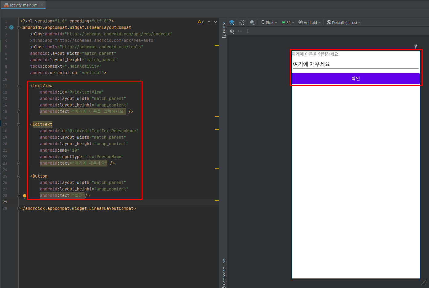
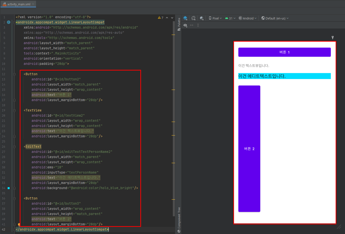
padding, layout_margin 속성
- padding 속성을 사용하여 위젯의 경계선으로부터 위젯 안의 요소가 떨어지게 설정할 수 있습니다.
- 기본적으로 레이아웃 내에 버튼, 텍스트뷰 등을 여러 개 두었을 때 레이아웃의 경계선에 딱 붙어서 표현되는데, padding 속성을 사용하면 레이아웃의 경계선과 위젯 사이에 여백을 둘 수 있습니다.
예제 4-8 간격이 없는 XML 코드
- 세 위젯이 레이아웃의 경계선에 딱 붙어 있어 답답해 보입니다.
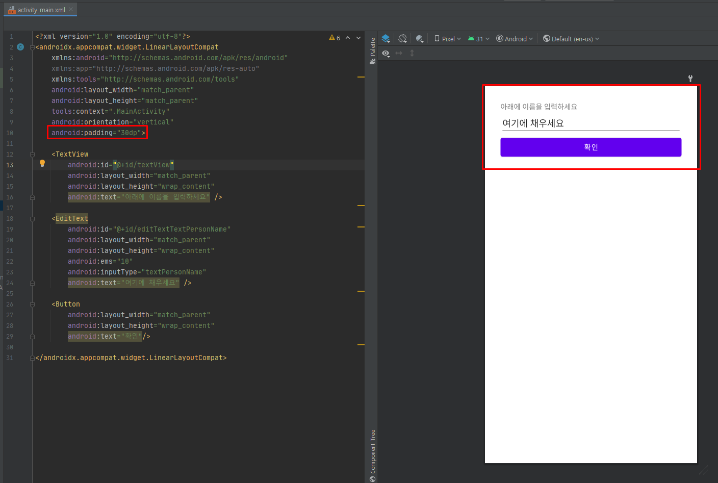
예제 4-9 padding 속성의 XML 코드
- LinearLayout에 지정된 padding 속성 때문에 그 안의 요소들이 경계선에서 30dp만큼 떨어져서 출력되었습니다.
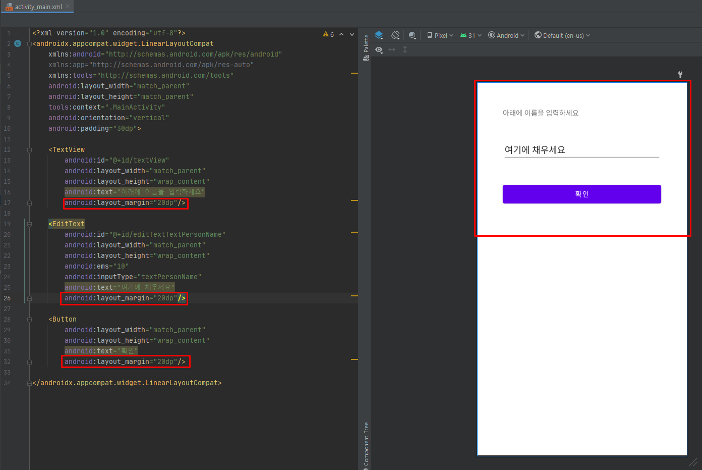
- 위젯과 위젯 사이에 여유를 두고 싶다면 layout_margin 속성을 사용합니다.
예제 4-10 layout_margin 속성의 XML 코드
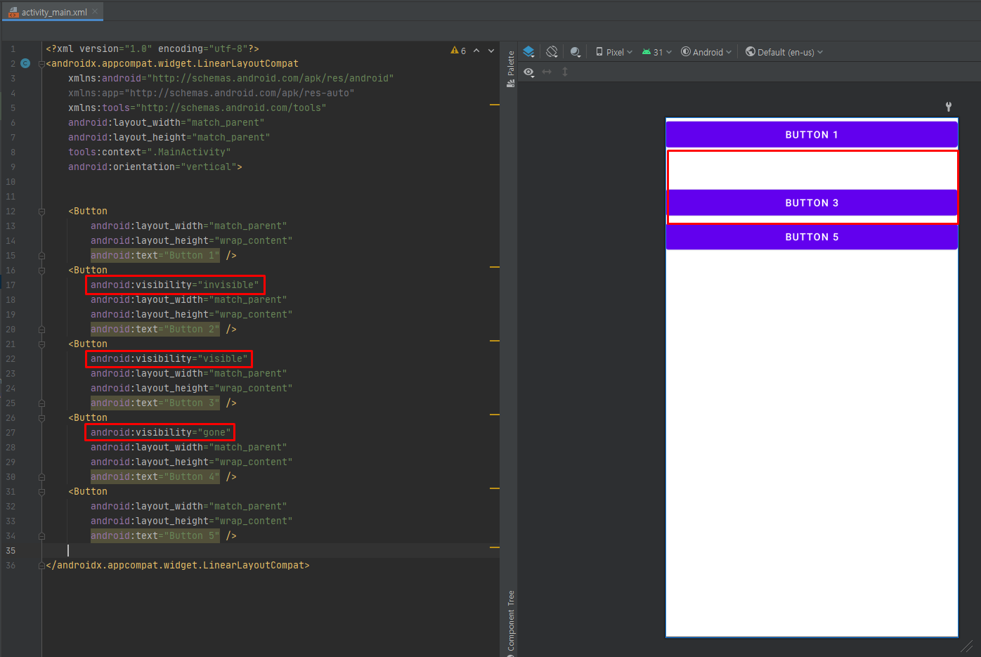
visibility 속성
- visibility 속성으로 위젯을 보일 것인지 여부를 결정할 수 있습니다.
- 세 가지 값을 지정할 수 있는데 visible은 보이는 상태, invisible과 gone은 안 보이는 상태입니다.
- invisible과 gone의 차이는 invisible은 보이지 않을 뿐 원래의 자리를 계속 유지하지만, gone은 그 자리까지 아예 내놓는다는 것입니다.
- visibility 속성은 XML보다 Java 코드에서 상황에 따라 동적으로 필요한 버튼 등을 보이거나 안보이게 하는 경우에 주로 활용됩니다.
예제 4-11 visibility 속성의 XML 코드
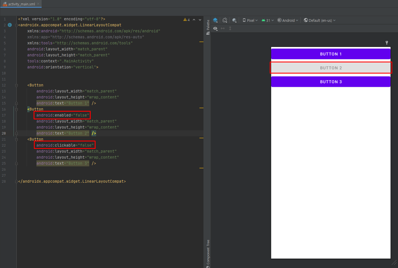
enabled, clickable 속성
- 위젯의 동작 여부는 enabled 속성으로, 클릭이나 터치가 가능하게 하는 것은 clickable 속성으로 설정합니다.
- 값은 true와 false로 지정하며 디폴트 값은 true입니다.
- enabled, clickable 속성은 XML보다 Java 코드에서 주로 사용합니다.
예제 4-12 enabled, clickable 속성의 XML 코드
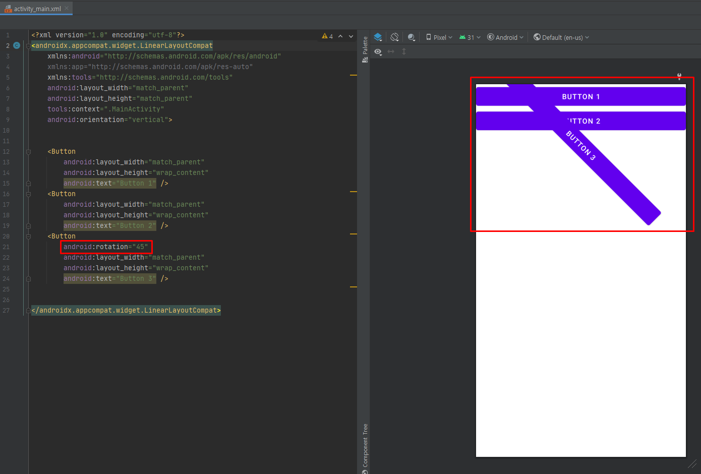
rotation 속성
- rotation 속성은 위젯을 회전시켜서 출력하며 값은 각도로 지정합니다.
- 특별한 화면을 만들 때 사용합니다.
예제 4-13 rotation 속성의 XML 코드
예제 4-14 직접 풀어보기
정리
- layout_width는 너비, layout_height는 높이를 의미합니다.
- match_parent는 이름 그대로 부모(대개는 레이아웃)에 너비나 높이를 맞춘다는 의미입니다.
- wrap_content는 글자가 꼭 들어갈 정도로 자신의 너비나 높이를 설정한다는 의미입니다.
- background 속성은 위젯의 색상을 주로 #RRGGBB 값으로 지정합니다.
- padding 속성에는 자신의 내부에 들어 있는 위젯과 자신의 경계선 사이 간격을 지정합니다.
- layout_margin 속성에는 자신과 부모 레이아웃이나 위젯 사이의 간격, 주위 다른 위젯과의 간격을 지정합니다.
- visibility 속성은 위젯을 보이게 할 것인지, 안 보이게 할 것인지를 설정할 수 있습니다.
- enabled 속성은 위젯의 동작 여부를 설정할 수 있습니다.
- clickable 속성은 위젯에 클릭이나 터치 가능 여부를 설정할 수 있습니다.
2. 기본 위젯 다루기
2-1 텍스트뷰
- 텍스트뷰 계층도입니다.
- 텍스트뷰는 View 클래스 바로 다음에 위치하며 다양한 위젯이 그 하위에 존재합니다.
- 텍스트뷰의 하위(에디트텍스트, 버튼, 체크박스 등)는 모두 텍스트뷰로부터 상속받습니다.
text 속성
- 텍스트뷰에 나타나는 문자열을 표현합니다.
- "문자열"형식으로 값을 직접 입력하거나 "@string/변수명" 형식으로 설정한 후 string.xml 파일에 저장할 수 있습니다.
textColor 속성
- 글자의 색상을 지정하며, background 속성처럼 값은 #RRGGBB나 #AARRGGBB 형식입니다.
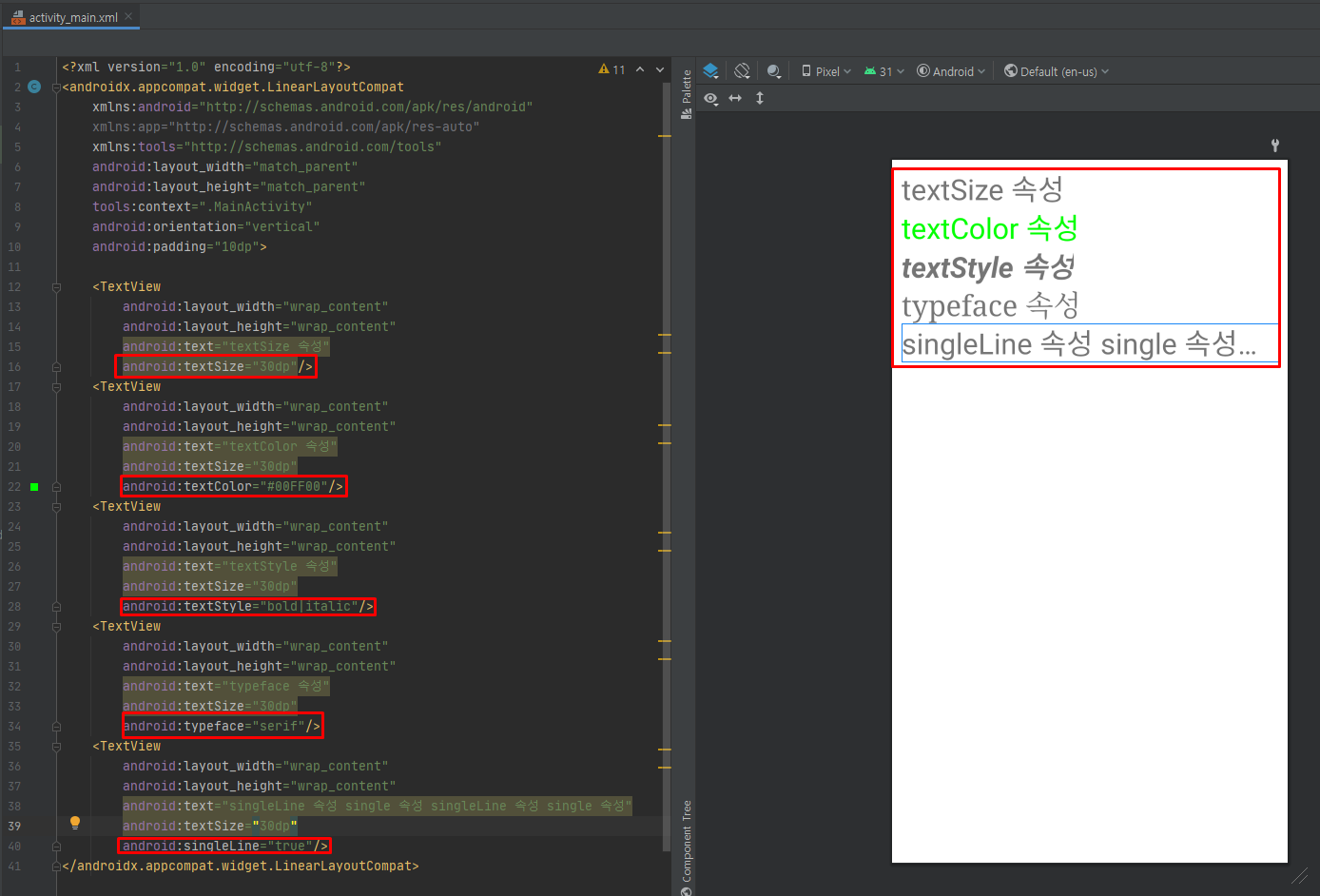
textSize 속성
- 글자의 크기를 dp, px, in, mm, sp 단위로 지정합니다.
typeface 속성
- 글자의 글꼴을 지정합니다.
- 값으로 sans, serif, monospace를 설정할 수 있고 디폴트는 normal입니다.
textStyle 속성
- 글자의 스타일을 지정합니다.
- 값으로 bold, italic, bold | italic을 설정할 수 있고, 디폴트는 normal입니다.
singleLine 속성
- 글이 길어 줄이 넘어갈 경우 강제로 한 줄깢디만 출력하고 문자열의 맨뒤에 '...'를 표시합니다.
- 값으로 true와 false를 설정할 수 있고 디폴트는 false입니다.
예제 4-15 글자 관련 속성의 XML 코드
2-2 Java 코드로 XML 속성 설정
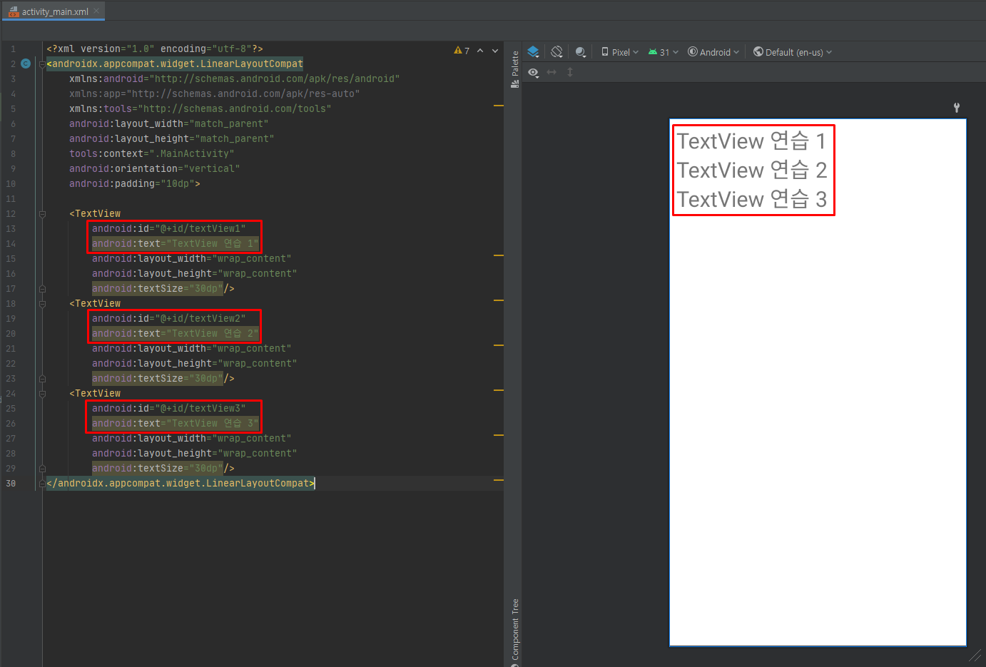
예제 4-16 텍스트뷰가 3개있는 activity_main.xml
예제 4-17 텍스트 속성을 변경하는 Java 코드
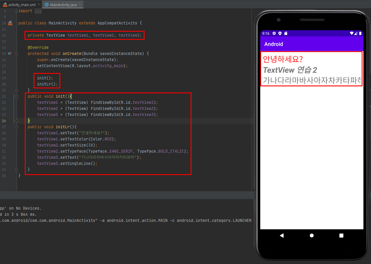
XML 속성과 관련된 메서드

2-3 버튼과 에디트텍스트
- 버튼과 에디트텍스트는 사용자에게서 어떤 값을 입력받기 위한 가장 기본적인 위젯으로도 활용도가 높습니다.
- 두 위젯은 View 클래스와 TextView 클래스 상속받으므로 거의 비슷하게 사용할 수 있습니다.
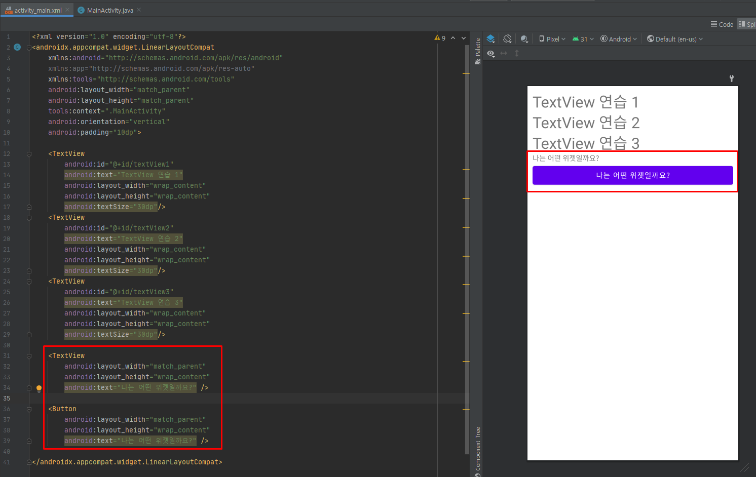
<TextView
        android:layout_width="match_parent"
        android:layout_height="wrap_content"
        android:text="나는 어떤 위젯일까요?" />
- 위는 간단한 텍스트뷰 예제입니다.
- 이 텍스트뷰 예제에서 TextView만 Button으로 바꾸면 버튼으로 변경이 됩니다.
<Button
        android:layout_width="match_parent"
        android:layout_height="wrap_content"
        android:text="나는 어떤 위젯일까요?" />
- 필요시 TextView의 하위 클래스인 EditText, RadioButton, CheckBox, ToggleButton 등으로 바꿀 수 있습니다.
버튼
- 아래는 버튼의 계층도 입니다.
- 버튼에서는 버튼을 클릭하는 이벤트를 가장 많이 사용합니다.
    <Button
        android:id="@+id/button1"
        android:text="확인" />
- 일반적인 버튼의 XML입니다.
버튼을 클릭했을 때 동작하는 Java 코드 단계
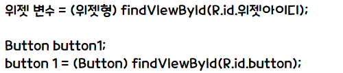
① 버튼 변수 선언
Button myButton;② 변수에 버튼 위젯 대입
myButton = (Button)findViewById(R.id.button1);③ 버튼을 클릭할 때 동작하는 클래스 정의
myButton.setOnClickListener( new View.OnClickListener(){
	public void onClick(View v) {
    	// 동작 내용을 이 부분에 코딩
    }
});
myButton.setOnClickListener( v -> { // 동작 내용을 이 부분에 코딩 ( 수업에서 사용한 람다식을 활용한 방법 ) });
- 위의 세 단계는 대부분의 위젯(라디오버튼, 이미지버튼, 체크박스, 토글박스 등)에서 거의 동일하게 사용되므로 통째로 외워두면 좋습니다.
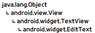
에디트텍스트
- 아래는 에디트텍스트의 계층도입니다.
- 에디트텍스트는 값을 입력받은 후 해당 값을 Java 코드에서 가져와 사용하는 용도로 많이 쓰입니다.
- Java 코드에서 에디트텍스트에 값을 입력하는 경우도 종종 있습니다.
    <EditText
        android:id="@+id/editText1"/>
- 일반적인 에디트텍스트의 XML입니다.
- 에디트텍스트도 변수를 선언하고 이 변수에 해당 아이디 값을 넣은 후에 접근합니다.
에디트텍스트 사용했을 때 동작하는 Java 코드 단계
① 에디트텍스트 변수 선언
EditText myEdit;② 변수에 에디트텍스트 위젯 대입
myEdit = (EditText)findViewById(R.id.editText1);③ 에디트텍스트에 입력된 값 가져오기 → 주로 버튼 클릭 이벤트 리스너 안에 삽입
String myStr = myEdit.getText( ).toString( );
- getText( ) 메서드는 에디트텍스트에 입력한 값을 반환하는데, 이를 문자열로 바꾸기 위해 toString( )을 함께 사용했습니다.
- 반환값을 문자열로 변경할 때 가장 많이 사용하는 방식입니다.
실습 4-1 초간단 계산기 앱 만들기
예제 4-18
<?xml version="1.0" encoding="utf-8"?>
<androidx.appcompat.widget.LinearLayoutCompat
    xmlns:android="http://schemas.android.com/apk/res/android"
    xmlns:app="http://schemas.android.com/apk/res-auto"
    xmlns:tools="http://schemas.android.com/tools"
    android:layout_width="match_parent"
    android:layout_height="match_parent"
    android:orientation="vertical"
    tools:context=".MainActivity">
    <EditText
        android:id="@+id/et1"
        android:layout_width="wrap_content"
        android:layout_height="wrap_content"
        android:layout_margin="10dp"
        android:hint="숫자 1" />
    <EditText
        android:id="@+id/et2"
        android:layout_width="wrap_content"
        android:layout_height="wrap_content"
        android:layout_margin="10dp"
        android:hint="숫자 2" />
    <Button
        android:id="@+id/btnAdd"
        android:layout_width="match_parent"
        android:layout_height="wrap_content"
        android:layout_margin="10dp"
        android:text="더하기" />
    <Button
        android:id="@+id/btnMinus"
        android:layout_width="match_parent"
        android:layout_height="wrap_content"
        android:layout_margin="10dp"
        android:text="빼기" />
    <Button
        android:id="@+id/btnDup"
        android:layout_width="match_parent"
        android:layout_height="wrap_content"
        android:layout_margin="10dp"
        android:text="곱하기" />
    <Button
        android:id="@+id/btnDivide"
        android:layout_width="match_parent"
        android:layout_height="wrap_content"
        android:layout_margin="10dp"
        android:text="나누기" />
    <TextView
        android:id="@+id/tvResult"
        android:layout_width="wrap_content"
        android:layout_height="wrap_content"
        android:textSize="30dp"
        android:textColor="@android:color/holo_red_light"
        android:layout_margin="10dp"
        android:text="계산 결과 : " />
</androidx.appcompat.widget.LinearLayoutCompat>

예제 4-19 Java 코드 1
예제 4-20 Java 코드 2
예제 4-21 Java 코드 3

예제 4-22 완성된 Java 코드
package com.com.project4_1;
import androidx.appcompat.app.AppCompatActivity;
import android.os.Bundle;
import android.widget.Button;
import android.widget.EditText;
import android.widget.TextView;
public class MainActivity extends AppCompatActivity implements InitActivity {
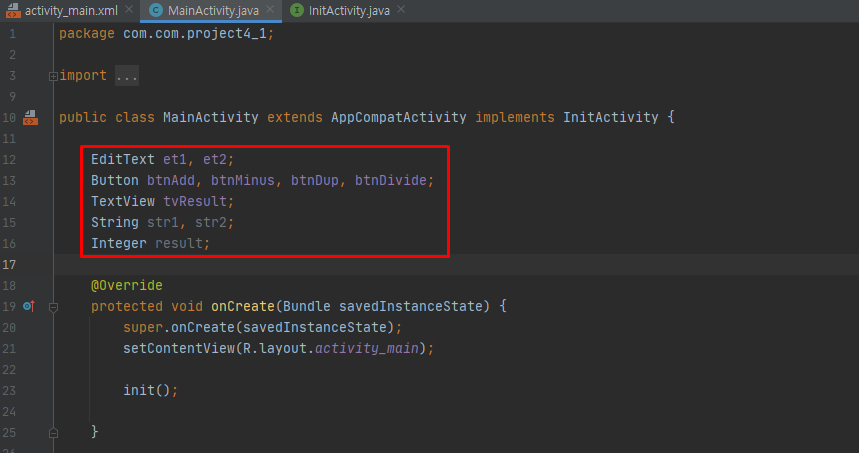
EditText et1, et2;
Button btnAdd, btnMinus, btnDup, btnDivide;
TextView tvResult;
String str1, str2;
Integer result;
@Override
protected void onCreate(Bundle savedInstanceState) {
super.onCreate(savedInstanceState);
setContentView(R.layout.activity_main);
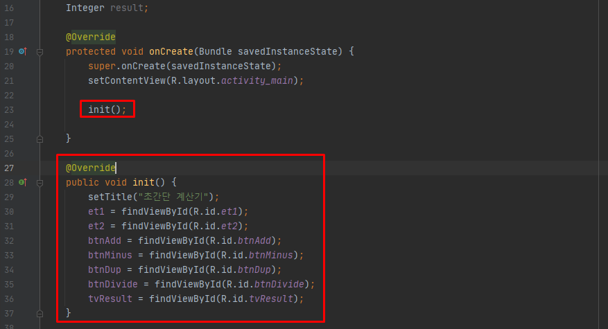
init();
initLr();
}
@Override
public void init() {
setTitle("초간단 계산기");
et1 = findViewById(R.id.et1);
et2 = findViewById(R.id.et2);
btnAdd = findViewById(R.id.btnAdd);
btnMinus = findViewById(R.id.btnMinus);
btnDup = findViewById(R.id.btnDup);
btnDivide = findViewById(R.id.btnDivide);
tvResult = findViewById(R.id.tvResult);
}
@Override
public void initLr() {
btnAdd.setOnClickListener(v -> {
str1 = et1.getText().toString();
str2 = et2.getText().toString();
result = Integer.parseInt(str1) + Integer.parseInt(str2);
tvResult.setText("계산 결과 : " + result.toString());
});
btnMinus.setOnClickListener(v -> {
str1 = et1.getText().toString();
str2 = et2.getText().toString();
result = Integer.parseInt(str1) - Integer.parseInt(str2);
tvResult.setText("계산 결과 : " + result.toString());
});
btnDup.setOnClickListener(v -> {
str1 = et1.getText().toString();
str2 = et2.getText().toString();
result = Integer.parseInt(str1) * Integer.parseInt(str2);
tvResult.setText("계산 결과 : " + result.toString());
});
btnDivide.setOnClickListener(v -> {
str1 = et1.getText().toString();
str2 = et2.getText().toString();
result = Integer.parseInt(str1) / Integer.parseInt(str2);
tvResult.setText("계산 결과 : " + result.toString());
});
}
}3. 기본 위젯 활용하기
3-1 컴파운드버튼
- 아래는 컴파운드버튼 계층도입니다.
- CompoundButton 클래스는 Button 클래스의 하위 클래스로 체크 박스, 라디오 버튼, 스위치, 토글버튼의 상위 클래스입니다.
- 위 네 가지는 공통적으로 체크 또는 언체크 상태가 될 수 있습니다.
- 실제로 비슷한 형태를 띠지만 용도는 조금식 다릅니다.
체크박스
- 체크박스는 클릭할 때마다 상태가 체크, 언체크로 바뀝니다.
- 여러개의 체크박스가 있어도 독립적으로 동작한다는 특징이 있어 여러 개를 동시에 체크할 수 있습니다.
- Java 코드에서는 강제로 체크를 켜거나 끄는 setChecked( ), 체크 상태를 반대로 바꾸는 toggle( ), 체크되었는지 확인하는 isChecked( ) 등의 메서드를 많이 사용합니다.
- 버튼에서 클릭 이벤트 발생 시 OnClickListener 리스너를 사용했듯이, 체크박스에는 체크 또는 언체크 이벤트 발생 시 OnCheckedChangeListener 리스너를 사용할 수 있습니다.
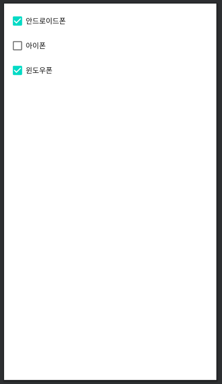
예제 4-23 체크박스의 XML 코드
<?xml version="1.0" encoding="utf-8"?>
<androidx.appcompat.widget.LinearLayoutCompat
    xmlns:android="http://schemas.android.com/apk/res/android"
    xmlns:app="http://schemas.android.com/apk/res-auto"
    xmlns:tools="http://schemas.android.com/tools"
    android:layout_width="match_parent"
    android:layout_height="match_parent"
    tools:context=".MainActivity"
    android:orientation="vertical"
    android:padding="10dp">
   <CheckBox
       android:id="@+id/android"
       android:layout_width="wrap_content"
       android:layout_height="wrap_content"
       android:text="안드로이드폰"
       android:checked="true" />
    <CheckBox
        android:id="@+id/iphon"
        android:layout_width="wrap_content"
        android:layout_height="wrap_content"
        android:text="아이폰"
        android:checked="false" />
    <CheckBox
        android:id="@+id/window"
        android:layout_width="wrap_content"
        android:layout_height="wrap_content"
        android:text="윈도우폰"
        android:checked="true" />
</androidx.appcompat.widget.LinearLayoutCompat>
- checked 속성이 true로 되어 있는데, 이처럼 동시에 여러개를 선택할 수 있습니다.
체크와 언체크가 바뀌는는 Java 코드 단계
① 체크박스 변수 선언
CheckBox myCheck;② 변수에 체크박스 위젯 대입
myCheck = (CheckBox)findViewById(R.id.android);③ 체크박스가 변경될 떄 동작하는 클래스 정의
myCheck.setOnCheckedChangeListener(new CompoundButton.OnCheckedChangeListener() {
	public void onCheckedChanged(CompoundButton compoundButton, boolean b) {
                // 동작 내용을 이 부분에 작성
	}
});
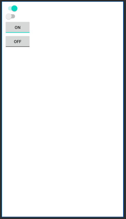
스위치와 토글버튼
- 스위치와 토글버튼은 모양만 조금 다를 뿐 용도는 거의 동일합니다.
- 스위치의 주 용도는 온/오프 상태 표시입니다.
- 체크박스를 스위치나 토글버튼처럼 사용할 수도 있지만 모양이 조금 다르므로 상황에 맞게 고르는 것이 좋습니다.
예제 4-24 스위치와 토글버튼의 XML 코드
<?xml version="1.0" encoding="utf-8"?>
<androidx.appcompat.widget.LinearLayoutCompat
    xmlns:android="http://schemas.android.com/apk/res/android"
    xmlns:app="http://schemas.android.com/apk/res-auto"
    xmlns:tools="http://schemas.android.com/tools"
    android:layout_width="match_parent"
    android:layout_height="match_parent"
    tools:context=".MainActivity"
    android:orientation="vertical"
    android:padding="10dp">
    <Switch
        android:layout_width="wrap_content"
        android:layout_height="wrap_content"
        android:checked="true"/>
    <Switch
        android:layout_width="wrap_content"
        android:layout_height="wrap_content"
        android:checked="false"/>
    <ToggleButton
        android:layout_width="wrap_content"
        android:layout_height="wrap_content"
        android:checked="true"/>
    <ToggleButton
        android:layout_width="wrap_content"
        android:layout_height="wrap_content"
        android:checked="false"/>
</androidx.appcompat.widget.LinearLayoutCompat>
- checked 속성은 true와 false에 따라서 색상과 글자가 다르게 표현됩니다.
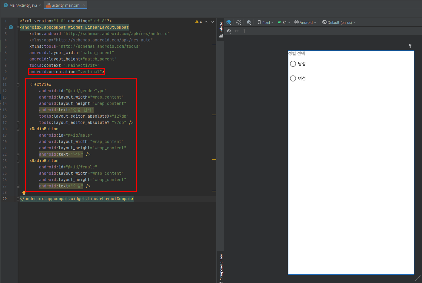
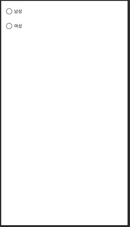
라디오버튼과 라디오그룹
- 라디오버튼은 XML 속성이나 메서드가 체크박스와 거의 동일하지만 용도가 다릅니다.
- 성별을 선택하는 것처럼 여러 개중 하나만 선택해야 하는 경우에 사용합니다.
- 라디오버튼만 여러개 나열하면 클릭하는 것마다 모두 중복 선택되므로 라디오그룹(RadioGroup)과 함께 사용해야합니다.
- 라디오그룹은 ViewGroup-LinearLayout의 하위 클래스로 존재하며, TextView 하위의 위젯들과는 성격이 조금 다릅니다.
- 라디오그룹은 대부분 라디오버튼을 묶는 역할만 합니다.
예제 4-25 라디오그룹과 라디오버튼의 XML 코드
<?xml version="1.0" encoding="utf-8"?>
<androidx.appcompat.widget.LinearLayoutCompat
    xmlns:android="http://schemas.android.com/apk/res/android"
    xmlns:app="http://schemas.android.com/apk/res-auto"
    xmlns:tools="http://schemas.android.com/tools"
    android:layout_width="match_parent"
    android:layout_height="match_parent"
    tools:context=".MainActivity"
    android:orientation="vertical"
    android:padding="10dp">
    <RadioGroup
        android:layout_width="wrap_content"
        android:layout_height="wrap_content"
        android:id="@+id/rG1">
        <RadioButton
            android:layout_width="wrap_content"
            android:layout_height="wrap_content"
            android:text="남성" />
        <RadioButton
            android:layout_width="wrap_content"
            android:layout_height="wrap_content"
            android:text="여성" />
    </RadioGroup>
</androidx.appcompat.widget.LinearLayoutCompat>
3-2 이미지뷰와 이미지버튼
- 이미지뷰는 그림을 출력하는 위젯으로, 그림을 넣거나 화면을 화려하게 구성할 때 사용합니다.
- 이미지뷰에 보여줄 그림 파일은 일반적으로 프로젝트의 [res] - [drawable] 폴더에 있어야합니다.
- 접근은 XML에서 "@drawable / 그림 아이디" 형식으로 합니다.
- 아래는 이미지뷰 계층도입니다.
- ImageView 클래스는 View 클래스에서 바로 상속받기 때문에 앞에서 배운 TextView의 하위 위젯들과 속성이 조금 다릅니다.
- 이미지와 관련된 속성과 메서드를 주의 깊게 볼 필요가 있습니다.
- ImageButton 클래스는 ImageView 클래스에서 상속받으며 거의 동일한 용도로 사용하지만 버튼처럼 클릭하는데 사용됩니다.
- 이미지버튼은 그림으로 표현된 예쁜 버튼을 만들 때 사용할 수 있습니다.
이미지뷰와 이미지버튼의 XML 속성
- 이미지뷰와 이미지버튼의 XML 속성으로는 이미지의 경로를 나타내는 src, 이미지의 크기를 지정하는 maxHeight/maxWidth, 이미지의 확대/축소 방식을 지정하는 scaleType 등이 있습니다.
- scaleType 속성으로 martix, fitXY, fitStart, fitEnd 등 여덟 가지 값을 지정할 수 있는데, 지정한 값에 따라 이미지를 확대/축소하는 방식이 결정됩니다.
- 이미지를 사용하려면 먼저 그림 파일을 [res] - [drawable] 폴더에 복사해놓아야 합니다.
- 파일 포맷은 png, jpg, gif를 지원하지만 png나 jpg를 권장합니다.
- 참고로 [res] - [mipmap]에 같은 이름의 앱 아이콘 이미지(ic_launcher.png)가 디폴트로 들어 있는데, 각각은 같은 이미지이지만 해상도가 mdpi(48X48), hdpi(72X72), xhdpi(96X96), xxhdpi(144X144), xxxhdpi(192X192) 등으로 다릅니다.
- 이는 모두 XML 파일에서는 @mipmap/ic_launcher로, Java 코드에서는 R.mipmap.ic_launcher로 사용됩니다.
- 앱 아이콘인 ic_launcher를 화면에 출력하면 안드로이드 운영체재가 현재 안드로이드폰의 해상도에 적절한 이미지를 알아서 선택합니다.
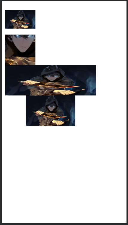
예제 4-26 이미지뷰와 이미지버튼의 XML 코드
<?xml version="1.0" encoding="utf-8"?>
<androidx.appcompat.widget.LinearLayoutCompat
    xmlns:android="http://schemas.android.com/apk/res/android"
    xmlns:app="http://schemas.android.com/apk/res-auto"
    xmlns:tools="http://schemas.android.com/tools"
    android:layout_width="match_parent"
    android:layout_height="match_parent"
    tools:context=".MainActivity"
    android:orientation="vertical"
    android:padding="10dp">
    <ImageView
        android:layout_width="100dp"
        android:layout_height="100dp"
        android:src="@drawable/level" />
    <ImageButton
        android:layout_width="100dp"
        android:layout_height="100dp"
        android:src="@drawable/level" />
    <ImageView
        android:layout_width="300dp"
        android:layout_height="100dp"
        android:scaleType="fitXY"
        android:src="@drawable/level" />
    <ImageView
        android:layout_width="300dp"
        android:layout_height="100dp"
        android:scaleType="fitCenter"
        android:src="@drawable/level" />
</androidx.appcompat.widget.LinearLayoutCompat>
- 첫 번째 기본적인 ImageView 형식입니다.
- 두 번째 기본적인 ImageButton은 형식입니다.
- 세 번째, 네 번째 ImageView에서는 크기를 확대했습니다.
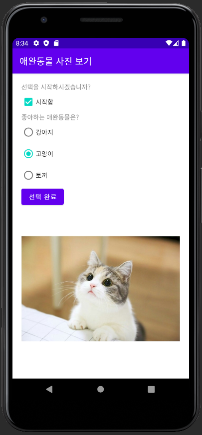
실습 4-2
예제 4-27 activity_main.xml 코드
<?xml version="1.0" encoding="utf-8"?>
<androidx.appcompat.widget.LinearLayoutCompat
    xmlns:android="http://schemas.android.com/apk/res/android"
    xmlns:app="http://schemas.android.com/apk/res-auto"
    xmlns:tools="http://schemas.android.com/tools"
    android:layout_width="match_parent"
    android:layout_height="match_parent"
    android:orientation="vertical"
    tools:context=".MainActivity"
    android:layout_margin="20dp">

    <TextView
        android:id="@+id/tvStart"
        android:layout_width="wrap_content"
        android:layout_height="wrap_content"
        android:text="선택을 시작하시겠습니까?" />
    <CheckBox
        android:id="@+id/cbStart"
        android:layout_width="wrap_content"
        android:layout_height="wrap_content"
        android:text="시작함 " />
    <TextView
        android:id="@+id/tvPet"
        android:layout_width="wrap_content"
        android:layout_height="wrap_content"
        android:text="좋아하는 애완동물은?"
        android:visibility="invisible"/>

    <RadioGroup
        android:id="@+id/rGroup1"
        android:layout_width="wrap_content"
        android:layout_height="wrap_content"
        android:visibility="invisible">
        <RadioButton
            android:id="@+id/btnPuppy"
            android:layout_width="wrap_content"
            android:layout_height="wrap_content"
            android:text="강아지" />
        <RadioButton
            android:id="@+id/btnCat"
            android:layout_width="wrap_content"
            android:layout_height="wrap_content"
            android:text="고양이" />
        <RadioButton
            android:id="@+id/btnRabbit"
            android:layout_width="wrap_content"
            android:layout_height="wrap_content"
            android:text="토끼" />
    </RadioGroup>

    <Button
        android:id="@+id/btnEnd"
        android:layout_width="wrap_content"
        android:layout_height="wrap_content"
        android:text="선택 완료"
        android:visibility="invisible"/>
    <ImageView
        android:id="@+id/imgPet"
        android:layout_width="wrap_content"
        android:layout_height="wrap_content"
        app:srcCompat="@drawable/cat"
        android:visibility="invisible"/>

</androidx.appcompat.widget.LinearLayoutCompat>- visibility 속성을 이용해서 위젯이 보이지 않게 설정할 수 있습니다.
예제 4-28 Java 코드 1
예제 4-29 Java 코드 2
예제 4-30 Java 코드 3
예제 4-31 Java 코드 4
MainActivity
package com.com.project4_2;
import androidx.appcompat.app.AppCompatActivity;
import android.media.Image;
import android.os.Bundle;
import android.view.View;
import android.widget.Button;
import android.widget.CheckBox;
import android.widget.CompoundButton;
import android.widget.ImageView;
import android.widget.RadioButton;
import android.widget.RadioGroup;
import android.widget.TextView;
import android.widget.Toast;
public class MainActivity extends AppCompatActivity implements InitActivity {
private static final String TAG = "MainActivity2";
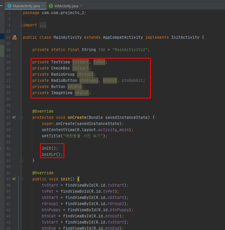
private TextView tvStart, tvPet;
private CheckBox cbStart;
private RadioGroup rGroup1;
private RadioButton btnPuppy, btnCat, btnRabbit;
private Button btnEnd;
private ImageView imgPet;
@Override
protected void onCreate(Bundle savedInstanceState) {
super.onCreate(savedInstanceState);
setContentView(R.layout.activity_main);
setTitle("애완동물 사진 보기");
init();
initLr();
}
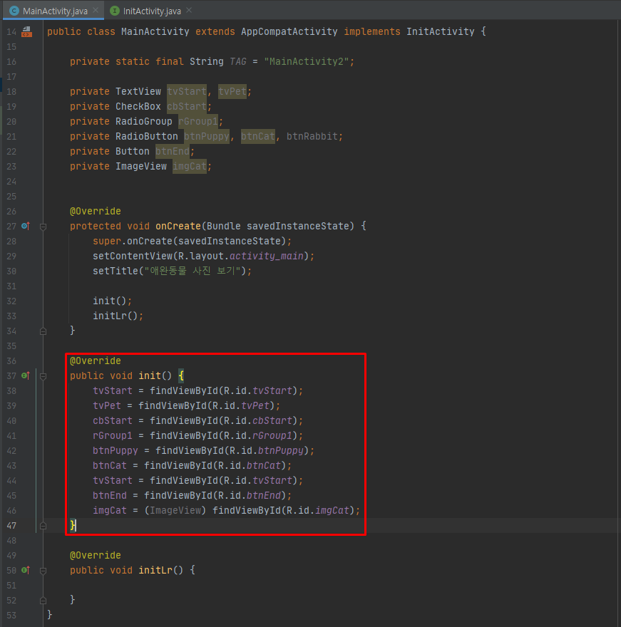
@Override
public void init() {
tvStart = findViewById(R.id.tvStart);
tvPet = findViewById(R.id.tvPet);
cbStart = findViewById(R.id.cbStart);
rGroup1 = findViewById(R.id.rGroup1);
btnPuppy = findViewById(R.id.btnPuppy);
btnCat = findViewById(R.id.btnCat);
btnEnd = findViewById(R.id.btnEnd);
imgPet = (ImageView) findViewById(R.id.imgPet);
}
@Override
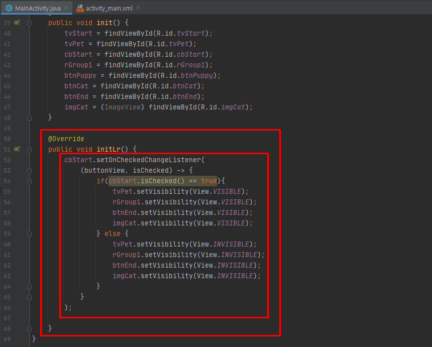
public void initLr() {
cbStart.setOnCheckedChangeListener(
(buttonView, isChecked) -> {
if(cbStart.isChecked() == true){
tvPet.setVisibility(View.VISIBLE);
rGroup1.setVisibility(View.VISIBLE);
btnEnd.setVisibility(View.VISIBLE);
imgPet.setVisibility(View.VISIBLE);
} else {
tvPet.setVisibility(View.INVISIBLE);
rGroup1.setVisibility(View.INVISIBLE);
btnEnd.setVisibility(View.INVISIBLE);
imgPet.setVisibility(View.INVISIBLE);
}
}
);
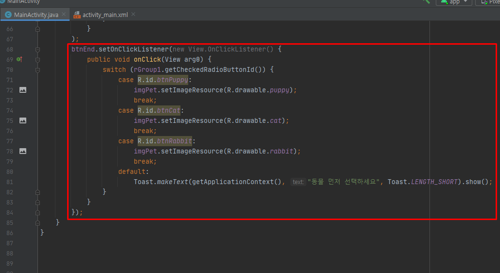
btnEnd.setOnClickListener(new View.OnClickListener() {
public void onClick(View arg0) {
switch (rGroup1.getCheckedRadioButtonId()) {
case R.id.btnPuppy:
imgPet.setImageResource(R.drawable.puppy);
break;
case R.id.btnCat:
imgPet.setImageResource(R.drawable.cat);
break;
case R.id.btnRabbit:
imgPet.setImageResource(R.drawable.rabbit);
break;
default:
Toast.makeText(getApplicationContext(), "동물 먼저 선택하세요", Toast.LENGTH_SHORT).show();
}
}
});
}
}

Nil Desperandum <절대 절망하지 마라>