
1. 레이아웃의 개요
- 버튼, 텍스트뷰, 에디트텍스트 등 안드로이드에서 사용하는 위젯은 레이아웃이라는 틀 위에 존재해야 합니다.
- 레이아웃은 위젯을 배치하여 안드로이드 화면을 목적에 맞게 배열할 수 있게 합니다.
1-1 레이아웃의 기본 개념
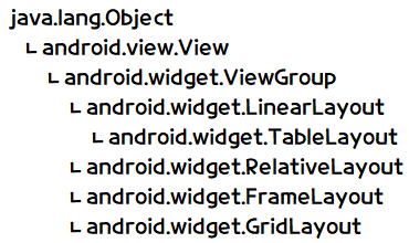
- 레이아웃은 ViewGroup 클래스로부터 상속받으며 내부에 무엇을 담는 용도로 쓰입니다.
- 레이아웃 안에 존재하는 위젯을 배치하게 해줍니다.
- 레이아웃 중에서 가장 많이 사용되는 것은 리니어 레이아웃이며, 이를 선형 레이아웃이라고도 합니다.
- 레이아웃도 View 클래스의 하위 클래스이므로 View 클래스의 XML 속성과 메서드를 모두 사용할 수 있습니다.
레이아웃의 대표적인 속성
- orientation : 레이아웃 안에 배치할 위젯의 수직 또는 수평 방향을 설정합니다.
- gravity : 레이아웃 안에 배치할 위젯의 정렬 방향을 좌측, 우측, 중앙 등으로 설정합니다.
- padding :레이아웃 안에 배치할 위젯의 여백을 설정합니다.
- layout_weight : 레이아웃이 전체 화면에서 차지하는 공간의 가중값을 설정하는데, 여러 개의 레이아웃이 중복될 때 주로 사용합니다.
- baselineAligned : 레이아웃 안에 배치할 위젯을 보기 좋게 정렬한다.
1-2 레이아웃의 종류
- 자주 사용되는 레이아웃은 리니어레이아웃(LinearLayout), 렐러티브레이아웃(RelativeLayout), 프레임레이아웃(FrameLayout), 테이블레이아웃(TableLayout), 그리드레이아웃(GridLayout) 등이 있습니다.
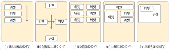
리니어레이아웃(선형 레이아웃)
- 레이아웃의 왼쪽 위부터 아래쪽 또는 오른쪽으로 차례로 배치합니다.
렐러티브레이아웃(상대 레이아웃)
- 위젯 자신이 속한 레이아웃의 상하좌우 위치를 지정하여 배치하거나 다른 위젯으로부터 상대적인 위치를 지정합니다.
테이블레이아웃
- 행과 열의 개수를 지정한 테이블 형태로 위젯을 배열합니다.
그리드레이아웃
- 테이블레이아웃과 비슷하지만 행 또는 열을 확장하여 다양하게 배치할 때 더 편리합니다.
프레임레이아웃
- 위젯을 왼쪽 위에 일률적으로 겹쳐서 배치하여 중복되어 보이는 효과를 낼 수 있습니다.
- 여러 개의 위젯을 배치한 후 상황에 따라서 필요한 위젯을 보이는 방식에 주로 활용됩니다.
2. 리니어레이아웃
2-1 기본 리니어레이아웃의 형태
orientation 속성
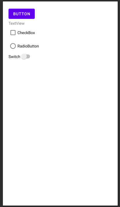
- 리니어레이아웃의 가장 기본적인 속성은 orientation이며, 값으로 vertical과 horizontal을 설정할 수 있습니다.
- vertical은 리니어레이아웃 안에 포함될 위젯의 배치를 왼쪽 위부터 수직방향으로 쌓겠다는 의미이고, horizontal은 수평 방향으로 쌓겠다는 의미입니다.
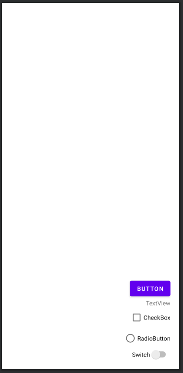
예제 5-1 orientation 속성이 vertical인 XML 코드
<?xml version="1.0" encoding="utf-8"?>
<androidx.appcompat.widget.LinearLayoutCompat
    xmlns:android="http://schemas.android.com/apk/res/android"
    xmlns:app="http://schemas.android.com/apk/res-auto"
    xmlns:tools="http://schemas.android.com/tools"
    android:layout_width="match_parent"
    android:layout_height="match_parent"
    tools:context=".MainActivity"
    android:layout_margin="20dp"
    android:orientation="vertical">

   <Button
        android:layout_width="wrap_content"
        android:layout_height="wrap_content"
        android:text="Button" />
    <TextView
        android:layout_width="wrap_content"
        android:layout_height="wrap_content"
        android:text="TextView" />
    <CheckBox
        android:layout_width="wrap_content"
        android:layout_height="wrap_content"
        android:text="CheckBox" />
    <RadioButton
        android:layout_width="wrap_content"
        android:layout_height="wrap_content"
        android:text="RadioButton" />
    <Switch
        android:layout_width="wrap_content"
        android:layout_height="wrap_content"
        android:text="Switch" />

</androidx.appcompat.widget.LinearLayoutCompat>
- 위와 같이 orientation 속성을 vertical로 설정하면 리니어레이아웃에 포함된 위젯이 수직방향, 즉 위에서 아래로 차곡차곡 쌓입니다.
예제 5-2 orientation 속성이 horizontal인 XML 코드
<androidx.appcompat.widget.LinearLayoutCompat
    xmlns:android="http://schemas.android.com/apk/res/android"
    xmlns:app="http://schemas.android.com/apk/res-auto"
    xmlns:tools="http://schemas.android.com/tools"
    android:layout_width="match_parent"
    android:layout_height="match_parent"
    tools:context=".MainActivity"
    android:layout_margin="20dp"
    android:orientation="horizontal">
    // 생략( 예제 5-1과 동일 )
    </androidx.appcompat.widget.LinearLayoutCompat>
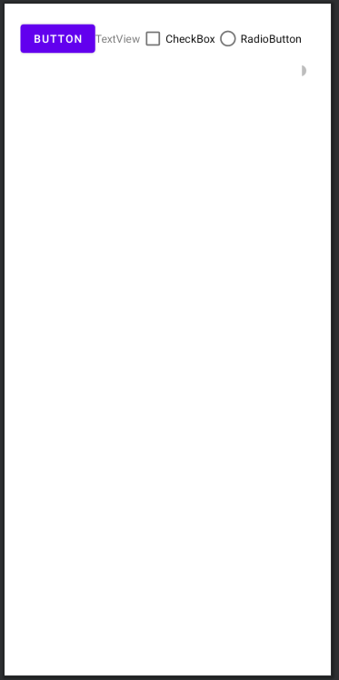
- 레이아웃 안의 위젯이 수평 방향으로 배열되어 있습니다.
- 마지막 스위치 위젯이 보이지 않습니다.
- 위젯이 많아서 화면이 넘어가면 자동으로 보이지 않기 때문입니다.
gravity와 layout_gravity 속성
- gravity 속성으로 레이아웃 안의 위젯을 어디에 배치할 것인지를 결정하며 값으로 left, right, center, top, bottom 등을 사용할 수 있습니다.
- 2개를 조합하여 right|bottom처럼 사용할 수도 있는데, 이는 오른쪽 아래에 정렬한다는 의미입니다.
- gravity 속성이 자신에게 포함된 자식(주로 위젯)을 어디에 위치시킬지 결정한다면, layout_gravity 속성은 자신의 위치를 부모(주로 레이아웃)의 어디에 위치시킬지를 결정합니다.
- gravity는 레이아웃에, layout_gravity는 위젯에 주로 지정합니다.
예제 5-3 gravity 속성의 XML 코드
<?xml version="1.0" encoding="utf-8"?>
<androidx.appcompat.widget.LinearLayoutCompat
    xmlns:android="http://schemas.android.com/apk/res/android"
    xmlns:app="http://schemas.android.com/apk/res-auto"
    xmlns:tools="http://schemas.android.com/tools"
    android:layout_width="match_parent"
    android:layout_height="match_parent"
    tools:context=".MainActivity"
    android:layout_margin="20dp"
    android:orientation="vertical"
    android:gravity="right|bottom">
	// 생략( 예제 5-2와 동일 )
</androidx.appcompat.widget.LinearLayoutCompat>
- 레이아웃에 gravity를 지정했기 때문에 안에 들어 있는 5개의 위젯이 오른쪽 아래에 몰려서 정렬되었습니다.
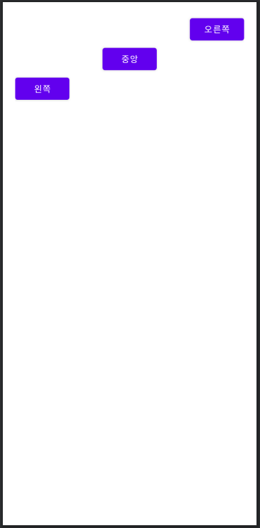
예제 5-4 layout_gravity 속성의 XML 코드
<?xml version="1.0" encoding="utf-8"?>
<androidx.appcompat.widget.LinearLayoutCompat
    xmlns:android="http://schemas.android.com/apk/res/android"
    xmlns:app="http://schemas.android.com/apk/res-auto"
    xmlns:tools="http://schemas.android.com/tools"
    android:layout_width="match_parent"
    android:layout_height="match_parent"
    tools:context=".MainActivity"
    android:layout_margin="20dp"
    android:orientation="vertical">

    <Button
        android:layout_gravity="right"
        android:layout_width="wrap_content"
        android:layout_height="wrap_content"
        android:text="오른쪽" />
    <Button
        android:layout_gravity="center"
        android:layout_width="wrap_content"
        android:layout_height="wrap_content"
        android:text="중앙" />
    <Button
        android:layout_gravity="left"
        android:layout_width="wrap_content"
        android:layout_height="wrap_content"
        android:text="왼쪽" />

</androidx.appcompat.widget.LinearLayoutCompat>
- orientation을 vertical로 설정했으므로 위젯이 수직으로 배열됩니다.
- layout_gravity가 right이면 자신을 부모(여기서는 리니어레이아웃)의 오른쪽에, center이면 중앙에, left이면 왼쪽에 위치시킵니다.
- orientation을 horizontal로 설정하여 위젯을 수평으로 쌓는다면 layout_gravit를 right, left 대신에 top, bottom으로 설정하면 됩니다.
baselineAligned 속성
- baselineAligned 속성은 크기가 다른 위젯들을 보기 좋게 정렬해주는 것으로 true와 false를 지정할 수 있습니다.
- baselineAligned 속성의 디폴트 값은 true 이므로 생략해도 잘 배치되기 대문에 특별히 신경 쓰지 않아도 됩니다.
2-2 중복 리니어레이아웃의 형태
- 안드로이드 화면을 구성하다 보면 한 화면에서 위젯을 수평과 수직으로 다양하게 배치해야 하는 경우가 종종 있습니다.
- 이럴 때 리니어레이아웃 안에 리니어레이아웃을 생성하는 방식을 사용해야 합니다.
- 큰 리니어레이아웃을 3개의 작은 리니어레이아웃으로 분류한 후 각 리니어레이아웃 안에 필요한 위젯을 배치하는 방식을 사용합니다.
layout_weight 속성
- 리니어레이아웃을 여러 개 사용할 경우 각 레이아웃의 크기를 지정해야 합니다.
- 레이아웃을 화면 전체에 해줘야 하기 때문에 dp, px 등의 단위로 지정하기 보다는 주로 화면 전체에 대한 비율(%)로 지정합니다.
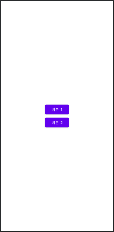
예제 5-5 3개의 레이아웃으로 구분한 XML 코드
<?xml version="1.0" encoding="utf-8"?>
<androidx.appcompat.widget.LinearLayoutCompat
    xmlns:android="http://schemas.android.com/apk/res/android"
    xmlns:app="http://schemas.android.com/apk/res-auto"
    xmlns:tools="http://schemas.android.com/tools"
    android:layout_width="match_parent"
    android:layout_height="match_parent"
    tools:context=".MainActivity"
    android:layout_margin="20dp"
    android:orientation="vertical">

    <androidx.appcompat.widget.LinearLayoutCompat
        android:layout_width="match_parent"
        android:layout_height="match_parent"
        android:gravity="center"
        android:orientation="vertical">
        <Button
            android:layout_width="wrap_content"
            android:layout_height="wrap_content"
            android:text="버튼 1" />
        <Button
            android:layout_width="wrap_content"
            android:layout_height="wrap_content"
            android:text="버튼 2" />
    </androidx.appcompat.widget.LinearLayoutCompat>
    <androidx.appcompat.widget.LinearLayoutCompat
        android:layout_width="match_parent"
        android:layout_height="match_parent"
        android:gravity="center"
        android:orientation="vertical">
        <Button
            android:layout_width="wrap_content"
            android:layout_height="wrap_content"
            android:text="버튼 3" />
        <Button
            android:layout_width="wrap_content"
            android:layout_height="wrap_content"
            android:text="버튼 4" />
    </androidx.appcompat.widget.LinearLayoutCompat>
    <androidx.appcompat.widget.LinearLayoutCompat
        android:layout_width="match_parent"
        android:layout_height="match_parent"
        android:gravity="center"
        android:orientation="vertical">
        <Button
            android:layout_width="wrap_content"
            android:layout_height="wrap_content"
            android:text="버튼 5" />
        <Button
            android:layout_width="wrap_content"
            android:layout_height="wrap_content"
            android:text="버튼 6" />
    </androidx.appcompat.widget.LinearLayoutCompat>

</androidx.appcompat.widget.LinearLayoutCompat>
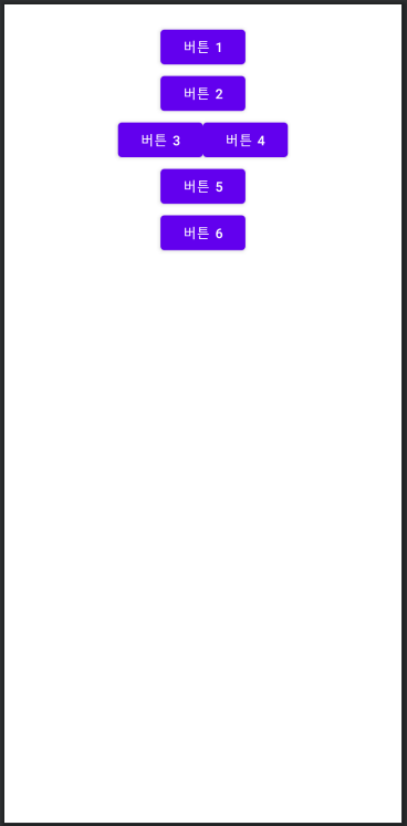
- 결과는 첫 번째 레이아웃의 버튼만 보입니다.
- LinearLayout의 layout_height를 wrap_content로 바꿔줍니다.
예제 5-6 layout_height를 wrap_content로 변경
<?xml version="1.0" encoding="utf-8"?>
<androidx.appcompat.widget.LinearLayoutCompat
    xmlns:android="http://schemas.android.com/apk/res/android"
    xmlns:app="http://schemas.android.com/apk/res-auto"
    xmlns:tools="http://schemas.android.com/tools"
    android:layout_width="match_parent"
    android:layout_height="match_parent"
    tools:context=".MainActivity"
    android:layout_margin="20dp"
    android:orientation="vertical">

    <androidx.appcompat.widget.LinearLayoutCompat
        android:layout_width="match_parent"
        android:layout_height="wrap_content"
        android:gravity="center"
        android:orientation="vertical">
	// 생략( 예제 5-5와 동일 )
    </androidx.appcompat.widget.LinearLayoutCompat>
    <androidx.appcompat.widget.LinearLayoutCompat
        android:layout_width="match_parent"
        android:layout_height="wrap_content"
        android:gravity="center"
        android:orientation="horizontal">
	// 생략( 예제 5-5와 동일 )
    </androidx.appcompat.widget.LinearLayoutCompat>
    <androidx.appcompat.widget.LinearLayoutCompat
        android:layout_width="match_parent"
        android:layout_height="wrap_content"
        android:gravity="center"
        android:orientation="vertical">
	// 생략( 예제 5-5와 동일 )
    </androidx.appcompat.widget.LinearLayoutCompat>

</androidx.appcompat.widget.LinearLayoutCompat>
- 3개의 레이아웃이 모두 보이기는 하지만 화면을 꽉 채우지는 않습니다.
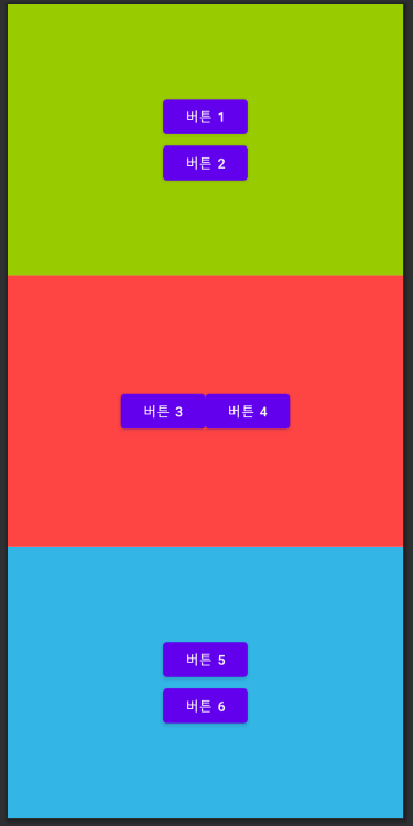
- layout_weight 속성으로 각 레이아웃의 가중값을 지정할 수 있습니다.
- 세 레이아웃의 높이를 동일하게 하고 싶다면 layout_weight를 모두 1로 지정하면 됩니다.
예제 5-7 layout_weight를 1로 지정
<?xml version="1.0" encoding="utf-8"?>
<androidx.appcompat.widget.LinearLayoutCompat
    xmlns:android="http://schemas.android.com/apk/res/android"
    xmlns:app="http://schemas.android.com/apk/res-auto"
    xmlns:tools="http://schemas.android.com/tools"
    android:layout_width="match_parent"
    android:layout_height="match_parent"
    tools:context=".MainActivity"
    android:orientation="vertical">

    <androidx.appcompat.widget.LinearLayoutCompat
        android:layout_width="match_parent"
        android:layout_height="match_parent"
        android:gravity="center"
        android:orientation="vertical"
        android:layout_weight="1"
        android:background="@android:color/holo_green_light">
        // 생략( 예제 5-6와 동일 )
    </androidx.appcompat.widget.LinearLayoutCompat>
    <androidx.appcompat.widget.LinearLayoutCompat
        android:layout_width="match_parent"
        android:layout_height="match_parent"
        android:gravity="center"
        android:orientation="horizontal"
        android:layout_weight="1"
        android:background="@android:color/holo_red_light">
        // 생략( 예제 5-6와 동일 )
    </androidx.appcompat.widget.LinearLayoutCompat>
    <androidx.appcompat.widget.LinearLayoutCompat
        android:layout_width="match_parent"
        android:layout_height="match_parent"
        android:gravity="center"
        android:orientation="vertical"
        android:layout_weight="1"
        android:background="@android:color/holo_blue_light">
        // 생략( 예제 5-6와 동일 )
    </androidx.appcompat.widget.LinearLayoutCompat>

</androidx.appcompat.widget.LinearLayoutCompat>
- 의도한 대로 3개의 레이아웃이 1:1:1 비율로 출력되었습니다.
- 비율을 다르게 하고 싶다면 layout_height를 모두 0dp로 설정한 다음 layout_weight를 원하는 비율로 지정하면 됩니다.
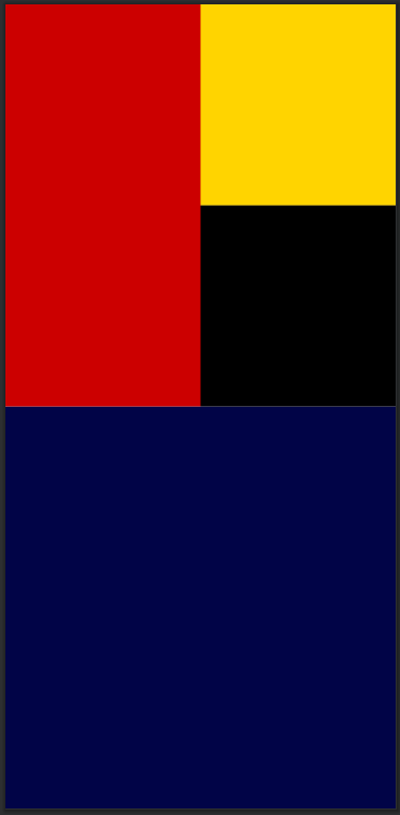
리니어 레이아웃 중첩
<?xml version="1.0" encoding="utf-8"?>
<androidx.appcompat.widget.LinearLayoutCompat
    xmlns:android="http://schemas.android.com/apk/res/android"
    xmlns:app="http://schemas.android.com/apk/res-auto"
    xmlns:tools="http://schemas.android.com/tools"
    android:layout_width="match_parent"
    android:layout_height="match_parent"
    tools:context=".MainActivity"
    android:orientation="vertical">

    <androidx.appcompat.widget.LinearLayoutCompat
        android:layout_width="match_parent"
        android:layout_height="0dp"
        android:gravity="center"
        android:orientation="horizontal"
        android:layout_weight="50">

        <androidx.appcompat.widget.LinearLayoutCompat
            android:layout_width="0dp"
            android:layout_height="match_parent"
            android:gravity="center"
            android:layout_weight="50"
            android:background="@android:color/holo_red_dark">

        </androidx.appcompat.widget.LinearLayoutCompat>
        <androidx.appcompat.widget.LinearLayoutCompat
            android:layout_width="0dp"
            android:layout_height="match_parent"
            android:gravity="center"
            android:orientation="vertical"
            android:layout_weight="50">

            <androidx.appcompat.widget.LinearLayoutCompat
                android:layout_width="match_parent"
                android:layout_height="0dp"
                android:gravity="center"
                android:layout_weight="50"
                android:background="#FFD400">

            </androidx.appcompat.widget.LinearLayoutCompat>
            <androidx.appcompat.widget.LinearLayoutCompat
                android:layout_width="match_parent"
                android:layout_height="0dp"
                android:gravity="center"
                android:layout_weight="50"
                android:background="@android:color/black">

            </androidx.appcompat.widget.LinearLayoutCompat>
        </androidx.appcompat.widget.LinearLayoutCompat>
    </androidx.appcompat.widget.LinearLayoutCompat>

    <androidx.appcompat.widget.LinearLayoutCompat
        android:layout_width="match_parent"
        android:layout_height="0dp"
        android:gravity="center"
        android:orientation="horizontal"
        android:layout_weight="50"
        android:background="#010447">
    </androidx.appcompat.widget.LinearLayoutCompat>

</androidx.appcompat.widget.LinearLayoutCompat>
2-3 Java 코드로 화면 만들기
- 지금까지 작성한 프로젝트는 기본적으로 activity_main.xml에서 화면을 구성한 후 Java 파일(MainActivity.java)의 setContentView( ) 메서드로 화면을 출력합니다.
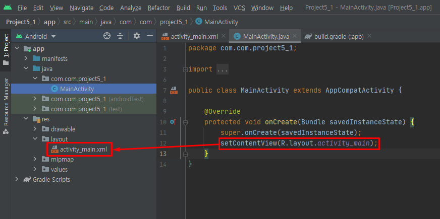
- 메인 Java 코드의 setContentView( ) 메서드는 xml 파일을 화면에 출력하는 기능을 합니다.
- R.layout.activity_main은 바로 activity_main.xml 파일을 의미하므로, 구성한 activity_main.xml 파일이 화면에 출력되는 것입니다.
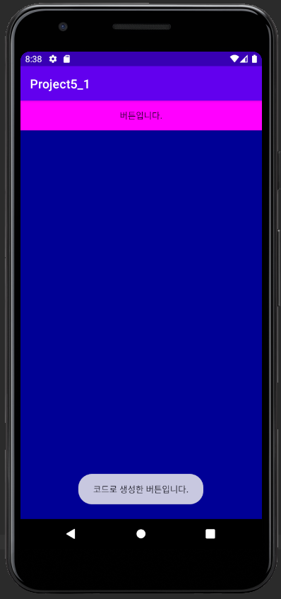
실습 5-1 XML 파일 없이 화면 코딩하기
- 버튼을 클릭하면 토스트 메세지가 출력되는 화면을 Java로만 코딩해봅니다.
예제 5-8 리니어레이아웃을 생성하는 Java 코드
package com.com.project5_1;

import androidx.appcompat.app.AppCompatActivity;
import android.graphics.Color;
import android.os.Bundle;
import android.widget.LinearLayout;

public class MainActivity extends AppCompatActivity {

    @Override
    protected void onCreate(Bundle savedInstanceState) {
        super.onCreate(savedInstanceState);
        // setContentView(R.layout.activity_main);

        LinearLayout.LayoutParams params = new LinearLayout.LayoutParams(   // 가로, 세로
                LinearLayout.LayoutParams.MATCH_PARENT,
                LinearLayout.LayoutParams.MATCH_PARENT
        );

        LinearLayout baseLayout = new LinearLayout(this);
        baseLayout.setOrientation(LinearLayout.VERTICAL);    // orientation 은 vertical
        baseLayout.setBackgroundColor(Color.rgb(0, 0, 150));    // 배경색 설정
        setContentView(baseLayout, params);
    }
}
- 위 코드는 아래 XML 코드와 동일합니다.
<LinearLayout
	android:layout_width = "match_parent"
	android:layout_height = "match_parent"
	android:background = "#0000FF"
	android:orientation = "vertical" >
</ LinearLayout>
예제 5-9 버튼을 생성하는 Java 코드
Button btn = new Button(this);  // 버튼 생성
btn.setText("버튼입니다.");  // 텍스트 지정
btn.setBackgroundColor(Color.MAGENTA);  // 버튼 색상 지정
baseLayout.addView(btn);    // baseLayout 에 btn 추가

btn.setOnClickListener(new View.OnClickListener(){
	public void onClick(View arg0) {
		Toast.makeText(getApplicationContext(),
			"코드로 생성한 버튼입니다.",
			Toast.LENGTH_SHORT).show();
	}
});
- 위 코드는 setContentView(baseLayout, params);에 이어서 추가해줍니다.
- 위 코드는 아래 XML 코드와 동일합니다.
<Button
	android:layout_width = "match_parent"
	android:layout_height = "wrap_parent"
	android:background = "#FF00FF"
	android:text = "버튼입니다." />
3. 기타 레이아웃
- 레이아웃에는 리니어레이아웃 외에도 렐러티브레이아웃, 프레임레이아웃, 테이블레이아웃, 그리드레이아웃이 있습니다.
- 리니어레이아웃보다 활용 빈도는 낮지만 리니어레이아웃으로 배치하기 어려울 때 사용하면 편리하니 잘 익혀두면 좋습니다.
3-1 렐러티브레이아웃
- 렐러티브레이아웃은 상대 레이아웃이라고도 하며, 이름처럼 레이아웃 내부에 포함된 위젯을 상대적인 위치로 배치합니다.
- 렐러티브레이아웃 안에 포함된 위젯은 렐러티브레이아웃의 어디쯤에 위치시킬 것인지 지정해야 합니다.
- 렐러티브레이아웃에 있는 위젯의 위치와 관련된 속성은 크게 두 부류로 나눌 수 있습니다.
- 렐러티브레이아웃의 상하좌우에 배치하는 경우와 다른 위젯의 상대 위치에 배치하는 경우가 있습니다.
렐러티브레이아웃의 상하좌우에 배치
- 렐러티브레이아웃 안에 포함된 위젯의 속성 중 부모(레이아웃)의 어느 위치에 배치할지를 결정하는 속성은 모두 일곱 가지입니다.
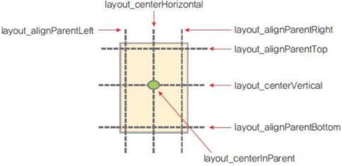
- 위 그림은 렐러티브레이아웃에 있는 위젯을 부모(렐러티브레이아웃)의 어느 부분에 위치시킬지를 보여줍니다.
- 각 속성의 값은 true 또는 false 입니다.
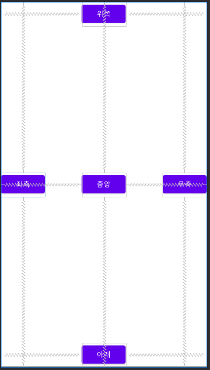
예제 5-10 렐러티브레이아웃의 XML 코드 1
<?xml version="1.0" encoding="utf-8"?>
<RelativeLayout
    xmlns:android="http://schemas.android.com/apk/res/android"
    xmlns:app="http://schemas.android.com/apk/res-auto"
    xmlns:tools="http://schemas.android.com/tools"
    android:layout_width="match_parent"
    android:layout_height="match_parent"
    tools:context=".MainActivity">

    <Button
        android:id="@+id/button"
        android:layout_width="wrap_content"
        android:layout_height="wrap_content"
        android:layout_alignParentTop="true"
        android:layout_centerHorizontal="true"
        android:text="위쪽" />
    <Button
        android:id="@+id/button2"
        android:layout_width="wrap_content"
        android:layout_height="wrap_content"
        android:layout_alignParentLeft="true"
        android:layout_centerVertical="true"
        android:text="좌측" />
    <Button
        android:id="@+id/button3"
        android:layout_width="wrap_content"
        android:layout_height="wrap_content"
        android:layout_centerInParent="true"
        android:text="중앙" />
    <Button
        android:id="@+id/button4"
        android:layout_width="wrap_content"
        android:layout_height="wrap_content"
        android:layout_alignParentRight="true"
        android:layout_centerVertical="true"
        android:text="우측" />
    <Button
        android:id="@+id/button5"
        android:layout_width="wrap_content"
        android:layout_height="wrap_content"
        android:layout_alignParentBottom="true"
        android:layout_centerHorizontal="true"
        android:text="아래" />

</RelativeLayout>
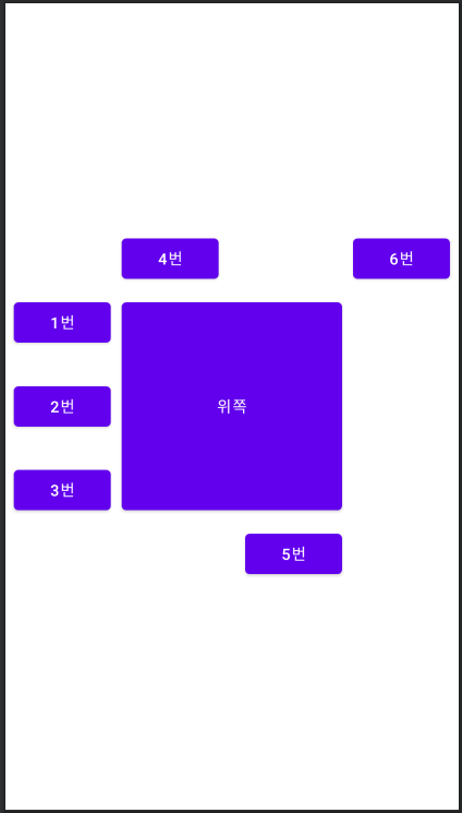
다른 위젯의 상대 위치에 배치
- 렐러티브레이아웃 안에서 다른 위젯의 특정한 곳에 배치하는 방법도 있습니다.
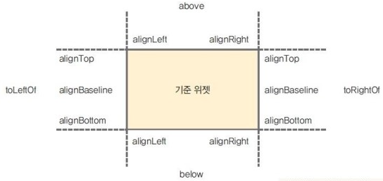
- 위 그림에서 간략하게 나타내기 위해 속성 이름의 layout_은 생략했습니다.
- 각 속성의 값에는 다른 위젯의 아이디를 지정하면 되는데 "@+id/기준 위젯의 아이디"와 같은 형식으로 사용합니다.
- 다른 위젯의 상하좌우에는 layout_above, layout_below, layout_toLeftOf, layout_toRightOf 속성을 사용하고 다른 위젯의 상단, 중앙, 하단 기준에는 layout_alignTop, layout_alignBaseline, layout_alignBottom을 사용합니다.
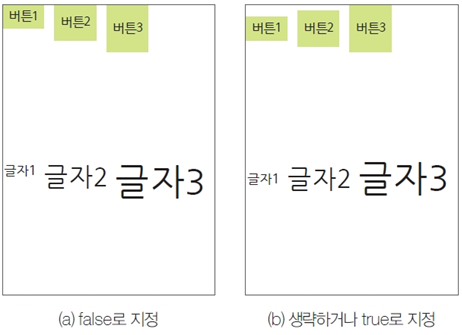
- 렐러티브레이아웅세는 하나의 위젯에 대한 상대적인 위치만 적용할 수 있는 것이 아니라 여러 위젯에 대한 상대적인 위치를 적용할 수도 있습니다.
예제 5-11 렐러티브레이아웃의 XML 코드 2
<?xml version="1.0" encoding="utf-8"?>
<RelativeLayout
    xmlns:android="http://schemas.android.com/apk/res/android"
    xmlns:app="http://schemas.android.com/apk/res-auto"
    xmlns:tools="http://schemas.android.com/tools"
    android:layout_width="match_parent"
    android:layout_height="match_parent"
    tools:context=".MainActivity">

    <Button
        android:id="@+id/btnBase"
        android:layout_width="200dp"
        android:layout_height="200dp"
        android:layout_centerVertical="true"
        android:layout_centerHorizontal="true"
        android:text="위쪽"
        android:layout_margin="10dp"/>
    <Button
        android:id="@+id/btn1"
        android:layout_width="wrap_content"
        android:layout_height="wrap_content"
        android:layout_alignTop="@+id/btnBase"
        android:layout_toLeftOf="@+id/btnBase"
        android:text="1번" />
    <Button
        android:layout_width="wrap_content"
        android:layout_height="wrap_content"
        android:layout_alignBaseline="@+id/btnBase"
        android:layout_toLeftOf="@+id/btnBase"
        android:text="2번" />
    <Button
        android:layout_width="wrap_content"
        android:layout_height="wrap_content"
        android:layout_alignBottom="@+id/btnBase"
        android:layout_toLeftOf="@+id/btnBase"
        android:text="3번" />
    <Button
        android:layout_width="wrap_content"
        android:layout_height="wrap_content"
        android:layout_alignLeft="@+id/btnBase"
        android:layout_above="@+id/btnBase"
        android:text="4번" />
    <Button
        android:layout_width="wrap_content"
        android:layout_height="wrap_content"
        android:layout_alignRight="@+id/btnBase"
        android:layout_below="@+id/btnBase"
        android:text="5번" />
    <Button
        android:layout_width="wrap_content"
        android:layout_height="wrap_content"
        android:layout_above="@+id/btnBase"
        android:layout_toRightOf="@+id/btnBase"
        android:text="6번" />

</RelativeLayout>
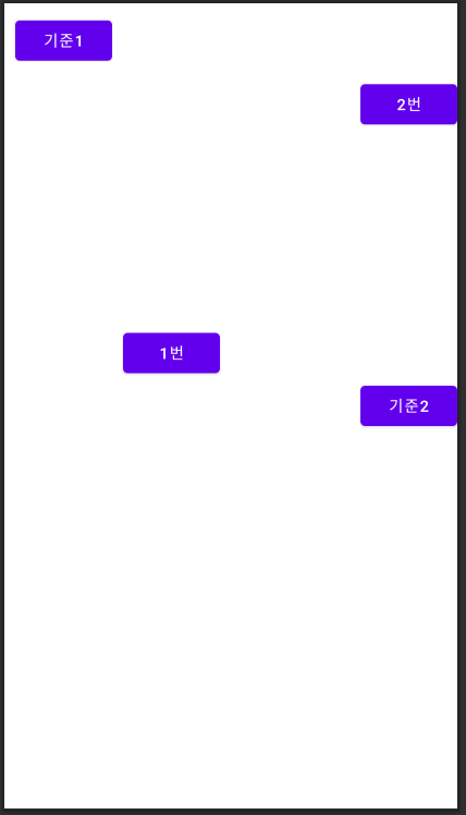
5-12 렐러티브레이아웃 속성을 조합한 XML 코드
<?xml version="1.0" encoding="utf-8"?>
<RelativeLayout
    xmlns:android="http://schemas.android.com/apk/res/android"
    xmlns:app="http://schemas.android.com/apk/res-auto"
    xmlns:tools="http://schemas.android.com/tools"
    android:layout_width="match_parent"
    android:layout_height="match_parent"
    tools:context=".MainActivity">

    <Button
        android:id="@+id/btnBase1"
        android:layout_width="wrap_content"
        android:layout_height="wrap_content"
        android:layout_alignParentLeft="true"
        android:layout_alignParentTop="true"
        android:text="기준1"
        android:layout_margin="10dp"/>
    <Button
        android:id="@+id/btnBase2"
        android:layout_width="wrap_content"
        android:layout_height="wrap_content"
        android:layout_alignParentRight="true"
        android:layout_centerVertical="true"
        android:text="기준2" />
    <Button
        android:layout_width="wrap_content"
        android:layout_height="wrap_content"
        android:layout_above="@id/btnBase2"
        android:layout_toRightOf="@+id/btnBase1"
        android:text="1번" />
    <Button
        android:layout_width="wrap_content"
        android:layout_height="wrap_content"
        android:layout_alignParentRight="true"
        android:layout_below="@+id/btnBase1"
        android:text="2번" />

</RelativeLayout>
3-2 테이블레이아웃
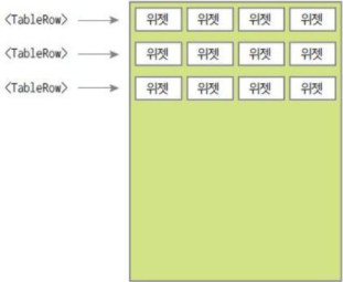
- 테이블레이아웃은 위젯을 표 형태로 배치할 때 주로 활용됩니다.
- 테이블레이아웃을 사용하여 행과 열의 수를 정하고 그 안에 위젯을 배치하면 편합니다.
- 이때 <TableRow>를 함께 사용하는데 <TableRow>의 수가 바로 행의 수입니다.
- 열의 수는 <TableRow> 안에 포함된 위젯의 수로 결정됩니다.
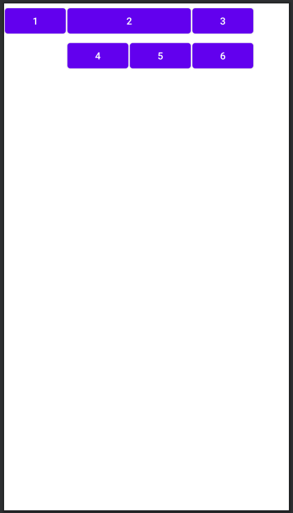
테이블레이아웃의 속성
- 테이블레이아웃에서 설정하는 속성에는 layout_span, layout_column, stretchColumns가 있습니다.
- layout_span과 layout_column은 테이블에이아웃 안에 포함된 위젯에 설정하는 속성입니다.
- layout_span은 열을 합쳐서 표시하라는 의미로, layout_span="2"는 현재 셀부터 2개의 셀을 합쳐서 표시해줍니다.
- layout_column은 지정된 열에 현재 위젯을 표시하라는 의미입니다.
- stretchColumns는 <TableRow> 자체에 설정하는 속성으로 지정된 열의 너비를 늘리라는 의미입니다.
- stretchColumns="*"는 각 셀을 모두 같은 크기로 확장하여 전체 화면이 꽉 차는 효과를 냅니다.
- 열 번호는 0번부터 시작합니다.
예제 5-13 테이블레이아웃의 XML 코드
<?xml version="1.0" encoding="utf-8"?>
<TableLayout
    xmlns:android="http://schemas.android.com/apk/res/android"
    xmlns:app="http://schemas.android.com/apk/res-auto"
    xmlns:tools="http://schemas.android.com/tools"
    android:layout_width="match_parent"
    android:layout_height="match_parent"
    tools:context=".MainActivity">

    <TableRow>
        <Button
            android:text="1"
            android:layout_margin="1dp"/>
        <Button
            android:layout_span="2"
            android:text="2"
            android:layout_margin="1dp"/>
        <Button
            android:text="3"
            android:layout_margin="1dp"/>
    </TableRow>
    <TableRow>
        <Button
            android:layout_column="1"
            android:text="4"
            android:layout_margin="1dp"/>
        <Button
            android:text="5"
            android:layout_margin="1dp"/>
        <Button
            android:text="6"
            android:layout_margin="1dp"/>
    </TableRow>

</TableLayout>
- 테이블레이아웃 안에 포함된 위젯은 layout_width, layout_height 속성을 생략해도 됩니다.
3-3 그리드레이아웃
- 그리드레이아웃도 테이블레이아웃과 마찬가지로 위젯을 표 형태로 배치할 때 사용하지만 좀 더 직관적입니다.
- 테이블레이아웃에서는 다소 어려웠떤 행 확장도 간단하게 할 수 있어서 유연한 화면 구성에 적합합니다.
그리드레이아웃의 속성
- 그리드레이아웃에서 자주 사용되는 속성
- rowCount : 행의 수
- columnCount : 열의 수
- orientation : 그리드를 수평 방향으로 우선할 것인지, 수직 방향으로 우선할 것인지를 결정합니다. - 그리드레이아웃 안에 포함될 위젯에서 자주 사용되는 속성
- layout_row : 자신이 위치할 행 번호(0번부터 시작)
- layout_column : 자신이 위치할 열 번호(0번부터 시작)
- layout_rowSpan : 행을 지정된 수만큼 확장한다.
- layout_columnSpan : 열을 지정된 수만큼 확장한다.
- layout_gravity : 주로 fill, fill_vertical, fill_horizontal 등으로 지정하는데, layout_rowSpan이나 layout_columnSpan으로 행 또는 열이 확장되었을 떄 위젯을 확장된 셀에 꽉 채우는 효과를 낸다.
예제 5-14 그리드레이아웃의 XML 코드
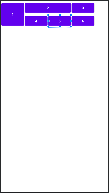
<?xml version="1.0" encoding="utf-8"?>
<GridLayout
    xmlns:android="http://schemas.android.com/apk/res/android"
    xmlns:app="http://schemas.android.com/apk/res-auto"
    xmlns:tools="http://schemas.android.com/tools"
    android:layout_width="match_parent"
    android:layout_height="100dp"
    android:columnCount="4"
    android:rowCount="2"
    tools:context=".MainActivity">

        <Button
            android:layout_column="0"
            android:layout_row="0"
            android:layout_rowSpan="2"
            android:layout_gravity="fill_vertical"
            android:text="1"
            android:layout_margin="1dp"/>
        <Button
            android:layout_column="1"
            android:layout_row="0"
            android:layout_columnSpan="2"
            android:layout_gravity="fill_horizontal"
            android:text="2"
            android:layout_margin="1dp"/>
        <Button
            android:layout_column="3"
            android:layout_row="0"
            android:text="3"
            android:layout_margin="1dp"/>
        <Button
            android:layout_row="1"
            android:layout_column="1"
            android:layout_margin="1dp"
            android:text="4" />
        <Button
            android:layout_column="2"
            android:layout_row="1"
            android:text="5"
            android:layout_margin="1dp"/>
        <Button
            android:layout_column="3"
            android:layout_row="1"
            android:text="6"
            android:layout_margin="1dp"/>

</GridLayout>
3-4 프레임레이아웃
- 프레임레이아웃은 단순히 레이아웃 안의 위젯을 왼쪽 상단부터 겹쳐서 출력합니다.
- 프레임레이아웃 그 자체를 사용하기보다는 탭 위젯 등과 혼용할 때 유용합니다.
프레임레이아웃의 속성
- foreground : 프레임레이아웃의 전경 이미지를 지정합니다.
- foregroundGravity : 전경 이미지의 위치를 지정하며 fill, right, left, top, bottom 등의 값을 사용합니다.
예제 5-15 프레임레이아웃의 XML 코드
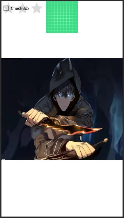
<?xml version="1.0" encoding="utf-8"?>
<FrameLayout
    xmlns:android="http://schemas.android.com/apk/res/android"
    xmlns:app="http://schemas.android.com/apk/res-auto"
    xmlns:tools="http://schemas.android.com/tools"
    android:layout_width="match_parent"
    android:layout_height="match_parent"
    android:foreground="@drawable/level"
    android:foregroundGravity="center|fill_horizontal"
    tools:context=".MainActivity">

    <RatingBar
        android:layout_width="240dp"
        android:layout_height="wrap_content"
        android:id="@+id/rbTest" />
    <ImageView
        android:layout_width="match_parent"
        android:layout_height="wrap_content"
        android:src="@drawable/ic_launcher_background" />
    <CheckBox
        android:layout_width="match_parent"
        android:layout_height="wrap_content"
        android:text="CheckBox"/>

</FrameLayout>
- 위젯이 모두 겹쳐져서 출력되는 것을 확인할 수 있습니다.

Nil Desperandum <절대 절망하지 마라>