1. 배경 이미지 스타일링 하기
배경 이미지 스타일에는 background-color , background-image , background-repeat , background-position , background-attachment , background , background-size 가 있습니다.
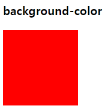
background-color
HTML 요소의 배경 색을 지정합니다.
✍ 코드
<head>
  <style>
    .red {
      background-color: red;
      width: 120px;
      height: 120px;
    }
  </style>
</head>
<body>
  <h3>background-color</h3>
  <div class="red"></div>
</body>
👉 결과
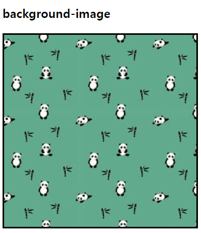
background-image
HTML 요소에 배경 이미지를 한 개 또는 여러 개를 지정할 수 있습니다.
✍ 코드
<head>
  <style>
    .image {
      background-image: url("../assets/images/pandas.jpg");
      width: 300px;
      height: 300px;
      border: 3px solid black;
    }
  </style>
</head>
<body>
  <h3>background-image</h3>
  <div class="image"></div>
</body>
👉 결과
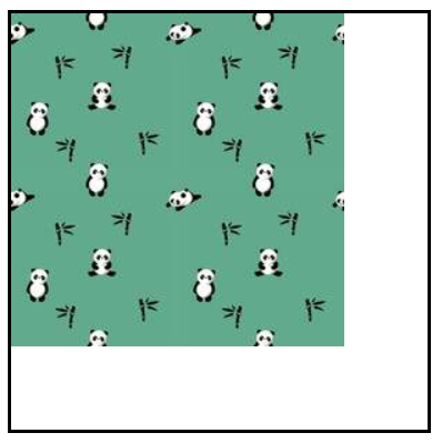
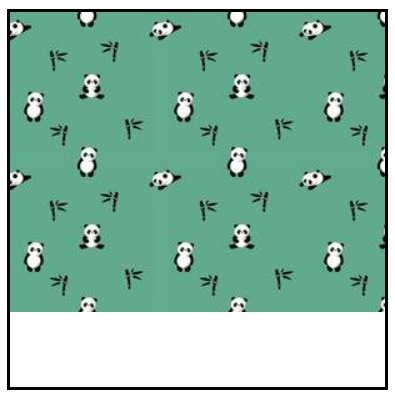
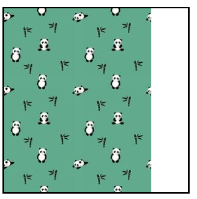
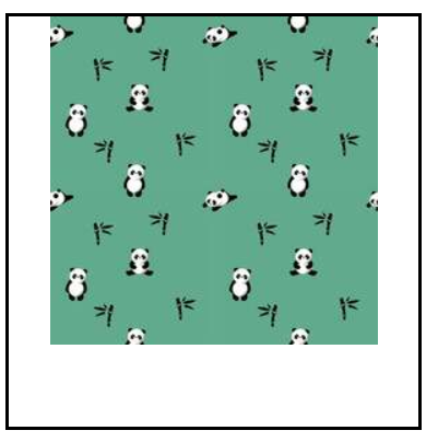
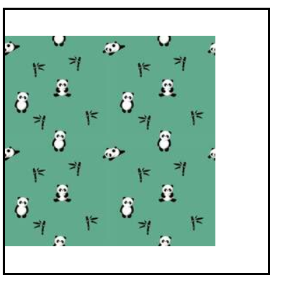
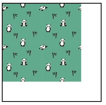
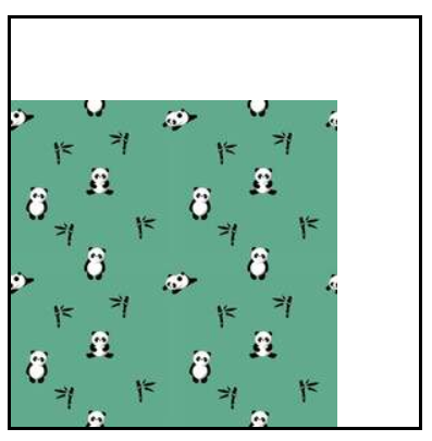
background-repeat
배경 이미지의 반복 방법을 지정합니다.
-
repeat: 가로, 세로 반복 -
no-repeat: 반복하지 않음 -
repeat-x: 가로 반복 -
repeat-y: 세로 반복
✍ 코드
<head>
  <style>
    .image_1 {
      background-image: url("../assets/images/pandas.jpg");
      /* 가로, 세로 반복 */
      background-repeat: repeat;
      width: 300px;
      height: 300px;
      border: 3px solid black;
      margin-bottom: 40px;
    }
    .image_2 {
      background-image: url("../assets/images/pandas.jpg");
      /* 반복하지 않겠다는 표현 */
      background-repeat: no-repeat;
      width: 300px;
      height: 300px;
      border: 3px solid black;
      margin-bottom: 40px;
    }
    .image_3 {
      background-image: url("../assets/images/pandas.jpg");
      /* x축으로만 반복 */
      background-repeat: repeat-x;
      width: 300px;
      height: 300px;
      border: 3px solid black;
      margin-bottom: 40px;
    }
    .image_4 {
      background-image: url("../assets/images/pandas.jpg");
      /* y축으로만 반복 */
      background-repeat: repeat-y;
      width: 300px;
      height: 300px;
      border: 3px solid black;
      margin-bottom: 40px;
    }
  </style>
</head>
<body>
  <h3>background-image</h3>
  <div class="image_1"></div>
  <div class="image_2"></div>
  <div class="image_3"></div>
  <div class="image_4"></div>
</body>
👉 결과
-
background-repeat: repeat;

-
background-repeat: no-repeat;
-
background-repeat: repeat-x;
-
backgrond-repeat: repeat-y;
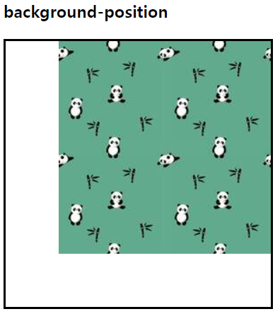
background-position
배경 이미지의 초기 위치를 설정합니다.
✍ 코드
<head>
  <style>
    .image_5 {
      background-image: url("../assets/images/pandas.jpg");
      background-repeat: no-repeat;
      background-position-x: right;
      width: 300px;
      height: 300px;
      border: 3px solid black;
      margin-bottom: 40px;
    }
    .image_6 {
      background-image: url("../assets/images/pandas.jpg");
      background-repeat: no-repeat;
      background-position-x: left;
      width: 300px;
      height: 300px;
      border: 3px solid black;
      margin-bottom: 40px;
    }
    .image_7 {
      background-image: url("../assets/images/pandas.jpg");
      background-repeat: no-repeat;
      background-position-x: center;
      width: 300px;
      height: 300px;
      border: 3px solid black;
      margin-bottom: 40px;
    }
    .image_8 {
      background-image: url("../assets/images/pandas.jpg");
      background-repeat: no-repeat;
      background-position-y: center;
      width: 300px;
      height: 300px;
      border: 3px solid black;
      margin-bottom: 40px;
    }
    .image_9 {
      background-image: url("../assets/images/pandas.jpg");
      background-repeat: no-repeat;
      background-position-y: top;
      width: 300px;
      height: 300px;
      border: 3px solid black;
      margin-bottom: 40px;
    }
    .image_10 {
      background-image: url("../assets/images/pandas.jpg");
      background-repeat: no-repeat;
      background-position-y: bottom;
      width: 300px;
      height: 300px;
      border: 3px solid black;
      margin-bottom: 40px;
    }
  </style>
</head>
<body>
  <h3>background-position</h3>
  <div class="image_5"></div>
  <div class="image_6"></div>
  <div class="image_7"></div>
  <div class="image_8"></div>
  <div class="image_9"></div>
  <div class="image_10"></div>
</body>
👉 결과
-
background-position-x: right;
-
background-position-x: left;

-
background-position-x: center;
-
background-position-y: center;
-
background-position-y: top;
-
background-position-y: bottom;
background-attachment
배경 이미지를 viewport 내에서 고정할지 말지를 지정하는 속성입니다.
-
scroll: 기본값으로 선택한 요소와 함께 움직입니다. 내용을 스크롤하면 배경 이미지는 스크롤되지 않습니다. -
fixed: 움직이지 않습니다. -
local: 선택한 요소와 함께 움직입니다. 내용을 스크롤하면 배경 이미지도 스크롤됩니다. -
initial: 기본값으로 설정합니다. -
inherit: 부모 요소의 속성값을 상속받습니다. -
overflow: scroll;은 내용이 넘쳐 흘렀을 때 scroll을 한다는 의미입니다.
✍ 코드
<head>
  <style>
    .image {
      background-image: url("../assets/images/pandas.jpg");
      background-repeat: repeat;
      background-position: top right;
      width: 200px;
      height: 400px;
      border: 1px solid black;
      display: inline-block;
      overflow: scroll;
    }
    .attachment-scroll {
      background-attachment: scroll;
    }
    .attachment-fixed {
      background-attachment: fixed;
    }
    .attachment-local {
      background-attachment: local;
    }
  </style>
</head>
<body>
  <h3>background-attachment
  <div class="image attachment-scroll">Lorem*8</div>
  <div class="image attachment-fixed">Lorem*8</div>
  <div class="image attachment-local">Lorem*8</div>
</body>
background
background-image background-repeat background-position background-attachment 속성을 한꺼번에 선언할 수 있습니다.
✍ 코드
background: url("../assets/images/pandas.jpg") no-repeat top right fixed;background-size
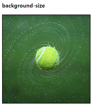
배경 이미지의 크기를 설정합니다.
-
contain: 이미지가 잘리거나 찌그러지지 않는 한도 내에서 제일 크게 설정. -
cover: 이미지가 찌그러지지 않는 한도 내에서 제일 크게 설정. 이미지의 가로와 세로 비가 요소와 다르다면 이미지를 세로 또는 가로 방향으로 잘라내어 빈 공간이 생기지 않도록 설정합니다. (주로 현업에서 많이 사용) -
auto: 배경 이미지의 원본 크기를 유지. -
<length>: 원본 크기의 너비/높이를 주어진 값으로 늘리거나 줄임. 음수는 유효하지 않음. -
<percentage>: 배경 위치 지정 영역의 지정된 백분율에 해당하는 크기로 이미지를 늘립니다.
✍ 코드
<head>
  <style>
    .background-size {
      width: 300px;
      height: 300px;
      background-image: url("../assets/images/sports.jpg");
      background-repeat: no-repeat;
      background-size: cover;
      background-position: center;
      border: 2px solid black;
    }
  </style>
</head>
<body>
  <div>
    <h3>background-size</h3>
    <div class="background-size"></div>
  </div>
</body>
👉 결과
2. 그라데이션
그라데이션은 크게 선형 그라데이션과 원형 그라데이션이 있습니다.
선형 그라데이션
linear-gradient() 함수는 두 개 이상의 색상이 직선을 따라 점진적으로 변화하는 것을 말합니다.
-
to키워드를 사용하여 방향을 결정할 수 있습니다. -
deg키워드를 사용하여 각도값을 지정할 수 있습니다.
✍ 코드
<head>
  <style>
    .linear-gradient {
      width: 500px;
      height: 200px;
      border: 1px solid red;
      background: linear-gradient(to right, red, blue);
    }
  </style>
</head>
<body>
  <h3>linear-gradient</h3>
  <div class="linear-gradient"></div>
</body>
👉 결과
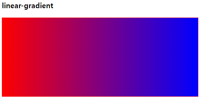
-
top에서 bottom으로 그라데이션
background: linear-gradient(red, blue); -
왼쪽에서 오른쪽으로 그라데이션
background: linear-gradient(to right, red, blue); -
아래에서 위로 그라데이션
background: linear-gradient(to top, red, blue); -
사선으로 그라데이션
background: linear-gradient(to top right, red, blue); -
각도 표현
background: linear-gradient(45deg, red, blue); -
% 표현 가능
background: linear-gradient(to right, red 50%, blue 80%, yellow 100%);
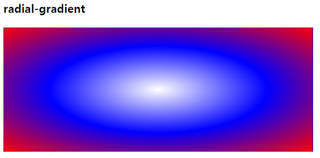
원형 그라데이션
- 타원형
radial-gradient()함수를 사용하여 타원형 그라데이션을 만들 수 있습니다.
✍ 코드
<head>
  <style>
    .radial-gradient {
      width: 500px;
      height: 200px;
      border: 1px solid blue;
      background: radial-gradient(white, blue, red);
    }
  </style>
</head>
<body>
  <h3>radial-gradient</h3>
  <div class="radial-gradient"></div>
</body>
👉 결과
- 정원
radial-gradient(circle)함수를 사용하여 타원형 그라데이션을 만들 수 있습니다.
✍ 코드
<head>
  <style>
    .radial-gradient {
      width: 500px;
      height: 200px;
      border: 1px solid blue;
      background: radial-gradient(circle at 10% 50%, white, yellow, red, blue);
    }
  </style>
</head>
<body>
  <h3>radial-gradient</h3>
  <div class="radial-gradient"></div>
</body>
👉 결과