1. 가상 클래스 (Pseudo class)
가상 클래스(Pseudo-class)는 선택하고자 하는 HTML 요소의 특정 상태를 명시할 때 사용합니다.
-
문법
선택자:가상클래스이름 {속성: 속성값;} -
종류
-
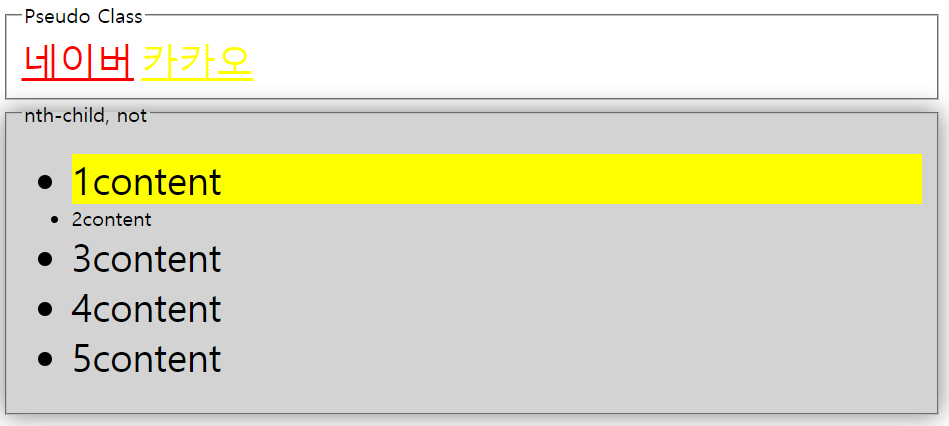
:link: 아직 방문하지 않은 요소를 나타냅니다. -
:visited: 사용자가 방문한 적이 있는 링크를 나타냅니다. -
:active: 사용자가 활성화한 요소(버튼 등)를 나타냅니다. -
:hover: 사용자의 마우스 커서가 요소 위에 올라가 있으면 선택됩니다. -
:focus: 양식의 입력 칸 등 포커스 받은 요소를 나타냅니다. -
:nth-child: 형제 사이에서 순서에 따라서 요소를 선택합니다. -
:not(selector): 요소를 제외시킵니다.
-
✍ 코드
<head>
  <style>
    a {
      font-size: 30px;
    }
    a:link {
      color: yellow;
    }
    a:visited {
      color: red;
    }
    a:hover {
      color: blue;
      font-weight: 900;
    }
    fieldset:hover {
      background-color: lightgrey;
      box-shadow: 0 0 20px grey;
    }
    input:focus {
      outline: none;
      border: 3px solid red;
      box-shadow: 0 0 20px rgb(176, 118, 118);
    }
    li:nth-child(1) {
      background-color: yellow;
    }
    li:not(.target) {
      font-size: 30px;
    }
  </style>
</head>
<body>
  <fieldset>
    <legend>Pseudo Class</legend>
    <div>
      <a href="https://naver.com">네이버</a>
      <a href="https://kakao.com">카카오</a>
    </div>
  </fieldset>
  <fieldset>
    <legend>nth-child, not</legend>
    <ul>
      <li>1content</li>
      <li class="target">2content</li>
      <li>3content</li>
      <li>4content</li>
      <li>5content</li>
    </ul>
  </fieldset>
</body>
👉 결과
-
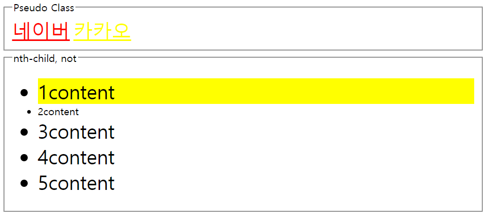
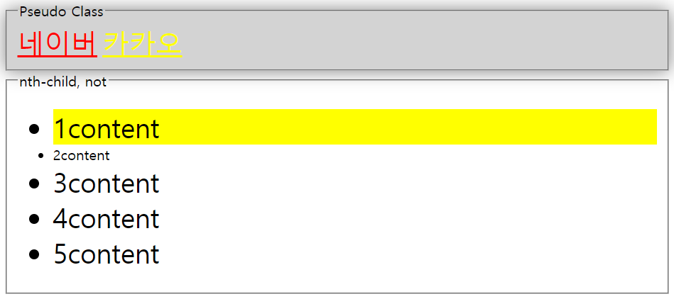
방문한 적 있는 링크 : red
-
방문한 적 없는 링크 : yellow
-
li의 형제들 중 1번재 요소 : yellow
-
li 중 class가 target인 요소만 font-size가 작음
-
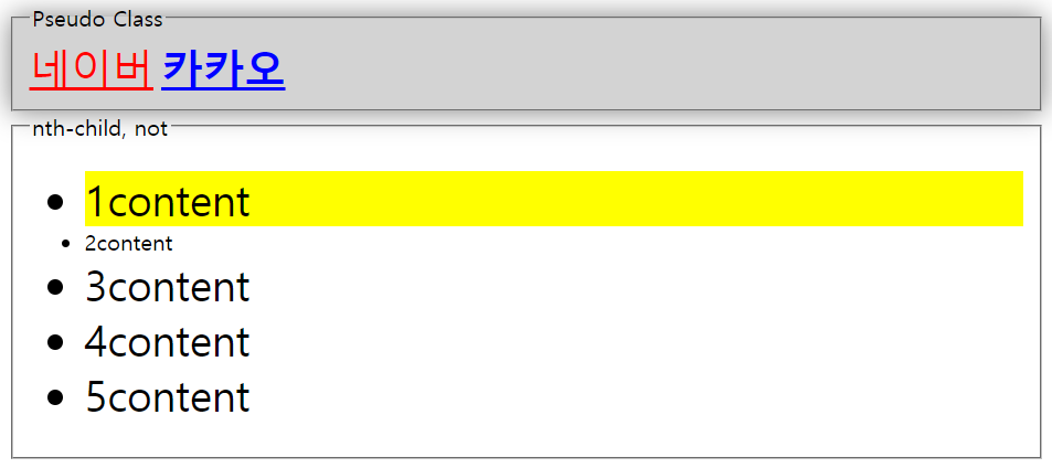
마우스 커서가 있는 fieldset : lightgrey
-
box 그림자는 번짐 20px에 grey
-
마우스 커서가 있는
a태그 : blue -
font-weight가 900
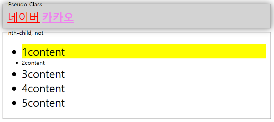
- 활성화한 요소(클릭하고 있는) : violet
2. 가상 요소 (Pseudo element)
가상 요소는 해당 HTML 요소의 특정 부분만을 선택할 때 사용합니다.
-
툴팁 : 특정 정보를 보여주는 말풍선
-
문법
선택자::가상요소이름 {속성: 속성값;} -
종류
-
::first-letter: 텍스트의 첫 글자만을 선택합니다. 단, 블록 레벨 요소에만 사용할 수 있습니다. -
::first-line: 텍스트의 첫 라인만을 선택합니다. 단, 블록 레벨 요소에만 사용할 수 있습니다. -
::before: 특정 요소의 내용 부분 바로 앞에 다른 요소를 삽입할 때 사용합니다. -
::after: 특정 요소의 내용 부분 바로 뒤에 다른 요소를 삽입할 때 사용합니다. -
::selection: 사용자가 선택한 부분만을 선택할 때 사용합니다.
-
✍ 코드
<head>
<style>
.required::before {
content: '*';
margin-right: 2px;
color: red;
font-size: 18px;
}
[data-tooltip] {
position: relative;
}
[data-tooltip]:hover::after {
content: attr(data-tooltip);
position: absolute;
top: 0px;
left: 56px;
background-color: black;
color: white;
width: 200px;
}
.letter::first-letter {
font-size: 60px;
color: blue;
}
.line::first-letter {
background-color: yellow;
color: blue;
font-size: 20px;
}
p::selection {
background-color: violet;
color: white;
}
</style>
</head>
<body>
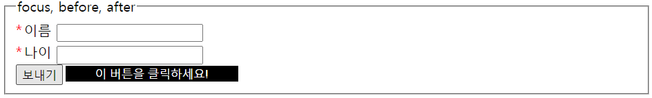
<fieldset>
<legend>focus, before, after</legend>
<div class="field">
<label class="required" for="name">이름</label>
<input type="text" id="name">
</div>
<div class="field">
<label class="required" for="age">나이</label>
<input type="text" id="age">
</div>
<button data-tooltip="이 버튼을 클릭하세요!">보내기</button>
</fieldset>
<fieldset>
<legend>first-letter, first-line, selection</legend>
<div>
<p class="letter">
Lorem ipsum dolor sit amet consectetur adipisicing elit. Odit voluptatum aut obcaecati nobis corrupti soluta excepturi ut nesciunt molestiae dolorum facere, quas quis deleniti odio cum earum recusandae beatae vitae!
A mollitia id hic impedit deleniti soluta officiis, exercitationem repudiandae minima. Ea eos, reiciendis quas optio consectetur cumque corrupti temporibus ullam doloremque iste facilis architecto rerum laboriosam a, officiis quos.
</p>
<p class="line">
Lorem ipsum dolor sit amet consectetur adipisicing elit. Odit voluptatum aut obcaecati nobis corrupti soluta excepturi ut nesciunt molestiae dolorum facere, quas quis deleniti odio cum earum recusandae beatae vitae!
A mollitia id hic impedit deleniti soluta officiis, exercitationem repudiandae minima. Ea eos, reiciendis quas optio consectetur cumque corrupti temporibus ullam doloremque iste facilis architecto rerum laboriosam a, officiis quos.
</p>
</div>
</fieldset>
</body>👉 결과
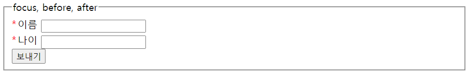
label class="required"인 것들은.required::before을 통해서content인 *를 추가
-
툴팁으로서 툴팁의
position을relative로 한 후 이를 기준으로 만들고 위치 -
data-tooltip에 내용 입력 -> CSS에서attr(data-tooltip);으로 표현 -
hover도 적용함으로써 마우스 커서를 올렸을 때 나타나도록 표현
-
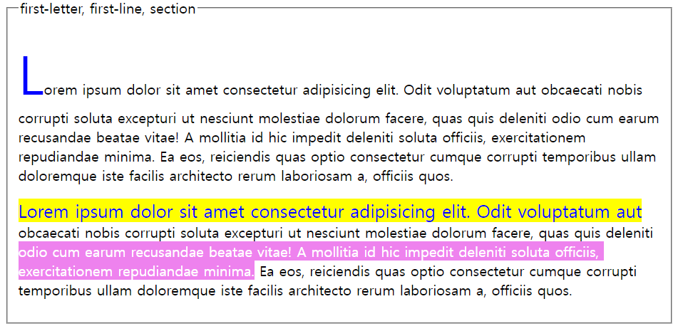
first-letter을color: blue로 적용하고 글씨를 크게 적용 -
first-line을background-color: yellow로 적용하고 글씨를color: blue로 적용 -
p::selection을 통해background-color: violet을 적용하고color: white를 적용 -> 이는 선택할 때 적용