1. Transform 속성
HTML 요소를 회전, 크기 조절, 기울이기, 이동 효과를 나타낼 때 사용합니다.
특수한 함수를 활용해서 표현합니다.
단, 해당 요소의
display속성은block또는inline-block
2. Transform 함수
-
translate(tx, ty): 지정한 크기만큼 x축·y축으로 이동 -
translateX(tx): 지정한 크기만큼 x축으로 이동 -
translateY(ty): 지정한 크기만큼 y축으로 이동 -
scale(sx, sy): 지정한 크기만큼 x축·y축으로 확대&축소 -
scaleX(sx): 지정한 크기만큼 x축으로 확대&축소 -
scaleY(sy): 지정한 크기만큼 y축으로 확대&축소 -
rotate(각도): 지정한 각도만큼 회전-
+: 시계방향 -
-: 시계반대방향
-
-
rotateX(각도): x축을 기준으로 회전- 입체감 표현 =>
perspective속성을 부모 요소에 적용
- 입체감 표현 =>
-
rotateY(각도): y축을 기준으로 회전- 입체감 표현 =>
perspective속성을 부모 요소에 적용
- 입체감 표현 =>
-
rotateZ(각도): z축을 기준으로 회전- 입체감 표현 =>
perspective속성을 부모 요소에 적용
- 입체감 표현 =>
-
skew(ax, ay): 지정한 각도만큼 x축·y축으로 왜곡 -
skewX(ax): 지정한 각도만큼 x축으로 왜곡 -
skewY(ay): 지정한 각도만큼 y축으로 왜곡
✍ 코드
<head>
<style>
body {
margin: 0px;
padding: 0px;
background-color: lightgray;
}
.outline, .box {
width: 60px;
height: 60px;
}
.outline {
border: 3px solid yellow;
margin: 0 auto;
margin-top: 20px;
}
.box {
background-color: blue;
}
</style>
</head>
<body>
<div class="outline">
<div class="box box1"></div>
</div>
<div class="outline">
<div class="box box2"></div>
</div>
<div class="outline">
<div class="box box3"></div>
</div>
<div class="outline">
<div class="box box4"></div>
</div>
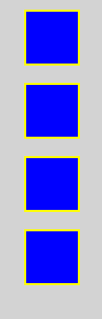
</body>👉 결과
🧐 실무에서는 아래 코드처럼 기본 브라우저 스타일을 초기화하여 사용!
body {
      margin: 0px;
      padding: 0px;
    }
🧐 margin: 0 auto; 를 하면 중앙에 배치
그러나 margin: auto auto; 적용이 안됨
=> why? HTML에서 margin top 과 margin bottom 의 auto 는 0으로 인식됩니다.
translate 함수
x축과 y축으로 이동하는 함수입니다.
✍ 코드
<head>
  <style>
    body {
      margin: 0px;
      padding: 0px;
      background-color: lightgray;
    }
    .outline, .box {
      width: 60px;
      height: 60px;
    }
    .outline {
      border: 3px solid yellow;
      margin: 0 auto;
      margin-top: 20px;
    }
    .box {
      background-color: blue;
    }
    .box1 {
     transform: trnaslate(10px, 10px);
    }
  </style>
</head>
<body>
  <div class="outline">
    <div class="box box1"></div>
  </div>
  <div class="outline">
    <div class="box box2"></div>
  </div>
  <div class="outline">
    <div class="box box3"></div>
  </div>
  <div class="outline">
    <div class="box box4"></div>
  </div>
</body>
👉 결과
🧐 box1 의 배경이 왼쪽으로 20px 움직입니다.
<style>
  .box1 {
    transform: trnaslateX(-20px);
  }
</style>
🧐 box1 의 배경이 오른쪽으로 20px 움직입니다.
<style>
  .box1 {
    transform: trnaslateX(20px);
  }
</style>
🤔 box1 의 배경이 아래쪽으로 20px 움직입니다.
<style>
  .box1 {
    transform: trnaslateY(20px);
  }
</style>
🤔 box1 의 배경이 위쪽으로 20px 움직입니다.
<style>
.box1 {
transform: trnaslateY(-20px);
}
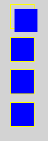
</style>scale 함수
x축과 y축으로 확대·축소되는 함수입니다.
✍ 코드
<head>
  <style>
    body {
      margin: 0px;
      padding: 0px;
      background-color: lightgray;
    }
    .outline, .box {
      width: 60px;
      height: 60px;
    }
    .outline {
      border: 3px solid yellow;
      margin: 0 auto;
      margin-top: 20px;
    }
    .box {
      background-color: blue;
    }
    .box2 {
      transform: scale(2, 0.5);
    }
  </style>
</head>
<body>
  <div class="outline">
    <div class="box box1"></div>
  </div>
  <div class="outline">
    <div class="box box2"></div>
  </div>
  <div class="outline">
    <div class="box box3"></div>
  </div>
  <div class="outline">
    <div class="box box4"></div>
  </div>
</body>
👉 결과
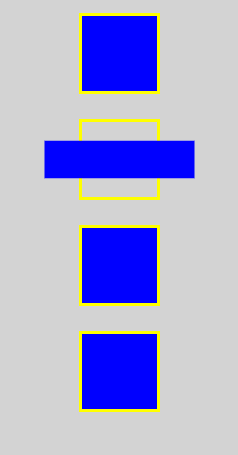
🧐 box2 의 배경의 가로가 2배가 됩니다.
<style>
  .box2 {
    transform: scaleX(2);
  }
</style>
🧐 box2 의 배경의 가로가 0.5배가 됩니다.
<style>
  .box2 {
    transform: scaleX(0.5);
  }
</style>
🧐 box2 의 배경의 세로가 2배가 됩니다.
<style>
  .box2 {
    transform: scaleY(2);
  }
</style>
🧐 box2 의 배경의 세로가 0.5배가 됩니다.
<style>
  .box2 {
    transform: scaleY(0.5);
  }
</style>
rotate 함수
지정한 각도만큼 회전합니다.
✍ 코드
<head>
  <style>
    body {
      margin: 0px;
      padding: 0px;
      background-color: lightgray;
    }
    .outline, .box {
      width: 60px;
      height: 60px;
    }
    .outline {
      border: 3px solid yellow;
      margin: 0 auto;
      margin-top: 20px;
    }
    .box {
      background-color: blue;
    }
    .box3 {
      transform: rotate(45deg);
    }
    .outline-box3 {
      perspective: 50px;
    }
  </style>
</head>
<body>
  <div class="outline">
    <div class="box box1"></div>
  </div>
  <div class="outline">
    <div class="box box2"></div>
  </div>
  <div class="outline outline-box3">
    <div class="box box3"></div>
  </div>
  <div class="outline">
    <div class="box box4"></div>
  </div>
</body>
👉 결과
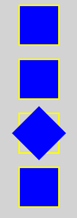
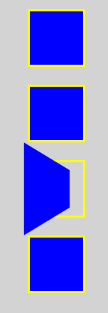
🧐 rotateX(45deg) 를 이용하여 회전했음에도 식별이 어려움
=> perspective 속성을 이용하여 원근감을 표현!!
<style>
  .box3 {
    transform: rotateX(45deg);
  }
  .outline-box3 {
    perspective: 50px;
  }
</style>
<body>
  <div class="outline outline-box3">
    <div class="box box3"></div>
  </div>
</body>-
perspective사용 전
-
perspective사용 후
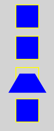
🧐 perspective: 값; 에서 값이 작을수록 원근감이 더 가깝게 느껴집니다.
🧐 rotateY(45deg) 는 y축으로 45도 회전한 것
이 또한 perspective 적용 가능
<style>
  .box3 {
    transform: rotateY(45deg);
  }
  .outline-box3 {
    perspective: 50px;
  }
</style>
<body>
  <div class="outline outline-box3">
    <div class="box box3"></div>
  </div>
</body>-
perspective사용 전
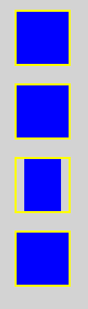
-
perspective사용 후
🧐 rotateZ(45deg) 는 rotate(45deg) 와 동일
skew 함수
x축과 y축으로 왜곡하는 함수입니다.
✍ 코드
<head>
  <style>
    body {
      margin: 0px;
      padding: 0px;
      background-color: lightgray;
    }
    .outline, .box {
      width: 60px;
      height: 60px;
    }
    .outline {
      border: 3px solid yellow;
      margin: 0 auto;
      margin-top: 20px;
    }
    .box {
      background-color: blue;
    }
    .box4 {
      transform: skew(15deg, 20deg);
    }
  </style>
</head>
<body>
  <div class="outline">
    <div class="box box1"></div>
  </div>
  <div class="outline">
    <div class="box box2"></div>
  </div>
  <div class="outline">
    <div class="box box3"></div>
  </div>
  <div class="outline">
    <div class="box box4"></div>
  </div>
</body>
👉 결과
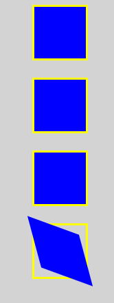
🧐 x축으로 비틀림
<style>
  .box4 {
    transform: skewX(15deg);
  }
</style>
🧐 y축으로 비틀림
<style>
  .box4 {
    transform: skewY(15deg);
  }
</style>