SASS (scss) + classnames
나는 바닐라 css보다는 sass를 선호하고 그 중에서 scss (*.module.scss)와 classnames의 조합을 선호한다.
classnames 라이브러리는 조건부 클래스 조합을 간결하게 만들어주는데, bind기능으로 css파일과 함께 조합이 가능하다.
예시
// Example.module.scss
.custom {
	...
}
.radio {
	...
    &.selected {
    	border: 1px solid green;
    }
}
import classNames from 'classnames/bind'
import styles from './Example.module.scss'
const cx = classNames.bind(styles)
const Example = () => {
const [selected, setSelected] = useState(undefined)
return <div className={cx('custom')}>
...
<ul>
{options.map(option => {
const {label, value} = option
return (
<Radio
key={value}
className={cx('radio', {selected: selected === value})
onClick={() => {
setSelected(value)
}
}}>{label}</Radio>
)
})}
</ul>
</div>
}위처럼 select라는 클래스를 classnames를 이용해서 조건부로 쉽게 부여할 수 있다.
&(앰퍼센드)
위 예시에서, cx('radio',{selected})는 조건부로 cx('radio', 'selected')를 적용한다는 말이다.
그렇다면 클래스가 만약 다음과 같다면 차이를 명확히 아는가?
.radio {
	...
    .selected {
    	border: 1px solid green;
    }
}
&(앰퍼센드)는 현재 부모 선택자를 참조해서 치환된다
첫 예시의 .radio클래스를 css로 컴파일하면 다음과 같다
.radio.selected후자의 경우 (&가 없는 중첩) 컴파일 결과는 다음과 같다
.radio .selected즉, .radio 요소의 자식 중 .selected 클래스를 가진 요소에 스타일이 적용된다 (부모-자식 관계)
& + &
현재 선택자 바로 뒤에 같은 선택자가 올 때
즉, 형제 관계에서 같은 요소가 연속으로 있을 때 선택된다
.item {
	margin-top: 0;

	& + &{
    	margin-top: 16px;
    }
}
이 경우 예를들어 .item을 가지는 리스트가 연속될때, 두번째 부터의 .item에 margin-top: 16px 이 적용
&:last-child
현재 선택자가 부모의 마지막 자식일 때
.item {
	border-bottom: 1px solid #eee;

    &:last-child {
    	border-bottom: none;
    }
}
이 경우 마지막의 .item에는 border-bottom: none 이 적용
&:first-child
현재 선택자가 부모의 첫 번째 자식일 때
.item {
	...

    &:first-child: {
    	opacity: 0.8;
    }
}
이 경우 첫번째 .item에만 opacity: 0.8 이 적용
정렬 패턴
정중앙 배치
.custom {
	position: absolute;
    top: 50%;
    left: 50%;
    transform: translate(-50%, -50%);
}
수직 중앙 정렬
.custom {
	position: absolute;
    top: 50%;
    transform: translateY(-50%);
}
가로 중앙 정렬
.custom {
	position: absolute;
    left: 50%;
    transform: translateX(-50%, -50%);
}
수평 중앙 정렬
.custom {
	position: absolute;
    left: 50%;
    transform: translateX(-50%);
}
flex
정말 많이 사용하는 display: flex의 flex속성에 대해 알아보자
flex는 기본적으로 flex-grow, flex-shrink, flex-basis를 동시에 가지는 축약형이다.
실무에 자주쓰이는 패턴
flex: 1
flex: 1은 flex: 1 1 0에 해당하며, 남는 공간을 전부 채운다 (균등분배)
flex: 0 0 auto
flex: 0 0 auto는 flex컨테이너의 크기가 바뀌어도 내 크기만큼만 차지하고 늘어나거나 줄어들지 않는다
mobile first 반응형 레이아웃
요즘은 모바일 뷰를 우선적으로 레이아웃으로 잡고, 해상도가 커질수록 레이아웃을 좌우 패딩에만 조절하는 경향이 많은것 같다.
//App.tsx

function App() {
  return (
    <div className={cx("layout")}>
      <header className={cx("header")}>헤더의 위치</header>

      <main className={cx("container-wrapper")}>
          <div className={cx("container")}>
            <ul>
              <li>컨텐츠1</li>
              <li>컨텐츠2</li>
              <li>컨텐츠3</li>
              <li>컨텐츠4</li>
              <li>컨텐츠5</li>
              <li>컨텐츠6</li>
            </ul>
          </div>
      </main>
      <footer className={cx("footer")}>푸터의 위치</footer>
    </div>
  );
}
//App.module.scss
.layout {
height: 100vh;
background-color: #f3f5f7;
display: flex;
flex-direction: column;
}
.header {
height: 60px;
background-color: yellow;
text-align: center;
}
.container-wrapper {
display: flex;
height: 100%;
flex: 1;
justify-content: center;
overflow-y: auto;
}
.container {
background-color: pink;
width: 100%;
max-width: 600px;
@media screen and (min-width: 1024px) {
max-width: 800px;
}
}
.footer{
height: 60px;
background-color: red;
text-align: center;
}
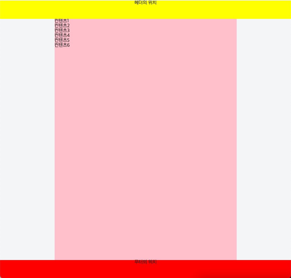
위와 같은 레이아웃 스타일을 요즘 많이 사용하는것 같음