Modifiers
override
.foreground(), .padding(), .border() ... 등 여러 View에 대해 Modifier가 존재. 하지만 순서가 중요.
SwiftUI는 View를 계속 override하기때문에 modifier의 순서에 따라 다른UI가 생긴다(주로 크기에 영향을 주는 modifier에 대해 민감)
.system property
modifier 객체가 지원하는 기본속성 대신, system속성을 사용 가능
ex) .font(.title) or .font(.system(size: int, weight: .bold))
.overlay
ZStack처럼 어떤 View에 새로운 View를 오버레이 가능
Image("어떤포스터이미지")
	...
    .overlay(alignment: .bottom){
    	View()
    }

혹은

AsyncImage(url: URL(string:url주소)){ image in
    image
    	.// modifiers
}placeholder {
	비동기 이미지가 로딩 혹은 에러일경우보여줄 View
    .overlay {
	ProgressView() // 로딩 인디케이터 뷰
 }
}
자주쓰는
.background(
	RoundedRectangle(cornerRadius:15).fill(.white).opacity().shadow()...
)

.overlay {
	RoundedRectangle(cornerRadius: 10).stroke(.gray, lineWidth: 1)...
}

.frame(width, height, maxWidth, maxHeight)

.Button(){}
	.alert("alert로 보여줄 문구", isPresented: Binding<bool>){
    	Button("확인", role: .cancel){
        	// action영역 isPresented State를 toggle하는 등
        }
    }
Views
ScrollView
embed한 영역에 대해 스크롤 가능 (기본값은 .vertical)
Stack
공통적으로 alignment, spacing 인자 설정 가능
VStack: Vertical allign
HStack: Horizontal allign
ZStack: Z-axis allign
Spacer
Stack기준 View 사이 간격에 대해 최대한 밀어버림
Image
1) assets에 등록한 name으로 이미지를 불러올 수 있음 Image("등록한이미지파일명") 이런식으로
2) 시스템이미지명으로 불러올수 있음 (Apple에서 지원하는 아이콘) Image(systemName: "")
3) UiImage 타입의 이미지도 호출 가능 Image(uiImage: "")
AsyncImage
이미지 소스의 url로 호출시키는 ImageView.
url의 optional 처리를 해야하고 사용법은 다음과 같다.
if let imageUrl = viewModel?.imageUrl {
	let url = URL(string: imageUrl)
    AsyncImage(url: url) {image in
    	image
        	.resizable()
            ...
    } placeholder: {
    	ProgressView()
    }
}
하지만 캐싱 기능이 없어서 실무에서는 외부 라이브러리를 사용한다 (KingFisher)
KFImage (KingFisher)
외부 패키지 KingFisher의 비동기 캐싱기능을 가진 KFImage View.
AsyncImage와 사용법은 비슷하나, 기본적으로 캐싱기능이 내장되고, 비동기 이미지 요청에 대해 좀더 디테일하게 설정이 가능하다 (성공시, 실패시, 재호출횟수 등)
KFImage(url)
	.placeholder { _ in
		ProgressView()
}
 .resizable()
 ...
Image - modifiers
resizable()
이미지의 크기(frame)를 조절하려면 resizable() 사용. 이는 뷰가 차지할 수 있는 최대영역을 차지하게 함. 이후 clipShape, overlay, cornerRadius(보더 radius), aspectRatio(비율 조절) 등 modifier 적용 가능
aspectRatio(contentMode: .fit or .fill)
aspectRatio를 사용하면 이미지의 비율을 조절할 수 있다.
Image()
	.resizable()
    .aspectRatio(1, contentMode: .fit or .fill )
첫번째 인자에 비율(가로,세로)을 생략하면 이미지의 원본 비율을 따른다
contentMode속성은 fit과 fill이 존재하며, 그 차이점을 알아보자
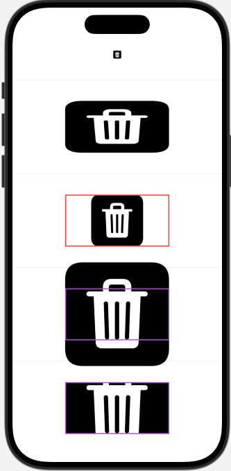
struct ContentView: View {
    var body: some View {
        VStack(spacing: 40) {
            Image(systemName: "trash.square.fill") // 기본 시스템 이미지
            Divider()

           Image(systemName: "trash.square.fill")
                .resizable()
                .frame(width: 200, height: 100) // 이렇게 조절은 하지만 비율이 깨짐
            Divider()

            Image(systemName: "trash.square.fill")
                 .resizable()
                 .aspectRatio(1,contentMode: .fit)
                 // fit의 경우 border를 기준으로 비율이 유지되어
                 // 보더의 수평,수직중 최대로 걸릴때까지 사이즈가 증가함
                 .frame(width: 200, height: 100)
                 .border(.red, width: 2)
            Divider()

            Image(systemName: "trash.square.fill")
                 .resizable()
                 .aspectRatio(contentMode: .fill)
                 // fill의 경우, border의 수평 혹은 수직라인을 초과하고,
                 // 나머지 보더를 최대로 걸릴때까지 사이즈가 증가함
                 .frame(width: 200, height: 100)
                 .border(.purple, width: 2)
            Divider()

            Image(systemName: "trash.square.fill")
                 .resizable()
                 .aspectRatio(contentMode: .fill)
                 .frame(width: 200, height: 100)
                 .border(.purple, width: 2)
                 .clipped() // fill로 튀어나온 영역을 잘라버림.
        }
    }
}-
contentMode: .fit
-> 뷰가 차지하는 영역(border기준) 기준으로 비율을 유지시켜서, horiziontal, vertical 보더에 어느 한 지점이라도 최대로 걸릴때까지만 사이즈가 증가함 -
contentMode: .fill
-> border의 horiziontal, vertical 중 하나의 영역을 초과해서 나머지 영역에 최대로 걸릴때까지 사이즈가 증가함 -
clipped()는 왜 사용하는가?
예를들어 사진업로드를 하는데, frame에 maxWidth, maxHeight가 정해져있다고 가정하자. 사진마다 크기가 다르지만 contentMode: .fill로 전부 채우고, 튀어나온 부분은 clipped로 잘라내서 어떤 다른 원본 비율을 가진 사진을 업로드 하더라도 동일한 규격으로 꽉차게 보여줄 수 있음
위 예시 코드를 시뮬레이터에서 시각화하면 다음과 같다.
List
VStack과 ScrollView의 기능을 가짐
.listStyle() modifier
Button
Button{
	// action 영역
} label: {
	// 라벨 영역
}
TabView
앱의 하단 네비게이션 바처럼 탭에 따른 화면을 보여줄수 있다
var body: some View {
        TabView {
            Text("1탭 화면")
                .tabItem {
                    Image(systemName: "house.fill")
                    Text("Home")
                }
                .toolbarBackground(.black, for: .toolbar) // 만약 1탭화면이 어두워서 탭바가 안보일경우
            Text("2탭 화면")
                .tabItem {
                    Image(systemName: "gamecontroller")
                    Text("Game")
                }
			...
    }
    }
LazyVGrid
LazyVGrid는 ScrollView를 임베딩 했을 때 수직으로 스크롤 되는 그리드 뷰를 의미한다.
또한 "Lazy" 에서 알 수 있는데 여러 그리드 뷰를 한번에 로드하는게 아닌, 스크롤될때마다 로딩시킨다 (최적화)
LazyVGrid는 columns와 spacing을 인자로 받는데, spacing은 vertical의 간격을 의미하고,
columns는 컬럼에 해당하는 설정을 담당한다. GridItem으로 구성 가능하다.
대표 모디파이어로 onAppear, task등 LazyVGrid가 로드될때 실행시킬 코드블럭이 존재하는데, 이는 동기, 비동기 코드에 해당한다.
let colums: [GridItem] = [
	GridItem(.flexible(), spacing: 2), // spacing은 horizontal의 간격
    GridItem(.flexible(), spacing: 2),
    GridItem(.flexible(), spacing: 2),
]
var body: some View {
...
LazyVGrid(columns: columns, spacing: 2) {
                        ForEach(0 ..< 10, id: \.self) { _ in
                            Image("image_lion3")
                                .resizable()
                                .scaledToFit()
                            Image("image_lion4")
                                .resizable()
                                .scaledToFit()
                        }
                    }
                    .onAppear {}
                    .task {}
                 }
위 코드는 3열에 해당하는 그리드를 만들었고, 그 안에 뷰를 반복문으로 이미지를 채웠을 뿐이다.
GirdItem설정에 대해 위는 .flexible()을 사용했는데, 이는 컨텐츠가 flexible하게 늘어난다.
만약 고정된 너비를 지정하고싶다면 GridItem(.fixed(너비)) 를 사용할 수 있다
탭 이동
단순히 탭을 클릭하여 탭뷰를 전환시키는게 아닌, 탭이아닌 다른 로직으로 탭을 이동시킬 수 있다.
각 탭의 tag를 부여해서, selection 생성자로 탭을 구분하여, 바인딩을 통해 자식 뷰에서 탭 인덱스를 조절할 수 있다.
// 탭뷰
@State var tabIndex = 0
var body: some View {
	TabView (selection: $tabIndex) {
    	Text("1탭 화면")
                .tabItem {
                    Image(systemName: "house.fill")
                }
                .tag(0)
    	CustomView(tabIndex: $tabIndex)
                .tabItem {
                    Image(systemName: "gamecontroller")
                }
                .tag(1)
		...
    }
}

// CustomView

@Binding var tabIndex: Int
var body: some View {
	Button {
    	tabIndex = 0 // 이 버튼을 누르면 0번째 탭으로 이동
    } label {
	Text("뒤로가기")
}
}
NavigationStack
앱에서 화면을 이동시킬때 Stack방식으로 화면위에 화면을 덮어 Stack을 쌓고, 뒤로가면 Stack을 pop out한다.
그 Stack의 범위를 NavigationStack으로 정의하고, NavigationLink로 Stack을 쌓는다.
기본 동작으로 NavigationLink로 이동하면, 뒤로가기 버튼이 생기고 Stack popout이 가능하지만, 여러 모디파이어로 뒤로가기를 바꾸거나, 헤더를 추가하거나 할 수 있다.
하지만 이런 navigation modifiers는 Link될 뷰에서 설정해줘야함
// LoginView
NavigationStack { // 이 영역에 대해 Navigation 가능

...
NavigationLink { // 2) 여기로 네비게이션
	EnterEmailView()
} label: { // 1) 이걸 누르면
	Text("새 계정 만들기")
	}
}

// EnterEmailView
struct EnterEmailView: View {
    @Environment(\.dismiss) var dismiss // Stack popout (뒤로가기는 이 변수로 처리)
    var body: some View {
	VStack {
	...
	}
     .navigationBarBackButtonHidden() // 기본 네비게이션스택의 뒤로가기버튼 숨기기 (이 뷰가 네비게이션 링크일때)
        .toolbar { // 대신 툴바를 사용하겠다
            ToolbarItem(placement: .topBarLeading) {
                Button {
                    dismiss()
                } label: {
                    Image(systemName: "chevron.backward")
                        .resizable()
                        .aspectRatio(contentMode: .fit)
                        .frame(width: 20, height: 20)
                        .tint(.black)
                }
            }
        }
 }
}
LinearGradient, Color
Gradient가 들어간 배경을 만들때 LinearGradient View를 사용하고 ZStack에 넣어 사용한다.
defualt options
LinearGradient(colors: [.blue, .red], startPoint: .top, endPoint: .bottom)
	.ignoresSafeArea() // 필요에 따라 사용
기본적인 colors에 따라 균등하게 색을 섞는다
custom options
LinearGradient(stops: [Gradient.Stop(color: .yellow, location: 0.1),
                               Gradient.Stop(color: .red, location: 0.3),
                               Gradient.Stop(color: .blue, location: 0.6),
                               Gradient.Stop(color: .green, location: 1)],
                       startPoint: .topLeading, endPoint: .bottomTrailing)
            .opacity(0.2)
            .ignoresSafeArea()
각 colors에 대해 얼마나 포함시킬것인지 디테일하게 설정이 가능하다
RGB Colors
기본적인 색상을 사용할때 Color.red (축약으로 .red 등) 이렇게 사용할 경우 정직한 red컬러가 나온다.
하지만 rgb 값을 사용해 커스텀 컬러를 만들 경우 예를들어 255,249,241 이런 rgb값을 SwiftUI에 추출하려면 이런식으로 사용도 가능하다.
let customYellowColor = Color(red: 255/255, green: 249/255, blue: 241/255)TextField
웹의 기본 인풋과 같은 역할이다. text생성자에 State를 바인딩해 입력하면 자동으로 반영된다
TextField("placeholder", text: $바인딩변수)
	.textInputAutocapitalization(.never) // 첫글자에 대해 대문자 처리를 할것인가
    ...
SecureField
TextField와 동일하게 사용하지만 text값이 마스킹 처리되어 노출된다 (비밀번호 필드)