학습한 내용
CSS Animation
1. https://animate.style/
- 애니메이션이 구현되어 있는 css 파일을 쓸 수 있다.
- CDN : style.css이 들어가 있는 link 태그 위에 넣는다.
<link
    rel="stylesheet"
    href="https://cdnjs.cloudflare.com/ajax/libs/animate.css/4.1.1/animate.min.css"
 />
[html]
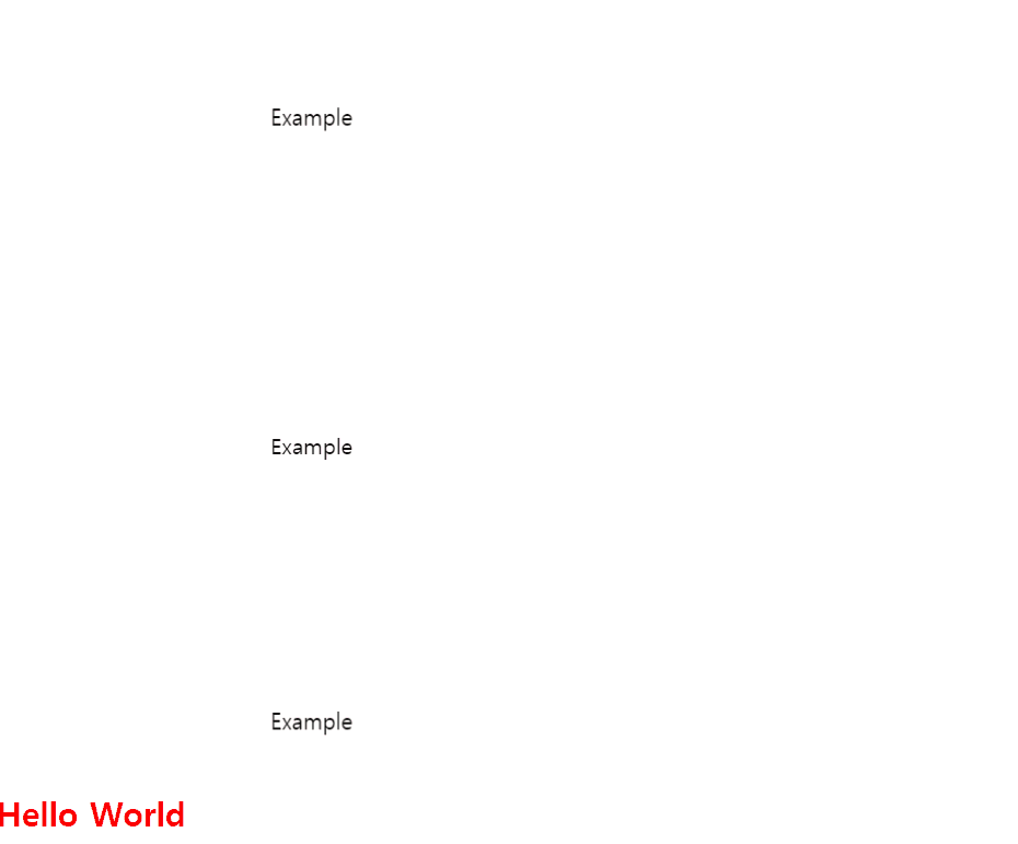
	<div class="animate__animated animate__bounce">Example</div>

	<div class="animate__animated animate__bounce animate__faster">Example</div>

	<div class="animate__animated animate__bounce animate__slow">Example</div>

	<h2 class="color-red">Hello World</h2>
[css]
.color-red {
	color: red;
}


.animate__animated {
	margin-top: 200px;
	margin-left: 200px;
}
-
href="https://cdnjs.cloudflare.com/ajax/libs/animate.css/4.1.1/animate.min.css";-> 웹 상의 css 파일을 불러온다. -
https://cdnjs.cloudflare.com/ajax/libs/animate.css/4.1.1/animate.css
-> animate.css의 구조 확인
2. https://codepen.io/
- 다양한 예시를 볼 수 있다.
학습한 내용 중 어려웠던 점 또는 해결 못한 것들
어제 배운 내용 중 부모 자식 태그가 둘 다 relative 일 때 margin-top을 이용한 margin 병합이 왜 일어나지 않는지에 대한 질문을 보고 같은 의문점이 생겼다.
해결 방법 작성
(1) 마진 병합현상 일어나지 않게 하는 방법
- 공간을 차지하고 있는 요소를 해당 자리에 넣는다.
- parent요소에 border 속성을 주거나 padding 속성을 준다.
- 혹은 부모 태그와 자식 태그 사이에 빈 table 태그를 넣는다.
- 자식요소의 display 속성값을 inline-block으로 바꾸기
- 부모요소에게
overflow:hidden;속성값을 적용한다. - 출처 : https://velog.io/@ursr0706/%EB%A7%88%EC%A7%84margin
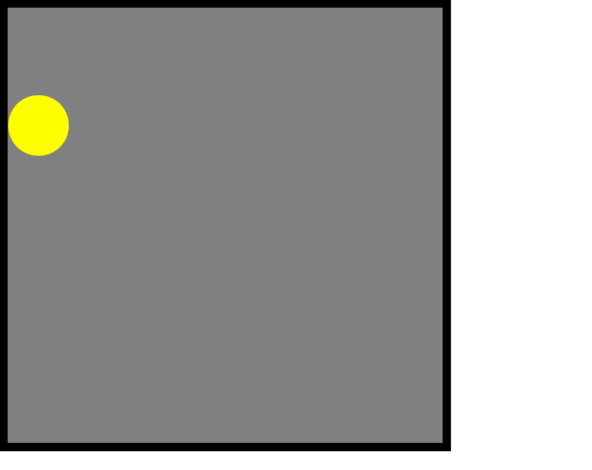
(2) html과 css를 활용하여 확인
[html]
	<div class="mario-container">
		<div class="mario-coin"></div>
	</div>
[css - border 有]
.mario-container {
	position: relative;

	width: 500px;
	height: 500px;
	background-color: gray;
	border: solid 10px black;
}

.mario-container .mario-coin {
	position: relative;

	width: 70px;
	height: 70px;
	background-color: yellow;
	border-radius: 50%;

	margin-top: 100px;
}
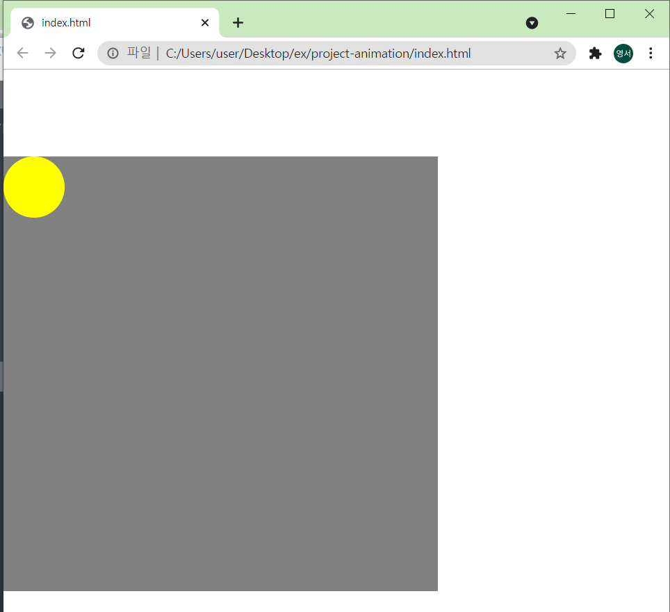
[css - border 無]
.mario-container {
	position: relative;

	width: 500px;
	height: 500px;
	background-color: gray;
	/*border: solid 10px black;*/
}

.mario-container .mario-coin {
	position: relative;

	width: 70px;
	height: 70px;
	background-color: yellow;
	border-radius: 50%;

	margin-top: 100px;
}
학습 소감
position에 따른 다양한 특성들을 이해하는 것과 확실히 습득하는 것은 차이가 있다고 느꼈다. 코드를 다양하게 바꿔보면서 습득하고자 노력해야겠다.