
Flexbox 📦 📦 📦 ✨
flex flex-direction column row justify-content align-items flex-start flex-end center ...
Flexbox 는 행과 열을 기준으로 요소들을 배치할 수 있다. 레이아웃잡기에는 flexbox 가 좋다!
.container {
        display: flex; /* flexbox 선언 */
        flex-direction: row; /* 가로배치 or 세로배치 결정 */
        justify-content: center; /* 주축의 정렬 */
        align-items: center; /* 교차축의 정렬 */
      }
Flexbox 속성 은 종류에 따라 container 박스에 넣거나, 혹은 각각의 item 요소들 에 줄 수 있다.
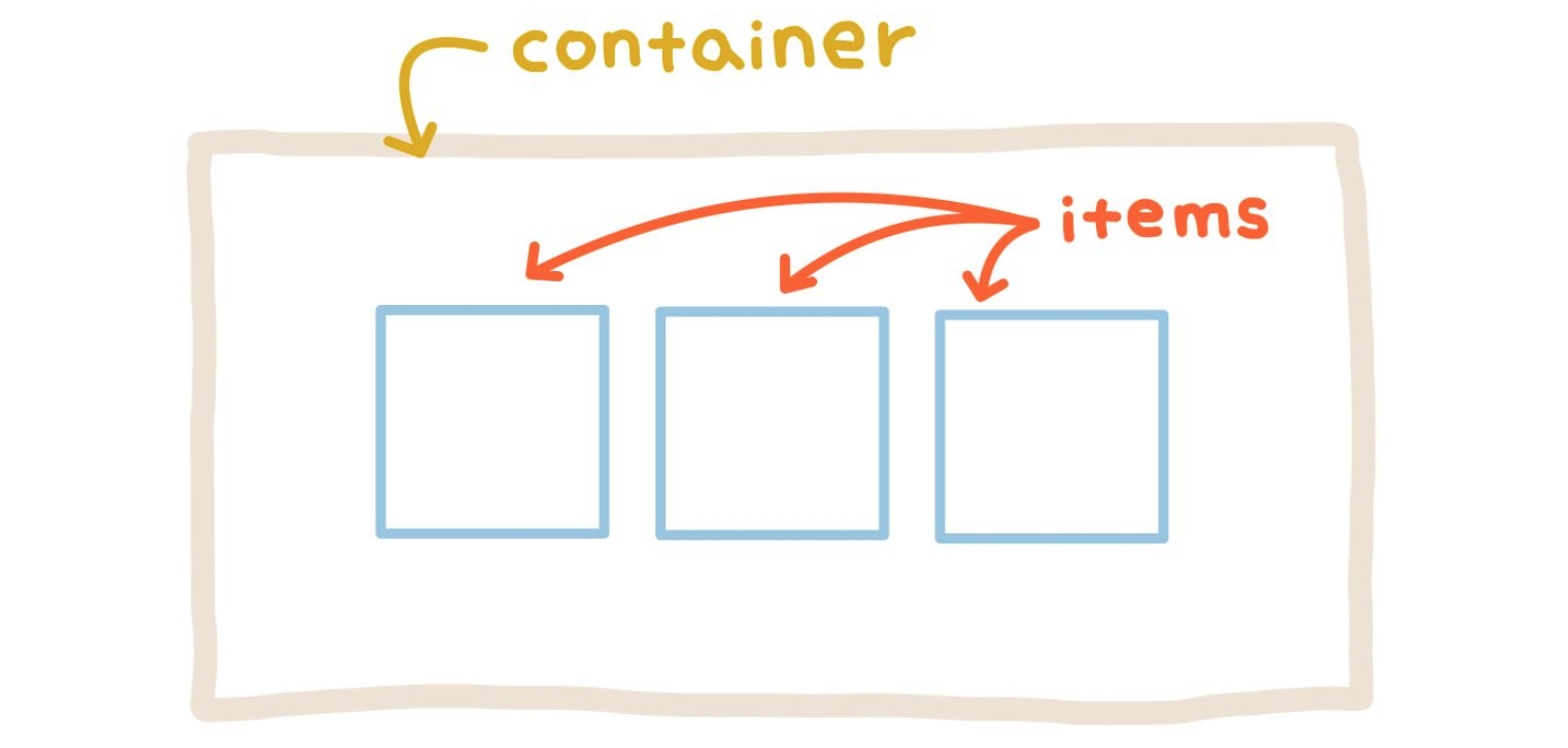
container 은 flex container 이고, items 들은 flex items 이다.
Flex container
① display: flex
display: flex
레이아웃 배치를 하고자 하는 요소들을 감싸고 있는 부모요소(컨테이너)에게 display: flex 를 선언한다.
  .container {
    display: flex;
  }
② main-axis / cross-axis
Flexbox 를 이용하기 위해서는 축에대한 개념이 필요하다.
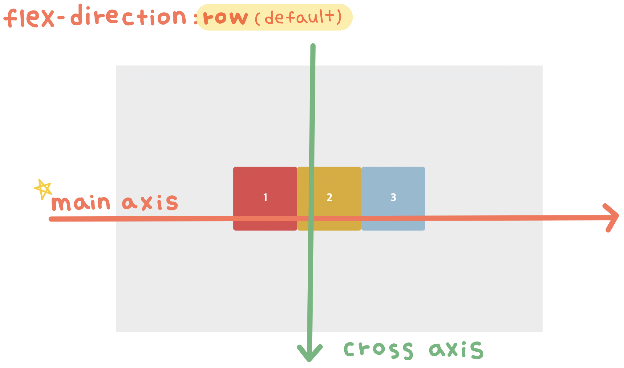
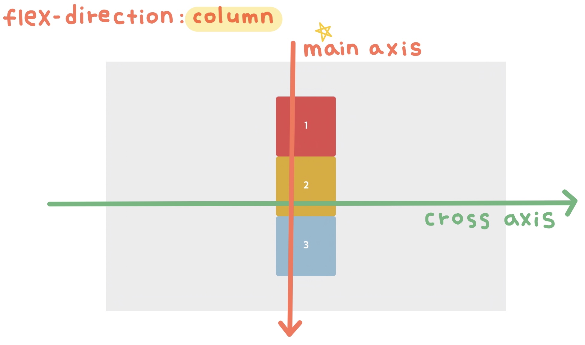
main-axis : 요소들이 배치되고 있는 방향으로 진행하는 축
cross-axis : main-axis 와 직각을 이루는 축이다.
→ 그렇기 때문에 가로배치 / 세로배치에 따라서 축은 바뀐다.
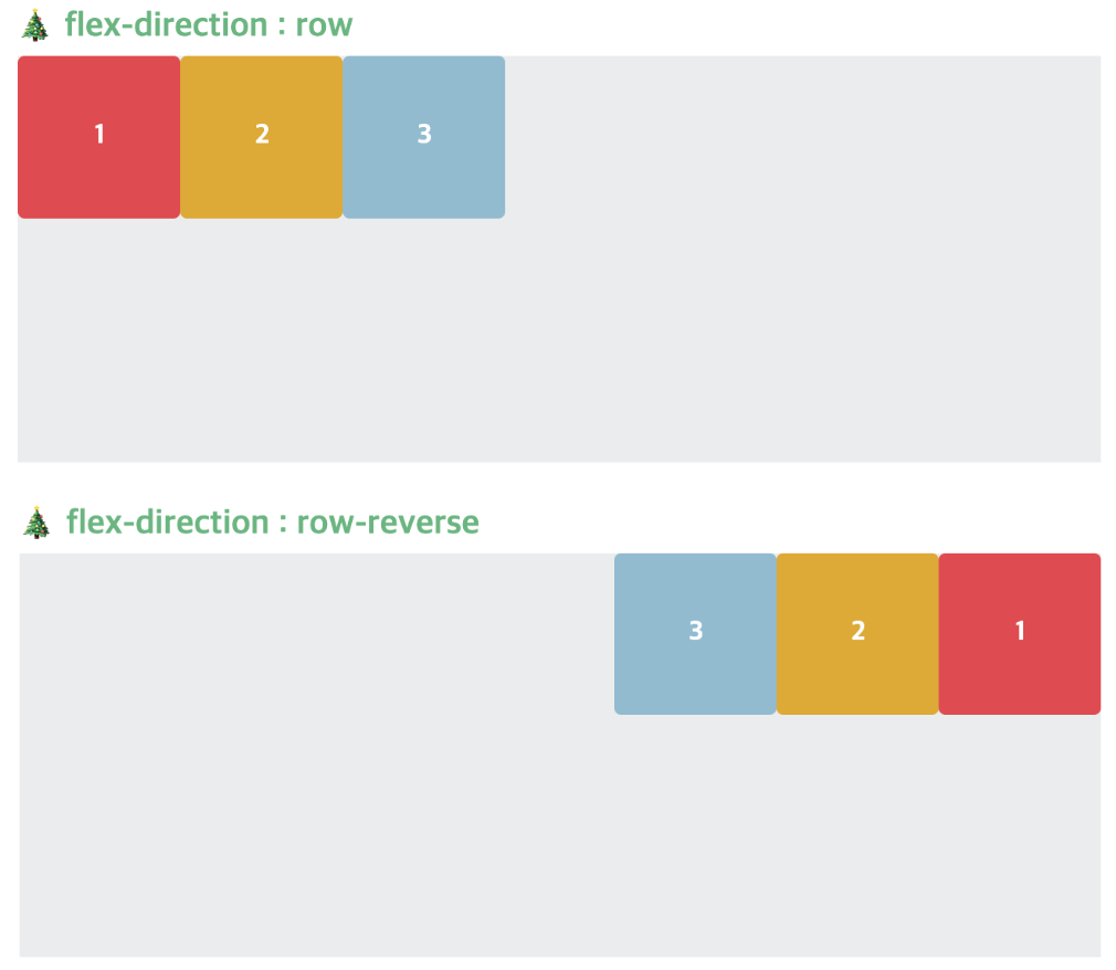
row 방향 일때에는 왼쪽 → 오른쪽 방향이 main axis 가 된다.
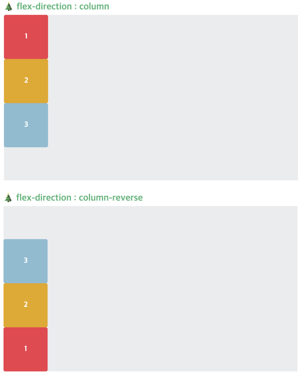
column 방향 일때에는 위 → 아래 방향이 main axis 가 된다.
③ flex-direction
flex-direcion row row-reverse column column-reverse
부모요소(컨테이너)에게 flex-direction: 방향 을 선언해주면, 배치 방향을 정할 수 있다.
 .container {
 	flex-direction: row | row-reverse | column | column-reverse ;
 }
✨ flex 를 선언했을때, 기본으로 설정된 방향은 row 이다.
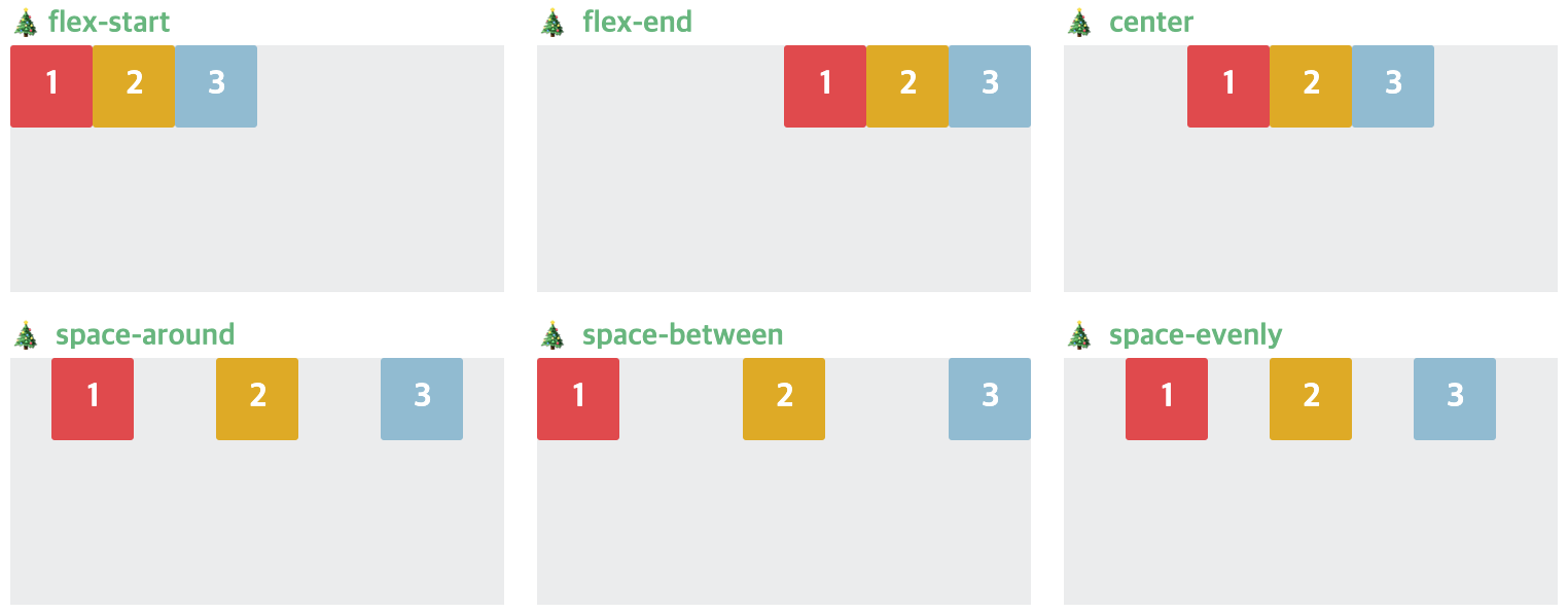
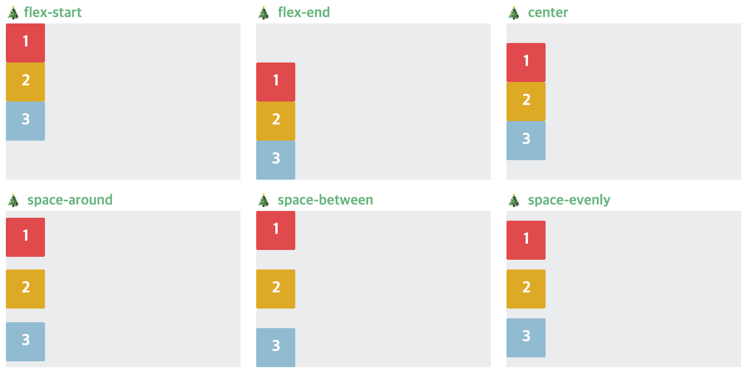
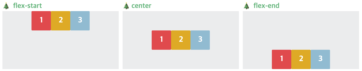
④ justify-content
flex-start flex-end center space-between space-around space-evenly
justify-content 는 main-axis 의 정렬을 위한 property 이다.
 .container {
 	justify-content: flex-start | flex-end | center |
     			 space-between | space-around | sapce-evenly |
    			 start | end | left | right ;
 }
만약 flex-direction: row 라면 main-axis 는 가로축(왼쪽 ➡️ 오른쪽) 이 되므로,
flex-direction: column 이면 main-axis 는 수직축(위 ⬇️ 아래) 이 되므로,
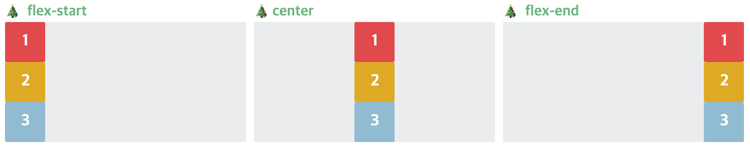
⑤ align-items
flex-start flex-end center stretch baseline
align-items 는 cross-axis 의 정렬을 위한 property 이다.
 .container {
 	align-items: flex-start | flex-end | center | stretch | baseline ;
 }
만약 flex-direction: row 라면 cross-axis 는 수직축(위 ⬇️ 아래) 이 되므로,
만약 flex-direction: column 이면 cross-axis 는 가로축(왼쪽 ➡️ 오른쪽) 이 되므로,
⑥ flex-wrap
nowrap warp wrap-reverse
flex-item 요소 들을
- 한줄에 배치하도록 할 것인지,
- 공간이 부족하다면 자동으로 줄을 바꾸어 내려올 것인지를 결정하는 속성이다.
 .container {
 	flex-wrap: nowrap | wrap | wrap-reverse ;
 }
nowrap 기본 설정값으로, flex-container 부모요소 영역을 벗어나더라도 flex-item 요소들을 한 줄에 배치한다.
wrap flex-item 요소들이 공간이 부족하면, 여러 행에 걸쳐서 배치된다.
Flex items
① order
같은 flex container 안에있는 items 끼리, HTML 마크업은 그대로 둔 채 순서를 바꿔줄 수 있다.
order 기본 값 : 0 이다.
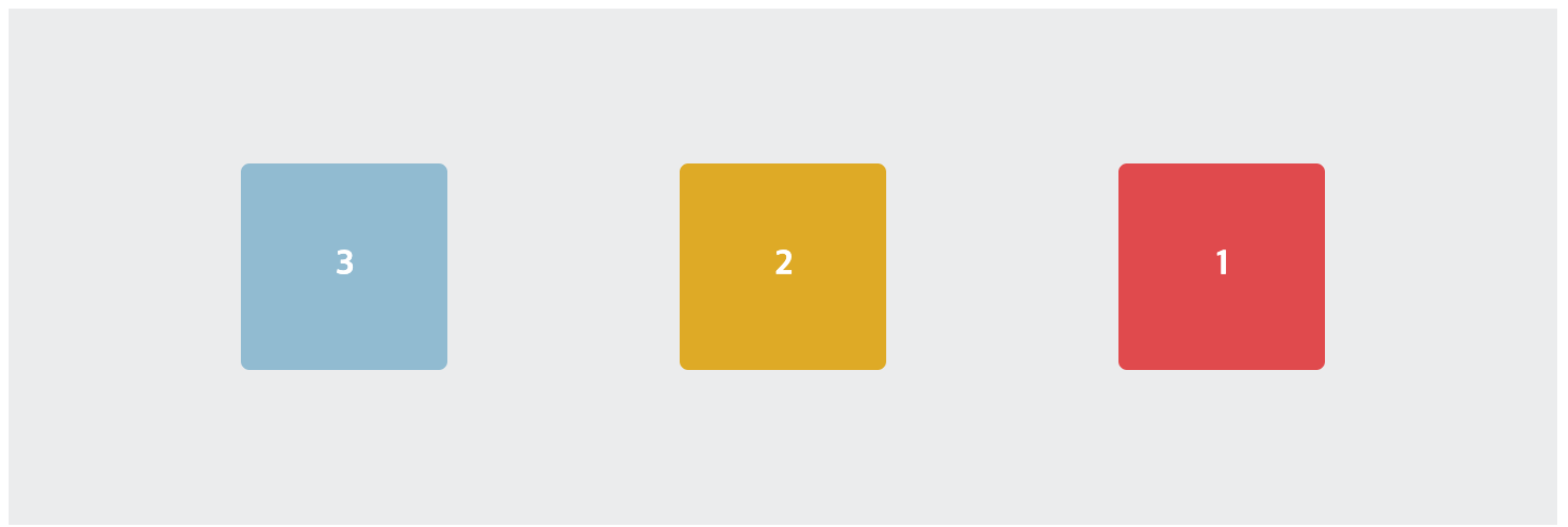
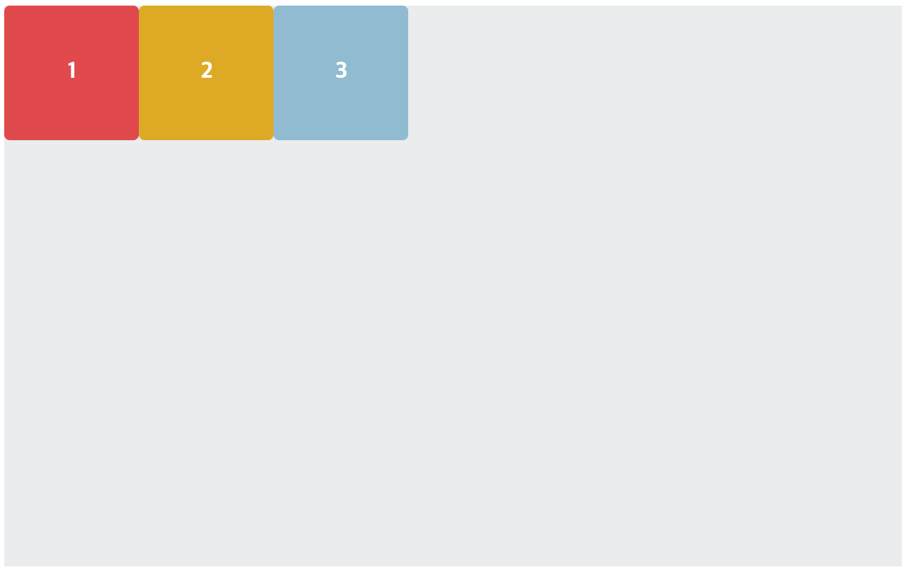
html
<div class="red">1</div>
<div class="yellow">2</div>
<div class="blue">3</div>
css
.red {
	order: 1;
}
.yellow {
 /* dafault order : 0 */
}
.blue {
	orrder: -1;
}
② flex-grow
flex-item 요소가 flex-container 내부에서 남는 공간이 있을 때 할당 받을 공간의 정도를 선언해준다.
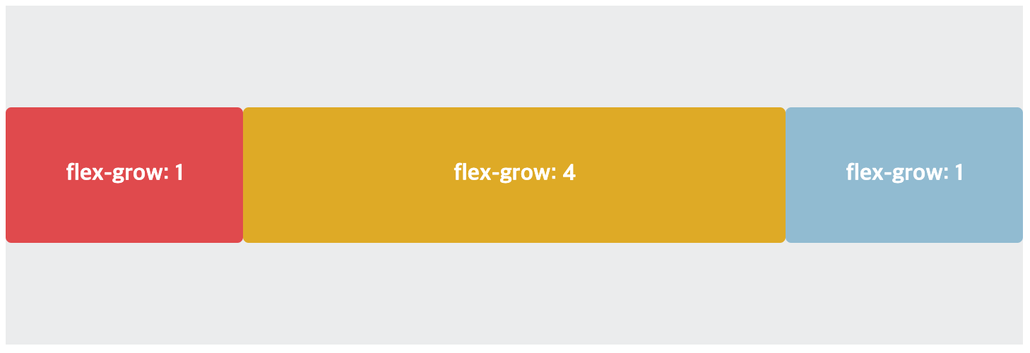
.red {
    flex-grow: 1;
}
.yellow {
    flex-grow: 4;
}
.blue {
    flex-grow: 1;
}
③ flex-shrink
flex-grow 속성이 남는 공간을 items 에게 분배하는 방법이었다면,
flex-shrink 는 main-axis의 공간이 부족할 때 각 item 들의 사이즈를 줄이는 정도를 정한다.
숫자가 클수록 → 더 빨리 줄어든다
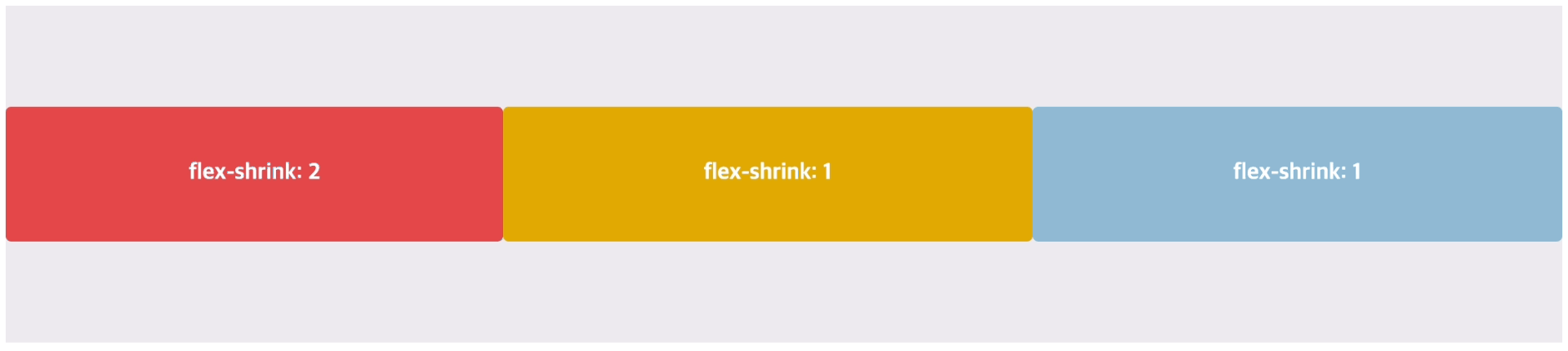
 .red {
      flex-shrink: 2;
    }

 .yellow {
      flex-shrink: 1;
    }

 .blue {
      flex-shrink: 1;
    }
④ align-self
align-items 로 정해진 것과 별개로, 개별적으로 다른 정렬값을 갖도록 해준다.
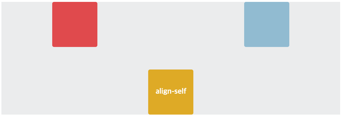
  .container {
      display:flex;
      justify-content: space-evenly;
      align-items: flex-start;
  }

   .yellow {
      align-self: flex-end;
    }
https://css-tricks.com/snippets/css/a-guide-to-flexbox/#flexbox-background