✅Section02. 머신러닝에 필요한 기본 지식
📌Python 문법 crash course
🏷️if,elif, else Statements
if 1 == 2:
    print('first')
elif 3 == 3:
    print('middle')
else:
    print('Last')
🏷️enumerate
인덱스하고 값을 같이 반환해주는 함수
seq = ['a', 'b', 'c', 'd', 'e']

for i, el in enumerate(seq):
    print(i, el)
🏷️list comprehension
기존 리스트의 요소를 바꾸거나 필터링하여 새로운 리스트를 만든다
x = [1,2,3,4]
[item**2 for item in x]

실행결과 : [1, 4, 9, 16]
🏷️functions
def times2(x):
    return x * 2

times2(2)
🏷️lambda 표현
이름 없는 함수
(lambda x: x*2)(2)🏷️map, filter 함수
- map 함수 : 리스트 요소에 함수를 매핑해서 결과를 반환
- filter 함수 : 리스트 요소를 필터링해서 반환
seq = [1,2,3,4,5]

list(map(times2, seq))
list(map(lambda x: x*2, seq))

list(filter(lambda x: x%2 == 0, seq))
📌Numpy를 이용한 Matrix 다루기
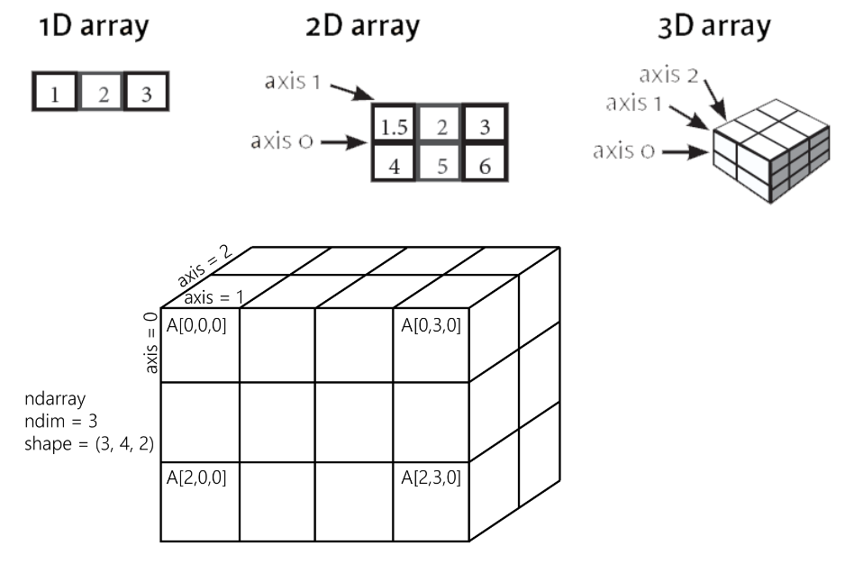
🏷️Numpy란 ?
- 대용량 데이터 배열을 효율적으로 다룰 수 있도록 설계됨
- 선형대수, 행렬 연산 등의 수학적 함수 내장
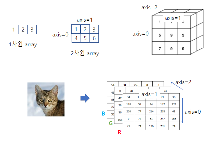
- 1차원 : vector, 2차원 : matrix, 3차원 이상 : tensor
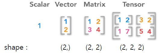
- rank : array의 차원
- shape : 각 차원의 사이즈
- dtype : 텐서의 데이터 타입
🏷️Matrix의 numpy 표현
Matrix 표현
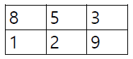
np.array([[8,5,3],[1,2,9]])

''' [[8 5 3]
    [1 2 9]]'''
Tensor 표현
np.array([[[1, 2], [3, 4]], [[5, 6], [7, 8]]])

''' [[[1 2]
      [3 4]]
     [[5 6]
      [7 8]]'''
📌Numpy 실습, 선형대수 기초
🏷️ndarray
np.argmax() : 가장 큰 인덱스 찾는 함수
x = np.array([1,2,3])
np.argmax(x) # 인덱스가 가장 큰 값 0~2
실행결과 : 2
🏷️slicing
📢 두 번째, 세 번째 슬라이싱 방법은 머신러닝 할 때 사용되는 슬라이싱 요령 !
- 두 번째 슬라이싱 : 훈련용, 검증용 데이터로 나눌 때
- 세 번째 슬라이싱 : 특징(피처)데이터와, 정답(라벨)데이터로 구분할 때
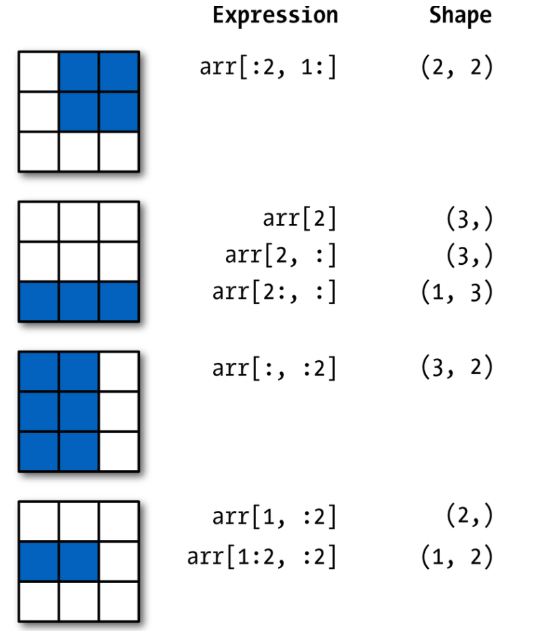
📢 Vector 형태를 Matrix 형태로 변환
arr = np.array([[1,2,3],[4,5,6],[7,8,9]])

print(arr[1,:2]) #vector 형태, 요소가 2인 형태
print(arr[1:2, :2]) #행렬 형태, 대괄호가 하나 더 생김
''' [4 5]
   [[4 5]]
vector 형태를 matrix 형태로 바꿔줌 shape = (1,2) '''
🏷️Matrix 곱셈
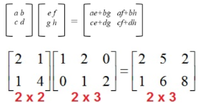
np.matmul(a,b)
a = np.array([[2,1],[1,4]])
b = np.array([[1,2,0],[0,1,2]])
print(np.matmul(a,b)) # matmul만 해주면 Matrix 곱셈 연산이 수행
'''[[2 5 2]
    [1 6 8]]'''
🏷️전치행렬
= 원래 행렬의 행과 열을 뒤바꾼 행렬
A = np.arange(9) # 요소가 9개인 벡터
B = A.reshape(3, 3) # 3x3 Matrix로 바꿈

# B의 전치행렬
B.T
np.transpose(B)
B.transpose() # 3가지 표현
📌Pandas 기초
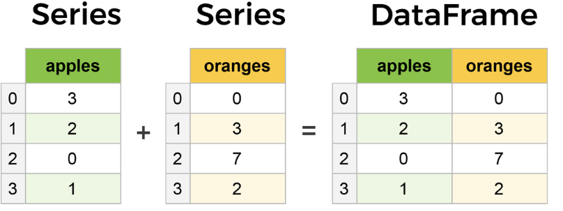
Pandas는 시리즈 데이터 타입과 데이터프레임 데이터 타입으로 구성됨
Tabular 형식의 데이터 처리
- Series(1차원) : 넘파이 배열과 유사하지만 시리즈는 axis(행,열)에 라벨 부여 가능
- DataFrame(2차원,table) : Series가 모이면 데이터프레임이 됨
🏷️DataFrame
<DataFrame의 column 명>
np.random.seed(101)
data = np.random.randn(5,4) # 정규 분포 형태로 데이터 형성
df = pd.DataFrame(data, columns = ["W","X","Y","Z"])
# 칼럼에 라벨을 부여
df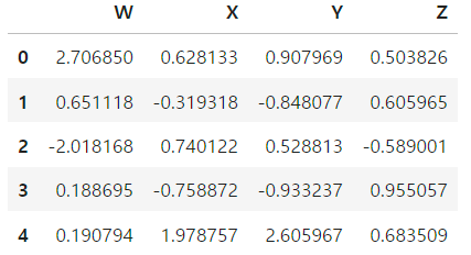
- 데이터프레임의 정보
df.info()
df.describe() # 데이터프레임의 기술 통계를 알려줌
# 데이터의 평균,표준편자,최소,최대 등등 알려줌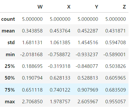
<인덱싱>
- W에 해당하는 칼럼만 보고 싶을 때
df["W"]
df.W- 여러 개의 칼럼을 보고 싶을 때 --> 대괄호 2개
df[["W","X","Y"]]🏷️새로운 column 추가/제거
- 칼럼 추가
df["NEW"] = df["X"] + df["Y"]
df- 칼럼 삭제
행 방향 : axis 0
열 방향 : axis 1
칼럼을 삭제하려면 axis = 1이라고 지정해줘야함.
df.drop("NEW", axis = 1) # 메모리 상에서만 삭제
df.drop("NEW", axis = 1, inplace = True)
# 원본 데이터에서도 삭제
🏷️결측치 처리
dropna()
결측치를 포함한 모든 행, 열(axis = 1) 삭제
df = pd.DataFrame({'A': [1, 2, np.nan],
                   'B': [5, np.nan, np.nan],
                   'C': [1, 2, 3]})
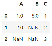
- 결측치를 포함한 행을 전부 삭제
df.dropna()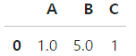
- 결측치를 포함한 열을 전부 삭제
df.dropna(axis=1)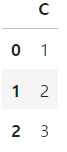
fillna()
임의의 data로 결측치 대체
- 결측치를 0으로 대체
# 결측치를 0으로 대체
df.fillna(value=0) 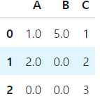
- 결측치를 A 칼럼의 평균값으로 대체
# 결측치를 A 칼럼의 평균값으로 대체
df['A'].fillna(value=df['A'].mean())
🏷️엑셀 파일 다루기
- csv파일 읽어오는 방법
sep = " ; " --> 세미 콜론으로 데이터 분리
#read csv는 디폴트로 콤마(,)로 분리된 것을 찾음
df = pd.read_csv("winequality-red.csv", sep = ";") df.head() # 맨 앞 5개만 나옴
df.tail() #맨 뒤 5개만 나옴
📌Matplotlib 기초
대표적인 시각화 도구
📢 matplotlib의 두 가지 스타일
- Functional Programming 스타일 (주로 사용됨)
import matplotlib.pyplot as plt
plt.plot(x, y)
- OOP stype
fig, ax = plt.subplots()
ax.plot(x, y)
pyplot의 object 구성
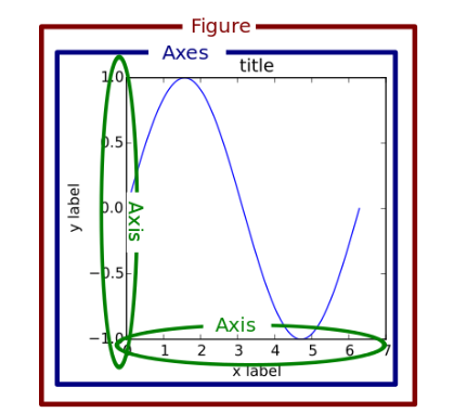
🏷️선 그래프
x = [5,8,10] # (x,y) = (5,12), (8,16),(10,6) 대응되도록 선 그래프를 그림
y = [12,16,6]

x2 = [6,9,11]
y2 = [6,15,7]

plt.plot(x,y)
plt.plot(x2,y2)
plt.title("Test Plot") # title 추가
plt.xlabel("month") # label 추가
plt.ylabel("price")
plt.show()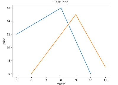
🏷️bar chart(막대 그래프)
plt.bar(x,y, label = "korea")
plt.bar(x2,y2 , label = "US")
plt.xlabel("age") # x축의 이름을 달아주는 코드
plt.ylabel("person number") # y축의 코드를 달아주는 코드
plt.legend() #법례를 나타내는 코드, label을 달아준 게 위에 나타남.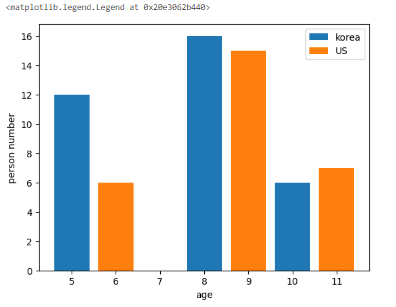
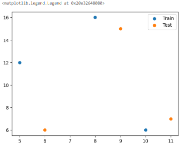
🏷️scatter plot(산점도)
plt.scatter(x,y, label = "Train")
# x,y 산점도를 그리면 x = 5일때 y = 12이렇게 데이터 분포가 나타나짐
plt.scatter(x2,y2, label = "Test")
plt.legend()
* 산점도는 많이 쓰임
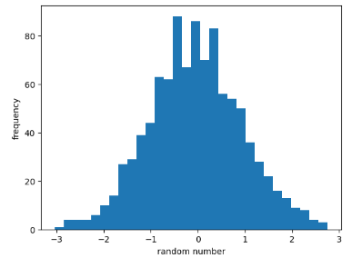
🏷️histogram(히스토그램)
np.random.seed(0)
x = np.random.randn(1000) #1000개의 난수를 만듦
plt.hist(x , bins = 30) # 종 모양의 분포로 히스토그램이 나타나지는 것을 알 수 있음.
# randn --> 정규분포로 난수 생성
# bins = 30, 히스토그램에 간격이 30개로 나타남.
plt.xlabel("random number")
plt.ylabel("frequency") #히스토그램은 항상 빈도임
plt.show()
* 종 모양, 표준 정규분포 형태로 데이터가 형성되었다는 것을 알 수 있음
🏷️Imshow
이미지를 보이게 하는 함수
from sklearn.datasets import load_digits
x = load_digits() # load_digits 데이터 중에서 우리는 이미지 데이터를 쓰려고 함
# 파이썬의 딕셔너리 형태로 이뤄져있음
img = x['images']

plt.imshow(img)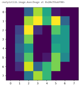
📌Feature Scaling
데이터들의 단위를 비슷한 크기, 구간 내로 맞춰주는 작업
sklearn의 preprocessing 모듈은 스케일링을 쉽게 할 수 있도록 지원
from sklearn.preprocessing import MinMaxScaler
from sklearn.preprocessing import StandardScaler
🏷️Simple Scaling
- 주로 이미지 전처리할 때 간단히 사용
- 픽셀값이 0~255 이므로 최댓값 255로 나눠주면 스케일링이 됨
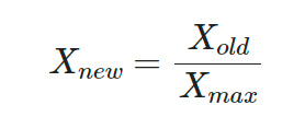
X_simple = X/X.max()
X_simple
🏷️MinMax Scaling
- 최솟값이 0, 최댓값이 1로 스케일링되어 데이터들이 0~1 구간 내에 존재
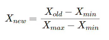
# MinMaxScaler
scaler = MinMaxScaler()
X_minmax = scaler.fit_transform(X)- fit 단계 : min,max을 미리 계산해놓음
- transform 단계 : fit 단계에서 구한 min,max을 공식에 적용
🏷️Standard Scaling
- 스케일링 후 데이터의 분포가 평균이 0인 정규 분포로 바뀜
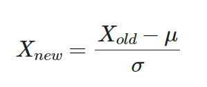
# Standard Scaler
scaler = StandardScaler()
X_standard = scaler.fit_transform(X)
개발 & 공부 기록