Flutter 3 버젼 부터 새로운 디자인 시스템인 Material3를 사용 할 수 있게 되었습니다. 이번 시간에는 Material3의 여러 기능 중 하나의 seedColor으로 전체 컬러 스킴을 만들어내는 기능을 활용해 테마를 변경할 수 있는 간단한 계산기 앱을 개발해보았습니다.
입력한 값을 계산하는 로직은 문자열로 입력된 수식을 연산할 수 있도록 도와주는 math_expressions 패키지를 사용했습니다.
구체적인 계산기 기능 구현 코드는 포스트 아래에 첨부한 github 저장소 링크를 참고하시면 됩니다.
Material3 설정하기
ThemeData의 useMaterial3를 true로 설정하면 Material3를 사용할 수 있습니다.
class MyApp extends StatelessWidget {
const MyApp({super.key});
Widget build(BuildContext context) {
return MaterialApp(
title: 'Calculator',
debugShowCheckedModeBanner: false,
theme: ThemeData(
//true 설정해줍니다
useMaterial3: true,
),
home: const CalculatorScreen(),
);
}
}UI별 색상 지정해주기
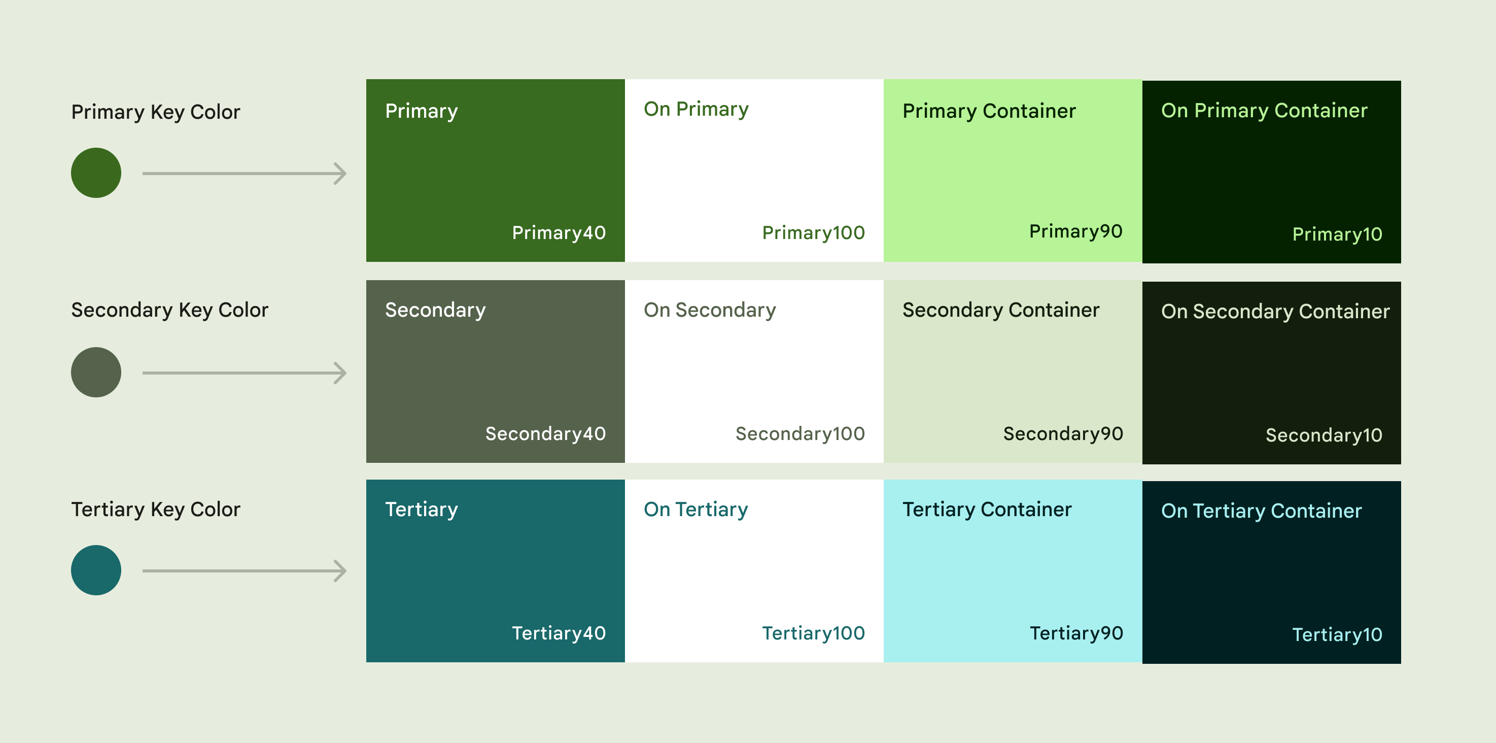
material3에서는 seed color를 지정해주면 primary, secondary 등을 포함한 Color Scheme를 생성해줍니다. 때문에 각각의 UI 색상을 Theme Color로 지정해주면 다크모드로 변경되거나 seed Color가 변경되었을때 연결된 색상을 일괄적으로 변경할 수 있습니다.
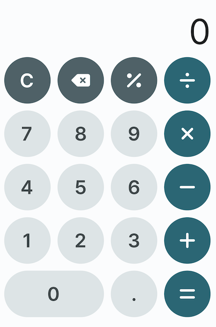
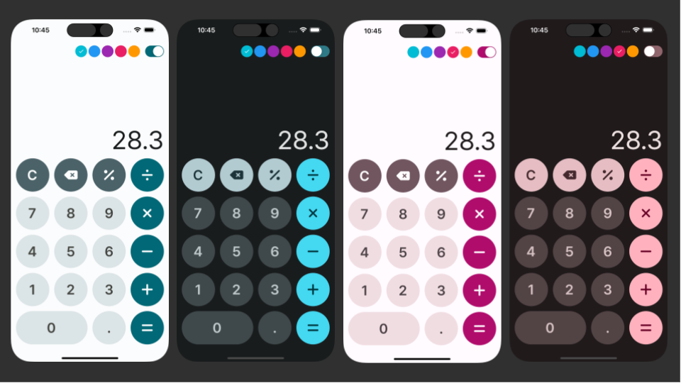
본 계산기 앱에서는 숫자키는 surfaceVariant, 우측 연산자 버튼은 primary, 기타 연산자는 secondary로 지정해주었습니다. 버튼 내부 텍스트나 아이콘 색상 역시 각각 onSurfaceVariant, onPrimary, onSecondary로 지정해줬습니다.
enum _InputButtonColorType {
primary,
secondary,
normal,
}
class InputButton extends StatelessWidget {
const InputButton({
Key? key,
required this.inputType,
required this.size,
}) : super(key: key);
final InputType inputType;
final Size size;
Widget build(BuildContext context) {
return SizedBox(
height: size.height,
width: size.width,
child: MaterialButton(
textColor: _getForegroundColor(context),
onPressed: () => _onPressButton(context),
padding: EdgeInsets.zero,
highlightColor: _getHighlightColor(context),
color: _getButtonColor(context),
highlightElevation: 0,
elevation: 0,
shape: RoundedRectangleBorder(
borderRadius: BorderRadius.circular(size.height / 2),
),
child: SizedBox(
height: double.infinity,
width: double.infinity,
child: _getSymbol(),
),
),
);
}
...
_InputButtonColorType _getColorType() {
switch (inputType) {
case InputType.number0:
case InputType.number1:
case InputType.number2:
case InputType.number3:
case InputType.number4:
case InputType.number5:
case InputType.number6:
case InputType.number7:
case InputType.number8:
case InputType.number9:
case InputType.point:
return _InputButtonColorType.normal;
case InputType.addition:
case InputType.subtraction:
case InputType.multiplication:
case InputType.division:
case InputType.equality:
return _InputButtonColorType.primary;
case InputType.clear:
case InputType.delete:
case InputType.percent:
return _InputButtonColorType.secondary;
}
}
Color _getButtonColor(BuildContext context) {
switch (_getColorType()) {
case _InputButtonColorType.primary:
return Theme.of(context).colorScheme.primary;
case _InputButtonColorType.secondary:
return Theme.of(context).colorScheme.secondary;
case _InputButtonColorType.normal:
return Theme.of(context).colorScheme.surfaceVariant;
}
}
Color _getHighlightColor(BuildContext context) {
switch (_getColorType()) {
case _InputButtonColorType.primary:
return Theme.of(context).colorScheme.primaryContainer;
case _InputButtonColorType.secondary:
return Theme.of(context).colorScheme.secondaryContainer;
case _InputButtonColorType.normal:
return Theme.of(context).colorScheme.tertiaryContainer;
}
}
Color _getForegroundColor(BuildContext context) {
switch (_getColorType()) {
case _InputButtonColorType.primary:
return Theme.of(context).colorScheme.onPrimary;
case _InputButtonColorType.secondary:
return Theme.of(context).colorScheme.onSecondary;
case _InputButtonColorType.normal:
return Theme.of(context).colorScheme.onSurfaceVariant;
}
}
}
테마 변경 기능 만들기
provider를 사용해 앱 전체 Theme를 변경하는 기능을 구현합니다.
우선 아래와 같이 theme viewmodel을 작성해줍니다.
import 'package:flutter/material.dart';

const List<Color> kThemeSeedColors = [
  Colors.cyan,
  Colors.blue,
  Colors.purple,
  Colors.pink,
  Colors.orange
];

class ThemeViewModel extends ChangeNotifier {
  Color get seedColor => kThemeSeedColors[_seedColorIndex];
  int _seedColorIndex = 0;
  set seedColorIndex(int index) {
    _seedColorIndex = index;
    notifyListeners();
  }

  Brightness get brightness => _brightness;
  Brightness _brightness = Brightness.light;

  set brightness(Brightness value) {
    _brightness = value;
    notifyListeners();
  }
}
이후 MaterialApp theme의 colorScheme에 viewmodel의 값을 넣어줍니다.
colorScheme: ColorScheme.fromSeed(
          seedColor: viewmodel.seedColor,
          brightness: viewmodel.brightness,
)seedColor에 특정 색상을 넣어주면 해당 색상을 초기값으로 해서 컬러 스킴을 만들어주며, brightness로 다크모드 여부를 변경할 수 있습니다.
작성된 main 스크립트는 아래와 같습니다.
void main() {
runApp(
MultiProvider(
providers: [
ChangeNotifierProvider(create: (_) => CalculatorViewModel()),
ChangeNotifierProvider(create: (_) => ThemeViewModel()),
],
child: const MyApp(),
),
);
}
class MyApp extends StatelessWidget {
const MyApp({super.key});
Widget build(BuildContext context) {
var viewmodel = context.watch<ThemeViewModel>();
return MaterialApp(
title: 'Calculator',
debugShowCheckedModeBanner: false,
theme: ThemeData(
fontFamily: "Pretendard",
useMaterial3: true,
colorScheme: ColorScheme.fromSeed(
seedColor: viewmodel.seedColor,
brightness: viewmodel.brightness,
),
),
home: const CalculatorScreen(),
);
}
}
실제 값은 변경하는 UI는 app bar에 버튼과 스위치로 구현하였습니다.
import 'package:flutter/cupertino.dart';
import 'package:flutter/material.dart';
import 'package:flutter_calculator/viewmodels/theme_viewmodel.dart';
import 'package:provider/provider.dart';

class ThemeAppBar {
  static AppBar getAppBar(BuildContext context) {
    var viewmodel = context.watch<ThemeViewModel>();

    return AppBar(
      actions: [
        Row(
          children: kThemeSeedColors
              .map((e) => _buildSeedColorButton(e, context))
              .toList(),
        ),
        const SizedBox(width: 10),
        CupertinoSwitch(
          value: viewmodel.brightness == Brightness.light,
          onChanged: (value) {
            viewmodel.brightness = value ? Brightness.light : Brightness.dark;
          },
          activeColor: Theme.of(context).colorScheme.primary,
          trackColor: Theme.of(context).colorScheme.primary.withOpacity(0.5),
        ),
        const SizedBox(width: 10),
      ],
    );
  }

  static Widget _buildSeedColorButton(Color color, BuildContext context) {
    var viewmodel = context.watch<ThemeViewModel>();
    return GestureDetector(
      onTap: () {
        viewmodel.seedColorIndex = kThemeSeedColors.indexOf(color);
      },
      child: Padding(
        padding: const EdgeInsets.only(left: 4.0),
        child: CircleAvatar(
          radius: 16,
          backgroundColor: color,
          child: viewmodel.seedColor == color
              ? const Icon(
                  Icons.check,
                  size: 16.0,
                  color: Colors.white,
                )
              : null,
        ),
      ),
    );
  }
}
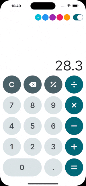
위와 같이 상단 appbar의 버튼들을 눌러 앱 전체 테마를 바꿀 수 있는 계산기가 완성되었습니다.
테마 기능을 적용해보기 위해 최소 기능만으로 구현한 만큼, 기능적으로 부족한게 많지만 관련 기능이 많은 분들께 참고가 될 수 있으면 좋겠습니다.
전체코드는 아래 Github 저장소에서 확인하실 수 있습니다.
Repo : https://github.com/sangh518/flutter_calculator
감사합니다 :)

2개의 댓글

Nice work! I love how you used Material3 + seed colors and provider to build a clean, theme-switchable calculator. This is going to be really useful for UpcomingWeb APK https://upcomingweb.com/category/apk/ thanks for sharing!
플러터 공부하면서 앱 만드는 중인데 도움 많이 되었습니다. 감사합니다~