
데이터를 그래픽 요소로 매핑하여 시각적으로 표현하는 것
-
왜 시각화 하나요?
-
시각화 결과는 누구를 대상으로 하나요?
-
어떤 데이터를 시각화 할 것 인가요?
-
어떤 흐름에서 인사이트를 전달할 것 인가요?
-
전달하고자 하는 내용에 맞는 방법인가요?
-
만족스러운 디자인을 가지고 있나요?
데이터
- 개별 데이터 셋을 보여줄 것인가
- 전체 데이터의 구성, 분포를 보여줄 것인가
정형 데이터
- CSV 파일
- row가 데이터 1개 item
- 가장 쉽게 시각화 할 수 있음
데이터 간 관계, 데이터 간 비교 등
시계열 데이터
- 시간 흐름에 따른 데이터
- 주식 등
지리/지도 데이터
- 지도 정보와 보고자 하는 정보 간의 조화 중요
- 거리, 경로, 분포 등 다양한 실사용
관계 데이터
- 그래프, 네트워크
- 노드와 링크로 구성 됨
- Json, 2d array, linked list 등으로 전달 됨
- 가독성이 좋지 않기에, mapping 방법이 중요
- 휴리스틱 방법론을 자주 사용
계층적 데이터
- 회사 조직도, 가계도 등 계층이 있는 데이터
- 네트워크와 비슷하지만 계층이 존재하기에 다름
- Tree, Treemap 등
데이터 내부 분류
- 수치형과 범주형
- 수치형에는 연속형과 이산형
- 범주형에는 명목형과 순서형
시각화
- mark로 구성
점, 선, 면 - Channel
각 마크를 변경할 수 있는 요소가 바로 채널
전주의적 속성
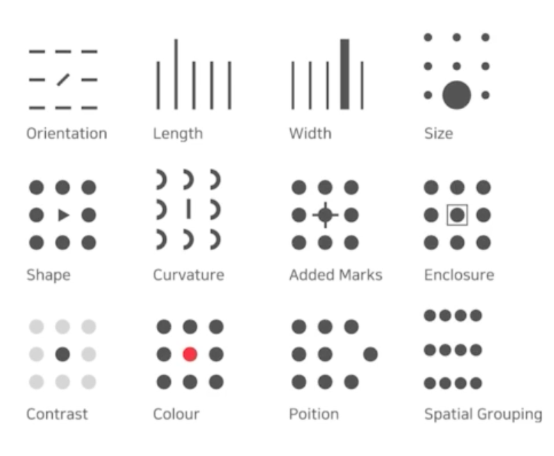
- 주의를 주지 않아도 인지하게 되는 요소
- 동시에 사용하게 된다면 데이터가 실제 데이터와 어떻게 다른지 파악하기 힘듬
- 적재 적소에 사용하는 것이 중요
- 적절하게 사용할 때 시각적 분리 (Visual pop-out)
Python and Matplotlib
Why Matplotlib?
- numpy, scipy 베이스여서 호환이 좋음
- Scikit-Learn, PyTorch, Tensorflow 등
- 다양한 시각화 방법론 제공
- seaborn, plotly 등 시각화 라이브러리도 존재
- matlab에서 따온 느낌
import matplotlib.pyplot as plt 기본 Plot
- figure 라는 틀에서 ax라는 서브플롯을 추가해서 만듬
fig = plt.figure()
plt.show()- figure는 큰 틀이라 서브플롯을 최소 1개 이상 추가해야 함
fig = plt.figure()
ax = fig.add_subplot()
plt.show()- 기본적인 plot 이 나옴
- 내부에 시각화 방법론을 적용 하는 것
fig = plt.figure(figzise=(12,7))- 인치로 사이즈 지정
ax = fig.add_subplot(121)
# ax = fig.add_subplot(1,2,1)- 1행 2열로 나눈 fig에 1 위치에 plot 추가
- 제로 인덱스 아닌 것 기억하기
plt로 그래프 그리기
fig = plt.figure()
ax = fig.add_subplot()
x = [1,2,3]
# x = np.array([1,2,3])
plt.plot(x)
plt.show()- custom으로 할 때는 객체 지향 방법론을 사용할 것
fig = plt.figure()
x1=[1,2,3]
x2=[3,2,1]

ax1 = fig.add_subplot(211)
ax2 = fig.add_subplot(212)

ax1.plot(x1)
ax2.plot(x2)
plt.show()
색상 지정
ax.plot([1,1,1],color='r') # 한 글자로 색상 정하기
ax.plot([2,2,2],color='forestgreen') # color name
ax.plot[3,3,3],color='#000000') # hex code
텍스트 사용
legend
ax.plot([1,1,1],label='1')
ax.plot([2,2,2],label='2')
ax.plot[3,3,3],label='3')
ax.legend()- 범례 생성
title
ax.set_title('basic')- sub plot ax에 제목 추가
fig.suptitle('basic') # super -
fig 전체 플롯 title에 제목 추가
-
ax에서 특정 데이터를 변경하는 경우 .set_{} 형태의 메소드가 많음
-
가져올때는 ax.get_{} 으로 가져오면 됨
ticks
ax.set_xticks([0,1,2])- x 축을 0,1,2만 보이게
ax.set_xticks([0,1,2])
ax.set_xticklabels(['zero','one','two']) - x 축 레이블 이름 변경
일반적인 텍스트 추가
ax.text(x=1 ,y=2 ,s = 'This is text')- 특정 좌표에 작성
ax.annotate(text='This is Text',xy=(1,2))- 텍스트와 화살표 등 여러가지 더 넣을 수 있음