1)학습한 내용
1.html,css기초강의
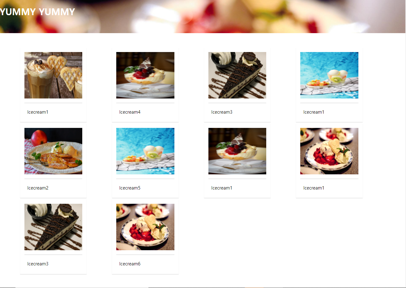
2.grid-columns
*html
<!DOCTYPE html>
<html lang="en">
<head>
    <meta charset="UTF-8">
    <meta http-equiv="X-UA-Compatible" content="IE=edge">
    <meta name="viewport" content="width=device-width, initial-scale=1.0">
    <title>Document</title>
    <link rel="stylesheet" href="./0524.css">
</head>
<body>
    <h1>YUMMY YUMMY</h1>
    <div id="wrapper">
    <div id="columns">
        <div class="card">
            <img src="./images/img1.jpg">
            <p>Icecream1</p>
        </div>
        <div class="card">
            <img src="./images/img2.jpg">
            <p>Icecream2</p>
        </div>
        <div class="card">
            <img src="./images/img3.jpg">
            <p>Icecream3</p>
        </div>
        <div class="card">
            <img src="./images/img4.jpg">
            <p>Icecream4</p>
        </div>
        <div class="card">
            <img src="./images/img5.jpg">
            <p>Icecream5</p>
        </div>
        <div class="card">
            <img src="./images/img6.jpg">
            <p>Icecream6</p>
        </div>
        <div class="card">
            <img src="./images/img3.jpg">
            <p>Icecream3</p>
        </div>
        <div class="card">
            <img src="./images/img4.jpg">
            <p>Icecream1</p>
        </div>
        <div class="card">
            <img src="./images/img5.jpg">
            <p>Icecream1</p>
        </div>
        <div class="card">
            <img src="./images/img6.jpg">
            <p>Icecream1</p>
        </div>
    </div>
</div>
</body>
</html>력하세요
*css
@charset "utf-8";
*{
margin: 0;
padding: 0;
}
h1{
width: 100%;
height: 150px;
line-height: 150px;
padding: left 50px;
background: url("./images/img6.jpg") no-repeat left top;
background-size: cover;
color: white;
}
#wrapper{
width: 90%;
max-width: 1400px;
min-width: 760px;
margin: 50px auto;
}
#columns{
column-count: 2;
column-gap: 10px;
}
.card{
display: inline-block;
width: 200px;
background-color: white;
box-shadow: 0 1px 1px #ccc;
padding: 15px;
padding-bottom: 15px;
margin-bottom: 5px;
}
.card img{
width: 100%;
height: 160px;
border-bottom: 1px solid #ccc;
padding-bottom: 15px;
margin-bottom: 5px;
}
.card p{
padding: 10px;
}
@media (min-width:900px){
#columns{
column-count: 3;
}
}
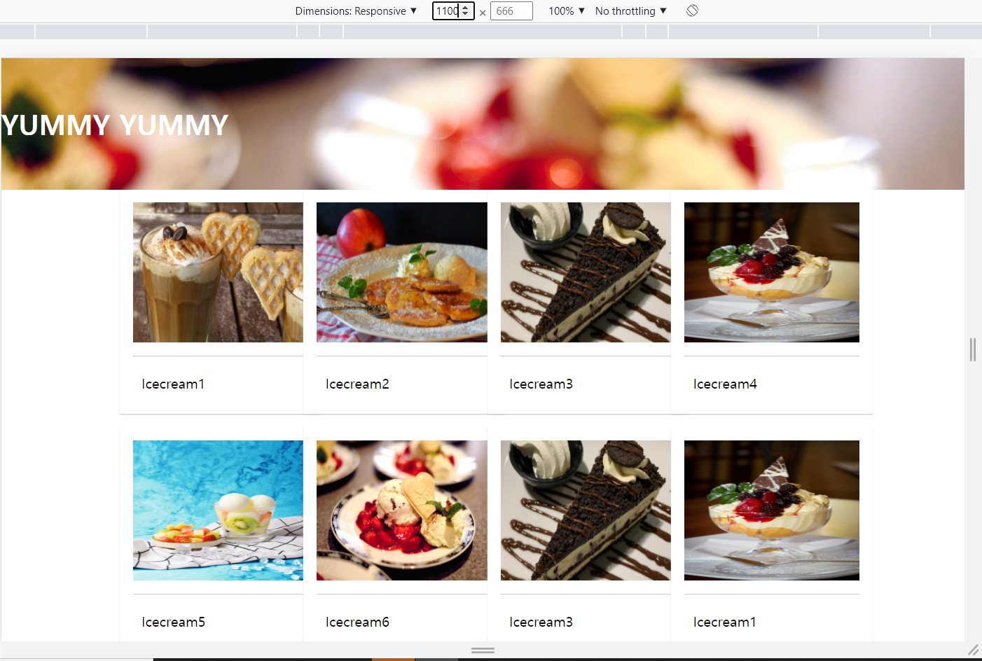
@media (min-width:1100px){
#columns{
column-count: 4;
}
}결과:
3.grid css표준
*html
<!DOCTYPE html>
<html lang="en">
<head>
    <meta charset="UTF-8">
    <meta http-equiv="X-UA-Compatible" content="IE=edge">
    <meta name="viewport" content="width=device-width, initial-scale=1.0">
    <title>Document</title>
    <link rel="stylesheet" href="./0524.css">
</head>
<body>
    <h1>YUMMY YUMMY</h1>
    <div id="wrapper">
        <div class="card">
            <img src="./images/img1.jpg">
            <p>Icecream1</p>
        </div>
        <div class="card">
            <img src="./images/img2.jpg">
            <p>Icecream2</p>
        </div>
        <div class="card">
            <img src="./images/img3.jpg">
            <p>Icecream3</p>
        </div>
        <div class="card">
            <img src="./images/img4.jpg">
            <p>Icecream4</p>
        </div>
        <div class="card">
            <img src="./images/img5.jpg">
            <p>Icecream5</p>
        </div>
        <div class="card">
            <img src="./images/img6.jpg">
            <p>Icecream6</p>
        </div>
        <div class="card">
            <img src="./images/img3.jpg">
            <p>Icecream3</p>
        </div>
        <div class="card">
            <img src="./images/img4.jpg">
            <p>Icecream1</p>
        </div>
        <div class="card">
            <img src="./images/img5.jpg">
            <p>Icecream1</p>
        </div>
</div>
</body>
</html>
css
@charset "utf-8";
{
margin: 0;
padding: 0;
}
h1{
width: 100%;
height: 150px;
line-height: 150px;
padding: left 50px;
background: url("./images/img6.jpg") no-repeat left top;
background-size: cover;
color: white;
}
#wrapper{
display: grid;
grid-template-columns: repeat(2,200px);
grid-template-rows: minmax(220px auto);
grid-gap: 10px 10px;
justify-content: center;
}
.card{
display: inline-block;
width: 200px;
background-color: white;
box-shadow: 0 1px 1px #ccc;
padding: 15px;
padding-bottom: 15px;
margin-bottom: 5px;
}
.card img{
width: 100%;
height: 160px;
border-bottom: 1px solid #ccc;
padding-bottom: 15px;
margin-bottom: 5px;
}
.card p{
padding: 10px;
}
@media (min-width:900px){
#wrapper{
justify-content: center;
grid-template-columns: repeat(3,200px);
}
}
@media (min-width:1100px){
#wrapper{
justify-content: center;
grid-template-columns: repeat(4,200px);
}
}
*결과: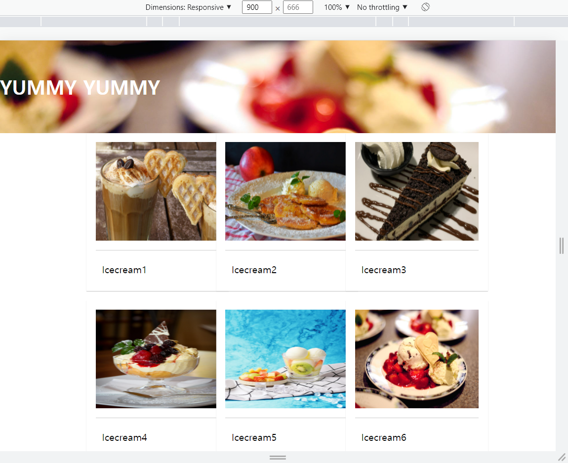
2)학습내용중 어려웠던점
X
3)해결방안
X
4)학습소감
보는 너비에 따라 사진의 개수,글자크기등 조정할수있는것에대해 배움을 얻었다
5)과제
*html
<!DOCTYPE html>
<html lang="en">
<head>
<meta charset="UTF-8">
<meta http-equiv="X-UA-Compatible" content="IE=edge">
<meta name="viewport" content="width=device-width, initial-scale=1.0">
<title>Document</title>
<link rel="stylesheet" href="./0524.css">
<link rel="stylesheet" href="./css/style.css">
<link href="https://fonts.googleapis.com/css2?family=Dancing+Script&display=swap" rel="stylesheet">
<script src="https://kit.fontawesome.com/b8a7fea4d4.js" crossorigin="anonymous"></script>
</head>
<body>
<div class="container">
<section class="top">
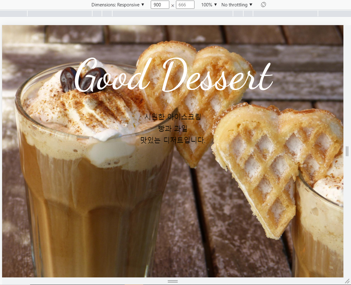
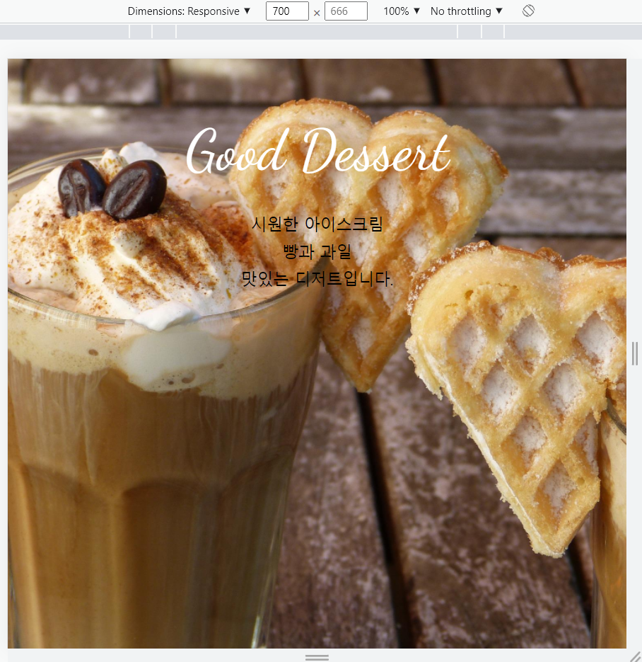
<h1 class="title">Good Dessert</h1>
<p>시원한 아이스크림<br>
빵과 과일<br>
맛있는 디저트입니다.</p>
</section>
<section class="menu">
<h2 class="title">Menu</h2>
</section>
<section class="contact">
<h2 class="title">Contact</h2>
<p>서울시 서초구 서운로 00-00</p>
<p>영업시간 : 8:00~20:00</p>
<a class="btn" href="#">문의사항</a>
<ul class="contact-sns">
<li><a href="#"><i class="fab fa-instagram"></i></a></li>
<li><a href="#"><i class="fab fa-twitter"></i></a></li>
<li><a href="#"><i class="fab fa-facebook"></i></a></li>
</ul>
</section>
</div>
</body>
</html>*css
@charset "utf-8";
*{
box-sizing: border-box;
padding: 0;
}
html{
font-size: 100%;
line-height: 1.15;
}
body{
font-family: sans-serif;
margin: 0;
}
a{
background-color: transparent;
text-decoration: none;
}
img{
border-style: none;
vertical-align: bottom;
}
h1,h2{
font-weight: lighter;
margin: 0;
color: white;
}
.title{
font-family: 'Dancing script',cursive;
font-size: 112px;
margin-bottom: 32px;
padding-top: 10vh;
}
p{
line-height: 1.7;
font-size: 18px;
}
.container{
height: 100vh;
overflow: auto;
scroll-snap-type: y mandatory;
}
.top{
background-image: url("./images/img1.jpg");
}
section{
height: 100vh;
background-size: cover;
background-repeat: no-repeat;
background-position: center;
text-align: center;
scroll-snap-align:start;
}
.menu{
background-image: url("./images/img2.jpg");
}
.contact{
background-image: url("./images/img3.jpg");
}
.btn{
background-color: #555;
font-size: 24px;
color: #fff;
padding: 16px 56px;
border-radius:6px ;
display: inline-block;
margin: 32px 0 36px;
}
.btn:hover{
background-color: #777;
}
.contact-sns{
display: flex;
justify-content:center;
list-style: none;
}
.contact-sns a{
display: inline-block;
background-color: white;
color: #555;
width: 60px;
height: 60px;
margin: 0 8px;
border-radius: 50%;
font-size: 40px;
padding: 7px;
}
.contact-sns a:hover{
background-color: rgba(255, 255, 255,5);
}
@media screen and (max-width:700px){
.title{
font-size: 64px;
}
}
*결과: