
👨💻TIL
perspective(원근법)
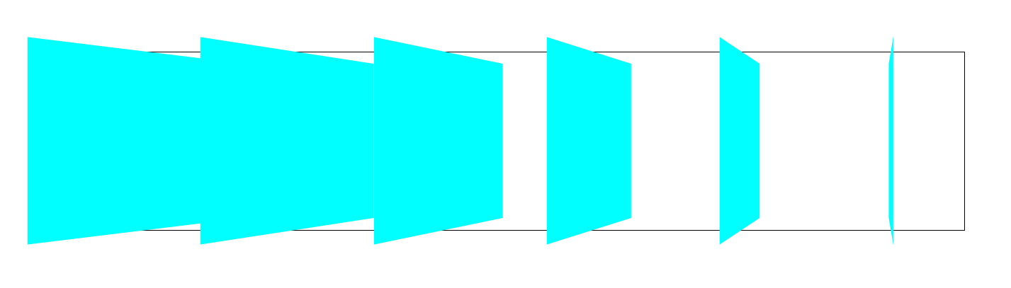
perspective는 우리가 대상을 보는 거리이다. 따라서 값이 작을수록 더 가까이 보이게 되어서, 효과가 더 극적으로 나타난다.
<!DOCTYPE html>
<html lang="ko">
<head>
    <meta charset="UTF-8">
    <meta http-equiv="X-UA-Compatible" content="IE=edge">
    <meta name="viewport" content="width=device-width, initial-scale=1.0">
    <title>perspective</title>
    <style>
        .원본 {
            display: flex;
            justify-content: space-between;
            width: 1000px;
            height: 200px;
            border: 1px solid black;
            margin: 100px auto;
            perspective: 400px;
        }

        .회전패널 {
            width: 200px;
            height: 200px;
            background: aqua;
            transform: rotateY(45deg);
        }
    </style>
</head>
<body>
    <div class="원본">
        <div class="회전패널"></div>
        <div class="회전패널"></div>
        <div class="회전패널"></div>
        <div class="회전패널"></div>
        <div class="회전패널"></div>
        <div class="회전패널"></div>
    </div>
</body>
</html>
위 코드에서 div에 모두 같은 각도의 움직임을 주었는데, 아래 사진에서 결과를 보면 다 다른 형태로 나온다. 이 이유는 Y축에서 회전시켰을 때 바라보는 화면이 정면이 아니라 우측 중앙 기준이기 때문이다.
@media 미디어쿼리
미디어쿼리는 반응형을 위한 기본이자 핵심이다. 화면크기 마다 각각 다르게 CSS를 적용하는 것이다.
해상도 320px 이상 또는 768px 미만 -> 스마트폰
해상도 768px 이상 또는 1024px 미만 -> 태블릿
해상도 1024px 초과 -> PC
미디어쿼리 적용
1) CSS 파일 내에 직접 작성
@media (min-width:768px) {}2) link태그에 media 속성을 설정해 사용
<link rel="stylesheet" media="all and (min-width:1000px)" href="desktop.css" >
<link rel="stylesheet" media="all and (min-width:768px) and (max-width:1199px)" href="laptop.css" >
대부분 첫번째 방법을 사용한다. 요청이 많아질수록 성능이 저하되고, 중복되는 코드가 많아짐에 따라 UI가 망가질수도 있기때문이다.
max width & min width
.container {
  font-size: 32px;
}

@media (max-width: 600px) {
  .container {
    font-size: 12px;
  }
}
이 코드는 max-width(최대 width)가 600px일 때, 즉 600px 이하일 때 적용되는 코드이다.
.container {
  font-size: 32px;
}

@media (min-width: 600px) {
  .container {
    font-size: 12px;
  }
}
이 코드는 min-width(최소 width)가 600px일 때, 즉 600px 이상인 경우 적용되는 코드이다.
🎈animation 활용 과제
🏬 건물짓기


🎴 카드 뒤집기
https://github.com/pyeong777/frontend_html/tree/main/11%EC%9B%94%209%EC%9D%BC/flip-card
🙆 버튼 애니메이션
https://github.com/pyeong777/frontend_html/blob/main/11%EC%9B%94%2010%EC%9D%BC/buttondp.html
https://pyeongdevlog.vercel.app