.gif)
이번에 진행한 실습은 Sticky Nav로, scroll되는 위치를 파악해서 Nav의 속성을 fixed로 바꾸어주는 간단한 실습을 진행했다. 😊
시작해보자!
Learning Point
- element.getBoundingClientRect에 대해 학습한다.
- scroll event에 대해 학습한다.
HTML Part
<!DOCTYPE html>
<html lang="en">
  <head>
    <meta charset="UTF-8" />
    <title>Sticky Nav</title>
    <link rel="stylesheet" href="style-START.css" />
  </head>
  <body>
    <header>
      <h1>A story about getting lost.</h1>
    </header>

    <nav id="main">
      <ul>
        <li class="logo"><a href="#">LOST.</a></li>
        <li><a href="#">Home</a></li>
        <li><a href="#">About</a></li>
        <li><a href="#">Images</a></li>
        <li><a href="#">Locations</a></li>
        <li><a href="#">Maps</a></li>
      </ul>
    </nav>

    <div class="site-wrap">
      ...
    </div>
  </body>
</html>
CSS Part
html {
  box-sizing: border-box;
  background: #eeeeee;
  font-family: "helvetica neue";
  font-size: 20px;
  font-weight: 200;
}

body {
  margin: 0;
}

*,
*:before,
*:after {
  box-sizing: inherit;
}

.site-wrap {
  max-width: 700px;
  margin: 70px auto;
  background: white;
  padding: 40px;
  text-align: justify;
  box-shadow: 0 0 10px 5px rgba(0, 0, 0, 0.05);
  transform: scale(0.98);
  transition: transform 0.5s;
}

header {
  text-align: center;
  height: 50vh;
  background: url(http://wes.io/iEgP/wow-so-deep.jpg) bottom center no-repeat;
  background-size: cover;
  display: flex;
  align-items: center;
  justify-content: center;
}

h1 {
  color: white;
  font-size: 7vw;
  text-shadow: 3px 4px 0 rgba(0, 0, 0, 0.2);
}

nav {
  background: black;
  top: 0;
  width: 100%;
  transition: all 0.5s;
  position: relative;
  z-index: 1;
}

nav ul {
  margin: 0;
  padding: 0;
  list-style: none;
  display: flex;
}

nav li {
  flex: 1;
  text-align: center;
  display: flex;
  justify-content: center;
  align-items: center;
}

li.logo {
  max-width: 0;
  overflow: hidden;
  background: white;
  transition: all 0.5s;
  font-weight: 600;
  font-size: 30px;
}

li.logo a {
  color: black;
}

nav a {
  text-decoration: none;
  padding: 20px;
  display: inline-block;
  color: white;
  transition: all 0.2s;
  text-transform: uppercase;
}

body.fixed-nav nav {
  position: fixed;
}

body.fixed-nav .logo {
  max-width: 500px;
}

body.fixed-nav .site-wrap {
  transform: scale(1);
}
Javascript Part
const navbar = document.querySelector("#main");
const logo = document.querySelector(".logo");
const navbar_rect = navbar.getBoundingClientRect();

window.addEventListener("scroll", () => {
  if (window.scrollY >= navbar_rect.top) {
    document.body.classList.add("fixed-nav");
    document.body.style.paddingTop = navbar_rect.height + "px";
  } else {
    document.body.classList.remove("fixed-nav");
    document.body.style.paddingTop = 0;
  }
});
정리
처음에는 javascript에서 class를 줘서 css로 요소를 컨트롤 하는 방식이 아닌, javascript에서 style을 변경하는 방식을 이용했다.
먼저 코딩을 끝내고 나중에 예제 코드를 보니까 정답코드에서는 classList를 이용해서 class를 toggle해주고, css로 따로 설정해 주고 있었다.
예제 코드의 방식이 더 마음에 들어서 코드를 수정했다!
paddingTop을 element의 height만큼 추가해준 이유는 간단한데, position: fixed가 되면 더이상 공간을 차지하지 않기 때문에 전체 layout에 영향을 미치기 때문이다.
따라서 navbar의 height만큼 body에 padding을 주어 layout이 유지되도록 하였다.
(이 내용이 헷갈리시는 분들은 position관련 포스팅을 참조하세요😁)
element.getBoundingClientRect
getBoundingClientRect 함수는 해당 element의 위치 정보를 반환해주는 함수이다. viewport 기준으로 현재 element의 좌측 상단의 좌표인 x/left, y/top과 우측 하단의 좌표인 right,bottom을 반환한다.
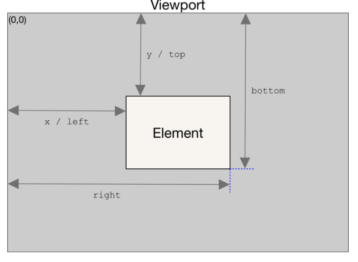
right와 bottom은 css에서의 right bottom과 반대되는 기준이므로 주의가 필요하다!
이번에도 역시 getBoundingClientRect을 사용했는데, 특정 요소를 기준으로 동적으로 어떤 action을 취하고자 할때는 필수적으로 사용되는 것 같다.
처음 봤을때는 익숙치 않았는데 실습을 통해 2~3번 사용하다보니 굉장히 익숙해진 느낌이라 뿌듯하다.😁😁