📘 오늘 배운 것
1. z-index
⠀⠀⠀⠀⠀⠀⠀⠀⠀⠀⠀⠀⠀⠀⠀⠀⠀⠀⠀⠀⠀⠀⠀⠀⠀⠀⠀⠀⠀⠀⠀⠀⠀👇👇👇

-
z축의 높이에 영향을 미치는 속성( 숫자값만 입력, 단위는 생략 ), 더 높은 z-index 값을 가진 것이 위로 올라옴 !
-> z축 높이값을 지정한다는 것은 3차원에서만 사용이 가능하며, 3차원 속성값을 가지고 있는 position에서만 사용 가능 -
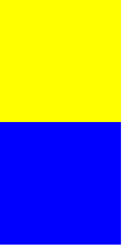
형제 관계일 때는 absolute (3차원) 속성 사용시, 레이어 처럼 뒤에 겹쳐짐 ( blue 박스가 없어진 것이 아니라, yellow 박스 뒤에, 즉 레이어에 겹쳐져 있는 것. )
	<div class="z-one"></div>
	<div class="z-two"></div>
.z-one {
position: absolute;
width: 200px;
height: 200px;
background-color: yellow;
}
.z-two {
position: absolute;
width: 200px;
height: 200px;
background-color: blue;
}2. 형제 관계에 따른 position 속성값에 대해 어떻게 나타나는지 ?
첫번째 형제에게 순수 3차원 포지션값을 주었을 경우, 레이어가 겹침 (첫번째 형제의 포지션값에 따라 레이어 겹침 여부 결정됨)
Tip. 큰 공간(구역)을 만들땐 첫번째 형제에게 2차원 값을 준다.
-> 겹침 현상이 일어나는 것을 방지하기 위해
3. Float 태그
내가 선택한 공간(영역) x축으로 나란히 정렬
박스를 띄운 다음 원하는 곳으로 이동
1) 왼쪽 끝 오른쪽 끝으로 배치
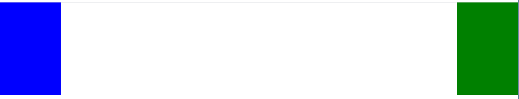
	<div class="left-1"></div>
	<div class="right-1"></div>
.left-1 {
float: left;
width: 100px;
height: 150px;
background-color: blue;
}
.right-1 {
float: right;
width: 100px;
height: 150px;
background-color: green;
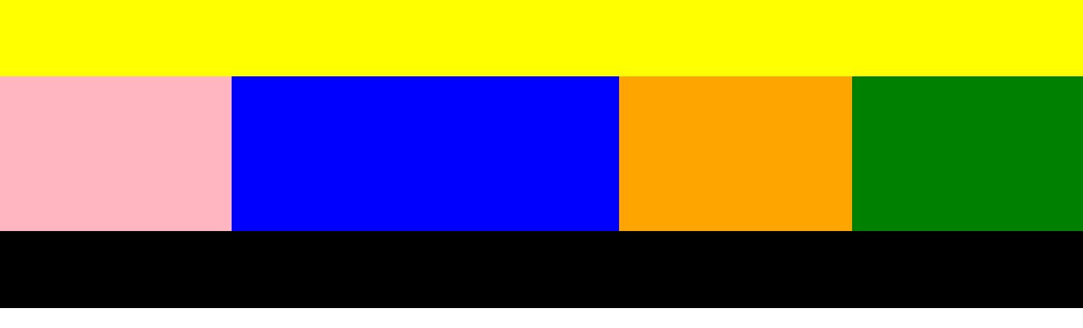
}2) float 태그로 전통적인 웹페이지 레이아웃 구조 만들기
⭐ ) clear: both; 태그 함께 사용
( float를 마지막으로 사용한 태그 다음 태그안에 clear: both; 넣어주기 )
켜주는 태그는 float, 꺼주는 태그 clear
✔ ) float태그는 고정값을 주었을 경우 레이어 틀어짐 현상있음
1) 가변값(%)으로 사용하기 : 굳이 부모값이 고정값일 필요 X (이런 경우는 사실 드물다,,)
2) section 태그로 고정 section값 주기 !
부모의 값을 고정적으로 두어야 웹페이지 크기 늘이고 줄일때, 레이어 틀어짐 현상이 없어짐
📍 ) float 사용시 주의 사항
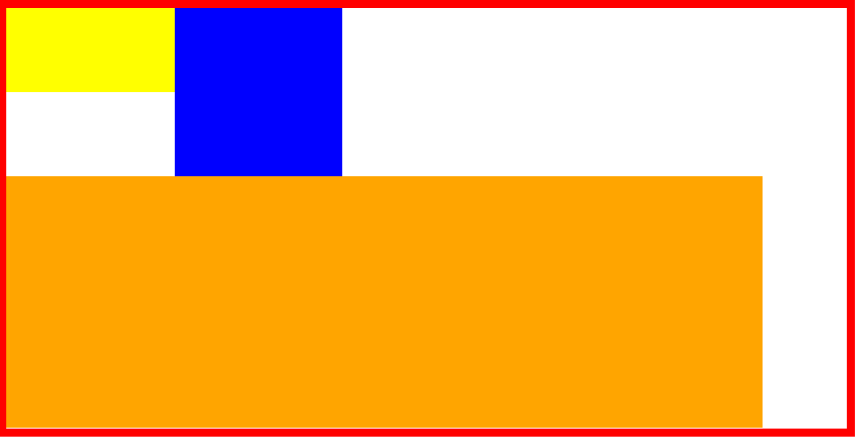
1) section의 width값은 float의 width값 합한것 보다 크거나 같아야함
2) 부모값(section)의 높이값이 없을 경우 section은 사라지게된다 -> float는 3차원이기때문에 자식이 부모의 높이값에 영향을 미치지 않음!
3) position사용시 static OR relative 사용해야함! (absolute,fixed와 같은 순수 3차원은 함께ㅣ 사용 불가능) : float 3차원과 absolute,fixed 3차원이 만났기때문에 기능이 상쇄되었다고 보면 됨!
늘였을 때
줄였을 때
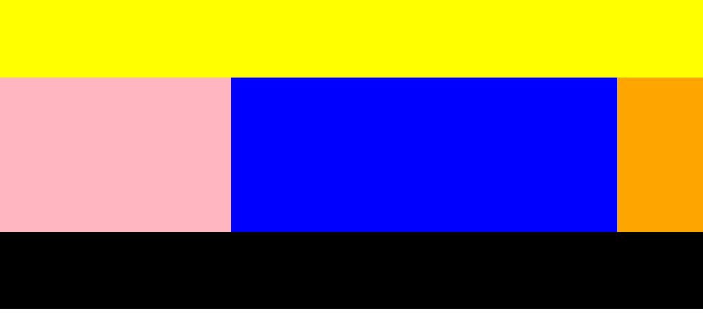
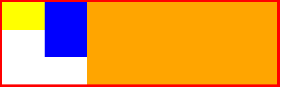
	<header></header>

	<section>

	<div class="left"></div>
	<div class="center"></div>
	<div class="right"></div>

	</section>

	<footer></footer>
header {
width: 100%;
height: 100px;
background-color: yellow;
}
.left {
float: left;
width: 300px;
height: 200px;
background-color: lightpink;
}
.center {
float: left;
width: 500px;
height: 200px;
background-color: blue;
}
.right {
float: right;
width: 300px;
height: 200px;
background-color: green;
}
footer {
clear: both;
width: 100%;
height: 100px;
background-color: black;
}
section {
width: 1400px;
height: 200px;
background-color: orange;
}실무 Tip)
1) clear: both;태그 적용하기 위해 관습적으로 사용하는 태그 사용하기 (HTML코드 빠르게 파악하기 위해 !)
<div class="clearfix"></div>.left-2 {
float: left;
width: 100px;
height: 150px;
background-color: yellow;
}
.right-2 {
float: right;
width: 100px;
height: 150px;
background-color: blue;
}
footer {
width: 100%;
height: 100px;
background-color: black;
}
.clearfix {
clear: both;
}2) overflow와 float의 만남 !
⭐ 부모의 높이값이 없더라도 자식의 높이값이 부모의 높이값에 영향을 주는 장치 ⭐
section {
	overflow: hidden;
	width: 800px;
	background-color: orange;
}
👉 overflow 속성
- 박스를 벋어나는 오브젝트를 감추기
overflow: hidden;
.over-box {
	overflow: hidden;
	width: 200px;
	height: 200px;
	background-color: yellow;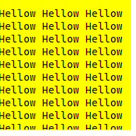
}- 감춰진 오브젝트 스크롤 이용해 보기
overflow: scroll;
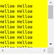
.over-box {
	/*overflow: hidden;*/
	overflow: scroll;
	width: 200px;
	height: 200px;
	background-color: yellow;
}- x축으로 정렬해서 보기
overflow-x: scroll;
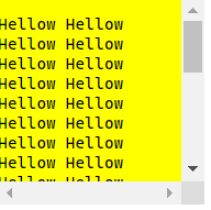
.over-box {
	/*overflow: hidden;*/
	/*overflow: scroll;*/
	overflow-x: scroll;

	width: 200px;
	height: 200px;
	background-color: yellow;
}
4. Flex 태그
효과적으로 효율적으로 레이아웃 작업(배치) 가능
float의 발전된 개념
-
부모 태그에 display: flex; 입력 : 자식들은 자동으로 왼쪽에서부터 x축으로 정렬됨 !
함께 사용하는 태그)
flex-direction: row; 입력 -> 기본값 X축 정렬
flex-direction: column; -> Y축 정렬
flex-direction: row-reverse; -> X축 역순 정렬
flex-direction: column-reverse; -> Y축 역순 정렬 -
flex-wrap: nowrap; -> 부모영역보다 자식들의 width합이 클 경우 부모영역에 맞춰 자동으로 사이즈를 줄여 부모영역에 맞춤
.container {
	display: flex;
	flex-wrap: nowrap;

	width: 1000px;
	border: solid 10px red;
}- flex-wrap: wrap; -> 부모영역보다 자식들의 width합이 커질 경우 자동 줄 바꿈 현상
( = direction과 wrap 한번에 입력하고 싶다면 -> flex-flow: row wrap; )
.container {
	display: flex;
	flex-wrap: wrap;

	width: 1000px;
	border: solid 10px red;
}-
flex 정렬
1) X축 정렬
justify-content: flex-start; -> 왼쪽 정렬
justify-content: flex-end; -> 오른쪽 정렬
justify-content: flex-center; -> 가운데 정렬
justify-content: space-between; -> 균일 배치
justify-content: space-around; -> 박스 바깥, 안쪽 동일한 공백, 물론 안쪽과 바깥쪽 공백 영역 크기는 다름 !
2) Y축 정렬
align-items: flex-start; -> 위쪽 정렬
align-items: flex-end; -> 아래쪽 정렬
align-items: center; -> 중간 정렬
align-items: baseline; -> 아이템 밑쪽 라인에 맞춰 정렬
참고 사이트 ) https://flexbox.help/ -
중앙 정렬(실무에서 가장 많이 사용 )
1) margin값으로 정렬
<div class="center-1"></div>.center-1 {
width: 300px;
height: 300px;
background-color: yellow;
margin: 0(상하) auto(좌우);
}2) position값으로 정렬
2번 수정의 단점: width값이 바뀌면 margin-left값도 변경해주어야함
.center-2 {
	position: relative;

	width: 300px;
	height: 300px;
	background-color: pink;

	left: 50%;
	margin-left: -150px(width값의 절반 크기);
}
참고 사이트 ) https://css-tricks.com/centering-css-complete-guide/
📌 오늘의 Tip
1) 완벽한 레이아웃 작업을 하고싶다면, 부모-자식 관계 + 형제-형제 관계에 따른 포지션 상관관계를 공부하라 !
2) 공간을 만드는 태그는 기본적으로 블럭요소를 가짐 ( 줄바꿈 현상으로 y축으로 정렬됨 )
❔ 어려웠던 것 OR 힘들었던 것
<!--
<header></header>

<section>

<div class="left"></div>
<div class="center"></div>
<div class="right"></div>

</section>

<footer></footer>
-->
이 부분이 실행되지 않았다.
💡 해결 방법!
footer 태그가 section안에 있었다.
footer 태그를 확실하게 알고 있다 생각했는데, 발생한 실수였다.
이번을 계기로 정의를 확실히 할 수 있었다.
🌱 공부를 마무리하며,
같은 것을 표현할 수 있는 태그가 참 많다~!
적시적소에 맞는 태그를 잘 활용하려면 반복적인 실습만이 답인것 같다..😁