📘 오늘 배운 것
1. 애니메이션
자바스크립트를 사용하지 않아도 일부 간단한 애니메이션 구현이 가능해졌다 !
📍 Transform
확대, 축소, 위치변경 등을 할 때 사용
1) rotate : 양수(오른쪽 회전) 음수(왼쪽 회전)
2) scale : (x축,y축) 가로,세로 크기 비율 조정
.transform {
width: 300px;
height: 300px;
background-color: yellow;
/* x축을 2배 키움, y축으로 3배 키움 */
transform: scale(2, 3);
/* 축소는 소숫점 사용 */
transform: scale(0.5, 0.5);
margin-left: 300px;
margin-top: 500px;
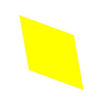
}3) skew : 3차원 회전
.transform {
	width: 300px;
	height: 300px;
	background-color: yellow;

	/* x축, y축 회전 */
	transform: skew(10deg, 20deg);
    	/* x축, y축 회전 반대 */
	transform: skew(-10deg, 20deg);

	margin-left: 300px;
	margin-top: 500px;
}
4) ⭐ translate : 선택영역 오브젝트 위치 이동
.transform {
	width: 300px;
	height: 300px;
	background-color: yellow;

	transform: translate(100px, 300px);

	margin-left: 300px;
	margin-top: 500px;
}
📍 Transition
애니메이션 움직이는 변화 과정 보여주기
한줄로 쓰되, duration, delay 순서만 잘 기억하기 ! hover 함께 사용하기 !
.transition {
	width: 300px;
	height: 300px;
	background-color: mediumblue;

	/*
	transition-property: width;
	transition-duration: 2s;
	transition-timing-function: linear;
	transition-delay: 1s;
	*/

	/*transition: width 2s linear 1s;*/
    transition: width 2s linear, height 2s linear;

}

.transition:hover {
	width: 600px;
	height: 800px;
}
📍 애니메이션
alternate 사용시 주의점
count에 6을 입력할 경우 from~to 총 3번 반복하게 된다. 무한으로 움직이고 싶을 경우 infinite 사용하기 !
.animation {
	width: 300px;
	height: 300px;
	background-color: midnightblue;

	animation-name: cloud;
	animation-duration: 3s;
	animation-timing-function: linear;
	animation-delay: 1s;

	animation-iteration-count: infinite;
	animation-direction: alternate;
}

@keyframes cloud {
	from {
		width: 300px;
		height: 300px;
		background-color: blue;
	}
	to {
		width: 600px;
		height: 600px;
		background-color: red;
	}
}
keyframe은 항상 같이 써야하며, from-to 말고도 %로도 표현이 가능하다.
@keyframes cloud {
	0% {
		width: 300px;
		height: 300px;
		background-color: blue;
	}

	50% {
		background-color: white;
	}

	100% {
		width: 600px;
		height: 600px;
		background-color: red;
	}
}
프리픽스 사용시 주의 !
keyframes에도 적용을 해야한다.
.spin-lion {
width: 150px;
height: 150px;
background-color: blue;
-webkit-animation: spinlion 1.5s linear infinite alternate;
}
@-webkit-keyframes spinlion {
from {
-webkit-transform: rotate(-10deg);
}
to {
-webkit-transform: rotate(10deg);
}
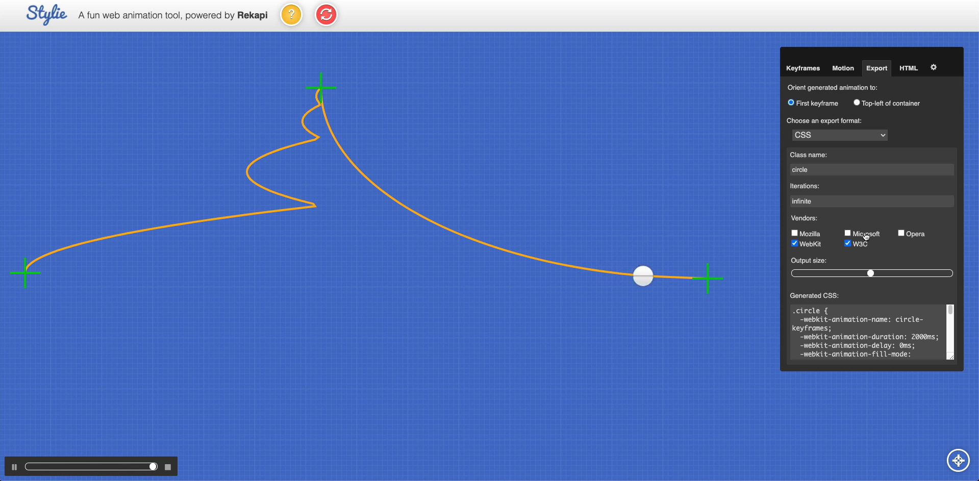
}어려운 애니메이션은 사이트 활용하기 👉 https://jeremyckahn.github.io/stylie/
📍 Menu 버튼 만들때 사용되는 기능
1) opacity 활용
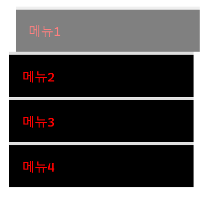
.mouse-animation li {
	width: 250px;
	background-color: #000000;
	padding: 20px;

	border-top: solid 5px #dfdfdf;
	transition: opacity 0.2s, margin-left 0.5s;
}

.mouse-animation li:hover {
	opacity: 0.5;
	margin-left: 10px;
}

.mouse-animation li a {
	color: red;
	font-size: 20px;
}
2) rgba : 폰트에 opacity 영향 주고 싶지 않을 때 사용 !
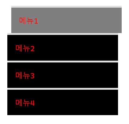
.mouse-animation li {
	width: 250px;
	background-color: rgba(0, 0, 0, 1);
	padding: 20px;

	border-top: solid 5px #dfdfdf;
	transition: opacity 0.2s, margin-left 0.5s;
}

.mouse-animation li:hover {
	background-color: rgba(0, 0, 0, 0.5);
	margin-left: 10px;
}

.mouse-animation li a {
	color: red;
	font-size: 20px;
}
rgba 색상 변환 사이트 👉 http://hex2rgba.devoth.com/
background-color: rgba(값, 값, 값, 투명도)
3) 움직일때 마다 박스 색상, 형태 변화 애니메이션
position: relative;로 top,bottom,left,right 사용하기
.move-box {
	position: relative;
	width: 200px;
	height: 200px;
	background-color: red;

	animation-name: moveBox;
	animation-duration: 4s;
	animation-timing-function: linear;
	animation-delay: 1s;
	animation-iteration-count: infinite;
	animation-direction: alternate;

	/* 0%에서 지정된 색을 최초색으로 사용 */
	animation-fill-mode: backwards;

}

@keyframes moveBox {

	0% {
		background-color: purple;
		left: 0;
		top: 0;
	}


	25% {
		background-color: yellow;
		left: 500px;
		top: 0;
	}

	50% {
		background-color: gray;
		left: 500px;
		top: 500px;
		border-radius: 50%;
	}

	75% {
		background-color: blueviolet;
		left: 0;
		top: 500px;
	}

	100% {
		background-color: red;
		left: 0;
		top: 0;
	}

}
📌 오늘의 Tip
1) 브라우저 하위 버전에 맞춰 transform 사용하고 싶다 ?
👉 프리픽스 붙여주기 !
-webkit- : 크롬, 사파리
-moz- : 파이어폭스
-ms- : 익스플로럴
-o- : 오페라
.transform {
	width: 300px;
	height: 300px;
	background-color: yellow;

	-webkit-transform: translate(100px, 300px);
	-moz-transform: translate(100px, 300px);
	-ms-transform: translate(100px, 300px);
	-o-transform: translate(100px, 300px);

	margin-left: 300px;
	margin-top: 500px;
}
❔ 어려웠던 것 OR 힘들었던 것
딱히 어렵거나 힘들었던 부분은 없었다.
다만, 앞으로 구현하고 싶은 애니메이션이 생긴다면 많은 고민과 검색을 하게 될 것 같았다 !
💡 해결 방법!
지금 배운것을 완벽하게 숙지하고, 그다음 단계로 넘어가는 것이 좋을듯 👍
🌱 공부를 마무리하며,
다양한 브라우저에서 사용할 수 있도록 프리픽스를 적용해주는 것에 놀라웠다.
웹사이트를 설계하는 일은 꽤나 섬세해야 잘할 수 있을 것 같다😂