4장. 스타일링
1) 인라인 스타일링
<View style={{ flex: 1, backgroundColor: '#fff', alignItems: 'center', justifyContent: 'center' }}>
<Text style={{ padding: 10, fontSize: 26, fontWeight: '400', color: 'red' }}>
2) 클래스 스타일링
const styles = StyleSheet.create({
	container: {
    	flex: 1,
        backgroundColor: '#fff',
        alignItems: 'center',
        justifyContent: 'center',
    },
    text: {
    	padding: 10,
        fontSize: 26,
        fontWeight: '600',
        color: 'black',
   	},
    error: {
    	padding: 10,
        fontSize: 26,
        fontWeight: '400',
        color: 'red',
    }
});
3) 여러 개 스타일 적용
- 여러 개 스타일
<Text style={[styles.text, styles.error]}>Inline Styling - Error</Text>- 인라인 스타일과 혼용
<Text style={[styles.text, { color: 'green' }]}>4) 외부 스타일 이용하기
src/styles.js
import { StyleSheet } from 'react-native';

export const viewStyles = StyleSheet.create({
	container: {
    	flex: 1,
        backgroundColor: '#fff',
        alignItems: 'center',
        justifyContent: 'center',
     },
});

export const textStyles = StyleSheet.create({
	text: {
    	padding: 10,
        fontSize: 26,
        fontWeight: '600',
        color: 'black',
    },
    error: }
    	fontWeight: '400',
        color: 'red',
   },
});
App.js에서
import { viewStyles, textStyles } from './styles';로 불러오면 된다.
<View style={viewStyles.container}>
	<Text style={[textStyles.text, { color: 'green' }]}> 이런식으로 사용 가능
5) flex와 범위
Header와 Contents, Footer로 나뉜다.
flex로 비율을 지정해주면 모든 기종에서 비율이 일정하게 보인다.
const styles = StyleSheet.create({
    container: {
        width: '100%',
        alignItems: 'center',
        justifyContent: 'center',
        height: 80,
    },
    header: {
        flex: 1,
        backgroundColor: '#f1c40f',
    },
    contents: {
        flex: 2,
        backgroundColor: '#1abc9c',
    },
    footer: {
        flex: 1,
        backgroundColor: '#3498db',
    },
    text: {
        fontSize: 26,
    }
});


App.js 에서
return (
    <View style={{ flex: 1 }}>
      <Header/>
      <Contents/>
      <Footer/>
    </View>
  );
6) flexDirection
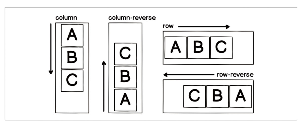
- column : 세로 방향으로 정렬(기본값)
- column-reverse : 세로 방향 역순 정렬
- row : 가로 방향으로 정렬
- row-reverse : 가로 방향 역순 정렬
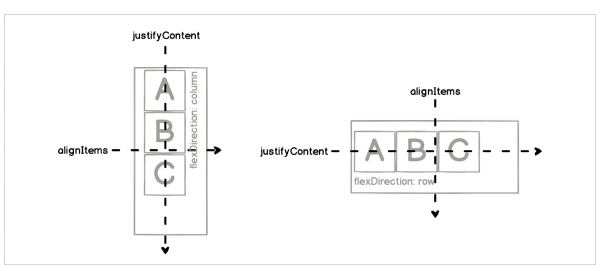
7) justifyContent
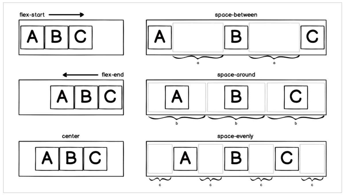
- flex-start : 시작점에서부터 정렬(기본값)
- flex-end : 끝에서부터 정렬
- center : 중앙 정렬
- space-between : 컴포넌트 사이의 공간을 동일하게 만들어서 정렬
- space-around : 컴포넌트 각각의 주변 공간을 동일하게 만들어서 정렬
- space-evenly : 컴포넌트 사이와 양 끝에 동일한 공간을 만들어서 정렬
8) alignItems
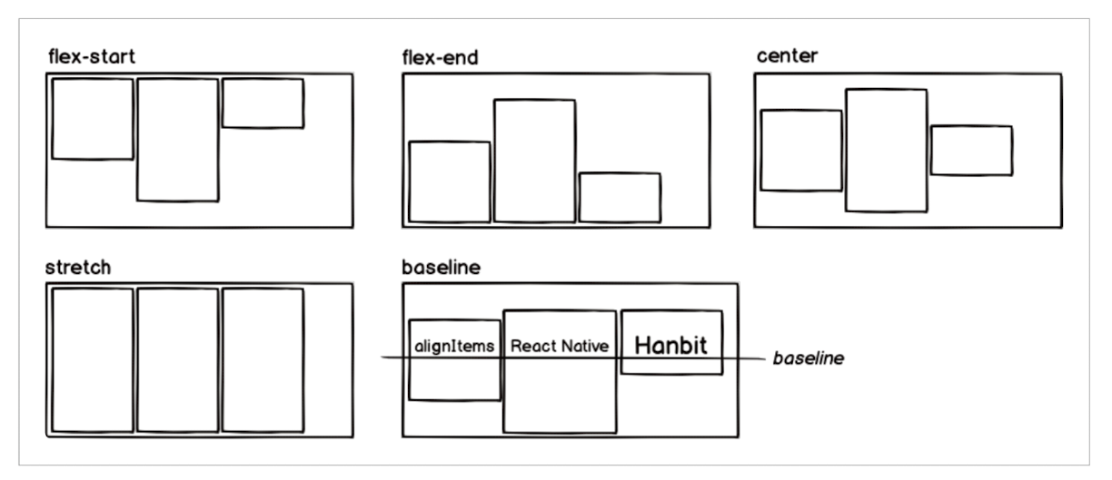
- flex-start : 시작점에서부터 정렬(기본값)
- flex-end : 끝에서부터 정렬
- center : 중앙 정렬
- stretch : alignItems의 방향으로 컴포넌트 확장
- baseline : 컴포넌트 내부의 텍스트(text) 베이스라인(baseline)을 기준으로 정렬
9) 그림자
- shadowColor : 그림자 색 설정
- shadowOffset : width와 height값을 지정하여 그림자 거리 설정
- shadowOpacity : 그림자 불투명도 설정
- shadowRadius : 그림자의 흐림 반경 설정
import { View, StyleSheet } from 'react-native';
import ShadowBox from './src/components/ShadowBox';

export default function App() {
  return (
    <View style={styles.container}>
      <ShadowBox/>
    </View>
  );
}

const styles = StyleSheet.create({
  container: {
    flex: 1,
    alignItems: 'center',
    justifyContent: 'center',
  },
});
10) 스타일드 컴포넌트
자바스크립트 파일 안에 스타일을 작성하는 라이브러리이다.
npm install styled-components
import styled from 'styled-components/native';

const MyTextomponent = styled.Text`
	color: #fff;`;
const whiteText = css` color: #fff; font-size: 14px;`;
const MyBoldTextComponent = styled.Text`${whiteText} font-weight: 600;`;
const ErrorText = styled(StyledText)`font-weight: 600; color: red;`;
style.컴포넌트이름 백틱안에 스타일 지정한다.
11) 스타일시트 사용
- props사용하기
props로 값에 따라 다른 색이 지정되도록 수정할 수 있다.
const ButtonContainer = styled.TouchableOpacity`
    background-color: ${props => props.title === 'Hanbit' ? '#3498db' : '#9b59b6'};
    border-radius: 15px;
    padding: 15px 40px;
    margin: 10px 0px;
    justify-content: center;
`;

const Title = styled.Text`
    font-size: 20px;
    font-weight: 600;
    color: #fff;
`;

const Button = props => {
    return (
        <ButtonContainer title={props.title}>
            <Title>{props.title}</Title>
        </ButtonContainer>
    )
}
export default Button;
- attrs사용하기
스타일드 컴포넌트에서 속성을 설정할 때 사용하는 attrs의 사용법
고정된 Props나 "동적으로 변하는 스타일"을 HTML(또는 Native) 태그에 미리 붙여두는 도구이다.
스타일 정의 시점에 속성을 포함한다.
const StyledInput = styled.TextInput.attrs({
  placeholder: "Enter a text...", // 기본값 설정
  placeholderTextColor: "#3498db",
  keyboardType: "email-address", // 키보드 타입 고정
})`
  width: 200px;
  height: 60px;
  border: 2px solid #3498db;
`;

// 이제 호출할 때 아무것도 안 적어도 위 속성들이 적용됨!
<StyledInput />
전달한 값에 따라 수정되게 하기
const StyledInput = styled.TextInput.attrs(props => ({
    placeholder: 'Enter a text...',
    placeholderTextColor: props.borderColor,
}))
`
    width: 200px;
    height: 60px;
    margin: 5px;
    padding: 10px;
    border-radius: 10px;
    border: 2px;
    border-color: ${props => props.borderColor};
    font-size: 24px;
`;

const Input = props => {
    return <StyledInput borderColor={props.borderColor}/>
};

export default Input;
- ThemeProvider
theme.js에서 배경 색 지정
export const theme = {
    purple: '#9b59b6',
    blue: '#3498db',
}
모든 컴포넌트를 감싸는 최상위 컴포넌트로 ThemeProvider 컴포넌트를 사용하여 theme 속성에 설정한다.
const App = () => {
	return (
    	<ThemeProvider theme={theme}>
        	<Container>
            ...
            </Container>
        </ThemeProvider>
    )
}
- 화면 다크/라이트 모드
- theme.js 에서 정의
export const theme = {
    purple: '#9b59b6',
    blue: '#3498db',
}

export const lightTheme = {
    background: '#ffffff',
    text: '#ffffff',
    purple: '#9b59b6',
    blue: '#3498db',
};

export const darkTheme = {
    background: '#34495e',
    text: '#34495e',
    purple: '#9b59b6',
    blue: '#3498db',
}

- App.js 에서 호출하여 사용한다.
const Container = styled.View`
  flex: 1;
  background-color: #ffffff;
  align-items: center;
  justify-content: center;
  background-color: ${props => props.theme.background};
`;

const App = () => {
  const [isDark, setIsDark] = useState(false);
  const _toggleSwitch = () => setIsDark(!isDark);
  return (
    <ThemeProvider theme={isDark ? darkTheme : lightTheme}>
      <Container>
        <Switch value={isDark} onValueChange={_toggleSwitch}/>
        <Button title="Hanbit" />
        <Button title="React Native" />
        <Input borderColor="#3498db"/>
        <Input borderColor="#9b59b6"/>
      </Container>
    </ThemeProvider>
  );
};
공부 기록