2022.12.19 ~12.22
템플릿을 보고 혼자서 html,css 퍼블리싱해보기!!
템플릿 구조 파악하기
html 뼈대 만들기 (header,section,footer)
scss 사용하기
- 템플릿을 보고 구조 파악하기
오늘 내가 해야할 템플릿
- 네비게이션바는 마우스를 올리면 버튼처럼 변하고 색상도 변함.
- 메인 이미지가 있고 텍스트
- section 3가지 about catering, our menu, contact
- 마지막 하단
*각 section 끝나면 얇은 선이 있는데 화면엔 잘 보이지 않지만 구분선도 같이 넣어줘야함
- html로 뼈대 만들어주기
<header>
  <nav>
    네비게이션, 로고들어갈 자리
  </nav>
</header>
  <main>
    <section>메인배너</section>
    <section>abuot catering</section>
    <section>our menu</section>
    <section>contact</section>
</main>
<footer>
</footer>- 하나씩 차례대로 시작해보자~ 먼저 네이게이션바 부터~!~

마우스를 올리면 버튼 모양으로 변하고, 네비게이션 하단쪽에 보면 그림자가 들어가 있다..
그림자 css태그는 ▷box-shadow: 그림자 위치, 길이, 투명도
html
    <div id="header_logo" class="nav_items">
        <a href="#" target="_top"><button type="button">Gourmet au Catering</button></a>
      </div>
      <nav>
        <ul id="nav_list">
          <li class="nav_items">
            <a href="#main_about"><button type="button">About</button></a>
          </li>
          <li class="nav_items">
            <a href="#main_menu"><button type="button">Menu</button></a>
          </li>
          <li class="nav_items">
            <a href="#main_contact"><button type="button">Contact</button></a>
          </li>
        </ul>
      </nav>
scss
#headers {
  width: 100%;
  position: fixed;
  z-index: 1000;
  #header_wrapper {
    display: flex;
    justify-content: space-between;
    background-color: #fff;
    color: #000;
    padding: 8px 16px;
    box-shadow: 0 2px 5px 0 rgb(0 0 0 / 26%); -->네비하단 그림자
    .nav_items {
      a {
        button {
          background-color: #fff;
          font-size: 15px;
          padding: 8px 16px;
          letter-spacing: 4px;
          transition: 0.3s;
          &:hover {
            background-color: #ccc;
          }
        }
      }
    }
    #nav_list {
      display: flex;
      justify-content: flex-start;
    }
  }
그림자 css태그는 ▷box-shadow: 그림자 위치, 길이, 투명도
flex 배운거 열심이 잊지않고 많이많이많이~ 사용해보기!!

마우스를 올리면(hover)하면 자연스럽게 색이 변화하게 transition: 0.3;
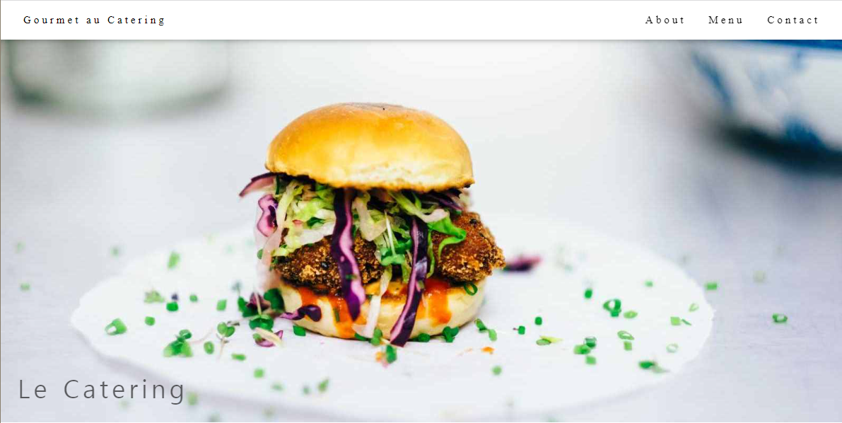
그리고 메인 이미지랑 텍스트 넣어보자~
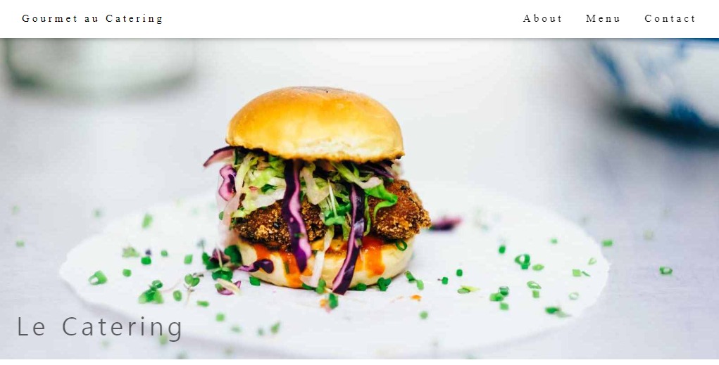
큰 이미지 하나에 그위에 텍스트가 있군.. >> position: 필요하겠어~
html
 <section id="main_banner">
      <img src="img/hamburger.jpg" alt="hamburger">
      <div id="main_banner_text">
        <h2>Le Catering</h2>
      </div>
    </section>
scss
#main_banner {
position: relative;
padding-top: 44px;
width: 100%;
max-width: 1600px;
min-width: 500px;
margin: 0 auto;
img {
width: 100%;
}
#main_banner_text {
position: absolute;
padding: 12px 24px;
bottom: 0;
left: 0;
> h2 {
font-size: 36px;
letter-spacing: 5px;
left: 0;
opacity: 0.6;
margin: 10px 0;
font-weight: 400;
}
}
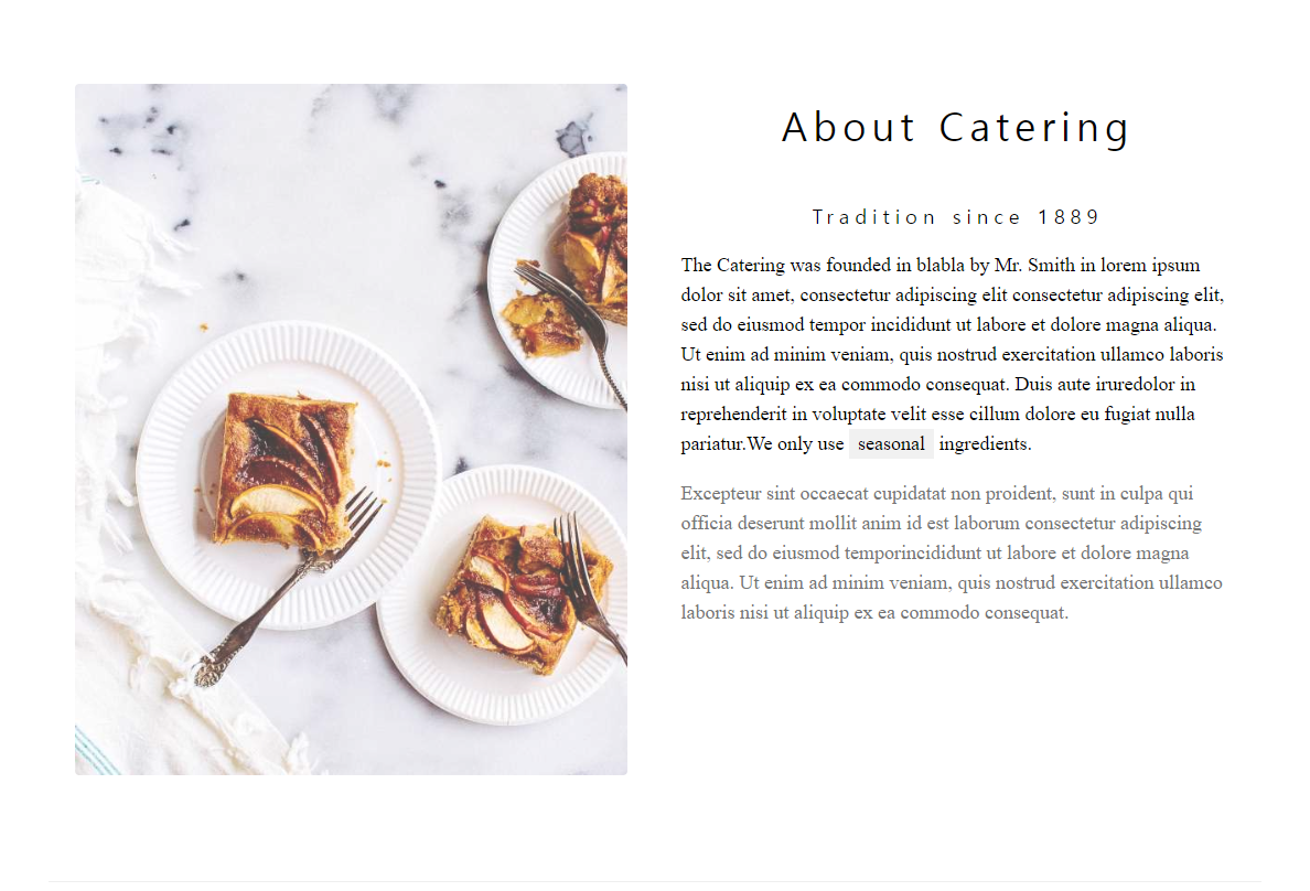
}3개 section (about, menu, contact) width값이 1100px 같은 넓이니깐 class="setions",
title도 같은 크기,여백, 두께 같기때문에 class="section_titles"
about_section 로 고고~
html
    <section id="main_about" class="sections">
      <div id="about_wrapper">
        <div id="about_img" class="containers">
          <img src="img/tablesetting2.jpg" alt="tablesetting">
        </div>
        <div id="about_text" class="containers">
          <h2 class="section_titles">About Catering</h2>
          <br>
          <p class="section_sub_titles">Tradition since 1889</p>
          <p class="about_texts">The Catering was founded in amet,.....(중략)We only use <span>seasonal</span> ingredients.</p>
          <p class="about_texts">Excepteur non proident, ....(중략) laboris nisi ut aliquip ex ea commodo consequat.
          </p>
        </div>
      </div>
    </section>

    <hr class="end_line"> ->section 끝날때 하단에 boder line이 있음..
문장중에 span 하나 있는 것도 체크~
scss
  .sections {
    width: 100%;
    max-width: 1100px;
    margin: 0 auto;
    padding: 64px 0;  -->  section 넓이 위 아래 여백
  }
  .section_titles {
    font-size: 36px;
    font-weight: 400;
    margin: 10px 0;
    letter-spacing: 5px;  --> title 글자 크기, 두께, 자간여백
  }
  ------------section 공통 class--------------

#main_about {
    #about_wrapper {
      width: 100%;
      display: flex;
      justify-content: space-between;
      #about_img {
        width: 50%;
        opacity: 0.75; 이미지 투명도
        > img {
          width: 100%;
          border-radius: 5px;
        }
      }
      #about_text {
        width: 50%;
        p {
          line-height: 1.5;
          word-break: keep-all; --> 단어로 줄바뀜
        }
        .about_texts {
          font-size: 18px;
          margin: 18px 0;
          font-weight: 500;
          color: #000;
          text-align: left;
          > span {
            padding-left: 8px;
            background-color: #f1f1f1;
            color: #000;
            text-align: center;
          }
          &:nth-last-child(1) {
            color: #757575;
          }
        }
      }
    }
  }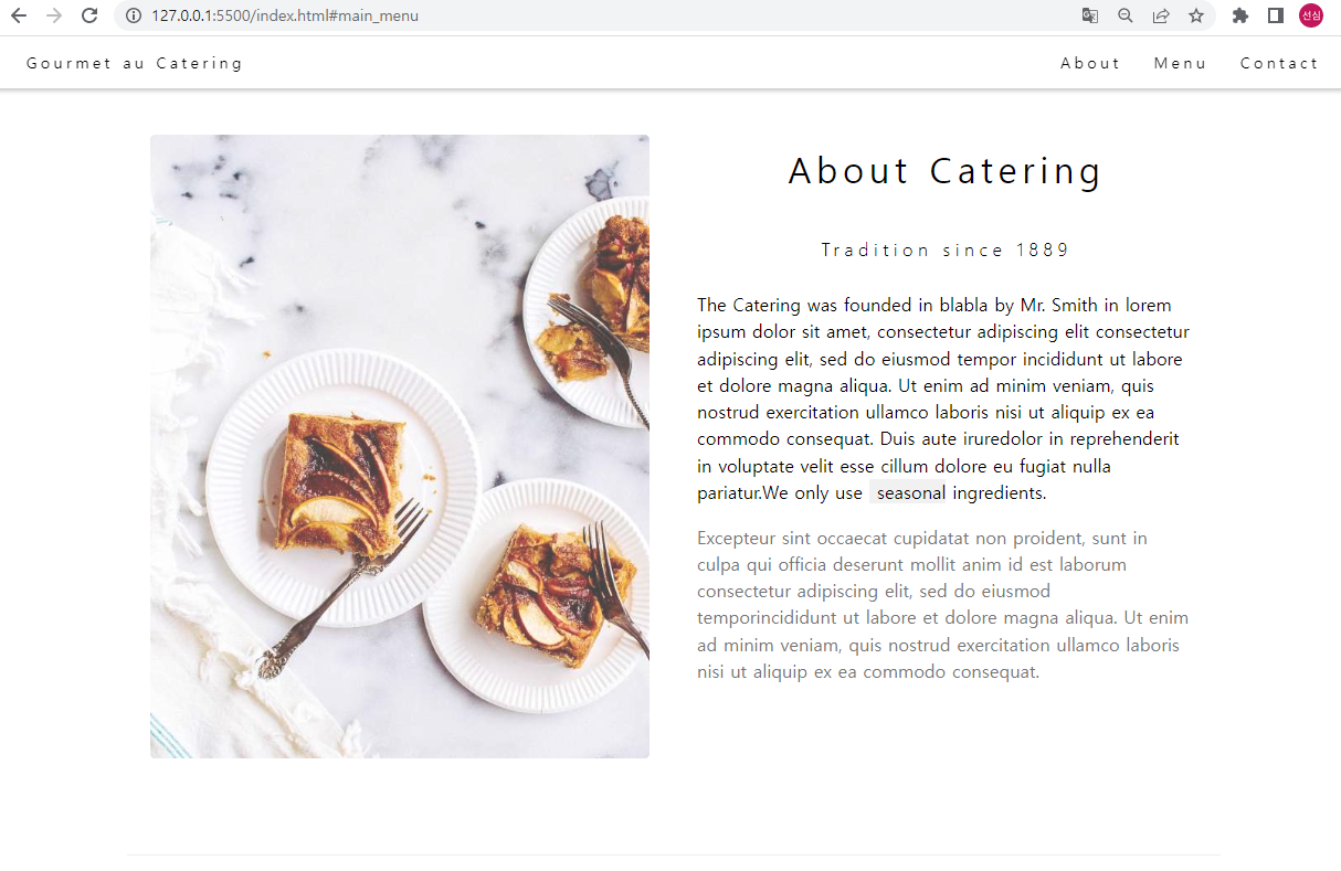
글자들 단어로 줄바뀜 해주는 ▷word-break: keep-all;
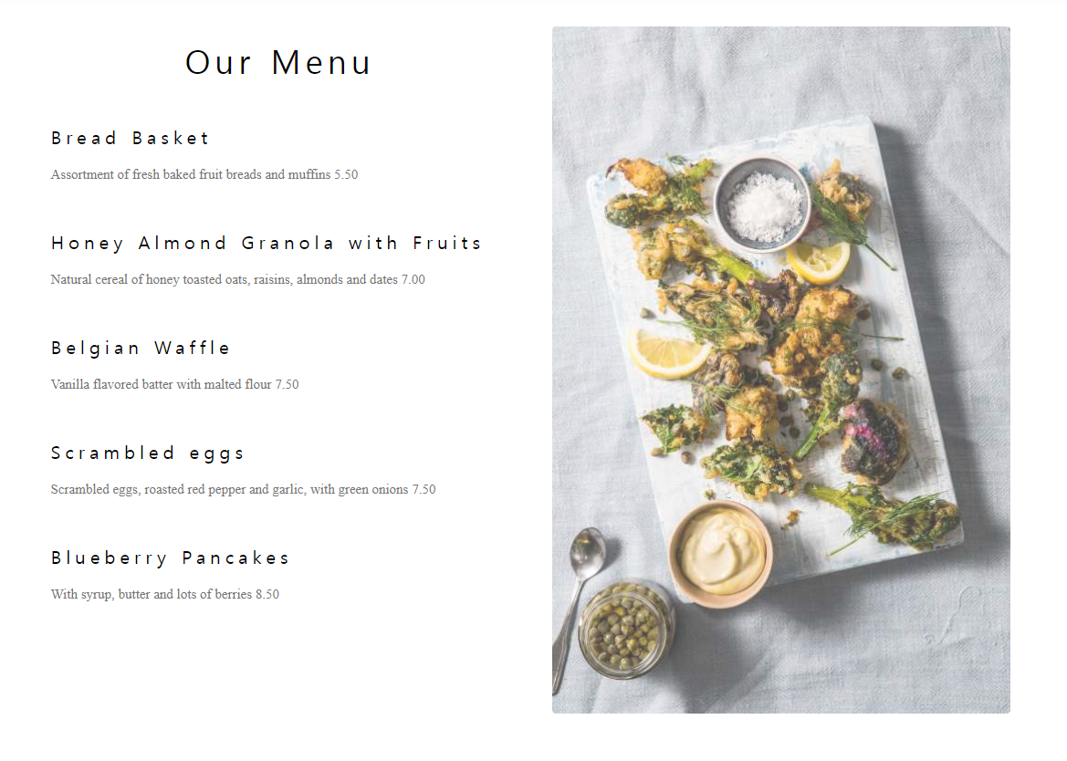
menu_section 로 고고~
html
 <section id="main_menu" class="sections">
      <div id="menu_wrapper">
        <div class="containers">
          <h2 class="section_titles">Our Menu</h2><br>
          <ul>
            <li class="menu_orders">
              <h4>Bread Basket</h4>
              <p>Assortment of fresh baked fruit breads and muffins 5.50</p>
            </li>
            <br>
            <li class="menu_orders">
              <h4>Honey Almond Granola with Fruits</h4>
              <p>Natural cereal of honey toasted oats, raisins, almonds and dates 7.00
              </p>
            </li>
            <br>
            <li class="menu_orders">
              <h4>Belgian Waffle</h4>
              <p>Vanilla flavored batter with malted flour 7.50</p>
            </li>
            <br>
            <li class="menu_orders">
              <h4>Scrambled eggs</h4>
              <p>Scrambled eggs, roasted red pepper and garlic, with green onions 7.50
              </p>
            </li>
            <br>
            <li class="menu_orders">
              <h4>Blueberry Pancakes</h4>
              <p>With syrup, butter and lots of berries 8.50</p>
            </li>
          </ul>
        </div>
        <div class="containers">
          <div id="menu_img">
            <img src="img/tablesetting.jpg" alt="">
          </div>
        </div>
      </div>
    </section>
    <!-- menu 끝 -->
    <hr class="end_line">  --> section 끝날 때 나오는 줄
scss
  #main_menu {
    #menu_wrapper {
      display: flex;
      justify-content: space-between;
      ul {
        margin: 15px 0;
        text-align: left;
        .menu_orders {
          h4 {
            letter-spacing: 5px;
            font-size: 20px;
            font-weight: 400;
            margin: 10px 0;
          }
          p {
            font-size: 15px;
            color: #757575;
            line-height: 1.5;
          }
        }
      }
      #menu_img {
        opacity: 0.7; 이미지 투명도
      }
    }
  }
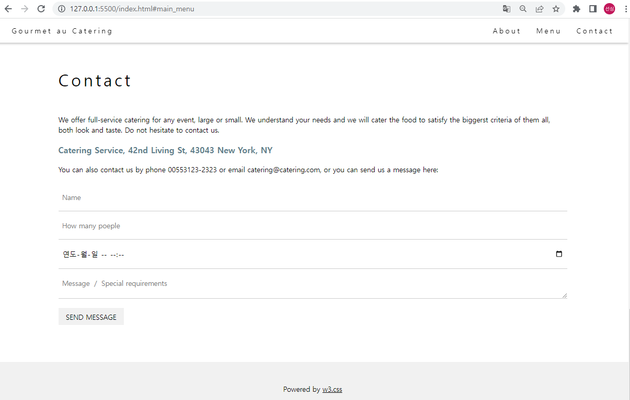
contant section 고고~
html
<section id="main_contact" class="sections">
      <div id="contact_wrapper">
        <div id="contact_address">
          <h2 class="section_titles">Contact</h2><br>
          <ul>
            <li>
              <p>We offer full-service.. (중략) needs and we will
                cater
                the food to... (중략) Do not hesitate to contact
                us.
              </p>
            </li>
            <li>
              <p>Catering Service, 42nd Living St, 43043 New York, NY</p>
            </li>
            <li>
              <p>You can also contact us by phone 00553123-2323 or email catering@catering.com, or you can send us a message here:</p>
            </li>
          </ul>
        </div>
        <div id="contact_form">
          <form>
            <div>
              <input id="name_form" type="text" placeholder="Name">
              <input id="people_form" type="number" placeholder="How many poeple">
              <input id="date_form" type="datetime-local" placeholder="Date and time" required name="date">
              <textarea id="message_form" placeholder="Message / Special requirements"></textarea>
              <button id="btn_send" type="button">SEND MESSAGE</button>
            </div>
          </form>
        </div>
      </div>
    </section>
scss
 #main_contact {
    #contact_wrapper {
      text-align: left;
      padding-left: 8px;
      #contact_address {
        > ul {
          > li {
            margin: 18px 0;
            font-size: 15px;
            font-weight: 400;
            &:nth-child(2) {
              font-size: 18px;
              color: #607d8b;
              font-weight: 600;
            }
            p {
              line-height: 1.5;
              word-break: keep-all;
            }
          }
        }
      }
      #contact_form {
        width: 100%;
        form {
          div {
            display: block;
            input {
              width: 100%;
              padding: 20px 8px;
              font-size: 15px;
              border-bottom: 1px solid #ccc;
            }
            textarea {
              width: 100%;
              height: 65px;
              padding: 20px 8px;
              font-size: 15px;
              border-bottom: 1px solid #ccc;
            }
            #btn_send {
              margin: 16px 0;
              font-size: 15px;
              padding: 8px 16px;
              color: #000;
              background-color: #f1f1f1;
              transition: 0.3s;
              &:hover {
                background-color: #ccc;
              }
            }
          }
        }
      }
    }
  }
form 크기와 padding값 알맞게 넣어주었고, 문의사항 글은 input하지않고 textarea
send 버튼도 마우스를 hover하면 색이 바뀌는데 transition: 0.3s; 딜레이를 해주어 자연스럽게 디자인요소를 주었음~
마지막 footer
html
 <footer>
    <div id="footer_copy">
      <p>Powered by <a href="#" target="_blank">w3.css</a></p>
    </div>
  </footer>
scss
#footer_copy {
  width: 100%;
  background-color: #f1f1f1;
  color: #000;
  padding: 32px 0;
  > p {
    font-size: 15px;
    line-height: 1.5;
    margin: 15px 0;
    font-weight: bolder;
    > a {
      text-decoration: underline;
    }
  }
}
--이미지는 상단 이미지로 대체~>
이렇게 완성된 템플릿 스스로 해보기 완성!!
원본 템플릿이랑 비교해보았을 때 글자체가 달라서 그런지 또 다른 디자인 느낌이 난다.
아이들 등원시키고 틈틈히 오전에 스터디 한것들 생각 정리하고, 모르는건 찾아보면서 하다보니 완성이 되어가고 있었다.
이제 java script 제대로 알아보면서 완성도가 높은 website로 퍼블리싱하고싶다~!!
2022년은 엄마 역할도 중요하지만 내가 하고싶은 일!! 퍼블리싱 멋지게 하고픈 나 자신에게 화이팅~~ I can do it!!!