이고잉님 강좌를 보고 그리드에대해서 공부하다가, 조금 더 이해하고 싶어서 직접 만들어 보았다.
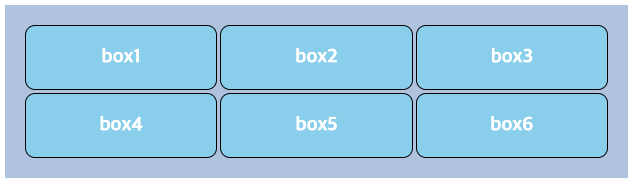
▼ HTML, CSS / Grid
<!doctype html>
<html>
<head>
<style>
  *{
     box-sizing:border-box;
    }
    .grid {
      display:grid;
      /*max-weight: 400px;*/
      background-color:lightsteelblue;
      padding: 20px;
      margin: auto;
      grid-gap: 20px;
      grid-template-columns: 1fr 1fr 1fr;
      grid-auto-rows: 1fr;
      grid-gap: 3px;
    }
    .box {
      border: black 1px solid;
      border-radius: 10px;
      background-color: skyblue;
      padding: 20px;
      color: white;
      font-weight: bold;
      font-size: larger;
      display: flex;
      justify-content: center;
      align-items: center;
    }
</style>
</head>
<body>
  <div class="grid">
    <div class="box"> box1 </div>
    <div class="box"> box2 </div>
    <div class="box"> box3 </div>
    <div class="box"> box4 </div>
    <div class="box"> box5 </div>
    <div class="box"> box6 </div>
  </div>
</body>
</html>
▼result
📌 작성메모
1) .grid 와 .box 에서 마진값 auto 가 어떻게 보여지는지 다시 체크했다.
( margin:0 auto; 는 위아래 여백 없이(0) 가로 중앙에 배치되는 가장 기본적인 서식이다. )
2) border-radius: 10px; 을 사용해서 라운딩 값을 주었다.
3) *{ box-sizing: border-box; }
: 폭과 너비를 가지기 위해 box-sizing은 border-box로 설정. content-box와의 차이를 좀더 명확하게 알아야겠다.
4) 다른부분은 크게 막히는 것이 없었는데 제일 오래 걸렸던 부분이다. ▼
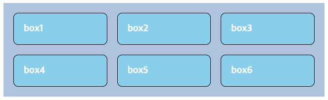
차례대로 진행하던 중 content글자만 가운데로 옮기면 되어서 구글링을해보고.. justify-items: center; (아이템 가로축 정렬방식)와 justify-content: center; 을 적용하면 해결 될 듯 보였는데, 자꾸만 아래처럼 되었다. 혼자서 이것저것 만져보고 개발자 도구를 사용해봐도 정확히 개념을 이해해야 풀 수 있을 것 같아서 무한 구글링을 했다!
- 그리드 컨테이너의 HTML 구조에는 세 가지 가있다
containeritemcontent, 그리드 컨테이너의 범위는 부모-자식 관계로 제한된다. 즉 그리드 컨테이너는 항상 부모이고, 그리드는 항상 자식이다. 그리드 속성은 이 관계 안에서만 작동한다. - 그리드 컨테이너는 자식 이외의 하위 항목은 그리드 레이아웃의 일부가 아니며 그리드 속성을 허용하지 않는다.
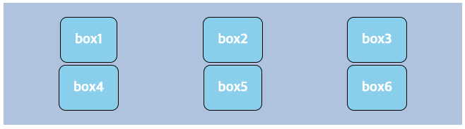
- 내가 처음 적용한
justify-items는, 콘텐츠가 아닌 그리드 항목을 중심에 배치(적용) 했던 것 같다. - 그리드 레이아웃의 구조와 범위를 참고하여, 그리드 항목을 부모로 콘텐츠를 자식으로 취급해서, 해당 요소를
.box에,display: flex;와 함께 작성했더니 결과처럼 보여졌다.
😎 성공 !!
✍️ flex box도 함께 이해해야겠다고 생각했다.
reperence) stackoverflow
기억보단 기록을 ✨