구현 전 생각
왼쪽 상단 nav 클릭시 -> 클래스 추가 및 삭제 -> hide show
구현 방법
container 와 nav 로 구성,
container에 배경색을 하얀색으로 해주고,
body 배경색을 회색으로 해놓음
container에 show-nav시 회전효과를 줘서 가려진 nav바를 보여줌
#open 클릭이벤트 넣어서 show-nav 클래스 add
#close 클릭이벤트 넣어서 show-nav 클래스 remove
HTML
<body>
<div class="container">
<div class="circle-container">
<div class="circle">
<button id="close">
<i class="fas fa-times"></i>
</button>
<button id="open">
<i class="fas fa-bars"></i>
</button>
</div>
</div>
<div class="content">
<h1>Amazing Article</h1>
<small>Florin Pop</small>
<p>
Lorem ~~~~~~~
</p>
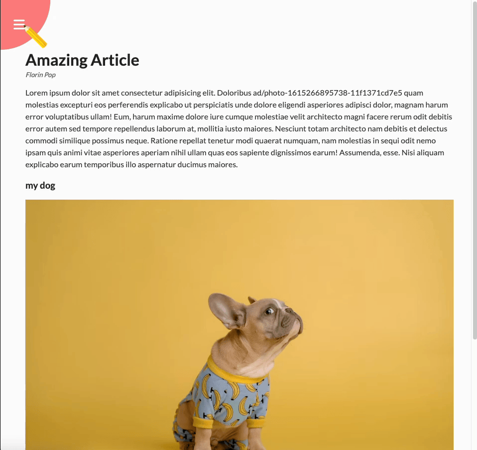
<h3>my dog</h3>
<img
src="https://images.unsplash.com/photo-1615266895738-11f1371cd7e5?ixlib=rb-1.2.1&ixid=MnwxMjA3fDB8MHxwaG90by1wYWdlfHx8fGVufDB8fHx8&auto=format&fit=crop&w=1169&q=80"
alt="doggy"
/>
<p>
Lorem ~~~
</p>
</div>
</div>
<nav>
<ul>
<li><i class="fas fa-home">Home</i></li>
<li><i class="fas fa-user-alt">About</i></li>
<li><i class="fas fa-envelope">Contact</i></li>
</ul>
</nav>JS
const open = document.getElementById("open");
const close = document.getElementById("close");
const container = document.querySelector(".container");

open.addEventListener("click", () => container.classList.add("show-nav"));
close.addEventListener("click", () => container.classList.remove("show-nav"));
CSS
body {
  font-family: "Lato", sans-serif;
  background-color: #333;
  color: #222;
  overflow-x: hidden;
  margin: 0;
}

.container {
  background-color: #fafafa;
  transform-origin: top left;
  transition: transform 0.5s linear;
  width: 100vw;
  min-height: 100vh;
  padding: 50px;
}

.container.show-nav {
  transform: rotate(-20deg);
}

.circle-container {
  position: fixed;
  top: -100px;
  left: -100px;
}

.circle {
  background-color: #ff7979;
  height: 200px;
  width: 200px;
  border-radius: 50%;
  position: relative;
  transition: transform 0.5s linear;
}

.container.show-nav .circle{
  transform: rotate(-70deg);
}


.circle button {
  cursor: pointer;
  position: absolute;
  top: 50%;
  left: 50%;
  height: 100px;
  background-color: transparent;
  border: 0;
  font-size: 26px;
  color: #fff;
}

.circle button :foucs {
  outline: none;
}

.circle button#open {
  left: 60%;
}

.circle button#close {
  top: 60%;
  transform: rotate(90deg);
  transform-origin: top left;
}

.container.show-nav + nav li {
  transform: translateX(0);
  transition-delay: 0.3s;
}

nav {
  position: fixed;

  bottom: 40px;
  left: 0;
  z-index: 100;
}

nav ul {
  list-style-type: none;
  padding-left: 30px;
}

nav ul li {
  text-transform: uppercase;
  color: white;
  margin: 40px 0;
  transform: translateX(-100%);
  transition: transform 0.4s ease-in;
}

nav ul li i {
  font-size: 20px;
  margin-right: 10px;
}

nav ul li + li {
  margin-left: 15px;
  transform: translateX(-150%);
}
nav ul li + li + li {
  margin-left: 30px;
  transform: translateX(-200%);
}

.content img {
  max-width: 100%;
}

.content {
  max-width: 1000px;
  margin: 50px auto;
}

.content h1 {
  margin: 0;
}

.content small {
  color: #555;
  font-style: italic;
}

.content p {
  color: #333;
  line-height: 1.5;
}
구현 후 생각
CSS가 다했다.
프론트엔드 개발자 항상 뭘 하고있는 슬킹(seulki + ing)