border-radius
h1 {
    border: 3px solid #228B22;
    border-radius: 30px;
}- 테두리의 꼭짓점을 둥글게 만듬
- 설정한 radius값을 반지름으로 하는 원을 박스의 꼭짓점에서 그려 둥근 테두리를 그리는 원리
-2.jpg)
단위
vmax vs vmin
- vmax : 화면의 넓이와 높이 중 큰 값을 기준으로 하는 백분율 단위
- vmin : 화면의 넓이와 높이 중 작은 값을 기준으로 하는 백분율 단위
- 즉, 가로세로중 작은곳이나 큰곳 기준!!
vmin
<!DOCTYPE html>
<html lang="ko">
  <head>
    <meta charset="UTF-8" />
    <meta http-equiv="X-UA-Compatible" content="IE=edge" />
    <meta name="viewport" content="width=device-width, initial-scale=1.0" />
    <title>그외단위!</title>
    <style>
      body {
        margin: 0;
        background-color: palevioletred;
      }
      div {
        background-color: white;
        width: 50vmin;
        height: 50vmin;
        /* vmin : width 와 heigth중 더 작은값을 기준으로 % 즉, 50vmin이면 세로를 기준으로 50% 즉!! 가로세로중 작은곳 */
      }
    </style>
  </head>
  <body>
    <div></div>
  </body>
</html>
vmax
<!DOCTYPE html>
<html lang="ko">
  <head>
    <meta charset="UTF-8" />
    <meta http-equiv="X-UA-Compatible" content="IE=edge" />
    <meta name="viewport" content="width=device-width, initial-scale=1.0" />
    <title>그외단위!</title>
    <style>
      body {
        margin: 0;
        background-color: palevioletred;
      }
      div {
        background-color: white;
        width: 50vmax;
        height: 50vmax;
        /* vmax : width 와 heigth중 더 큰값을 기준으로 % 즉, 50vmax이면 가로를 기준으로 50% 즉!! 가로세로중 큰곳 */
      }
    </style>
  </head>
  <body>
    <div></div>
  </body>
</html>
overflow
- overflow 속성은 요소의 콘텐츠가 너무 커다랄 경우 요소를 어떻게 처리할지 지정한다.
- overflow-x, overflow-y의 축 별로 값을 설정할 수 있다.
overflow 속성
visible
overflow 속성의 기본값. 콘텐츠를 자르지 않음
hidden
콘텐츠를 요소의 크기만큼 맞추기 위해 잘라낸다. 스크롤 바를 제공하지 않음.
💡 float나 magin 합침 현상 등에서 자식 요소의 넓이나 높이를 포함시키기 위해서도 많이 사용한다.
scroll
콘텐츠를 요소의 크기만큼 맞추기 위해 잘라낸다.
잘려진 나머지 부분을 확인 할 수 있도록 스크롤 바를 제공한다.
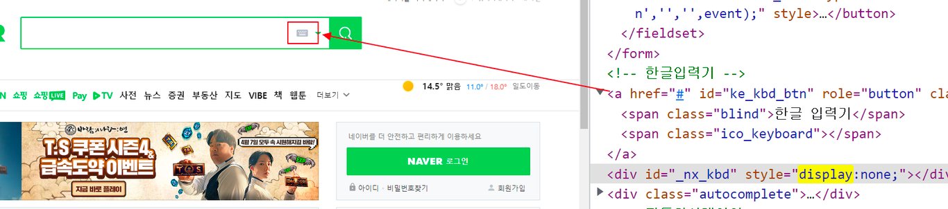
overflow:hidden vs display:none vs visibility:hidden
overflow:hidden
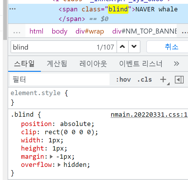
position:absolute: clip이 absolute, fixed일때만 적용가능(레이아웃 영향 미치지 않기 위해)clip:rect(0 0 0 0): top bottm left right 가 같은 값이면 요소가 숨겨짐width:1px,height:1px: 스크린 리더는 width, height 사이즈가 0인 엘리먼트의 콘텐츠를 읽을 수 없으니, 엘리먼트의 사이즈는 최소 1px 이상으로 적용함margin:-1px: 부모 요소 밖으로 위치시킴overflow:hidden: oveflow된 콘텐츠 숨김
display:none

*display 를 사용하는 경우, B가 안보이고, B가 있던 자리 사라지게됨!
visibility:hidden
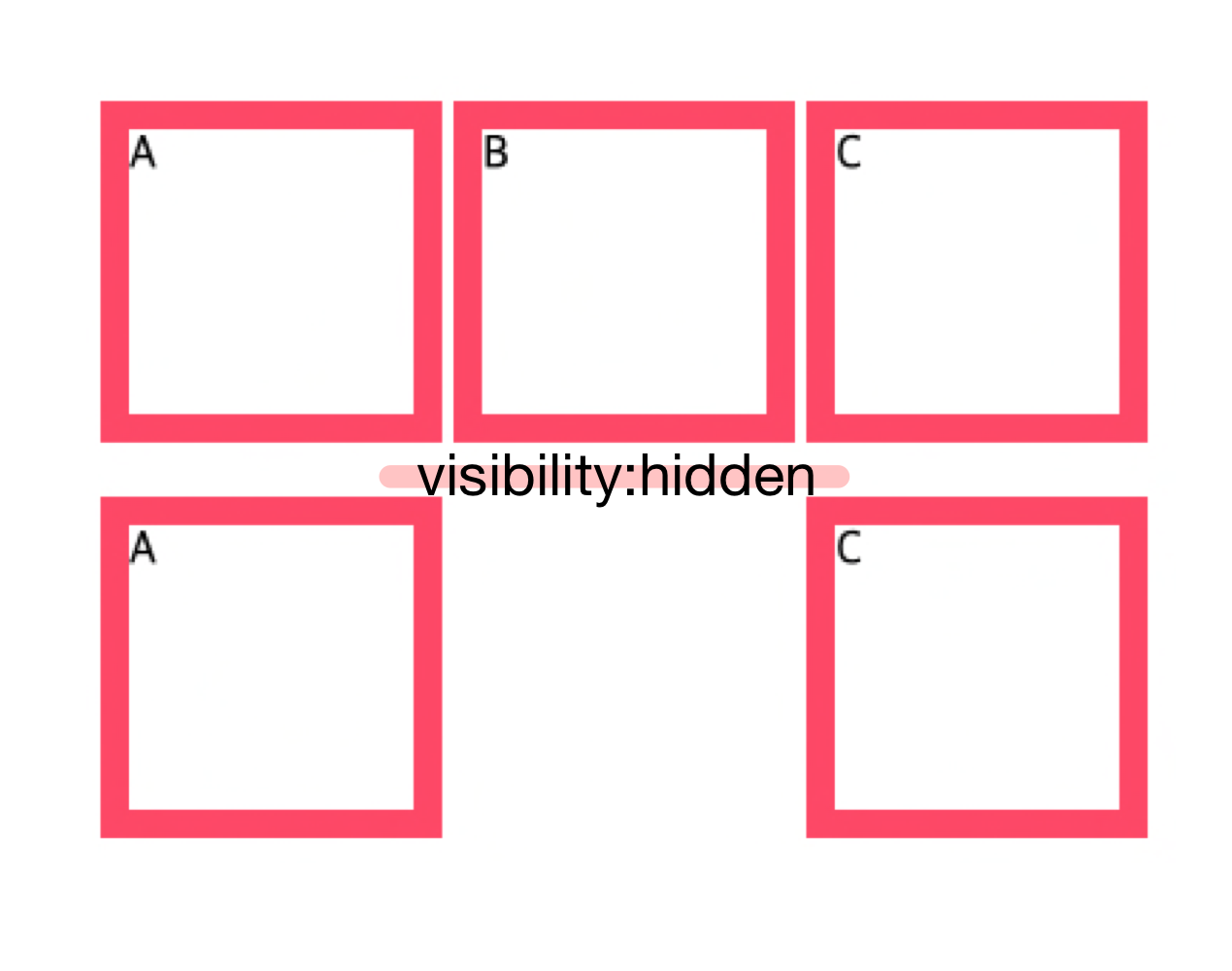
*visibility 를 사용하는경우, 화면에서 가려지기는 하지만, B 가 있던 자리는 그대로 남아있음
즉 overflow:hidden 은 text를 숨김에도 스크린리더에 알림으로 웹접근성이 좋다!
reference : https://jmjmjm.tistory.com/78

프론트엔드 개발자 항상 뭘 하고있는 슬킹(seulki + ing)