
실제 데이터를 활용해서 막대 그래프 표현하기
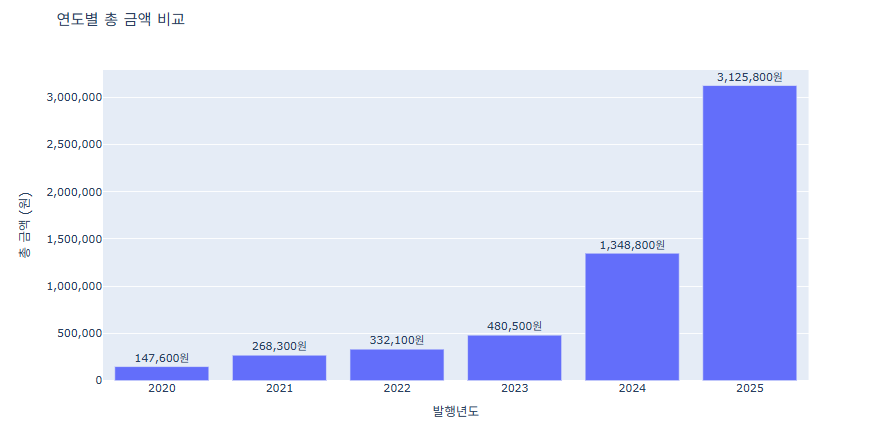
예제 1 (경상북도희망구입도서)
import pandas as pd
import plotly.express as px
# CSV 불러오기
df = pd.read_csv('경상북도희망도서.csv')
df.columns = df.columns.str.strip()
# 연도별 총 금액 집계
year_sum = df.groupby('발행년도')['금액'].sum().reset_index()
# Plotly Express로 막대그래프
fig = px.bar(
    year_sum,
    x='발행년도',
    y='금액',
    title='연도별 총 금액 비교',
    labels={'발행년도':'발행년도', '금액':'총 금액 (원)'},
    text='금액'
)
fig.update_layout(
    yaxis=dict(
        tickformat=",",  # 천 단위 콤마
        title='총 금액 (원)'
    )
)
fig.update_traces(texttemplate='%{text:,}원', textposition='outside')
fig.update_layout(uniformtext_minsize=12, uniformtext_mode='hide')
fig.show()
예제 2 (한국가스충전소)
데이터가 너무 방대해서 그래프를 놔눠서 진행
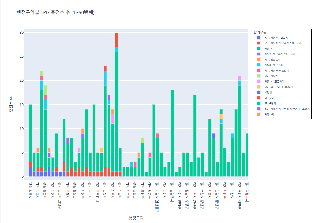
코드 1~60번째 행정구역import pandas as pd import plotly.express as px # CSV 파일 로드 df = pd.read_csv("/content/한국가스안전공사_전국 LPG 충전소 현황_20250423.csv") # 집계 (행정구역 + 관리구분별 충전소 수) grouped = df.groupby(['행정구역', '관리구분']).size().reset_index(name='충전소 수') # 행정구역 고유 리스트 regions = grouped['행정구역'].unique() subset_regions = regions[0:60] subset_df = grouped[grouped['행정구역'].isin(subset_regions)] fig = px.bar( subset_df, x='행정구역', y='충전소 수', color='관리구분', pattern_shape='관리구분', pattern_shape_sequence=[".", "x", "/", "\\"], title='행정구역별 LPG 충전소 수 (1~60번째)', labels={'행정구역': '행정구역', '충전소 수': '충전소 수'} ) fig.update_layout( legend=dict( font=dict(size=9), itemsizing='constant', itemwidth=30, borderwidth=1, bordercolor="Black" ) ) fig.show()
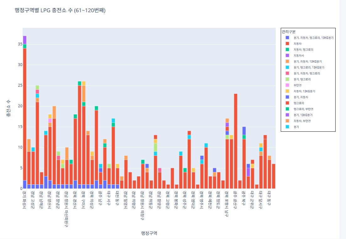
코드 61~120번째 행정구역
import pandas as pd
import plotly.express as px
# CSV 파일 로드
df = pd.read_csv("/content/한국가스안전공사_전국 LPG 충전소 현황_20250423.csv")
# 집계 (행정구역 + 관리구분별 충전소 수)
grouped = df.groupby(['행정구역', '관리구분']).size().reset_index(name='충전소 수')
# 행정구역 고유 리스트
regions = grouped['행정구역'].unique()
subset_regions = regions[60:120]
subset_df = grouped[grouped['행정구역'].isin(subset_regions)]
fig = px.bar(
    subset_df,
    x='행정구역',
    y='충전소 수',
    color='관리구분',
    pattern_shape='관리구분',
    pattern_shape_sequence=[".", "x", "/", "\\"],
    title='행정구역별 LPG 충전소 수 (61~120번째)',
    labels={'행정구역': '행정구역', '충전소 수': '충전소 수'}
)
fig.update_layout(
    legend=dict(
        font=dict(size=9),
        itemsizing='constant',
        itemwidth=30,
        borderwidth=1,
        bordercolor="Black"
    )
)
fig.show()
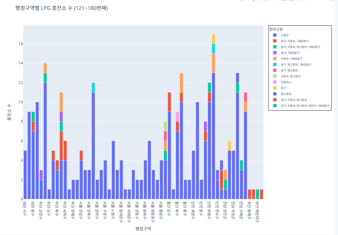
코드 121~180번째 행정구역
import pandas as pd
import plotly.express as px
# CSV 파일 로드
df = pd.read_csv("/content/한국가스안전공사_전국 LPG 충전소 현황_20250423.csv")
# 집계 (행정구역 + 관리구분별 충전소 수)
grouped = df.groupby(['행정구역', '관리구분']).size().reset_index(name='충전소 수')
# 행정구역 고유 리스트
regions = grouped['행정구역'].unique()
subset_regions = regions[120:180]
subset_df = grouped[grouped['행정구역'].isin(subset_regions)]
fig = px.bar(
    subset_df,
    x='행정구역',
    y='충전소 수',
    color='관리구분',
    pattern_shape='관리구분',
    pattern_shape_sequence=[".", "x", "/", "\\"],
    title='행정구역별 LPG 충전소 수 (121~180번째)',
    labels={'행정구역': '행정구역', '충전소 수': '충전소 수'}
)
fig.update_layout(
    legend=dict(
        font=dict(size=9),
        itemsizing='constant',
        itemwidth=30,
        borderwidth=1,
        bordercolor="Black"
    )
)
fig.show()
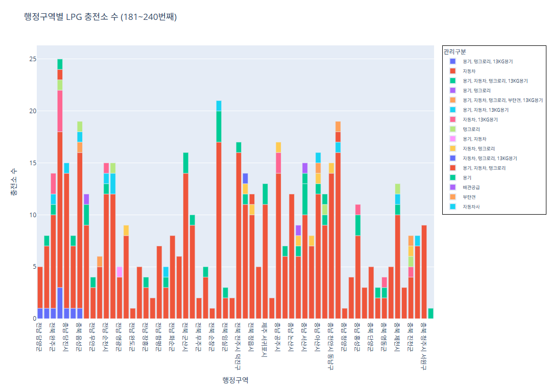
코드 181~240번째 행정구역
import pandas as pd
import plotly.express as px
# CSV 파일 로드
df = pd.read_csv("/content/한국가스안전공사_전국 LPG 충전소 현황_20250423.csv")
# 집계 (행정구역 + 관리구분별 충전소 수)
grouped = df.groupby(['행정구역', '관리구분']).size().reset_index(name='충전소 수')
# 행정구역 고유 리스트
regions = grouped['행정구역'].unique()
subset_regions = regions[180:240]
subset_df = grouped[grouped['행정구역'].isin(subset_regions)]
fig = px.bar(
    subset_df,
    x='행정구역',
    y='충전소 수',
    color='관리구분',
    pattern_shape='관리구분',
    pattern_shape_sequence=[".", "x", "/", "\\"],
    title='행정구역별 LPG 충전소 수 (181~240번째)',
    labels={'행정구역': '행정구역', '충전소 수': '충전소 수'}
)
fig.update_layout(
    legend=dict(
        font=dict(size=9),
        itemsizing='constant',
        itemwidth=30,
        borderwidth=1,
        bordercolor="Black"
    )
)
fig.show()
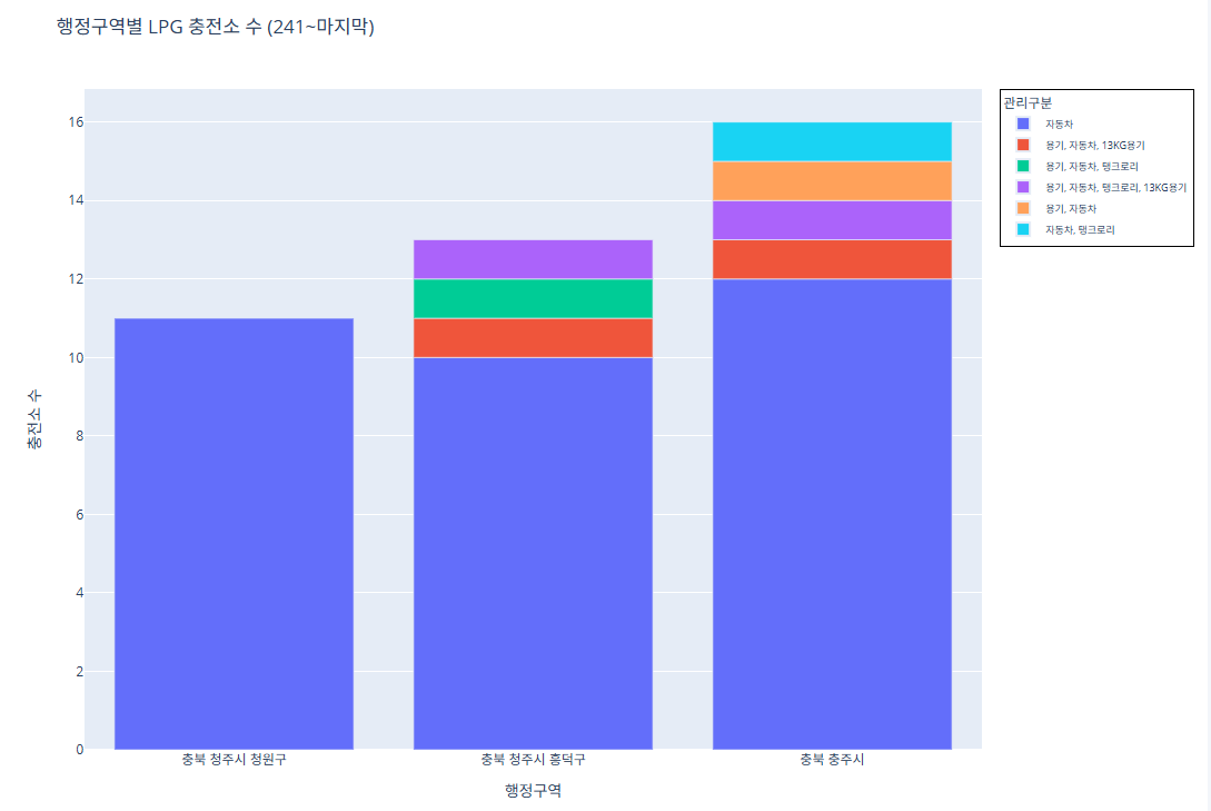
코드 241~243번째 행정구역
import pandas as pd
import plotly.express as px
# CSV 파일 로드
df = pd.read_csv("/content/한국가스안전공사_전국 LPG 충전소 현황_20250423.csv")
# 집계 (행정구역 + 관리구분별 충전소 수)
grouped = df.groupby(['행정구역', '관리구분']).size().reset_index(name='충전소 수')
# 행정구역 고유 리스트
regions = grouped['행정구역'].unique()
subset_regions = regions[240:]
subset_df = grouped[grouped['행정구역'].isin(subset_regions)]
fig = px.bar(
    subset_df,
    x='행정구역',
    y='충전소 수',
    color='관리구분',
    pattern_shape='관리구분',
    pattern_shape_sequence=[".", "x", "/", "\\"],
    title='행정구역별 LPG 충전소 수 (241~마지막)',
    labels={'행정구역': '행정구역', '충전소 수': '충전소 수'}
)
fig.update_layout(
    legend=dict(
        font=dict(size=9),
        itemsizing='constant',
        itemwidth=30,
        borderwidth=1,
        bordercolor="Black"
    )
)
fig.show()
예제 3 (제주면세점 판매 물품과 매출)
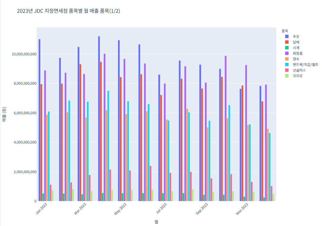
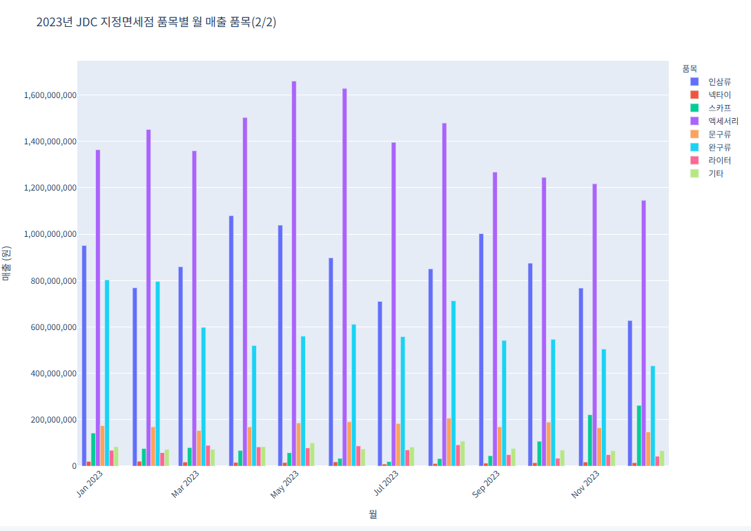
그래프가 너무 방대해서 2개의 그래프로 놔눠서 진행 (1~12월 달이 아닌, 1,3,5,7,9,11 홀수달만 나오게 진행
코드 1 (품목별 월 매출 품목(1/2))import pandas as pd import plotly.express as px # CSV 파일 불러오기 file_path = "/content/제주국제자유도시개발센터_JDC지정면세점 품목별 매출 실적_20231231.csv" df = pd.read_csv(file_path) # 데이터를 long format으로 변환 df_melted = df.melt(id_vars="품목", var_name="월", value_name="매출") df_melted["매출"] = pd.to_numeric(df_melted["매출"], errors='coerce') df_melted["월"] = df_melted["월"].astype(str) # 품목 리스트를 반으로 나누기 (상위 절반) unique_items = df["품목"].unique() half = len(unique_items) // 2 items_group_1 = unique_items[:half] df_group_1 = df_melted[df_melted["품목"].isin(items_group_1)] # 첫 번째 그래프 fig1 = px.bar( df_group_1, x="월", y="매출", color="품목", title="2023년 JDC 지정면세점 품목별 월 매출 품목(1/2)", barmode="group" ) fig1.update_layout( xaxis_title="월", yaxis_title="매출 (원)", legend_title="품목", xaxis_tickangle=-45, font=dict(family="NanumGothic, sans-serif"), yaxis_tickformat="," ) fig1.show()
코드 2 (품목별 월 매출 품목(2/2))
import pandas as pd
import plotly.express as px
# CSV 파일 불러오기
file_path = "/content/제주국제자유도시개발센터_JDC지정면세점 품목별 매출 실적_20231231.csv"
df = pd.read_csv(file_path)
# 데이터를 long format으로 변환
df_melted = df.melt(id_vars="품목", var_name="월", value_name="매출")
df_melted["매출"] = pd.to_numeric(df_melted["매출"], errors='coerce')
df_melted["월"] = df_melted["월"].astype(str)
# 품목 리스트를 반으로 나누기 (하위 절반)
unique_items = df["품목"].unique()
half = len(unique_items) // 2
items_group_2 = unique_items[half:]
df_group_2 = df_melted[df_melted["품목"].isin(items_group_2)]
# 두 번째 그래프
fig2 = px.bar(
    df_group_2,
    x="월",
    y="매출",
    color="품목",
    title="2023년 JDC 지정면세점 품목별 월 매출 품목(2/2)",
    barmode="group"
)
fig2.update_layout(
    xaxis_title="월",
    yaxis_title="매출 (원)",
    legend_title="품목",
    xaxis_tickangle=-45,
    font=dict(family="NanumGothic, sans-serif"),
    yaxis_tickformat=","
)
fig2.show()
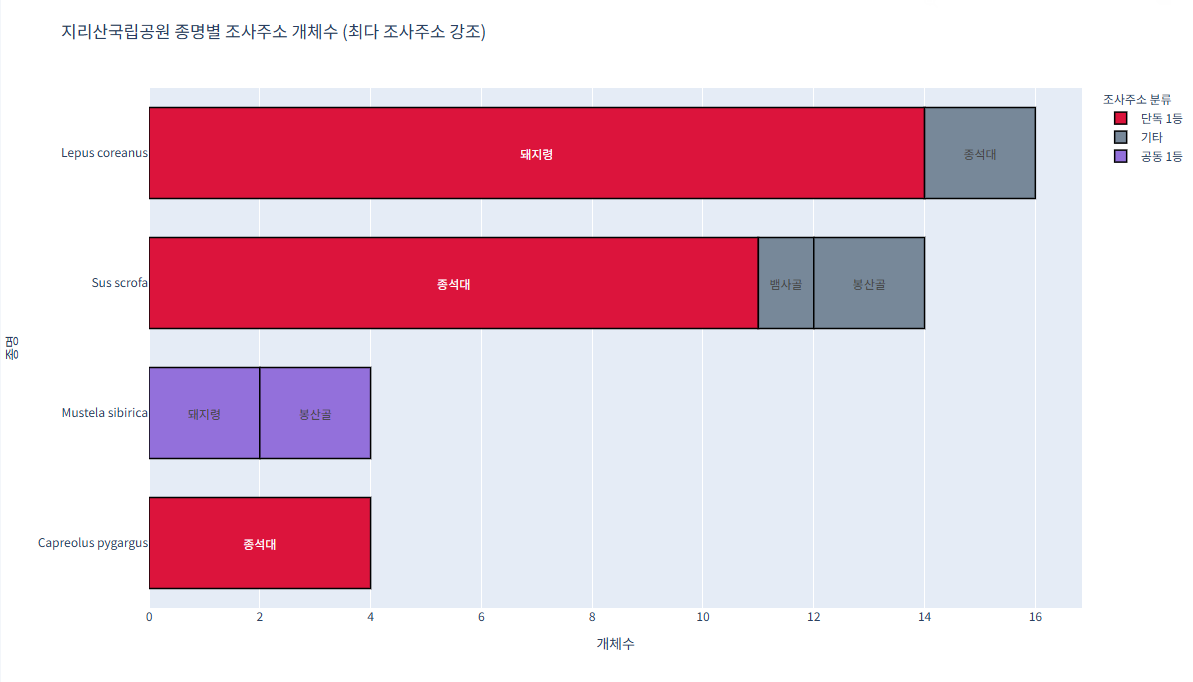
예제 4 (지리산국립공원_생물자원현황)
가장 많이 발견된 조사주소는 빨간색 수가
같으면 보라색
기타는 회색으로 진행import pandas as pd import plotly.express as px # CSV 불러오기 df = pd.read_csv("/content/지리산국립공원_생물자원현황_2023.csv") # 종명 영어→한글 매핑 (필요한 종명 모두 추가) species_map = { "Abies koreana": "구상나무", "Quercus mongolica": "신갈나무", "Pinus densiflora": "소나무", "Rhododendron mucronulatum": "진달래" } df['종명'] = df['종명'].map(species_map).fillna(df['종명']) # 개체수 집계 grouped = df.groupby(['종명', '조사주소'])['개체수'].sum().reset_index() # 최대값 및 공동 1등 조사주소 구분 컬럼 추가 def classify_max_addr(sub): max_val = sub['개체수'].max() max_addrs = sub[sub['개체수'] == max_val]['조사주소'].tolist() def label(addr): if addr in max_addrs: if len(max_addrs) > 1: return '공동 1등' else: return '단독 1등' else: return '기타' return sub.assign(분류=sub['조사주소'].apply(label)) grouped = grouped.groupby('종명').apply(classify_max_addr).reset_index(drop=True) # 색상 맵 color_map = { '단독 1등': 'crimson', '공동 1등': 'mediumpurple', '기타': 'lightslategray' } # plotly express로 가로 막대 그리기 fig = px.bar( grouped, x='개체수', y='종명', color='분류', pattern_shape='분류', orientation='h', text='조사주소', color_discrete_map=color_map, title='지리산국립공원 종명별 조사주소 개체수 (최다 조사주소 강조)' ) fig.update_traces( textposition='inside', insidetextanchor='middle', marker_line_width=1.5, marker_line_color='black', width=0.7 # 막대 두께 비율 ) fig.update_layout( yaxis={'categoryorder':'total ascending'}, bargap=0.15, legend_title_text='조사주소 분류', width=1200, height=700, font=dict(family="NanumGothic, sans-serif") ) fig.show()
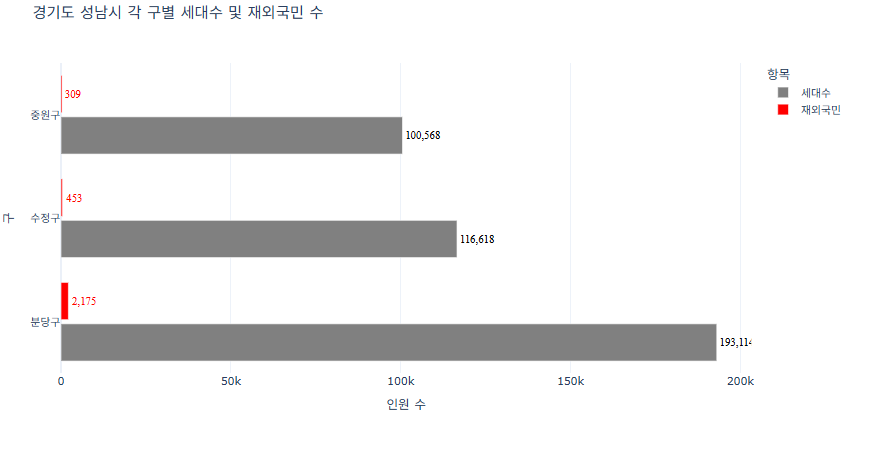
예제 5 (경기도 성남시 각 구별 세대수 및 재외국민 수)
세대 수의 막대는 회색으로
제외국민의 수는 빨간색으로 구분하기import pandas as pd import plotly.express as px # CSV 파일 불러오기 df = pd.read_csv("경기도성남시인구현황.csv") # 구별로 세대수와 재외국민 수 합계 계산 grouped = df.groupby('구별')[['세대수', '재외국민']].sum().reset_index() # 긴 형태로 변환 (Plotly 시각화를 위해) df_melted = pd.melt(grouped, id_vars='구별', value_vars=['세대수', '재외국민'], var_name='항목', value_name='수') # 색상 맵 지정: 세대수 -> 회색, 재외국민 -> 빨간색 color_map = { '세대수': '#808080', # 회색 '재외국민': 'red' # 빨간색 } # Plotly 그래프 생성 (가로 막대) fig = px.bar( df_melted, y='구별', x='수', color='항목', color_discrete_map=color_map, barmode='group', title='경기도 성남시 각 구별 세대수 및 재외국민 수', labels={'구별': '구', '수': '인원 수', '항목': '항목'}, orientation='h' ) # 그래프 레이아웃 및 스타일 조정 fig.update_layout( bargap=0.2, bargroupgap=0.1, xaxis_title='인원 수', yaxis_title='구', legend_title='항목', template='plotly_white' ) # 트레이스별로 텍스트 스타일 다르게 적용 for trace in fig.data: if trace.name == '세대수': # 회색 그래프 trace.update( texttemplate='%{x:,}', textposition='outside', textfont=dict(size=12, color='black', family='Times'), textangle=0 ) elif trace.name == '재외국민': # 빨간색 그래프 trace.update( texttemplate='%{x:,}', textposition='outside', textfont=dict(size=12, color='red', family='Times'), textangle=0 ) fig.show()

개발자를 꿈꾸는 학생