시작하기 전에 import 하기
import plotly.express as px
import plotly.graph_objects as go
import plotly.express as px
import numpy as np
Bar Plot
Bar Plot은 막대 그래프 라고도 하며 범주형 데이터를 직사각형의 막대로 표현하는 그래프 입니다.
Plotly를 활용하여 Bar Plot 을 그리는 방법에 대해 알아보도록 하겠습니다.
Keyword : Plotly Bar Plot, Plotly 막대 그래프, px.bar, go.Bar, Plotly bar style, Plotly bar color, Plotly bar width, Plotly 막대 스타일, Plotly 막대 색, Plotly 막대 너비
Express를 활용한 기본 사용방법
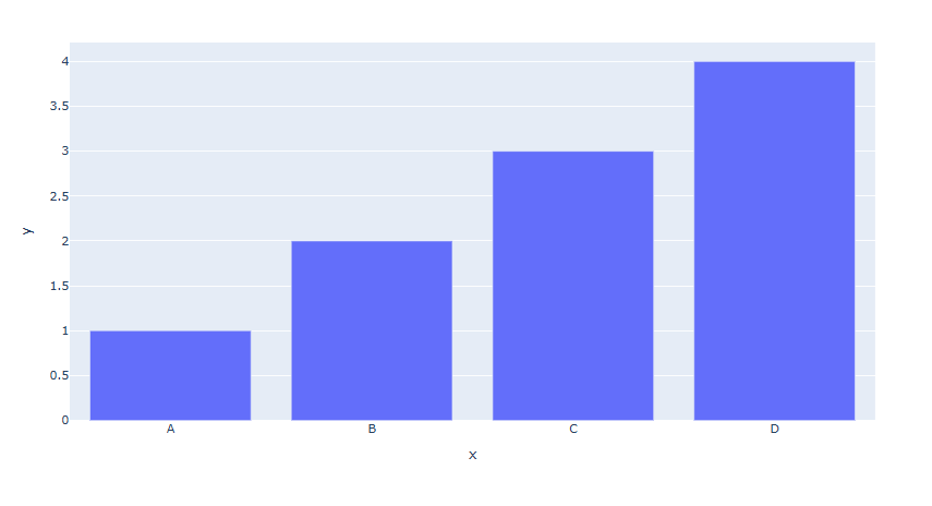
px.bar(x=['A', 'B', 'C', 'D'], y=[1,2,3,4])
# 데이터셋을 활용한 입력
px.bar(data_frame= df, x='year', y='pop')
사용 함수]
px.line()
[함수 input 내용]
데이터 직접 입력
x = x값 리스트
y = y값 리스트
데이터셋을 활용한 입력
data_frame = pandas 데이터 프레임
x = x값 컬럼 명
y = y값 컬럼 명
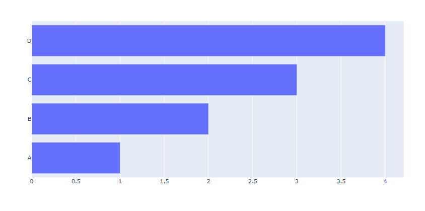
예제 1
fig = px.bar(x=['A', 'B', 'C', 'D'], y=[1,2,3,4])
fig.show()
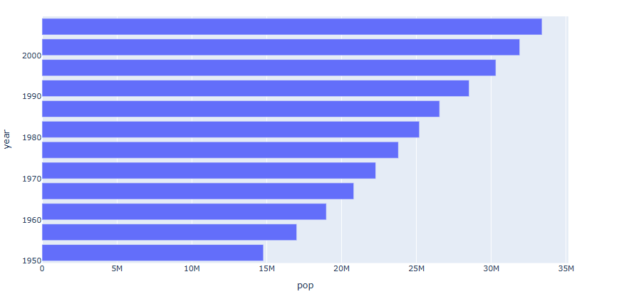
예제 2
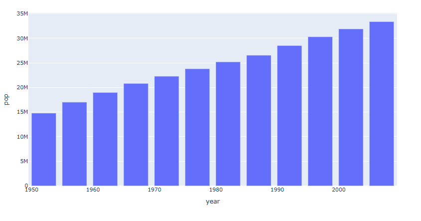
df = px.data.gapminder().query("country == 'Canada'")
fig = px.bar(data_frame= df, x='year', y='pop')
fig.show()
graph_objects를 활용한 기본 사용
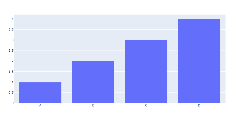
fig.add_trace(go.Bar(x=['A', 'B', 'C', 'D'], y=[1,2,3,4]))[사용 함수]
fig.add_trace() : Trace를 추가할때 사용
go.Bar() : fig.add_trace() 안에 넣은 Bar Trace
[함수 input 내용]
x = x값 리스트 (범주형)
y = y값 리스트
예제
# Figure  생성
fig = go.Figure()
# Bar Trace 추가
fig.add_trace(go.Bar(x=['A', 'B', 'C', 'D'], y=[1,2,3,4]))
fig.show()
수평 막대그래프 그리기
수평으로 막대 그래프를 그리기 위해서는 express, graph_objects 모두 함수안에 아래 코드를 추가합니다.
orientation='h'
express
#데이터 불러오기
df = px.data.gapminder().query("country == 'Canada'")
fig = px.bar(data_frame= df, x='pop', y='year',orientation='h')
fig.show()
graph_objects
# Figure 생성
fig = go.Figure()
fig.add_trace(go.Bar(x=[1,2,3,4], y=['A', 'B', 'C', 'D'],orientation='h'))
fig.show()
express 를 활용한 다양한 기능
한 막대에 다른 범주 쌓아 올리기
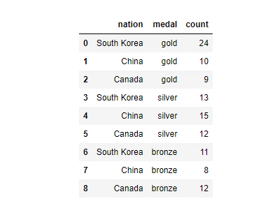
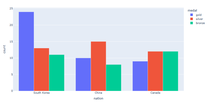
먼저 예제에 사용 할 데이터 셋은 Ploty에서 제공하는 국가 별 메달 획득 갯수 데이터 입니다.
import plotly.express as px
long_df = px.data.medals_long()
long_df
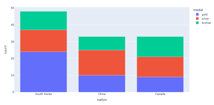
각 나라별로 금, 은, 동 의 데이터를 한 막대위에 색으로 구분하여 쌓아 올리겠습니다.
long_df = px.data.medals_long()
fig = px.bar(long_df, x="nation", y="count", color="medal")
fig.show()
구분해서 쌓아 올리고자 하는 데이터 컬럼 명을 "color = " 으로 지정합니다.
쌓아 올리지 않고 따로 막대로 그리기
long_df = px.data.medals_long()
fig = px.bar(long_df, x="nation", y="count", color="medal", barmode="group")
fig.show()
"barmode="group" 으로 지정합니다.
막대 위에 텍스트 넣기
df = px.data.gapminder().query("continent == 'Europe' and year == 2007 and pop > 2.e6")
fig = px.bar(df, y='pop', x='country', text_auto=True)
fig.show()
"text_auto = True 으로 지정하면 해당 막대의 y값이 텍스트로 나타니다.
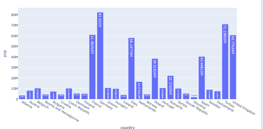
헌데 소수점이 너무 길어서 어떤 막대 위의 텍스트는 거의 보이지 않습니다. 숫자를 2개 까지만 표기 해 보겠습니다.
df = px.data.gapminder().query("continent == 'Europe' and year == 2007 and pop > 2.e6")
fig = px.bar(df, y='pop', x='country', text_auto='.2s')
fig.show()
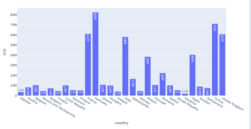
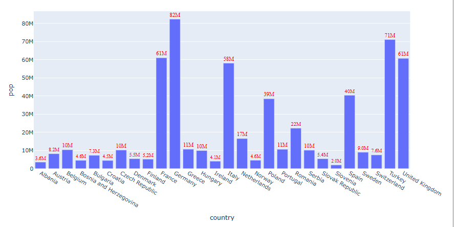
아직 Text가 잘 안보이는 막대가 있습니다 이번에는 직접 텍스트 스타일을 변경해보겠습니다.
df = px.data.gapminder().query("continent == 'Europe' and year == 2007 and pop > 2.e6")
fig = px.bar(df, y='pop', x='country', text_auto='.2s')
fig.update_traces(textfont_size=12,textfont_color='red',textfont_family = "Times", textangle=0, textposition="outside")
fig.show()
[사용 함수]
fig.update_traces()
[함수 input 내용]
line_shape
textfont_size: 텍스트 사이즈를 지정합니다.
textfont_color: 텍스트 색을 지정합니다.
textfont_family : 텍스트 서체를 지정합니다.
textangle: 텍스트 각도를 지정합니다.
textposition: {"inside" , "outside", "auto"} 텍스트 위치를 지정합니다.
inside : 막대 안쪽에 위치합니다.
outside : 막대 바깥쪽에 위치합니다.
auto : 자동으로 위치를 지정합니다.
막대 내부 패턴무 지정하기
df = px.data.gapminder().query("continent=='Oceania'")
fig = px.bar(df, x="medal", y="count", color="nation", pattern_shape="nation")
fig.show()
패턴을 달리 하고싶은 컬럼명을 "pattern_shape = "으로 지정합니다.
import plotly.express as px
# 오세아니아 대륙 데이터 (2007년만 추출)
df = px.data.gapminder().query("continent == 'Oceania' and year == 2007")
# 막대그래프 생성
fig = px.bar(
    df,
    x="country",
    y="pop",
    color="country",
    pattern_shape="country",
    pattern_shape_sequence=[".", "x"]
)
fig.show()
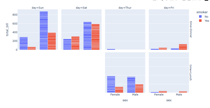
여러개로 나눠 그리기 (Facet)
df = px.data.tips()
fig = px.bar(df, x="sex", y="total_bill", color="smoker", barmode="group",facet_row="time", facet_col="day")
fig.show()
Plotly express 함수의 Facet 기능을 활용하여 범주형 데이터에 따라 자동으로 그래프 나눠그리기가 가능합니다. [링크 추가]
"facet_col= " 또는 "facet_row= " 에 나눠 그리고자 하는 범주형 데이터의 컬럼명을 입력하면 자동을 분류하여 그래프가 생성합니다.
예제는 facet_col = "day" , facet_col = "time"를 입력하여 시간과 요일에 따라 그래프를 따로 그렸습니다
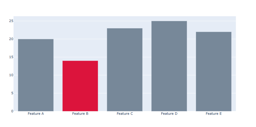
막대 색 각각 지정하기
각각의 막대마다 색을 지정하기 위해선 graph_objects 를 활용하여 Bar Plot을 그려야 합니다.
fig = go.Figure()
#막대 색 리스트
colors = ['lightslategray','crimson','lightslategray','lightslategray','lightslategray']
# Trace 추가
fig.add_trace(go.Bar(x=['Feature A', 'Feature B', 'Feature C','Feature D', 'Feature E'],y=[20, 14, 23, 25, 22],
    marker_color=colors))
fig.show()
x값이 총 5개이기 때문에 5개의 막대가 생성됩니다.
따라서 marker_color = 에 총 5개의 색을 일일히 지정할 리스트를 넣어 줍니다.
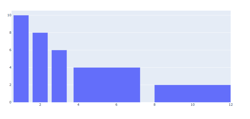
막대 너비 각각 지정하기
각각의 막대마다 색을 지정하기 위해선 graph_objects 를 활용하여 Bar Plot을 그려야 합니다.
fig = go.Figure()
#막대 색 리스트
colors = ['lightslategray','crimson','lightslategray','lightslategray','lightslategray']
# Trace 추가
fig.add_trace(go.Bar(x=[1, 2, 3, 5.5, 10],y=[10, 8, 6, 4, 2],width=[0.8, 0.8, 0.8, 3.5, 4]))
fig.show()
x값이 총 5개이기 때문에 5개의 막대가 생성됩니다.
따라서 width = 에 총 5개의 각각의 막대의 너비를 리스트 형태로 넣어줍니다.
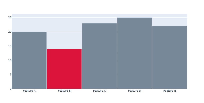
막대 와 막대 사이 간격 조정하기
fig.update_layout(
    bargap = 막대와 막대사이 간격
    bargroupgap = 막대 그룹간 사이간견
)
[사용 함수]
fig.update_layout()
[함수 input 내용]
bargap : 막대와 막대사이 간격
bargroupgap : 막대 그룹간 사이간견# Figure 생성 fig = go.Figure() #막대 색 리스트 colors = ['lightslategray','crimson','lightslategray','lightslategray','lightslategray'] # Trace 추가 fig.add_trace(go.Bar(x=['Feature A', 'Feature B', 'Feature C','Feature D', 'Feature E'],y=[20, 14, 23, 25, 22], marker_color=colors)) # 막대사이 간격 조정 fig.update_layout(bargap=0.01) fig.show()
실제 데이터를 활용해서 막대 그래프 표현하기
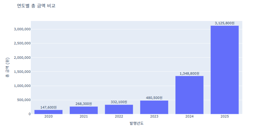
예제 1 (경상북도희망구입도서)
import pandas as pd
import plotly.express as px
# CSV 불러오기
df = pd.read_csv('경상북도희망도서.csv')
df.columns = df.columns.str.strip()
# 연도별 총 금액 집계
year_sum = df.groupby('발행년도')['금액'].sum().reset_index()
# Plotly Express로 막대그래프
fig = px.bar(
    year_sum,
    x='발행년도',
    y='금액',
    title='연도별 총 금액 비교',
    labels={'발행년도':'발행년도', '금액':'총 금액 (원)'},
    text='금액'
)
fig.update_layout(
    yaxis=dict(
        tickformat=",",  # 천 단위 콤마
        title='총 금액 (원)'
    )
)
fig.update_traces(texttemplate='%{text:,}원', textposition='outside')
fig.update_layout(uniformtext_minsize=12, uniformtext_mode='hide')
fig.show()
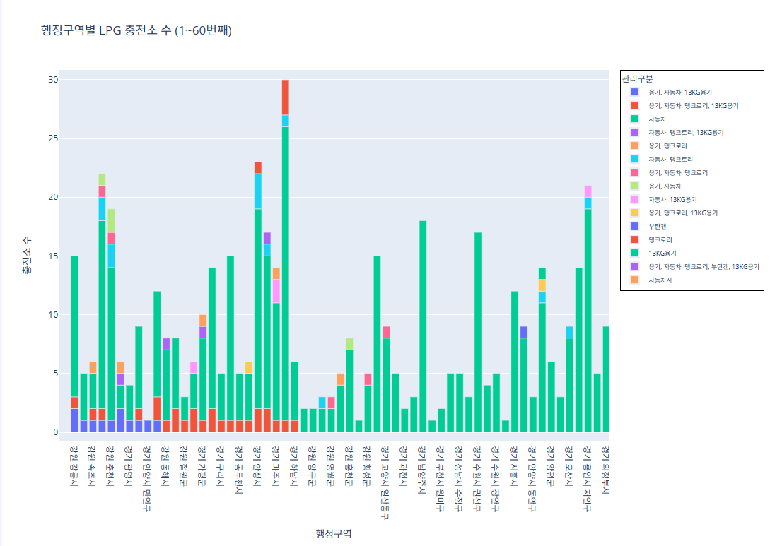
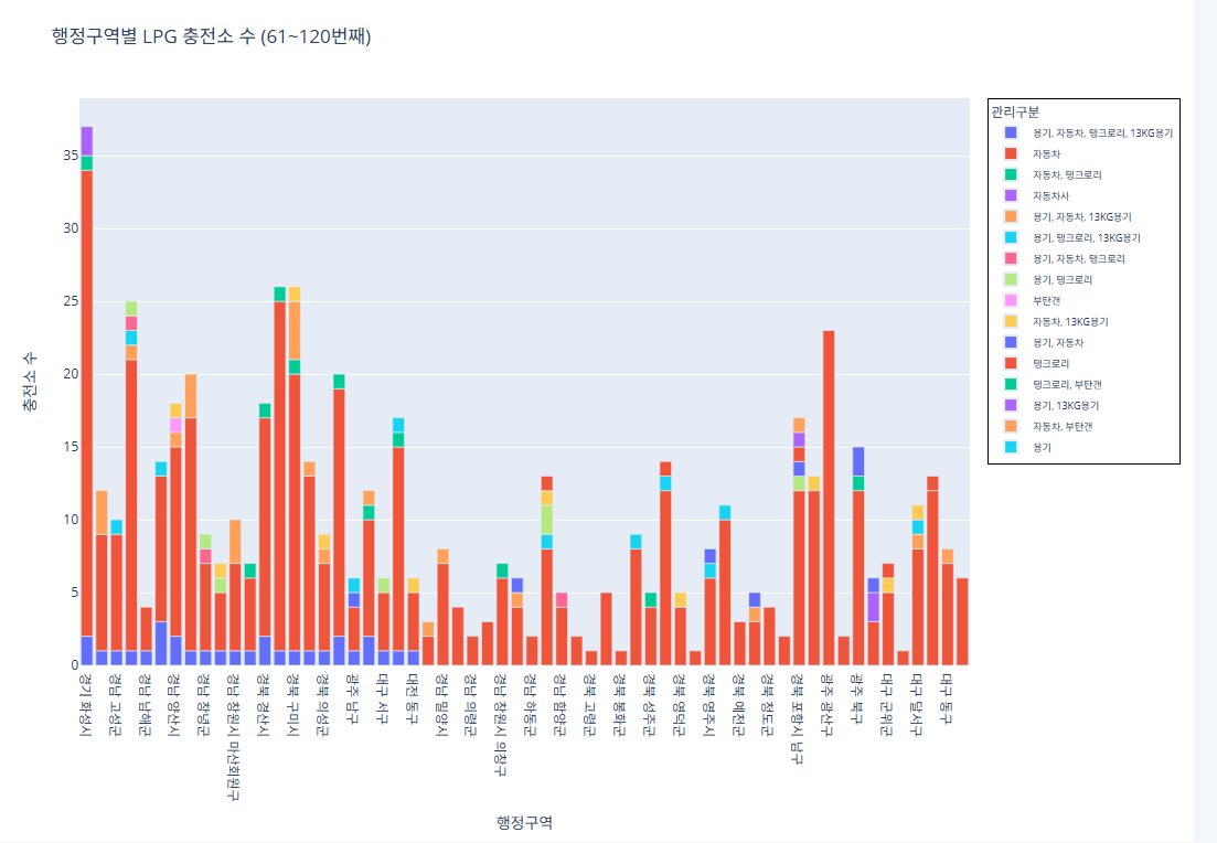
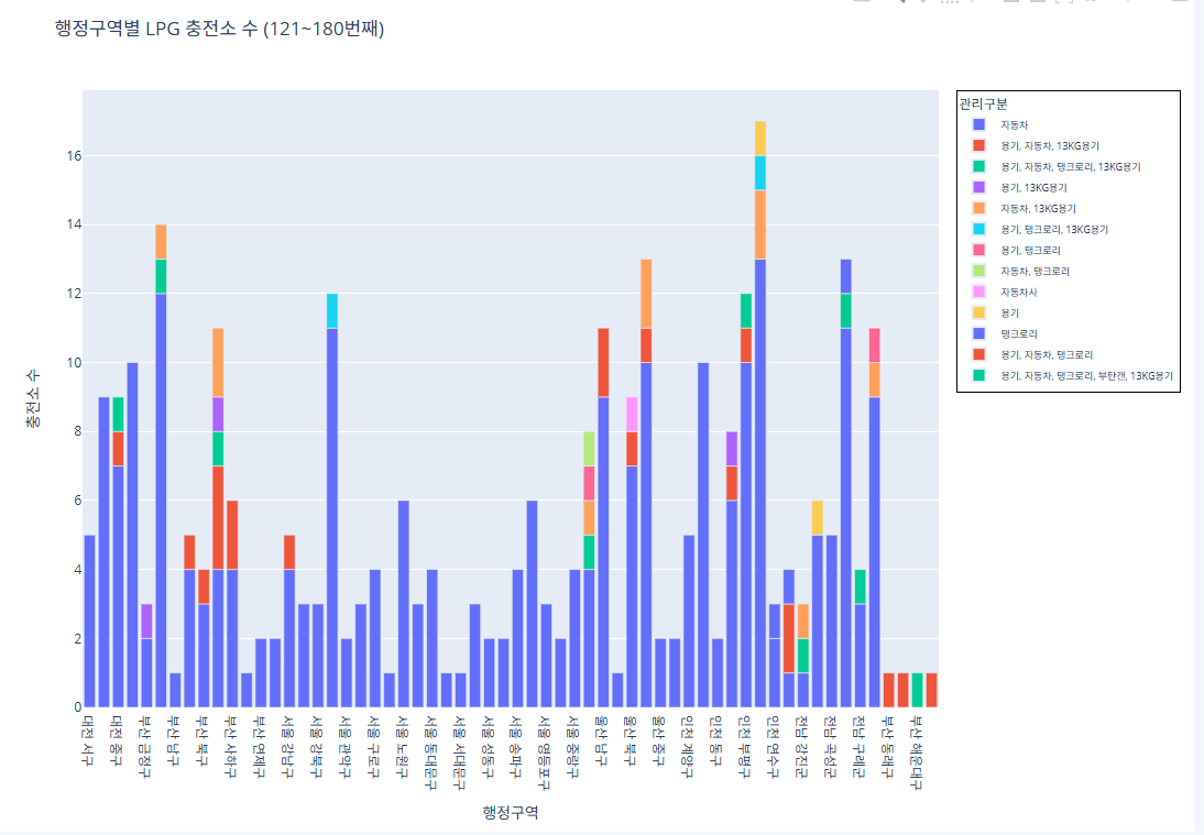
예제 2 (한국가스충전소)
데이터가 너무 방대해서 그래프를 놔눠서 진행
코드 1~60번째 행정구역import pandas as pd import plotly.express as px # CSV 파일 로드 df = pd.read_csv("/content/한국가스안전공사_전국 LPG 충전소 현황_20250423.csv") # 집계 (행정구역 + 관리구분별 충전소 수) grouped = df.groupby(['행정구역', '관리구분']).size().reset_index(name='충전소 수') # 행정구역 고유 리스트 regions = grouped['행정구역'].unique() subset_regions = regions[0:60] subset_df = grouped[grouped['행정구역'].isin(subset_regions)] fig = px.bar( subset_df, x='행정구역', y='충전소 수', color='관리구분', pattern_shape='관리구분', pattern_shape_sequence=[".", "x", "/", "\\"], title='행정구역별 LPG 충전소 수 (1~60번째)', labels={'행정구역': '행정구역', '충전소 수': '충전소 수'} ) fig.update_layout( legend=dict( font=dict(size=9), itemsizing='constant', itemwidth=30, borderwidth=1, bordercolor="Black" ) ) fig.show()
코드 61~120번째 행정구역
import pandas as pd
import plotly.express as px
# CSV 파일 로드
df = pd.read_csv("/content/한국가스안전공사_전국 LPG 충전소 현황_20250423.csv")
# 집계 (행정구역 + 관리구분별 충전소 수)
grouped = df.groupby(['행정구역', '관리구분']).size().reset_index(name='충전소 수')
# 행정구역 고유 리스트
regions = grouped['행정구역'].unique()
subset_regions = regions[60:120]
subset_df = grouped[grouped['행정구역'].isin(subset_regions)]
fig = px.bar(
    subset_df,
    x='행정구역',
    y='충전소 수',
    color='관리구분',
    pattern_shape='관리구분',
    pattern_shape_sequence=[".", "x", "/", "\\"],
    title='행정구역별 LPG 충전소 수 (61~120번째)',
    labels={'행정구역': '행정구역', '충전소 수': '충전소 수'}
)
fig.update_layout(
    legend=dict(
        font=dict(size=9),
        itemsizing='constant',
        itemwidth=30,
        borderwidth=1,
        bordercolor="Black"
    )
)
fig.show()
코드 121~180번째 행정구역
import pandas as pd
import plotly.express as px
# CSV 파일 로드
df = pd.read_csv("/content/한국가스안전공사_전국 LPG 충전소 현황_20250423.csv")
# 집계 (행정구역 + 관리구분별 충전소 수)
grouped = df.groupby(['행정구역', '관리구분']).size().reset_index(name='충전소 수')
# 행정구역 고유 리스트
regions = grouped['행정구역'].unique()
subset_regions = regions[120:180]
subset_df = grouped[grouped['행정구역'].isin(subset_regions)]
fig = px.bar(
    subset_df,
    x='행정구역',
    y='충전소 수',
    color='관리구분',
    pattern_shape='관리구분',
    pattern_shape_sequence=[".", "x", "/", "\\"],
    title='행정구역별 LPG 충전소 수 (121~180번째)',
    labels={'행정구역': '행정구역', '충전소 수': '충전소 수'}
)
fig.update_layout(
    legend=dict(
        font=dict(size=9),
        itemsizing='constant',
        itemwidth=30,
        borderwidth=1,
        bordercolor="Black"
    )
)
fig.show()
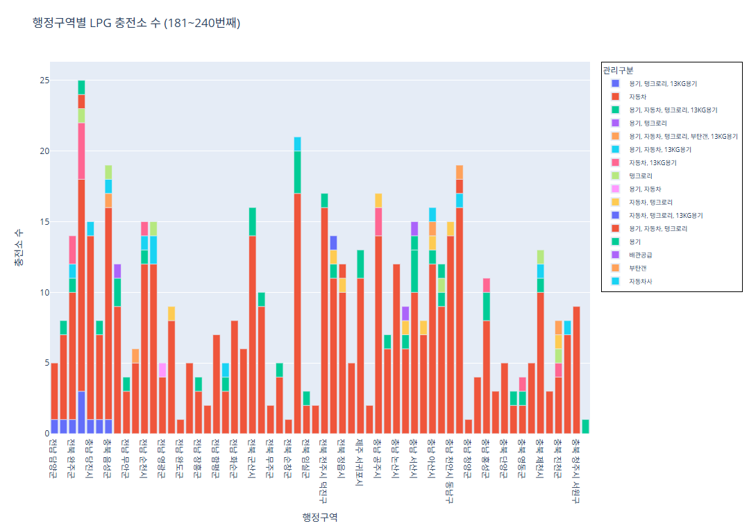
코드 181~240번째 행정구역
import pandas as pd
import plotly.express as px
# CSV 파일 로드
df = pd.read_csv("/content/한국가스안전공사_전국 LPG 충전소 현황_20250423.csv")
# 집계 (행정구역 + 관리구분별 충전소 수)
grouped = df.groupby(['행정구역', '관리구분']).size().reset_index(name='충전소 수')
# 행정구역 고유 리스트
regions = grouped['행정구역'].unique()
subset_regions = regions[180:240]
subset_df = grouped[grouped['행정구역'].isin(subset_regions)]
fig = px.bar(
    subset_df,
    x='행정구역',
    y='충전소 수',
    color='관리구분',
    pattern_shape='관리구분',
    pattern_shape_sequence=[".", "x", "/", "\\"],
    title='행정구역별 LPG 충전소 수 (181~240번째)',
    labels={'행정구역': '행정구역', '충전소 수': '충전소 수'}
)
fig.update_layout(
    legend=dict(
        font=dict(size=9),
        itemsizing='constant',
        itemwidth=30,
        borderwidth=1,
        bordercolor="Black"
    )
)
fig.show()
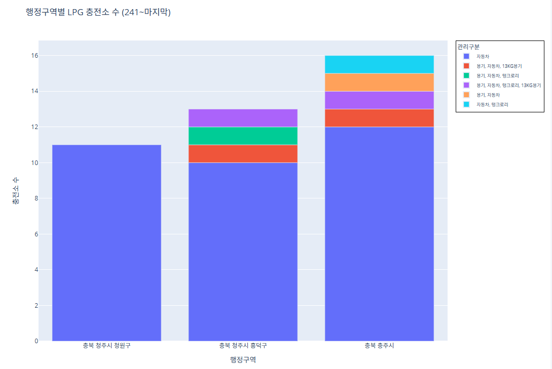
코드 241~243번째 행정구역
import pandas as pd
import plotly.express as px
# CSV 파일 로드
df = pd.read_csv("/content/한국가스안전공사_전국 LPG 충전소 현황_20250423.csv")
# 집계 (행정구역 + 관리구분별 충전소 수)
grouped = df.groupby(['행정구역', '관리구분']).size().reset_index(name='충전소 수')
# 행정구역 고유 리스트
regions = grouped['행정구역'].unique()
subset_regions = regions[240:]
subset_df = grouped[grouped['행정구역'].isin(subset_regions)]
fig = px.bar(
    subset_df,
    x='행정구역',
    y='충전소 수',
    color='관리구분',
    pattern_shape='관리구분',
    pattern_shape_sequence=[".", "x", "/", "\\"],
    title='행정구역별 LPG 충전소 수 (241~마지막)',
    labels={'행정구역': '행정구역', '충전소 수': '충전소 수'}
)
fig.update_layout(
    legend=dict(
        font=dict(size=9),
        itemsizing='constant',
        itemwidth=30,
        borderwidth=1,
        bordercolor="Black"
    )
)
fig.show()
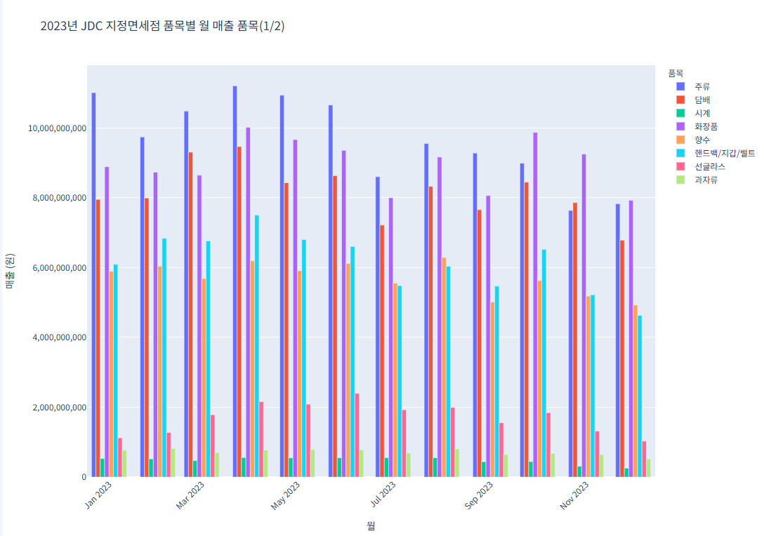
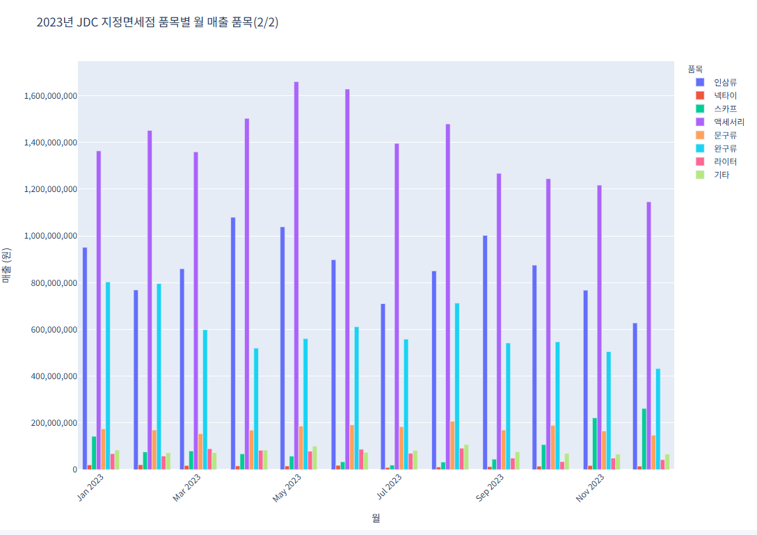
예제 3 (제주면세점 판매 물품과 매출)
그래프가 너무 방대해서 2개의 그래프로 놔눠서 진행 (1~12월 달이 아닌, 1,3,5,7,9,11 홀수달만 나오게 진행
코드 1 (품목별 월 매출 품목(1/2))import pandas as pd import plotly.express as px # CSV 파일 불러오기 file_path = "/content/제주국제자유도시개발센터_JDC지정면세점 품목별 매출 실적_20231231.csv" df = pd.read_csv(file_path) # 데이터를 long format으로 변환 df_melted = df.melt(id_vars="품목", var_name="월", value_name="매출") df_melted["매출"] = pd.to_numeric(df_melted["매출"], errors='coerce') df_melted["월"] = df_melted["월"].astype(str) # 품목 리스트를 반으로 나누기 (상위 절반) unique_items = df["품목"].unique() half = len(unique_items) // 2 items_group_1 = unique_items[:half] df_group_1 = df_melted[df_melted["품목"].isin(items_group_1)] # 첫 번째 그래프 fig1 = px.bar( df_group_1, x="월", y="매출", color="품목", title="2023년 JDC 지정면세점 품목별 월 매출 품목(1/2)", barmode="group" ) fig1.update_layout( xaxis_title="월", yaxis_title="매출 (원)", legend_title="품목", xaxis_tickangle=-45, font=dict(family="NanumGothic, sans-serif"), yaxis_tickformat="," ) fig1.show()
코드 2 (품목별 월 매출 품목(2/2))
import pandas as pd
import plotly.express as px
# CSV 파일 불러오기
file_path = "/content/제주국제자유도시개발센터_JDC지정면세점 품목별 매출 실적_20231231.csv"
df = pd.read_csv(file_path)
# 데이터를 long format으로 변환
df_melted = df.melt(id_vars="품목", var_name="월", value_name="매출")
df_melted["매출"] = pd.to_numeric(df_melted["매출"], errors='coerce')
df_melted["월"] = df_melted["월"].astype(str)
# 품목 리스트를 반으로 나누기 (하위 절반)
unique_items = df["품목"].unique()
half = len(unique_items) // 2
items_group_2 = unique_items[half:]
df_group_2 = df_melted[df_melted["품목"].isin(items_group_2)]
# 두 번째 그래프
fig2 = px.bar(
    df_group_2,
    x="월",
    y="매출",
    color="품목",
    title="2023년 JDC 지정면세점 품목별 월 매출 품목(2/2)",
    barmode="group"
)
fig2.update_layout(
    xaxis_title="월",
    yaxis_title="매출 (원)",
    legend_title="품목",
    xaxis_tickangle=-45,
    font=dict(family="NanumGothic, sans-serif"),
    yaxis_tickformat=","
)
fig2.show()
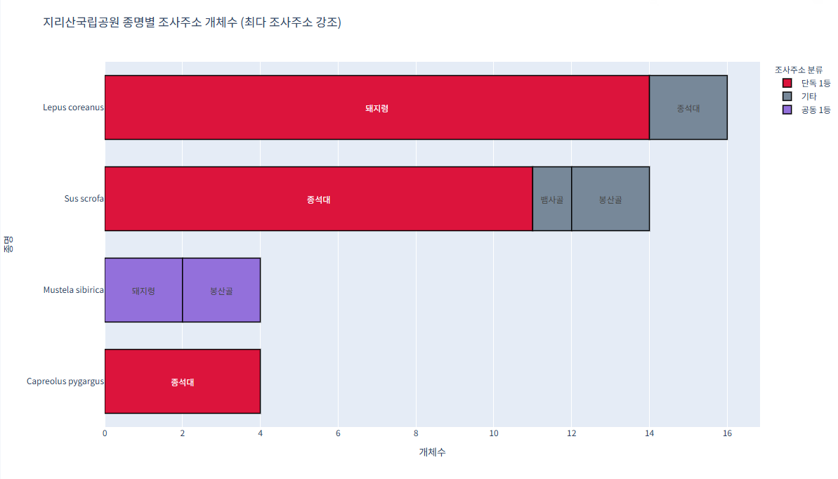
예제 4 (지리산국립공원_생물자원현황)
가장 많이 발견된 조사주소는 빨간색 수가
같으면 보라색
기타는 회색으로 진행import pandas as pd import plotly.express as px # CSV 불러오기 df = pd.read_csv("/content/지리산국립공원_생물자원현황_2023.csv") # 종명 영어→한글 매핑 (필요한 종명 모두 추가) species_map = { "Abies koreana": "구상나무", "Quercus mongolica": "신갈나무", "Pinus densiflora": "소나무", "Rhododendron mucronulatum": "진달래" } df['종명'] = df['종명'].map(species_map).fillna(df['종명']) # 개체수 집계 grouped = df.groupby(['종명', '조사주소'])['개체수'].sum().reset_index() # 최대값 및 공동 1등 조사주소 구분 컬럼 추가 def classify_max_addr(sub): max_val = sub['개체수'].max() max_addrs = sub[sub['개체수'] == max_val]['조사주소'].tolist() def label(addr): if addr in max_addrs: if len(max_addrs) > 1: return '공동 1등' else: return '단독 1등' else: return '기타' return sub.assign(분류=sub['조사주소'].apply(label)) grouped = grouped.groupby('종명').apply(classify_max_addr).reset_index(drop=True) # 색상 맵 color_map = { '단독 1등': 'crimson', '공동 1등': 'mediumpurple', '기타': 'lightslategray' } # plotly express로 가로 막대 그리기 fig = px.bar( grouped, x='개체수', y='종명', color='분류', pattern_shape='분류', orientation='h', text='조사주소', color_discrete_map=color_map, title='지리산국립공원 종명별 조사주소 개체수 (최다 조사주소 강조)' ) fig.update_traces( textposition='inside', insidetextanchor='middle', marker_line_width=1.5, marker_line_color='black', width=0.7 # 막대 두께 비율 ) fig.update_layout( yaxis={'categoryorder':'total ascending'}, bargap=0.15, legend_title_text='조사주소 분류', width=1200, height=700, font=dict(family="NanumGothic, sans-serif") ) fig.show()
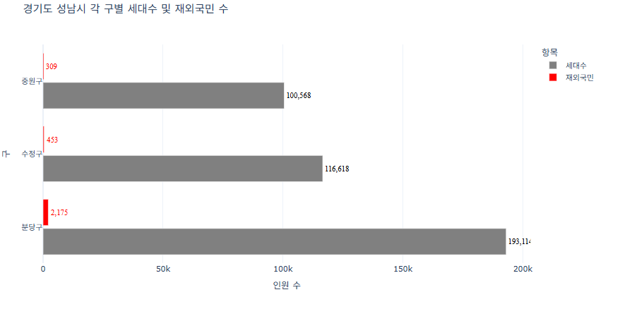
예제 5 (경기도 성남시 각 구별 세대수 및 재외국민 수)
세대 수의 막대는 회색으로
제외국민의 수는 빨간색으로 구분하기import pandas as pd import plotly.express as px # CSV 파일 불러오기 df = pd.read_csv("경기도성남시인구현황.csv") # 구별로 세대수와 재외국민 수 합계 계산 grouped = df.groupby('구별')[['세대수', '재외국민']].sum().reset_index() # 긴 형태로 변환 (Plotly 시각화를 위해) df_melted = pd.melt(grouped, id_vars='구별', value_vars=['세대수', '재외국민'], var_name='항목', value_name='수') # 색상 맵 지정: 세대수 -> 회색, 재외국민 -> 빨간색 color_map = { '세대수': '#808080', # 회색 '재외국민': 'red' # 빨간색 } # Plotly 그래프 생성 (가로 막대) fig = px.bar( df_melted, y='구별', x='수', color='항목', color_discrete_map=color_map, barmode='group', title='경기도 성남시 각 구별 세대수 및 재외국민 수', labels={'구별': '구', '수': '인원 수', '항목': '항목'}, orientation='h' ) # 그래프 레이아웃 및 스타일 조정 fig.update_layout( bargap=0.2, bargroupgap=0.1, xaxis_title='인원 수', yaxis_title='구', legend_title='항목', template='plotly_white' ) # 트레이스별로 텍스트 스타일 다르게 적용 for trace in fig.data: if trace.name == '세대수': # 회색 그래프 trace.update( texttemplate='%{x:,}', textposition='outside', textfont=dict(size=12, color='black', family='Times'), textangle=0 ) elif trace.name == '재외국민': # 빨간색 그래프 trace.update( texttemplate='%{x:,}', textposition='outside', textfont=dict(size=12, color='red', family='Times'), textangle=0 ) fig.show()